10,000 search results
(0.026 seconds)
- Gans Gotico Globo by Intellecta Design,
$9.00See also other font families inspired by Gans' original typefaces: Gans Tipo Adorno , Gans Lath Modern , Gans Titular Adornada, Gans Ibarra , Gans Antigua , Gans Antigua Manuscrito , Gans Fulgor , Gans Radio Lumina , Gans Carmem Adornada , Gans Italiana and Gans Titania . - Brondi by System B,
$14.00 Brondi is based on a wood type specimen from a french foundry, featuring a weird grotesque with inverted contrast and extremely tight spacing. It was used for large displays mainly in advertising. The font is a caps version only.
 - Gans Royality by Intellecta Design,
$23.90 See also other font families inspired by Gans' original typefaces: Gans Tipo Adorno, Gans Lath Modern, Gans Titular Adornada, Gans Ibarra, Gans Antigua, Gans Antigua Manuscrito, Gans Fulgor, Gans Radio Lumina, Gans Carmem Adornada, Gans Italiana, and Gans Titania.
 - Rustic Setting JNL by Jeff Levine,
$29.00 Rustic Setting JNL is the solidified version of Rustic Stencil JNL. Originally modeled from lettering on the cover a children's book, the solid version of this Western-inspired typeface is reminiscent of the classic wood types of the era.
 - Giro by Suomi,
$25.00 I saw an old logo for Giro d'Italia on telly, and was just smitten by the truly ugly type: just ruler and compass work, no intakes or optical corrections whatsoever. I just had to turn that into a font.
 - Gloriosus NF by Nick's Fonts,
$10.00 Originally issued as Apollo by the Central Type Foundry of Saint Louis, this face evokes the glamor of late Victorian era. Both versions of this font support the Latin 1252, Central European 1250, Turkish 1254 and Baltic 1257 codepages.
 - Gilbey by Solotype,
$19.95Although wood types are found throughout the world, most of the decorative one originated in the United States. This one would work well on theatrical playbills, and advertising for tourist railroads, wild west shows and concerts in the park. - Hair by URW Type Foundry,
$39.99 Hair is another beautiful URW++ FontForum contribution by Wojtek Ruhnau. It is a technically ambitious multi-line script-like type design that should be used carefully and in large sizes only. However, set properly, Hair renders beautifully and charmingly.
 - Roundhead by Solotype,
$19.95A surprisingly modern looking condensed sans serif issued by Mackellar, Smiths & Jordan foundry in 1887. Its narrow width makes it useful for long copy headlines. Designed by the freelance type cutter Charles Beeler who did many fonts for Mackellar. - Vingiloth by Mr. Typeman,
$12.00 Vingiloth is a delicate script which simulates natural handwriting. Vingiloth includes Vingiloth Regular and Vingiloth Caps, designed to contrast and compliment each other with elegant beauty and contemporary style, making it an excellent fit for projects of all types.
 - Lawbreaker JNL by Jeff Levine,
$29.00 The December, 1935 movie poster for James Cagney in “Public Enemy” has its title hand lettered in a bold, squared, slab serif type style. Now digitally recreated as Lawbreaker JNL, it is available in both regular and oblique versions.
 - Nadianne by Monotype,
$40.99Aldo Novarese, the famous Italian type designer (ITC Novarese, Eurostile, and many others), designed Nadianne. The elegant, readable Agfa Nadianne looks as good on an invitation as it does on a business letter. Featured in: Best Fonts for Tattoos - Hattan Antique by Solotype,
$19.95This font is a somewhat modified version of the original issued by the Manhattan Type Foundry in the 1880s. This New York foundry was in business for less than five years, so its fonts are not too well known. - Presswood JNL by Jeff Levine,
$29.00 Presswood JNL was modeled from the title font used on the cover of a specimen book issued by the Delittle Wood Type Company of York, England. This bold, friendly sans serif is available in both regular and oblique versions.
 - Onick by Wordshape,
$- While researching the history of Onitsuka Tiger's branding and graphic design, I came across an odd, yet highly appealing piece of custom lettering on the company's ONICK ski boots from the 1970s. Reminiscent of aspects of the typeface Black-Out by Eli Carrico (released by my type foundry Wordshape), yet vertically compressed with razor-sliced counters and odd stencil element that makes up one of the legs of the "K", the ONICK lettering is a potential source for an intriguing modular font. I immediately thought of Ryoichi Tsunekawa as a potential collaborator to bring this piece of lettering to full-fledged life in the contemporary context. Based in Nagoya, Tsunekawa runs an independent type foundry called Dharma Type, including three specialized foundry sub-labels: Flat-It, devoted to display lettering; Prop-A-Ganda, a series of fonts inspired by and based on retro propaganda posters, movie posters, retail sign lettering & advertisements in the early 20th century; and Holiday Type, a series of decorative and retro scripts for holiday use. The past year has seen a flurry of notice of his work abroad, having been featured in both MyFonts' "Creative Characters" and YouWorkForThem's newsletter. As the work of most Japanese type designers is almost wholly unnoticed abroad, for Tsunekawa to be interviewed by two of the most popular type distribution companies in the world is definitely something beyond the norm. Perhaps it is because he works independently, or perhaps it is due to the charm and friendliness with which his typefaces are infused. Either way, this attention is both welcome and appreciated. Beyond mere charm, Tsunekawa's work is nuanced, detailed, and accessible due to its high level of finish. His fonts stand apart from his contemporaries in Latin typeface design in Japan due to his fascination with pop, vernacular and historical lettering from "non-pure" sources- whereas type designers like Kunihiko Okano and Akira Kobayashi have spent years analyzing the essence of Western letterform construction and unlocking the essence of Latin forms, Tsunekawa views surface and the awkward nature of his sources as being of value, as well. His irreverence for the formal doctrines of history imbue his typeface designs with a rugged inventiveness that would be missed by most- glyphs without source designs are guessed at and approximated, often in a manner wildly divergent from what Western eyes would assume. It is in these moments that I find sheer delight in Tsunekawa’s work and what make me most pleased to invite him aboard Neojaponisme and Onitsuka Tiger’s type development project. His assorted typefaces show an eclecticism in finish and as holistic systems- Tsunekawa's return email to me about the proposed type project showed a digital sketch of how a completed typeface family from the source lettering might look, rendered with an effortlessness and dedication to detail that belies a skilled craftsperson. Further development showed Tsunekawa’s rigor- the typeface in development rapidly featured glyphs ignored by many: a full set of fractions, Eastern European diacritics and accents, superior and inferior numerals, alternate characters, and custom ligatures - all designed with regulated, detailed spacing. ONICK is a typeface Tsunekawa should be proud of- an homage to a moment in history rendered in the absolute best fashion. We are proud to present it to the world! --Ian Lynam
 - VTC-TribalThreeFree - Personal use only

- A10 STAR Black by Mogtahid,
$90.00 As a former typographer / lino and calligrapher, Abdallah NASRI had recourse to the nature of the idea of an "INTERCHANGEABLE" collection for types who in reality offer a police collar parallel to the complex typeface of the variable. Our fashion is outlined by a simple calculation defined by superimposed geometric circles where we used only its ¼ to fill the need for the angles of each of our letters. Always with the idea of having in the same allocated space, the same letter nested as many times as fat example from Hairline to Ultrabold. It was in this way that I was able to obtain a large number of styles, with a very interesting kerning which prompted me to extend the font to other languages with +1000 characters and +600 glyphs. I have always been treasured by the all in "1". I assure you that I sought to obtain the maximum of Visibility for a use S / Titling TV, WEB Pages and Typography Typo; once the difficult thing was done, I was rewarded by a font that has countless typographic openings for the world of graphics with 10 styles of weights in hand, and again I am happy to have personalized the charm of each letter by new details; I do not regret the time spent on thinking about it so that it is useful and at the same time pleasant as a working tool, finally profitable in all sectors and more multilingual, without forgetting that it is a family of inter change c ' is to say: All the types occupy the same height of the body and it is their fats which differs in the same space width of each of the letters, therefore no interference in spacing. Here, an additional alternative, a participation of a septuagenarian in the service of the love of modern digital typography. • TEST: At 50% screen in a body of 12 pixels, the A10 STAR Alphabet subjected to a test, has a clear Readability / Visibility. • P.S: A10 STAR integrates Diacriticism in all its forms. Texte d'origine : Abdallah NASRI a eu recours en étant ancien typographe/lino et calligraphe à la nature de l'idée d'une collection "INTERCHANGEABLE" pour les types qui en réalité offre un collier de police parallèle à la fonte complexe du variable. Notre mode est esquissé par un calcul simple défini par des ronds géométrique superposés où on a utilisé seulement son ¼ pour garnir le besoin des angles de chacune de nos lettres. Toujours dans l’idée à avoir dans le même espacement alloué, la même lettre imbriquée autant de fois de graisse exemple du Hairline à Ultrabold. C’est de cette manière que j’ai pu obtenir un grand nombre de styles, avec un crénage très intéressant ce qui m’a incité à étendre la police à d’autres langues avec +1000 caractères et +600 glyphes. J’ai toujours été prisé par le tout en « 1 ». Je vous assure que j’ai cherché à obtenir le maximum de Visibilité pour une utilisation S/Titrage TV, Pages WEB et Maquette typo ; une fois le difficile fait, j’ai été récompensé par une police qui possède d’innombrable ouverture typographique pour le monde du Graphisme avec comme atout en main 10 styles de graisses, et encore je suis content pour avoir personnalisé le charme de chaque lettre par des détails nouveaux ; je ne regrette pas le temps passé dessus à réfléchir pour qu’il soit utile et à la fois agréable comme outil de travail, enfin profitable tous secteurs confondus et en plus multilingue, sans oublié que c’est une famille d’inter change c’est-à-dire : Tous les types occupent la même hauteur du corps et c'est leurs graisses qui diffère dans un même espace largeur de chacune des lettres, donc aucune interférence dans l’espacement. Voilà, une alternative supplémentaire, une participation d’un septuagénaire au service de l’amour de la typographie numérique moderne. • TEST : A 50% d'écran dans un corps de 12 pixels, l'Alphabet A10 STAR soumise a un test, présente une nette Lisibilité / Visibilité. • P.S : A10 STAR intégre la Diacritique dans toutes ses formes.
 - Actium by Type Mafia,
$45.00 Actium is a contemporary multilingual sans serif typeface developed to help perfect typography automatically. Type Mafia has focussed on words with odd combinations of capital letters and numbers, such as product names and postal codes such as WD40 and H1N5, jump out of the text. They sit awkwardly together as the numerals have been designed to work with the lowercase, not the uppercase letters – affecting readability.To fix this Type Mafia invented Smart Capo™. Smart Capo™ Smart Capo is a feature that automatically activates once you type an uppercase letter together with a number. When a capital letter is sat next to a numeral, Smart Capo converts the letter to a mid-cap — a contemporary alternative to small caps — and the default old-style numeral to a lining numeral. Actium’s mid-caps and lining numerals have been designed with the same height (between cap and x-height) so they sit comfortably next to each other and fit more harmoniously into text. Smart Capo applies equal attention to capitalised words without any numbers, such as NAVO and USA, and are also automatically set into mid-capitals. Working on its own, Smart Capo saves time and money for the typographer — taking the pain out of text formatting — and makes it a more pleasurable experience for the reader. This feature is made possible by the use of ‘contextual alternates’, an OpenType feature used in modern font software, working with a set of characters specially designed at mid-cap height. By default these changes automatically take place so it doesn't need to be switched on, it will just work. Actium Actium’s design has an unusual diagonal contrast — much more common in a serifed face than in a sans serif — giving it more bite. The typeface looks elegant when set in large sizes and remains very legible when shown in small sizes. The family consists of six weights in two styles, making a dozen fonts. Weights range from light to black in roman and true italic. All fonts are fully loaded with functional elements. Actium boasts an extended Latin character set and with Greek. This means a wide range of Western languages are supported: perfect for use in bilingual publications and packaging. For numerals, each font includes old-style and lining figures in both proportional and tabular widths, with superiors and inferiors. These allow you to select the right set of numbers for the right task.
 - Varidox by insigne,
$35.00 Varidox, a variable typeface design, allows users to connect with specific design combinations with slightly varied differences in style. These variations in design enable the user to reach a wider scope of audiences. As the name suggests, Varidox is a paradox of sorts--that is, a combination of two disparate forms with two major driving influences. In the case of type design, the conflict lies in the age-old conundrum of artistic expression versus marketplace demand. Should the focus center primarily on functionality for the customer or err on the side of advancing creativity? If both are required, where does the proper balance lie? Viewed as an art, type design selections are often guided by the pulse of the industry, usually emphasizing unique and contemporary shapes. Critics are often leading indicators of where the marketplace will move. Currently, many design mavens have an eye favoring reverse stress. However, these forms have largely failed to penetrate the marketplace, another major driving factor influencing the font world. Clients now (as well as presumably for the foreseeable future) demand the more conservative forms of monoline sans serifs. Typeface designers are left with a predicament. Variable typefaces hand a great deal of creative control to the consumers of type. The demands of type design critics, personal influences of the typeface designer and the demands of the marketplace can all now be inserted into a single font and adjusted to best suit the end user. Varidox tries to blend the extremes of critical feature demands and the bleeding edge of fashionable type with perceptive usability on a scalable spectrum. The consumer of the typeface can choose a number between one and one-thousand. Using a more conservative style would mean staying between zero and five hundred, while gradually moving higher toward one thousand at the high end of the spectrum would produce increasingly contemporary results. Essentially, variable fonts offer the ability to satisfy the needs of the many versus the needs of the few along an axis with a thousand articulations, stabilizing this delicate balance with a single number that represents a specific form between the two masters, a form specifically targeted towards the end user. Practically, a user in some cases may wish to use more conservative slab form of Varidox for a more conservative clientele. Alternatively, the same user may then choose an intermediate instance much closer to the other extreme in order to make a more emphatic statement with a non-traditional form. Parametric type offers a new options for both designers and the end users of type. In the future, type will be able to morph to target the reader, based on factors including demographics, mood or cultural influences. In the future, the ability to adjust parameters will be common. With Varidox, the level of experimentality can be gauged and then entered into the typeface. In the future, machine learning, for example, could determine the mood of an individual, their level of experimentality or their interest and then adjust the typeface to meet these calculated parameters. This ability to customize and tailor the experience exists for both for the designer and the reader. With the advent of new marketing technologies, typefaces could adjust themselves on web pages to target consumers and their desires. A large conglomerate brand could shift and adapt to appeal to a specific target customer. A typeface facing a consumer would be more friendly and approachable, whereas a typeface facing a business to business (B2B) customer would be more businesslike in its appearance. Through both experience, however, the type would still be recognizable as belonging to the conglomerate brand. The font industry has only begun to realize such potential of variable fonts beyond simple visual appearance. As variable font continues to target the user, the technology will continue to reveal new capabilities, which allow identities and layouts to adjust to the ultimate user of type: the reader.
 - Record Store Stencil by Ian Farnam,
$10.00 Record Store Stencil is based on classic stencil lettering from the first half of the 20th century. The font features Upper and lowercase, small caps, in upright, italic, and backslant. The font's multipart letterforms are ideal for color application. Available are two color variations, Black with Red accents and Blue with Red accents, with cycling activated through contextual alternates.
 - Five And Dime NF by Nick's Fonts,
$10.00A font with a strong architectural feel, inspired by those great commercial emporiums of a bygone era. To cap the crossbars, use [brackets] to enclose uppercase letters, {braces} to enclose lowercase letters, and the upright bar | between upper- and lowercase letters. Both versions of the font include 1252 Latin, 1250 CE (with localization for Romanian and Moldovan). - Bommer Slab by dooType,
$15.00 Bommer project started in January of 2014 and I am happy to announce the first family - Bommer Slab - is now ready for release. This family includes 14 weights - being seven uprights and seven italics. This font has a strong personality, that makes it perfect for use in headline sizes but means it also works gracefully within text blocks.
 - Corradine Handwriting Italic by Corradine Fonts,
$19.95 Few fonts reach the goal of simulate properly the hand writing aspect. Based on the hand writing of Manuel Corradine, Corradine Handwriting fonts have a lot of automatized alternates and ligatures that give them a natural hand writing feeling. Initially we were offering just the upright version of Corradine Handwriting but now here is the nice italic version.
 - Gestura by NamelaType,
$17.00 Gestura is a Connecting script font that has an angled terminal upturned tail at the end of the ascender, and a flat terminal at the end of each letter, giving a bold impression in a script font. Gestura consists of 14 styles from Light to Black with each matching italics, 2 Variable Font; Upright and Oblique.
 - Maple Lane Cursive by Okaycat,
$29.95 Okaycat presents "Maple Lane Cursive". You can mix and match with Forest Cursive and Maple Lane from Okaycat. Maple Lane Cursive is a wonderful connected letter cursive script arriving with fancy & upright styles. Maple Lane Cursive features beautiful style & luxurious curves. Maple Lane Cursive is extended, containing West European diacritics & ligatures, making it suitable for multilingual environments & publications.
 - Katharine by Teweka,
$20.00 Katharine is a fresh new font, Made in Upright style, Katharine Has 417 glyphs with lots of swash options. This Katharine font is very easy for you to work with, because it has automatic letter and number combinations to change the swash inside the letters. This font is suitable for: Branding, Logotype, Poster, Social Media and others.
 - Engula by CBRTEXT Studio,
$23.00 Engula is a sans serif font family. It consists of 28 fonts. 14 upright styles and 14 matching italic styles. Engula is a nice and comfortable font for everyone to see. So that it can make your project and branding smooth. Engula supports 17 languages including Afrikaans, Albanian, Catalan, Danish, Dutch, English, etc. Engula also has several alternative letters.
 - Lignette by FaceType,
$30.00 You are looking for a contemporary upright script family? Lignette Script is an elegant monoline font consisting of 535 glyphs, with a wide range of languages covered (including Greek) and 71 beautiful ligatures. Please make sure to use applications that support OpenType features. Moreover Marcus Sterz created Lignette Deco to complete the graceful look with frames and ornaments.
 - Sumptuous by Locomotype,
$15.00 Sumptuous is a classic sans-serif family that combines geometric and humanist shapes. It comes in 14 weights, 10 uprights and 10 italics. Each weight includes OpenType features such as standard ligatures, directional ligatures, tabular figures, fractions and more and also extended language support. Suitable for magazines, headline, body text, logo, poster and other graphic design projects.
 - Onthel by 38-lineart,
$16.00 Onthel is a bold-script with a touch of rhythmic brush that is very charming and has character. It was inspired by Onthel Bicycles, which is a Dutch design bicycle that is characterized by an upright sitting position and has a very strong and high-quality reputation. This font is a good choice for your logotype and lettering craft.
 - UpMax by NicolassFonts,
$99.99 UpMax is a modern font family. This family is ideally suited for graphic design and display use. Language support: extended Latin (including Vietnamese), Cyrillic (including Bulgarian), and Greek. It comes in 16 weights, 8 uprights, matching italics and Variable font. Each weight includes 2540 glyphs and 36 OpenType features (including Small Caps, Ligatures, Numerals, and Typographic Variants).
 - Bassen by SRS Type,
$25.00 Bassen is a contemporary neo-grotesque typefaces that offers 10 uprights and matching italics. This typeface harmoniously combines classic respect with modern inspiration. Bassen is polite, neutral, highly legible, and aesthetically pleasing. Its low cap height makes it particularly versatile for mobile and website applications. Bassen seamlessly blends with any project, providing natural elegance, harmony, and perfect balance.
 - Limehouse Script by ITC,
$40.99Limehouse Script is the work of British designer Alan Meeks, a display face with a wide variety of applications. It is a script face with capitals meant to be used with the lowercase letters and strokes to join many characters. Limehouse Script is a striking, informal upright script which reveals a combination of brush letter and handwriting influence. - Querino Sans by Mans Greback,
$59.00 Querino Sans is an extra-bold sans-serif font, created by Måns Grebäck during 2018 and 2019. It comes as a regular, upright version and as italic. The font is multilingual and has an extensive range of glyphs; it supports all Latin-based European languages, contains numbers as well as all symbols and characters you'll ever need.
 - Cendra by Locomotype,
$23.00 Introducing Cendra, a cutting-edge typeface meticulously crafted to seamlessly blend functionality and personality into a harmonious masterpiece. Elevate your design projects with Cendra, boasting an impressive range of 8 weights, from the delicate Thin to the commanding Black. Embrace the synergy of upright and matching italics versions, ensuring your designs exude a dynamic and cohesive aesthetic.
 - Futo Sans by HB Font,
$25.00 Futo Sans family is a modern & soft sans-serif family has 8 weights upright with matching italics. Its corners and shape give a soft feeling but straight strokes and solid structure make it strong. Each font includes opentype features such as Proportional Figures, Tabular Figures, Numerator, Superscript, Subscript, Case-Sensitive, Denominators, Scientific Inferiors, Ordinals, Ligatures and Fractions.
 - Rosmitta by Jos Gandos,
$15.00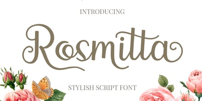 Rosmitta is a new, modern, fresh and upright script . This font will make your design look elegant, natural and stylish. Rosmitta is perfect font for any awesome projects such as photography, watermarks, quote design, social media posts, advertisements, logos and branding, invitations, product designs, labels, stationery, wedding designs, product packaging, special events or any project that need handwriting taste.
 - IngrianaCasual by Ingrimayne Type,
$9.95 IngrianaCasual features a hand-drawn sans-serif family with an italics that has semi-script lower-case letters. The five upright weights are relaxed and informal and the five italics styles are decorative and elegant. The family is very legible and can be be used for many purposes including brochures and advertising, though probably not for book text.
 - Adria Slab by FaceType,
$- Adria Slab is a smooth slab serif typeface that comes in seven weights and charming upright italics. Try combine it with its super friendly family member Adria Grotesk. Enjoy making great typography with a vast choice of lining, tabular and old style figures, numerators, denominators, tabular figures, fractions, ligatures, some sweet symbols and even alternate arrows.
 - Trivette by Greater Albion Typefounders,
$12.00 Trivette is an ‘All Capitals’ calligraphic display face, where all upright strokes are rendered as curves and where everything approaching the vertical are rendered in threes. That’s probably as clear as mud, but the results combine charm and legibility with a decorative period air. Recommended for poster work where a sense of dignified fun is important.
