5,779 search results
(0.017 seconds)
- Modern Royale by Bluestype Studio,
$15.00 Modern Royale is a chic and quirky lettered serif font. Trendy and stylish, this font will elevate each of your creations. Modern Royale is PUA encoded which means you can access all of the glyphs and swashes with ease! Very suitable for logo, headline, tittle, and the other various formal forms such as invitations, labels, logos, magazines, books, greeting / wedding cards, packaging, fashion, make up, stationery, novels, labels or any type of advertising purpose. Features : - Stylistic Alternates & Ligature - Number & Punctuation - Support Multilingual Languange Thank You.
 - Origin Story by Comicraft,
$49.00 Down in his secret underground font laboratory, mild mannered John Roshell was tinkering with his iPad when the Apple Pencil suddenly bit him and he found himself feverishly creating letterforms on the tablet... Before long his hand was burning and glowing with superspeed — his penstrokes were longer than one-eighth of a mile; he was suddenly able to letter a twenty-story omnibus with newfound fontastic strength and could create tremendous weights with more leading than an express train... And thus was born: ORIGIN STORY!
 - Brahma Rounded by Tall Chai,
$15.00 Brahma Rounded is a modern geometric rounded sans-serif font family with weights ranging from Thin (100) to Black (900). It is a sibling of the Brahma font family. Features: Available in 9 weights Over 550 glyphs supporting extended Latin Ideal for display texts: Titles, Logos and Headlines etc. Perfect for branding and rebranding Supports OpenTypes features like Ligatures and Stylistic Alternates Tabular Numerals included Symbols for 10 major currencies including Bitcoin provided in all weights Description: The name comes from Brahmā who is known as the god of creation. And manifesting the same spirit, the Brahma font family focuses on modern creativity. With its smooth and polished curves, Brahma Rounded provides friendly, casual vibes to all its characters. Every character effortlessly integrates with current design standards and interfaces. The fonts are professional yet have a hint of informal personality in them. This makes Brahma Rounded perfect for use in modern apps and websites. Brahma Rounded is built for the influencing, designing and marketing squads. It has a trendy geometric characteristic which is ideal for any branding and rebranding. Brahma has lot of OpenType features (like ligatures and tabular numerals) and the Extended Latin character set supports over a hundred languages. Start Creating!
 - Nosfer - Unknown license

- Nadall - Unknown license

- Chyelovek - Unknown license

- Quub by OneSevenPointFive,
$10.00 An excellent choice for Logo design, Headlines, Titles, All caps text, etc. Feedback: https://forms.gle/iY8Zswmsg689m95M8
 - Fartitudo by Tour De Force,
$25.00 A bit provocative, catchy and bouncy family for modern package designs, posters, labels, t-shirts etc.
 - Musaf MF by Masterfont,
$59.00 High readability with an historic flavor, this elegant font family is great for signage, headline etc.
 - Evening River by Letterhend,
$19.00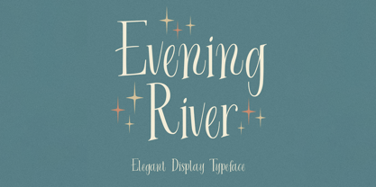 Introducing, Evening River an elegant display typeface. this font is perfect for headline, packaging, branding, etc.
 - Adva Open MF by Masterfont,
$59.00 Highly legible single stroked stencil font family in 3 weights. Use for titles, signage, captions etc.
 - LTC Spire by Lanston Type Co.,
$24.95 LTC Spire with alternate caps was designed by Lanston’s type director Sol Hess in 1937. Spire Roman was designed without lowercase. But it includes alternate rounded caps which transform this extra condensed “fat face” into more of an art deco titling face. Spire Roman has been used within department store logos, luxury hotel signage, perfumes, etc, etc.
 - Sadi Sans by Koray Özbey,
$19.00 Sadi Slab is designed to be used on small scales like book texts, newspapers, magazines etc. Also its large counters make the font suitable for digital screens. The anatomy of the typeface gives a formal appearance which is a more fitting choice for subjects like law, finance, medical science etc. Another member of Sadi family is Sadi Slab.
 - Fathing by Multype Studio,
$17.00 Introducing, Fathing Script. This is a modern script font. It maintains its classy calligraphic influences while feeling contemporary and fresh. Fathing is perfect to use in logotype / wordmark, badge, sign board, poster, headline text, apparel, wedding invitation, etc. This font has many opentype features like ligature, stylistic alternate, contextual alternate, swash, etc and support multi language
 - Cendhany by Javatypestd,
$10.00 Introducing Cendhany is a hand lettered typeface. This font is made by handwriting naturally using a brush pen so it can produce good quality fonts. They work perfectly for you who needs a typeface for headline, logotype, apparel, invitation, branding, packaging, wedding, advertising, etc. This typeface comes in uppercase, lowercase, punctuation, symbols, numerals, alternate, ligatures, etc also supports multilingual.
 - B Racing by WAP Type,
$15.00 Hi Everyone! Introducing our newest font : BRACING ! This is a new modern “racing speed car motor theme” display font. BRACING is a sophisticated cool font which will be perfect for branding, logo, sticker, decal, signage, flyer, brochure etc. There are many industries that is suitable for this font : car, racing, automotive, tournament, cup, futuristic startup, etc
 - Intrigue JNL by Jeff Levine,
$29.00 The hand-lettered movie titles from one of the William Powell-Myrna Loy "Thin Man" series of films was the basis for Intrigue JNL. Although the lettering style is decidedly from the Art Deco era, it also bears a strong resemblance to the 1980s techno movement; this font being adaptable to any era or design theme.
 - Mongolia by Goodigital13,
$20.00 It can be used in different purposes: lettering and logotype, labels, t-shirts, product packaging, invitations, advertising, and any classic / vintage typography design projects. will be great for any projects including : branding, logo, stationery, business card, signage, flyer, brochure etc. Almost all industries will be match for this typeface: events, music video, makeup artist, travel, promotions, musician, magician etc
 - Eat More Fruit JNL by Jeff Levine,
$29.00 Eat More Fruit JNL is an odd name for a typeface, but then again the lettering style of the font is just as unusual. Named for a 1940s-era poster espousing "Put more pep in your step... eat more fruit", the lettering (although Art Deco in nature) also evokes images of 1960s and 1970s hippie-era concert posters.
 - Callonsky Script by Letterhend,
$15.00 Introducing, Callonsky, a romantic modern script with a twist of fun! The natural hand writing script is suitable for you who needs a typeface for headline, logotype, apparel, invitation, branding, packaging, advertising etc. This typeface is comes in uppercase, lowercase, punctuations, symbols & numerals, stylistic set alternate, ligatures, etc also support multilingual. It also already PUA Encoded.
 - Retrosey by Garisman Studio,
$20.00 Inspired by the old style of letters used for signs or signs in the 60s era, Retrosey was born with two main styles; Retrosey One (Bold) and Retrosey Two (Inline). Born with the old spirit and evoking new styles from the past. Retrosey is able to fulfill your desire to feel the era again. Make it in your style with happiness! You can use Retrosey for the needs of making signs, signpainting, advertisements, price lists in stores, menu lists, posters, movie titles, book covers, main text in titles, clothing designs, or whatever you want by returning to the 60s era.
 - Period Piece JNL by Jeff Levine,
$29.00 A period piece is something of or pertaining to a specific era or time. Anything evoking a knowledge or feeling of an era can be labeled as such. The aptly named type font Period Piece JNL reflects the hand lettering found on the cover of early 20th century vintage sheet music entitled "My Baby's Arms" (from the stage production of "Ziegfeld Follies of 1919"). Although strongly akin to the coming Art Deco movement in its lettering style, Period Piece JNL still contains a strong influence of the Art Nouveau era of the 1900s through the 1920s.
 - Vaquero by Scriptorium,
$24.00Vaquero is a Wild West style font. It is characteristic of a lot of western era signage, with super-narrow characters and unusual decorative spurs and serifs. There are some similarities in Vaquero to some of our other western fonts. It sort of ties together the historic tradition of western era type and the more fanciful tradition of romantic type derived from the era of the wild west. It has the width, height and general letter shapes of Academy, but the decorative elements are similar to more fanciful fonts like Riudoso. The result is very evocative of the old west. - Rusty Store by Alit Design,
$15.00 Introducing Rusty Store Typeface Rusty Store Typeface is inspired by the classic era typeface in the 1800 era but is combined with today’s era and produces a very elegant and charming typeface. The details of the “Rusty Store” shape are very subtle and flow creating unique and gorgeous curves. Elegant serif like “Rusty Store” are very easy to apply to any design, especially those with an elegant and smooth concept, apart from that this font is very easy to use in both design and non-design programs because all alternates and glyphs are supported by Unicode (PUA).
 - Sign Designer JNL by Jeff Levine,
$29.00 Sign Designer JNL was inspired by a set of 1960s-era gold foil embossed self-adhesive letters.
 - Staxx Pro by RMU,
$45.00 Staxx Pro - a fantastic plastic display font - for ads, posters, billboards, covers, car and truck design etc.
 - Mimi MF by Masterfont,
$59.00 Simple yet decorative serif stroked font . Use for titles, signage, captions etc. Highly legible at children books.
 - Smart by Falling Angel,
$9.00 The Smart family started out as an idea for a smart design and kids magazine, games, etc.
 - PR Foxtail 01 by PR Fonts,
$5.00 The bushy weed commonly known as foxtail provides the inspiration for this set of ornaments, and reveals its connection to the prairies. The appearance has an affinity to cowboy themed work and would combine well with wood type decorative text.
 - Astigma - Unknown license

- Rogers - Unknown license

- Revx by OneSevenPointFive,
$5.00 • Excellent choice for Logo designing, Main body text, Headings, Titles, etc. • Rounded corners for calm yet attractive typeface.
 - Blind Date MF by Masterfont,
$59.00A practical handwriting font for all your day by day fresh and crazy design needs: headlines, signage etc. - Dovshan by Michael Browers,
$25.00Dovshan contains an assortment of 78 ornaments inspired by the style, look, and feel of the Victorian era. - Fried Coteret MF by Masterfont,
$59.00 A practical font family for all your needs: headlines, body text, signage etc. High legibility at small sizes.
 - Momcake Pro by Rivian,
$15.00 Modern geometric sans serif typeface. Suitable for many projects such as logo, printing, social media, website, apps, etc.
 - Pretty Lily by Epiclinez,
$18.00 Pretty Lily is a dry brush handwritten script font. Very cool if use for logos, headlines, branding, etc.
 - Berengard Caps Two by Intellecta Design,
$12.00 a classical wood type era box ornament using blackletter... a beautiful arrangement for publishing edition and other jobs
 - Sophiazoya by Michael Browers,
$15.00Sophiazoya contains an assortment of 72 ornaments inspired by the style, look, and feel of the Victorian era. - Ellaroza by Michael Browers,
$15.00Ellaroza contains an assortment of 78 ornaments inspired by the style, look, and feel of the Victorian era.


