10,000 search results (0.044 seconds)
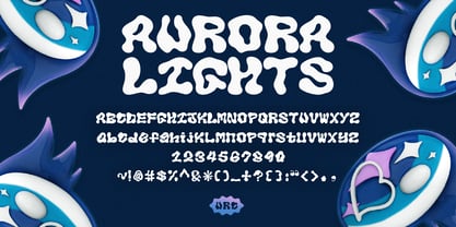
  1. Aurora Lights by Lazy Holiday Studio, $15.00
    Aurora Lights was designed by Moon Young. Aurora Lights was inspired by album [ AURORA - URC ]. Included: -Uppercase and Lowercase -Number and Punctuation It expresses the fluid shape of the aurora. Recomended to use it on album covers and posters.
  2. Occidental Tourist NF by Nick's Fonts, $10.00
    Dave West's eponymous Futura Casual, designed for Photo-Lettering, Inc. in the 1960s, inspired this loosy-goosy take on a classic face. Both versions of the font contain the complete Unicode Latin 1252 and Central European 1250 character sets.
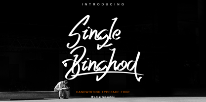
  3. Single Binghod by Liartgraphic, $14.00
    The latest font from liartgraphic studio. With the name single binghod which means single (one) in English and binghod means (damaging) in Hindi. Our fonts are multilingual, and our alternate glyphs are suitable for creating handwritten logos and posters.
  4. Miscellany JNL by Jeff Levine, $29.00
    Miscellany JNL collects numerous images of various genres into one dingbat font. There are vintage stencil patterns, old-time ad cuts and decorations, line spacers [number keys 1 through 7], conversation balloons, parking lot symbols and other assorted goodies.
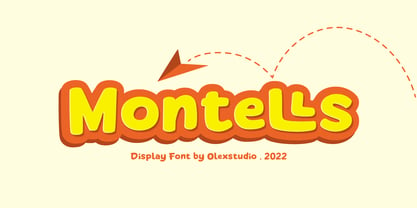
  5. Montells by Olexstudio, $16.00
    MONTELLS - Display Font will look gorgeous on all your designs, invitation, poster design, book design, branding materials, logo's and all project design other. MONTELLS - Display Font contains standard characters, character is Uppercase, Lowercase, numbers, punctuation, ligatures and international glyphs.
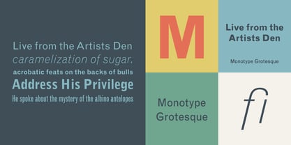
  6. Monotype Grotesque by Monotype, $40.99
    This updating of Berthold’s Ideal Grotesque was supervised at Monotype in 1926 by F.H. Pierpont. With some of the eccentricities in the borrowed original reduced, this series retains enough character to have become one of the world’s great sanserifs.
  7. SP Reka by Remote Inc, $39.00
    It was an unlikely union. Reka was a Maori maiden who made her home on the shores of Piha. I was a struggling actor who had spent the last six months in Bangkok, working as a cross-eyed prostitute.
  8. Second Impression JNL by Jeff Levine, $29.00
    Second Impression JNL is the solid version of Lasting Impression JNL by Jeff Levine. It emulates the look of ink-stamped letters and numerals. Based on a 1930s-era set of rubber stamps, there is a limited character set.
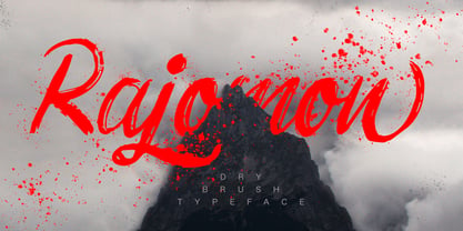
  9. Rajomon by Etewut, $20.00
    Introducing Rajomon the hand drawn script made with dry brush. All European languages are in. More of all there are initial, final and alternative letters for making your lettering on a high level as a peak of the rock!
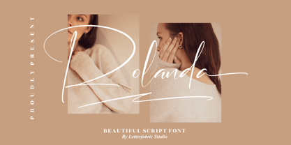
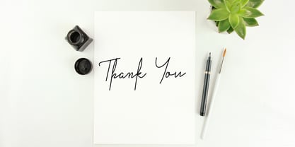
  10. Rolanda by Letterena Studios, $9.00
    Rolanda feels equally charming and elegant. It looks stunning on wedding invitations, thank you cards, quotes, greeting cards, logos, business cards and more. This font is PUA encoded which means you can access all glyphs and swashes with ease!
  11. Presswood JNL by Jeff Levine, $29.00
    Presswood JNL was modeled from the title font used on the cover of a specimen book issued by the Delittle Wood Type Company of York, England. This bold, friendly sans serif is available in both regular and oblique versions.
  12. Catalonia by Dieza Design, $9.00
    This is our newest product, we call it Catalonia! Catalonia is a hand writing font, with sweet touches and unique personality in each letter. Catalonia is very good to use on: - Wedding invitations, - Fashion magazines - Logos - Signatures - Photography watermarks
  13. As of my last update in April 2023, the "3-DSalter" font is not widely recognized or documented in mainstream typographic resources or font directories. Given this, I'll take a creative approach to d...
  14. TA Bankslab by Tural Alisoy, $33.00
    The building of the Northern Bank of St. Petersburg's Baku branch was built in 1903-1905. It was the first Art Nouveau-style building in Baku, Azerbaijan. Later the bank was transformed into the Russian-Asian Bank. After the oil boom in Baku in the 19th century, branches of many banks and new banks were opened in the city. The branch of the Northern Bank of St. Petersburg was among the first banks that was opened in Baku. N.Bayev was the architect of the building for the branch of the Northern Bank of St. Petersburg located at Gorchakovskaya 3 in 1903-1905. The building currently houses the Central Branch of the International Bank of Azerbaijan. My purpose in writing this is not to copy and paste the information from Wikipedia. What attracted me to the building was the word "Банкъ" (Bank) written in Cyrillic letters, which was also used in Azerbaijan during the Soviet era. The exact date of the writing is not known. Every time I pass by this building, I always thought of creating a font of this writing someday. I had taken a photo of the building and saved it on my phone. I did a lot of research on the font and asked a lot of people. However, some did not provide information at all and some said they did not have any information. I was interested in the history of this font but I do not know if this font really existed or it was created by the architect out of nowhere. If there was such a history of this font, I wanted to recreate this font and make it available. If not, I had to create it from scratch in the same way, using only existing letters on the building. Finally, I made up my mind and decided to develop the font with all letters I have got. It was difficult to create a font based on the word, Банкъ. Because in the appearance of the letters, the midline of the letters on A, H, K was very distinct, both in the form of inclination and in more precise degrees. The serif part of the letters, the height of the upper and lower sides, differed from each other. I don't know whether it was done this way when the building was constructed or it happened over time. I prepared and kept the initial version of the font. I took a break for a while. I started digging on the story of the font again. Meanwhile, I was researching and got inspired by similar fonts. Unfortunately, my research on the font's history did not yield any results. I decided to continue finishing up the font. After developing the demo, I created the font by keeping certain parts of these differences in the letters. In addition, I had to consider the development of letters in the Cyrillic, as well as the Latin alphabet, over the past period. Thus, I began to look at the appearance of slab-serif or serif fonts of that time. In general, as I gain more experience in developing fonts, I try to focus on the precision of the design for each font. In recent years, I specifically paid attention to this matter. YouTube channel and articles by Alexandra K.'s of ParaType, as well as, information and samples from TypeType and Fontfabric studios on the Cyrillic alphabet were quite useful. I gathered data regarding the Latin alphabet from various credible sources. I do not know if I could accomplish what I aimed at but I know one thing that I could develop the font. Maybe someday I'll have to revise this font. For now, I share it with you. I created the font in 10 styles. 7 weight from Thin to Extra Black, an Outline, Shadow, and Art Nouveau. The Art Nouveau style was inspired by the texture in the background used for the text on the building. The texture I applied to capital letters adds beauty to the font. If you like the font feel free to use it or simply let me know if your current alphabet doesn't support this font.
  15. TA Bankslab Art Nouveau by Tural Alisoy, $40.00
    TA Bankslab graphic presentation at Behance The building of the Northern Bank of St. Petersburg's Baku branch was built in 1903-1905. It was the first Art Nouveau-style building in Baku, Azerbaijan. Later the bank was transformed into the Russian-Asian Bank. After the oil boom in Baku in the 19th century, branches of many banks and new banks were opened in the city. The branch of the Northern Bank of St. Petersburg was among the first banks that was opened in Baku. N.Bayev was the architect of the building for the branch of the Northern Bank of St. Petersburg located at Gorchakovskaya 3 in 1903-1905. The building currently houses the Central Branch of the International Bank of Azerbaijan. My purpose in writing this is not to copy and paste the information from Wikipedia. What attracted me to the building was the word "Банкъ" (Bank) written in Cyrillic letters, which was also used in Azerbaijan during the Soviet era. The exact date of the writing is not known. Every time I pass by this building, I always thought of creating a font of this writing someday. I had taken a photo of the building and saved it on my phone. I did a lot of research on the font and asked a lot of people. However, some did not provide information at all and some said they did not have any information. I was interested in the history of this font but I do not know if this font really existed or it was created by the architect out of nowhere. If there was such a history of this font, I wanted to recreate this font and make it available. If not, I had to create it from scratch in the same way, using only existing letters on the building. Finally, I made up my mind and decided to develop the font with all letters I have got. It was difficult to create a font based on the word, Банкъ. Because in the appearance of the letters, the midline of the letters on A, H, K was very distinct, both in the form of inclination and in more precise degrees. The serif part of the letters, the height of the upper and lower sides, differed from each other. I don't know whether it was done this way when the building was constructed or it happened over time. I prepared and kept the initial version of the font. I took a break for a while. I started digging on the story of the font again. Meanwhile, I was researching and got inspired by similar fonts. Unfortunately, my research on the font's history did not yield any results. I decided to continue finishing up the font. After developing the demo, I created the font by keeping certain parts of these differences in the letters. In addition, I had to consider the development of letters in the Cyrillic, as well as the Latin alphabet, over the past period. Thus, I began to look at the appearance of slab-serif or serif fonts of that time. In general, as I gain more experience in developing fonts, I try to focus on the precision of the design for each font. In recent years, I specifically paid attention to this matter. YouTube channel and articles by Alexandra K.'s of ParaType, as well as, information and samples from TypeType and Fontfabric studios on the Cyrillic alphabet were quite useful. I gathered data regarding the Latin alphabet from various credible sources. I do not know if I could accomplish what I aimed at but I know one thing that I could develop the font. Maybe someday I'll have to revise this font. For now, I share it with you. I created the font in 10 styles. 7 weight from Thin to Extra Black, an Outline, Shadow, and Art Nouveau. The Art Nouveau style was inspired by the texture in the background used for the text on the building. The texture I applied to capital letters adds beauty to the font. If you like the font feel free to use it or simply let me know if your current alphabet doesn't support this font.
  16. The IndochineNF font, crafted by the talented type designer Nick Curtis, stands as a vibrant testament to the allure and timeless beauty of early 20th-century typefaces, with a unique flair that draw...
  17. The X360 font, crafted by the creative mind of Redge, is an example of typographic design that encapsulates the essence of modernity and technological advancement. Redge, known for their innovative a...
  18. Xtreme Chrome, crafted by the talented Vic Fieger, is a distinctive font that captures the essence of chrome aesthetics effortlessly, blending nostalgia with modern design trends. This font harks bac...
  19. The font Mastodon, created by Apostrophic Labs, is a distinctive typeface that stands out due to its unique style and versatility. It belongs to a category of fonts that combine elements of both nove...
  20. As of my last update in April 2023, there isn’t a widely recognized font specifically named "Madonna" that is part of standard typographic resources or libraries. However, let's explore a hypothetica...
  21. NKOTB Fever - Personal use only
  22. Blocked Off - Personal use only
  23. SwissCheese - Unknown license
  24. Surrendered Heart - Personal use only
  25. Indie Flower - Personal use only
  26. Addis Ababa - Personal use only
  27. Akbar - Unknown license
  28. Gloria Hallelujah - Personal use only
  29. Feuerfeste - Unknown license
  30. happyhanneke - Personal use only
  31. Crop©Bats AOE - Unknown license
  32. Boomerang - Unknown license
  33. Over the Rainbow - Personal use only
  34. Mailart Rubberstamp - Unknown license
  35. Victim - Unknown license
  36. PavementKana - Unknown license
  37. PopUps - Unknown license
  38. Farmhouse by Victory Type, $20.00
    Farmhouse is a rustic serif typeface that was inspired by the woodcarved store signs on Main Street in a quaint little village nearby. Farmhouse is based upon the shapes of Baskerville but has a unique rustic character all its own.
  39. West Coast Antics NF by Nick's Fonts, $10.00
    This roly-poly romp through the alphabets is based on a showing from Carl Holmes' 1950s book, ABC of Lettering, published by art-for-the-masses magnate Walter T. Foster. Named as an apt companion to my East Coast Frolics.
  40. Roman Holiday NF by Nick's Fonts, $10.00
    A rollicking fun, freewheeling font based on designs compiled by R. Henderson in the 1903 book, The Signist. Both versions of this font contain complete Unicode 1252 (Latin) and Unicode 1250 (Central European) character sets, with localization for Romanian and Moldovan.
Looking for more fonts? Check out our New, Sans, Script, Handwriting fonts or Categories
abstract fontscontact usprivacy policyweb font generator
Processing