10,000 search results
(0.071 seconds)
- Sci Fied - 100% free

- Mordred - Unknown license

- SF Cartoonist Hand SC - Unknown license

- Olympus - Unknown license

- Redhead Goddess - Unknown license

- Beardstown by Swell Type,
$15.00 Beardstown is solid, hardworking & no-nonsense. It may be a little gritty & rough around the edges, but it can also be open, warm and welcoming. Beardstown is a little Midwestern town on a river with a town square where you can buy comic books from a spinner rack at the front of the drugstore and read 'em with a root beer float from the soda counter in the back. The Beardstown font is perfect for t-shirts, sports graphics, beer cans, trading cards, carnival posters and record albums. But that’s it. I mean, you could use it on foofy hipster stuff like organic produce, vegan meat substitutes, electric car accessories or mountain bike parts, but you risk Beardstown coming over there to kick your butt. Features: three versions of each letter and two versions of each number automatically rotate for authentic print texture thirteen catchwords (like "and" "of" "for" & "the") accessible in Discretionary Ligatures support for 223 languages including Western & Central Europe, Vietnamese & Cyrillic
 - Remsen Script by Three Islands Press,
$39.00 The 1765 Stamp Act ignited in American colonists a simmering distrust of the distant British Parliament, whose oppressive trade duties they deemed unfair assaults on their rights as English subjects. Before long, of course, this little dustup spawned The Boston Tea Party, the American Revolution, and the birth of the U. S. of A. But before the Battles of Lexington and Concord, a group of Philadelphia merchants made one last-ditch call for commercial cooperation across the Atlantic. This futile appeal survives to this day on a three-page broadside, finely engrossed by a penman of the period and passed down through the generations of a family named Remsen. Remsen Script is an interpretation of that penman’s neat, formal cursive—from its broad antique flourishes to its subtle unevenness and gently ragged strokes. Perfect for event announcements, fine product packaging, recreations of historical documents, or anywhere you wish to offer a whiff of a bygone era.
 - Elektrogothik is a typeface that encapsulates the spirit of two seemingly disparate worlds: the dark allure of gothic culture and the energized pulse of electronic music. This font is designed to bri...
- Rockwell by Monotype,
$40.99 Whether you call them slab serif, square serif, or Egyptian, you know them when you see them – sturdy, nearly monoweight designs with blunt, straight-edged serifs and a no-nonsense attitude. The Rockwell® Nova family is a fine example of this appealing and eminently usable type style. This is a design that is both robust and adaptable. Marked by the flat top-serifs on the cap A, unusual Q tail and high-legibility two-storied lowercase a, Rockwell has a bit of handmade charm that distinguishes it from the cool, more modern interpretations of the slab serif style. The family is excellent for branding, headlines and other display uses. The simple shapes and hearty serifs also make it a good choice for short blocks of textual content in both print and on-screen environments. The light and bold weights are perfect for setting blocks of text copy, while the extra bold and condensed designs bring authority to display copy. Throw in a little color, and you amp up Rockwell’s messaging power. The regular and italic designs perform handsomely, in the most modest of screen resolutions. With four weights of normal proportions, each with a complementary italic, and three condensed designs, two with italics, the family is a commanding and versatile graphic communicator. Rockwell’s large x-height, simple character shapes and open counters, make for an exceptionally legible design. It should not, however, be set so tight that its serifs touch, as this will erode legibility and impair readability. A benefit to Rockwell’s slab serifs, however, is that the design combines beautifully with both sans serif typefaces and a variety of serif designs. Rockwell OpenType® Pro fonts have an extended character set supporting Greek, Cyrillic, most Central European and many Eastern European languages, in addition to providing for the automatic insertion of ligatures and fractions. Looking for its perfect pairing? Look no further than ITC Berkeley Old Style, Between™, ITC Franklin Gothic®, Harmonia Sans™, Metro® Nova or Frutiger® Serif.
 - Kofi by Canada Type,
$24.95Just when you thought every possible fat alphabet has already been done, Kofi shows you that there still are plenty of good ideas left in the genre! Kofi is simply fat, fun letters that scream for attention and promise delight. This package ships with two fonts, the second constituting a busload of alternates. - Boldman by Balpirick,
$15.00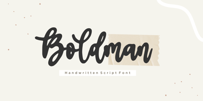 Boldman is a Handwritten Script Font. Boldman is a chic, trendy script font that emanates confidence and versatility. Its stylish alternates and ligatures make this font the perfect match for any project. Boldman aalso multilingual support. Enjoy the font, feel free to comment or feedback, send me PM or email. Thank you!
 - Katalina by Shape Studio,
$12.00 Katalina Font is a new modern script calligraphy font with an irregular baseline. Trendy and feminine style.Katalina Font Script looks lovely on wedding invitations, thank you cards, quotes, greeting cards, logos, business cards and more. Perfect for using in ink or watercolour. Including initial and terminal letters, alternates, ligatures and multiple language support.
 - Greatness Serif by Shape Studio,
$14.00 Greatness font is a new modern serif calligraphy font with an irregular baseline. Trendy and feminine style.Greatness font looks lovely on wedding invitations, thank you cards, quotes, greeting cards, logos, business cards and more. Perfect for using in ink or watercolour. Including initial and terminal letters, alternates, ligatures and multiple language support.
 - Glitch Esports by Alphabet Agency,
$15.00 Alphabet Agency presents this super cool new font originally designed for use in e-Sports related projects. Due to the private success, it is now commercially available for you to use. So now is your chance to stay ahead of the competition with this trendy font and create some new cool designs. gg.
 - Sabeth by Craft Supply Co,
$20.00 Sabeth - Elegant Typeface perfectly captures its essence, combining opulence, elegance, and timeless allure. It creates a captivating statement of refined luxury. This typeface is ideal for greeting card, packaging, brand identity, poster, or any purpose to make your design project look eye catching and trendy. Feel free to play with this typeface!
 - Groovy Boss by Eu Iturria Morante,
$36.00 Groovy Boss is a decorative type, inspired by the playful aesthetics from the 60s and 70s. Groovy and Boss were words used in those decades to refer to something as cool or trendy. Great for titles or short phrases, the curves and psychedelic forms of each letter will contribute to creating amazing compositions.
 - Thinker Justice by Balpirick,
$15.00 Thinker Justice is a Modern Handwritten Font. Thinker Justice is a trendy and modern handwritten font. Simple and natural, this font will become your top choice for formal and informal designs in no time! Thinker Justice also multilingual support. Enjoy the font, feel free to comment or feedback, send me PM or email.
 - Sixties Pin Buttons JNL by Jeff Levine,
$29.00 During the turbulent era of the 1960s, the youth of America found various ways to protest against "The Establishment". Whether it was campus unrest, protest songs, sit-ins or other methods, the message was the counter-culture movement. Arising from this disenchantment with traditional social standards, a small but effective means of protest arose that made no sound, yet spoke volumes - the pin button. Statements against the war in Vietnam, free love, drug use and other messages popped up on little metal discs pinned to tee shirts, suspenders, head band and hats. Sixties Pin Buttons JNL recreates twenty-six of these messages in both white on black (upper case keys) and black on white (lower case keys). Blank buttons in both white and black are found on the parenthesis keys.
 - Frieze by Fine Fonts,
$29.00 The origin of this font was a frieze in the RAF Chapel in Westminster Abbey which Michael Harvey was commissioned to design and create. It was comprised of the names of the top brass in wartime Bomber Command, namely Dowding, Harris, Newall, Tedder, Portal and Douglas. The Brief was to cut the letters in bronze and gild them. Instead, they were cut in perspex and gilded. To sit comfortably within the long and narrow vertical space available beneath the chapel’s stained glass window, extended letterforms were used with many vertical serifs omitted and with lengthened horizontal serifs. Some twenty years later, the missing upper-case letters were drawn together with the lowercase letters and Frieze, the font, was born. Subsequently, additional weights and styles were added to create a font family of six styles.
 - Blau by Wilton Foundry,
$19.00 Designed with a hand-chiseled feel, Blau’s sculpted characters add a refined personality to a wide range of brand, corporate, product and service applications. Highlighting the sculpted theme, inkwell treatment variations are prevalent throughout Blau, with several key glyphs that are stenciled for increased legibility. This sturdy, typographic workhorse shines when a slightly unorthodox typographic approach is required — a prime choice for distinctive and dynamic logotype use. The Blau family is available in Light, Light Italic, Regular, Italic, Bold and Bold Italic. The name Blau was chosen to celebrate the color Blue (or Blau in German, Blaauw in Dutch, Bleu French, Blå in Norwegian, Swedish & Danish, Blua in Esperanto, Blár in Icelandic) Blue is nature’s color for water, sky, mountains and glaciers. Blue is embraced as the color of heaven and authority, denim jeans and corporate logos. Surveys in the US and Europe show that blue is the color most commonly associated with harmony, faithfulness, confidence, distance, infinity, the imagination, and cold. In US and European public opinion polls, it is the most popular color, chosen by both men and women as their favorite color. Another very popular Wilton Foundry font in the “blue” family is “Cyan” and “Cyan Neue”.
 - Cowgirl by By Meg Burk,
$25.00 An uppercase font that has versatile character. Got a story to tell? Cowgirl can help you tell it. Includes western-themed vector illustrations handmade by Meg Burk. I grew up spending almost every family vacation as a road trip across the southwestern US. In these adventures, I fell in love with learning about the nature around us; deserts, mountains, plains, piñon trees, rainbow trout, black bears, eagles, and more. I fell into freezing cold white water rapids, explored long-abandoned cliff dwellings, camped under the Milky Way, saw old cave markings, stone markings, preserved art, and read many a many old map legends. These memories are visceral and the inspiration that I get from them permeates my every day. Take a piece of these stories with you and use them in your designs, too. Handmade, meant to last a lifetime and inspire others for decades to come.
 - Mackay by René Bieder,
$39.00 Mackay is a powerful transitional serif in 6 weights plus matching italics, designed for screen and print. The eccentric serifs on uppercase letters like E, F, L and T are inspired by Alexander Kay’s “Ronaldson” from 1884, working as the starting point for the family. The lowercase letters follow the traditional Antiqua model with attributes tracing back to drawings from the early 20th century. The “grotesk” lowercase a, as well as the sharp lowercase s, derived from the closed shapes of uppercase letters like C, G or S, create a compact and bold appearance while a large x-height and small descenders add a modern look. In favor of a dynamic and elegant impression, the design of the italic cuts come with a strong calligraphic influence. This results in completely new shapes for letters like lowercase a or g, ensuring a smooth integration into their surrounding letters while maintaining a distinctive appearance when combining with romans. The family comes with a variety of opentype features like case sensitive shapes, old style figures, fractions, ordinals and many more. Additional attention was given to the standard and discretionary ligatures, extending the structure of the basic glyphs with elegantly designed letter combinations for g/i, i/t or s/t. According to their dynamic architecture, the italic weights are equipped with additional initial swash characters to subtle accentuate the calligraphic roots. As a result of a high stroke contrast the family works great in paragraphs with medium to large font sizes like headlines, short paragraphs or logos. With its 12 cuts, the family meets all requirements on high quality typography.
 - Space Rave - Personal use only

- ColorTube - 100% free

- Rotterdam Demo - Personal use only

- Premier League with Lion Number - Personal use only

- Eighty-Eight - Personal use only

- Bebas Neue - 100% free

- Surfing & Kiteboarding - Personal use only

- Game Of Squids - 100% free

- Xenogears - 100% free

- Impacted - Unknown license

- Overspray - Personal use only

- Cocaine Sans - Unknown license

- Sturkopf Grotesk - 100% free

- Headshop - Personal use only

- cabanyalZ - Personal use only

- DisneyPark - Unknown license

- GALLEDIS - Unknown license

- #44 Font - Personal use only


