10,000 search results
(0.047 seconds)
- Peanut Butter Man by PizzaDude.dk,
$20.00Forget everything about Times New Roman and all the other classic typefaces! Forget all that and take a bite of Peanut Butter Man! - Magpie by Elster Fonts,
$24.00 Magpie is a font family consisting of three sub-families with both regular and italic styles. Originally designed on squared paper, over time it has moved further and further away from this rigid grid, although its appearance is still based on it, so it can easily be used for logotypes or headlines with strict grid-based layouts. While Magpie Text is suitable for headlines and short texts, Magpie Display is ideal for logotypes or more playful headlines. Finally, Magpie Mix is a combination of both families. Magpie Text Regular represents stability, Magpie Display Italic is ideal for dynamic logos or headlines. To cover more languages, cyrillic and greek letters were added and Magpie can be used for nearly a hundred languages. In addition to the four common numeral variants, special numerals, punctuations and symbols for all-caps (c2sc) are included. Furthermore case-sensitive punctuations and symbols are available. To expand the typographic possibilities, four stylistic sets, different symbols, forms and standard- and discretionary ligatures have been added. Each Magpie-font contains more than 880 glyphs.
 - Megapolis by Artisticandunique,
$9.00 Megapolis - Sans Serif Font Family - Multilingual support - 16 Styles With its elegant and clean structure with 16 styles and multilingual supports, you can easily use the sans serif font feature in many areas. From body text to big headlines, from classic to modern and bold styles, you can develop your projects. Ideal for books and magazines, magazine covers, editorials, headlines, websites, logos, branding, advertising and more. You can create your unique designs with this font. Have a good time.
 - Tip Me Cheapy - Unknown license

- Zaftig by Typeco,
$29.00Many current poster artists like to reference the graphic type styles that were popular in the ’60s and ’70s. Zaftig is a contemporary font that takes the geometric and blocky inspiration from that era but then steps off in a modern direction. At first glance, it may appear that the capitals of Zaftig all take up the same amount of space, but certain letters have been designed proportionally for a better flow. Zaftig contains the basic character set and will work for most European languages. If you like your OpenType fonts with more features, Typeco also offers Pro version of Zaftig that includes Tiling Alternates, Stylistic Alternates, Small Caps, Small Cap Figures, and support for most languages that use Latin, Central European, Cyrillic, and Greek scripts. - Dharma Slab by Dharma Type,
$19.99 Dharma Slab is an antiqued slab serif designed inspired by 1800s-style wood type. All glyphs had been designed carefully to be retro-looking of the old time and to fill all with nostalgia. This condensed font family with 42 styles will be the best solution for posters, titles and anywhere you need impact. To complete your work perfectly, Gothic Extras family is ready for free. They include borders, ornaments and frames designed using vintage catalog of Hamilton in 1800s as a model. Incidentally, g, r and y has their alternative glyphs that can be available with OpenType salt feature and tabular figures can be available with tnum feature. Be sure to check out the sans serif style of this Dharma series named Dharma Gothic.
 - Bender Script by Dear Alison,
$29.00 Would you hire one of the top hand lettering artists that worked for companies like Max Factor for your designs? Of course you would! Chas Bluemlein passed away many years back, and you couldn't have afforded his services anyway, but his lettering prowess which graced many advertisements, primarily cosmetic ads, has been pulled together from numerous samples to make this font. Bender Script comes with BONUS Swash alternates to mix up the flavor a bit, and exudes passion and confidence! Now you can own not only a piece of his lettering legacy, but you can also put it to work for you! This beauty is a sure fit into any font collection, so what are you waiting for, buy it today!
 - Mantul Pro by Struggle Studio,
$12.00 Mantul Pro is inspired by the sans-serif style and a little modern touch, making this font luxurious & neat. Mantul itself has a meaning (Mantap Betul = Really Good), because it requires very good accuracy in doing so making this font the best. After a long journey of doing this font work, finally finished.made very carefully has 19 font styles that are luxurious & extraordinary.This font is done for a very long time, and therefore the font can be considered as a very extraordinary and best font. Can be used for designs, logos, labels, badges, clothing designs, letterhead and titles, stationery, etc.
 - LetterTrain by Ingrimayne Type,
$14.95 This set of four fonts, organized as a font family, consists of toy train cars with letters on them. Upper and lower cases have different typefaces on them, so there are eight different type styles available. Some of the letters on the cars are from Salloon, TiredOfCourier, Glitzy, Qwatick, and PhederFrack. To add variety using more cars without letters, use the XLaserTrain font.
 - Almoneda by Sudtipos,
$49.00 Almoneda: Sale at public auction of movable goods, generally used. And also: private and voluntary sale of jewelry and junk that is made without the intervention of justice. Formerly, it was nothing more than the market or sale of things and spoils won from the enemy in war. Nowadays, the almoneda is practically associated with spaces where the sale of "old things" takes place and, in Madrid, they are usually concentrated in the area of El Rastro, an open-air market that is set up on Sundays and some holidays in the center of Madrid. There, you can find everything and, if you walk around a lot and look hard enough, great typographic finds. It is there where I find a large number of elements (usually from the late nineteenth and early twentieth century) such as boxes, posters, books, etc.. in which appear uppercase letters with a variety of shapes, letters embedded, rare ligatures ... In addition, many elements extracted from street signs, tiles from bars and commemorative elements of Madrid have been used to complete this font design made with care and patience. Thus was born Almoneda, a modern typeface with a marked axis and great contrast, and an uppercase with several sets of characters to play with and enjoy. It also includes a large number of ligatures and discretionary ligatures. A Variable font is included with the full package license. Almoneda, a typeface that will not leave you indifferent. They take it out of my hands, hey!
 - AT Borsnery by Amera Type,
$15.00 Borsnery is a decorative font that can be a great choice for your visual needs. With a modern vintage style, it can be more ideally used for posters, signage, and other visual branding needs And now we provide a different work than before, the first time for our fonts combined with well and carefully crafted illustrations. If you like and want this, please visit ameratype.com
 - NCO Potatoe by New Cat Orange,
$12.50 There is a very simple reason why the name of this font includes a potato. Or potatoe, if you prefer. It was carefully carved out of 14,5 kg of potatoes. Or 32.0 lb of potatos. Every single letter, every digit and every symbol. Manually, of course, and care-fully. It took a while. Longer than digitizing it, but since we love great quality, we put just as much care into this process.
 - Oceanwide Pro by California Type Foundry,
$47.00 A font perfect for not just one, but many projects! Introducing Oceanwide Pro, a sans that loves to be used in just about any situation! Designed with ultra clean lines and versatility in mind, Oceanwide wants to be your new favorite sans! Oceanwide’s ultra clean letters work anywhere you want to communicate orderliness and competence, and designed to build trust and rapport with your audience. Its wide proportions make it ideal for display and logo use. Oceanwide especially shines for white/bright letters on black/dark backgrounds! That’s because the inside shapes are nearly perfect circles in many weights. Here's a quick video tour of Oceanwide Pro by Dave Lawrence, including all the great things Oceanwide can be used for! We've tested Oceanwide for these industries, with stunning results!: Tech Arts Fashion & Style Business & Branding Corporations Logistics Architecture Food and many more... Oceanwide can be used for: Headers Subheadlines Logos Even body text, if tracked. Print & Screen The styles it can take are also many. It's great for: Modern/minimalist design Flat design Cut out design User Interface (UI) Technical designs In combination with text effects, even for grunge and other situations. And many others... DESIGN FEATURES Simplicity Tall x-height Hand-sloped obliques (italics) Narrow spacing Semi-wide proportions Expert kerning Well proportioned, usable lights & extra lights Large caps Great ALL CAPS MODE Uppercase punctuation Uppercase spacing with California Type Foundry’s Smart Tracking™ Advanced fraction support Proportional lining figures Thick joins Smooth curves Sturdy—great for textures and effects Variable font available Latin Pro character set for Central European languages. That's the writing for over 782 languages and transliterations worldwide! DESIGN STORY—THE FORGOTTEN SANS by Dave Lawrence, Lead Designer, California Type Foundry Adrian Frutiger was the 20th century master of sans, but I didn't realize he had made—not one—but TWO geometric sans! It wasn't until I had purchased the book “Adrian Frutiger: Typefaces”. I had hoped to someday meet Adrian Frutiger, but he passed away that very same year. Here is the story of Frutiger's forgotten sans. Back in 1968, Frutiger was approached by Pentagram to make a design for British Petroleum. They wanted a "new version of Futura". However, they wanted him to make a couple adjustments. First, they felt that Futura was "too fiddly." By this, they meant that it narrowed too much at the joins. (Joins are for example where the round and straight parts of the 'd' meet.) This is something that is necessary for small print text (to prevent ink clogging), but is not necessary at large sizes. Second, they wanted it to be entirely geometric, using the circular shape with minimal optical corrections. Unfortunately this font was not even used very consistently in the BP brand. A haphazard mix of Futura and Frutiger's BP font ensued. It was then replaced by another font design very soon after. My design is different in several ways. First, the commas and quotes are a more modern style. I tried his original commas, but these just didn’t work to 21st century eyes. Second, in his drawings, Frutiger went for a more standard u with a downstroke on the right. However, Oceanwide has a simpler u. Third, I made more optical adjustments. At the direction of his employer, Frutiger reluctantly put no font optical corrections into the letters. So I think my optical adjustments are similar to what Frutiger would have wanted. Fourth, I extended the weight into the light and extra light ranges. Fifth, the rest of the font I created according to the principles of Adrian Frutiger, but with no sources for inspiration. Here is Frutiger’s design philosophy, in his own words: “If you remember the shape of your spoon at lunch, it has to be the wrong shape. The spoon and the letter are tools; one to take food from the bowl, the other to take information off the page... When it is a good design, the reader has to feel comfortable because the letter is both banal and beautiful.” The words about the spoon were the ones I kept in my mind as I tried to make the curves ultra smooth, and the shapes ultra simple. Hopefully this font is a worthy successor to the font that inspired it. Released on the 93rd birthday of Adrian Frutiger, to celebrate the life and achievements of this amazing designer. ——————— Simplicity. Versatility. Oceanwide.
 - NorB Architect Pencil Condensed by NorFonts,
$35.00 NorB Architect Pencil Condensed fonts are the fruit from learning architectural lettering books so featuring 7 condensed weights going from Light to Extra Bold version. These Architectural fonts will add a beautiful architectural hand-lettering style to all your CAD project drawings. Architects have always wanted their CAD drawings to look more like they were drawn by hand, rather than by a CAD program. These AutoCAD fonts are the first step in bringing back that “artistic hand-drawn” feel to your CAD drawings or any graphic design project that can use true type fonts. They also can be used with any word processing program for text and display use, print and web projects, apps and ePub, Comics, graphic identities, branding, editorial, advertising, scrapbooking, cards and invitations … or even just for fun!
 - NorB ARCHITECT PENCIL by NorFonts,
$35.00 NorB Architect Pencil fonts are the fruit from learning architectural lettering books so featuring 7 weights going from Light to Extra Bold version. These Architectural fonts will add a beautiful architectural hand-lettering style to all your CAD project drawings. Architects have always wanted their CAD drawings to look more like they were drawn by hand, rather than by a CAD program. These AutoCAD fonts are the first step in bringing back that “artistic hand-drawn” feel to your CAD drawings or any graphic design project that can use true type fonts. They also can be used with any word processing program for text and display use, print and web projects, apps and ePub, Comics, graphic identities, branding, editorial, advertising, scrapbooking, cards and invitations … or even just for fun!
 - The Spring by Sakha Design,
$14.00 The Spring is a romantic and sweet handwritten font. It looks astonishing on love letters, greeting cards, logos, business cards, and every other design which needs a personalized touch. This font is PUA encoded which means you can access all of the glyphs and swashes with ease!
 - El Masterico by OKSHUtypeCO,
$14.00 El Maestro - a new fresh unique font. Very suitable for greeting cards, branding materials, business cards, quotes, posters, and more!This font are perfect for wedding postcard. Or you can create perfect and unique design of your logo, blog, stationery, marketing, magazines and more :) Multilingual OK!!!
 - Banuchi by OKSHUtypeCO,
$12.00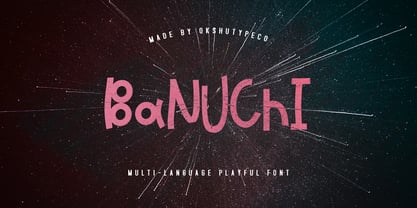 Banuchi - a new fresh handmade playful font. Very suitable for greeting cards, branding materials, business cards, quotes, posters, and more!This font are perfect for wedding postcard. Or you can create perfect and unique design of your logo, blog, stationery, marketing, magazines and more :) Multilingual OK
 - Green Leaves by Sakha Design,
$14.00 Green Leaves is a romantic and sweet handwritten font. It looks astonishing on love letters, greeting cards, logos, business cards, and every other design which needs a personalized touch. This font is PUA encoded which means you can access all of the glyphs and swashes with ease!
 - Thanklove by Sakha Design,
$14.00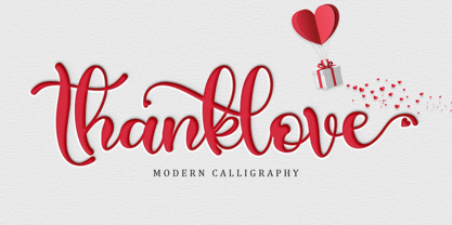 Thanklove is a romantic and sweet handwritten font. It looks astonishing on love letters, greeting cards, logos, business cards and every other design which needs a personalized touch. This font is PUA encoded which means you can access all of the glyphs and swashes with ease!
 - Bubble Dubble family by OKSHUtypeCO,
$9.00 Bubble Dubble- a new fresh handmade playful font. Very suitable for greeting cards, branding materials, business cards, quotes, posters, and more!This font are perfect for wedding postcard. Or you can create perfect and unique design of your logo, blog, stationery, marketing, magazines and more :) Multilingual OK
 - P22 Klauss Kursiv by IHOF,
$29.95 P22 Klauss Kursiv is the first ever digital revival and expansion of the last face Karl Klauß designed for the Genzsch & Heyse foundry in Stuttgart before he died in 1956. Karl Klauß’s classical training in the graphic arts gave him solid chops to use as a springboard for design ideas that remained relevant among the countless trends fleeting around the turmoil of two world wars. By the mid-1950s, a kind of ornamental deco aesthetic was well on its way into mainstream design in post-war Europe, and demand was high for unique, lively and non-minimal ad faces. Klauß, a reliable designer with a proven track record of calligraphic faces, pushed the envelope on his own calligraphy and designed something that packages elegance in a boldness seldom seen before in luxury scripts. Quite a bit of talent is on display in Klauss Kursiv. In spite of the restraint this kind of design imposes on itself almost by default, the interplay between thick and thin never seems forced or challenging. Clear, natural strokes build a compact alphabet that demonstrates the wrist control of a veteran calligrapher. Creative nib angling segues into very clever start-and-stop constructs to make attractive forms that work quite well together, yet stand well to individual scrutiny. P22 Klauss Kursiv comes with a load of built-in alternates and ligatures in a font of over 470 glyphs, providing extended support for Latin languages.
 - Mike Kunkel by Comicraft,
$29.00 Yes it's true, from time to time those awfully nice chaps at Comicraft have been known to create fonts for artists simply because We Love Their Work. Affable HEROBEAR AND THE KID kreator, Mike "He's just like your Favorite Uncle" Kunkel was lettering his beautiful children's comic strip with a font used by many, many other comic strip creators. John "JG" Roshell put a stop to all that and created a font based on Mike's own unique hand lettering style and now we make it available to you so that you can bring a little bit of Mike's Magick to your own warm and fuzzy work... because the Mike Kunkel font will help you remember your childhood... pass it on.
 - Anabel - Personal use only

- KellyAnnGothic - Unknown license

- Back In The USSR DL - Personal use only

- monogram kk - Personal use only

- OXIDO ExtBd ExtCond - Personal use only

- Bride Style by Just Font You,
$18.00 Bride Style, A sweet beautiful delicate script font. Inspired from the wedding modern calligraphy style but presented in a fashion editorial way. Perfectly fit for branding, logo, wedding things, greeting cards, fashion, lookbook, moodboard, presentation, imagine the luxury, beautiful, stylish, and casual in the same time.
 - Azteria by ARToni,
$17.00 Azteria is a modern display font with a dashing appearance, bold, strong and powerfull. the luxury can be seen from each point. with a retro and classic style to keep it dashing all the time. This font is perfect for logos, t-shirts, decals, stickers and more
 - Holiday Penguins by Deniart Systems,
$24.00 It's always holiday time with this frolicking bunch of penguins. Whether celebrating the end of year holidays or prancing around on vacation, these 52 Holiday Penguins are always having a blast.
 - Timelord by Comicraft,
$19.00 VWORP! VWORP! This font will travel through the four dimensions of time and space to materialise on your hard drive. TIMELORD was created for Telos publishing's line of DOCTOR WHO novellas.
 - Grande Parade JNL by Jeff Levine,
$29.00Grande Parade JNL is a decorative version of Winnetka JNL, which was based on antique wood type. The look and feel of this design combines old-time typography and festive charm. - Magus by Artisticandunique,
$30.00 Magus - Serif font family - 6 Styles - Multilingual supports. Magus is a stylistic and powerful serif font family with different alternative character designs. You will have the opportunity to enrich the content of your projects with alternative characters.This font comes with Multilingual options, 6 styles and rich glyph options. It has a stylist structure that can be effective in the development of your projects. While you can easily use standard characters in plain texts, you can also create aesthetic styles with alternative characters. According to the purpose of use in the typographic compositions you will create; you can also create stylish looks for your titles in books or magazines in creating a brand identity. This font provides flexibility in all your projects with the alternatives it offers. Especially for editorials, magazines, books, branding, identity, packaging, logo design, web design, headlines, movie titles etc. If you're looking for a font with stylistic alternatives, Magus serif font might meet your needs. With this font you can create your unique designs. Have a good time.
 - Inlow by Harvester Type,
$10.00 Inlow is a font that evokes a sense of retromodernity, aesthetics, and something perfect. When developing it, I wanted to convey a touch of retro design and modern design. It can be used in the design of posters, logos, covers, Instagram, just in the text and many other ideas, all just border on your ideas. I think I can see this font on the covers of books. It's exciting. Inspirations were book covers and cars from the 60s and 80s. I wanted to convey retro and modernism. The use of the font is unlimited, and the support of many European languages and not only gives a huge scope for creativity! Design By Eugene Bunin.
 - Karmila Script by Alcode,
$18.00 Karmila Script is a decorative signature font, where you can achieve the feeling of handwritten letters. So that this font is perfect for your modern graphic design needs, such as social media content, wedding invitations, book covers, greeting cards, logos, branding, business cards and certificates, actually for any design work that requires a formal or luxurious impression. Try Karmila Script, enjoy the richness of OpenType features and let her fun and elegant excitement make you happy and enhance your creativity! You can use this font very easily.
 - Relato Sans by Emtype Foundry,
$69.00 Relato Sans is the other face of Relato Serif (a typeface with much idiosyncrasy) nevertheless, the sans version of this typeface is more austere and aseptic. A humanistic type, with a contemporary cut, created for general use in texts and holders and with a great variety of weights, which allow enough flexibility for projects of great magnitude. Although leading with an independent family it maintains many of the characteristics of its homologous such as proportions, the “x” height, the construction based on air lines of the italic, ornaments and so on. These details show coherence with the serif version, and at the same time reinforce its personality. Being a multifunctional type, the “kerning” has been worked to function in small sizes as well as in larger ones such as holders. The contrast between weights, was optimized to be used in pairs (Light with Semibold, Regular with Bold and Medium with Black). Relato Sans is presented in 6 different weights, in Roman, Italic, Small Caps and Small Caps Italic with three different styles of numerals, Old style figures, Lining figures and Small Caps figures.
 - Lichtspielhaus Slab by Typocalypse,
$19.00 Lichtspielhaus Slab is an ultra condensed handwritten typeface based on Lichtspielhaus. It still transports you back to a time where neon lights and marquee letters decorated cinema facades. This time with Slab. There are 8 styles: Hairline, Thin, Light, Regular, Medium, Bold, Black and Heavy. “Lichtspielhaus Slab” is the third part of a Type Noir Quadrilogy.
 - Tank by Typodermic,
$11.95 Are you tired of flimsy typefaces that can’t stand up to the rigors of modern design warfare? Then it’s time to enlist in the Tank army! Tank is a typeface that means business. With its heavy letterforms and industrial appearance, it commands attention and demands respect. The tight spacing and lack of negative space give it a robust precision that other typefaces can only dream of. It’s the perfect weapon for delivering a knockout blow with bold color blocks or as a photo cut-out effect. And don’t let the name fool you—this typeface may be called Tank, but it’s far from slow or clunky. It comes in a large Regular style that will leave your competitors in the dust, an ironically titled Light version that still packs a punch, and a pair of oblique styles that add a dynamic twist to your designs. So what are you waiting for? Show the world that you mean business with the heavy headline artillery of Tank. Most Latin-based European, and some Cyrillic-based writing systems are supported, including the following languages. A Afaan Oromo, Afar, Afrikaans, Albanian, Alsatian, Aromanian, Aymara, Bashkir (Latin), Basque, Belarusian (Latin), Bemba, Bikol, Bosnian, Breton, Bulgarian, Cape Verdean, Creole, Catalan, Cebuano, Chamorro, Chavacano, Chichewa, Crimean Tatar (Latin), Croatian, Czech, Danish, Dawan, Dholuo, Dutch, English, Estonian, Faroese, Fijian, Filipino, Finnish, French, Frisian, Friulian, Gagauz (Latin), Galician, Ganda, Genoese, German, Greenlandic, Guadeloupean Creole, Haitian Creole, Hawaiian, Hiligaynon, Hungarian, Icelandic, Ilocano, Indonesian, Irish, Italian, Jamaican, Kaqchikel, Karakalpak (Latin), Kashubian, Kikongo, Kinyarwanda, Kirundi, Komi-Permyak, Kurdish (Latin), Latvian, Lithuanian, Lombard, Low Saxon, Luxembourgish, Maasai, Macedonian, Makhuwa, Malay, Maltese, Māori, Moldovan, Montenegrin, Ndebele, Neapolitan, Norwegian, Novial, Occitan, Ossetian, Ossetian (Latin), Papiamento, Piedmontese, Polish, Portuguese, Quechua, Rarotongan, Romanian, Romansh, Russian, Sami, Sango, Saramaccan, Sardinian, Scottish Gaelic, Serbian, Serbian (Latin), Shona, Sicilian, Silesian, Slovak, Slovenian, Somali, Sorbian, Sotho, Spanish, Swahili, Swazi, Swedish, Tagalog, Tahitian, Tetum, Tongan, Tshiluba, Tsonga, Tswana, Tumbuka, Turkish, Turkmen (Latin), Tuvaluan, Uzbek (Latin), Venetian, Vepsian, Võro, Walloon, Waray-Waray, Wayuu, Welsh, Wolof, Xhosa, Yapese, Zapotec Zulu and Zuni.
 - Monotype Engravers Old English by Monotype,
$29.99 The rather wide, caps-only Monotype Engravers family imitates scripts that evolved from copperplate and steel plate engravers hands of the nineteenth century, which were a quite expressive medium! Monotype Engravers' letters show a strong contrast between thick and thin strokes and have sharply cut serifs. In 1899, Robert Wiebking (who worked for a number of foundries in his time) designed an all-caps typeface named Engravers Roman."" Shortly thereafter, American Type Founders, Inc. (ATF) released another successful ancestor of this design in 1902, ""Engravers Bold,"" designed by Morris Fuller Benton. Engravers Bold was also released by the Barnhart Brothes & Spinder foundry. Also made available by Lanston Monotype at the beginning of the twentieth century, the Engravers faces soon became a popular choice for letter heads, advertising and stationery.


