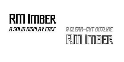
A great new display face. The slight serif gives extra character to this solid looking design, whilst the outline version has an open, clean look.
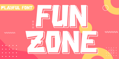
Fun Zone is a fun, fun display font. With its modern and bold character, this typeface will be the right choice for you to use.
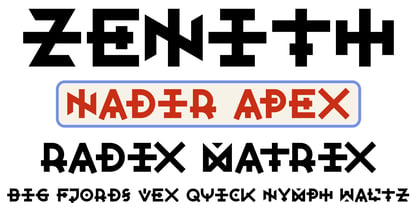
Chinese characters have simplifed and more complex, "traditional" variants. Zenith imagines what an un-simplified, traditional version of the Latin alphabet might have looked like.
LD Cottage resembles the antique writing you would find in an ancient fairytale or story. Enjoy this fun font and let your imagination take flight!
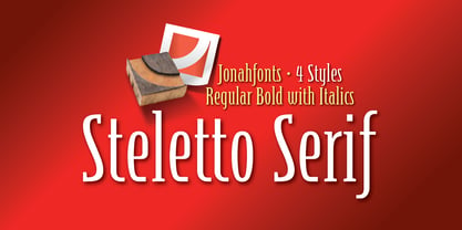
Condensed serif font. Great for tight-fitting headlines and other condensed titling situations such as headlines, ads, invitations, captions, packaging, bulletins, posters, and greeting cards.
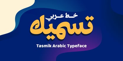
Tasmik literally means thickening, this font is thick like extrabold in wight, impressed firm but flexible, suitable for display text and the center of interest.
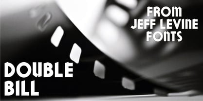
Double Bill JNL gets its inspiration from the promotional movie trailer for 1938's gangster comedy "A Slight Case of Murder" starring Edward G. Robinson.
Hundo - Personal use only
As of my last update in early 2023, Canuth may not be among the most recognized or widely discussed typefaces within the vast and eclectic world of typography. However, let's embark on a creative jou...
Ah, the Riparo font! It's like diving into the world of quirky and eye-catching typography, a playground where creativity meets functionality. Crafted by the talented Vladimir Nikolic, Riparo doesn't...
The "ShipsNBoats" typeface, a captivating creation by Manfred Klein, is an aesthetically distinct font that brings the essence of maritime wonders directly to the realm of typography. Klein, known fo...
Sure, let me tell you about a whimsical and delightful font named "Cup Font." Imagine a font that is as playful and comforting as a warm cup of your favorite beverage on a chilly morning. That's Cup ...
"You Wish You Were a Shirley" is a font that, even by its title, imparts a sense of whimsy and nostalgia. This font is inspired by the mid-20th century hand lettering that could be found in quaint to...
"Old Copperfield," crafted by the ingenious efforts of GemFonts | Graham Meade, is a captivating font that appears to breathe a vintage soul into the modern-day canvas of typography. This typeface, a...
The Janda Snickerdoodle Serif, designed by Kimberly Geswein, is a font that captures the whimsy and fun of hand-drawn letterforms while maintaining a serenity that comes from its serif elements. This...
Ah, KG Seven Sixteen, a font that confidently saunters into the world of typography, tipping its hat with a cheeky grin. Crafted by the whimsical wand of Kimberly Geswein, it's as if this font was sp...
The Minster No 1 font, by Paul Lloyd Fonts, is a distinct and beautifully crafted typeface that exudes an aura of both historical gravitas and whimsical elegance. This font captures the essence of tr...
Ah, the Confinental FREE font by Inspiratype – a name that evokes the elegance of a continental breakfast in Paris but with the 'FREE' tag dangling like a cherry on top that says, "Bonjour, mon ami! ...
Ah, if fonts were people, Struck Base PERSONAL USE ONLY PERSONAL USE ONLY by Måns Grebäck would be that incredibly charismatic friend who insists on making a dramatic entrance at every party, yet onl...
The Duvall font, crafted by the talented Paul Lloyd Fonts, is a distinctive typeface that captures the essence of historical elegance and intricate detail often found in the typography of earlier cen...
Ah, the whimsical world of fonts, where the personality of a text comes to live, breathe, and sometimes do a little dance. Enter the scene: Digital Tech by Phuxer Designs. Imagine if the circuits of ...
Aromo by TipoType, $19.00 Aromo was initially conceived for editorial purposes. This typeface mixes the versatility of a simple and modern sans-serif, with the sensibility of the humanist feeling: thus making it useful in a wide range of purposes when a balanced and friendly font, with elegant proportions and high readability is required. The functional nature of its design is complemented by a family of 14 variants (7 weights, plus their matching true italics) interpolated optically for application as a hierarchical resource, where the middle weights (Light, Regular) have been optimized for use in small bodies, while the extremes (Ultra Light, Black) where designed for display environments._ Aromo also offers a wide range of historical and discretionary ligatures, small caps, eleven different types of numerals and a set of more than 700 characters covering about two hundred languages of Latin script._
Thoroughly contemporary, clean, and ready for work, Tilden Sans was designed by Delve Withrington to be no-nonsense but still stylish and friendly. Tilden Sans is square-ish with low contrast and a generous x-height. Curvilinear strokes like those in the capitals C or S, and many lowercase letters feature incised terminals offering a measure of distinction from other sans serifs, without sacrificing legibility. All of those features work in unison to make this typeface a pleasure to use and read. The Tilden Sans family has seven useful weights ranging from Light to Black and features a glyph repertoire of over 900 glyphs with language support for 225 languages. This versatile typeface performs brilliantly in a host of sizes. The Regular and Medium weights can be used at text sizes, while the Light and Black weights are great for display size settings.
As with any attempt at a new typeface, you want to create something different. A difficult task as most legible fonts are based on something previous. Somatype isn't actually based on any particular font but it has unavoidable similarities to others. The important difference here being the distinctive quirk of the connection points going opposite to the norm; exemplified best by the lower case d & e. Once devised, the unique characteristic was applied wherever possible, keeping the rest of the characters in a sympathetic, rounded style. I first designed this in the light weight version, seeing it working best as a large open display font for magazines etc. but realized it would be too light for body copy at small scale, so, medium and bold weights were created to resolve that issue. Incidentally, the word ‘somatype’ literally means body-type.
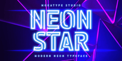
Introducing the Neon Sci-fi Futuristic Font called Neonstat a unique font with a futuristic style that can make your futuristic logotype more interesting. Inspired by real-world neon light signs, this font is perfect for adding your own glowing light effects or can be used to actually design real-world neon signs. Neonstar font is suitable for your design and allows you to create beautiful designs, headlines, posters, logos, badges, and much more. It is also best used for posts, logos, posters, labels, and more. Works on PC & Mac, simple installations, accessible in Adobe Illustrator, Adobe Photoshop, Adobe InDesign, and even works on Microsoft Word. PUA Encoded Characters - Fully accessible without additional design software. Fonts include multilingual support Image used: All photographs/pictures/vectors used in the preview are not included, they are intended for illustration only. Thank You
The different fonts in the Why Square family are an extension of the designs begun in Zoran Kostic's Just Square family. Why Square's lowercase letters are all more condensed versions of Just Square's letters, and in some of the fonts, the uppercase letters are wider. The first five fonts are the different weights of Why Square (UltraThin, UltraLight, Thin, Light, and Regular). Here, all of the characters--both upper and lowercase--are more condensed versions of the geometric letters from the Just Square family. The next five fonts (UltraThin, UltraLight, Thin, Light, and Regular weights) include identical lowercase letters to those from the first five fonts in the family, but their capitals are considerably wider. These may be used as initials, either with the other fonts in the Why Square family, or with the Just Square family.
»Supra Demiserif« is the demi serif addition to the Supra family. I am no fan of slab serif fonts, so I designed this one with half serifs, that makes the serifs less important. Then I found, that the italic does not look nice with slab serifs, so I did only one italic cut for the normal weight. The light and normal weights and the dominant x-height with its high ascenders make for easy reading of long copy. The heavy and x-light weights are great for elegant headlines. Supra is an OpenType family for professional typography with an extended character set of over 700 glyphs. It supports more than 40 Central- and Eastern-European as well as many Western languages. Ligatures, different figures, fractions, currency symbols and smallcaps can be found in all cuts. with each other.
Aromo by Underground, $19.00 Aromo was initially conceived for editorial purposes. This typeface mixes the versatility of a simple and modern sans-serif, with the sensibility of the humanist feeling: thus making it useful in a wide range of purposes when a balanced and friendly font, with elegant proportions and high readability is required. The functional nature of its design is complemented by a family of 14 variants (7 weights, plus their matching true italics) interpolated optically for application as a hierarchical resource, where the middle weights (Light, Regular) have been optimized for use in small bodies, while the extremes (Ultra Light, Black) where designed for display environments. Aromo also offers a wide range of historical and discretionary ligatures, small caps, eleven different types of numerals and a set of more than 700 characters covering about two hundred languages of Latin script.
Stevia is a font family designed by Carlos Fabian Camargo Guerrero. Stevia is a sweet font family created to design logos, cards, posters, book covers, blogs, packaging, walls, etc. Stevia is useful to differentiate your designs and stimulate your imagination through 5 fonts drawn with an apparent handmade lettering look. Stevia dingbats has more than 250 special monolineal icons to accompany Stevia Script Black (600 glyphs), Stevia Script Light (470 glyphs), Stevia Subtitles Bold (300 glyphs) and Stevia Subtitles Light (300 glyphs) in quotes, legends and short writings. That’s why you'll get a lot of alternative letters in uppercase, lowercase and opentype numbers as well as ligatures and flourishes ideal for beginning, middle and end of word. In summary Stevia is great for communicating naturalness and freshness in designs that need to be outside conventional typographic norms.
Ralph M. Unger, (Arno Drescher), 2006, (1936) Originally, Arabella Pro was designed by Arnold Drescher around 1936/1939. Drescher created this wonderful script for former Germany type foundry Joh. Wagner. The typeface has been redesigned, digitized, completed and expanded as OpenType Pro in the profonts studio.Arabella Pro comes in two versions, light and medium, each with a large selection of manually designed ligatures and alternates, i.e. swashed upper case to make this naturally flowing script design a perfect font for OTF-savvy applications like e.g. InDesign or Quark Xpress 7.Arabella Pro light and medium are perfect partners for any sans serif, especially for Futura. It is perfectly suited for anything in the area of headlines, posters, invitations etc. However, since it is very well legible, it can also be used individually for small text blocks.
German designer Rosemarie Kloos-Rau created Wiesbaden Swing in 1992 for Linotype. This light, informal typeface is based on her own handwriting, and the strokes have a feeling of spontaneity and energetic flair. Characters like the D, O, W, g, n and y really do swing with unbridled confidence and joy. Kloos-Rau says about her typeface: “From the experience with my design company I recognized the need for fonts with personality. Wiesbaden Swing is my contemporary contribution to the field of calligraphy, a headline font which offers a fresh and unconventional approach to typography.” This family has both regular and bold weights, and a set of Dingbats. The Dingbats are light-hearted and zippy symbols for holidays, children’s products, menus, and more. Wiesbaden Swing will add zest to packaging, catalogs, menus, websites, greeting cards, and magazine layouts.

A geometric Art Déco multi-widths type family Anisette has sprouted as a way to test some ideas of designs. It has started with a simple line construction (not outlines as usual) that can be easily expanded and condensed in its width in Illustrator. Subsequently, this principle of multiple widths and extreme weights permitted to Jean François Porchez to have a better understanding with the limitations associated with the use of MultipleMaster to create intermediate font weights. Anisette is built around the idea of two widths capitals can be described as a geometric sanserif typeface influenced by the 30s and the Art Deco movement. Its design relies on multiple sources, from Banjo through Cassandre posters, but especially lettering of Paul Iribe. In France, at that time, the Art Déco spirit is mainly capitals. Gérard Blanchard has pointed to Jean François that Art Nouveau typefaces designed by Bellery-Desfontaines was featured before the Banjo with this principle of two widths capitals. A simple sentence will be as diverse in its representations, as the number of Anisette variables available to the user. With Anisette, typography becomes a game, as to design any title page as flamboyant as if it has been specially drawn for it. Two typefaces, many possibilities The complementarity between the two typefaces are these wide capitals mixed with narrow capitals for the Anisette while the Anisette Petite – in its latest version proposes capitals on a square proportions, intermediate between the two others sets. Anisette Petite proposes capitals in a square proportion, intermediate between the two other sets, all of which are interchangeable. In addition, Anisette Petite also includes a set of lowercase letters. Its style references shop signs present in our cities throughout the twentieth century. Anisette, an Art Déco typeface Anisette: Reveal your typographic expertise Club des directeurs artistiques, 46e palmarès Bukva:raz 2001 Slanted: Contemporary Typefaces #24

The coffee made typography. CoffeeBreak is a typefamily designed by Carlos Fabian Camargo G. Its purpose is to communicate similar feelings to the ones you get when you first try the best roasted Colombian coffee early in the morning. That is the reason of the waiting, accompanied, or when you only want to be, nuances your design with its fonts full of flavor, texture and passion. For each time, every time, it gives you hints of flavor to design your day. It unleashes your artistic streak mixing possibilities as you wish, to your taste or the taste of your friends or that special someone. From handwriting to every warm drop of your first mug of the morning, we've always got something for you. Eye catching, modern, beautiful, cool and adventurous styles in the CoffeeBrwak shop ready for you to purchase. - CoffeeBreak A & B: 2 typographic tools with countless swashes and ligatures ideal for use at the beginning, in the middle or end of words that need italics, flavored dancers and rhythm masterfully expressed in gestural strokes for his calligraphic experimental logic. - Coffee Break Script 1 & 2: write them you can easily with decorative letters advocating a return to the artisan product ingenuity of the primacy of man over machine so your upper and lower case letters travel in a single line. - CoffeeBreak Words & WordsBold: It contains words specially designed to attract attention. - CoffeeBreak Dingbats: They are figurative silhouettes with textures that add warmth and a highly communicative environment. All are easily activated glyphs using the Glyphs panel in Illustrator, InDesign and Photoshop. Special thanks: Ilustrations: Eduardo Gomes. Photos: Karen Salvatierra. Texts: Javier Lineares- Description: Ernesto Googolplex. French translation: Marta Cano
Obla by LetterPalette, $20.00 
The Obla font family is a modern serif typeface accompanied by appropriate italic in seven weights. Sketches of letters were drawn manually, using thick marker for creating shape and pencil for finishing details. Calligraphic origin of shapes is revealed beneath strained curves drawn on computer. All of the weights were carefully adjusted to each other. Obla is equipped with some basic OpenType features and supports Cyrillic and Latin script. Using Obla in small sizes is very convenient, because of its large x-height, and Obla is a very readable typeface. It seduces the reader with its vivacious character. The typeface is also suitable for usage in large sizes. The best choice for headlines is using the heaviest (Black) and the lightest (Thin) weight. There are two smaller family packages in offer: Obla Basic Set contains Regular, Italic, Bold and Bold Italic, while Obla Light Set contains Light, Light Italic, SemiBold and SemiBold Italic. These two sets are the most appropriate for working with small text. Other weights can be bought separately, or within the whole family. Obla is an awarded typeface. It got Special Mention in Cyrillic Typefaces category in Granshan 2016 competition and it was chosen as a Merit Winner in Print’s Typography and Lettering Awards competition. At that time, before publishing, the typeface was named Petra.

Before Bodoni, there was Didot. With the publication by Francois Ambroise Didot of Paris in 1784 of his prospectus for Tasso’s La Gerusalemme Liberata, the rococo typographical style of Fournier de Jeune was replaced with a spartan, neo-classical style that John Baskerville pioneered. The typeface Didot used for this work was of Didot’s own creation and is considered by both G. Dowding and P. Meggs to be the first modern face. Three years later, Bodoni of Parma is using a very similar face. Just as Bodoni’s typeface evolved over time, so did that of the Didot family. The eldest son of Francois Ambroise Didot, Pierre, ran the printing office; and Firmin ran the typefoundry. Pierre used the flattened, wove paper, again pioneered by Baskerville, to permit a more accurate impression and allow the use of more delicate letterforms. Firmin took full advantage of the improved paper by further refining the typeface introduced by his father. The printing of Racine’s Oeuvres in 1801 (seen in our gallery image #2) shows the symbiotic results of their efforts, especially in the marked increase in the sharpness of the serifs when compared to their owns works of only six years earlier. It has been suggested that one reason Bodoni achieved greater popularity than Didot is the thinner hairlines of Didot were more fragile when cast in metal type and thus more expensive for printers to use than Bodoni. This ceased to be a problem with the advent of phototypesetting, opening the door for a renewed interest in the work of the Didot family and especially that of Firmin Didot. Although further refinements in the Didot typeface were to come (notably the lower case ‘g’ shown in 1819), we have chosen 1801 as the nominal basis for our presentation of HiH Firmin Didot. We like the thick-thin circumflex that replaced the evenly-stroked version of 1795, possible only with the flatter wove paper. We like the unusual coat-hanger cedilla. We like the organic, leaf-like tail of the ‘Q.’ We like the strange, little number ‘2’ and the wonderfully assertive ‘4.’ And we like the distinctive and delightful awkwardness of the double-v (w). Please note that we have provided alternative versions of the upper and lower case w that are slightly more conventional than the original designs. Personally, I find the moderns (often called Didones) hard on the eyes in extended blocks of text. That does not stop me from enjoying their cold, crisp clarity. They represent the Age of Reason and the power of man’s intellect, while reflecting also its limitations. In the title pages set by Bodoni, Bulmer and Didot, I see the spare beauty of a winter landscape. That appeals to a New Englander like myself. Another aspect that appeals to me is setting a page in HiH Firmin Didot and watching people try to figure out what typeface it is. It looks a lot like Bodoni, but it isn't!


