1,384 search results
(0.008 seconds)
- Deng Thick - Unknown license

- Medrano - Unknown license

- Charybdis - Unknown license

- Umpyre - Unknown license

- Vinsome - Unknown license

- Anke Print - Unknown license

- Somora - Unknown license

- Alothea by Stefani Letter,
$14.00 Alothea is a friendly and modern script font with a quirky style. Masterfully designed to become a true favorite. Beautiful and versatile, this font will become your top choice for a wide spectrum of creative ideas in no time! This font is PUA encoded which means you can access all of the glyphs.
 - Hagane by Saiffont,
$20.00 This typeface was created during the process of logo making. Simple and stylish design which can be used in pretty much any projects, especially in action themed projects. The sharp terminals in this typeface resemble the tip of "Katana", a Japanese weapon. Hagane means "steel" in Japanese, which is used to make Katana.
 - Witchcraft by Alan Meeks,
$45.00 Witchcraft is a classic Roman font in three weights and corresponding italics. The ‘v’,’w’,and ‘y’, use the old style join at the top reminiscent of Georg Belwe’s Roman design “Belwe”. The large x-height makes for a powerful headline font but excellent for text setting especially in the lighter weights.
 - Aminta by Alias Collection,
$60.00 Aminta is an eclectic and expressive take on the Courier aesthetic. Aminta mixes the utility aesthetic of Courier, the default computer typeface and subversive piece of non-design graphic designers are presented with in the top left hand corner of Quark documents, and eclectic and expressive letterforms derived from drawing and handwriting.
 - Racnegut by SimpleType Studios,
$15.00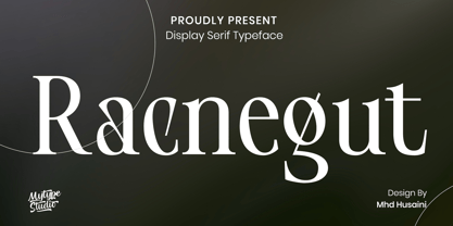 Racnegut is high contrast serif font features a mixed modern-classic design. Racnegut support multilingual languages, numbers, punctuation and alternative-ligatures. Create unique & amp; beautiful logotype, use it as an elegant solution for your next magazine layout, or choose Racnegut for any graphics that require a sleek look with a elegant flair.
 - Superstar Grotesk by Not Bad Typeface,
$30.00 Superstar Grotesk is a free interpretation of the first Cyrillic versions of Royal Grotesk and Akzidenz Grotesk, later the "Roublennaya" typeface is the same irremovable pop artist who lingered in the top of the typographic charts until the digital era, and formed the image of the Cyrillic alphabet in the 20th century.
 - Ettore by Comics Font Store,
$9.00 ETTORE is a font for onomatopoeia. Friendly-looking, it is inspired by the lettering of the classic French comics with an adventurous and humorous font-style. It is chunky, marked, with low contrast. The kerning is perfectly balanced. It is made with a chisel-tipped marker determining its thick, square, flat stroke.
 - Chunky Nouveau JNL by Jeff Levine,
$29.00 Chunky Nouveau JNL was inspired by a circa-1928 water applied decal for the Top Most Insulated Jug. The plump, rounded hand lettering of the brand name was given a slightly thicker treatment to create a more poster-oriented display design. Chunky Nouveau JNL is available in both regular and oblique versions.
 - Brazil Pixo Reto by Just in Type,
$20.00In Brazil, young people sign their gang names on the top of São Paulo City buildings. Their letters are tall and structured just like the buildings that they have to scale. For them, typography has become an extreme sport. The font Brazil Pixo Reto pays homage to these new athletes of design. - Sugary Pancake by Hanoded,
$15.00 Sugary Pancakes - ahh, my kids love them. We don't make them too often, as they are 'energetic' enough as it is. This calorie-rich font is ideal for Children's Books and posters: it is fun, bouncy, very legible and full of character. Comes with a topping of diacritics and a stack of happiness.
 - Petit Four by Hanoded,
$15.00 A "Petit Four" is a small, bite-sized, French pastry. The font before you is a bite-sized Hanoded original. It is hand made, fun to use and comes with a lot of calories. Like its namesake, use Petit Four sparingly and it will be the cherry on top of your design.
 - Thinker Justice by Balpirick,
$15.00 Thinker Justice is a Modern Handwritten Font. Thinker Justice is a trendy and modern handwritten font. Simple and natural, this font will become your top choice for formal and informal designs in no time! Thinker Justice also multilingual support. Enjoy the font, feel free to comment or feedback, send me PM or email.
 - Hamburger by FontMesa,
$29.00 Our new Hamburger font is based on the old classic Brush Script design with many new additions. We've added many alternates to the design including lowercase swash tail letters, swash underscores and a few alternate uppercase letters. Upright scripts are popular these day so new to this old type design is a near upright script version, a lot of hand work went into producing it. One of the biggest problems with the old Brush Script font is that people use it as all caps, which doesn't look good because of the extended swash on the top left side of the caps letters. We've fixed that problem by making an all caps version where the caps in the lowercase position have the top left swash tucked in to help the letters display better as an all caps font. We've also created a small caps version, again the small caps lowercase have all the top left swashes tucked in to bring the letters closer together for a better display. Also new to this font are two higher x-height versions that are ideal for signage. The first is Hamburger X which stands for extra x-height and the second is Hamburger SPX which stands for super x-height. Both of these higher x-height fonts are suitable for signage on a building, billboard and vehicle lettering where you're looking for faster readability from moving traffic. We've designed a new lowercase b and moved the original to an alternate position. We've also redesigned the uppercase C bringing the bottom up to the baseline and moved the original C to an alternate position. The original lowercase g was open at the top, we've closed it and we're not offering the original g as an alternate.
 - Tiffy - Unknown license

- the EV$NT - Personal use only

- Dining Out JNL by Jeff Levine,
$29.00 A 1940s ad flier for the Los Angeles restaurant “Lucca Paris Inn” had its name hand lettered at the top of the page in a condensed Art Deco slab serif with some stylized characters. Given a more uniform look, the end result became Dining Out JNL and is available in both regular and oblique versions.
 - Flyover by Ronnie Boy,
$19.00 When a formation of jets flies over the top of a stadium before a big game, there is an unparalleled sense of excitement in the crowd. Flyover, a display typeface, captures that moment with an italic base, left-facing serifs, hollowed notches and a change in angle representing the instant the jets pass overhead.
 - Budrick BB by Blambot,
$8.00 Budrick BB is a slick, clean body copy font family that's just a bit rounded. It is available in four weights: Regular, Italic, Bold, and Bold Italic. (And those Italics have some slightly different letter forms than the plain versions!) To top it all off, Budrick BB has a hefty collection of European characters.
 - Rainmark by Haiku Monkey,
$20.00 Rainmark is a joyful display font that can help make your designs stand out from the crowd. Use the regular version on its own, or layer it on top of the shadow style for extra oomph! Rainmark works beautifully on posters, labels, T-shirts,... anything where a bold, fun font is what you need.
 - Snow Bunny by Sipanji21,
$18.00 Snow Bunny is a decorative font with a snow decoration on the top of characters and bubble looks there are bones hollow in the characters. It will elevate a wide range of design projects to the highest level, be it branding, headings, wedding designs, invitations, signatures, logotype, wall art illustration, apparel, labels, and much more!
 - Linotype Colibri by Linotype,
$29.99Linotype Colibri is a delightfully playful display face, from the award-winning German typeface designer Hans-Jürgen Ellenberger. Linotype Colibri's letters dance up and down across the baseline, and appear as if they had been drawn quickly and whimsically with a felt tip pen. The design is available in two weights: Light and Regular. - Upperclass by Enrich Design,
$24.95Upperclass was a font I created back in 1995. I had a brainstorm about the uppercase letter “A”. I noticed that the cross bar for the letter A is always toward the bottom, what if I moved it toward the top. The result is a unique font, a great addition to your font collection. - Vermicello by ParaType,
$30.00 An original display typeface was designed for ParaType in 2007 by Isabella Chaeva. Informal handwriting shapes of letters are formed by several separate elements — traces of monoline writing tool like broad felt-tipped pen. The name of the font reveals the fact that curvy strokes resemble worms. For use in advertising and display typography.
 - Guglia by Leo Colalillo,
$20.00 Guglia is an extra textura typeface ispired by the gothic architecture shapes and in particular to his vertical extremization based on a rigid scheme, like the calligraphy of that period. A spire (Guglia in italian) is a tapering conical or pyramidal structure on the top of a building, often a skyscraper or a church tower.
 - Slab Happy by Will Ryan,
$15.00 Slab Happy is a layered typographic system that adds a unique twist to neutral slab serifs. By pasting layers on top of one another and altering fonts and colors, you can create infinite combinations of slabby brilliance. Slab Happy looks best when set in display sizes, but functions just as well at smaller point sizes.
 - aaaiight! - Unknown license

- Pudmonkey - Unknown license

- Wasser - Unknown license

- Riddleprint - Unknown license

- ITC Humana Serif by ITC,
$29.99ITC Humana font is the work of British designer Timothy Donaldson, an extended and versatile font family with a large array of variations. Donaldson first created ITC Humana Script with a broad-tipped pen and then went on to design the corresponding roman. ITC Humana is the perfect font for anything requiring both clarity and a touch of personality. - Mirabelle by Magpie Paper Works,
$14.00 Mirabelle from Magpie Paper Works is a family of four hand-lettered fonts designed to coordinate with each other or stand alone as display faces. Each font was created with a felt-tipped pen & ink, and includes a full set of capital and lowercase letters, as well as multi-lingual support, currency figures, numerals, and punctuation.
 - Planca by Vertigo,
$18.00 Planca is a sans serif typeface with medium contrast and distorted rhythm of the line. Spaced and mastered for optimal readability. All lines are of equal thickness. Its morphology is based on the study of traditional writing with a wide tip stick. It comes in 4 different weights (Light, Regular, Bold and Black) and provide multilingual support.
 - Kino MT by Monotype,
$29.99Kino font was designed in 1930 by Martin Dovey for the Monotype Corporation. Heavy in weight with the letters clipped at the top and bottom, Kino is unique among display types. Display typefaces with triangular serifs are sometimes called Latins and Kino is referred to as a serifless Latin. Use Kino font sparingly in informal display situations."


