10,000 search results
(0.185 seconds)
- Flat10 Holly by Dharma Type,
$14.99 Very decorative pixel font which has organic and soft impressions. The best pixel font for Christmas. This 8-bit pixel font is designed with respect for 80s game designers and the pixel font pioneers in middle 90s. Use at size 10 pixels or multiples of 10 and anti-alias off is recommended. List of our Pixel Font Project. ·Flat10 Antique ·Flat10 Artdeco ·Flat10 Arts&Crafts ·Flat10 fraktur ·Flat10 Holy ·Flat10 Holly ·Flat10 Segments ·Flat10 Stencil ·Flat20 Gothic ·Flat20 Headline ·Flat20 Hippies ·Flat20 Streamer ·Behrensmeyer Vigesimals ·Civilite Vigesimals
 - Heptal by deFharo,
$11.00 - Heptal is a typeface family with five weights including true italics. The geometry of the characters is neo-gothic and the serifs are polygonal concave or inverted Tuscan. - Heptal fonts offer a complete set of lowercase alternatives and advanced open type functions. - The proportions, the metrics and the Kerning are meticulously configured so that the texts are shown fluid and the graphic stain is compensated. - These fonts have a wide table of characters (530 glyphs) with support for all the languages derived from Latin.
 - Clydesdale by Red Rooster Collection,
$60.00 Clydesdale is a five-weight compressed sans serif font family. It was designed by Steve Jackaman over a several-year period, and was released in 2017. Clydesdale, much like its sister typefaces Coliseum and Torpedo, was inspired by authoritative Roman display typefaces. The font family excels in displays, but is a great performer in all text sizes. It is perfect for users who enjoy the impressiveness of Coliseum Pro and Torpedo, and need a complementary sans serif typeface.
 - Rajjah Familia by Creativemedialab,
$20.00 Rajjah Familia - Blackletter font family Blackletter (sometimes black letter), also known as Gothic script, Gothic minuscule, or Textura, was a script used throughout Western Europe from approximately 1150 until the 17th century. Blackletter is currently widely used in modern creative design trends ranging from tattoo lettering, calligraphy, clothing brands, music, sports, labels and much more. Rajjah Familia looks gothic but easy to read, neat and beautiful. Comes with light, regular, medium and bold version. Rajjah is the right choice for your next projects!
 - Melusine by Scriptorium,
$18.00Melusine is based on an ornate style of gothic calligraphy used primarily in decorative signs and advertising in Germany around the turn of the century. It has many of the characteristics of a true medieval gothic hand, but is a more elaborate, extreme variaton on the style. - Fashion by ITC,
$29.99Fashion Compressed and Engraved are the works of British designer Alan Meeks. Fashion Compressed is an elegant modern roman typeface suitable for a variety of advertising styles. The capitals can be used as initials or combined with the lower case letters. Fashion Engraved was produced when Meeks reworked Fashion Compressed, resulting in a beautiful, engraved typeface. - Taranatiritiza by Intellecta Design,
$9.00Free interpretation of the classic Gothic Tuscan 1, by William Hamilton Page. - Nakara by Kreuk Type Foundry,
$12.00 Nakara Serif is All-Caps Modern Serif Typeface with solid heavy impressions. Available in 3 styles: Regular Outline Rough Nakara Serif ideally suited for headline title, badges lockup, logo, branding, posters etc. Supports Multi-language, Stylistic Ligatures & PUA encoded for alternates styles.
 - Ensemble Inline JNL by Jeff Levine,
$29.00 A 1940s-era edition of the sheet music for the Marine Corps Hymn offered up the hand lettering which comprises Ensemble Inline JNL. Bold, condensed and attention-getting, this titling font commands attention. Available in Inline, Solid, Inline Oblique and Solid Oblique versions.
 - Odessa by ITC,
$29.99Odessa was designed by Peter O'Donnell, an impressive, refined sans serif typeface based on the compass and ruler design of Futura. It is best set with wide letter spacing and is particularly good for an upscale, fashionable look. The fine-line casing of Odessa emphasizes its clean, proportioned features. - Bank Sans EF by Elsner+Flake,
$35.00 With its extended complement, this comprehensive redesign of Bank Gothic by Elsner+Flake offers a wide spectrum for usage. After 80 years, the typeface Bank Gothic, designed by Morris Fuller Benton in 1930, is still as desirable for all areas of graphic design as it has ever been. Its usage spans the design of headlines to exterior design. Game manufacturers adopt this spry typeface, so reminiscent of the Bauhaus and its geometric forms, as often as do architects and web designers. The creative path of the Bank Gothic from hot metal type via phototypesetting to digital variations created by desktop designers has by now taken on great breadth. The number of cuts has increased. The original Roman weight has been augmented by Oblique and Italic variants. The original versions came with just a complement of Small Caps. Now, they are, however, enlarged by often quite individualized lower case letters. In order to do justice to the form changes and in order to differentiate between the various versions, the Bank Gothic, since 2007 a US trademark of the Grosse Pointe Group (Trademark FontHaus, USA), is nowadays available under a variety of different names. Some of these variations remain close to the original concept, others strive for greater individualism in their designs. The typeface family which was cut by the American typefoundry ATF (American Type Founders) in the early 1930’s consisted of a normal and a narrow type family, each one in the weights Light, Medium and Bold. In addition to its basic ornamental structure which has its origin in square or rectangular geometric forms, there is another unique feature of the Bank Gothic: the normally round upper case letters such as B, C, G, O, P, Q, R and U are also rectangular. The one exception is the upper case letter D, which remains round, most likely for legibility reasons (there is the danger of mistaking it for the letter O.) Because of the huge success of this type design, which follows the design principles of the more square and the more contemporary adaption of the already existing Copperplate, it was soon adopted by all of the major type and typesetting manufacturers. Thus, the Bank Gothic appeared at Linotype; as Commerce Gothic it was brought out by Ludlow; and as Deluxe Gothic on Intertype typesetters. Among others, it was also available from Monotype and sold under the name Stationer’s Gothic. In 1936, Linotype introduced 6pt and 12pt weights of the condensed version as Card Gothic. Lateron, Linotype came out with Bank Gothic Medium Condensed in larger sizes and a more narrow set width and named it Poster Gothic. With the advent of photoypesetters and CRT technologies, the Bank Gothic experienced an even wider acceptance. The first digital versions, designed according to present computing technologies, was created by Bitstream whose PostScript fonts in Regular and Medium weights have been available through FontShop since 1991. These were followed by digital redesigns by FontHaus, USA, and, in 1996, by Elsner+Flake who were also the first company to add cursive cuts. In 2009, they extended the family to 16 weights in both Roman and Oblique designs. In addition, they created the long-awaited Cyrillic complement. In 2010, Elsner+Flake completed the set with lowercase letters and small caps. Since its redesign the type family has been available from Elsner+Flake under the name Bank Sans®. The character set of the Bank Sans® Caps and the Bank Sans® covers almost all latin-based languages (Europe Plus) as well as the Cyrillic character set MAC OS Cyrillic and MS Windows 1251. Both families are available in Normal, Condensed and Compressed weights in 4 stroke widths each (Light, Regular, Medium and Bold). The basic stroke widths of the different weights have been kept even which allows the mixing of, for instance, normal upper case letters and the more narrow small caps. This gives the family an even wider and more interactive range of use. There are, furthermore, extensive sets of numerals which can be accessed via OpenType-Features. The Bank Sans® type family, as opposed to the Bank Sans® Caps family, contains, instead of the optically reduced upper case letters, newly designed lower case letters and the matching small caps. Bank Sans® fonts are available in the formats OpenType and TrueType.
 - Heikudo Freedom by Hanzel Space,
$25.00 A typeface that proves its usefulness over time. Letter strokes that produce unique characters on each glyph so that they display a natural impression. This font is very suitable for branding, film titles, book titles, quotes, product names and the business you want to create. What's Included : Heikudo Freedom Standard glyphs Works on PC / Mac Simple installations Accessible in the Adobe Illustrator, Adobe Photoshop, Adobe InDesign, even work on Microsoft Word.
 - San Angelo NF by Nick's Fonts,
$10.00A heavy unnamed Gothic typeface from the 1890 William H. Page Foundry woodtype specimen book provided the template for this bold, brash, no-nonsense face. It's designed to set tight, so your headlines will definitely get noticed. Named for a town in West Central Texas which is noted for being the home of the Buffalo Soliders in the late 1800s. Both versions of this font contain the Unicode 1252 (Latin) and Unicode 1250 (Central European) character sets, with localization for Romanian and Moldovan. - ITC Franklin by ITC,
$40.99 The ITC Franklin™ typeface design marks the next phase in the evolution of one of the most important American gothic typefaces. Morris Fuller Benton drew the original design in 1902 for American Type Founders (ATF); it was the first significant modernization of a nineteenth-century grotesque. Named in honor of Benjamin Franklin, the design not only became a best seller, it also served as a model for several other sans serif typefaces that followed it. Originally issued in just one weight, the ATF Franklin Gothic family was expanded over several years to include an italic, a condensed, a condensed shaded, an extra condensed and, finally, a wide. No light or intermediate weights were ever created for the metal type family. In 1980, under license from American Type Founders, ITC commissioned Victor Caruso to create four new weights in roman and italic - book, medium, demi and heavy - while preserving the characteristics of the original ATF design. This series was followed in 1991 by a suite of twelve condensed and compressed designs drawn by David Berlow. ITC Franklin Gothic was originally released as two designs: one for display type and one for text. However, in early digital interpretations, a combined text and display solution meant the same fonts were used to set type in any size, from tiny six-point text to billboard-size letters. The problem was that the typeface design was almost always compromised and this hampered its performance at any size. David Berlow, president of Font Bureau, approached ITC with a proposal to solve this problem that would be mutually beneficial. Font Bureau would rework the ITC Franklin Gothic family, enlarge and separate it into distinct text and display designs, then offer it as part of its library as well. ITC saw the obvious value in the collaboration, and work began in early 2004. The project was supposed to end with the release of new text and display designs the following year. But, like so many design projects, the ITC Franklin venture became more extensive, more complicated and more time consuming than originally intended. The 22-font ITC Franklin Gothic family has now grown to 48 designs and is called simply ITC Franklin. The new designs range from the very willowy Thin to the robust Ultra -- with Light, Medium, Bold and Black weights in between. Each weight is also available in Narrow, Condensed and Compressed variants, and each design has a complementary Italic. In addition to a suite of new biform characters (lowercase characters drawn with the height and weight of capitals), the new ITC Franklin Pro fonts also offer an extended character set that supports most Central European and many Eastern European languages. ITC Franklin Text is currently under development.
 - Ananda Black Personal Use - Personal use only

- League of Ages - Personal use only

- Vampetica - Personal use only

- Bleeding Freaks - Unknown license

- DuerersMinuskeln - 100% free

- Flaemische Kanzleischrift - Personal use only

- Dark11 - Unknown license

- Fraktura - Personal use only

- Wolf's Bane - Unknown license

- Kingthings Versalis - 100% free

- Larkin Capitals - Unknown license

- Dragonwick - Unknown license

- Evil Cow - Unknown license

- TRUEblood - Personal use only

- Ironbridge by Device,
$29.00 A cast iron plaque from Bristol Temple Meads Station serves as inspiration for this antique font. The plaque commemorates the design contribution of Isambard Kingdom Brunel, who in March 1833 at only 27 was appointed chief engineer of the Great Western Railway, the line that links London to Bristol. This helped establish Brunel as one of the world’s leading engineers. Impressive achievements along the route include viaducts at Hanwell and Chippenham, Maidenhead Bridge, Box Tunnel and Bristol Temple Meads Station. Ironbridge evokes industrial heritage, gothic spookiness or eroded heavy metal.
 - GS Franklin Ave. by Great Scott,
$18.00 Franklin Ave. is a condensed sans serif in the style of the classics Franklin Gothic and News Gothic. Nostalgic and gives a great vintage feel. It's bold and comes in two styles: Regular and Oblique. Franklin Ave. is best used in headlines and large formats or in logos or branding.
 - Kerad by Lemonthe,
$12.00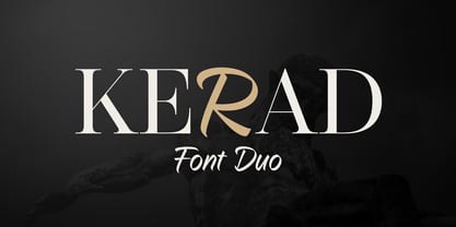 Kerad Font Duo is a captivating combination of modern serif and handwritten font, both seamlessly mixable to create a unique and appealing impression. It is suitable for various design projects such as logos, branding, packaging design, web design, titles, posters, printing, advertising, and much more.
 - Alterous Text by ZetDesign,
$15.00 Alterous is made for a bold impression on each of your works. This font can be used for title and text display so it is suitable for all types of designs, whether posters, flyers, banners, t-shirts, screen printing, magazines, newspapers, logos, and others.
 - Alterous Display by ZetDesign,
$15.00 Alterous is made for a bold impression on each of your works. This font can be used for title and text display so it is suitable for all types of designs, whether posters, flyers, banners, t-shirts, screen printing, magazines, newspapers, logos, and others.
 - Archive Old Style Condensed by Archive Type,
$19.95Compressed old style display typeface. - Yonkers by Jonahfonts,
$25.00 Yonkers a classic gothic face a very legible face. Very suitable for various applications.
 - Rust Bucket by BA Graphics,
$45.00 A mild grunge, a simple distressed gothic with just enough roughness to be cool.
 - Shàngó Chiseled by CastleType,
$59.00 Based on the elegant and somewhat delicate Shàngó "Classic", Shàngó Chiseled goes to the other extreme with a bold and emphatic design that continues the legacy of the beautiful classic proportions of Dr. Schneidler's original titling typeface. Warm, cheerful, open, and sensitively masculine, Shàngó Chiseled can give you the impact you need. Perfect for an embossed look, or of classic lettering in stone. A complete character set that supports most European languages. Shàngó Chiseled is a member of the extended Shàngó family (Classic, Chiseled, Sans, Gothic).
 - Musical Arrangement JNL by Jeff Levine,
$29.00 The hand-lettered title on a piece of sheet music for 1938's "Don't Be That Way" (as recorded by Benny Goodman) featured squared letters with rounded corners, slight variants in line thickness and interesting "overhangs". Additionally, some letters closed off on one end while others were opened, giving the impression of a slight "maze" effect. This unique song title was enough of an inspiration to be turned into Musical Arrangement JNL.
 - Wildebeast 3 by AsbakLab,
$9.00 Wildebeast is a type of retro font display with a classic and distinctive shape that gives an old school feel in it with the addition of a combination of each letter giving an additional impression to many of your projects there are many things you can do with this font, namely you can use it as a novel book title, classic movie title and your classic stories on social media Thank you very much
 - Thik by Zang-O-Fonts,
$25.00I've heard it described as "Copperplate Gothic" on LSD. It's broad, funky and dangerously pointy.


