10,000 search results
(0.053 seconds)
- Nortnoh by Alit Design,
$21.00 Introducing the "Northnoh Metal Modern Typeface" – where the raw power of brutalism meets the modern edge of dead metal aesthetics. Unleash the untamed spirit of your designs with this bold and brave font that boasts a prickly character, exuding strength and attitude. Designed for those who dare to be different, this typeface is a true representation of fearless creativity. With 862 meticulously crafted glyphs, the "Northnoh Metal Modern Typeface" ensures a comprehensive arsenal for your typographic adventures. Explore a world of possibilities with included ligatures and alternatives, allowing you to customize and enhance your text with a touch of unique flair. The font's distinctive personality is perfect for projects that demand an unconventional and daring approach. Whether you're working on album covers, posters, branding, or any other design where a fierce statement is required, the "Northnoh Metal Modern Typeface" rises to the occasion. Embrace the rebellious spirit of dead metal while enjoying the ease of use and versatility this typeface offers. Its multilingual support broadens the horizons of your creativity, making it a global tool for expression. Unleash the brutal beauty of "Northnoh Metal Modern Typeface" and let your designs scream with individuality. Elevate your projects to new heights with a font that challenges the norm and breaks free from the conventional boundaries of typography.
 - Gevher by Hurufatfont,
$23.00 Gevher is a grotesque based font family that the product of a meticulous work that spread over 2 years. It differs from other grotesque fonts with its very soft angular turns to the rounded forms and its daring ink traps. The rigid and stable structure is balanced by deep ink traps and unusual opposite angle at the joints. Thus it has a more humanistic expression. It has 3 widths: Condensed, Narrow and Normal. It consists of 8 main weights and their compatible italics, totally has 48 styles. Therefore, it provides a wide range of usage practices. It offers creative "contextual alternates" for the best reading experience. Ideal for every editorial design, packaging, corporate identity, brand, application, web and desktop usages.
 - Metaverse Display by Brenners Template,
$19.00 Metaverse Display Font Family The basic skeleton structure of this font family is based on block-shaped rectangles and arcs. Therefore, it contains the possibility of being simple, but free of transformation. Alternates are designed to give individual glyphs a special transforming effect, and can be used as a means to emphasize contextual characteristics. 94 Alternates are included, and it is designed to maximize the characteristics of glyphs through defiant and irregular free deformation, not just width deformation. These Alternates can be used in most apps that support Opentype. It is included in Stylistic Set 1 and 2 for uppercase and Stylistic Set 3 and 4 for lowercase. The function of the App to switch on Alternates, refer to the Opentype provided by each App.
 - Pegasus by chicken,
$23.00 Pegasus scrapes the DNA of a great twentieth century painter who scattered text across his work like no other… not any kind of facsimile, but tough, playful, adaptable display type forged from the bones of a unique writing hand. Three weights - Skinny, Domestic and Peso - each offer five alternates for each letter, three for each numeral and multiple versions of many punctuation and other symbols. Letters are uppercase only with the lowercase providing one of the alternate forms of each letter… with OpenType Contextual Alternates switched on, you get automatic variation between the two… and you can manually throw in wilder variations from the remaining alternates. Some repeated punctuation - periods, question marks, etc. - are automatically varied too. OpenType Stylistic Set 1 switches to a rowdier selection from the alternates… Set 2 flips all the E’s to distinctive ‘skeleton’ alternates… Set 3 introduces automatic variation into numerals. Save some $$$ by purchasing the Whole Livery Line - all three weights at a nice discount... or, if you're really hurting, Cheapskate offers just two alternates for each letter and a single set of numerals.
 - Roasted Bailey by Timurtype,
$14.00 Introduced by Timurtype Studio! Roasted Bailey is a Handwritten Script Font This font takes you into a world of timeless elegance and individuality with the charm of a charming handwritten font. In a digital landscape dominated by uniformity, these fonts stand as a testament to the timeless charm of the human touch and artistic expression. Each letter becomes a brushstroke, and each word a canvas of authenticity, imbuing your designs with a distinct personality that goes beyond the ordinary. Handwritten script fonts captivate with their unique rhythm, celebrating the fluidity of handwriting and the spontaneity of creative expression. More than just typography, they are a bridge between analog and digital, a poetic dance between tradition and modernity. the true warmth these fonts bring, elevate your projects to a world where every word becomes a heartfelt brushstroke in a design masterpiece Roasted Bailey Font also supports multilingualism. Enhance your designs with our original fonts, feel free to comment or provide feedback, Enjoy the fonts 😊 Thank You
 - Slant - Unknown license

- Architect - Unknown license

- MemphisDisplay - Unknown license

- Lombardic - Unknown license

- FATSOcaps - Unknown license

- SUNSET - Unknown license

- Mortbats - Unknown license

- Quibel - Unknown license

- ManTiqua-BlaXX - Unknown license

- Framework Mono by High Peak,
$21.00 Framework Mono is a modern monospaced typeface. A close relative of the original Mittelhorn font family, with whom it shares some letter and number design features, the two fonts are ideal companions. It comes in 3 weights, 3 uprights and matching italics. Designed with opentype features, each weight includes extended language support, fractions, arrows, ligatures and more. Perfectly suited for graphic design and for any display use. It could nicely work with code editors, web, editorial design, as well as corporate tabular data sheets and more. Enjoy!
 - Jerome by Peterdraw,
$14.00 Jerome inspired by compact, strong, and solid font. It comes with 3 weights: Thin, Light, and Regular. Jerome features strong and solid lines, gorgeous glyphs, and stunning styles. It would perfect for logos, magazines, quotes, posters, branding, name card, stationary, design title, blog header, art quote, typography. Features: 3 weights: Thin, Light, and Regular Standard ligatures Small Caps Fractions Ordinals Superscript Subscript We wish you enjoy our font and please don't hesitate to drop us a message if you have any issues or queries.
 - Maphylla by Groen Studio,
$15.00 Maplylla is a script font, beautiful and unique. It is a model of modern calligraphy typefaces, in combination with a calligraphy writing style. In total, there are 378 glyphs. Features include: Contextual Alternates Standart ligatures Discretionary ligatures Stylistic Alternates Stylistic sets initial form File included: Maplylla OTF Languages supported: Breton, Catalan, Czech, Danish, Estonian,French, German, Hungarian, Icelandic, Italian, Romanian, Scottish Gaelic, Slovak, Latvian, Lithuanian, Norwegian, English, Finnish, Polish, Portuguese, Slovenian, Spanish, Swedish, Turkish, Welsh. Basically, all european languages that are based on latin alphabet Can be used for various purposes.such as headings, logos, wedding invitations, t-shirts, letterhead, signage, labels, news, posters, badges etc. To enable the OpenType Stylistic alternates, you need a program that supports OpenType features such as Adobe Illustrator CS, Adobe Indesign & CorelDraw X6-X7.
 - Fenwick Outline Free - Unknown license

- 36 Dope by Power Type,
$- 36Dope is a display typeface with an experimental serif design. It draws from the event ’36DaysOfType’ held in 2023. Created as part of the ’36DaysOfPower’ theme, this font showcases unique and unconventional serifs, reflecting the creative and powerful spirit of the event. With its bold and experimental look, 36dope is well-suited for attention-grabbing headlines, titles, or graphic design projects that aim to convey a sense of strength and artistic innovation. This font is intended for eye-catching headlines, titles, or other graphic design projects that require a bold and experimental look.
 - PF DIN Text by Parachute,
$79.00 The purpose of the original DIN 1451 standard was to lay down a style of lettering which is timeless and easily legible. Unfortunately, these early letters lacked elegance and were not properly designed for typographic applications. Ever since its first publication in the 1930’s, several type foundries adopted the original designs for digital photocomposition. By early 2000, it became apparent that the existing DIN-based fonts did not fulfil the ever-increasing demand for a diverse set of weights and additional support for non-Latin languages. Parachute® was set out to fill this gap by introducing the PF DIN series which has become ever since the most comprehensive and sophisticated set of DIN typefaces. It was based on the original standards but was specifically designed to fit typographic requirements. Its letterforms divert from the stiff geometric structure of the original and introduce instead elements which are familiar, softer and easier to read. The first set of fonts was completed in 2002 as a group of 3 families which included condensed and compressed versions. With its vast array of weights, the extended language support, but most of all its meticulous and elaborate design, it has proved itself valuable to numerous design agencies around the world. Ever since its first release, it has been used in diverse editorials, packaging, branding and advertising campaigns as well as a great number of websites. It was quoted by Publish magazine as being “an overkill series for complex corporate identity projects”. The whole PF DIN Text type system (with normal, condensed and compressed styles) includes 45 weights from Hairline to Extra Black including true-italics. Additionally, every font in the Pro series is powered by 270 very useful symbols for packaging, environmental graphics, signage, transportation, computing, fabric care. There are 2 versions to choose from: The PRO version is the most powerful. All weights support Latin, Cyrillic, Greek, Central/Eastern European, Romanian, Baltic and Turkish, with 20 advanced opentype features including small caps. The standard STD version is more economic. All weights support Latin, Central/Eastern European, Romanian, Baltic and Turkish, with 18 advanced opentype features including small caps. In 2010 Parachute® released 4 new families DIN Monospace, DIN Stencil, DIN Text Arabic and DIN Text Universal. All these are complemented by the popular DIN Display version. Altogether the Parachute DIN series is a set of 8 superfamilies with a total of 96 weights.
 - Rellita Display by Gatype,
$18.00 Rellita Display is a serif font with a luxurious, elegant, modern, unique and classy look. This font was specially created for luxury themed projects, branding projects, Magazine, Social Media, Branding, Logos, website headers or simply as a stylish text overlay to any background image. and Many more need a Luxury touch. . Rellita Display includes full set: Swash Ligature stand discretionary Ligatures uppercase and lowercase multilingual character number punctuation If there's anything else you're not sure about, feel free to message me :) That's it! Have fun using Rellita Serif! Display!!
 - Hermit by Davide Romito,
$106.00 Hermit was born like a modern and personal reinterpretation of Gothic-style alphabets, where improvisation and personal taste have led the design towards a new aesthetic mix between gothic and modern typefaces, creating new glyphs with tweaked strokes to achieve a good level of legibility. Hermit is a modern gothic font designed for brave designers and for epic designs, available in three weights and variable fonts. It is good to use for Branding and Editorial projects with texts not too small, Advertising, Packaging, Labeling, and Book or Magazine titles.
 - Flowery Drop Caps by Celebrity Fontz,
$15.99The Flowery Drop Caps font is a set of highly ornate block letters with rich embedded flowery designs, perfect for Spring and holiday themes and publications or any text where you want to add some texture, pizzazz, and depth to make your message stand out. This one-of-a-kind font has the feel of a homemade embroidered or quilted design and comes with both upper and lower case letters to give you more design flexibility. (Numbers, special characters, and punctuation are a neutral sans serif typeface and are included for convenience only.) - Riodis by Propertype,
$14.00 Riodis Display is a serif font with a luxurious, elegant, modern, unique and classy appearance. This font is specially created for luxury themed projects, branding projects, Magazines, Social Media, Branding, Logos, website headers or simply as a stylish text overlay on any background image.and many more that require a luxurious touch. . Riodis includes a complete set: .Swash .The binding place .Discretionary ligatures Uppercase and lowercase letters .Multilingual characters .Number .Punctuation Feature: Riodis. OF Riodis. TT If there's anything else you're unsure about, please message me :) That's it! Have fun using Riodis!
 - Urban Crazy by Sipanji21,
$15.00 "Urban Crazy" is a graffiti font that contains several different styles and layers within it. When these styles and layers are properly combined in a design, they can create a three-dimensional (3D) effect on the text. Fonts like this are often used in street art, posters, and other designs that aim to add dimension and depth to their typography. With "Urban Crazy," you have the flexibility to create text with various effects and styles, ranging from simple to highly complex. This allows you to customize the design according to your creative vision.
 - Swansea by Mysterylab,
$17.00 Swansea font is an ornate and elegant serif typeface providing both roman and italic variants. The old world strokes and flourish embellishments are fused with a modern uniformity that makes this type versatile and useful in many contexts. A collection of two character ligatures bring out additional possibilities (It's easy to override these ligatures in the Glyphs menu of most design software packages.) It's excellent for posh specialty branding applications, antique themes, fine art publications, fashion, and much more. This font also includes the complete Cyrillic character set for Russian, Belarusian, and Ukrainian.
 - Blonde Fraktur by ParaType,
$30.00 Blonde Fraktur is a free interpretation of the Gothic theme in Cyrillic. The font is neither Fraktur nor any other Gothic script from the formal point of view, but it makes text look like Gothic script, no matter which language is used. Blonde Fraktur was written with a quill by Alexandra Korolkova and prepared in digital form by Alexandra Pushkova. The font contains a set of alternatives and swashed variations. It suits well for advertising of beer, sausages, pubs and other places where Gothic scripts are commonly used.
 - Snowflake Drop Caps by Celebrity Fontz,
$15.99The Snowflake Drop Caps font is a set of highly ornate block letters with rich embedded snowflake designs, perfect for winter and holiday themes and publications or any text where you want to add some texture, pizzazz, and depth to make your message stand out. This one-of-a-kind font has the feel of a homemade embroidered or quilted design and comes with both upper and lower case letters to give you more design flexibility. (Numbers, special characters, and punctuation are a neutral sans serif typeface and are included for convenience only.) - Versteeg by Blank Is The New Black,
$10.00 Versteeg was originally designed as a font that would work at a singular pixel level. In the spirit of this reduction, Versteeg was designed with an x-height of 3 units with capitals at 4 units. This extreme simplification is what makes Versteeg unique. After designing the square version of the typeface, creating a series of circular versions was a natural evolution. These versions have a resemblance to braille, but don't actually have a relationship with any braille characters. The width of each face is carefully designed to make sure that the letters will align perfectly in multiple lines. Versteeg is, for the most part, a display typeface, and isn't recommended for large blocks of text.
 - Ogenblik by Hanoded,
$15.00 The other day, I was thinking how time flies and how my kids grow up so fast. In the blink of an eye, they had turned from babies into almost-teenagers. They're not teenagers yet, but given their tantrums, it does feel like I have three teenagers in the house... ;-) Ogenblik, in Dutch, means: ‘in the blink of an eye’, ‘lightning fast’, or ‘for a brief moment’. It’s similar to the German ‘Augenblick’, which means exactly the same. Ogenblik was made with the same dried out marker pen that helped me create my font Castlerigg. I guess it had more than one extra font in it! Ogenblik is a bit of a grungy, yet quite legible and neat font. Comes with multilingual support.
 - Balgena by Gold Type,
$10.00 Balgena is a versatile, high-contrast sans serif font family. Qualux comes from the words Quality and Luxury. This font has a distinctive serif style with a luxurious style in a light form, but also has a friendly and playful style in a bold font. Balgena has an extra glyph to give the crafter more options in designing. These extras will make a design look more classy, elegant, unique and edgy. Balgena is a font suitable for many projects, for modern or even retro vintage designs, branding, logos, crafts, stickers, sublimation, wedding invitations, and more. This font is suitable for a variety of projects such as logos, branding, magazines, signage, fashion, and many more. You will get : 3 type fonts -Regular -Bold -Italic mail features: Uppercase and lowercase letters Numbers and punctuation Multilingual support PUA encoded fonts Alternative styles and ligatures Thank You
 - New Millennium by Three Islands Press,
$24.00New Millennium is one of three font families that share a common name, a common design philosophy, a common x-height, and basic character shapes. (The others are New Millennium Sans and New Millennium Linear; all three work well together.) New Millennium is a serif face of what some might describe as a "modern style." But although it has flat serifs, it differs markedly from, say, Bodoni or Didot -- especially in the italic, which is a radical departure from tradition. (The bold styles are in fact sans-serif, identical to those of New Millennium Sans.) There's also a nice, dark Headline style for display text. New Millennium is a distinctive, legible, accessible text face that might be well suited to, say, scientific documentation. - Outcast by Canada Type,
$49.95 Outcast puts the whole grunge font problem to rest by eliminating repetition. Here we have eight variations on each character (4 all cap fonts), so there is no more need to use the same character twice in any display setting. You have the main interchangeable fonts, then you have Outcast Pro — an amalgamation of all four fonts, synched together in one file and programmed with a contextual alternates feature that randomizes setting on the fly. Language support includes Western, Central and Eastern European character sets, as well as Baltic, Esperanto, Maltese, Turkish, and Celtic/Welsh languages. For those end-of-days shirts and placards everyone is eager to design now. Because true grunge never repeats itself.
 - Knocked by Crumphand,
$25.00 Introducing a new Slab Serif fonts "Knocked" Knocked fonts is an inspiration to College fonts, Varsity fonts, Athletic fonts and Retro fonts. this Knocked fonts is pretty good and good for experimenting with your design. comes with 3 styles; Regular, Rough and Stripes.
 - Gustatory Delight by Ali Hamidi,
$12.00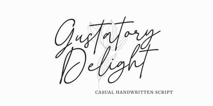 Gustatory Delight is a perfect handwritten script font that has a modern and authentic look, this font has a simple and unique character in both lowercase and uppercase, this font is perfect for branding, signature, logo, packaging, presentations, planners, resumes, business card, brochures, fashion, t-shirt, wedding invitations, yard signs and more.
 - Breathy Signature by Nathatype,
$29.00 Reveal your very best design result that makes everyone brainstorming easily with Breathy Signature. It's a versatile monoline signature font. The brushstrokes and curves style applied to the characters that resemblance to actual handwriting gives this font natural yet elegant feels. This font also easy to read and will look great in a variety of sizes. Features: Stylistic Sets Ligatures Swashes Numerals and Punctuations PUA Encoded It can be used for many design projects, such as poster, logo, book cover, branding, heading, printed product, merchandise, quotes, social media campaign, etc. Get more inspiration about how to use it by seeing the font preview. Thank you for purchasing our fonts. Please don’t hesitate to contact us, if you have any further question or issues. We’re happy to help. Happy Designing.
 - Milko by Jesse Tilley,
$12.00 670 Characters in this tiny font. It's small, it's clean and there are no gimmicks. This is as simple as a bitmap font gets.
 - Deco Multiline JNL by Jeff Levine,
$29.00 The 1934 Dick Powell-Ruby Keeler-Joan Blondell movie musical "Dames" gave us the classic song "I Only Have Eyes for You", but the sheet music for the song had the movie title hand lettered in a multi-line Art Deco sans serif design that just begged to be turned into a type font. From these few letters now comes Deco Multiline JNL, which is available in both regular and oblique versions.
 - Angleface by ArtyType,
$29.00 With initial thoughts of creating something tubular, I had in the back of my mind the kind of contemporary chrome furniture that became ubiquitous throughout the 60s and that concept remained with me throughout the development process. The font-styling idea worked out very well in this case, resulting in plenty of optional character variations for my chosen theme, most of which are included in both styles of light and bold character sets.
 - Egyptian Hieroglyphics – Deities by Deniart Systems,
$30.00 Give your documents a sense of history. The study of the ancient Egyptian Hieroglyphics has been an ongoing fascination by scholars and Egyptology buffs for literally centuries. The discovery of the Rosetta stone in 1799 provided an incredible breakthrough in deciphering the hieroglyphs, however there continues to be conflicting opinions on the literal translation of both the phonetic and ideographic symbols. As such, the interpretation provided in this manual represents an assembly of the most popular transcriptions. This series contains 62 assorted gods and deities as well as a few well known kings or pharaoh's from the New Dynasty. It is important to note that most of the gods and deities were represented in many different forms throughout the centuries and regions of Ancient Egypt, and these are but some of these representations. NOTE: this font comes with an interpretation guide in pdf format.


