10,000 search results
(0.038 seconds)
- Bandera Pro by AndrijType,
$45.00 This square serif typeface is a real workhorse. It is a modern tool for text design: extremely legible, pan-european multilingual (Latin, Greek and Cyrillic), well shaped. Bandera Pro has six weights with original italics, alternatives, small capitals and three sets of digits. It catches attention in headlines of posters and magazines or makes reading comfortable in plain texts. Bandera Pro shares main proportions with sans serif Osnova Pro typefamily so ideally can pair it. Bandera is Spanish for ‘flag’. And Bandera is a symbol of Ukrainian fighting for freedom for many years.
 - Dulce by Latinotype,
$49.00 Dulce is a swash typeface with an elegant and romantic touch. It is thin, but it becomes thick where two terminals meet and it also has swelling at terminals. Its wide range of ligatures makes it a versatile typeface, suitable for headlines and short phrases. You will see all of these ligatures on the screen, enabling “standard ligatures” and “discretionary ligatures” options. Ornaments are also included, which can be very useful for designing. Dulce is ideal for magazines, logotypes, advertising, etc. Use it for whatever you want and enjoy!
 - Fiducia by Typogama,
$19.00 Inspired by the first Swiss banknotes, Fiducia is a four weight display typeface. Linked through a common theme, this family is a collection of four styles of typography, Serif, Modern, Slab and Sans. Connected through common vertical proportions, the styles can be combined and mixed to create diverse layouts. These four styles include a range of Opentype features, they all share a range of numerals and each weight equally features its own additional option, for example adding a titling style in the Serif weight or Small capitals in the Sans.
 - Le Havre Sketch by insigne,
$22.00 Le Havre Rough, a letterpress variant of Le Havre is 72% off for a limited time! Le Havre Sketch is a hand-sketched geometric sans serif. The family contains three weights. All members of the family include Sixty-four OpenType ligatures that add a realistic, natural effect and ensure that no two letters in a word repeat, oldstyle figures and small caps. Please see the sample brochure to see these features in action. Le Havre Sketch is an excellent choice when you need a fun and interesting sans-serif.
 - Cavita by Underground,
$29.00 Cavita typeface is a mix between both grotesque and calligraphic models: regulars have a rough grotesque spirit; while the italics where inspired in calligraphic gestures. All of these details are reinforced with an inverted modulation (horizontals strokes are thicker than usual). The italics seem to move away from the traditional concept of type system, but work very well along side. This typeface has very particular shapes and rhythm, it's different and identifiable from the rest, making it a very good option to use on every piece of design.
 - Pittsbrook by Fontdation,
$15.00 Pittsbrook Family, a pack of classic typefaces that inspired by the letters used in old advertisement and packagings. Its rigid shape gives you strong, sharp and blocky feelings, no curves were harmed in the making of these typefaces. Comes in three styles; Sans, Serif and Outline, all of them are consistently mouse-crafted characters, we spent a lot of attention to every details. Suits best for any classic/vintage design project, such as E-Sport logo, liquor/food label, packaging, headline, space-filler, logotype, typographic quote writings, etc.
 - LTC Goudy Sans by Lanston Type Co.,
$24.95 Goudy Sans Bold was originally designed by Fredric Goudy in 1922 as a less formal "gothic" and finished in 1929. The light was designed in 1930 and the Light Italic in 1931. Alternate letterforms are included in these three Goudy designs which are digitized true to their original design. In 2006, designer Colin Kahn drew "LTC Goudy Sans Regular" which is a medium weight version intended for text purposes. Kahn has also designed an experimental "LTC Goudy Sans Hairline" which has a skeletal almost mono-width stroke and results in a surprisingly elegant display face.
 - Psychophante by Kenn Munk,
$15.00Remember back in the day when medals where for The Beatles and foreign dictators only? No more! Psychophante is a 64 pixel medal-building dingbat. Make fresh pixly medals (like the 'I Really Like Your 'fro medal' and the 'Best Hotel Booker medal') for yourself and/or for friends who deserve them. Each medal is made up of three interchangable parts: - Uppercase consonants are the top of the medal. - Vowels are the middle. - Lowercase consonants are the dangly bit. Numerals are special characters, to be followed by a lowercase consonant - Jorge Jenks by Colllab Studio,
$14.00 "Hi there, thank you for passing by. Colllab Studio is here. We crafted best collection of typefaces in a variety of styles to keep you covered for any project that comes your way! If you are looking for a font that is perfect to make your designs look hip and fresh, go no further. Jorge Jenks has got it all. It’s simple, organic, versatile, and super modern – but not too futuristic. It will set you above the rest of the market. Jorge Jenks is an urban brush font reflecting the urban freedom and organic flow of city life. it has strokes that are made of multiple connected nodes and his forms are unique and imperfect. This makes him a great match for both display and text typography, as well as logo design. A Million Thanks www.colllabstudio.com
 - Mister Arigato by Colllab Studio,
$19.00 "Hi there, thank you for passing by. Colllab Studio here. We crafted best collection of typefaces in a variety of styles to keep you covered for any project that comes your way! Mister Arigato is a modern, unique calligraphy font inspired by traditional Japanese and Korean brush lettering. It gives you that little extra something you always been looking for. We do more than just type, we help you show how much you care in your most precious brand. This font is a great option for any project that involves sending letters as a decorative piece of artwork (attach it to a mug, or place on a greetings card), or for use for branding purposes(headline, logo, etc.). Though it is not double-width, the letters easily tailor to any word-spacing. A Million Thanks www.colllabstudio.com
 - Destroy by Meutuwah,
$12.00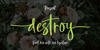 INTRODUCING Destroy Brush is handwritten font with a modern Brush feel. Destroy Brush is perfect for modern projects, headings, blogs, logos, brandings, web design, card, coffee shop, t-shirt, invitations and more! Programs that support in this font is a Microsoft Office Adobe Photo Shop, Adobe Illustrator, Adobe Indesign, and Corel Draw, badges etc. Thank You Font Lovers....!
 - Northell by Meutuwah,
$20.00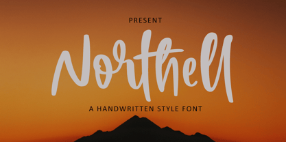 INTRODUCING Northell is handwritten font with a modern Brush feel. Northell is perfect for modern projects, headings, blogs, logos, brandings, web design, card, coffee shop, t-shirt, invitations and more! Programs that support in this font is a Microsoft Office Adobe Photo Shop, Adobe Illustrator, Adobe Indesign, and Corel Draw, badges etc. Thank You Font Lovers....!
 - Mountty by Meutuwah,
$20.00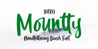 INTRODUCING Mountty is handwritten font with a modern Brush feel. Mountty is perfect for modern projects, headings, blogs, logos, brandings, web design, card, coffee shop, t-shirt, invitations and more! Programs that support in this font is a Microsoft Office Adobe Photo Shop, Adobe Illustrator, Adobe Indesign, and Corel Draw, badges etc. Thank You Font Lovers....!
 - Love Squall by Meutuwah,
$16.00 INTRODUCING Love Squall is handwritten font with a modern Brush feel. Love Squall is perfect for modern projects, headings, blogs, logos, brandings, web design, card, coffee shop, t-shirt, invitations and more! Programs that support in this font is a Microsoft Office Adobe Photo Shop, Adobe Illustrator, Adobe Indesign, and Corel Draw, badges etc. Thank You Font Lovers....!
 - Trek - Unknown license

- IM FELL FLOWERS 1 - Unknown license

- TOY_SOLDIERS - Personal use only

- KG Shadow of the Night - Personal use only

- exotica - Unknown license

- AddamsRegular - Unknown license

- SF Espionage Medium - Unknown license

- Distant Galaxy Condensed - Unknown license

- Christmas Card - Unknown license

- Bullpen 3D - Unknown license

- Joe Schmoe by Hanoded,
$15.00 Joe Shmoe is the regular guy, the one who doesn't attract too much attention, but is always there when you need him. So is Joe Shmoe font: it is an easy-going, regular, nothing fancy kinda font and it comes with all the accents!
 - Tipperary eText by Monotype,
$57.99Tipperary was designed by Steve Matteson and named for a favorite 'single track' bike trail, Tipperary is a monoline Humanist Sans Serif typeface. The clear, open, letter forms curve abruptly in an almost squarish geometry much like the sharp turns on the Tipperary trail. The clear, austere forms offer exceptional legibility for both interface designs and extended reading. Small size package labels and crisp branding programs benefit from Tipperary's emphasis on clean, readable design. eText typefaces are designed to meet the challenges of extended reading in digital environments such as mobile devices or desktop screens. Their forerunners are among the world's most popular and important book typefaces for print media. These classic designs were reinterpreted to conform to technological constraints of LCD and e-Paper while retaining the properties of proportion and form which made them favorites for print. - Brda by Linotype,
$29.99Brda originally designed by the Polish designer Franciszek Otto for the Powiat weekly newspaper. Powiat needed a new, dynamically drawn sans serif for its headlines, and Otto's Brda fit the bill. Combining traditional Grotesk letterforms with witty subtleties, like the notched-joint seen in the capital G, Brda displays a novel design that works best when set large. The typeface is named after the Brda river, which runs through Bydgoszcz, Poland, the city where Powiat is published. The Brda family includes three weights, each with a companion italic: Regular, Bold, and Extra Bold. The Brda family's Extra Bold weight was one of the winners selected in the 2003 International Type Design Contest, sponsored by Linotype GmbH. Franciszek Otto also teaches graphic design at the Secondary Art School in Bydgoszcz, where his typefaces rank among the students' favorites. - Snow Atisen by Differentialtype,
$10.00 Snow Atisen is a festive and fun handwritten font. Perfect for adding a touch of holiday magic to Christmas cards, New Year's decorations, winter designs and other fun projects. Comes with 3 styles that you can mix and match. This font has the potential to become your favorite font of choice, whatever the occasion, spread the joy of the season with this unique font.
 - SF News by Sultan Fonts,
$19.99 About this font family: News - Dedicated to writing a news text in newspapers, magazines, road boards, book , TV and other printing products, and web pages. The News font contains 3 styles (regular, Medium and bold) The font includes a matching Latin design and support for Arabic, Persian, Kurdish, and Urdu. Language families: Arabic, Persian, Kurdish, Urdu, Latin Designer: Sultan Maqtari Design date: 2021 Publisher: Sultan Fonts
 - Lust Pro by Positype,
$50.00 Confident and versatile, Lust Pro™ is an exercise in indulgence—an attempt to create something over the top and vastly useful. If Lust Pro seems both new and familiar, that’s because it is. The series unapologetically channels Herb Lubalin, but produced with a deliberate, contemporary twist. There is an intentional slyness infused in the letterforms—the extreme thick and thin lines flow effortlessly without becoming gratuitous. It’s always just enough, not too much. What makes the type series so appealing? The curves. When asked to describe the letterforms, most people unwittingly allude to the human form, using adjectives usually reserved for describing physical traits… creating all-too-familiar comparisons. Summerour has grown to accept this as unavoidable and reasonable given his acknowledgement of its influences and has provided nuances within the letterforms to accentuate that. Intended to be set large, the typeface boasts 3 widths and 5 weights and matching italics for both the Regular and Didone variants (that’s 60 fonts in total), making it perfect for editorial use and a highly flexible solution for any display need.
 - Lust Pro Didone by Positype,
$50.00 Confident and versatile, Lust Pro™ is an exercise in indulgence—an attempt to create something over the top and vastly useful. If Lust Pro seems both new and familiar, that’s because it is. The series unapologetically channels Herb Lubalin, but produced with a deliberate, contemporary twist. There is an intentional slyness infused in the letterforms—the extreme thick and thin lines flow effortlessly without becoming gratuitous. It’s always just enough, not too much. What makes the type series so appealing? The curves. When asked to describe the letterforms, most people unwittingly allude to the human form, using adjectives usually reserved for describing physical traits… creating all-too-familiar comparisons. Summerour has grown to accept this as unavoidable and reasonable given his acknowledgement of its influences and has provided nuances within the letterforms to accentuate that. Intended to be set large, the typeface boasts 3 widths and 5 weights and matching italics for both the Regular and Didone variants (that’s 60 fonts in total), making it perfect for editorial use and a highly flexible solution for any display need.
 - Outr by Outerend,
$20.00 The fonts "Outr" were created with the concept of typography in motion. These display fonts look unique as movie titles, TV show logos, game titles, and many other products, especially with edgy and tech designs on screens. These are more suitable for and work very well in 2D and 3D motion graphics.
 - Peloric by TanveerType,
$8.00 Introducing fresh PELORIC sans serif typeface which is well crafted for the classic and modern outlook. It can be read easily from a small size to a large size. Feeling fresh & trendy with it’s distinctive visual. It is well suited for branding, website & mobile layout and many more. It can also be used for branding materials, business cards, social media, packaging, prints, quotes & posters, etc. It comes up with 12 different weights as thin, thin italic, light, light italic, regular, italic, medium, medium italic, bold, bold italic, inline & inline italic. So, if you are looking for a new stylish and unique font, then here is the best font just designed for you and supporting any operating system and platform.
 - Claire News by Monotype,
$29.99Claire News is a clear choice for text, especially for newspapers and books. The Claire News font family has a resemblance to New Clarendon but there is a greater contrast in strokes and serifs have more defined brackets. - Sister Frisky by Chank,
$99.00 Sister Frisky jumps up and down and drinks a lot of coffee. There are no two parallel lines in this font, and no right angles. Here's a flashy, dancing, retro script with an sharp edge and clear wit!
 - Digital Stitch by 2D Typo,
$28.00 Digital Stitch is the embroidery of digital era. This font is a blend of pixel stylization of traditional cross-stitch embroidery and stylization of printed circuit boards. There is a big collection of ornaments in the symbols set.
 - Yana by Laura Worthington,
$49.00 Yana is classy and confident. Its classical proportions convey worldly sophistication and experience. Designed as a versatile font for everything from text use to headlines and titling, you’ll find yourself using Yana in project after project. Yana is available in regular, bold, and italic variants, and includes two sets of swash capitals, each available in standard sizes, small caps, and mid-sized petite caps, ideal for adding beautiful, properly scaled flourishes to the middle or end of wordmarks. See what’s included! http://bit.ly/2bOpVXA These fonts have been specially coded for access of all the swashes, alternates and ornaments without the need for professional design software! Info and instructions here: http://lauraworthingtontype.com/faqs/
 - Hummingbird by Laura Worthington,
$39.00 Hummingbird is reminiscent of old-fashioned cursive penmanship found in treasured letters bundled together by silken ribbons or in worn leather-bound ledgers. Hummingbird is graced with an impressive number of contextual alternates (214!) that bring a flowing randomness to the typeface, creating a more natural handwritten appearance. The font also has 266 swashes including an entire set of decorated uppercase letters that add personality, emphasis, and beauty. See what’s included! http://bit.ly/2cdVw4d *NOTE* Basic versions DO NOT include swashes, alternates or ornaments These fonts have been specially coded for access of all the swashes, alternates and ornaments without the need for professional design software! Info and instructions here: http://lauraworthingtontype.com/faqs/
 - Speeday by deFharo,
$24.00 Speeday is a Display and Sans Serif typeface family, slanted at 23 ° with a rounded finish, with 3 styles, Regular, Bold and Small Caps that include 9 sets of numbers, 3 sets of uppercase and alternate letters, as well as advanced Open functions Type. Thick typography with a contemporary appearance that brings great dynamism to the texts written with it, its use in graphic, editorial and advertising design guarantees originality, difference and maximum readability, the kerning has been carefully configured in all versions. See specimen in PDF
 - Moksha - 100% free


