10,000 search results
(0.059 seconds)
- OliJo - Unknown license

- Bandwidth Bandless BRK - Unknown license

- Corporate - Unknown license

- Tenby Five - Unknown license

- HVD Poster - Unknown license

- Berlin Email - 100% free

- Hypherin by ahweproject,
$9.00 Hypherin is a gorgeous and bold handwritten font, crafted to give your headlines and logotype projects a stylish touch. This font reads as strong, confident, and dynamic and can add tons of nostalgic character to your designs. Hypherin is PUA encoded which means you can access all of the beautiful glyphs and swashes with ease!
 - Hudsson Romano by Letterafandi Studio,
$16.00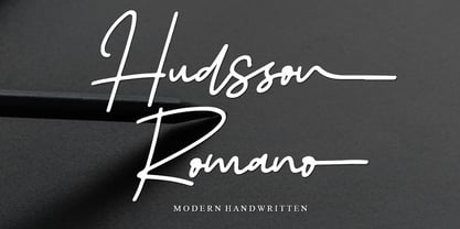 Hudsson Romano is a simple and quirky looking Signature handwritten font. It has a classy, elegant, and modern look that you can use for logos, branding, invitations, stationery, wedding designs, social media posts, and much more! This font is PUA encoded, which means you can access all of the glyphs and swashes with ease!
 - Creamer by Creativework Studio,
$14.00 Creamer is a gorgeous and bold handwritten font, crafted to give your headlines and logotype projects a stylish touch. This font reads as strong, confident, and dynamic and can add tons of nostalgic character to your designs. Creamer is PUA encoded which means you can access all of the glyphs and swashes with ease.
 - Surfinta Mars - Unknown license

- Univers Next Paneuropean by Linotype,
$89.00 Linotype Univers is a completely reworked version of the original Univers Univers typeface family designed by Adrian Frutiger in 1957. After a long process of painstakingly detailed revision, Frutiger and the design staff at Linotype completed this large joint project in 1997. The result: a brilliant and cohesive font family of 63 weights and styles including the 4 monospaced typewriter weights. All the existing weights were completely redrawn, with careful attention paid to making the proportions more consistent with each other and improving fine details such as curves and thick-to-thin stroke ratios. The family was expanded from 27 to 63 weights, providing a much larger framework to graphic designers for choosing just the right style. The bold and condensed weights were reworked for improved legibility and on-screen application. The stroke weights were revised for consistency within each face as well as in relationship to the other weights. By following Frutiger's original designs, the humanist character of the sans serif Univers now comes through more distinctly. T he systemized numbering system has also been updated. With its sturdy, clean forms Univers can facilitate an expression of cool elegance and rational competence. In fact, the strong familial relationships between all the styles and weights make it a serviceable choice for large graphic design projects that require versatility with consistency. Frutiger was successful in staying true to his initial aims; the new Linotype Univers does indeed work in longer texts as well as for display settings. In 2010 the typeface family was extended and renamed into a more logical naming of "Univers Next" to fit better in the Platinum Collection naming.
 - Simplo by Durotype,
$49.00 Simplo: the ‘Italian Futura’. Simplo is a geometric sans serif typeface, built in sixteen styles. It is a tribute to the 1930s typeface Semplicità, designed by Nebiolo’s Alessandro Butti. Although many details of Simplo differ from Semplicità, it preserves the spirit of the original. Simplo is ideal for use in display sizes. It is also quite legible in text, and is well suited for graphic design and corporate identity design. Simplo has sixteen styles, extensive language support, eight different kinds of figures, sophisticated OpenType features — so it’s ready for advanced typographic projects. The most notable characteristics of this typeface are the ‘t’ and the ‘f’. The ‘t’ is the culmination of simplicity: a vertical line with just a simple right-side crossbar. The ‘f’ also has just a right-side crossbar, and is really tall: it reaches both the highest and lowest vertical position of the typeface. The top of the distinctive ‘s’, is much narrower than its bottom. The ‘a’, ‘b’, ‘d’, ‘g’, ‘p’, ‘q’, and ‘u’ are spurless, and show a family resemblance with Hans Reichel’s 1990s typeface Dax. However, these letters are rounder and more geometric than Dax’s counterparts, because of Dax’s higher x-height and narrower design. In Paul Shaw’s Imprint article about typefaces that have been overlooked and/or underappreciated, “Overlooked Typefaces”, he concluded his discussion of Semplicità as follows: “These idiosyncrasies suggest that Semplicità might find a warm reception today, given the current love affair with Gotham, Neutraface and Proxima—and the resurgence of ITC Avant-Garde Gothic.” Free demo font available. For more information about Simplo, download the PDF Specimen Manual.
 - P22 Blox by P22 Type Foundry,
$24.95 P22 Blox is a modular system of shapes that can build letterforms and abstract patterns. Created as a working prototype for the letterpress P22 Blox project from P22 Analog and Starshaped Press, this system of shapes presents a unique approach to designing letterforms with a limited set of variables. Based on the American Type Founders 1944 modular metal type ornament system... you can have hours of fun building letters, patterns and more.
 - Bali Beach by Posterizer KG,
$19.00 Bali Beach is a script handwritten font with a casual, inky and modern look. You can use the alternates and ligatures to give your design a realistic, hand painted look. If you find a single repeating glyph, you can change that by toggling between Stylistic Alternates. There are Cyrillic glyphs and more then 150 playful Dingbats with inky texture. Bali Beach is the perfect choice for all natural and unconventional beautiful things.
 - Apple Peach by Jafar07,
$18.00 Apple Peach is a font that is designed cubby and childish but can also be easily used in the modern era who want to have a fat and smooth design that has a high level of legibility. The advantage of this font is that it can be used for various product designs according to your needs. What did you get? Regular font Uppercase & Lowercase Numbers & Punctuation Multilingual Support Works on PC & Mac Simple Installations
 - Oh Icons by Poważne Studio,
$19.00 Oh Icons is a family of 382 icons divided into three thematic sets. Each set contains 52 characters, plus alternate glyphs in Open Type Stylistic sets. Every icon can be used independently, but you can also merge them to design an adult or a baby figure, a nursery room or to dress a dog. Black backgrounds will let you colour your icons. Have fun and stay tuned for the new topics already in the works!
 - Pais by Latinotype,
$39.00 "País" is a contemporary and modern grotesque sans serif, inspired by the grotesques of the early 20th century, but more geometric and with a wider x-height than its referents; making it ideal for the current times. "País" comes in 2 versions, each with 9 weights, from thin to black, and matching italics, for a total of 36 fonts. The standard sans serif version is fresh, clean, and more ideally neutral. It's a perfect choice for editorial design, branding, headlines, or any other piece of graphic design. The "País Alt" version has more expressive and modern characters, with some giving it a much more playful image. It is ideal for logos, packaging, web and television use. País contains a total of 682 characters that make it possible to write in more than 200 Latin languages and basic Cyrillic.
 - Luzern by Gumpita Rahayu,
$- Inspired by the most common grotesque heights and boxed sans serif typefaces, Luzern Typefaces was built with low-mid contrast sans serif and was designed in quite tall caps height and lower x-height which represents the flavor of the dynamic typefaces and is subtle for the display typefaces. The typefaces comes with five weights, from light to extra bold, plus matching italics in each weights. And Luzern Typefaces is loaded with OpenType features such as some stylistic alternates in uppercase, case-sensitive forms, fractions, and another numerals features such as super and subscript characters, tabular figures, numerator-denominator, etc. It’s highly usable for display text titles such as editorial magazine headline, websites heading, poster, advertising, logo, also it works well for medium body text. It comes with more 400+ glyph support including more latin european diacritics language.
 - Kitchen Stink by Bogstav,
$15.00 Just like a nice breakfast, Kitchen Stink is a great way to start the day! :) You may already have guessed that the fontname is the result of a wordplay. Sometimes it's funny how a single letter can completely change the meaning of a word. In this case! With this font, you are dealing with a gentle mixture of a basic handwritten font, a comic font and oldschool grafitti! The result is this steady, sometimes a bit off, but legible crunchy handwritten font!
 - Slinces Heart by Nathatype,
$29.00 Slinces Heart is a captivating script font that captures the essence of handwriting with a touch of romance. Each letter in this font is meticulously crafted with fairly high line contrast, adding a dynamic and eye-catching quality to the font. The swinging endings in Slinces Heart add a flourish of creativity and uniqueness. With its smooth and flowing letterforms, this font offers a natural and seamless writing style. For the best legibility you can use this font in the bigger text sizes.
 - Surfoid by astroluxtype,
$20.00 Surfoid is a bold, soft, hazy, lazy and sleepy font-dude that is most happy under an umbrella at the beach holding a drink with an umbrella in the glass. It’s fun, fun, fun until daddy takes the T-Bird away because of the problems that too much fun creates. It’s a rounded off, a little blurry on the lazy edges and would never want to be a serif font. Serif is not the style of Surfoid. Dressed up and sophisticated, this font never wants to be in a suit and tie. Happy is to be in tie dye t-shirt…with its feet dug deep into the cool sand. This is a display headline font best seen at sizes greater than 36 points. It is a full glyph set with upper and lowercase forms. Very Stoked.
 - Flink by Identity Letters,
$25.00 The joy of pure geometry, revisited. Geometric typefaces are a staple in every typographer’s toolbox since the 1920s. It was a time when iconic faces such as Futura, Erbar, and Kabel appeared on the scene and turned the world of type upside-down. Inspired by those early giants as well as later epigones with a legacy of their own (such as 1970’s Avant Garde Gothic), Flink is the Identity Letters take on this genre, characterized by a clean and focused appearance. With neat shapes and the look of pure geometry, Flink adapts to a vast range of applications and topics, from the fine print in contract to website body copy to logo design to billboard-size slogans. Its x-height is considerably larger than in classic geometric sans-serif fonts; its proportions are harmonized as opposed to strictly constructed. This makes for a more contemporary look, setting it apart from the classics. To further reduce the rigidity of a purely geometric composition, you can replace some letters with more humanist alternates, such as a, g, j, etc. This font family comes along in 8 weights from Thin to Black. Each weight consists of an Upright and Italic version. There are more than 750 characters per style, including two stylistic sets that offer variations to the look and feel of Flink, making it even more versatile. Plenty of additional Open Type Features like ligatures, case sensitive forms, old-style figures, and symbols make Flink a valuable tool for the discerning typographer. Flink is the reimagination of a classic genre, designed to suit the needs of our time. ––––– Please note: There is an upgraded Version available: Flink Neue
 - SURROUNDED large - Unknown license

- Lougra by Creativemedialab,
$22.00 Monograms or connected letters are very popular; apart from looking elegant, the monogram will also present an impression that sticks in the eyes of the audience. Lougra has more than 100 monograms or ligatures, making designing an initial or logo easier. Lougra is elegant and minimal modern sans serif. It has three contrast options which are display, regular and text.
 - Kuro by The Northern Block,
$- Kuro is a precisely rendered sans-serif type family. Modern geometric forms combined with subtle detailing create a charming, straightforward and versatile design. The lighter weights bring a contemporary touch to body copy while the bold weights add the strength of character to branding, identity and packaging. Details include eight weights, over 450 characters, manually edited kerning and Opentype features.
 - General by Juraj Chrastina,
$29.00 It's all about these subtle nuances that make a neutral sans typeface different. Pure geometry with a human touch is a recipe that works in every generation. Inspired by classical fonts from the early 20th century, General rides the line between traditional and modern styles. With its 5 light weights, the General family is a strong tool for a clean design.
 - Anori by Océane Moutot,
$29.90 Anori is a playful sans serif. Inspired by handwriting and the playfulness of the italic sharp, Anori is a dynamic, high contrast and smooth typeface. It will bring originality to your designs and the large variety of glyphs will give you freedom for all of your projects. Anori is available in 10 styles, from light to black, in roman and italic.
 - Brodaers by Trustha,
$17.00 Brodaers is a display sans serif font. With the initial concept of the inner shape, made round. Comes in six styles, which makes it easier for the project you are working on, as well as alternative glyphs as an attractive option. It comes with 400+ glyphs, which also includes multilingual languages. Brodaers is perfect for headlines, branding, and many more.
 - Adequate by K-Type,
$20.00 ADEQUATE is a basic geometric sans serif typeface comprising 6 weights plus a free italic with each. The family has modern, workaday letterforms with a tall x-height for clarity and legibility. Adequate does the job; it doesn't claim to be beautiful and lacks the fashionable mannerisms of many contemporary faces, but there is something timeless, perhaps elegant, about its mathematical simplicity.
 - ABTS milk by Albatross,
$19.00 ABTS milk is fresh and fun script typeface with a unique blend of masculine, feminine, slab, serif, and sans-serif characteristics. The combination creates endless possibilities for different applications and breathes more personality into the typeface itself. With 384 glyphs, ABTS milk covers a wide range of languages and dialects, and also includes symbols, as seen in the gallery images.
 - Chaos by Zenmurai,
$20.00 Chaos is a caps only modern sans with a geometric and futuristic style touch inspired by “Blade Runner” , “Cyberpunk 2077” , “Ghost In The Shell” and Futuristic UI & Transistor. The difficulty in make Chaos typeface is achieve balance between simplicity and complexity.This font is an exploration of Sci-Fi movies & Futuristic User Interface, using the visual language narratives to catalyze new styles and perception.
 - Likely by Adam Ladd,
$25.00 Likely is a joyful, brush script type family with complementary sans and extras styles. Hand drawn freely but carefully, each font is designed to work together to present a vibrant and natural package. Layer and colorize the free Counter styles to easily enhance the color palette or use the over 170 matching catchwords and shapes to make your designs even more fun!
 - Antipasto Pro by Zetafonts,
$39.00 Antipasto is a geometric sans serif font designed by Cosimo Lorenzo Pancini. The original family of three weights has been revised and expanded in 2017 with Antipasto Pro that now includes cyrillic and greek characters, open type features (small caps and old style numerals), six new weights from the hairline to the extrabold and an icons set in 8 weights.
 - Flounder by Dominik Krotscheck,
$6.50 The Flounder is a simple and clean condensed all-caps sans serif font. It is a close relative of the Floz, but has rounded edges and a wider range of glyphs. Furthermore it is equipped with a bunch of ligatures, as well as alternates for the letters j, w, q and z. It comes in three weights with their respective italics.
 - Brookside JNL by Jeff Levine,
$29.00 The 1920s were part of an era in songwriting where snappy wordplay and clever (if not long) titles prevailed. The lettering on one such piece of sheet music with the song title "In A Shady Nook by A Babbling Brook" offered up a bold, condensed sans serif design which is now available digitally as Brookside JNL. Available in both regular and oblique versions.
 - Churchward Isabella by BluHead Studio,
$25.00 Churchward Isabella is a five weight typeface family originally designed during the 1980's by the late type designer Joseph Churchward, from New Zealand. A straightforward, geometric sans serif, it is a no-nonsense, highly legible workhorse design, readable on screen as well as in print, for text, headline and display. The family includes Light, Regular, Medium, Bold and Extra Bold.
 - DokChampa by Microsoft Corporation,
$49.00DokChampa is a Lao font based on the Arial typeface. DokChampa was created by the Monotype Type Drawing Office to support Lao and Thai scripts. The DokChampa font is a legible sans serif that is good for use on screen and in printed documents. DokChampa is a Lao script font and requires an application program that supports Lao or Thai scripts. - Scenarie by Genetype,
$16.00 Introducing Scenarie Display Typeface: Streamlined Elegance Redefined Unveil the art of sophistication with Scenarie Display – a condensed sans serif font meticulously designed to streamline your designs. From sleek logos to space-efficient layouts, Scenarie Display offers a modern and refined touch. Embrace the power of condensed typography Enjoy the font, feel free to comment or feedback, send me PM or email. Thank you!
 - Springsteel by Paragraph,
$21.00 Introducing Springsteel, a new display sans serif with an unusual construction: curved lines on the outside with only a few straight lines on the inside. The resulting typeface shows a great deal of tension and dynamics. Preferably, it should be used at larger sizes, at smaller sizes only for special effects. It was spaced and kerned by Igino Marini/iKern.
 - Pelita by Lafontype,
$25.00 Pelita is a sans serif family which is divided into 2 sub-families, Regular and Grande. Pelita is designed with a terminal that forms a curved angle on one side so as to give the impression of representing firmness and softness. The grande version is a modified version of the main version, but is designed more streamlined with curves and more extreme angles.


