10,000 search results
(0.073 seconds)
- Gabilo Script by Sulthan Studio,
$14.00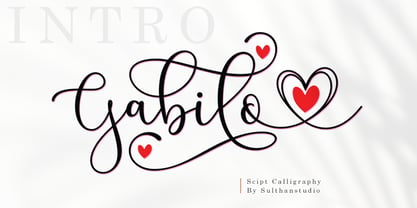 Gabilo Script font with a smooth, handwritten style. Gabilo script is perfect for branding projects, homeware design, product packaging, use in business cards, invitation cards, etc. Simply as a stylish text overlay onto a background image or anything that requires a touch of elegance. also comes with heart swashes that can be spliced.
 - Scrivano by Outras Fontes,
$19.95 The Scrivano family was designed by Ricardo Esteves Gomes, inspired by some handwritings from the Middle Ages and Renaissance period. There are four elegant organic font styles (Regular, Italic, Bold & Bold Italic) that can be very useful to compose long or short texts in graphic standards that need some 'old style' feeling.
 - Labyrinthus Rounded by Cerri Antonio,
$30.00 Labyrinthus Rounded is a multiline decorative font that works very well for identity logos, posters and 3D-works. It continues the tradition of the precedent Labyrinthus but with a softer rounded impact. It's interesting to note that with it it's possible to play with the multiline concept to create endless overlapping geometric creations.
 - Allabbad by Abjad,
$5.00 Allabbad typeface was inspired by one of the hand letterings that belong to the godfather of Arab graphic design, Mohieddine Allabbad. The typeface is part of the Arsheef Alkhatt Project, a platform that revives and tributes classical Arabic lettering from different resources and presents them as affordable, digital fonts for independent designers.
 - Ready Kid by Flying Fuzzball,
$22.00 Ready Kid is a versatile, funky display typeface that is inspired by freehand signpainting with a dose of childhood nostalgia. It's perfect for children's birthday party invitations, punk band marketing, or packaging for art supplies. There are six sets of stylistic alternatives, 340+ ligatures, and 1200+ glyphs that cover over 200 languages.
 - Reaver - Personal use only

- Soft Serve by Sentinel Type,
$24.90Looking like happy frosting on a cupcake at a twiddle bug party, this bouncy food entry from Canadian designer Haley Fiege turns the original Jellybrush type into organic happiness you can spread on pancakes, ice-cream, sorbets, sauces and condements, oh peanut butter! Yeah, all kinds of sandwich fillings. Anything really. What else? People who own rubber factories. Anybody in the food business, like green grocers or your local bakery. Thrift stores. Falling somewhere between cushions and cat food, this flexible and inviting letter mixes simplicity with organic character and humor for a wide range of uses. Soft Serve’s compact cursive forms and bouncy friendliness draw on artbrush scripts and the typo-italic model of Renaissance Vatican scribe Ludovico Arrighi. A versatile workhorse ideal for: * Dairy & beverage * Sweets & soft drink * Five minute food & sauces * Pet food & accessories * Bathroom & kitchen * Cushions, pillows, rubber & swimming pool, etc. - Sunchilla by Hydric Design,
$8.00 Hi there! Hydric Design proudly present the Sunchilla Script font, inspired by The Day of the Dead is a Mexican holiday celebrated throughout Mexico, in particular the Central and South regions, and by people of Mexican heritage elsewhere called "Dia De Muertos" design with a touch of Sweet, Unique and Fun style. Sunnchilla Script font is made in a handwriting style so it is suitable for use in product design and display titles. Sunchilla Script font are included in the display font category so can be used for any designs that have a cheerful, elegant and sweet impression. and also will be very suitable when used on titles, logos, product posters, websites, menu books, books, and many designs that can be explored using document fonts. it will looks very beautiful because it will easy to remember and very easy to use.
 - Messenger by Canada Type,
$29.95 Messenger is a redux of two mid-1970s Markus Low designs: Markus Roman, an upright calligraphic face, and Ingrid, a popular typositor-era script. Through the original film faces were a couple of years apart and carried different names, they essentially had the same kind of Roman/Italic relationship two members of the same typeface family would have. The forms of both faces were reworked and updated to fit in the Ingrid mold, which is the truer-to-calligraphy one. The Messenger package is comprised of two interchangeable fonts that support Western, Eastern and Central European languages, as well as Baltic, Celtic/Welsh and Esperanto. Messenger Pro is a single OpenType font that contains the characters of both Messenger and Messenger Alt, linked by programmed features for stylistic alternates, automatic f-ligatures and class-based kerning.
 - Matchmaker by Angie Makes,
$30.00 Matchmaker, a modern calligraphy typeface, was inspired by the various works of modern day calligraphers. Its tall, quirky, and juxtaposed letterforms provide a deviation from traditional calligraphy-inspired typefaces. Matchmaker features smart contextual alternates and swashes that add to the front and beginnings of letters (using lowercase letters, enter === before the word then +++ after the word to see the feature in action). Also watch as letters on the end of words magically receive a shortened tail. This font works best in OpenType aware software so that you can take advantage of its many tricks and features. Comes as an .otf (OpenType font) file. Here is a great article on open type aware software: http://www.myfonts.com/info/opentype-support-in-applications/ Chocked full of swashes, alternates, and ordinals, Matchmaker just might be the perfect match for your next project.
 - Charliez Script by Cooldesignlab,
$10.00 Charliez Script is a modern handwritting script. I hope you are interested in this font, if you want to use it for your work, this font can be used easily and simply because there are many features in it containing a full set of letters small and large, various kinds of punctuation, numbers, and multilingual support. The font also contains several alternative styles and stylisticsSets for those of you who have software that is able to work OpenType (Photoshop / Illustrator / InDesign). Charliez Script is suitable for market designs that are currently being developed, this font has a trendy, natural and soft model, with this font you can take advantage of opportunities at every moment in one extraordinary way to highlight your party celebrations. This font has provided PUA unicode (special code font). if you have a problem? Contact me: Cooldesignlab@gmail.com
 - Heinyta by RGB Studio,
$19.00 Proudly Present a new font called Heinyta inspired by urban script fonts with sharp and beautiful letters that create fonts that are modern, trendy and elegant. Heinyta is a font intended for logotype creation. But with almost 500 glyphs inside the font, you can also create many of other typography designs. Stylistic Alternates, Swashes, Contectual Alternate and Ligatures is a list of features from OpenType which you can use to pairing the letters each other powerfully. Heinyta came with opentype features such stylistic alternates, stylistic sets & ligatures good for logotype, poster, badge, book cover, tshirt design, packaging and any more. Files Include : Basic Latin A-Z and a-z Numbers Symbols PUA Encode Multi-language Support Thanks and have a wonderful day, If you have any questions, please get in touch with us Don't forget to check out our other products.
 - Scissor Madness by Hanoded,
$15.00 Back in 2017, I was working on a cutout font that I originally wanted to call Scissor Madness. In the end, I named it Cut Along and it was quite a popular font for a while. This week I decided to clean up my fonts folder a bit (as I usually have tons of unfinished fonts lurking in there) and I found a file named Scissor Madness. It was the original try-out for Cut Along. It contained a couple of nice glyphs that I never used, so I started playing around with them and after a day, I had a whole new font! So, in short, Scissor Madness was partly cut out by hand, partly computer made, but it is 100% fun to use! Scissor Madness comes with a bunch of very cute discretionary ligatures.
 - Braton Composer by Alit Design,
$14.00 After releasing the Rumble Brave font with a vintage elegant style successful in the market. Now we are launching a vintage font that is plump, looks fat, strong, heavy but still elegant and unique. "Braton Composer typeface" falls into the bold serif font category, but it also has italic options. This impression is perfect for design that has a firm and elegant concept. Braton Composer typeface is very worthy of your collection, because Braton Composer is very unique when combined with swash and alternative of the character options. In addition to "Braton Composer Regular" also has 2 other styles, namely "Braton Composer Rough"and "Braton Composor Stamp Rough". Braton Composer Typeface is perfect for beverage label design project. coffee label. logotype design, badges, classic wedding concept. victorian design concept and so on. gig poster, letterhead, droop cap, titles, and any artworks.
 - Layfort by Identity Letters,
$29.00 What do you get when you cross Industrial Revolution with Art Déco? The raw force of steam-powered vessels with the panache of dashing streamliners? A sturdy industrial grotesque with a swanky stylized sans? We don't know, but our Layfort is a strong contender. It's a contrasted sans-serif typeface with old-style proportions: varying letter widths create a more vivid texture than your usual contemporary sans, and the true italics are narrower than the uprights. Layfort is elegant enough for fashion, art, and luxury; yet sufficiently sincere for serious business. And at 16 styles & 750 glyphs, it's ready for complex typographic demands (try the round dots at SS09). Let your designs fly!
 - Expline Variable by Formatype Foundry,
$140.00 Expline typeface finds its roots in modernist design but subtly pays homage to early Modern Industrial Grotesks. This fusion creates a font that encapsulates the essence of tradition while embracing the contemporary. The font incorporates sharp details in select characters and curves, imparting a delicate sweetness while preserving the robust character associated with Grotesk fonts. This unique blend allows Expline to strike a perfect balance between display and text usage, making it a versatile choice for a variety of design projects. Expline's flexibility shines through its extensive weight options. The font family offers eight distinct weights, each thoughtfully crafted to establish a clear typographic hierarchy. Designers can easily choose the right weight to suit the specific needs of their projects, whether it's a bold headline or a refined body text. This variety ensures that your typography will always make the right visual impact. Expline typeface doesn't stop at weights. It provides expansive character sets across each weight, encompassing all Western European diacritics, Punctuation, Mathematics, and Numerics. This ensures that your typography will seamlessly support various languages and punctuation marks, making it a global choice. In addition, the font boasts OpenType features, granting the flexibility to explore multiple subsets. This includes alternate capital letterforms, tabular and lining numerals (both proportional and old-style), enabling endless typographic possibilities. Whether you're designing for print or web, these features allow you to fine-tune your typography for a perfect fit. Expline is a font that bridges the gap between modernist design principles and early industrial influences, resulting in a Neo-Grotesk font with a contemporary twist. Its comprehensive weight options, expansive character sets, and OpenType features make it a versatile choice for any medium between print and screen.
 - Expline by Formatype Foundry,
$39.00 Expline typeface finds its roots in modernist design but subtly pays homage to early Modern Industrial Grotesks. This fusion creates a font that encapsulates the essence of tradition while embracing the contemporary. The font incorporates sharp details in select characters and curves, imparting a delicate sweetness while preserving the robust character associated with grotesk fonts. This unique blend allows Expline to strike a perfect balance between display and text usage, making it a versatile choice for a variety of design projects. Expline's flexibility shines through its extensive weight options. The font family offers eight distinct weights, each thoughtfully crafted to establish a clear typographic hierarchy. Designers can easily choose the right weight to suit the specific needs of their projects, whether it's a bold headline or a refined body text. This variety ensures that your typography will always make the right visual impact. Expline typeface doesn't stop at weights. It provides expansive character sets across each weight, encompassing all Western European diacritics, Punctuation, Mathematics, and Numerics. This ensures that your typography will seamlessly support various languages and punctuation marks, making it a global choice. In addition, the font boasts OpenType features, granting the flexibility to explore multiple subsets. This includes alternate capital letterforms, tabular and lining numerals (both proportional and old-style), enabling endless typographic possibilities. Whether you're designing for print or web, these features allow you to fine-tune your typography for a perfect fit. Expline is a font that bridges the gap between modernist design principles and early industrial influences, resulting in a Neo-Grotesk font with a contemporary twist. Its comprehensive weight options, expansive character sets, and OpenType features make it a versatile choice for any medium between print and screen.
 - Skill by Lián Types,
$49.00 DESCRIPTION With Skill I wanted to create something wild. Something that splashed the letters with life. To do this, I knew I'd have to break the barrier between analog and digital, so I took my best brush and started to play. Throughout the years as a type-designer I've met and become fan of many calligraphers. My belief that only a good calligrapher can make good typography (1) has become even stronger. I'm now absolutely sure that only practice improves the skill, especially in this field. So, with this in mind, I started a font which was a challenge for me because sometimes the gap between paper and screen can be gigantic. Skill is another of my attemps (2) to capture the spirit of the pointed brush, its expressiveness, the passions and fears of the artist. This font is about freedom. Freedom everywhere. Movement, velocity, passion. To achieve this, many alternates and ligatures per glyph were designed. Use it on magazines, posters, book covers, music albums, t-shirts, skates, tattoos. NOTES (1) This is mostly referred to script fonts, though text fonts made by designers with a deep calligraphic background have at least to me, an extra charm. (2) See my fonts Live and Indie. TIPS Thanks to Open-Type, the font gives the user the chance to play and get many wonderful results: In example, using the font with “discretionary ligatures” activated will give more life to the written word. Some letters will jump of the base, while others will ligate or not with the following (typical of gestural calligraphy). Adobe Illustrator is recommended. STYLES Skill is the most complete style. It has all the alternates and ligatures that can be seen in the posters and more! Skill Standard is a variant with no decorative glyphs. It has the basic alphabet and some ligatures for better legibility.
 - CoffeeBreak by Andinistas,
$36.00 The coffee made typography. CoffeeBreak is a typefamily designed by Carlos Fabian Camargo G. Its purpose is to communicate similar feelings to the ones you get when you first try the best roasted Colombian coffee early in the morning. That is the reason of the waiting, accompanied, or when you only want to be, nuances your design with its fonts full of flavor, texture and passion. For each time, every time, it gives you hints of flavor to design your day. It unleashes your artistic streak mixing possibilities as you wish, to your taste or the taste of your friends or that special someone. From handwriting to every warm drop of your first mug of the morning, we've always got something for you. Eye catching, modern, beautiful, cool and adventurous styles in the CoffeeBrwak shop ready for you to purchase. - CoffeeBreak A & B: 2 typographic tools with countless swashes and ligatures ideal for use at the beginning, in the middle or end of words that need italics, flavored dancers and rhythm masterfully expressed in gestural strokes for his calligraphic experimental logic. - Coffee Break Script 1 & 2: write them you can easily with decorative letters advocating a return to the artisan product ingenuity of the primacy of man over machine so your upper and lower case letters travel in a single line. - CoffeeBreak Words & WordsBold: It contains words specially designed to attract attention. - CoffeeBreak Dingbats: They are figurative silhouettes with textures that add warmth and a highly communicative environment. All are easily activated glyphs using the Glyphs panel in Illustrator, InDesign and Photoshop. Special thanks: Ilustrations: Eduardo Gomes. Photos: Karen Salvatierra. Texts: Javier Lineares- Description: Ernesto Googolplex. French translation: Marta Cano
 - ITC Sportbet by ITC,
$40.99Looking for something new for setting powerful headlines? Need a font that can create logos with ease? How about something masculine, a design with authority and panache? Then ITC’s newest typeface, ITC Sportbet™, may be the perfect choice. ITC Sportbet is a design that should be set tight, creating an arresting graphic image as well as words. Although a capital-only typeface, it benefits from a large suite of alternate characters that enable individual words and headlines to be customized with a distinctive personality. In addition to the obvious power of ITC Sportbet’s square-jawed character shapes, it’s fun to use. Exchange one or two letters with their alternative designs and a brand new headline or logo appears. ITC Sportbet was designed by Dane Wilson, the principal of the London-based design firm of Dane Design. Although this is his first commercial typeface design, Wilson has ample experience creating logos and custom typefaces for corporate branding. In fact, Sportbet grew out of such a project. “The idea initially came from wanting to provide a client with a stylish, modern and graphically impactful corporate identity logo font,” recalls Wilson. “Although the first sketches looked promising as a typeface, because of time and budget constraints, developing an entire alphabet would be overambitious.” Not to be deterred, Wilson continued to work on the design when time permitted. He eventually completed the font and started final application tests. The results looked good to Wilson, but he felt that the design was missing something. “I hit upon the idea of breaking out the left side of all the closed counters,” Wilson wrote about the design. “This simple device gave Sportbet the kick it needed.” Although one weight and a capital-only typeface, Wilson’s ITC Sportbet should prove to be a powerful and versatile communicator. - Gambler by Fenotype,
$25.00 Gambler is a characteristic display type collection of 7 font styles with both clean and textured -making it total 14 fonts designed to play together. Gambler strikes with witty and elegant appeal combining vintage and modern elements. Gambler is an effective set for creating identities for branding, posters, book covers, headlines, logotypes, prints on garments, restaurant menus, beer labels and so on, both offline and online. Gambler Script is a smooth contrasted script that comes in two weights and it is packed with plenty of OpenType features: Standard Ligatures and Contextual Alternates are automatically on and they help to keep the flow and connections smooth. From Stylistic Alternates you’ll find characters with pointed endings and some other small variations. For extra flair try Swash or Titling Alternates. Gambler Script is PUA encoded so you can access the extra characters in most graphic design softwares. Gambler Brush is a soft brush script with low contrast and large x-height. Gambler Brush comes with following OpenType features: Standard Ligatures and Contextual Alternates that are automatically on and that keep the connections smooth. For less uneven word picture try Stylistic or Swash Alternates. Gambler Brush is PUA encoded so you can access the extra characters in most graphic design softwares. Gambler Flare is a flared serif with sharp edges and wide characters Gambler Flare comes in two weights. Gambler Gothic is a rigid condensed sans serif that comes in two styles: Regular and Shadow. Gambler Gothic Shadow has a narrow lining giving a three dimensional expression to the font. Gambler fonts are designed to play together, in pairs, or all together but they also work great as themselves or combined with other Fenotype Fonts.
 - Folklore by Ahmad Jamaludin,
$15.00 Just in time for your Halloween projects hopefully :) Say hello to Folklore! A font that's all about spooky, ghoulish fun! With its charming all caps style and built-in speckly texture, Folklore brings a touch of whimsy to your creative projects. Plus, we've included an Outline version of the font as a little bonus. What's Included? Folklore Main File Regular and Outline version Instructions (Access special characters, even in Cricut Design) Unique Letterforms Works on PC & Mac Simple Installations Accessible in Adobe Illustrator, Adobe Photoshop, Microsoft Word even Canva! PUA Encoded Characters. Fully accessible without additional design software. Multilingual Supports: (Afrikaans, Albanian, Catalan, Croatian, Czech, Danish, Dutch, English, Estonian, Finnish, French, German, Hungarian, Icelandic, Italian, Lithuanian, Maltese, Norwegian, Polish, Portuguese, Slovenian, Spanish, Swedish, Turkish, Zulu) Thank you, Dharmas Studio
 - LHF Saratoga Panels 4 by Letterhead Fonts,
$53.00The final collection in the series of 4 fonts. Each font contains 37 expertly drawn panels. All you have to do is add your own text and color for a quick and easy design. All 37 of these panels are exclusive to Letterhead Fonts. Typing each letter generates a different panel. Special Note: Due to the large file size of these fonts, they will not convert for use in Gerber Omega. Instead, Omega users may wish to use an alternate program to type the characters and import them into Omega as .eps files. CorelDraw users should use the "Weld" command rather than "Convert to Curves" command to convert these fonts to vector outlines. Otherwise, the program may crash due to the sheer number of points in each panel. - Use Your Words by Joanne Marie,
$10.00 Here’s a different kind of font for the hand lettered look! Use Your Words is a catchwords font family consisting of 3 fonts: 1.) Use Your Words Circles 2.) Use Your Words Arrows 3.) Use Your Words Banners It’s all hand drawn and hand lettered in a monoline script font with a shadow effect to boot. This font will be perfect to include on designs such as mugs, t-shirts, bags, notebooks, inspirational quotes for the home and office, and more. There are 215 words (no more than 4 letters per word) in both upper and lowercase, plus numbers, ampersand, question and exclamation marks in all three styles. There are 444 glyphs per font. I love using this font in my hand lettering designs and I hope you will too!
 - Barcis by insigne,
$24.75 Take your reader far away to a tropical morning, where the inviting aroma of a fresh roast introduces them to a gentle breeze and the first, warm light of day. Take them there with Barcis. This organic face with its tall x-height and neo-humanist attributes shows its free spirit through unique terminals, calligraphy-inspired strokes, and a rich variety of OpenType alternates All insigne fonts are loaded with OpenType options. Barcis is geared up for pro typography. The font features many numeral sets, with fractions, old-style figures, superiors and inferiors. OpenType-capable programs like Quark or the Adobe suite allow you to quickly change ligatures and alternates. You can see these options shown in the .pdf brochure. Barcis also features the glyphs to aid a variety of languages, together with Central, Eastern and Western European languages. In all, Barcis supports around forty languages that utilize the Latin script, earning Barcis the pick for for multi-lingual publications and packaging. Barcis features three different widths and seven weights from exceptional Light-weight to dense Black. Each of these individual fonts offers its own authentic italics and alternate glyphs as well. With its high versatility, Barcis is without a doubt an amazing titling font, a great choice for journals, a solid option for web use, or even for clearly defining your mark in logotype. Bring Barcis into your library, and use it to carry your audience away.
 - Dr Slab by Dharma Type,
$14.99 Extraordinary impact and visual conspicuousness. Dr Slab is a super 3D serif family for posters, logos and all display. The basic idea is not a brand new. Stacking type system have been used since before wood type age. As you imagined, colored wood type(woodcut), many other engravings and contemporary printer machine print many colors separately with different printing plates for each colors. Dr Slab uses the same system for 3d effect. Please use Photoshop or Illustrator, or your favorite graphic design apps that can handle layers. Layers are the printing plates of wood type. You should be able to change text color for each layers. Dr Slab "Base" style is the core of this font family. You can add effects by using the other styles(Rim, Shadow, Ext). Instruction 1. Type your text as you like. 2. Set font-name "Dr Slab" and font-style "Base" 3. Set color for "Base". 4. Duplicate the layer which includes "Base" text. 5. Set font-style and color for new layers. 6. Stacked layers in different font-style and color make the text in 3D. For further detail, https://www.dropbox.com/s/9p9083zv2855bcq/DrSlab.pdf Dr Slab "Base" style can be used solely. Rounded slabs add soft, cute and casual impressions to your design. Spec: OpenType Format (.otf) with over 500 glyphs! Basic Latin ✓ Western Europe ✓ Central Europe ✓ South Eastern Europe ✓ Mac Roman ✓ Windows 1252 ✓ Adobe Latin 1 ✓ Adobe Latin 2 ✓ Adobe Latin 3 ✓ Almost all Latins are covered.
 - Ah, the Aerosol font by Bright Ideas! Imagine diving into the spirited world of street art, where each letter crafted is an embodiment of rebellion, laced with a mellow undertone of creativity. That'...
- Valmera by Arterfak Project,
$13.00 Valmera is an elegant serif font, designed with modern-classy style. Valmera has a high contrast of the strokes that gives the minimalist looks, the serif crafted minimal to makes the letterform more classy. Also, the letter spacing is set wide that looks so clean. It is versatile and luxury! Available in 3 weights that you can use it for a headline, sub-headline, and body text. Valmera is a great choice for a minimalist design such as book cover, magazine, cards, packaging, quotes, editorial needs, advertising, traveling needs, logos & branding. Valmera is complete with alternates and swashes on the uppercase letter that possible you can make a typographic text. Font Features: Uppercase Lowercase Numbers Symbols Punctuation Stylistic alternates Swashes Accents (28 Languages) Thank you for visiting and watching, have a nice day!
 - Abesif by Twinletter,
$12.00 Introducing Abesif sans serif font. This font is stretched from the normal theme, it is boring, while different, it seems strange. from there we design the appearance of this font that is not normal so that it is not boring and we display it differently but not look strange. so if you use this font it will look different from the others but it doesn't look strange because it has a normal design. so that it creates an impression that is easy for each of your audience to remember when they first see your project. This font is very suitable as text with displays for various kinds of branding, advertisements, posters, banners, packaging, news headlines, magazines, websites, logo design, banners, social media design and of course you can use a lot more.
 - Wonderful Melanesia by Arterfak Project,
$15.00 Say hello to Wonderful Melanesia. A fancy font combination, minimalist signature, and elegant serif. These fonts are carefully designed with attention to every detail of the letterforms, which makes the perfect font combination that you can apply for your design that needs an elegant touch, classy looks, and minimalist. The serif font is designed with a few spacing so that it provides more clarity when reading it, and the signature font designed with dynamic strokes that give it the more natural handwriting. Wonderful Melanesia has equipped with many OpenType features. There are beautiful ligatures, Stylistic alternates, and swashes which you can use it to get your design more softly. Fonts featured : Uppercase Lowercase Numbers Punctuation & symbols Stylistic alternates Ligatures Swashes Accented characters : ÀÁÂÃÄÅÆÇÈÉÊËÌÍÎÏÐÑÒÓÔÕÖØÙÚÛÜÝÞßàáâãäåæçèéêëìíîïñòóôõöøùúûüýþÿıŁłŒœŠšŸŽž Thank you for watching and have a wonderful day!
 - Scriptissimo by Wiescher Design,
$39.50 Scriptissimo is, as the name says, very much of a script! It is in the best American tradition. A script that could have served for writing the Constitution with, if only they would have had computers at that time. Scriptissimo consists of three different scripts that are meant to be used together. One is the script with the more or less plain characters. Two is the version for characters to start a word with. Three is the cut that has the characters for the end of a word. Ligatures is used for, well, ligatures and some glyphs like Ltd., GmbH, and so on. Scriptissimo is a very elegant and versatile script. It can be used for chocolate bars as well as stock certificates. I really enjoyed designing it. Yours scriptissimo, Gert Wiescher
 - Boundar by Huruforia,
$8.00 Boundar is a sans serif font with a Geometric style, this font consists of 6 Weights and 208 Glyph. Boundar is taken from the Indonesian word "Bundar" which means circle because in this font there are so many circle elements in the manufacturing process. And I (Grapya) as the designer in this font hope, Boundar Typeface can be useful for you. If there is an error or anything that is less pleasing, you can contact us via our email, we will be happy to receive a review from you so that my team and I can be better in the future. and please note that every font that we upload in front of your monitor screen must have been tested by the curator of MyFonts. Thank You, Grapya & Suratoria Team
 - Brutman by Sardiez,
$36.00 The purpose of Brutman was to create a typeface that reimagined the incise style for the 21st century. Its roots emerge from the humanistic style, adopting the structures of the roman capitals for the upright version and some features of the chancery style for the italics. On the other side, its contours are forged by the frankness of the brutalist style, which can be seen in the asymmetrical flared terminations, the sharp shoulders and the diagonal cuts that emulate the stress of the broad nib pen. The result is a typeface that combines a sleek character with a historical flair. It conveys a feeling of modernity and sophistication when it comes to shine in big sizes, but on the functional size has sharp shapes that make it perform very well on small ones.
 - Sancoale by insigne,
$22.00 Sancoale is a new sans serif that is simple and geometric. It is a contemporary design that is distinctive and unique, but not too far outside the box. This makes for a typeface family that is very useful for many applications. The design is simplified without stems or spurs in the default character set. The OpenType alternates do include alternates with stems, and there are six weights with true italics. Please see the informative .pdf brochure to see these features in action. OpenType capable applications such as Quark or the Adobe suite can take full advantage of the automatically replacing ligatures and alternates. This family also includes the glyphs to support a wide range of languages. Sancoale is a great choice for a professional designer that wants to achieve a simple but still unique look.
 - Teenage Rockstar by Teenage Foundry,
$19.00 TF Teenage Rockstar Display Script Font - a stylized design that is sure to bring a touch of elegance and sophistication to your projects. Our font features swooping tails on select lowercase letters, adding an extra level of flourish and personality that is sure to capture attention. There are 2 styles available (Regular & Extrude). Both font versions are meticulously crafted with attention to detail, ensuring that each letterform maintains its structural integrity while still conveying its unique style. With our display script font, you can create designs that are both elegant and impactful, giving you the freedom to express your creativity with confidence. Features: Uppercase, Lowercase, Numeral, Opentype Features, Punctuation & Multilingual. Note: To access tails, just type underscore + underscore + numeral. The alternates feature must be active. Example __3 For any questions please contact me 🙂 Thanks!
 - Sigmund Freud Typeface by Harald Geisler,
$29.00 “For those who regret what keyboards and touch screens have done to their penmanship, typographer Harald Geisler has an answer: Sigmund Freud.” — The Wall Street Journal Sigmund Freud was a neurologist who lived from 1856 to 1939. His research and studies led to the foundation of ‘Psychoanalysis’. When I first saw Freud’s century old letters, I was fascinated by the beauty of these historic manuscripts. It made me smile to imagine a person writing his or her shrink a letter set in Freud’s handwriting. I started to plan creating a font based on his manuscripts. I contacted the Sigmund Freud Museum Vienna and Freud Museum London. To start the creation I selected eight handwritten documents from the archive in Vienna – This selection of specimen was my orientation during the design process. The Samples were created between 1883 to 1938 and are of various character such as handwritten scientific papers, personal letters, notes and a telegram. A successful Kickstarter Campaign "The Sigmund Freud Typeface - A Letter to your Shrink" with over 1400 Backers enabled me to visit the archive in Vienna and study the original manuscripts of Sigmund Freud. After a year of preparation and design work, I finished four alphabets based on Freud’s handwriting. What are the different Versions PRO, Kurrent, #1, #2, #3 and #4 about? “This project gives people the convenience afforded by the computer while maintaining the romantic nostalgia, beauty, and character of letter writing with real handwriting.” — Daniel Vahab, The Huffington Post When you write with your hand, every letter looks a little different. When you write a text on your computer every letter looks exactly the same. In order to make type look like handwriting, I chose four different variations of each letter from Freud’s manuscripts, drew and stored them in the font. The font is then programmed to exchange letters while you are typing. This makes the rendered result on your screen or print look like unique handwriting. PRO While you are typing… the PRO Version actively combines all four alphabets and exchanges them automatically. Through this mechanism never the same two o’s will stand next to each other. With every touch a unique look is generated. This works in certain applications i.e. Word 2010(or newer), Pages, TextEdit, Editor(Pre-installed on Windows 7 or newer), InDesign, Illustrator… →Here you can see an animation of what this effect looks like in action. (Please Note: some applications like LibreOffice, OpenOffice do currently not support this feature. Date: December 2013) #1 #2 #3 and #4 The Sigmund Freud Typeface #1, #2, #3 and #4 each hold one individual lowercase alphabet based on Freud’s handwriting. Kurrent Most of Freud’s correspondence was written in German. Until the 1950′s a different handwriting was taught throughout German speaking countries (Switzerland, Austria, Germany). This style is called Kurrent. The name Kurrent and Cursive derive from the Latin word currere - to run, hurry - both styles were designed to write fast. As you can see in the samples above, Freud practiced both Kurrent and when writing english Cursive (Latin script or Joined-up). Kurrent has three significantly different letters (s,h,e). Use Kurrent to render the authentic look of an historic Sigmund Freud letter in German. Bundle On the Top of this page you can get all six fonts of the Sigmund Freud Typeface Family in a bundle. International Typeface All styles of the Sigmund Freud Typeface feature a wide range of accented letters so you can write to all your friends in Sweden (Bjørn) France (Chloé & Zoë), Ireland (Dáirine), Poland (Łucja), Germany (Jörg) and almost everywhere around the globe (Find a complete list in the tech specs). Usage recommendations I hope that this design will be valuable to you and most of all that you have fun with this typeface! 1. Point Size — To reproduce the size of Sigmund Freud’s handwriting adjust the type size between 18-24 point in your word processor. If you are using an imaging software like Photoshop set the resolution to 300dpi and adjust the point size between 18-24. 2. Line Spacing — Narrow the line hight until swashes of capital letters touch the baseline above. This also happens when you write a letter and gives the document a unique handwritten look. 3. Right Aligned — Freud had the habit to write towards the right edge of the page and start loosely on the left. Set your text alignment to ‘right’ to incorporate this dramatic expression also to your documents. What do other People say about the Sigmund Freud Typeface? “Wouldn’t you love to write a letter to your shrink using the Sigmund Freud typeface?” — Dorothy Tan, Design TAXI ''“JUST DON’T WRITE A LETTER TO YOUR MOTHER WITH IT… …until the reader looks a bit closer, and they see 70+ years of modern science weighing in on turn-of-the-century pop psychology."'' — Mark Willson, Fast Company “Doctor, what does it mean if you dream of creating a font of Freud’s handwriting?” — Ayun Halliday, Open Culture “…geekily romantic, at once artistic and scientific” — Edie Jarolim, Freud’s Butcher “…sympathisch” — Jürgen Siebert, Fontblog !WOW! Thank you for reading the complete font description! You are awesome! If you still have a question please contact me through MyFonts or my website haraldgeisler.com. Credits This project was made possible by the help of 1481 Backers on Kickstarter and the kind support of the Sigmund Freud Museum Vienna and the Freud Museum London. Thank you. All of Freud’s Manuscripts shown are © Sigmund Freud Museum Vienna. Poster Image: IN17 - Sigmund Freud, Germany 1932. © Freud Museum London. Flag Image: IN19 - Sigmund Freud 1930’s. © Freud Museum London.
 - A10 STAR Black by Mogtahid,
$90.00 As a former typographer / lino and calligrapher, Abdallah NASRI had recourse to the nature of the idea of an "INTERCHANGEABLE" collection for types who in reality offer a police collar parallel to the complex typeface of the variable. Our fashion is outlined by a simple calculation defined by superimposed geometric circles where we used only its ¼ to fill the need for the angles of each of our letters. Always with the idea of having in the same allocated space, the same letter nested as many times as fat example from Hairline to Ultrabold. It was in this way that I was able to obtain a large number of styles, with a very interesting kerning which prompted me to extend the font to other languages with +1000 characters and +600 glyphs. I have always been treasured by the all in "1". I assure you that I sought to obtain the maximum of Visibility for a use S / Titling TV, WEB Pages and Typography Typo; once the difficult thing was done, I was rewarded by a font that has countless typographic openings for the world of graphics with 10 styles of weights in hand, and again I am happy to have personalized the charm of each letter by new details; I do not regret the time spent on thinking about it so that it is useful and at the same time pleasant as a working tool, finally profitable in all sectors and more multilingual, without forgetting that it is a family of inter change c ' is to say: All the types occupy the same height of the body and it is their fats which differs in the same space width of each of the letters, therefore no interference in spacing. Here, an additional alternative, a participation of a septuagenarian in the service of the love of modern digital typography. • TEST: At 50% screen in a body of 12 pixels, the A10 STAR Alphabet subjected to a test, has a clear Readability / Visibility. • P.S: A10 STAR integrates Diacriticism in all its forms. Texte d'origine : Abdallah NASRI a eu recours en étant ancien typographe/lino et calligraphe à la nature de l'idée d'une collection "INTERCHANGEABLE" pour les types qui en réalité offre un collier de police parallèle à la fonte complexe du variable. Notre mode est esquissé par un calcul simple défini par des ronds géométrique superposés où on a utilisé seulement son ¼ pour garnir le besoin des angles de chacune de nos lettres. Toujours dans l’idée à avoir dans le même espacement alloué, la même lettre imbriquée autant de fois de graisse exemple du Hairline à Ultrabold. C’est de cette manière que j’ai pu obtenir un grand nombre de styles, avec un crénage très intéressant ce qui m’a incité à étendre la police à d’autres langues avec +1000 caractères et +600 glyphes. J’ai toujours été prisé par le tout en « 1 ». Je vous assure que j’ai cherché à obtenir le maximum de Visibilité pour une utilisation S/Titrage TV, Pages WEB et Maquette typo ; une fois le difficile fait, j’ai été récompensé par une police qui possède d’innombrable ouverture typographique pour le monde du Graphisme avec comme atout en main 10 styles de graisses, et encore je suis content pour avoir personnalisé le charme de chaque lettre par des détails nouveaux ; je ne regrette pas le temps passé dessus à réfléchir pour qu’il soit utile et à la fois agréable comme outil de travail, enfin profitable tous secteurs confondus et en plus multilingue, sans oublié que c’est une famille d’inter change c’est-à-dire : Tous les types occupent la même hauteur du corps et c'est leurs graisses qui diffère dans un même espace largeur de chacune des lettres, donc aucune interférence dans l’espacement. Voilà, une alternative supplémentaire, une participation d’un septuagénaire au service de l’amour de la typographie numérique moderne. • TEST : A 50% d'écran dans un corps de 12 pixels, l'Alphabet A10 STAR soumise a un test, présente une nette Lisibilité / Visibilité. • P.S : A10 STAR intégre la Diacritique dans toutes ses formes.
 - Atocha by Sudtipos,
$49.00 It was expected that Joluvian’s third type font would be inspired by the city where he currently resides: Madrid, Spain. His previous creations had originated in Venezuela (Zulia) and The Philippines (Salamat), both, places where he had once lived. Joluvian believes “now is the time to pay tribute and show gratitude towards a city that has bestowed me with so many fortunes.” He considers that Madrid’s people, streets, scents, flavor and sounds are gift enough to awaken the creative urgency in any artist. This time around, it is being expressed through the crafts of the Typographic industry. Since his arrival in Spain, Joluvian has been attached to the city’s central area, specifically to the renowned Atocha Street and its railroad station. It was precisely on that street that Joluvian and Mauco Sosa, his friend and partner, decided to establish the Patera Studio: a charming creative space that birthed the concept for this new font which they proudly named Atocha Script. The artists where still in the final phases of their previous script, Salamat, when the idea for Atocha came about. This dynamic is actually very typical of the artistic process, in which every finished product spawns the need to create its next level offspring. “Working on Atocha and Atocha Caps has been a very pleasant journey. We have given our best efforts, for we wanted to offer a typeface that was both versatile and user-friendly on a number of applications, showing a wide scope of alternatives in our glyphs,” says the artist. The illustrations were created by Mauco, to ensure visual integration that would showcase the work of both members of the Patera Studio and their complementing aesthetic voices. Atocha, as Salamat and Zulia before, was digitized by Alejandro Paul.
 - John Sans by Storm Type Foundry,
$49.00 The idea of a brand-new grotesk is certainly rather foolish – there are already lots of these typefaces in the world and, quite simply, nothing is more beautiful than the original Gill. The sans-serif chapter of typography is now closed by hundreds of technically perfect imitations of Syntax and Frutiger, which are, however, for the most part based on the cool din-aesthetics. The only chance, when looking for inspiration, is to go very far... A grotesk does not afford such a variety as a serif typeface, it is dull and can soon tire the eye. This is why books are not set in sans serif faces. A grotesk is, however, always welcome for expressing different degrees of emphasis, for headings, marginal notes, captions, registers, in short for any service accompaniment of a book, including its titlings. We also often come across a text in which we want to distinguish the individual speaking or writing persons by the use of different typefaces. The condition is that such grotesk should blend in perfectly with the proportions, colour and above all with the expression of the basic, serif typeface. In the area of non-fiction typography, what we appreciate in sans-serif typefaces is that they are clamorous in inscriptions and economic in the setting. John Sans is to be a modest servant and at the same time an original loudspeaker; it wishes to inhabit libraries of educated persons and to shout from billboards. A year ago we completed the transcription of the typefaces of John Baskerville, whose heritage still stands out vividly in our memory. Baskerville cleverly incorporated certain constructional elements in the design of the individual letters of his typeface. These elements include above all the alternation of softand sharp stroke endings. The frequency of these endings in the text and their rhythm produce a balanced impression. The anchoring of the letters on the surface varies and they do not look monotonous when they are read. We attempted to use these tricks also in the creation of a sans-serif typeface. Except that, if we wished to create a genuine “Baroque grotesk”, all the decorativeness of the original would have to be repeated, which would result in a parody. On the contrary, to achieve a mere contrast with the soft Baskerville it is sufficient to choose any other hard grotesk and not to take a great deal of time over designing a new one. Between these two extremes, we chose a path starting with the construction of an almost monolinear skeleton, to which the elements of Baskerville were carefully attached. After many tests of the text, however, some of the flourishes had to be removed again. Anything that is superfluous or ornamental is against the substance of a grotesk typeface. The monolinear character can be impinged upon in those places where any consistency would become a burden. The fine shading and softening is for the benefit of both legibility and aesthetics. The more marked incisions of all crotches are a characteristic feature of this typeface, especially in the bold designs. The colour of the Text, Medium and Bold designs is commensurate with their serif counterparts. The White and X-Black designs already exceed the framework of book graphics and are suitable for use in advertisements and magazines. The original concept of the italics copying faithfully Baskerville’s morphology turned out to be a blind alley. This design would restrict the independent use of the grotesk typeface. We, therefore, began to model the new italics only after the completion of the upright designs. The features which these new italics and Baskerville have in common are the angle of the slope and the softened sloped strokes of the lower case letters. There are also certain reminiscences in the details (K, k). More complicated are the signs & and @, in the case of which regard is paid to distinguishing, in the design, the upright, sloped @ small caps forms. The one-storey lower-case g and the absence of a descender in the lower-case f contributes to the open and simple expression of the design. Also the inclusion of non-aligning figures in the basic designs and of aligning figures in small caps serves the purpose of harmonization of the sans-serif families with the serif families. Non-aligning figures link up better with lower-case letters in the text. If John Sans looks like many other modern typefaces, it is just as well. It certainly is not to the detriment of a Latin typeface as a means of communication, if different typographers in different places of the world arrive in different ways at a similar result.
 - Moksha - 100% free


PreviousPage 250 of 250