10,000 search results
(0.041 seconds)
- Rezak by TypeTogether,
$36.00 Nothing is hidden in the simplistic forms and overt aesthetic of Anya Danilova’s Rezak font family. Rezak is not a type family directly from the digital world, but was inspired by the stout presence of cutting letters out of tangible material: paper, stone, and wood. With only a few cuts, the shapes remain dark and simple. With more cuts, the shapes become lighter and more defined, resulting in a dynamic type family not stuck within one specific category. The Black and medium weights began as one approach before separating into display and text categories. The four text weights were created through pendulum swings in design direction that experimented with contrast, angles, tangent redirections, and the amount of anomalies allowed. The text weights are vocal when set larger than ten points and subtle at smaller sizes. The tech-heavy Incised display style came last, employing a surprising range of trigonometric functions to make it behave exactly as desired. Its look can result in something distinctive and emotional or completely over-the-top. Most normal typefaces change only in thickness; Rezak changes in intention, highlighting the relationship between dark and light, presence and absence, what’s removed and what remains. Rezak’s Black and Incised display styles are like a shaft of light in reverse and are perfect in situations of impact: websites, headlines and large text, gaming, call-outs, posters, and packaging. The tone works for something from youthful or craft-oriented to organic and natural products. Try these two in logotypes, complex print layering, branding, and words-as-pattern for greater experimentation. The text styles are bold, energetic, well informed, and round out the family with four weights (Regular, Semibold, Bold, Extrabold) and matching italics for a family grand total of ten. These jaunty styles work well in children’s books, call-outs, movie titles, and subheads for myriad subjects such as architecture, coffee, nature, cooking, and other rough-and-tumble purposes. Rezak’s crunchy letters are meant to expose rough, daring, or dramatic text. A further benefit is that this family is not sequestered within one specific genre or script, so it can be easily interpreted for other scripts, such as its current Latin and extended Cyrillic which supports such neglected languages as Abkhaz, Itelmen, and Koryak. Rezak’s push toward creativity and innovation, with an eye on typography’s rich history, reinforces our foundry’s mission to publish invigorating forms at the highest function and widest applicability.
 - 112 Hours by Device,
$9.00 Rian Hughes’ 15th collection of fonts, “112 Hours”, is entirely dedicated to numbers. Culled from a myriad of sources – clock faces, tickets, watches house numbers – it is an eclectic and wide-ranging set. Each font contains only numerals and related punctuation – no letters. A new book has been designed by Hughes to show the collection, and includes sample settings, complete character sets, source material and an introduction. This is available print-to-order on Blurb in paperback and hardback: http://www.blurb.com/b/5539073-112-hours-hardback http://www.blurb.com/b/5539045-112-hours-paperback From the introduction: The idea for this, the fifteenth Device Fonts collection, began when I came across an online auction site dedicated to antique clocks. I was mesmerized by the inventive and bizarre numerals on their faces. Shorn of the need to extend the internal logic of a typeface through the entire alphabet, the designers of these treasures were free to explore interesting forms and shapes that would otherwise be denied them. Given this horological starting point, I decided to produce 12 fonts, each featuring just the numbers from 1 to 12 and, where appropriate, a small set of supporting characters — in most cases, the international currency symbols, a colon, full stop, hyphen, slash and the number sign. 10, 11 and 12 I opted to place in the capital A, B and C slots. Each font is shown in its entirety here. I soon passed 12, so the next logical finish line was 24. Like a typographic Jack Bauer, I soon passed that too -— the more I researched, the more I came across interesting and unique examples that insisted on digitization, or that inspired me to explore some new design direction. The sources broadened to include tickets, numbering machines, ecclesiastical brass plates and more. Though not derived from clock faces, I opted to keep the 1-12 conceit for consistency, which allowed me to design what are effectively numerical ligatures. I finally concluded one hundred fonts over my original estimate at 112. Even though it’s not strictly divisible by 12, the number has a certain symmetry, I reasoned, and was as good a place as any to round off the project. An overview reveals a broad range that nonetheless fall into several loose categories. There are fairly faithful revivals, only diverging from their source material to even out inconsistencies and regularize weighting or shape to make them more functional in a modern context; designs taken directly from the source material, preserving all the inky grit and character of the original; designs that are loosely based on a couple of numbers from the source material but diverge dramatically for reasons of improved aesthetics or mere whim; and entirely new designs with no historical precedent. As projects like this evolve (and, to be frank, get out of hand), they can take you in directions and to places you didn’t envisage when you first set out. Along the way, I corresponded with experts in railway livery, and now know about the history of cab side and smokebox plates; I travelled to the Musée de l’imprimerie in Nantes, France, to examine their numbering machines; I photographed house numbers in Paris, Florence, Venice, Amsterdam and here in the UK; I delved into my collection of tickets, passes and printed ephemera; I visited the Science Museum in London, the Royal Signals Museum in Dorset, and the Museum of London to source early adding machines, war-time telegraphs and post-war ration books. I photographed watches at Worthing Museum, weighing scales large enough to stand on in a Brick Lane pub, and digital station clocks at Baker Street tube station. I went to the London Under-ground archive at Acton Depot, where you can see all manner of vintage enamel signs and woodblock type; I photographed grocer’s stalls in East End street markets; I dug out old clocks I recalled from childhood at my parents’ place, examined old manual typewriters and cash tills, and crouched down with a torch to look at my electricity meter. I found out that Jane Fonda kicked a policeman, and unusually for someone with a lifelong aversion to sport, picked up some horse-racing jargon. I share some of that research here. In many cases I have not been slavish about staying close to the source material if I didn’t think it warranted it, so a close comparison will reveal differences. These changes could be made for aesthetic reasons, functional reasons (the originals didn’t need to be set in any combination, for example), or just reasons of personal taste. Where reference for the additional characters were not available — which was always the case with fonts derived from clock faces — I have endeavored to design them in a sympathetic style. I may even extend some of these to the full alphabet in the future. If I do, these number-only fonts could be considered as experimental design exercises: forays into form to probe interesting new graphic possibilities.
 - Origin Story by Comicraft,
$49.00 Down in his secret underground font laboratory, mild mannered John Roshell was tinkering with his iPad when the Apple Pencil suddenly bit him and he found himself feverishly creating letterforms on the tablet... Before long his hand was burning and glowing with superspeed — his penstrokes were longer than one-eighth of a mile; he was suddenly able to letter a twenty-story omnibus with newfound fontastic strength and could create tremendous weights with more leading than an express train... And thus was born: ORIGIN STORY!
 - Logistra by Riasyletter_Studio,
$19.00 Make the typography logo on your brand more elegant and professional by using the Logistra font, The Logistra font is a serif font that has thick and thin strokes that contrast in the glyphs and is made with a straight line structure and smooth curves so that the Logistra font looks professional and elegant, and there are alternative letters and ligatures to make your typography design look unique and attractive. Logistra font is also perfect for various projects such as hand lettering, merchandise, advertisements, invitations, social media posts, video thumbnails, quotes and etc. What's Included : - Logistra (otf/ttf/woff) - More than 280 of glyphs (include Uppercase, Lowercase, Numerals & Punctuations,Ligatures and Stylistic) - multilingual support - Works on PC & Mac - Simple installations - Accessible in the Adobe Illustrator, Adobe Photoshop, Adobe InDesign, even work on Microsoft Word. - PUA Encoded Characters (fully accessible without additional design software) Support For Language : Albanian, Basque, Breton, Chamorro, Danish, Dutch, English, Finnish, French, Frisian, Galician, German, Italian, Malagasy, Norwegian, Portuguese, Spanish, Alsatian, Aragonese, Arapaho, Arrernte, Asturian, Aymara, Bislama, Cebuano, Corsican, Fijian, French_creole, Genoese, Gilbertese, Greenlandic, Haitian_creole, Hiligaynon, Hmong, Hopi, Ibanag, Iloko_ilokano, Indonesian, Interglossa_glosa, Interlingua, Irish_gaelic, Jerriais, Lojban, Lombard, Luxembourgeois, Manx, Mohawk, Norfolk_pitcairnese, Occitan, Oromo, Pangasinan, Papiamento, Piedmontese, Potawatomi, Rhaeto-romance, Romansh, Rotokas, Sami_lule, Samoan, Sardinian, Scots_gaelic, Seychelles_creole, Shona, Sicilian, Somali, Southern_ndebele, Swahili, Swati_swazi, Tagalog_filipino_pilipino, Tetum, Tok_pisin, Uyghur_latinized, Volapuk, Walloon, Warlpiri, Xhosa, Yapese, Zulu, Latinbasic, Ubasic, Demo
 - Gordita by Type Atelier,
$25.00 Gordita is a minimal sans serif typeface with a geometric foundation that has been built upon with modern details that result in an optically balanced, friendly typeface. When designing Gordita referring to features in Futura were influential as were the structural and harmonious strokes of Gotham. Forms have been optically compensated to appear natural and purely geometric. Joints are slightly tapered and ink traps feature in heavier weights with the purpose of achieving maximum legibility. Gordita has been tested in print and on screen in a wide range of point/pixel sizes. The family is equipped with OpenType features including alternate glyphs, fractions, case sensitive forms, small figures, arrows and symbols as well as old style and tabular figures. Now delivered in 7 weights with matching italics that slant at 15°. The italics are slightly lighter and narrower than the upright versions. The horizontal weighting in the italics have been reduced to compensate for the loss of vertical stroke thickness. With support for over two hundred languages with an extended Latin and Cyrillic character set, Gordita is ready to be put to work. Designed by Thomas Gillett, metrics and engineering by iKern (Igino Marini). The family has been recently updated to include two additional weights (Thin & Ultra + their matching italics) as well as slightly opened apertures for better legibility in the heavier weights, new glyphs and more opentype features.
 - Belugia by Riasyletter_Studio,
$19.00 Make the typography logo on your brand more elegant and professional by using the Belugia font, Belugia font is a serif font that has thick and thin strokes that contrast in the glyphs and is made with a straight line structure and smooth curves so that the Belugia font looks professional and elegant, and there are alternative letters and ligatures to make your typography design look unique and attractive. Belugia font is also perfect for various projects such as hand lettering, merchandise, advertisements, invitations, social media posts, video thumbnails, quotes and etc. What's Included : - More than 310 of glyphs (include Uppercase, Lowercase, Numerals & Punctuations, Ligatures and Stylistic) - multilingual support - Works on PC & Mac - Simple installations - Accessible in the Adobe Illustrator, Adobe Photoshop, Adobe InDesign, even work on Microsoft Word. - PUA Encoded Characters (fully accessible without additional design software) Support For Language : Albanian, Basque, Breton, Chamorro, Danish, Dutch, English, Finnish, French, Frisian, Galician, German, Italian, Malagasy, Norwegian, Portuguese, Spanish, Alsatian, Aragonese, Arapaho, Arrernte, Asturian, Aymara, Bislama, Cebuano, Corsican, Fijian, French_creole, Genoese, Gilbertese, Greenlandic, Haitian_creole, Hiligaynon, Hmong, Hopi, Ibanag, Iloko_ilokano, Indonesian, Interglossa_glosa, Interlingua, Irish_gaelic, Jerriais, Lojban, Lombard, Luxembourgeois, Manx, Mohawk, Norfolk_pitcairnese, Occitan, Oromo, Pangasinan, Papiamento, Piedmontese, Potawatomi, Rhaeto-romance, Romansh, Rotokas, Sami_lule, Samoan, Sardinian, Scots_gaelic, Seychelles_creole, Shona, Sicilian, Somali, Southern_ndebele, Swahili, Swati_swazi, Tagalog_filipino_pilipino, Tetum, Tok_pisin, Uyghur_latinized, Volapuk, Walloon, Warlpiri, Xhosa, Yapese, Zulu, Latinbasic, Ubasic, Demo
 - Axial cut by deFharo,
$21.00 Axial Cut is a sans serif typeface (Latin Extended-A), a contemporary and rounded evolution of geometric fonts for screen, but this time the letters are built on an axial axis that results in trapezoidal counter-shapes, joints with reduced antlers and rounded corners that correct optical effects in small sizes to make the typography more legible, and at the same time, in large sizes it shows its original shapes. The Axial Cut typeface family is made up of four weights: Light, Regular, Medium and Bold, each with 785 characters. I have taken particular care with the metrics and dimensions of each letter or sign, with a very careful and precise kerning configuration to achieve the For maximum readability, these are fonts with slightly higher ascenders than capitals and short descenders to make it more compact. The editing possibilities and unique designs with these complex typefaces are very wide, the fonts have a complete set of uppercase letters and a lowercase set with alternative characters as well as lowercase letters and numbers in different positions (lowercase, denominators, numerals, and uppercase) that They also work as automatic fractions, they also incorporate small capital letters and three sets of alternative numbers (Normal, Old style numbers, Square numbers), etc. Discover other alternative signs, characters and Open Type functions in the PDF: Specimen & The Cheat Sheet.
 - Customs Paperwork Pro AOE by Astigmatic,
$24.00 Customs Paperwork Pro brings the unique style of the NuMode Type No. 61 vintage typewriter keyset to the digital age. Antique typewriters have an incredible warmth and appeal to them, primarily because of their unpredictable "grunge" results that were a mix from the force of keystrokes to the wear of the ribbon and paper texture. This typeface is further fleshed out with SmallCaps and extensive figure sets to add a more serious note to the nature of the typeface, when needed. WHAT'S INCLUDED: Extensive language support. Customs Paperwork Pro has accented and special characters that support the following languages: Afrikaans, Albanian, Basque, Bosnian, Breton, Catalan Cornish, Corsican, Croatian, Czech, Danish, Dutch, Embu, English, Esperanto, Estonian, Faroese, Filipino, Finnish, French, Galician, German, Hungarian, Icelandic, Irish, Indonesian, Italian, Kurdish, Leonese, Luxenbourgish, Malay, Maltese, Manx, Maori, Meru, Morisyen, North Ndebele, Norwegian Bokmål, Norwegian Nynorsk, Nyankole, Occitan, Oromo, Polish, Portuguese, Rhaeto-Romanic, Romanian, Scottish Gaelic, Scots, Serbian (Latin), Slovak, Slovenian, Spanish, Swahili, Swedish, Tagalog, Turkish, Walloon, & Welsh. Antique typewriters are incredible, but they aren't something easily accessible to everyone, nor do most people want to fiddle with white out edits and the like. That's why typewriter fonts that capture the flavor of vintage typewriters are a no brainer (convenient and easily editable). I hope you enjoy playing with it just as much as I had fun making it.
 - Restraining Order Pro AOE by Astigmatic,
$24.00 Restraining Order Pro brings the unique style of a vintage typewriter keyset to the digital age. Antique typewriters have an incredible warmth and appeal to them, primarily because of their unpredictable "grunge" results that were a mix from the force of keystrokes to the wear of the ribbon and paper texture. This typeface is further fleshed out with SmallCaps and extensive figure sets to add a more serious note to the nature of the typeface, when needed. WHAT'S INCLUDED: Extensive language support. Restraining Order Pro has accented and special characters that support the following languages: Afrikaans, Albanian, Basque, Bosnian, Breton, Catalan Cornish, Corsican, Croatian, Czech, Danish, Dutch, Embu, English, Esperanto, Estonian, Faroese, Filipino, Finnish, French, Galician, German, Hungarian, Icelandic, Irish, Indonesian, Italian, Kurdish, Leonese, Luxenbourgish, Malay, Maltese, Manx, Maori, Meru, Morisyen, North Ndebele, Norwegian Bokmål, Norwegian Nynorsk, Nyankole, Occitan, Oromo, Polish, Portuguese, Rhaeto-Romanic, Romanian, Scottish Gaelic, Scots, Serbian (Latin), Slovak, Slovenian, Spanish, Swahili, Swedish, Tagalog, Turkish, Walloon, & Welsh. Antique typewriters are incredible, but they aren't something easily accessible to everyone, nor do most people want to fiddle with white out edits and the like. That's why typewriter fonts that capture the flavor of vintage typewriters are a no brainer (convenient and easily editable). I hope you enjoy playing with it just as much as I had fun making it.
 - Cabo Soft by Design A Lot,
$15.00 Cabo Soft is the 2.0 version of our original Cabo Rounded Typeface, created back in 2015. With this new version, Cabo Soft, we have brought multiple upgrades and updates compared with the original version. Some of those consist in the addition of more glyphs and accents, alternate designs for many of the glyphs (including an alternate for @, #, some of the numbers and more), and most importantly, we have done a slight update in the design of the letters, which we'll give more details in the following paragraphs. The main style and thought behind our Cabo fonts has always been the rounded corners and the soft and welcoming vibe that it gives. It's friendly and familiar, but also modern and slightly elegant, especially the Thin and Light styles. With Cabo Soft we have worked on adding an extra touch to the design of the letters by working on the termination edges of each letter. If Cabo Rounded had an exact round termination for each letter, with Cabo Soft we have developed a unique non-equally rounded shape that is applied to all types of terminations for each letter. This new design approach makes it have a more clean style, a more modern and unique look, but it also gives stylish, exclusivist and elegant vibes, while still being friendly and familiar. Thanks to it's variety in weights and styles, you can use Cabo Soft in almost any design project. It works well with headlines and paragraphs, it's a perfect match for logo design and branding, but can also do wonders in videos, signage and many other elements. The typeface covers most likely the entire Latin Alphabet, it comes with multiple design alternates for many of the letters, glyphs and numbers, with accents applied for all of the available alternates. As a finishing note, with the help of our Cabo Soft typeface you can create an friendly and welcoming designs, as well as stylish, elegant and exclusivist. It has all the necessary glyphs and accents for any Latin Alphabet projects, and you can play around with all of the alternates to create unique designs right from the start.
 - Blastone by Azetype,
$10.00 Presenting Blastone! A Brush Font with 2 Versions, Alternates, and Extra. This font made with the perfect combination of each character. You can type by Mix & Match with an alternate version and extra swashes to get a unique combining. It looks original and can be used for all your project needs. Each glyph has its own uniqueness and when meeting with others will provide dynamic and pleasing proximity. This font can be used at any time and any project. You can see in the presentation picture above, Blastone looks amazing on design projects. So, Blastone Font can't wait to give its touch to all your design projects such as quotes, poster design, personal branding, promotional materials, logotype, product packaging, etc. Besides that, Besteam also has some ligature that gives a surprise when you type certain characters combining. The ligatures are ee, ff, ii, nn, oo, rr, ss, tt, and yy. WHAT'S INCLUDED? 1. Blastone Texture • The first version comes with uppercase, lowercase, ligatures, numeral, punctuation, symbols, and Standard Latin Multilingual Support (Afrikaans, Albanian, Catalan, Danish, Dutch, English, French, German, Icelandic, Indonesian, Italian, Malay, Norwegian, Portuguese, Spanisch, Swedish, Zulu, and More). 2. Blastone Texture Alternate • The Second version comes with uppercase, lowercase, ligatures, numeral, punctuation, symbols, and Standard Latin Multilingual Support (Afrikaans, Albanian, Catalan, Danish, Dutch, English, French, German, Icelandic, Indonesian, Italian, Malay, Norwegian, Portuguese, Spanisch, Swedish, Zulu, and More). 3. Blastone Solid • It comes with uppercase, lowercase, ligatures, numeral, punctuation, symbols, and Standard Latin Multilingual Support (Afrikaans, Albanian, Catalan, Danish, Dutch, English, French, German, Icelandic, Indonesian, Italian, Malay, Norwegian, Portuguese, Spanisch, Swedish, Zulu, and More). 4. Blastone Solid Alternate • It comes with uppercase, lowercase, ligatures, numeral, punctuation, symbols, and Standard Latin Multilingual Support (Afrikaans, Albanian, Catalan, Danish, Dutch, English, French, German, Icelandic, Indonesian, Italian, Malay, Norwegian, Portuguese, Spanisch, Swedish, Zulu, and More). 5. Blastone Texture Swash • It comes with 19 underline swashes. Just type s_1 until s_19 to feature all or type a-z/A-Z and choose this version. 6. Blastone Solid Swash • It comes with 19 underline swashes. Just type s_1 until s_19 to feature all or type a-z/A-Z and choose this version. Enjoy the Font! Thank You Azetype Studio
 - Chikita by Canada Type,
$24.95 Chikita greets you with big, happy eyes, and all the energy in the world. She wants to skip the talking and get to the dance floor, where she owns the beat and sways like a tongue of fire. She doesn't settle for anything less than everyone in the room fixating on her, and every pair of eyes is indeed happy to oblige. Being both the noumenon and phenomenon of the party, she remains in your mind long after closing time. And you just know the next time you see her your heart will skip a beat and a welcome wave of contentedness will wash over you. The Chikita design is rooted in the work of 1930s Dutch lettering artist Martin Meÿer, whose little-known work concerned itself with the beauty of letters mostly as individual forms, rather than part of a flowing alphabet. Chikita was reconceptualized to strike a great balance between singular and flowing beauties, resulting in a cheerful and very memorable expression. Chikita is available in all popular font formats, and the character sets cover a wide range of codepages, including Central and Eastern European languages, Esperanto, Turkish, Baltic, Celtic/Welsh and Vietnamese.
 - Lillius by Aga Silva,
$22.50 This font contains images in two variants, that is: tiles (seamless, endless) and dingbats showing plants, leaves, blooms, frogs, butterflies and ants. Note: Please be aware that you may need to prepare those patterns in order to work with them in CAD-CAM or if you intend them for bolt cutter etc.
 - Diallome by MJB Letters,
$16.00 Diallome is a stylish signature font that has an elegant flow, this font will look very luxurious on wedding invitations, fashion logos, brand logos, thank you cards, business cards, watermarks, and any other design that wants to have a handwritten touch. Diallome Features - Uppercase and Lowercase - Numerical and Punctuation - PUA Encoded - Multilingual Language
 - Fiery Art by Hatftype,
$15.00 A graffiti display font with free style font that has the characteristics of street art that shows freedom and is filled with unique characters. Feature : * Symbol * Number * Punctuation * Multilingual support * Support in Mac and Windows OS * Support in design application (photoshop, illustrator, and more) * Upper Case I really hope you enjoy it.
 - Subtitle by Type.write.type,
$8.00 Subtitle is a handdrawn slab serif that contains condensed and wide width capital letters in one font. With slightly wobbly lines, Subtitle is designed to be legible at a variety of sizes to give that quirky, fun feel to any informal occasion or brand. Central, Eastern and Western European language support included.
 - Tenda Display by Attract Studio,
$18.00 Tenda Display is a simple font but a whimsical design that comes with a bold emotional character to read. Tenda Display uses the Opentype feature with the intention of multiplying other unique characters such as Alternate letters and Ligatures that suit your project. Include : Tenda Display Tenda Display Outline Tenda Display Extrude
 - Sporten by Din Studio,
$29.00 Sporten is a classic sport font. Made for any professional project especially that related to the sports. Beside that, this font can be used for printing, branding and quotes. Includes: Sporten (OTF) Features: PUA Encoded Multilingual Support Numerals and Punctuation Bonus Esport Logo Thank you for downloading premium fonts from Din Studio
 - Zigas Signature by Aminmario Studio,
$20.00 Zigas Signature is a stylish typeface that has natural hand write looks. It gives a vintage and sophisticated vibe to your design project. Zigas Signature is perfect for branding projects, logo, wedding designs, social media posts, advertisements, product packaging, product designs, label, photography, watermark, invitation, stationery and any projects that need handwriting taste.
 - Mister Rii PB by Pink Broccoli,
$19.00 A spunktastic offbeat latin typeface inspired by numerous Caribbean travel brochures & retro album covers from the mid 50’s. This font really dances off the page! Opentype features include Stylistic Alternates that change the scale of monetary symbols, and Contextual Alternates that modifies the second letter when typing double letters in lowercase.
 - Kofi by Canada Type,
$24.95Just when you thought every possible fat alphabet has already been done, Kofi shows you that there still are plenty of good ideas left in the genre! Kofi is simply fat, fun letters that scream for attention and promise delight. This package ships with two fonts, the second constituting a busload of alternates. - Black Future by Seventh Imperium,
$37.00 Black Future typeface is a new calligraphy script font combined with street art calligraphy and blackletter, that results in a wide range of calligraphy brush to achieve a typeface with sharp edges that looks brave. Contains almost 480 glyphs with opentype features. Stylistic alternates, swash and more. Can be used for various purposes.
 - CourtGesture by Ingrimayne Type,
$5.00 The CourtGesture family fonts are zany, absurd, whimsical typefaces that were inspired by nineteenth century faces that have one style on the top and another on the bottom. They are rather crudely drawn. The CourtGestureInside style was designed to be layered over letters of CourtGesture to fill in the tops with color.
 - Comicartoon by Bejeletter,
$14.00 Comicartoon is a playful and cheerful display font that captures the magic of cartoons from a distant era. You can use it for cartoon related designs, children games or just any creation that requires a lovely touch. Get inspired by its beautiful charm, and turn any design project into a stand out!
 - Irrational by Gassstype,
$25.00 Irrational - Strong Brush Font is an Authentic brush Font that is written casually and quickly. Letters are made with Procreate. Then trace down into vector format, and carefully crafted into a typeface. That is why Irrational has a rough, authentic, and strong characteristic more natural look. You can activate Ligature OpenType panel.
 - Bellatrone by Sarid Ezra,
$15.00 Bellatrone - Modern Script is a script that contain lowercase, uppercase, symbol, and also support multi language. There's a lot ligatures in this font. Bellatrone Script is a font that you can use to make a logo for branding, beautiful fashion design, suitable for wedding invitation, or handwritten quote. Also already PUA Encoded.
 - Bourgeois by Barnbrook Fonts,
$75.00 Bourgeois is a squarish geometric font that plunders mid-century modernism and gives it a contemporary edge. It speaks with a distinctive self-assuredness that makes it highly-suited to branding and identity work. With 24 styles in its 2016 form, Bourgeois is one of our most extensive, versatile and widely-used typefaces.
 - Pinky Dime by Aisyah,
$12.00 Pinky Dime Handwriting Font is a cute and playful typeface that mimics the look of handwritten notes. It features slightly slanted characters with thin strokes, giving a casual and informal vibe to any design project. This font is perfect for greeting cards, invitations, logos, and other creative projects that require a personal touch.
 - Risa by K-Type,
$20.00 Risa is an easygoing sans serif for display and text. With a dash of deco and a soupçon of sixties, gentle curves grace diagonal strokes bestowing a sensual tenderness that is further enhanced by subtle soft cornering throughout and a swollen fullness at the baseline, bottom-heaviness that helps make Risa highly legible.
 - Netherfield by Ef Studio,
$15.00 Netherfield is classic script font that inspired by eighteen century manuscript. It has unique stem and form that show antique feels. Suitable for branding project, packaging, quotes, greeting card, and so on. You can get uppercase and lowercase letters, numeral and punctuation, lowercase alternates, and ligatures. Please look at preview pictures detaily.
 - Emiken Display by Attract Studio,
$18.00 Emiken Display is a contemporary font with lots of psychedelic designs that comes with an emotional character that is bold to read. Emiken Display has three types of fonts, namely regular, slant and italic style. Emiken Display is very suitable when used for logo designs, badges, web layouts, headers, packaging and many others.
 - Aftersick by Prominent and Affluent,
$30.00 Aftersick is a font that seamlessly blends modern style with a touch of vintage charm. With its elegant serifs and contemporary details, Aftersick Serif embodies a unique fusion of classic sophistication and contemporary appeal. Drawing inspiration from vintage typography, Aftersick Serif showcases a subtle nostalgia that evokes a sense of timelessness design.
 - NailsNStaples by Ingrimayne Type,
$14.95 In NailsNStaples the letters are made up of nails and staples. (The staples are not the staples one uses to join paper, but the kind one hammers into wood.) It is not often that one needs a typeface made of nails and staples, but if one does, there is a font for that.
 - Rushbold by Sign Studio,
$15.00 Rushbold inspired by the old brush style that has a fat body, it will really help to bring out a warm, retro, vintage, classic, playful feel. Has 2 Stylistic Sets (Upper & Lowercase) and other Alternate Characters. Each section has a smooth line so that for large prints it will still look good.
 - True Message by Attractype,
$15.00 True Message is a handwritten brush font that created by skilled hands to make this font look stylish and elegant. This font is suitable for branding projects, logo, wedding designs, visiting cards, social media posts, advertisements, product packaging, product designs, label, photography, watermark, invitation, stationery and any projects that need unique handwriting taste.
 - Vintage Rough by Nirmana Visual,
$22.00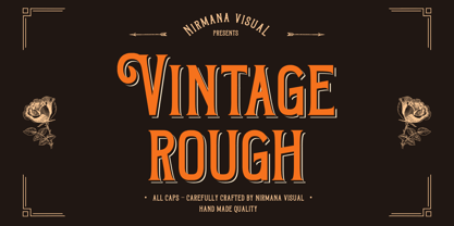 Introducing Vintage Rough. A Vintage display font that has a classy, clean, and has dramatic movement. This font is great for your next creative project such as logos, quotes, invitations, product packaging, posters, and social. It is also great for watermarks on photography and product merchandise, or anything that needs a vintage taste.
 - August by Alias Collection,
$60.00 Almost a straightened italic typeface, August explores the idea of taking italic and script letterforms out of context and creating a typeface with a mix of references that does not look like too soft and feminine, but has a sharpness and angularity in some of its characters that jars against this softness.
 - Marker Line by Sakha Design,
$10.00 Marker Line is a dynamic display font that captures the essence of casual, playful handwriting. Its thick strokes resemble marker pen strokes, adding a fun and modern touch to any design. This font is perfect for bold headlines, posters, and branding materials that aim to stand out with a youthful and vibrant appeal.
 - Black Lonthe by Letterafandi Studio,
$20.00 Black Lonthe is an exquisite blackletter font that exudes timeless elegance. With its bold and ornate strokes, it captures the essence of traditional calligraphy while adding a modern twist. The sleek, sophisticated design of Black Lonthe makes it perfect for creating eye-catching titles, logos, and invitations that leave a lasting impression.
 - Ardenson by Tower of Babel,
$10.00 Ardenson is an invitingly delightful script with a retro flair. Inspired by apartment signage of the 1950s and 60s, Ardenson strikes a vintage note that also feels at home in the present time. Perfect for any logo, signage, label design or any other project that needs a unique charm and laid back attitude.