10,000 search results
(0.045 seconds)
- CEREAL KILLERZ - Personal use only

- American Revolution by Celebrity Fontz,
$24.99American Revolution is a unique collection of signatures of 84 key personalities from both sides of the American Revolutionary War, one of the supreme dramas in history. A must-have for autograph collectors, desktop publishers, history buffs, or anyone who has ever dreamed of sending a letter, card, or e-mail “signed” as if by one of these famous Revolionary War figures. This font includes signatures from the following American Revolutionary War personalities, from both sides: Ethan Allen, Charles T. Armand, John Armstrong, Benedict Arnold, Pudhomme de Borre, John Cadwalader, George Rogers Clark, George Clinton, James Clinton, Thomas Conway, William Davidson, Philippe du Coudray, The Chevalier Louis Lebegue dePresle Duportail, Chistopher Gadsden, Horatio Gates, Moses Hazen, John Glover, Mordecai Gist, Nathaniel Greene, William Heath, Edward Hand, John E. Howard, Robert Howe, Isaac Huger, William Irvine, Henry Knox, Baron Johann de Kalb, Tadeusz Kosciuszko, Marquis de Lafayette, Charles Lee, Henry Lee, Andrew Lewis, William Maxwell, Benjamin Lincoln, Francis Marion, James Moore, Daniel Morgan, William Moultrie, Peter Muhlenberg, Alexander McDougall, Lewis Nicola, Lachlan McIntosh, John Nixon, Hugh Mercer, Samuel H. Parsons, Thomas Mifflin, John Paterson, Richard Montgomery, Andrew Pickens, Charles Cotesworth Pinckney, Enoch Poor, Count Casimir Pulaski, Israel Putnam, Joseph Reed, Elisha Sheldon, Arthur St. Clair, William Smallwood, Philip Schuyler, John Stark, Charles Scott, Adam Stephen, John Sullivan, Jethro Sumner, Thomas Sumter, James Varnum, Baron Friedrich Wilhelm August Heinrich Ferdinand von Steuben, Lord Stirling, Artemas Ward, Joseph Warren, George Washington, Anthony Wayne, James Wilkinson, Otho H. Williams, John Paul Jones, William Woodford, David Wooster, John Burgoyne, Sir Guy Carleton, Charles Cornwallis, Sir Henry Clinton, Sir Thomas Gage, Richard, Earl Howe, Sir William Howe, Sir Banastre Tarleton. This font behaves exactly like any other font. Each signature is mapped to a regular character on your keyboard. Open any Windows application, select the installed font, and type a letter, and the signature will appear at that point on the page. Painstaking craftsmanship and an incredible collection of hard-to-find signatures go into this one-of-a-kind font. Comes with a character map. - True North by Cultivated Mind,
$39.00 True North is a vintage inspired typeface with 16 styles and a monoline script. True North comes with labels, extras and free banners. Extras include wild animals, catchwords, numbers, symbols, tools, maple leaves and trees. True North is a headline font with alternate capitals. Combine all 16 styles with the script, banners, labels and extras and you get a wonderful vintage design. True North Script is a playful, fully-connected monoline script full of ligatures and alternate forms. Its wide range of international characters and alternate use of the power of OpenType automatically creates the feel of hand-lettering.
 - Simpaty by Afkari Studio,
$16.00 Simpaty Handwritting Signature Font is a stylish and elegant typeface designed to mimic natural handwriting. The font features smooth and flowing lines, giving it an authentic and personal touch. It is a versatile font that can be used for various design purposes, such as branding projects, wedding invitations, romantic themes, studio branding, logos, social media posts, clothing designs, posters, cafe or restaurant signage, and more. The font includes both uppercase and lowercase letters, numbers, and punctuation marks, providing a complete set of characters for your design needs. Additionally, it offers standard and special ligatures, allowing for beautiful and seamless connections between letters. Simpaty Handwritting Signature Font is compatible with both PC and Mac operating systems, and it can be easily installed on your computer. You can access and use it in popular design software like Adobe Illustrator, Adobe Photoshop, Adobe InDesign, and even Microsoft Word. This accessibility makes it convenient for users with different design software preferences. Furthermore, this font is fully functional and does not require any additional design software or plugins to be used effectively. It provides a hassle-free experience, allowing designers to create stunning and professional-looking projects with ease. In summary, Simpaty Handwritting Signature Font is a versatile and user-friendly typeface that adds a personal and sophisticated touch to various design projects. Its natural handwriting style and comprehensive character set make it suitable for a wide range of applications in both print and digital mediums. Features; Uppercase, Lowercase, Number, and Punctuation - Standart and Special Ligatures - Works on PC & Mac - Simple installations - Accessible in Adobe Illustrator, Adobe Photoshop, Adobe InDesign, even work on Microsoft Word - Fully accessible without additional design software. Mültîlíñgúãl Sùppört Hope you enjoy our font and this font is useful for your projects!
 - Aribau Grotesk by Emtype Foundry,
$69.00 Born from the intersection of the geometric and grotesque typefaces. Aribau Grotesk combines low contrast and generous width proportions with typical traits of american gothics from the early 20th century, like the counters aperture and a double story ‘g’. Driven by the process, some details that come from the geometric style arose, like the clean-shaped figures and the circular dots that convey a more affable and contemporary look. Aribau Grotesk PDF.
 - Funkboy by PizzaDude.dk,
$20.00 Funkboy looks like something that was made 20 years ago. You know, when Grandmaster Flash was scratching to the beat and graffiti was totally underground. Funkboy was made to look 100% oldschool, and now you can make your own bad-boy oldschool graffiti, using your computer! Comes with two hard knock alternate letters: the peace 'o' + the heart dotted 'i' You will need to use OpenType supporting applications to use the autoligatures.
 - Sweet Steeffie - Personal use only

- Quarter Braille by Echopraxium,
$20.00 Presentation QuarterBraille (Abbreviated as "QB" thereafter) is a decorative, steganographic and lattice font. Its core design concept is that Braille dots are represented as "quarters of a square"[1]. This is illustrated by posters 1 and 2 (NB: these glyph parts will be called "QB dots" thereafter). The other glyph parts (see poster 3) are purely decorative and meaningless in terms of Braille dots encoding[2]. All glyph parts are meant to generate a wide variety of patterns from horizontal and vertical combinations of glyphs. There is also a graphic convention to differentiate uppercase from lowercase letters with the presence or absence of shape subparts (in the "endings", "quarter of a circle with a ring" and "quarter of a diamond with a small square in the middle") like shown by poster 4. This font is suitable for very short texts (e.g. logos, acronyms, quotes, ambigrams, pangrams, palindromes, etc...) but on the other hand it may be used for steganographic purpose like geocaching as well as fictive alphabets (e.g. Alien/SciFi/Fantasy/Antique civilizations). Posters 1. Font Logo: the displayed text is " Quarter " followed by " Braille". There's a rainbow layer above the text to highlight the "QB dots", this is achieved by A..Z glyphs with "only QB dots" (codes 230..255) 2. Anatomy of a Glyph (L) and "QB Dots" (quarters of a square) 3. Glyphs Parts: Square and Cross (Inverted square), Circle and Inverted Circle (with or without the small circle in the middle), Diamond (with or without the small square in the middle), Inverted Square and Circle, Shape combos, Ending 4. Uppercase vs Lowercase (tiny shape subparts are shown in red) 5. Sample 1: Bathroom sink with QB tiles on the credence 6. Sample 2: Hands knuckle tatoos: "LOVE/HATE"[4] 7. Sample 3: Poker Hand: pocket Aces. It's an Ace of Hearts (Ah) on the left and an Ace of Spades (As) on the right. Like in regular cards, the card value (e.g. Ah) is displayed twice: at the top and rotated by 180 degrees at the bottom. This poster also illustrates that QB could be used to print embossed playing cards with tactile and visual display of card values. 8. Sample 4: Pangram: "Adept quick jog over frozen blue whisky mix" 9. Sample 5: Latin Magic Square: "SATOR AREPO TENET OPERA ROTAS" (NB: for compensation of the 2/3 glyph ratio, letters on each line are separated by a space: "S A T O R", ...). 10. Sample 6: Quote of Mahatma Gandhi: "Learn as if you will live forever, live like you will die tomorrow.". This is also a demonstration of border glyphs combinations. 11. Sample 7: Steganography use case: the text is a sequence of 64 aminoacids (1 Letter notation), this protein was described in a research paper "The complete Aminoacid sequence of an amyloid fibril protein AA of unusual size (64 residues) 1975". 12. Sample 8: Border Glyphs with the provided styles and mixed styles. The words are the same than in poster 9 ("SATOR AREPO TENET OPERA ROTAS"). Despite the 2/3 glyph ratio, the "TENET cross" was achieved by both inserting spaces in horizontally ("T ENE T") and by using the "thin borders glyphs". Notes a. Border glyphs[3] are meant to enhance the esthetics of text samples displayed with QB b. Special characters (e.g. *$()[].,;:&@# ...) are provided and follow the NABCC (North American Braille Computer Code) convention. c. A..Z Glyphs with only the "QB dots" are provided as demonstrated by posters 1 and 2 (A/N: this was very useful to create them). d. Glyph Map: 32..64: Special characters - 161..187: "Thin variant" of Border glyphs, 192..229: Border glyphs, 230..255: A..Z with only the "QB dots" - Codes 176 an 181 are "regular SPACE" (empty glyph). Footnotes 1. There is indeed two shapes which represent the braille dot: the "quarter of a square" and the "quarter of a cross". It's because a cross may be considered as an "inverted square" because the square corners are merged in the center. 2. That's why the SPACE glyph is only made of decorative/meaningless glyph parts (i.e. no "QB dots"). 3. For other fonts with border glyphs, please take a look at my other "decorative Braille fonts" (GoBraille, HexBraille, KernigBraille, StackBraille, MaBraille, DiamondBraille, LorraineBraille). 4. LOVE/HATE knuckle tatoos are inspired by the anthology scene from "The Night of the Hunter" movie (Charles Laughton 1955), it also appearead in "Do The Right Thing" movie (Spike Lee 1989). Disclaimer This font is not appropriate and not meant to print text documents in Braille for the blind readers audience.
 - White Cakes by Balpirick,
$15.00 White Cakes - a Monoline Handbrushed Font that's clean, elegant and perfect for a range of design projects! With its smooth, effortless lines and understated sophistication, this font is the perfect choice for those who want a modern look that's still timeless in its appeal. Crafted with precision and care, this font is incredibly versatile and can be used for a range of design projects, including logos, branding, invitations, packaging, and more. With its simple yet refined aesthetic, it's sure to make a lasting impression on anyone who sees it. - also multilingual support Enjoy the font! Feel free to comment or feedback! Thank you!
 - Creamy Bubble by Balpirick,
$15.00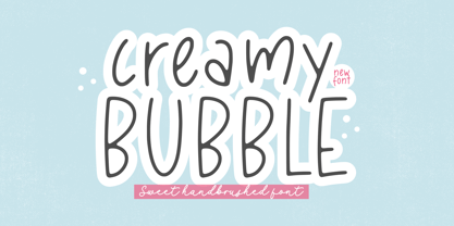 Creamy Bubble - a Sweet Handbrushed Font that's clean, elegant and perfect for a range of design projects! With its smooth, effortless lines and understated sophistication, this font is the perfect choice for those who want a modern look that's still timeless in its appeal. Crafted with precision and care, this font is incredibly versatile and can be used for a range of design projects, including logos, branding, invitations, packaging, and more. With its simple yet refined aesthetic, it's sure to make a lasting impression on anyone who sees it. - also multilingual support Enjoy the font! Feel free to comment or feedback! Thank you!
 - Delmon Delicate by Atharuah Studios,
$19.00 Delmon Delicate is a classy font duo, with elegant sans and script fonts. The two fonts are made with a balance that produces a beautiful blend to support all your design needs. For example, social media content, branding, merchandising, advertising, packaging, etc. Delmon Delicate includes 2 fonts: Delmon Delicate (Sans Serif) and Delmon Delicate Script, each of which has uppercase, lowercase letters, numbers, punctuation, and multilingual support. That's it! I hope you enjoy it. Feel free to comment if there are issues or queries. You can also say hello to me on Instagram: https://www.instagram.com/atharuah_ Thank You!
 - Sweet Cakery by Balpirick,
$15.00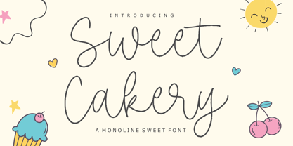 Sweet Cakery - a monoline Sweet Font that's clean, elegant and perfect for a range of design projects! With its smooth, effortless lines and understated sophistication, this font is the perfect choice for those who want a modern look that's still timeless in its appeal. Crafted with precision and care, this font is incredibly versatile and can be used for a range of design projects, including logos, branding, invitations, packaging, and more. With its simple yet refined aesthetic, it's sure to make a lasting impression on anyone who sees it. - also multilingual support Enjoy the font! Feel free to comment or feedback! Thank you!
 - Conium by MKGD,
$13.00 I designed Conium to be a sister font to Nightshade. It was meant to have the appearance of the hemlock plant without being too derivative; it’s thin drooping stems conjure images of Hamlet’s mad Ophilia clutching sickly weeds while thinking them to be flowers. It also projects the appearance of an ice cold, wrought iron, cemetery gate. The sort that one might pass on a damp overcast day. A fitting compliment to an Edward Gorey illustration from top, right down to the frigid ground from which it sprang. Conium has a glyph count of 388 and supports the following languages Afrikaans, Albanian, Asu, Basque, Bemba, Bena, Bosnian, Catalan, Chiga, Colognian, Cornish, Croatian, Czech, Danish, Embu, English, Esperanto, Estonian, Faroese, Filipino, Finnish, French, Friulian, Galician, German, Gusii, Hungarian, Icelandic, Indonesian, Irish, Italian, Kabuverdianu, Kalaallisut, Kalenjin, Kamba, Kikuyu, Kinyarwanda, Latvian, Lithuanian, Low German, Lower Sorbian, Luo, Luxembourgish, Luyia, Machame, Makhuwa-Meetto, Makonde, Malagasy, Malay, Maltese, Manx, Meru, Morisyen, North Ndebele, Norwegian Bokmål, Norwegian Nynorsk, Nyankole, Oromo, Polish, Portuguese, Romanian, Romansh, Rombo, Rundi, Rwa, Samburu, Sango, Sangu, Scottish Gaelic, Sena, Shambala, Shona, Slovak, Slovenian, Soga, Somali, Spanish, Swahili, Swedish, Swiss German, Taita, Teso, Turkmen, Upper Sorbian, Vunjo, Walser, Zulu
 - Mayfest by pentagonistudio,
$17.00 Mayfest Is An Elegant Display serif Inspired By Luxury and Elegant Character. FAQ's : Where are the OTF's? They are included in a download link( in a text file) in your main download file. 1 user 2 computers installation (Desktop License) You may NOT use for broadcast or Cinema/Motion Picture. You may NOT resell this font in any platform without further permission from designer. Do NOT embed font files in app/game/e-pub (for desktop license) You may NOT use the fonts in templates for sale/free. ( web/print/app ) For other license use please contact us. SOFTWARE REQUIREMENTS : Fonts and alternate : No special software required they may be used in any basic program /website apps that allows standard fonts That's it folks! You can go ahead and get cracking :) Follow My Shop For Upcoming Updates Including Additional Glyphs And Language Support. And Please Message Me If You Want Your Language Included or If There Are Any Features or Glyph Requests, Feel Free to Send me A Message. Have a Good Day !
 - Dr.Enoksen - Unknown license

- Graffito - Unknown license

- Blood Cyrillic - 100% free

- Tahoma by Microsoft Corporation,
$49.00Tahoma™ Family is one of Microsoft's most popular sans serif typeface families. The original Tahoma™ Family consisted of two Windows TrueType fonts (regular and bold), and was created to address the challenges of on-screen display, particularly at small sizes in dialog boxes and menus. In 2010 Ascender Corporation added italics, so now the Tahoma font family contains 4 fonts in total: Tahoma regular, italic, bold and bold italic. The Latin, Greek and Cyrillic characters were designed by world renowned type designer Matthew Carter, and hand-instructed by leading hinting expert, Tom Rickner. The Tahoma fonts set new standards in system font design. Tahoma is ideal for use in User Interface scenarios and other situations requiring the presentation of information on the screen. Character Set: Latin-1, WGL Pan-European (Eastern Europe, Cyrillic, Greek and Turkish). - Many Weatz - Personal use only

- ALCATRAZ - Personal use only

- Beckasin - Personal use only

- Sketchica - Personal use only

- Fangtasia - Personal use only

- Chavenir - Personal use only

- TRUEblood - Personal use only

- Origram Pro by Nuno Dias,
$21.00 ORIGRAM PRO is the full version of ORIGRAM Free Font, a font with over 100k downloads, and counting! This font was already featured in dozens of websites and Design Blogs. I decided to remake this font, smoothing out a few rough edges - so to speak - and adding value to the end result, with several different interesting tweaks and updates. Inspired in the Origami and Tangram tradition, the basic shape is an octagon. Geometrical and regular, resulting in a neat and captivating display font. Not particularly conceived to be used in common text, this stylized font will add value to any large scale image within the realm of logos & branding, outdoors, packaging, titles, magazines, posters, signs, shirts, scrap-booking... Your imagination is the limit. This display font comes now with Uppercases, updated Lowercases, Numbers, and a slew of new Diacritic Marks and Punctuation Marks. A large number of special characters was included in the package, enriching the font’s versatility and usability.
 - P22 Hieroglyphic by P22 Type Foundry,
$24.95Hieroglyphs were a pictorial alphabet used in Ancient Egypt from 3100 BC to approximately 300 AD. This font set features over 250 different phonetic and decorative hieroglyphics, complete with an extensive translation chart. P22’s Hieroglyphic font adapts one of the world’s most ancient forms of art and communication for today’s technology. Note: This is not an automatic word translator. It is a font set. It is used just like any other font and does not require special software skills. - FS Albert by Fontsmith,
$80.00 The x factor How do you make a font like FS Albert unique, distinctive? “When designing a font I try to question every letter,” says Jason Smith, “but all you need is a few that have an x factor. With FS Albert, they’re the lowercase ‘a’ and ‘g’ and the uppercase ‘I’ and ‘J’. “I remember a friend saying, ‘Why on earth have you designed the ‘a’ like that? Isn’t it too friendly for this kind of font?’ And, in a way, that’s what I wanted – honesty and warmth, because a lot of big brands at the time really needed to show a more human side.” Range of weights and styles FS Albert is a charismatic type: a warm, friendly sans serif face with a big personality. Open, strong and amenable, and available in a wide range of weights and styles, FS Albert suits almost every task you put it to. Fontsmith has crafted five finely-tuned upright Roman weights and four italic weights, as well as a special Narrow version to provide the best coverage and give headlines and text an easy-going character. The chunky kid “FS Albert was inspired by – and named after – my son, who was a bit of a chunky kid,” says Jason Smith. “I designed an extra bold weight because I always felt that the really big font heavy weights had the most personality. “I recently told Albert this story. He laughed, and forgave me for thinking he was a fat baby. He liked the big personality bit, though.” 1000s of glyphs Not content with a character set that covered Europe and the whole of the Western world, the studio decided to go further afield. There are now FS Albert character sets that cover western and eastern European languages, including those of Russia, as well as Cyrillic, Arabic and Greek scripts. In fact, the font now covers more than 100 languages, making it ideal for bringing a consistent typographic style to the communications of global brands.
 - FS Albert Paneuropean by Fontsmith,
$90.00The x factor How do you make a font like FS Albert unique, distinctive? “When designing a font I try to question every letter,” says Jason Smith, “but all you need is a few that have an x factor. With FS Albert, they’re the lowercase ‘a’ and ‘g’ and the uppercase ‘I’ and ‘J’. “I remember a friend saying, ‘Why on earth have you designed the ‘a’ like that? Isn’t it too friendly for this kind of font?’ And, in a way, that’s what I wanted – honesty and warmth, because a lot of big brands at the time really needed to show a more human side.” Range of weights and styles FS Albert is a charismatic type: a warm, friendly sans serif face with a big personality. Open, strong and amenable, and available in a wide range of weights and styles, FS Albert suits almost every task you put it to. Fontsmith has crafted five finely-tuned upright Roman weights and four italic weights, as well as a special Narrow version to provide the best coverage and give headlines and text an easy-going character. The chunky kid “FS Albert was inspired by – and named after – my son, who was a bit of a chunky kid,” says Jason Smith. “I designed an extra bold weight because I always felt that the really big font heavy weights had the most personality. “I recently told Albert this story. He laughed, and forgave me for thinking he was a fat baby. He liked the big personality bit, though.” 1000s of glyphs Not content with a character set that covered Europe and the whole of the Western world, the studio decided to go further afield. There are now FS Albert character sets that cover western and eastern European languages, including those of Russia, as well as Cyrillic, Arabic and Greek scripts. In fact, the font now covers more than 100 languages, making it ideal for bringing a consistent typographic style to the communications of global brands. - Aeonian by Adorae Types,
$40.00 Aeonian, designed by Emilia Adorno, was mostly inspired by the iconic morphology adopted by the arts of the 1920s. One hundred years later we can still see the resemblance between the wants and the needs of now and then to reach for the sky, to look ahead and enter the future in style. Now as then, we seek the right tools to do so, then once again, we embrace the rational, yet elegant and stylish forms of simplicity, geometry and symmetry. At the same time, there is a strong and growing need for a warmer approach to creating lovemarks. For that, Aeonian’s alternates hold attractive, soft and inviting shapes to an emotional appeal. Aeonian is a combination of all of them. A rational side entwined with an emotional one. Born a geometric sans, Aeonian ended up being a 2 in 1 font with a sans serif set and alternates reaching over 1200 glyphs. The entire family contains 6 weights, from thin to black, with its matching italics. It features a variety of ligatures to be used as connectors, specially for display. It also offers multilingual support, even for certain display ligatures. Later, Aeonian kept growing, with stylistic alternate sets of initial, mid and final glyphs. These are its arms to reach for infinity with a warm heart. The wide range of possibilities that Aeonian offers, makes it the best font for creating vast design systems with a rich visual language.
 - Sambo Briliant by Gian Studio,
$10.00 Brilliant Sambo Featuring Slab Serif totality and elegance. One of my most recent first releases, naturally drawn with pinpoint accuracy. Sambo Brilliant has the perfect amount of simplicity and subtlety for your next project. It perfectly represents the retro and vintage aesthetic. I recommend this font for your next logo, invitation, and home decor project that needs a succinct alternative combination touch! Sambo Brilliant appears with strong characters available: Get inspired by the image above and feel free to share with me what you get by using this font.
 - Bismuth Stencil by Setup,
$20.00 Bismuth is a simple versatile multi-purpose stencil display typeface with nine weights. Both the upper and the lower case are capitals -- the paired letters (e.g. Aa, Bb) differ in construction but keep the same width. The width is also consistent across all weights, making the fonts easily interchangeable. The nine styles are accompanied with a free font Bismuth Stencil Symbols which contains more than one hundred various arrows, symbols and patterns for even more striking display typography. Learn more about the typeface and its OpenType features at Urtd.net.
 - Mati by Sudtipos,
$19.00 Father's Day, or June 17 of this year, is in the middle of Argentinian winter. And like people do on wintery Sunday mornings, I was bundled up in bed with too many covers, pillows and comforters. Feeling good and not thinking about anything in particular, Father's Day was nowhere in the vicinity of my mind. My eleven year old son, Matías, came into the room with a handmade present for me. Up to this point, my Father's Day gift history was nothing unusual. Books, socks, hand-painted wooden spoons, the kind of thing any father would expect from his pre-teen son. So you can understand when I say I was bracing myself to fake excitement at my son's present. But this Father's Day was special. I didn't have to fake excitement. I was in fact excited beyond my own belief. Matí's handmade present was a complete alphabet drawn on an A4 paper. Grungy, childish, and sweeter than a ton of honey. He'd spent days making it, three-dimensioning the letters, wiggle-shadowing them. Incredible. A common annoyance for graphic designers is explaining to people, even those close to them, what they do for a living. You have to somehow make it understandable that you are a visual communicator, not an artist. Part of the problem is the fact that "graphic designer" and "visual communicator" are just not in the dictionary of standard professions out there. If you're a plumber, you can wrap all the duties of your job with 3.5 words: I'm a plumber. If you're a graphic designer, no wrapper, 3.5 or 300 words, will ever cover it. I've spent many hours throughout the years explaining to my own family and friends what I do for a living, but most of them still come back and ask what it is exactly that I do for dough. When you're a type designer, that problem magnifies itself considerably. When someone asks you what you do for a living, you start looking for the nearest exit, but none of the ones you can find is any good. All the one-line descriptions are vague, and every single one of them queues a long, one-sided conversation that usually ends with someone getting too drunk listening, or too tired of talking. Now imagine being a type designer, with a curious eleven year old son. The kid is curious as to why daddy keeps writing huge letters on the computer screen. Let's go play some ball, dad. As soon as I finish working, son. He looks over my shoulder and sees a big twirly H on the screen. To him it looks like a game, like I'm not working. And I have to explain it to him again. This Father's Day, my son gave me the one present that tells me he finally understands what I do for a living. Perhaps he is even comfortable with it, or curious enough about that he wants to try it out himself. Either way, it was the happiest Father's Day I've ever had, and I'm prouder of my son than of everything else I've done in my life. This is Matí's font. I hope you find it useful.
 - Unitext Variable by Monotype,
$155.99Unitext Variable Regular is a single font file that features one axis: Weight. TFor your convenience, the Weight axis has preset instances from Hairline to Black. This Roman (upright) font is provided as an option to customers who do not need Italics, and want to keep file sizes to a minimum. - Mister B by Bogstav,
$17.00 Mister B is my go on a handmade organic font. The letters are clumsy, with the width and height somewhat off here and there. Nevertheless, the result is a naive and charming font, which is suitable for most things that has to do with kids toys, organic products or comics.
 - Legendum - 100% free

- Defense by Reserves,
$49.00 Defense is an unyielding rectangular slab-serif stencil face designed with consistently balanced letterforms and a refined finish. It’s extremely angular geometric form commands attention in display settings, yet is also legible in short text blocks. The stencil mark width varies accordingly with each weight, helping to further define each style. Numerous alternate character sets allow room for customization, while the expanded ligatures push letter combinations to the limit. Stylistically, Defense’s almost crude, sharp-cornered construction is balanced by it’s sophisticated finish and attention to detail, often unrealized in similar faces of this genre. The upright weights are complimented by pairings of true italics, completely rebuilt, slightly narrower in width with modified letterforms, increasing their contrast and flow. Features include: Precision kerning Standard Ligatures set including 'f' ligatures (fi, fl, ff, fh, fj, ffl, ffi, ffj) Discretionary Ligatures set including (ft, rt, ae, oe, st, ft, ct, oc, oo, ry, AE, OE, AL, TH, HE, AK, AN, TT, HD, AM, AP, AR, NF, NE, NH, NL, NB, FL, ND, FE, AB, OB, OD, OF, OG, OH, OK, OL, OM, ON, OO, OP, OQ, OR, OU, AH, UE, UF, UB, UD, UH, UK, UL, UM, UN, UP, UR, UU, MP, XY, YX, KY, WY, VY, AF, FF, FI) Alternate characters (O, o, S, s, a, h circumflex, @, ®, ™, ¶, $, &, _, and various ligature alternates) Case forms (shifts various punctuation marks up to a position that works better with all-capital sequences) Capital Spacing (globally adjusts inter-glyph spacing for all-capital text) Slashed zero Full set of numerators/denominators Automatic fraction feature (supports any fraction combination) Extended language support (Latin-1 and Latin Extended-A) *Requires an application with OpenType and/or Unicode support.
 - Martian Grotesk by Martian Fonts,
$35.00 Martian Grotesk is a large typeface family originally designed for the screen which consists of a variable font with 2 axes of variation and 63 styles: Condensed to Ultra Wide, Thin to Ultra Black. Aesthetics The font style is characterized by some brutality and assertiveness. Overhanging terminals, a closed aperture, and an almost complete lack of contrast lead to this effect. Additionally, some elements of the letters are especially enlarged. This font gives any text the impression of being a “signature” style. Nevertheless, we still maintain the golden mean between its rebellious nature and readability. Perfect for web development We created Martian Grotesk for the web and digital project world. When laying out web pages, frontend developers are constantly faced with the fact that uneven metrics do not allow text to be evenly placed on some design element, for example, on a button. Instead, they have to compensate in some way, like making the top padding smaller and the bottom padding larger in CSS. This little deal really hurts. Also, if your project adheres to design system principles, you might be unable to stand a lack of systematic approach when working with fonts. We researched and calculated vertical metrics and set them up in a way that guarantees equal space above the cap height and under the baseline. This enables the text labels to be evenly placed on buttons, inputs, lists, and forms. In addition, we found a proper ratio of the letter heights, so, with commonly used font sizes—10, 15, and 20 pixels—the glyph heights stick to the pixel grid. As a result, the letter shapes become sharper, which reduces the load on the reader's eyes and simply looks much better. The typeface also comes equipped with OpenType and TrueType hinting, and Martian Grotesk appears legible on most platforms, even when being rendered in small sizes. When coupled together, all the above features make Martian Grotesk a reasonable choice for any user interface design. Roadmap Martian Grotesk right now is a work-in-progress product. The font is completely ready for professional use, however, many great features are still ahead! For example, support for Extended Cyrillic characters, and italics. Pricing Purchasing an early version of the font presents the opportunity to get it at a very attractive price! That’s because with every new version, costs will go up to reflect the additional value that comes with every release. But after purchasing Martian Grotesk, all its future updates are included for free!
 - Carniola by Linotype,
$29.99Franko Luin, Carniola's designer, on this typeface: Carniola is a pastiche of different type designs from the beginning of the 20th century, mostly American. I am not very fond of it, but was convinced to release it by someone who needed a typeface with a time typical feeling. On the other hand: why not use the original typefaces from that period? Carniola has its name from the Latin name of Kranjska/Krain, a principality in the former Habsburg monarchy (Austria-Hungary), now part of modern Slovenia. - Dreaming Outloud by My Creative Land,
$15.00 Say hello to a casual handwritten font family - Dreaming OutLoud. 8 handwritten typefaces made to complement each other in the best possible way. They are easy to use and perfect for expressing your thoughts, posting quotes and simple daily updates on social media. The font package is complemented by more than a 100 transparent background marker lines (easy to change color!) - to emphasise what you are saying :) - and dingbats & doodles font. Two sub-packages included: Elementary package. Use this one if you primarily work in Canva/Cricut and similar applications and don’t want to deal with OpenType features of the PRO fonts. To access alternates - simply change the font to it’s ALT version. Voilà. You can use these fonts on your iPad in Procreate app! Charged package. You need this one if you feel comfortable with OpenType features, if you work in Adobe Suite and similar applications that have OpenType panel to access OT features. You can use these fonts in Canva-like applications as well - they are fully unicode mapped. Contact me with your MyFonts order # to get a free bonus - more than a 100 "Marker selection lines" in png and psd


