2,472 search results
(0.019 seconds)
- Tannenberg Fett - Personal use only

- Fette Gotisch by Linotype,
$29.99Fette Gotisch font is an interpretation of Gothic scripts in the style of the 19th century. During this time, the individualistics handwritings of the past were used to create and define new broken letter forms. This style has heavily influenced the designs of the majority of today's broken letter fonts. The strong appearance of Fette Gotisch made it popular as a typeface for emphasizing text. - Fette Kanzlei by RMU,
$30.00 Fette Kanzlei is a beautiful mid-19th century blackletter font with a touch of calligraphy which has been brought back into life again. The long s can be reached by typing alt plus b or by activating the OT feature historical forms. This font also contains oldstyle numerals.
 - Fette Fraktur by Linotype,
$29.99 This font is one of the most used broken letter fonts today. Fette Fraktur is used to invoke a nostalgic or rustic feeling and found often on restaurants with hearty homemade food’ or breweries who use the good old recipes’ of the founder. The font was designed in the 19th century and from the beginning intended as an advertisement typeface. The lower case letters have a gothic character with only the ornamental flourishes making them broken letters, while the capital letters are more characteristic of broken letter typefaces. One could say Fette Fraktur is a true mix of styles, not unusual for typefaces created at the turn of the 19th century.
 - DXEgyptian Fett by DXTypefoundry,
$45.00 Digital version of the font Egyptian Bold (Headset No. 8, Narrow fat Egyptian), Cyrillic version of the Egyptienne schmale font, around 1870. A squared antiquarian font with almost no contrast between the strokes. For the reconstruction font were used stamp from the catalog Typefoundry and the factory of copper lines B. Krebs Priemnik, St. Petersburg and Frankfurt am Main; Catalog of hand and machine fonts, Publishing House Book, 1966; Catalog of manual fonts of the Kharkov liner factory, Prapor, 1973; Catalog of fonts typography Volodarskogo, Lenizdat, 1985.
 - Fette Gotisch by URW Type Foundry,
$35.00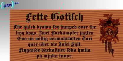
- Felt - Unknown license

- Tele-Marines - Unknown license

- Lemah Teles by Letterafandi Studio,
$14.00 Lemah Teles is a display font. It is a tough-looking font with a strong brush touch, ready to rock every design you want to create. It is perfect for logos, quotes, posters, clothing, and so much more! Add it to any of your creative projects, and be amazed by the generated outcome!
 - Melee - Unknown license

- Jeles by Tour De Force,
$25.00 Inheriting the beauty and style of old type classics from this genre, Jeles is blended with very elegant modern approach featuring soft corners, round slab serifs and tasty ball terminals. Jeles is designed mostly for display use and it is highly recommended to get the whole family if you want to get the best result. It is designed in two styles Condensed and Normal. The Condensed version is developed in two weights each coming with corresponding italics. While the Normal styles are three ranging from Regular, Bold and Black. The total of 7 separate fonts inside the family are quite enough if you look for diversity and flexibility at one place. You could use the uprights for more serious and strong headlines while the Italics work perfectly for more fresh and live subheads. Of course editorial design is only one of the many directions where Jeles family could be used successfully as we all know typefaces with so visible contrast between thin and thick and combined with classic elegance, could be easily used in every design of cosmetic industry, fashion, food, jewelry, etc. Try to design a stylish boutique shop signboard and you will surely discover its beauty and potential. Easy-to-read, it is good for print design, revealing its authentic letterpress-like character as well as perfect for screen use note that the thin strokes and serifs are not that thin to vanish on a low resolution monitor. Professionally designed, they are solid enough yet very elegant and even gentle making Jeles a desired family design of attractive web banners, web sites, apps and e-books.
 - Tale by Suomi,
$25.00 Tale is an experiment to convert the script-style calligraphy into bitmap format. The two variants have the same dimensions, but (as the naming suggests), Forty has double amount of pixels in it when compared to Twenty. Both variants have hand made bitmaps to compliment these correlating point sizes, and you can always get the appropriate bitmaps by multiplying by two.
 - Fette Trump-Deutsch - Unknown license

- Fette Deutsche Schrift by Lamatas un Slazdi,
$35.00 Fette Deutsche Schrift also known as Koch-Fraktur or Kochschrift was created by Rudolf Koch for Klingspor foundry between 1908 and 1910. The basis of this font is a publication in the magazine “Das Plakat” of September 1921. The font contains swash capitals to use as dropcaps, contextual alternates, glyphs for line endings, ligatures, discretional ligatures for use in German, ornaments and other OpenType features. It supports all the European languages using Latin alphabets (including slashed S and slashed long s used in Latvian old orthography till 1930s).
 - Fette Fraktur EF by Elsner+Flake,
$35.00 - Fette Gotische Maiuskel by Intellecta Design,
$4.95 - Grootesk - Unknown license

- Groteska by Designova,
$9.00 Groteska is a modern & minimal sans-serif typeface inspired from some popular swiss design typefaces, having traditional grotesque oriented type characteristics while being clean & minimalist by nature. The typeface comes with a total of 14 fonts spreading between 7 weights featuring 7 uprights and matching italics for each weights. Handcrafted and designed with powerful opentype features in mind, each weight includes extended language support including Western & Central European sets. Groteska is a perfect typeface for graphic design, web, print and any display use. The typeface could be perfect choice for logo / logotype design, branding, marketing graphics, banners, posters, signage, corporate identities as well as for editorial design.
 - Karyna Feet - Personal use only

- Muggy Feet by PizzaDude.dk,
$17.00 Muggy Feet is my handpainted and layered font. Mix the five different layers for realistic looking results. What makes it even more realistic is that the font uses "contextual alternates", which means that every letter of Muggy Feet has 5 different versions. Also, try to play around with the transparency of each layer of Muggy Feet. Muggy Feet is ready for your invitation, poster, book cover, packaging or signs.
 - Chicken Feet by BA Graphics,
$45.00An irresistible design by my (11 year old) Granddaughter; it brings that child innocence to font design. When she first showed it to me I was so impressed I could not resist I had to make it into her very own font. Alexandra is also the designer of the font flag and says she is working on new font ideas. - Sassoon Felt by Sassoon-Williams,
$48.00 Sassoon Felt’s more casual letterforms can be used either as informal text or for the teaching of reading and handwriting; having the letterforms most taught in UK schools. These fonts are an educators alternative to Comic Sans (from Microsoft) and Chalkboard (from Apple), which are more appropriate for ‘Print’ style writing in United States Elementary schools and may also be appropriate for parts of Australia, which can be identified usually by crucifix t, diagonal y downstroke, short f, two-stroke and there may be more. Free to download resources: How to access Stylistic Sets of alternative letters in these fonts
 - NT Fest by Novo Typo,
$26.00 Fest is a highly detailed, ornamental unicase typeface for display use. Designed by Novo Typo - (typo)graphic designers from Amsterdam - The Netherlands. Fest is perfect for designing sophisticated logos, fashionable headings or other beautiful display typography. The glyph set of Fest contains a lot of extra elegant glyphs, swooshes and ligatures.
 - Felt Noisy by PintassilgoPrints,
$24.00 Counting four variations for each letter and two for the numbers, Felt Noisy delivers a cool organic feel with a strong and spontaneous attitude. The typeface was drawn with a bad felt tip pen and resulted in two rather nice fonts that will stylishly fit many visual projects out there that don't look for any transparency at all. Give it a go!
 - Kette Pro by Tilde,
$39.75 The design of Kette evolved from searching new ways to make cool and semi-formal type. Study of aspects of legibility was part of the process when designing Kette. It suits posters, slogans. Condensed, Regular and Extended styles of Kette allow fitting variable long text in headlines retaining the style and feel of the original design. This Pro font is packed with all European and Cyrillic alphabets, small caps, variable figure sets and features.
 - ITC Bette by ITC,
$29.99 ITC Bette is a particularly elegant calligraphic design from the hand of Patty King. Refined and friendly, this vertical script appears to be drawn with a brush held delicately at a right angle to the page. The unconnected letters and flared ascenders create a feeling of spontaneity, while the design's vertical stress produces a calming counterpoint. Many capital letters drop comfortably below the baseline, and terminals echo a flick of the wrist.
 - Urban Fest by Allouse Studio,
$16.00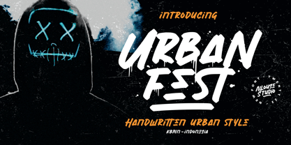 Proudly Presenting, Urban Fest A Handwritten Urban Style Font Urban Fest is perfect for any titles, logo, product packaging, branding project, megazine, social media, wedding, or just used to express words above the background. Urban Fest also come with Multi-Lingual Support. Enjoy the font, feel free to comment or feedback, send me PM or email.
 - Crocodile Feet by Hanoded,
$15.00 I had a Neneh Cherry song in my head when I made this font. In ‘Buffalo Stance’ she sings about a gigolo with his hands in his pockets and his crocodile feet. I liked the sound of it, so Crocodile Feet font was born. Crocodile Feet is a children’s book font: bold and cute, with easy to read glyphs. Comes with double letter ligatures in both the regular and the dots style.
 - Plakative Grotesk - 100% free

- Sturkopf Grotesk - 100% free

- Kalenderblatt Grotesk - Personal use only

- Power Grotesk by Power Type,
$15.00 Power Grotesk is a sans serif typeface with details that give typography that has its own characteristics from the thinnest to the thickest that is slightly widened. The goal is to create a typeface with legibility and good contrast between black and white so that it is suitable for different sizes. The typeface has a special feature that aids in reading and reproducing, trapping the right-sized ink for the text to work. The geometric shapes and structures reflect the inspiration and influence of medieval typography. Power Grotesk moves between the vast historical material that makes up modern typography, combining contemporary details with classic styles.
 - Messe Grotesk by Red Rooster Collection,
$45.00Based on the Albert Auspurg design, circa 1921-27. - Amsi Grotesk by Stawix,
$40.00 In 2015, Amsi Pro was released with the intention of easy usage and headings. After more than 5 years, Amsi has developed itself into the direction of Grotesk, which can be use comfortably as Graphic, both text and headlines, keeping its friendliness trait with Semi-Rounded and Humanist approach looking pleasing to the eye, succeeding the DNA of Amsi. The font has been set to equipped with 3 widths (Normal / Narrow / Condensed) for flexibilities in various demands. We are truly proud to present Amsi Grotesk.
 - Arupala Grotesk by Jetsmax Studio,
$15.00 Arupala Grotesk is a Grotesk font this versatile typeface will grab readers’ Attention. This font was inspired by a character named H. Aroepala. This font is suitable for both formal and informal events and is also suitable for various types of print and digital media.
 - Lens Grotesk by Typedepot,
$39.99 Lens Grotesk is a Neo-grotesque type family of 16 fonts born as a result of a very conscious research in the field of the neutral Swiss aesthetic. There's a reason for all the prominent examples of this design like Helvetica and Univers to be used on a daily basis for more than 70 years and it's a simple one - they just work. The closed terminals, the low contrast, uniform widths and proportions makes the Neo-grotesques feel just right. Although very often branded as stiff, the neutral Neo grotesques are here to stay and Lens Grotesk is our own reading of the popular style. Lens Grotesk takes the Neo-grotesk model one step further adding a pinch of Geometric sans-serif to the mix thus creating a way more modern and contemporary looking design. Characterized with more generous oval proportions and slightly more open terminals, Lens Grotesk keeps the modulation and rhythm needed for a slightly longer texts while visibly keeping everything in order. Zooming in you'll find traces of the Geometric aesthetic - the robust almost right angled approach of the arches and tails (look t, f, j, y) and the way more circular rounded shapes. Like all our fonts, Lens Grotesk is equipped with a range of OpenType features, stylistic alternatives and of course Cyrillic support. It comes in a pack of 16 fonts with 8 styles and their matching italics or one variable font file available with all full family purchases. Live Tester | Download Demo Fonts | Subscribe
 - Kommon Grotesk by TypeK,
$39.00 Introducing our foundry with the new Sans Serif typeface, Kommon™Grotesk, a super family with 96 styles. Different width from Extended to Compressed, variety of weights from Thin to Super, made Kommon™Grotesk suitable for multiple usage. The typeface was crafted till clean and simple. It has high legibility with modern and clear look to be use as text or display font. Kommon™Grotesk is effective displaying on many medias, both print and on screen.
 - Digi Grotesk by Linotype,
$29.99DigiGrotesk is one of the earliest digital fonts ever created. It is intended for use in longer texts set in smaller point sizes, including dictionaries and newspaper classified ads. - Guaruja Grotesk by Tipogra Fio,
$- Guaruja Grotesk is the first Tipogra Fio family for headlines & body copy. The grotesque form factor is much inspired in the Modernism movement from the mid of 20th Century but the Italic weight is a great cursive contrast aside the Roman ones so you can make very brutalist layouts or craft humanist projects, without losing the communication between all the family. Do not be afraid to type words with uppercase I and lowercase L because this last one has its own personality so do others glyphs like Italic lowercase G, Y and K and the straight corners in the Roman uppercase A, K, V, W, X, Y and Z. The same curves and corners are transferred to the numbers, symbols and so on. If your text is in a latin alphabet even though has lots of diacritcs, Guaruja may get it done! If you’re making a mathematical equation, it also can make it. If there’s a signaling project with lots of destinations, trust the arrows to help with together with the whole family.
 - Paul Grotesk by artill,
$29.00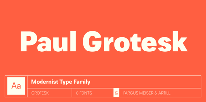


Page 1 of 62Next page