10,000 search results
(0.038 seconds)
- VU Rock N Roll by VisualizeUnited Fonts,
$65.00 VU Rock nRoll is a block display typeface, that comes in English and Greek characters, numerals and a very basic set of marks. It was inspired by graffiti and custom made wooden type. Having a rough look, it feels appropriate for short messaging and titles since its design is dynamic. Posters, labels and tees would host beautiful designs, that can stand out! Choose your text and rock n roll!
 - Betm Rounded by Typesketchbook,
$39.00 The typeface of Betm Rounded is based on the successful Betm font family by font foundry Typesketchbook. Font designer Chatnarong Jingsuphatada created Betm as a Rounded version to Betm. Both type families consist of ten weights plus with italic versions. Betm’s typeface has a friendly and modern sans serif appearance. This modern geometric font is very legible and can be used for headlines as well as small and long text.
 - Quebra Expa by Vanarchiv,
$55.00 Quebra Expa (Expanded) is an extend display sans-serif font family, available with four widths (Extra Condensed, Condensed, Normal and Expanded) and ten weights, italics versions are available. The main strokes contain small breaks simulating modulated variations on the letterforms, these details are more present on large body sizes. All font versions contain Latin and Cyrillic encoding characters and also ligatures, case-sensitive forms, fractions, oldstyle and finally tabular figures.
 - Tinman Pro by No Bodoni,
$35.00 TinmanPro is a mildly stressed humanist sans serif type based on the University of California Oldstyle type designed by Frederick Goudy. The design captures the warmth and friendly character of Goudy�s original in a monotone sans. Broad Latin support along with small caps, fraction support and other typographic niceties are included in the ten font family. Weight range includes Regular, Medium, DemiBold, Bold and ExtraBold with matching italics for each.
 - P22 Schneeberger by IHOF,
$29.95 In this font from graphic arts veteran Tracy Sabin, his trademark whimsy and playfulness are exhibited in spades. Sabin takes a multitude of influences, from mid-century art nouveau to today’s pleasant dream-pop doodles, and mixes them up into a sweet and animated alphabet that oozes energy, enthusiasm and honest innocence. Alongside the chromatic and colour-play possibilities that come with two layerable fonts, the jumpy, rough and curly elements that make up Schneeberger’s construct make this face a unique and essential tool for display and packaging aimed at catching the eyes of kids and teens. Use it for fantasy flicks, sugar-fix wrapping, and the elaborate backyard birthday party invite where the program is just as appealing for the adults as it is for the children. P22 Schneeberger comes in solid (Black) and outline (Regular) variants, each of which containing more than 400 characters, some very cool built-in stylistic alternates, a bunch of ligatures, and support for the majority of Latin languages.
 - Kaira by Gassstype,
$25.00 Hello Everyone, introduce our new product KAIRA is Bad Black Metal Font with a natural feel. This handmade font will make your design has a beautiful natural touch for each details. It is perfect for any design project as Invitation,logo, book cover, craft or any design purposes. KAIRA is Inspired by Logo style and combination with Unique Craft style. that will fulfill your design needs for quotes,sporty theme, logotype, wordmark, etc. This has many opentype features and support multi language.
 - Joy Braun by Maulana Creative,
$13.00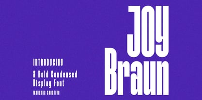 Joy Braun is a Modern sans display font. With combine the lowercase as an uppercase, fun character with a bit of ligatures. To give you an extra creative work. Joy Braun font support multilingual more than 100+ language. This font is good for logo design, Social media, Movie Titles, Books Titles, a short text even a long text letter and good for your secondary text font with scirpt or serif. Make a stunning work with Joy Braun font. Cheers, Maulana Creative
 - Cringe by Aiyari,
$25.00 Introducing "Cringe": a captivating typeface that draws inspiration from the mesmerizing world of psychedelic pop culture and combining it with a uncial letter form and calligraphy approach. Each character exudes a sense of whimsy and free-spiritedness. Cringe Font Family contains 5 style regular, medium, semi bold, bold, & Expanded. It comes with Stylistic set & ligatures. Ayr Cringe Font Family is best used for headings, logotype, quotes, apparel design, invitation, poster, flyers, greeting cards, packaging, book cover, printed quotes, cover album, movie, & etc
 - Edge Of Madness - Personal use only

- Fleet Street - Unknown license

- Sweet Square by Sweet,
$39.00The Engraver’s Square Gothic—like its rounder cousin, the engraver’s sans serif, Sweet® Sans,has been one of the more widely used stationer’s lettering styles since about 1900. Its minimal forms, made without curves, were popularized long ago by bankers and others seeking a serious, established feel to their stationery. One might argue that the design is a possible precursor to Morris Fuller Benton’s Bank Gothic® typeface. Sweet® Square is based on antique engraver’s lettering templates called “masterplates.” Professional stationers use a pantograph to manually transfer letters from these masterplates to a piece of copper or steel that is then etched to serve as a plate or die. This demanding technique is rare today given that most engravers now use a photographic process to make plates, where just about any font will do. But the lettering styles engravers popularized during the first half of the twentieth century remain both familiar and appealing. Referencing various masterplates, Mark van Bronkhorst has drawn Sweet Square in nine weights. The sources offered just uppercase, small caps, and figures, yet similar, condensed examples had a lowercase, making it possible to interpret a full character set for Sweet Square. Italics were also added to give the family greater versatility. The fonts are available as basic, “Standard” character sets, and as “Pro” character sets offering special characters, a variety of typographic features, and full support for Western and Central European languages. Sweet Square gives new life to an uncommon class of typeface: an early twentieth-century commercial invention that brings a singular verve to modern design. Its unique style is as useful as it is novel. Bank Gothic is a registered trademark of Grosse Pointe Group LLC. - LiebeGerda by LiebeFonts,
$29.00 Go out into the wilderness. Cut down a tree. Stop and smell the roses. And then treat yourself with this unplugged, hand-lettered typeface. LiebeGerda is an effortless-but-refined, spontaneous-but-elegant brush font. She is ready for your next project, and she wants to add that little crafty something that makes the difference. Her natural breath of fresh air lets you escape those same old monotonous script fonts you’ve been using. After our successful first brush font, LiebeDoris, and our first interconnected script, LiebeLotte, we’re combining both genres and taking them to the next level: an interconnected brush script. OpenType magic varies LiebeGerda’s letterforms: Most characters have no less than three different variations that are automatically shuffled and inserted as you type. Plus, the “All-Caps” OpenType feature exchanges uppercase letters with less-swashy variants. Now you know why every one of the four styles contains more than 1,200 characters! Ulrike of LiebeFonts painted LiebeGerda’s four styles individually from scratch and carefully adjusted every detail by hand. Rather than being one typeface with different weights, LiebeGerda is a package of four individual fonts that go together really well. Ulrike’s high level of type-nerdy craftsmanship shows. When you use LiebeGerda, your designs will easily convince your audience that they’re looking at a hand-crafted piece of lettering. Feel free to add a few of the stacked ligatures like “the”, “for”, and “new” to round off the illusion. Last but not least, LiebeGerda has a lot more detail than most other brush fonts. That means there’s no ugly, lazy bézier artifacts in the brush traces. You can print words at billboard size, and people will still believe they smell the paint from your brush!
 - Night Train by FontMesa,
$19.95 Night Train is a new font built from the ground up; while Night Train may resemble an old classic wood type there are a few lines that make this font a little more modern setting it apart from other wood type revivals. If you're a railroad enthusiast you're sure to enjoy the steam locomotive graphic located on the less than and greater than keys on all versions of this font, due to the fine detail of this train illustration the best printing results will be at 600dpi or higher on a laser printer. An alternate K and R are within the Night Train fonts, for Win Type1 these alternates are on the left and right bracket keys, for Truetype and OpenType you may access the alternates by using the Character Map in Windows or Adobe Illustrator, for OpenType you may also find them on the stylistic alternates page of the glyph map in Illustrator. There's something new with Night Train that the sign making people will love, for the first time FontMesa is pleased to offer a block shadowed version in four directions. One fill font is all that is needed for all four open faced fonts, you'll need an application that works in layers in order to use the fill font with the open faced fonts, simply place the fill font in its own layer then move it behind one of the open faced fonts of Night Train. The Night Train name has been on my list to use as a font name for a few years, a friend from years ago used to sail his boat in the Mackinac race from Chicago to Mackinac Island, the name of that boat was the Night Train. Watching the 2010 Olympic four man U.S. bobsled team win gold with their sled also called Night Train has inspired me to complete this font.
 - Hispania Script by HiH,
$10.00 Hispania Script is a distinctive and distinctly nineteenth century script. It was released by Schelter & Giesecke of Leipzig, Germany around 1890. Particularly noteworthy are the sharply-pointed legs of the upper case ‘K’ & ‘R’ that seem to be characteristic of the period. Similar strokes, often with a slight curve, may be seen in typefaces like Alt-Romanish and Tinteretto by Schelter & Giesecke, Artistic and Lateinsch by Bauer and Berthold and the poster lettering of Edward Penfield. The angle of this script (approximately 24 degrees) and the sharp delicate points must have made the manufacture of this face in metal type a challenge. The resulting type was probably quite fragile and subject to accidental damage. Additionally, the sharp points would be subject to wear. With digital type, these concerns are eliminated. As far as I know, no one has ever dropped a digital letter on the floor. Nonetheless, creating a digital outline for a typeface like Hispania Script, with many crossing strokes, can be quite time-consuming. Even with an accurate scan of a good quality original, it is usually necessary to construct each crossing stroke separately and then remove the overlap in order to obtain a sharp and convincing intersection. Steep internal angles are often defined with two points, rather than one, to minimize ink or toner fill that can muddy the rendering in smaller sizes. Like all formal scripts, Hispania Script is always useful for announcements and invitations. However, the distinctiveness of of this design strongly suggests that there are other applications that may benefit from its use. Step outside the box and try it in some unexpected places. It is the unexpected that often draws a person’s eye.
 - Quirky by Scholtz Fonts,
$19.95 The idea for Quirky was born while I was looking at a book of etchings by British artist Graham Clarke. His signature, crawling spider-like across the page, fascinated me with its casual, almost messy, inky dark and light drama. I started scribbling the alphabet as I imagined he would write it, based on his signature, then continued, adding curls, making the characters more angular, and refining the dramatic play between dark and light. Finally, Quirky appeared. Apparently casual, Quirky is, in fact, a true connected script. Quirky is characteristic of contemporary handwriting: It appears loose, angular, unstructured, and free, while maintaining good form and legibility. Its baseline is varied, creating an impression of impatient handwriting, without losing legibility. Quirky comes in five styles: condensed -- the most dramatic form, with great drama between thick and thin condensed black -- as with condensed but allows the user to provide exceptional emphasis wide -- increased readability wide black -- increased readability and emphasis splat -- messy and ink-blotted -- a hint of grunge Use Quirky for advertising, for humorous greeting cards, for a funky fashion look or tongue-in-cheek spooky media. Quirky is a fully professional font with extensive use of OpenType Ligatures. For example: most common double letter combinations such as "ee" are rendered as two, slightly different shaped "e"s. This variation in letter shapes removes the cues by which the reader identifies that he is viewing a FONT and thus conveys a strong sense of hand-lettered text. Language support includes all European character sets and has been designed to be used with the following languages: Afrikaans, Albanian, Basque, Bemba, Cornish, Danish, Dutch, English, Estonian, Faroese, Filipino, Finnish, French, Galician, Ganda, German, Icelandic, Indonesian, Irish, Italian, Kinyarwanda, Luo, Malagasy, Malay, Manx, Morisyen, North Ndebele, Norwegian Bokmål, Norwegian Nynorsk, Nyankole, Oromo, Portuguese, Romansh, Sango, Shona, Somali, Spanish, Swahili, Swedish, Swiss German and Zulu.
 - Andron 2 by SIAS,
$44.90 The sister fonts Andron 2 English and Andron 2 Deutsch provide a groundbreaking new possibility to render literature text bodies in a sophisticated traditional and yet modern way of type. In German typographic history there has once been a long-lasting struggle called the Frakturstreit (the blackletter quarrel). It was about wether German text ought to be composed in blackletter or rather in Roman type, a question upon which even Goethe, Schiller and other period celebrities got grey over time. However, blackletter type remained alive and has just recently seen an astonishing renaissance. This is not about a blackletter revisionism or some ‘mixture’ concept arguably bridging the gap between either worlds. Andron 2 English and Andron 2 Deutsch offer a new approach to circumvent that old antagonism. As for the lowercase letters I applied certain features of blackletter type onto the glyphs – but entirely abandoned the principle of the broken stroke as such. The result is a lowercase alphabet in the classical Andron style which may be considered an attractive alternative for text in English, German or even other languages. So it’s no longer entirely about choosing between ‘modern’ Roman or ‘ancient’ blackletter only. Andron 2 English Regular and Andron 2 Deutsch Regular feature the same lowercase glyphs but differ in the majuscules (Andron 2 English has normal Latin capitals). ++++ 2012 + NEW! +++ In response to its growing popularity we now present five new fonts as part of the Andron 2 series. Andron 2 English is completed by an Italic and a Bold font. Andron 2 Deutsch now contains three interesting alternative fonts: Italic, Scriptive and Laendlich. Last but not least – A new set of wonderful classical typographic ornaments is part of the Italic and Scriptive fonts. – You can also purchase these ornaments separately as “Andron Ornamente”.
 - Bobby Jones by Tom Chalky,
$19.00 Introducing The Loud & Proud Bobby Jones Font Collection Inside you'll find 16 quirky handcrafted fonts, oozing with personality, ripe and ready to take center stage within a variety of creative and fun design projects. If you're looking to grab eyeballs with an ad campaign, a logo design, apparel, printed stationery, and all that other good stuff, then worry not. Bobby has you covered. We all come with imperfections and Bobby is no exception! His outlines are slightly off, his corners are irregular, his straights aren't straight, but he's cool with it. In fact, he's too busy strutting his stuff. - What's Inside? Each of the fonts listed below boast multilingual glyph ranges and their own individually handcrafted outline style! (16 fonts in total!) - Bobby Jones - The original Bobby.J - Bobby Jones Soft - A rounded version of the above - Bobby Jones Condensed - The thinner and leaner sibling to Bobby Jones - Bobby Jones Condensed Soft - A rounded version of the above - Bobby Rough - A high-res textured version of the original - Bobby Rough Soft - A textured version of Bobby Jones Soft - Bobby Rough Condensed - A textured version of Bobby Jones Condensed - Bobby Rough Condensed Soft - A textured version of Bobby Jones Condensed Soft Designed a little over five years ago, the original Bobby Jones Font was my first ever product. This new and improved version has been entirely redesigned from bottom to top. Holding dearly to the punch that the original had, while adding a whole lot of extra power. I hope you enjoy the Bobby Jones Family as much as I do and have, and as always if you have any questions or comments, please do not hesitate to get in touch. I'd love to hear from you. (tom[at]tomchalky.com)
 - Sweet Square Pro by Sweet,
$59.00 The Engraver’s Square Gothic—like its rounder cousin, the engraver’s sans serif, Sweet® Sans,has been one of the more widely used stationer’s lettering styles since about 1900. Its minimal forms, made without curves, were popularized long ago by bankers and others seeking a serious, established feel to their stationery. One might argue that the design is a possible precursor to Morris Fuller Benton’s Bank Gothic® typeface. Sweet® Square is based on antique engraver’s lettering templates called “masterplates.” Professional stationers use a pantograph to manually transfer letters from these masterplates to a piece of copper or steel that is then etched to serve as a plate or die. This demanding technique is rare today given that most engravers now use a photographic process to make plates, where just about any font will do. But the lettering styles engravers popularized during the first half of the twentieth century remain both familiar and appealing. Referencing various masterplates, Mark van Bronkhorst has drawn Sweet Square in nine weights. The sources offered just uppercase, small caps, and figures, yet similar, condensed examples had a lowercase, making it possible to interpret a full character set for Sweet Square. Italics were also added to give the family greater versatility. The fonts are available as basic, “/fonts/sweet/square/” character sets, and as “Pro” character sets offering special characters, a variety of typographic features, and full support for Western and Central European languages. Sweet Square gives new life to an uncommon class of typeface: an early twentieth-century commercial invention that brings a singular verve to modern design. Its unique style is as useful as it is novel. Bank Gothic is a registered trademark of Grosse Pointe Group LLC.
 - Rhythm by Positype,
$42.00 I hate the idea of revivals. I have publicly said I choose not to do revivals because they make me uncomfortable. This is as close as I have been to crossing my own line. To be direct, Rhythm is based on the ATF typeface, Ratio (I just recently learned the foundry of origin). I came across this typeface from a printed specimen years ago when I was in school and held onto it. It was unique and I loved how well integrated the inline worked within both the flourish and serif of the glyphs—it was old, but not, reminiscent, but fresh. My specimen was limited in the glyph offering (it was c. 1930ish) and I realized a lot would need to be done to ‘finish’ it and bring it to contemporary expectations. I didn't want to do ‘retro’ and tried to avoid the visual trappings associated with it. What I did want to do is interpret what I had in the specimen and reinterpret it digitally, refining its construction and extending its typographic equity along the way. The ‘One’ and ‘Two’ (and their matching ‘Solids’) styles diverge providing various elaborations that coordinate well between rigid bracketed serifs and compact tails. I further expanded the glyph offering to include a full diacritic set, old style numerals, fractions, stylistic alternates, swashes, titling alternates and controlled flourishes that adhere to the efficient framework of the script. And yes, I refer to it as a ‘script’ because calling it a ‘cutesy serif’ seems wrong :) I hope this is seen less as a slavish revival and more as a championing of a really unique typeface. The Original Typeface was Adastra, designed by Herbert Thannhaeuser for the Foundry D. Stempel AG in Frankfurt, Germany.
 - Cinque Donne by Debi Sementelli Type Foundry,
$44.99 Cinque Donne means “Five Women” in Italian. It was inspired by the five sisters in my family as well as a group of five high school friends I have known for 46 years, aka “The Club Girls”. The Pro version has 3370 glyphs with all the bells and whistles! Women are connectors, encouragers and supporters. Young, old, shy, extroverted, when you put us together, somehow we make a beautiful impact on each other’s lives. This is what Cinque Donne does in a visual way. Some letters are simple and prefer to sit quietly. Others are flourished and proud and like the limelight in the middle of a word. And then there are alternates that are flexible and work in any number of surprising places. Stylistic sets can add a vivacious feel while contextual alternates bring better understanding. Classic or contemporary, subdued or flamboyant, these letters represent the variety of women that make life interesting for us all. Within the varied glyphs, I hope you find characters that remind you of the special women in your life. Let Cinque Donne salute them on the page! The Cinque Donne Family includes: Cinque Donne, Cinque Donne Bold, Cinque Donne Swash and Cinque Donne Pro. Check out the Buying Choices tab to see special discounted combinations! Crafters: All of my fonts have been specially coded for PUA (Private Use Area) so you can access all of the swashes and alternates using Character Map (PC) or Character Viewer (Mac) or with any number of apps including PopChar. If you would like to purchase PopChar at a special discount email me and I will send you the link. Cinque Donne Pro and Cinque Donne Swash include Swash, Stylistic and Titling Alternates, Contextual Alternates, Standard and Discretionary Ligatures, Roman Numerals & Fractions.
 - Lapis Pro by Canada Type,
$29.95 Lapis was Jim Rimmer's venture into a territory he'd earlier explored with his Lancelot and Fellowship faces. This time he stayed much longer, dug pretty deep, and had plenty of fun in there. The end result is the kind of mosaic of influences only a guy like Jim could consider, gather, manage and apply in a way that ultimately makes sense and works as a type family. On the surface Lapis seems like something that can be billed as what Jim would have called an "advertising text face". But under the hood, it's a whole other story. On top of the calligraphic, nib-driven base Jim usually employed in his faces, Lapis shows plenty of typographic traits from a variety of genres, from Egyptian to Latin, from blackletter angularity to Dutch-like curvature, with an overall tension even reminiscent of wood type. There are some Goudy-informed shapes that somehow fit comfortably within all this. Then it's all strung together with a mix of wedged, tapered and leaning serifs, placed with precision to reveal expert spontaneity and a great command of guiding the forms through counterspace. In the fall of 2013, the Lapis fonts were scrutinized and remastered into versatile performers for sizes large and small. The three weights and their italic counterparts have been refined and expanded across the board to include small caps, alternates, ligatures, ordinals, case-sensitive forms, six kinds of figures, automatic fractions, and a character set that covers an extended range of Latin languages. Each of the Lapis Pro fonts contains over 760 glyphs. For more details on the fonts' features, text and display specimens and print tests, consult the Lapis Pro PDF availabe in the Gallery section of this page. 20% of Lapis Pro's revenues will be donated to the Canada Type Scholarship Fund, supporting higher typography education in Canada.
 - Girasol by Lián Types,
$35.00 This is a cute story about a mother and her son. :) About a decade ago my own mother got very interested in my work. She used to say my letters had so many swirls and dazzling swashes, and suggested my job seemed to be very fun. She wondered if she could ever try to make her own alphabet... Well, she is a civil engineer and a maths teacher, and appeared to be a little tired of exact sciences... I remember answering this, while she was listening with her typical tender look: -"Mamá... While type-design may be a really enjoyable thing to do, it also involves having a great eye and knowledge about the history of letters: nice curves and shapes require a meticulous study and, like it happens in many fields, practice makes perfect"-. Well, she raised her eyebrows at me. -"and so what?"- She didn't have any experience neither in the field of art nor in the field of graphic design so, I told her that if she really wanted to get into this she should borrow some of my calligraphic books from my beloved shelves in my office. So... she did. Some weeks after that, she came to me with many sketches made with pencils and markers: some letters where very nice and unique while others naturally needed some work. I remember she added ball terminals to all of her letters (even if they didn't need them) because that was one of the rules she imposed. After some back and forth, we had the basis for what would be today, ten years later, the seed of this lovely font Girasol. Her proposal was nice, something I was not accustomed to do, that’s why many years later I decided to watch it with fresh new eyes and finished it. While she was in charge of making the lowercase letters, I helped with the uppercase and also added my hallmark in the alternates, already seen in others of my expressive fonts. The result is an upright decorative font that follows the behavior of the copperplate nib with a naive touch that makes it really cute and useful for a wide range of products. Many alternates per glyph make Girasol a very fun to use font which will delight you. Above posters are a proof of that! This font is a gift for my mother, Susana, who, in spite of her exacts academic background, taught me that beauty can also be found in the imperfect. 1 NOTES (1) In my fonts I'm always in seek of the perfect curve. When I designed Erotica and Dream Script, I read about Fibonacci’s spirals!
 - CMSquish, a font designed by Charly Masci, stands out as a distinctive, playful, and versatile typeface that brings a unique flair to any creative project. Imagine the letters as if they've been gent...
- Inhuman BB is a font that stands out for its dynamic and expressive qualities, designed to capture attention with its unique character. Developed by Blambot Fonts, a foundry well-known for creating c...
- As of my last update in April 2023, there isn’t a widely recognized font specifically named "Madonna" that is part of standard typographic resources or libraries. However, let's explore a hypothetica...
- The Bertolt Brecht font by Thiago Matsunaga is an evocative and expressive typeface that captures the spirit of innovation and sophistication. Named after the famed German playwright and poet Bertolt...
- As of my last update in early 2023, a font directly named "Family Guy" specifically designed to mimic the title logo or typography used in the popular American animated sitcom "Family Guy" does not h...
- Gipsiero by Bumbayo Font Fabrik is a font that arrests the eye with its unique blend of whimsy and elegance. Crafted with keen attention to detail, this typeface embodies a bold and adventurous spiri...
- AT Move Altera by André Toet Design,
$39.95 ALTERA a typeface based on a logotype André Toet made for a dutch broadcast company. This typeface is in fact carries a transformation in itself: it’s composed of three different weights and shapes. In our humble opinion the possibilities are endless ! So be a sport and use this typeface for logo’s and headings. Kick the can ! Concept/Art Direction/Design: André Toet © 2017
 - Futurette by Jvne77 Studio,
$11.00 Futurette is a large weight family, covering all your needs for futuristic or sport projects, logos and others. Each style comes with 409 glyphes and can be used for Display titling, but in text also well. It was inspired by a bunch of 70's and 80's types like Handel Gothic or the ITC Bolt, and more recent faces like Typodermic's Conthrax and Good Times...
 - Think Straight by HIRO.std,
$20.00 Think Straight a Bold Display Font. This font describes about fun, dynamic, street style, headline, pleasure, humanist, easy going, and easy to use. FEATURES - Uppercase and Lowercase letters - Support Opentype Features - 89 Ligatures - Numbering and Punctuations - PUA Encoded Characters - Multilingual Support - Works on PC or Mac USE Think Straight works great in any branding materials, logotype, poster, print, headline, t-shirt, packaging, magazine etc. Enjoy using! Thanks.
 - Christmas Deer by Arttype7,
$15.00 We just launched a new product font. charming fonts with a pretty christmas look, named "cristmas deer font". This font is inspired by deer antlers. has 3 beautiful swash variations. and also has more than 650 glyphs. This font also has a stylistic alternative for multilingual support. Perfect for logos, Christmas greeting cards, wedding invitations, web, t-shirts, souvenirs, quotes, graphic watermarks. thank you regards
 - Palmera Outline by RagamKata,
$14.00 Palmera is a geometric slab serif font. Simple and sharp-looking, this typeface will truly inspire you to create spectacular designs that will impress everyone. Palmera font is perfect for your up coming projects. Such as logo branding, editorial design, fashion, adventure apparel, stationery design, sport design, blog design, modern advertising design, card invitation, badge, art quote, home decor, book/cover title, special events and any more.
 - Captain Tall Ship by Alphabet Agency,
$20.00 Captain Tall Ship is the clean version of Captain Tall Shipwreck. The font can be used in many project themes, from birthday party invitations to beer labels. The font could be potentially used is a number of design themes including bars, pubs, pirate, navy, seafarer, alcohol products, western/cowboy, card game/gambling, biker gang, tattoos, emblems and crests, old military & hunting to name a few.
 - Southwave by FHFont,
$19.00 Southwave is script font with a hand-lettered, modern caligraphy style, with OpenType feature include in the font. Suitable for design, element design, wedding, event, t-shirt, logo, badges, sticker, and awesome work. Features Of The Font: - All Standard Character, Symbol, Multi-lingual Support, Ligature, Stylistic Sets and Swashes. - PUA Encoding Follow Me: - https://www.instagram.com/FHFont - https://twitter.com/FH_Font - https://www.facebook.com/FHFont/ - https://id.pinterest.com/feydesign/
 - Cardinal Script by FadeLine Studio,
$12.00 This is a beautiful handmade script font made with neat and clean. This font that will make your designs even more fun! With a style like this, this font will be suitable in use for logo's, branding projects, homeware designs, product packaging, mugs, quotes, posters, shopping bags, logo's, t-shirts, book covers, name card, invitation cards, greeting cards, and all your other lovely projects.
 - Cubevano by Lafontiva,
$19.00 Cubevano is a geometric, modular display typeface. It is the result of fascination with geometry, impossible objects and work of artists such as Oscar Reutersvärd. Family was created in 6 styles for any type of graphic design, such as logos, covers, posters, signs, shirts, etc. It looks best in large sizes. Cubevano typeface comes with uppercase and lowercase letters, numbers, currencies, punctations and multilingual support.
 - Bellamy by Calamar,
$12.00 Bellamy is a hand-drawn calligraphic script with dancing baseline and lots of possibilities. This expressive font will look awesome on your cards, wedding invitations, headings, branding materials, quotes, t-shirt and any other amazing projects you are working on. Bellamy includes Upper and Lowercase Basic Characters, Alternates Lowercase Characters, Standard Ligatures, Numbers and Punctuation. Bellamy has multilingual support for the Western and Central European Languages.
 - Sabrina Pamella by Bluestype Studio,
$15.00 This is our newest product called Sabrina Pamella. Sabrina Pamella is a stunning signature font with a bold vibe. It will turn any design idea into a true standout. This font is suitable for use on business cards, weddings, t-shirt designs, logos, magazines, quotes, fashion, watermarks, invitations, signatures. What's include: - Alternate Characters - Multilingual Support - Swashes Thank you, and don't forget to check out our other products.
 - Redzein by Almarkha Type,
$15.00 Introducing our latest Vintage Slab called Redzein Retro Display Slab with vintage taste can make your logotype become more interesting. inspired by the decorative arts and architecture movement. Redzein fonts is perfect for your project and allows you to create designs, headlines, posters, logos, badges, t-shirts and many more that are beautiful. It is also best used for posts, logos, posters, certificates, labels and more.

