10,000 search results (0.03 seconds)
  1. Maiers Nr 21 Pro by Ingo, $42.00
    A handwritten ”font for technicians“ from ca. 1900. Very geometrical, rigid forms borrowed from the typical characteristics of Jugendstil / Art Nouveau. This script is found in a magazine from the Otto Maier publishing house, Ravensburg, which was issued sometime in the years shortly before WWI. The magazine is entitled ”Schriften-Sammlung für Techniker: Verkleinerte Schriften der wichtigsten Alphabete“ (Collection of scripts for technical specialists: reduced scripts of the most significant alphabets) and published by Karl O. Maier. The original copy, produced by means of a galvanized plate, is just 7 centimeters wide. It served as the model for technical professions in which, at that time, the captions of drawings were still done by hand. The characters have been scanned, digitized and greatly magnified. Special attention was given to ensure the ”uneven“ edges, typical of handwritten script, remained effectively noticeable even in the digitized form. As a result, this ”technical“ font retains a handmade touch. Especially worthy of note are the Jugendstil forms characteristic at the turn of the19th century. In comparison, many alleged ”ultramodern“ font types of today suddenly look quite old-fashioned. Maier’s Nr. 21 Pro is suitable for all European languages. It includes ”Latin Extended-A,“ for Central and Eastern Europe incl. Turkish, and even Cyrillic and Greek, too. The font includes several stylistic alternates as well as a number of ligatures.
  2. Bodoni FB by Font Bureau, $40.00
    Working at American Type Founders from a Bruce Foundry recutting, Morris Fuller Benton worked out the dramatics of the English Fat Face, and in 1928 produced Ultra Bodoni, a headline spectacular. Using Benton’s 1933 Ultra Bodoni Extra Condensed, Richard Lipton digitized Bodoni FB Bold Condensed, then took compression even further and designed Bodoni FB Bold Compressed, a real technical tour de force; FB 1992
  3. WildWest-Normal - Unknown license
  4. Addington CF by Connary Fagen, $35.00
    Addington CF is a graceful and reliable serif, useful in any application. Beautiful and practical, Addington is designed for excellence at small point sizes, while doubling as a capable, bold display typeface. Includes roman and italic sets across seven weights. Addington CF pairs nicely with simple, bold headline typefaces, like Greycliff CF and Articulat CF. All typefaces from Connary Fagen include free updates, including new features, and free technical support.
  5. Tribal Times - Personal use only
  6. Red October - Personal use only
  7. Generator REX - Personal use only
  8. Hulkbusters 3D - Personal use only
  9. !Futurelic - Unknown license
  10. Nautilo Font System by Die Typonauten, $9.90
    Technical systems rule!
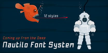
  11. ROTRING - Unknown license
  12. GOST type A - Unknown license
  13. Sans Andreas by Java Pep, $11.00
    Proudly presenting the newest handwritten font called Sans Andreas. These font made by handwritten style, so all shape looks unique and natural. Sans Andreas is a family font, with 4 styles regular, italic, bold, bold italic. Sans Andreas is also perfect for all your project that has sense fun, playful, art, and .etc If you have any questions or technical support don't hesitate to comment, message or contact java.indonesian@yahoo.com. Have a nice day.
  14. HeavyLOUDedge by TypoGraphicDesign, $19.00
    Head­line Font / Dis­play Font / Techno Fat Font Hea­vy­Loun­dEdge with 4 styles (regu­lar, bold, light, line) & 304 gly­phs, including accents & €.
  15. Rogers2 - Unknown license
  16. Wacamóler Caps - Personal use only
  17. Germanica - 100% free
  18. MLB Tuscan - Unknown license
  19. ThunderBay - Unknown license
  20. Schmalfette Fraktur - Personal use only
  21. Back In The USSR DL - Personal use only
  22. VINTAGE COLLEGE DEPT_DEMO_worn - Personal use only
  23. Stove Plate JNL by Jeff Levine, $29.00
    An old printer's advertising cut for Red Star Oil Stoves yielded a typeface that was both vintage and somewhat techno at the same time. Originally drawn as a slanted logo, the individual letters had an array of chamfered, angled and flat sides combined with a bold outline. This font is available in both vertical and oblique versions.
  24. Aircruiser - Personal use only
  25. Construct by Breitenlauf, $20.00
    Construct is a technically based headline font that can also be used as body text. The font has some new ligatures that are automatically applied. Construct particularly suitable for headlines which should have a urban and technical character.
  26. Pilatus by Milan Rohrer Studio, $20.00
    The Pilatus font is a sans-serif standard technical font based on the ISO 3098 standard. The standard was developed for a good reading when reducing technical plans on films. The font follows clear rules and geometric proportions.
  27. Televisio by Suomi, $25.00
    Televisio is a headline font witha technical retro feel.
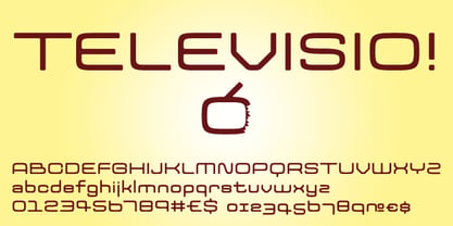
  28. Telegrama - 100% free
  29. Operational Amplifier - Unknown license
  30. Digital Readout Upright - Unknown license
  31. Konstructa Humana Stencil by TypoGraphicDesign, $19.00
    CONCEPT/ CHARACTERISTICS »Kon­strukta Humana Sten­cil« aka »Hot Cold« is a modern desi­gned sans serif type­face with huma­nist influ­en­ces and Sten­cil cha­rac­ter. The par­ti­ally strong line thick­ness dif­fe­rence (line con­trast) gives the font a touch of ele­gance and crea­tes ten­sion as fats. The font comes in 3 font styles. From ele­gant warm ten­der­ness »Thin« to the solid, bold, and robust­ness cold »Regular«. APPLICATION AREA The »Thin« font weight would pro­bably dig on fes­tive invi­ta­ti­ons and »Regu­lar« as con­cise pos­ter font. From head­lines in maga­zi­nes or web­sites about pos­ter design and fly­ers to t-shirt design. Just type it. TECHNICAL SPECIFICATIONS Head­line Font | Dis­play Font | Sans Serif Sten­cil Font »Kon­structa Humana Sten­cil« Open­Type Font (Mac + Win) with 375 gly­phs & 3 styles (regu­lar, light, thin). With alter­na­tive let­ters, liga­tures, accents & €.
  32. Aklimat MF by Masterfont, $59.00
    Elegant font family with a technical twist, formal yet elegant.
  33. Shaky Hand Some Comic by TypoGraphicDesign, $19.00
    CHARACTERISTICS The kiddy and warmly cha­rac­ter and the cute, huge points (amongst others punc­tua­tion), gives the type­face a high reco­gni­tion value and uniqueness. APPLICATION AREA The warm, child-like, bold and striking sans serif font »Shaky Hand Some Comic« would look good at dis­play size for head­lines in magazi­nes or web­sites, pos­ters, packa­ging, covers or webbanner. TECHNICAL SPECIFICATIONS Head­line Font | Dis­play Font | Sans Serif Font »Shaky Hand Some Comic« Open­Type Font with 340 gly­phs alter­na­tive let­ters and liga­tures (with accents & €) & 3 styles (regu­lar, bold & 3d)
  34. KING ARTHUR - Personal use only
  35. The Rio Lobo - Unknown license
  36. Shadowed Serif - Unknown license
  37. KellyAnnGothic - Unknown license
  38. Dampfplatz Solid - 100% free
  39. Selektor by Tour De Force, $25.00
    Selektor is a small font family characterized as geometrical sans. Inspired and after that designed with charm of technical letters, it contains a few letters with specific endings that gives Selektor a peculiar impression. Global overview of Selektor says it's a neutral, corporate, stable, well balanced font family, but not cold and heartless to leave readers without remembrance on its characteristics. It is fully appliable in all kinds of publications, from long texts in paragraphs to titles and product names. Contain 3 weights - Light, Regular and Bold and matching Italics. All family members include Small Caps and Fractions as well as additional OpenType features.
Looking for more fonts? Check out our New, Sans, Script, Handwriting fonts or Categories
abstract fontscontact usprivacy policyweb font generator
Processing