10,000 search results
(0.069 seconds)
- Minimo by Ahmet Altun,
$19.00 Minimo Font Family comes in 4 weights; Normals and Obliques. To have an eye-pleasing view, the corners are rounded and the lowercases are made smaller than the standard. With its soft structure, it is aimed to be legible even in the small sizes and also to be suitable for usage as webfont and application font. Moreover, with this font family, you can create eye-pleasing, cute and also nice works such as posters, printings, t-shirts, adds, magazines etc.
 - NorB Note by NorFonts,
$28.00 NorB Note is a handwritten text font with an angled fat marker lettering style. You can use this font with any word processing program for text and display use, print and web projects, apps and ePub, comic books, graphic identities, branding, editorial, advertising, scrapbooking, cards and invitations and any casual lettering purpose… or even just for fun! NorB Note comes with 3 weights, each with their matching Italics, Oblique and in a Light, Normal and Condensed version. (a Chalk version is also featured!)
 - Edits And Credits JNL by Jeff Levine,
$29.00Edits and Credits JNL is a cheerful sans serif typeface modeled from ceramic letters in a movie titling set from the late 40s or early 1950s. In the original kit, letters would be lined up accordingly against a contrasting background and photographed for home or professional movie and slide titles. Note: The cap height is slightly smaller than normal for the respective point size. This will give the effect of wider line spacing - similar to that of home movie titles. - Feltboard JNL by Jeff Levine,
$29.00Feltboard JNL was drawn from images of letters and numbers contained in a felt board (also known as a flannel board) sign kit from the 1940s or 1950s. The irregularity of stroke widths and character shapes is representative of the actual shapes of the die-cut pieces found within this kit. Note: The cap height is slightly smaller than normal for the respective point size. This will give the effect of wider line spacing - similar to that of hand-made signs. - DT Skiart by Dragon Tongue Foundry,
$30.00 Looking for something between a Serif and Sans Serif font? Try the DT Skiart font. This high quality, versatile font has the professional feel of a Serif, but has the open readability of a Sans Serif. A smart crisp font with smooth simple lines. It has a medium to strong stroke contrast, with the vertical line being heavier than the horizontal line, and no serifs. The DT Skiart family is made up of 5 weights in both italic and normal.
 - Tomkin by Typesketchbook,
$55.00 Tomkin font is an extra large super family of 54 fonts! Tomkin have such a big abundance of contrast, styles, weights, width. Typesketchbook consists of a very usable, clean and modern sans typeface with Semi-square struture. The complete Tomkin type family includes 9 weights with italic and 3 width (normal, narrow, condense) versions for each of them all in all 54 fonts for a multifunctional usage, especially for cooperative work, such as website, magazine, editorial, publishing , as well as packaging.
 - Aden by Sultan Fonts,
$19.99 Aden is An Arabic typeface for desktop applications. Aden is Modern typeface style. The font comes in two styles: normal and bold. The design is open, calligraphic, and very dynamic. This makes it suitable for large display sizes, especially in the area of advertising, while still functioning well as a text face. The font includes a matching Latin design and support for Arabic. It also includes proportional and tabular numerals for the supported languages. Aden typeface comes with many opentype features.
 - Tablet Gothic by TypeTogether,
$35.00 Graphic designers of any nationality and background know very well that the art of composing titles correctly is not easy, Especially when it comes to periodical publications where there is need for both flexibility and graphic coherence. Tablet Gothic was originally engineered as a titling type family, meant to help designers working on publications that require output as hard copies and a variety of digital platforms at the same time. As such, it is a grotesque sans serif that looks to the future of publishing with a clear understanding of its history, and reminiscences that go back to nineteenth century Britain and Germany. Tablet Gothic delivers the sturdy, straightforward and clean appearance expected from a grotesque, but it allows itself a good measure of personality to make it stand out on the page. Its 84 styles –six series of condensation and seven weights in each series plus obliques– guarantee that, whatever the publication format is, there's a Tablet Gothic font that will do the job and perform well both technically and aesthetically. Furthermore, the rounder styles, Tablet Gothic Wide, Normal and Narrow achieved amazing results at very small sizes, producing a beautiful texture and highly readable text blocks. Tablet Gothic fonts can be purchased individually, by series or as a complete bundle (best value!)
 - FF Cocon by FontFont,
$65.99 FF Cocon’s designer, Evert Bloemsma (1958—2005) described it as a “serious typeface”. Despite first impressions, the description holds up well. Since its 2001 release, FF Cocon has been used in an astoundingly wide variety of design applications. At large sizes, FF Cocon works as a display face, with beautiful detailing. And at small sizes, it remains surprisingly readable. The lowercase letters a, b, d, g, h, m, n, p, q, r and u, were drawn without spurs, as Bloemsma made an attempt to erase every trace of handwriting; even “normal,” neutral sans serif typefaces still retain elements in their letterforms like this. Bloemsma wanted none of it. Although a difficult starting point for a typeface, this proved successful. Bloemsma’s design is a family of rounded yet rather asymmetrical forms with details reminiscent of brush-strokes, but that were not made with a brush in hand. In spite of its claim to seriousness, FF Cocon is a family of seductive, voluptuous styles. The original FF Cocon had two widths—normal and condensed. Later, a more compact Extra Condensed version was introduced, as well as italics.
 - Senkron by Gurup Stüdyo,
$19.00 Senkron is composed of "normal" and a "blok" styles. Senkron ("normal") was designed as a pure and modern neo grotesk font. The anatomy of the letters are designed to achieve an equal text color. For this purpose, the legs of the letters “R” and "K" are designed with a vertical angle to prevent the white space that would occur in the middle of these letters. In the minuscule, the characteristic features of letters such as ‘a’, ‘l’, ‘t’ are concretized and legibility is supported in the text. Considerable attention has been paid to the harmony between the anatomical structures of the letters and the diacritical mark’s structure. Senkron Blok is arranged for situations which have diacritical marks overflow to leadings of the headline and headline typographical color is affected negatively from this situation. For this purpose, majuscule diacritical letters are resolved within the letter height. However, when this is done, new forms are obtained by integrated diacritical marks with letters instead of directly merging them. The idea behind this approach is to preserve the typographic value of diacritical marks and emphasize the semantic value of diacritical letters. 82 letters have been redesigned in this way.
 - Pea Breathe Easy - Unknown license

- Hexanova by Jetsmax Studio,
$15.00 Hexanova is a handmade display font that is text friendly but will give an elegant touch in its alternative characters. With its free style, this font specifically design to elevate your project and make it stand out even more. Hexanova Font best uses for poster, logotype, branding, cover, events, advertisements, animation, social media post, advertisements, and many more. Let your imagination run free!
 - Copperplate New by Caron twice,
$39.00 Imagine America in the 1930s. A gangster flick with Al Capone, a crime novel featuring Philip Marlowe. Our hero in a fedora sits in a classy bar, orders a double bourbon, lights a cigar and eyes the evening paper. He turns the pages, reading about a bank heist over on Third Avenue, a scandal involving a baseball player, a small ad for a general practitioner and a large spread about a famous law firm. What do the bottle of booze and the majestic facade of the bank have in common? The elegant baseball uniform and trustworthy attorneys? - Copperplate Gothic - When Frederick William Goudy created his legendary typeface in 1901, it went on to literally become the symbol of early 20th century America. Tiny serifs, characteristically broad letterforms, and particularly bold titles decorated calling cards at 6-point size, enormous bronze-cast logos, newspaper headlines, restaurant menus and more. This was the golden age of Copperplate, lasting up until the arrival of die neue Typografie and monospaced grotesques in the 1960s. Then the typeface almost completely disappeared. It made a partial comeback with the advent of the personal computer; digitizations of varying quality appeared, and one version even became a standard font in Adobe programs. This may have played a role in Copperplate later being used in DIY projects and amateur designs, which harmed its reputation. Copperplate New has been created to revive the faded glory of the original design. Formally, the new typeface expands the existing weight and proportional extremes. The slight serifs are reduced even further, making the typeface sans-like at smaller point sizes and improving readability. In contrast, at large point sizes it retains all of its original character. Decorative inline & shadow styles have been added and both have been created in all five proportions, making it easy to adapt the typesetting to the format you need. Despite these changes and innovations, Copperplate New remains true to Goudy’s original design and represents a snazzy way to evoke a golden era in American culture. Specimen: http://carontwice.com/files/specimen_Copperplate_New.pdf
 - Barchowsky Fluent Hand by Swansbury,
$24.00Swansbury, Inc. provides handwriting instruction to all ages, accompanied by two exemplar fonts, Barchowsky Fluent Hand.otf and Barchowsky Dot.otf. The basis for the design of the characters is the italic of the Renaissance. With the advantage of contextual alternates, Barchowsky Fluent Hand automatically joins lowercase letters so it can be used in any venue where a clean and elegant appearance of handwriting is desired. The fonts allow maximum instructional flexibility. Aside from their use in lesson plans, educators can customize pages for specific student interests, studies and needs. Included are all math symbols that one typically encounters in school curricula. Nan Jay Barchowsky, designer of this font, believes that children should hone their handwriting skills as they learn all subjects, reading, math, history and foreign languages. Both fonts support all Western European languages and Turkish. Barchowsky Dot is for young children or others who need remediation. The letterforms are identical to those in Barchowsky Fluent Hand. Used at a large point size open dots appear within the lines that form the characters indicating where one should start each stroke in a letter or number. Once formations are learned Barchowsky Fluent Hand can be used with the contextual alternates turned off until students are ready to write in the joined-up manner of a true cursive. Specifications: The technology for fonts that automatically join letters, or allow them to be unjoined is relatively new. At present, both fonts work on Windows XP with Service Pack 1 or later (or Vista), using AbiWord, a free word processor (go to abisource.com). They also work well with InDesign 2. Currently there is an unknown factor in later versions of InDesign for Windows that disallows joining. Macs completely support the fonts using InDesign 2 and later, PhotoshopCS and IllustratorCS. If you do not have these applications, there is an inexpensive word processor for Macs. - Hand of Hannah by TypoGraphicDesign,
$19.00 The typeface Hand of Hannah is designed from 2021 for the font foundry Typo Graphic Design by Hannah Englisch & Manuel Viergutz. The character of the handwritten script typeface is rough, ruggend and raw. With state-of-the-art OpenType-Feature (like Contextual Alternates (calt) and Stylistic Alternates (salt)). Each uppercase and each lowercase letter has automatically alternated two variations to bring humanly-random characteristics of handwriting to life. 4 font-styles (Regular, Bold, Heavy & Icons) with 732 glyphs (Latin 3) incl. 100+ decorative extras like icons, arrows, catch words, dingbats, emojis, symbols, geometric shapes (type the word #LOVE for ♥︎ or #SMILE for ☺ as OpenType-Feature dlig) and stylistic alternates. For use in logos, magazines, posters, advertisement plus as webfont for decorative headlines. The font works best for display size. Have fun with this font & use the DEMO-FONT (with reduced glyph-set) FOR FREE! ■ Font Name: Hand of Hannah ■ Font Styles: 4 font-styles (Regular, Bold, Heavy, Icon) + DEMO (with reduced glyph-set) ■ Font Category: Display Script for headline size ■ Font Format:.otf (Mac + Win, for Print) + .woff (for Web) ■ Glyph Set: 732 glyphs (Latin 3 incl. decorative extras like icons) ■ Language Support: 80 languages: Afrikaans Albanian Asu Basque Bemba Bena Breton Catalan Chiga Colognian Cornish Croatian Czech Danish Dutch English Estonian Faroese Filipino Finnish French Friulian Galician German Gusii Hungarian Indonesian Irish Italian Kabuverdianu Kalenjin Kinyarwanda Latvian Lithuanian Lower Sorbian Luo Luxembourgish Luyia Machame Makhuwa-Meetto Makonde Malagasy Manx Morisyen North Ndebele Norwegian Bokmål Norwegian Nynorsk Nyankole Oromo Polish Portuguese Quechua Romanian Romansh Rombo Rundi Rwa Samburu Sango Sangu Scottish Gaelic Sena Serbian Shambala Shona Slovak Soga Somali Spanish Swahili Swedish Swiss German Taita Teso Turkish Upper Sorbian Uzbek (Latin) Volapük Vunjo Zulu ■ Design Date: 2021 ■ Type Designer: Hannah Englisch, Manuel Viergutz
 - Rowan by VP Creative Shop,
$12.00 Introducing Rowan - Elegant typeface. 116 font styles included and 1 script Rowan is elegant and retro typeface loaded with 116 font styles (narrowest, narrower, narrow, regular, wide, wider, rough, outline and script with 6 weights) 87 languages support, alternate and ligature glyphs to make you typography truly unique! Language Support : Afrikaans, Albanian, Asu, Basque, Bemba, Bena, Breton, Chiga, Colognian, Cornish, Czech, Danish, Dutch, Embu, English, Estonian, Faroese, Filipino, Finnish, French, Friulian, Galician, Ganda, German, Gusi,i Hungarian, Indonesian, Irish, Italian, Jola-Fonyi, Kabuverdianu, Kalenjin, Kamba, Kikuyu, Kinyarwanda, Latvian, Lithuanian, Lower Sorbian, Luo, Luxembourgish, Luyia, Machame, Makhuwa-Meetto, Makonde, Malagasy, Maltese, Manx, Meru, Morisyen, North Ndebele, Norwegian, Bokmål, Norwegian, Nynorsk, Nyankole, Oromo, Polish, Portuguese, Quechua, Romanian, Romansh, Rombo, Rundi, Rwa, Samburu, Sango, Sangu, Scottish, Gaelic, Sena, Shambala, Shona, Slovak, Soga, Somali, Spanish, Swahili, Swedish, Swiss, German, Taita, Teso, Turkish, Upper, Sorbian, Uzbek (Latin), Volapük, Vunjo, Walser, Welsh, Western Frisian, Zulu FEATURES Uppercase, lowercase, numeral, punctuation & Symbol ligature glyphs alternates Narrowest - regular, italic and styled with 6 weights Narrower - regular, italic and styled with 6 weights Narrow - regular, italic and styled with 6 weights Regular - regular, italic and styled with 6 weights Wide - regular, italic and styled with 6 weights Wider - regular, italic and styled with 6 weights 1 script 2 rough styles 6 outline fonts Multilingual support - 87 languages No special software is required to type out the standard characters of the Typeface. How to access alternate glyphs? To access alternate glyphs in Adobe InDesign or Illustrator, choose Window Type & Tables Glyphs In Photoshop, choose Window Glyphs. In the panel that opens, click the Show menu and choose Alternates for Selection. Double-click an alternate's thumbnail to swap them out. Feel free to contact me if you have any questions! Mock ups and backgrounds used are not included. Thank you! Enjoy!
 - Barchowsky Dot by Swansbury,
$17.00Swansbury, Inc. provides handwriting instruction to all ages, accompanied by two exemplar fonts, Barchowsky Fluent Hand.otf and Barchowsky Dot.otf. The basis for the design of the characters is the italic of the Renaissance. With the advantage of contextual alternates, Barchowsky Fluent Hand automatically joins lowercase letters so it can be used in any venue where a clean and elegant appearance of handwriting is desired. The fonts allow maximum instructional flexibility. Aside from their use in lesson plans, educators can customize pages for specific student interests, studies and needs. Included are all math symbols that one typically encounters in school curricula. Nan Jay Barchowsky, designer of this font, believes that children should hone their handwriting skills as they learn all subjects, reading, math, history and foreign languages. Both fonts support all Western European languages and Turkish. Barchowsky Dot is for young children or others who need remediation. The letterforms are identical to those in Barchowsky Fluent Hand. Used at a large point size open dots appear within the lines that form the characters indicating where one should start each stroke in a letter or number. Once formations are learned Barchowsky Fluent Hand can be used with the contextual alternates turned off until students are ready to write in the joined-up manner of a true cursive. Specifications: The technology for fonts that automatically join letters, or allow them to be unjoined is relatively new. At present, both fonts work on Windows XP with Service Pack 1 or later (or Vista), using AbiWord, a free word processor (go to abisource.com). They also work well with InDesign 2. Currently there is an unknown factor in later versions of InDesign for Windows that disallows joining. Macs completely support the fonts using InDesign 2 and later, PhotoshopCS and IllustratorCS. If you do not have these applications, there is an inexpensive word processor for Macs. - PIXEL Pattern by TypoGraphicDesign,
$9.00 The typeface PIXEL pattern is designed from 2021 for the font foundry Typo Graphic Design by Manuel Viergutz. The display typeface is inspired in the past and present. 8 font-styles (Square, Circle, Square Flicker, Circle Cloud, Square Bold, Square Fat, Star, Star Spike) with 830 glyphs (Adobe Latin 3) incl. 100+ decorative extras like icons, arrows, German Capital Sharp S, dingbats, emojis, symbols, geometric shapes, catchwords, decorative ligatures (type the word #LOVE for ♥︎ or #SMILE for ☺ as OpenType-Feature dlig) and stylistic alternates (8 stylistic sets). For use in logos, magazines, posters, advertisement plus as webfont for decorative headlines. The font works best for display size. Have fun with this font & use the DEMO-FONT (with reduced glyph-set) FOR FREE! ■ Font Name: PIXEL pattern ■ Font Styles: 8 font-styles (Square, Circle, Square Flicker, Circle Cloud, Square Bold, Square Fat, Star, Star Spike) + DEMO (with reduced glyph-set) ■ Font Category: Display for headline size ■ Font Format:.ttf (for Print) + .woff (for Web) ■ Glyph Set: 830 glyphs (Latin 3 incl. decorative extras like icons) ■ Language Support: 93 languages: Afrikaans, Albanian, Asu, Basque, Bemba, Bena, Breton, Catalan, Chiga, Colognian, Cornish, Croatian, Czech, Danish, Dutch, Embu, English, Esperanto, Estonian, Faroese, Filipino, Finnish, French, Friulian, Galician, Ganda, German, Gusii, Hungarian, Inari Sami, Indonesian, Irish, Italian, Jola-Fonyi, Kabuverdianu, Kalenjin, Kamba, Kikuyu, Kinyarwanda, Latvian, Lithuanian, Lower Sorbian, Luo, Luxembourgish, Luyia, Machame, Makhuwa-Meetto, Makonde, Malagasy, Maltese, Manx, Meru, Morisyen, Northern Sami, North Ndebele, Norwegian Bokmål, NorwegianNynorsk, Nyankole, Oromo, Polish, Portuguese, Quechua, Romanian, Romansh, Rombo, Rundi, Rwa, Samburu, Sango, Sangu, Scottish Gaelic, Sena, Serbian, Shambala, Shona, Slovak, Soga, Somali, Spanish, Swahili, Swedish, Swiss German, Taita, Teso, Turkish, Upper Sorbian, Uzbek (Latin), Volapük, Vunjo, Walser, Welsh, Western Frisian, Zulu ■ Design Date: 2021 ■ Type Designer: Manuel Viergutz
 - Hand Of Evouli by TypoGraphicDesign,
$9.00 The typeface Hand Of Evouli is designed from 2022 for the font foundry Typo Graphic Design by Manuel Viergutz. The display font based on the original Handwriting. Digitized via handwritten template. Thanks to Evouli. 6 font-styles (Light Pen, Bold, xBold, Black Marker, Black Bounce, Mix) + 1 icon-style with 567 glyphs (Adobe Latin 3) incl. 100+ decorative extras like icons, arrows, dingbats, emojis, symbols, geometric shapes (type the word #LOVE for ❤️ or #SMILE for 🙂 as OpenType-Feature dlig) and stylistic alternates (4 stylistic sets). For use in logos, magazines, posters, advertisement plus as webfont for decorative headlines. The font works best for display size. Have fun with this font & use the DEMO-FONT (with reduced glyph-set) FOR FREE! Font Specifications ■ Font Name: Hand Of Evouli ■ Font Styles: 6 font styles (Light Pen, Bold, xBold, Black Marker, Black Bounce, Mix) + DEMO (with reduced glyph-set) ■ Font Category: Display Script for headline size ■ Font Format:.otf (Mac + Win, for Print) + .woff (for Web) ■ Glyph Set: 567 glyphs (Latin 3 incl. decorative extras like icons) ■ Language Support: 87 languages: Afrikaans Albanian Asu Basque Bemba Bena Breton Catalan Chiga Colognian Cornish Croatian Czech Danish Dutch English Estonian Faroese Filipino Finnish French Friulian Galician Ganda German Gusii Hungarian Inari Sami Indonesian Irish Italian Jola-Fonyi Kabuverdianu Kalenjin Kinyarwanda Latvian Lithuanian Lower Sorbian Luo Luxembourgish Luyia Machame Makhuwa-Meetto Makonde Malagasy Maltese Manx Morisyen Northern Sami North Ndebele Norwegian Bokmål Norwegian Nynorsk Nyankole Oromo Polish Portuguese Quechua Romanian Romansh Rombo Rundi Rwa Samburu Sango Sangu Scottish Gaelic Sena Serbian Shambala Shona Slovak Soga Somali Spanish Swahili Swedish Swiss German Taita Teso Turkish Upper Sorbian Uzbek (Latin) Volapük Vunjo Welsh Western Frisian Zulu ■ Design Date: 2022 ■ Type Designer: Evouli & Manuel Viergutz
 - Tighten is a compressed sans serif font family , notable for its elegance derived from an exaggerated vertical proportion. His style is a fusion between art-deco and futurism, which gives him an unm...
- Merengue Script by Sudtipos,
$59.00 Merengue Script is the second typeface designed by Panco, once again together with Ale Paul, who supervised the whole development. In this opportunity, the process of shape research and the systematization of signs led him to dive into new waters. The objective was to generate a system of signs in which the construction of such was not directly bound to traditional calligraphy, nor to texts typography. Instead, the point was to create signs inspired in “Brush pen” calligraphy but with their main features drawn or literally illustrated. The result was a font with personality, authenticity and uncommon formal aspects that make Merengue Script an interesting, highly attractive and rather unusual font. From the very beginning, the search was based on creating a font with weight and good presence in big formats, but, at the same time, efficient for brief texts of small formats. The aim was to make it usable mainly in candy, sweets and chocolate packaging. The predominance of round shapes, harmonious modulations and funny and friendly-looking visual rhythms spark a special effect in the usage of Merengue Script. Texts are enhanced with an interesting visual charm, capable of transforming a very simple text into a virtual illustration that semantically reinforces the messages in a simple way, without putting legibility at risk. With a basic set of stylistic alternatives full of frills and flounces for initials, ornamental and final letters, plus a set of disconnected signs, Merengue Script offers a wide and versatile range of options for graphic designers in the process of packaging design.
 - Sweet Steeffie - Personal use only

- Chiq by Ingo,
$36.00 The name suggests it: the Chiq is based on a well-known system font from Apple's classic Mac OS operating system. By revamping and expanding good old “Chicago“, I want to make that 90s tech charm available for the future. The model consisted of just a single style and inspired me to create “Chiq Bold,” which later became the starting point for the entire font family. The shapes of the Chiq are constructed according to a very simple principle. The contrast of stems and hairlines becomes more pronounced towards the bolder cuts. A few basic shapes form the framework for all characters. The shapes are very regular and sometimes form somewhat unusual figures, which has a negative effect on readability and makes the font rather unsuitable for long passages of text, but results in a very even typeface. This is particularly true for the extra-wide “UltraExpanded,” which is so wide that you can no longer recognize word images but literally have to spell them out. In this way, words are turned into letter bands with a great decorative effect. With variants from “Light” to “Black”, from “Normal” to “Ultra Expanded” and the italics, Chiq reaches beyond its archetype. This opens up a wide range of uses. It is even clearer, even more sober, and to a certain extent speaks an even more modern formal language. Chiq is also a variable font!
 - Makika Sun by Andinistas,
$39.00 Makika Sun enhances the handwritten expressive possibilities of an architect mom and a graphic designer dad in Bogotá, Colombia. In other words, it is a versatile handwritten font family designed for writing short messages in children's contexts. Makika Sun shines for its conceptualization and logic, combining ideas from the American calligrapher Austin Norman Palmer and the Italian calligrapher Ludovico degli Arrighi. Makika Sun, a creative font family specializing in titles and paragraphs for children's books, emerged in 2009 and has developed over the years. Its essence lies in the simplicity of handwriting. In 2023, Makika Sun was applied in the book "Secret Files Tardigrades 1" for children ages 5-6 on Amazon from MyMicroSchool. The main goal of Makika Sun is to emulate handwriting that is legible and accessible to everyone. Makika Sun stands out for its readability and uncomplicated, artisanal style. It offers four typographic styles that simulate different calibers of markers: thick tip (Makika Sun Black), medium tip (Makika Sun Bold), normal tip (Makika Sun Regular) and Makika Sun Dingbats, a set of arrows and figures perfect to enrich your writing. . In short, Makika Sun's versatility and stylistic uniformity make it easy to create writing in various typographic settings. Its typographic heart communicates harmony in messages meticulously designed for spontaneous contexts that require high readability. Makika Sun offers a dynamic range of styles in 4 fonts notable for their outstanding performance in the field of children's book design and the creation of playful brand identities.
 - ITC Werkstatt by ITC,
$29.99ITC Werkstatt is a result of the combined talents of Alphabet Soup's Paul Crome and Satwinder Sehmi, along with Ilene Strizver and Colin Brignall. It is inspired by the work of Rudolph Koch, the renowned German calligrapher, punchcutter, and type designer of the first third of this century, without being based directly on any of Koch's typefaces. Werkstatt has obvious affinities with the heavy, woodcut look of Koch's popular Neuland, but also with display faces like Wallau and even the light, delicate Koch Antiqua. Brignall began by drawing formal letters with a 55mm cap height, which Sehmi reinterpreted using a pen with a broad-edge nib. “Not an easy process,” says Brignall, “since one of the features of Koch's style is that while it was calligraphic in spirit, most of the time his counter shapes did not bear any resemblance to the external shapes, as they would in normal calligraphy. This meant that Sehmi could not complete a whole character in one go, but had to create the outside and inside shapes separately and then ink in the center of the letters.” The process was repeated, only without entirely filling in the outlines, for the Engraved version. Crome handled the scanning and digitization, maintaining the hand-made feel while creating usable digital outlines. “The collaboration of artisans with particular skills,” says Brignall, “in a modern-day, computer-aided studio environment, seems very much in step with the 'workshop' ethos that Rudolph Koch encouraged and promoted so much.” - Fibra One by Los Andes,
$26.00 Fibra One looks like a “soft” version of the Fibra font, but it is actually more than that—the second part of its name suggests that it is a reinterpretation of the original typeface. While this new version maintains the overall structure of Fibra and influence of the Avant Garde font, its shapes are different from those found in its predecessor—Fibra One features both soft corners and smooth transition between curved and straight sections. This gives the font a more dynamic and playful personality. Fibra One keeps the original contrast between curves and straight lines in glyphs such as ’n’ and ‘h’ (not found in rounded glyphs such as ‘a’ and ‘d’); details of display characters (e.g. three upper terminals in ‘W’ and projection off the stem in ‘A’); and exaggerated terminal in ‘R’. All these features give Fibra One a strong personality—a typeface that ‘gives you the chills’. Fibra One was specially designed for display use. The font has a very generous x-height that allows for use in corporate text, thanks to its good readability. Fibra One comes with 2 subfamilies—a more ’normal’ Basic family, with a smaller amount of stylistic features, for use in subheadings or any other type of text that requires formality, and an Alt family that shows off the true potential of the font, making it the perfect choice for magazine headlines, posters and logotypes.
 - Malachim Writing by Deniart Systems,
$10.00Magical alphabet used by secret societies in times past. NOTE: this font comes with a comprehensive interpretation guide in pdf format. - Story by Suomi,
$25.00 Story font is an experiment to convert the script-style calligraphy into bitmap format. Made alongside Tale fonts, with different design.
 - SpiroFace - 100% free

- Chicago Eskimo - Personal use only

- PR Agamemnon - Unknown license

- Fetch - Unknown license

- Chatter by Jonahfonts,
$25.00 A free style specifically designed for Packaging but still works well for Greeting cards, Magazines, Posters and Advertising Ads.
 - Chino Tattoo by Otto Maurer,
$25.00 Chino Tattoo is best for all Tattooartists and Tattoofans. You can use it to make Tattooflashs for your Tattoostudio. Chino Tattoo is a typical Tattoostyle Font. The Chinostyle comes from the Gangs of the USA (with latin roots). They often have Chist-Symbols.
 - Cherry Lime by Fikryal,
$15.00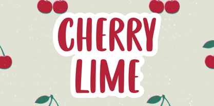 Cherry Lime is a fancy font perfect for crafting, branding, invitation, stationery, wedding designs, social media posts, advertisements, product packaging, product designs, label, photography, watermark, special events or anything. Cherry Lime with full set of uppercase letters, multilingual symbols, numerals and punctuation.
 - Aroma Beauty by Nirmana Visual,
$22.00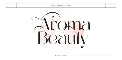 Aroma Beauty is a luxury typeface, full set of lowercase and uppercase letters, numerals and punctuation, multilingual symbols. Very suitable for the title, logo, typography, clothes, magazines, brochures, packaging and much more for your design needs, making your designs more modern and professional.
 - Cut by Turtle Arts,
$20.00Cut is a font made from rubber stamps that were specially hand carved by Kerrie. Cut is a single case alphabet, but the font includes Cut Regular and Cut Reversed (the upper and lower case letters) with numbers and extra image symbols. - CC Angular by Okaycat,
$24.50 Angular is all angular. This font has no curves! Dingbat symbols & icons replace a handful of the generally unused alternate characters, to make this font extra fun & useful. Angular is extended, containing West European diacritics & ligatures, making it suitable for multilingual environments & publications.
 - Bledso by Olivetype,
$18.00 Bledso is an authentic brush typeface. This all caps font is suitable for posters, magazines, apparels, movie headlines, packaging and more. So what's included : Basic Latin A-Z & a-z Numbers, symbols, and punctuations Ligatures and swashes Accented Characters : ÀÁÂÃÄÅÆÇÈÉÊËÌÍÎÏÑÒÓÔÕÖØŒŠÙÚÛÜŸÝŽàáâãäåæçèéêëìíîïñòóôõöøœšùúûüýÿžß Thank you
 - ABTS Gunsmoke by Albatross,
$29.00 ABTS Gunsmoke is a typeface inspired by the wild west of American History. It is a narrow typeface with a nice rhythm and balance, allowing for easy typesetting. Gunsmoke includes 447 characters, including all of the symbols seen in the gallery images.


