10,000 search results
(0.031 seconds)
- Manic Streets by Maulana Creative,
$15.00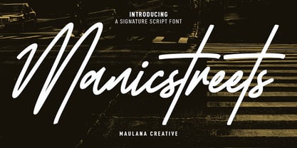 Manic Streets is a fancy hsignature super slanted script font. With regular stroke, fun character with a bit of ligatures and alternates. To give you an extra creative work. Manic Streets font support multilingual more than 100+ language. This font is good for logo design, Social media, Movie Titles, Books Titles, a short text even a long text letter and good for your secondary text font with sans or serif. Make a stunning work with Manic Streets font. Cheers, Maulana Creative
 - Heavenllys by Maulana Creative,
$15.00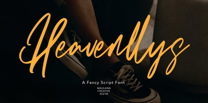 Heavenllys is a fancy script font With clean high contrast stroke, super slanted and fun character. It has Opentype features of ligatures, To give you an extra creative work. Heavenllys script script font support multilingual more than 100+ language. This font is good for logo design, Social media, Movie Titles, Books Titles, a short text even a long text letter and good for your secondary text font with sans or serif. Make a stunning work with Heavenllys font. Cheers, MaulanaCreative
 - Pallpitas by Maulana Creative,
$15.00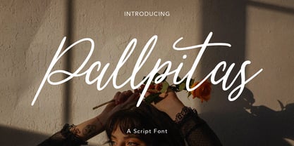 Pallpitas is a fancy script font With clean stroke, super slanted and fun character. It has Opentype features of ligatures and some alternate lowercase character, To give you an extra creative work. Pallpitas script script font support multilingual more than 100+ language. This font is good for logo design, Social media, Movie Titles, Books Titles, a short text even a long text letter and good for your secondary text font with sans or serif. Make a stunning work with Pallpitas font. Cheers, MaulanaCreative
 - Kartbones by Maulana Creative,
$15.00 Kartbones is a Casual Signature script font. With thin contrast stroke, super slanted and Unique Upper and lower character with a bit of ligatures. To give you an extra creative work. Kartbones font support multilingual more than 100+ language. This font is good for logo design, Social media, Movie Titles, Books Titles, a short text even a long text letter and good for your secondary text font with sans or serif. Make a stunning work with Kartbones font. Cheers, MaulanaCreative
 - Contempo Gothic by Arkitype,
$20.00 Contempo Gothic is a modern sans serif with a geometric approach. It comes in 18 weights, 9 uprights and its matching italics. Designed with opentype features including stylistic sets and tabular figures. Contempo Gothic includes extensive language support, fractions, arrows, ligatures and more. Perfectly suited for graphic design and any display use at any size. It could easily work for websites, blogs, signage, corporate identities, publishing and editorial design to name a few. Contempo Gothic is super versatile for everyday design use.
 - Tomkin by Typesketchbook,
$55.00 Tomkin font is an extra large super family of 54 fonts! Tomkin have such a big abundance of contrast, styles, weights, width. Typesketchbook consists of a very usable, clean and modern sans typeface with Semi-square struture. The complete Tomkin type family includes 9 weights with italic and 3 width (normal, narrow, condense) versions for each of them all in all 54 fonts for a multifunctional usage, especially for cooperative work, such as website, magazine, editorial, publishing , as well as packaging.
 - FF Turmino by FontFont,
$41.99 German type designer Ole Schäfer created this sans FontFont in 2002. The family has 6 weights, ranging from Light to Black and is ideally suited for advertising and packaging, editorial and publishing as well as sports. FF Turmino provides advanced typographical support with features such as ligatures, alternate characters, case-sensitive forms, fractions, super- and subscript characters, and stylistic alternates. It comes with a complete range of figure set options – oldstyle and lining figures, each in tabular and proportional widths.
 - Beauty Snowy by Maulana Creative,
$14.00 Beauty Snowy is an expressive super slanted signature script font. With high contrast contrast stroke, condensed and fun character with a bit of ligatures. To give you an extra creative work. Beauty Snowy font support multilingual more than 100+ language. This font is good for logo design, Social media, Movie Titles, Books Titles, a short text even a long text letter and good for your secondary text font with sans or serif. Make a stunning work with Beauty Snowy font. Cheers, MaulanaCreative
 - FF Dirty Four by FontFont,
$41.99 British type designer Neville Brody created this display FontFont in 1994. The font is ideally suited for advertising and packaging, music and nightlife as well as poster and billboards. FF Dirty Four provides advanced typographical support with features such as ligatures, alternate characters, and case-sensitive forms. It comes with proportional lining figures. This FontFont is a member of the FF Dirty super family, which also includes FF Dirty One, FF Dirty Seven, FF Dirty Six, and FF Dirty Three.
 - Revoluzia MF by Masterfont,
$59.00 A revival of old hand painted sign in Old Jaffa, from the mid of 20th century.
 - Rough Bits by Matthias Luh,
$15.00 Some old broken characters. It reminds me of old labels on walls, streets or on tanks.
 - Asgard by Zetafonts,
$39.00 Francesco Canovaro designed Asgard as a way to mix his passion for the raw energy of extra bold sans serif typography with the expressivity of high contrast and calligraphy-inspired letterforms. He built the typeface around a strong geometric sans skeleton, to make the letters feel solid and powerful while using wood-type vernacular solutions to solve density through high contrast details. The typeface name was chosen as an homage to the mythical homeland of the Norse Gods, evoking a land of fierce warriors, power and strength - but also of divine, delicate beauty. Thanks to the help of Andrea Tartarelli and Mario de Libero the original design was extended along with the design space, expanding the number of weights and widths with a "workhorse typeface" approach, and adding also a slanted axis to experiment with italics. The result is a super-family of 9 styles of 8 weights for a total of 72 fonts, each coming with an extended set of 968 glyphs covering over 200 languages using Latin, Greek and Cyrillic scripts. The three variation axes (width, weight, slant) are also all accessible in a variable font version that is included with the whole family. This gives the designer a full range of options for typesetting, with the Roman and Fit widths providing basic display and text-sized alternatives, and the Wide width adding more display and titling options. The inclusion of backslant italic styles gives Asgard an extra chance to add its voice to the typographic palette. To complement this, all Asgard fonts have been given a full set of Open Type Features including standard and discretionary ligatures, stylistic sets, positional numerals and case sensitive forms. Dynamic and expressive, Asgard is a super-family that manages to look brutal and refined at the same time, quoting the vernacular typographic practices of letterpress print while expressing the contemporary zeitgeist. • Suggested uses: perfect for contemporary branding and logo design, bold editorial design, dynamic packaging and countless other projects. • 73 styles: 8 weights + 8 italics + 8 backslant italics, 3 different widths + 1 variable font. • 968 glyphs in each weight. • Useful OpenType features: Access All Alternates, Contextual Alternates, Case-Sensitive Forms, Glyph Composition / Decomposition, Discretionary Ligatures, Denominators, Fractions, Kerning, Standard Ligatures, Lining Figures, Localized Forms, Mark Positioning, Mark to Mark Positioning, Alternate Annotation Forms, Numerators, Oldstyle Figures, Ordinals, Scientific Inferiors, Stylistic Set 1, Stylistic Set 2, Stylistic Set 3, Subscript, Superscript, Slashed Zero • 219 languages supported (extended Latin, Greek and Cyrillic alphabets): English, Spanish, Portuguese, French, Russian, German, Javanese (Latin), Vietnamese, Turkish, Italian, Polish, Afaan Oromo, Azeri, Tagalog, Sundanese (Latin), Filipino, Moldovan, Romanian, Indonesian, Dutch, Cebuano, Igbo, Malay, Uzbek (Latin), Kurdish (Latin), Swahili, Greek, Hungarian, Czech, Haitian Creole, Hiligaynon, Afrikaans, Somali, Zulu, Serbian, Swedish, Bulgarian, Shona, Quechua, Albanian, Catalan, Chichewa, Ilocano, Kikongo, Kinyarwanda, Neapolitan, Xhosa, Tshiluba, Slovak, Danish, Gikuyu, Finnish, Norwegian, Sicilian, Sotho (Southern), Kirundi, Tswana, Sotho (Northern), Belarusian (Latin), Turkmen (Latin), Bemba, Lombard, Lithuanian, Tsonga, Wolof, Jamaican, Dholuo, Galician, Ganda, Low Saxon, Waray-Waray, Makhuwa, Bikol, Kapampangan (Latin), Aymara, Zarma, Ndebele, Slovenian, Tumbuka, Venetian, Genoese, Piedmontese, Swazi, Zazaki, Latvian, Nahuatl, Silesian, Bashkir (Latin), Sardinian, Estonian, Afar, Cape Verdean Creole, Maasai, Occitan, Tetum, Oshiwambo, Basque, Welsh, Chavacano, Dawan, Montenegrin, Walloon, Asturian, Kaqchikel, Ossetian (Latin), Zapotec, Frisian, Guadeloupean Creole, Q’eqchi’, Karakalpak (Latin), Crimean Tatar (Latin), Sango, Luxembourgish, Samoan, Maltese, Tzotzil, Fijian, Friulian, Icelandic, Sranan, Wayuu, Papiamento, Aromanian, Corsican, Breton, Amis, Gagauz (Latin), Māori, Tok Pisin, Tongan, Alsatian, Atayal, Kiribati, Seychellois Creole, Võro, Tahitian, Scottish Gaelic, Chamorro, Greenlandic (Kalaallisut), Kashubian, Faroese, Rarotongan, Sorbian (Upper Sorbian), Karelian (Latin), Romansh, Chickasaw, Arvanitic (Latin), Nagamese Creole, Saramaccan, Ladin, Kaingang, Palauan, Sami (Northern Sami), Sorbian (Lower Sorbian), Drehu, Wallisian, Aragonese, Mirandese, Tuvaluan, Xavante, Zuni, Montagnais, Hawaiian, Marquesan, Niuean, Yapese, Vepsian, Bislama, Hopi, Megleno-Romanian, Creek, Aranese, Rotokas, Tokelauan, Mohawk, Onĕipŏt, Warlpiri, Cimbrian, Sami (Lule Sami), Jèrriais, Arrernte, Murrinh-Patha, Kala Lagaw Ya, Cofán, Gwich’in, Seri, Sami (Southern Sami), Istro-Romanian, Wik-Mungkan, Anuta, Cornish, Sami (Inari Sami), Yindjibarndi, Noongar, Hotcąk (Latin), Meriam Mir, Manx, Shawnee, Gooniyandi, Ido, Wiradjuri, Hän, Ngiyambaa, Delaware, Potawatomi, Abenaki, Esperanto, Folkspraak, Interglossa, Interlingua, Latin, Latino sine Flexione, Lojban, Novial, Occidental, Old Icelandic, Old Norse, Slovio (Latin), Volapük.
 - OldStyle 1 - Unknown license

- GoodCityModern Plain - Unknown license

- GhostTown - Unknown license

- Diploma - Unknown license

- Malabar by Linotype,
$29.99 Malabar is a type family for extensive text. Its design was developed with a nod toward newspapers. Malabar's characters are seriffed and of the Old Style genre. A strong diagonal axis is apparent within the curves. Sturdy serifs help strengthen the line of text in small point sizes, as well as define the overall feeling of the face. Malabar's x-height is very high, a deliberate choice that makes the most important parts of lowercase letters visibly larger in tiny settings. The height of the capital letters is also rather diminutive, allowing for better character fit, as well as eliminating a bit of clumsiness in German, which often includes quite a few uppercase letters. Diacritical marks and additional alphabetic forms required by many Western, Central, and Eastern European languages are naturally a part of the character set, including those needed in the Baltic states, for Romanian, and for Turkish. Malabar's accents are bold and direct, sitting well with their base glyphs. The family includes three weights, each with a companion Italic. Malabar Regular is equipped with small caps, and both it and Malabar Italic include oldstyle figures. All members of the family have both proportional and tabular-width lining figures, as well as special variants of certain punctuation marks vertically adjusted for all-caps text setting. Malabar is informed both by contemporary ideas of typeface design (sheared terminals, the wider-drawn s) as well as by 16th-century masters. Malabar Heavy and Heavy Italic are very loud; their blackness almost shouts out from the page. The Regular's wedge serifs become more slab-ish in nature as the letters' weight increases. Malabar Heavy and Heavy Italic are best relegated to headline use only. Malabar Bold and Bold Italic may be used for text emphasis, a job for which the Heavy is to dark. Malabar received a Certificate of Excellence in Type Design at the Type Directors Club of New York TDC2 competition in 2009.
 - Laurentian by Monotype,
$29.99 Maclean's is a weekly Canadian newsmagazine with a broad editorial mission. A typical issue covers everything from violence on the other side of the globe to the largest pumpkin grown in a local county. In 2001, Maclean's invited Rod McDonald to become part of the design team to renovate" the 96-year-old publication. The magazine wanted to offer its readers a typographic voice that was professional, clean, and easy to read. Above all, the typeface had to be able to speak about the hundreds of unrelated subjects addressed in each issue while remaining believable and uncontrived. A tall order, perhaps? Now add in that this would be the first text typeface ever commissioned by a Canadian magazine. McDonald, who some have called Canada's unofficial "typographer laureate," took on the challenge. McDonald used two historic models as the basis for Laurentian's design: the work of French type designer Claude Garamond, and that of the English printer and type founder, William Caslon. From Garamond Laurentian acquired its humanist axis, crisp serifs and terminals that mimic pen strokes. Caslon's letters are less humanistic, with a more marked contrast in stroke weight and serifs that appear constructed rather than drawn. These traits also made their mark on Laurentian. Using these two designs as a foundation, McDonald drew Laurentian with the narrow text columns and small type sizes of magazine composition in mind. He gave his letters strong vertical strokes and sturdy serifs, a robust x-height and a slightly compressed character width A tall order, per McDonald's genius is evident in the face's legibility, quiet liveliness and in the openness of the letters. The result is a typeface that not only met Maclean's demanding design brief, but also provides exceptional service in a wide variety of other applications. Laurentian is available in three weights of Regular, Semi Bold and Bold, with complementary italics for the Regular and Semi Bold, and a suite of titling caps."
 - ATF Franklin Gothic by ATF Collection,
$59.00 ATF Franklin Gothic® A new take on an old favorite Franklin Gothic has been the quintessential American sans for more than a century. Designed by Morris Fuller Benton and released in 1905 by American Type Founders, Franklin Gothic quickly stood out in the crowded field of sans-serif types, gaining an enduring popularity. Benton’s original design was a display face in a single weight. It had a bold, direct solidity, yet conveyed plenty of character. A modern typeface in the tradition of 19th-century grotesques, Franklin Gothic was drawn with a distinctive contrast in stroke weight, giving it a unique personality among the more mono-linear appearance of later geometric and neo-grotesque sans-serif types. Franklin Gothic has been interpreted into a series of weights before, most notably with ITC Franklin Gothic. But as the original type was just a bold display face (later accompanied by a few similarly bold widths and italics), how Benton’s design is expanded to multiple weights and styles as a digital type family can vary significantly. Benton designed several gothic faces that harmonize with one another, including Franklin Gothic, News Gothic, and Monotone Gothic, that can serve as models for new interpretations of his work. With ATF Franklin Gothic, Mark van Bronkhorst looked to Benton’s Monotone Gothic—originally a single typeface in a regular weight, and similar to Franklin Gothic in its forms—as the basis for lighter styles. ATF Franklin Gothic may appear familiar given its heritage, but is a new design offering a fresh take on Benton’s work. The text weights are wider and more open than some previous Franklin Gothic interpretations, and as a result are quite legible as text, at very small sizes, and on screen. ATF Franklin Gothic maintains the warmth and the spirit of a Benton classic while offering a suite of fonts tuned precisely for contemporary appeal and utility. The 18-font family offers nine weights with true italics, a Latin-extended character set, and a suite of OpenType features. Download the PDF specimen for ATF Franklin Gothic.
 - Defused - Personal use only

- Al Stagen by Aluyeah Studio,
$120.00 Stagen is a cloth with a length ranging from 5-10 meters and a width of about 15 cm which is usually used by traditional Javanese women as part of the traditional kebaya dress. The stagen is wrapped around the stomach to help maintain posture and "lock" the jarik cloth on the kebaya. Stagen existed before World War II in Indonesia and became an elegance in the harsh world at that time. Inspired by the rich culture, Stagen is a modern sans serif typeface that has an upright and sturdy impression, with unique curves in it. A simple, yet distinctive, elegant font that can be applied to many areas of design. Coming with 130+ stunning and super easy to use alternates and ligatures. Very suitable for magazine, headline, website, ads, product package and all type of design project you have. Features: OpenType support Multilingual support (15 languages) PUA Encoded Super Easy to Use alternates - It's OpenType support but you can easly call alternates character using special combination like A.2 R.3 L.A L.a etc so you don't need special software. To get results like the preview just type Sta.gen.
 - Blorp by Missy Meyer,
$12.00 I had a totally different name assigned to this font at first. Then, while drifting off to sleep one night during the creation process, my sleepy brain said, "You know, BLORP would be a great name to go with these letter shapes." Normally when I have those half-asleep ideas and look at them in the morning, they make no sense. But I decided to make a sample image for BLORP, and it turns out I really like it! So ... BLORP it is! This font is extensively edited for super-smooth lines and curves, so it'll cut like butter in your Cricut or Silhouette machine. Though it's also super cute for print projects, logos, branding, or anything else you want to use it for! It has a funky mix of letter sizes and heights, and two sets of uppercase letters, so you can mix everything together JuSt LikE tHIs, and it'll still look great! BLORP includes over 300 extended Latin characters for language support, including, but not limited to: Catalan, Czech, Danish, Esperanto, Estonian, Finnish, French, Gaelic, German, Icelandic, Irish, Italian, Latvian, Lithuanian, Norwegian, Polish, Portuguese, Romanian, Serbian (Latin), Slovak, Slovenian, Spanish, Swedish, Turkish, Welsh, and more!
 - Bartholeme by Galapagos,
$39.00The four weight semi-condensed Bartholemé family came into existence as a family expansion based on the designer's earlier concept, Bartholemé Open. This hybrid family was inspired by and loosely based on a number of contemporary mid-twentieth century type concepts having Old Face or Modern influence. Those inspirational type designs were primarily designed for various proprietary photolettering technologies of the time. The award-winning* Bartholemé Open and its companion design Bartholemé small capital open were inspired by various Shaded, Inline and Handtooled type models from the nineteenth and twentieth centuries. Most of those inspirational type designs were designed as titling fonts with all capital sets only. To set it apart from the earlier models, Bartholemé Open is semi-condensed intentionally designed with a lowercase. Design qualities include a large x- height, tightly curved ample counters, crisp serifs and tight bracketing. The overall plan of the family was originally intended for display usage in titling and short passages of text. At higher output resolutions all fonts read well at smaller point sizes. The Bartholemé family works well on its own, but also is compatible with type styles possessing qualities that complement or enhance its own. The Bartholemé family consists of a Regular weight complementing a Bold weight, along with Medium complementing an Extra Bold weight. The companion true-drawn italics are based on the Bartholemé roman design. * Award for Design Excellence bukva: raz! Type Design Competition of the Association Typographique Internationale, 2001 - Capitolium 2 by TypeTogether,
$58.00 Capitolium was designed in 1998 at the request of the Agenzia romana per la preparatione del Giubileo for the Jubilee of the Roman Catholic Church in 2000. This type design was the central part of the project for a wayfinding and information system to guide pilgrims and tourists through Rome. Capitolium also continues Rome’s almost uninterrupted two-thousand-year-old tradition of public lettering . It is a modern typeface for the twenty-first century and strongly related to the traditions of Rome. Soon after the completion of this project Unger began contemplating the possibility of bringing the atmosphere of this design to newspapers. Though Capitolium works well in most modern production processes and also on screens, it is too fragile for newsprint. For newspapers sturdier shapes were required as well as more characters to a line of text, and Capitolium News has a bigger x-height than Capitolium. Capitolium News is a thoroughly modern newsface, with classic letterforms linked to a strong tradition. Capitolium News for running text comes in the variations regular, italic, semibold, semibold italic, bold and bold italic. As is possible with most of Unger’s type designs, Capitolium News can be condensed and expanded without any harm to the letterforms. The update to this beautiful font family, Capitolium News, includes the addition of over 250 glyphs featuring full Latin A language support, new ligatures, 4 sets of numerals, arbitrary fractions and superiors/inferiors. Furthermore, kerning was added and fine tuned for better performance.
 - Morgan Sans by Feliciano,
$50.00The Morgan Project can be considered a big type family with ‘many styles’ or a set of different types that match with each other. For me it’s one typeface with different versions with deliberate and visible differences according to the propose to which each version was created. The design started in 2000 as a display type with the design of the Morgan Tower, to which more two display versions were added; Morgan Poster and Morgan Big — all together the make our: FTF Morgan Display Kit 1. All three versions consist only in uppercase with alternate letters in the lowercase and a set of special ligatures. Morgan Tower has four variants that differ in width/weight, Morgan Poster has six variants (often called styles), three weights in upright and oblique and Morgan Big has twelve, six weights in upright and oblique. Lately, the FTF Morgan Tex Kit 1 was added. Apropriate versions to use in text setting. Both versions, FTF Morgan Sans and FTF Morgan Sans Condensed share the same structure and character mapping. Four variants each; regular, bold, oblique and bold oblique with a large character set including: small caps, lining and old style figures (here called Office figures) — both tabular —, small caps lining figures, mathematical symbols and fraction figures, and, a set of foreign characters expanding the possibilities of use for a wider range of languages. Characters are distributed in six different font layouts: Lining, Office, Expert, Caps, Figures & Pi. - Times New Roman Windows compatible by Monotype,In 1931, The Times of London commissioned a new text type design from Stanley Morison and the Monotype Corporation, after Morison had written an article criticizing The Times for being badly printed and typographically behind the times. The new design was supervised by Stanley Morison and drawn by Victor Lardent, an artist from the advertising department of The Times. Morison used an older typeface, Plantin, as the basis for his design, but made revisions for legibility and economy of space (always important concerns for newspapers). As the old type used by the newspaper had been called Times Old Roman," Morison's revision became "Times New Roman." The Times of London debuted the new typeface in October 1932, and after one year the design was released for commercial sale. The Times New Roman World Version is an extension of the original Times New Roman with several other scripts like with the Helvetica World fonts. It is part of the Windows Vista system. The following code pages are supported:1250 Latin 2: Eastern European 1251 Cyrillic 1253 Greek 1254 Turkish 1255 Hebrew 1256 Arabic Note: The Roman and Bold versions include the arabic scripts but they are not part in the corresponding italic versions. 1257 Windows Baltic 1258 Windows Vietnamese
- !Sketchy Times - Unknown license

- MGN Debris by Morgana Studio,
$17.50 This design is characterized by its futuristic and modern aesthetic. The clean lines and minimalist approach create a sleek and sophisticated look, while the unique touches and use of the MGN Debris font give it a bold and edgy vibe. It is a perfect example of how a modern design can also be unique and innovative, with elements that set it apart from traditional designs. This style is perfect for businesses and organizations that want to convey a sense of innovation and cutting-edge technology. The MGN Debris font used in this design adds to its modern and futuristic feel. The font is bold and sharp, with a unique style that makes it stand out. It complements the overall design perfectly and adds to the edgy and unique vibe. This font is perfect for businesses and organizations that want to convey a sense of innovation and forward-thinking, and it pairs well with modern designs. Overall, this design is a great example of how a modern and futuristic style can be unique and captivating, with the use of the MGN Debris font adding an extra element of boldness and edge.
 - Jogan by Wahyu and Sani Co.,
$15.00 Inspired by the early days of video games where the graphics were made of squares (pixels), Wahyu Wibowo comes up with pixel based typeface design, Jogan, but instead of having medium width, he decided to make it narrow which is rarely exist in pixel style font. The style were expanding in the development process, so the family have 4 subfamilies: Jogan (regular, bold and monospace) Jogan Soft (regular, bold and monospace) Jogan Round (regular and monospace) Jogan Slab (regular and bold) Each Jogan font style contains 280+ glyphs which covers Western Europe languages: Afrikaans, Albanian, Asu, Basque, Bemba, Bena, Breton, Catalan, Chiga, Cornish, Danish, Dutch, English, Filipino, French, Friulian, Galician, German, Gusii, Indonesian, Irish, Italian, Kabuverdianu, Kalenjin, Kinyarwanda, Luo, Luxembourgish, Luyia, Machame, Makhuwa-Meetto, Makonde, Malagasy, Manx, Morisyen, North Ndebele, Norwegian Bokmål, Norwegian Nynorsk, Nyankole, Oromo, Portuguese, Quechua, Romansh, Rombo, Rundi, Rwa, Samburu, Sango, Sangu, Scottish Gaelic, Sena, Shambala, Shona, Soga, Somali, Spanish, Swahili, Swedish, Swiss German, Taita, Teso, Uzbek (Latin), Volapük, Vunjo, Zulu. Retro, retro-futuristic, futuristic, modern, techno theme projects fit perfectly with this typeface, any works from logo, poster, video, headlines, titles, and more!
 - Bastia by Jen Wagner Co.,
$17.00 Bastia is a classy, bold upper and lowercase typeface that looks incredible in both large and small settings. Best used as a display for headings and logos, Bastia's clean lines and smooth curves give any project an extra touch of class. See how it looks when used for body text in the 11th sample image above. I also love combining Bastia and clean sans serifs for minimal logos (see the "Lucky Finch" sample logo). This download also includes a special outline version of the serif, so you can layer text or add some flair to your logos and display type. There are also alternates available for "k" and "s" that give each letter some extra curves (available via the special characters panel One thing to note about Bastia is the letter spacing. It was intentionally spaced for clean reading if you wanted to use it for body type, so I recommend setting the spacing a little tighter for display use (around -10 to -20 should do!). Includes: Bastia Bold (uppercase & lowercase) Bastia Bold Outline (uppercase & lowercase) Numbers & punctuation Foreign language support Alternates for "k" and "s" – available via the special characters panel
 - Milky Berly by Blankids,
$24.00 Hello, Are you looking for a stylish and unique font? Do you want of creating Something that stand out and inspire creativity, imagination, and endless fun? Wait no more, we will give you the best choice. Milky Berly a Bold Stylish Font Milky Berly a Bold Stylish Font, Inspiring from playful stylish quirky style typography. This Bold Stylish font is perfect for a design that makes it more attractive and playful. made with a very good level of aesthetics making this font suitable for book cover, children book, comic, poster, packging, merchandise, logotype and much more. Milky Berly font includes Multilingual Support, among others : Afrikaans, Albanian, Asu, Basque, Bemba, Bena, Breton, Catalan, Chiga, Cornish, Danish, Dutch, English, Estonian, Faroese, Filipino, Finnish, French, Friulian, Galician, German, Gusii, Indonesian, Irish, Italian, Kabuverdianu, Kalenjin, Kinyarwanda, Luo, Luxembourgish, Luyia, Machame, Makhuwa, Meetto, Makonde, Malagasy, Manx, Morisyen, North Ndebele, Norwegian Bokmål, Norwegian Nynorsk, Nyankole, Oromo, Portuguese, Quechua, Romansh, Rombo, Rundi, Rwa, Samburu, Sango, Sangu, Scottish Gaelic, Sena, Shambala, Shona, Soga, Somali, Spanish, Swahili, Swedish, Swiss German, Taita, Teso, Uzbek (Latin), Volapük, Vunjo, Zulu FEATURES : Uppercase Lowercase Number Punctuation Multilingual PUA Encode Opentype
 - ITC Schuss Hand by ITC,
$29.99Designed by German graphic designer Jochen Schuss. ITC Schuss Hand and ITC Schuss Hand Bold can probably best be described as excellent all around scripts useful for a broad spectrum of advertising purposes as well as for those applications that benefit from a refined handwritten appearance. The characters themselves have a soft, almost “liquid” appearance which is enhanced by the subtle swelling at most of the stroke terminals. The slightly condensed nature of the characters plus a relatively large x-height ensures that both weights are ideal for the advertising arena. An additional feature on ITC Schuss Hand and ITC Schuss Hand Bold are the capital letters which can actually be used on their own in word settings whereas most script capitals are designed just for initialing purposes. The designer has also invested a good deal of careful thought to the way in which a high percentage of the lowercase letter combinations overlap to create an authentic hand-scripted appearance. This, together with the italicized letter forms, will make Schuss Hand and Schuss Hand Bold ideal candidates for those occasions when paper correspondence requires an informal style. So, as is claimed, an excellent all around script style. - ITC Oldrichium by ITC,
$29.99Spirited, unaffected and buoyant, the ITC Oldrichium type family pays homage to the calligraphy and typeface designs of Czech designer Oldrich Menhart. “I came upon one of Menhart's typefaces over a decade ago,” says George Thompson, designer of ITC Oldrichium. “I've been collecting examples of his work ever since.” Thompson was born in Chicago and grew up in north-west Indiana. “While I've been an educator and general graphic designer for over 30 years, lettering and type design have always been an important part of my work,” he says. Thompson now spends much of his free time designing typefaces. ITC Oldrichium is a subtle melding of the shapes and proportions of Menhart's Manuscript typeface, the energetic strokes of his calligraphy, and Thompson's own design skills. The result is a distinctive, powerful, and exceptionally versatile typeface family. Available in light, regular, demi bold and bold weights, with corresponding italics for all but the bold, ITC Oldrichium is comfortable setting both text and display copy. In addition to the basic weights, Thompson has created an Engraved version for those times when an especially powerful statement is called for. - Bigsize by Astageni,
$16.00 Unleash the playful vibes with Bigsize, a vibrant display font crafted to command attention and inject a dose of fun into any design. The bold, rounded letterforms make it a perfect choice for titles, headlines, and product packaging. Its whimsical charm also positions it as an ideal companion for brands targeting a youthful or lighthearted audience. Bigsize isn't just about fun; it's designed to be both playful and functional. Its readability, even at larger sizes, ensures that your message shines through. The font's distinctive style is a testament to the designer's creative exploration of letterforms, resulting in a typeface that strikes the perfect balance between playfulness and legibility. With over 350 glyphs, including support for broad Latin and Cyrillic languages, Bigsize proves its versatility across various design projects. Whether you're working on posters, billboards, logos, or digital ads, this font is your ticket to making a bold and memorable statement. Whether you're crafting a poster, developing packaging for a brand, or spearheading an advertising campaign, Bigsize is the font that will set your project apart. Its bold and comical aesthetic captivates your audience's attention, while its readability ensures your message resonates effortlessly."
 - Magedov Military by Mans Greback,
$69.00 The Magedov Military font is a strong and robust font that exudes power and authority. It has a sharp, geometric design with bold, hard edges that gives it a strict, army-inspired feel. In a blend of sans and slab serif styles, its unique and versatile look can be utilized for a wide range of projects. This font is perfect for university or college projects, as its straight and clear-cut design gives it an academic, high-school or college feel. It is also ideal for projects that require a strong and tough look, such as law enforcement, university or sports logos. Use the parenthesis symbols ( ) [ ] { } to make decorative elements. Example: United]States The Magedov Military family consists of four high-quality fonts: Regular, Italic, Bold and Bold Italic The font is built with advanced OpenType functionality and has a guaranteed top-notch quality, containing stylistic and contextual alternates, ligatures and more features; all to give you full control and customizability. It has extensive lingual support, covering all Latin-based languages, from Northern Europe to South Africa, from America to South-East Asia. It contains all characters and symbols you'll ever need, including all punctuation and numbers.
 - Standard CT by CastleType,
$59.00 CastleType was commissioned in 1991 by San Francisco Focus magazine to digitize three members of the Standard family. This is a Continental lineale that was popular in Switzerland in the 1950s and later in the United States. A cousin to the classic sans serifs, Standard is an alternative that is considerably warmer and a bit more idiosyncratic. In 2008, CastleType released additional members of the Standard CT family to make it a complete typographic solution with three widths (normal, condensed, extended) of four weights each (Regular, Medium, Bold, and Extra Bold). Some of the original Standard fonts, particularly Standard Regular, appear to have been hastily designed (or perhaps too closely imitated Helvetica); these have been greatly improved in the CastleType versions with more harmonious proportions and other refinements. The three lighter weights of the Extended subfamily were designed from scratch based on the new Standard CT Regular and Standard CT Extended Extra Bold. More recently, four light weights (Light, Extra Light, Ultra Light, and Hairline) have been added to each of the three widths. The entire Standard CT family includes support for most European languages, OpenType features, arbitrary fractions, and a collection of geometrics, dingbats & fleurons.
 - Nazanin by Linotype,
$187.99Nazanin, originally named Haghighi, is a modern Arabic text face first produced by Linotype in 1978. Its popular design was converted into OpenType format in 2005, taking full advantage of digital technology to allow accurate positioning of diacriticals and kerning refinements. The counters and inter-character proportions of Nazanin are characteristic of Persian display lettering and typography. This is particularly true of Nazanin bold, which gives a strong image when used for display purposes. Nazanin possesses fuller, deeper characters than is normally exhibited in Arabic typography: its angled counters contributing to fluid, well-balanced, yet vibrant, letterforms. Originally designed for Farsi typesetting, Nazanin has now become popular for Arabic typesetting as well. Nazanin is available in two OpenType weights: Nazanin Light and Nazanin Bold. Both of the fonts include Latin glyphs (from Palatino Roman and Palatino Bold, respectively) inside the font files, allowing a single font to set text in both most Western European and Arabic languages. Nazanin incorporate the Basic Latin character set and the Arabic character set, which supports Arabic, Persian, and Urdu. They include tabular and proportional Arabic, Persian, and Urdu numerals, as well as a set of tabular European (Latin) numerals. - Teenage Garde by Teenage Foundry,
$19.00 Introducing by Teenage Foundry! Teenage Garde is a bold and neat display typeface font that exudes confidence and modernity. With its strong, clean lines and sharp edges, this font is designed to make a bold statement. Teenage Garde boldness gives it a commanding presence, making it ideal for designs that require attention-grabbing headlines or strong brand identities. Despite its simplicity, the font still manages to maintain a sense of elegance and sophistication. This makes Teenage Garde a versatile choice for a wide range of design projects, including advertising materials, logos, posters, and website headers. There are 2 styles, Regular & Extrude. Features: Uppercase, Lowercase, Numeral, Punctuation & Multilingual. Multilingual contained: Afrikaans, Albanian, Asu, Basque, Bemba, Bena, Breton, Catalan, Chiga, Cornish, Danish, Dutch, English, Estonian, Filipino, Finnish, French, Friulian, Galician, German, Gusii, Indonesian, Irish, Italian, Kabuverdianu, Kalenjin, Kinyarwanda, Luo, Luxembourgish, Luyia, Machame, Makhuwa-Meetto, Makonde, Malagasy, Manx, Morisyen, North Ndebele, Norwegian Bokmål, Norwegian Nynorsk, Nyankole, Oromo, Portuguese, Quechua, Romansh, Rombo, Rundi, Rwa, Samburu, Sango, Sangu, Scottish Gaelic, Sena, Shambala, Shona, Soga, Somali, Spanish, Swahili, Swedish, Swiss German, Taita, Teso, Uzbek (Latin), Volapük, Vunjo, Zulu. For any questions please contact me 🙂 Thanks!
 - Galvantur by Ivangard Studios,
$12.00 Galvantur is a sans serif font, suitable for a wide range of applications. The main characteristic of this font is the slightly alien feel it can invoke, allowing it to really appear different and stand out, comparative to what other sans serifs may look like. The multiple styles included can further help customize your designs and projects, whether it's a body of text or an attention grabbing title. For example switching a block of text from regular style to oblique, can drastically change the overall appearance and feel of said text. Comes in 7 different styles - Regular, Oblique, Bold, Bold Oblique, Outlines, Bold Outlines and Oblique Outlines. To get an idea of the various styles, please check out the preview pictures or use the preview field to type in text. A full list of the glyphs included in this font can also be seen in the preview images. Galvantur supports Latin and Cyrillic based languages. The font includes a single alternative character for the letter "h". Because of the lack of ligatures and alternates, the font is rather standardized and will work with any and all software/applications.
 - Axeo by Asritype,
$13.00 Axeo is a freeform serif typeface. With more than 500 glyphs for each cut, Axeo supporting wide Latin Base Languages. The font structures is sans-serif typeface. Then, the fonts is made into serif (serifed) using rhombus and adapted/modified rhombus (before remove overlaps) placed on its appropriate positions. This fonts is released first, while the sans-serif is being in process. There are 10 fonts; 5 weight in normal width: Light, Regular, Medium, Bold, and Black; and 4 in semi-condensed: Light, Regular, Medium, Bold and Black, too. The fonts has some minor character variations, all are sets in SS01.There are also standard and discretionary ligatures, arrow, some geometric shapes and ornaments. With its sansserif structure, the Medium, Bold and Black fonts is playful with text effect in various applications such MS Word, CorelDraw or others to enhance the appearance. Its serif form will make unique enhancements. Thus, the fonts is suitable for Branding, logos, cards, advertisements, banners, display and more; for the main texts or its companions. While the light, regular and medium fonts can also be used as description text, card text, note, caption and longer non-formal texts or other usages.


