10,000 search results
(0.045 seconds)
- Compagnon by Hanoded,
$15.00 Compagnon is a friend, a partner. This handmade display font will come in super handy when you are working on that book cover, or the packaging of a product. It will shine on posters and websites and it will keep you warm at night. I guess that last bit is an exaggeration… Compagnon comes in three distinct styles: a ‘regular’ version, which is a bit rough around the edges, a ‘dirty’ version, with a juicy eroded look and a polka dot version. All three have their accompanying italics.
 - Heinz by Wiescher Design,
$39.50 Heinz is inspired by the poster design of Heinz Schulz-Neudamm for Fritz Lang’s famous silent movie Metropolis. Heinz Schulz-Neudamm did quite a lot of work for the German branches of big American movie companies like 20th Century Fox or MGM. His most famous work is probably the title lettering for the Metropolis movie. The original drawing for that poster sold in 2005 in London for 398.000 Pound Sterling (approx. US $ 600.000). I designed a completely new font in the feeling of Heinz’s lettering. Enjoy. Yours historically, Gert Wiescher
 - Novety Script by Mans Greback,
$59.00 Novety Script is a quirky script typeface, drawn and created by Mans Greback. It has a great contrast, with bold calligraphic curves and hair thin conjunctions, giving the lettering a juicy, swirly appearance. Use underscore _ anywhere in a word to make a swash. Example: Nov_ety Use multiple underscore to make different swashes. Example: Cute___ness (Download required.) Optimized for logotype and header usage, Novety Script works great for product branding or as a signature, or for a beautiful wallpaper quote graphic. It has a modern style and a strong personality to make it stand out. Novety Script is provided in four styles: Regular, Italic, Bold and Bold Italic. The font is built with advanced OpenType functionality and has a guaranteed top-notch quality, containing stylistic and contextual alternates, ligatures and more features; all to give you full control and customizability. It has extensive lingual support, covering all Latin-based languages, from North Europe to South Africa, from America to South-East Asia. It contains all characters and symbols you'll ever need, including all punctuation and numbers.
 - Cristal Text by Johannes Krenner,
$5.00 »Cristal Text« has nice to read lower case letters. It contains 636 letters per font style and some Open Type features: Different stylistic alternates and different sets of numerals. It is not monospaced: Therefor it stays not true to an underlying grid like it’s bigger brother »Cristal True«. But this offers a better legibility. The basis of this font is a Union-Jack or sixteen-segment display (SISD). I have found myself in the need of a precise and well-made font, that simulates the look of such a LCD display. Also it should offer enough letters and language support for the whole European region as well as different font styles.
 - Midnight Hour - Personal use only

- Aduana by Fabio Ares,
$- Aduana is the first typographic product of argentine-chilean typographic archeology project called "Valpo. Ciudad de Letras" (Fabio Ares & Karin Thiers, since 2016). Based on the letter located on the front of the Customs building (Valparaíso, Chile). The resultant family can be described as display type and modern renaissance style, with geometric shapes and serif and mild line modulation. The proceeds from the sale of the fonts will be used to finance the project.
 - PAG Bankas by Prop-a-ganda,
$19.99Prop-a-ganda offers retro-flavored fonts inspired by lettering on retro propaganda posters, retro advertising posters, retro packages all the world over. This is perfect font for your retrospective project. PAG Bankas is a vintage and old-fashioned that we can find in the posters of old silent film. Bankas’s retro forms lend itself to many design projects from branding to packaging, magazine headlines and so on. - Kid Knowledge by 38-lineart,
$6.00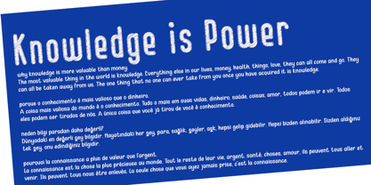 Kid Knowledge is a striking family. It includes 5 amazing styles which can be combined perfectly, giving you the opportunity to create multiple unique designs in an instant. It was inspired by children’s science projects and will give a playful touch to your designs.
 - Binder by Grype,
$16.00 Our Binder Family is a revival and expansion of Binder-Style, a typeface designed by Joseph Binder and released by D. Stempel AG in 1959. It originally was a single weight. In later film type adaptations, a bold style, and an outline with drop shadow style were made available. However, this typeface never really had a true sense of family or larger language compatible character set. The original Binder-style typeface found revived popularity with its super condensed style when it appeared on the movie poster for "Silence of the Lambs". It was always a disappointment to me how this typestyle had never gained more traction in use. And so, many years later, we decided to revive the original typestyle, and expand it with a range of weights and obliques to pair with those weights. We've moved most of the unusual lowercase forms to a Stylistic Alternates feature, along with unicast alternates for the Capitals. The family includes a full standard character set with expansive international support of latin based languages, and 4 weights jumping from Thin to Bold, along with 4 accompanying obliques. This family is ready for you to eat it up with a nice glass of Chianti. Here's what's included with the Binder Family: 538 glyphs per style - including Capitals, Lowercase, Numerals, Punctuation and an extensive character set that covers multilingual support of latin based languages. 4 weights: Thin, Light, Regular, & Bold. Accompanying Obliques with each weight/width style. TTF formatted fonts have been hinted for optimal performance. Here's why the Binder Family is for you: You're in need of a stylish condensed font with a variety of weights and obliques for your designs You're a fan of the typographic works of Joseph Binder, but wish there was more to them You love the style of Agency and Bank Gothic, but want something uber-narrow You are desperate to recreate the movie poster from Silence of the Lambs You just like to collect quality fonts to add to your design arsenal
 - P22 Gothic Gothic by IHOF,
$24.95 The name says it all. Gothic from the old literary style and/or current subculture genre. And Gothic meaning a block or sans serif style of lettering. The concept was to take the classic German style lettering and create a contemporary extended block letter typeface. The result is a fusion of old and new.
 - PAG Sottoterra by Prop-a-ganda,
$19.99Prop-a-ganda offers retro-flavored fonts inspired by lettering on retro propaganda posters, retro advertising posters, retro packages all the world over. This is perfect font for your retrospective project. PAG Sottoterra is heavy and high-contrast font, and you can see triangles in some letters. This font reminds us of old posters of science fiction movie. It works best for for display or titling. - Fire Ace by Typefactory,
$14.00 Fire Ace is a fiery display font with incredibly hot feel. Fire Ace has a fiery effect, it’s the perfect font for giving any design a fiery and dangerous feel, spices brand, speedy racing burnout effect or maybe spicy delicious food!
 - Eastside Brush by Adam Fathony,
$12.00 Eastiside Brush is Inspired by a casual style from sign painter who create a beautiful lettering trademark. A classical, timeless, and contemporary. Eastside Brush comes with 3 style, That's script style, cursive style, and capital style for all caps letter. It s should be easy to mix and match which best style for your design. Multiple language are available to all fonts.
 - Dhaique by BaronWNM,
$14.00 A simple and narrow style font. Multilingual letter, numbers, punctuation and alternate letters.
 - Is Not A Brazilian Font by Intellecta Design,
$17.95 an art deco font based on brazilian Rio's lettering old publish lettering style
 - Sansduski by Ingrimayne Type,
$9.00 Sansduski is a sans-serif decorative/display family. Its very high x-height and tight spacing make it more suitable for use at large point sizes than small point sizes. (There are better options if one wants a readable text font.) It comes in nine weights and one outline style, with an oblique style accompanying each of these ten styles to give a total of 20 styles in the family. The letter O is a rectangle with rounded corners and this shape motif is carried over to other characters that are usually rounded. For a monospaced rather than proportional version of this design idea, see SansduskiMono. Sansduski is appropriate for titles, posters, advertising, and other uses that benefit from simple letter forms that are geometric and clean.
 - Bandleader JNL by Jeff Levine,
$29.00 How does one arrive at a font name? With the thousands of digital typefaces available, it's not an easy process. Bandleader JNL was modeled from the hand-lettered title on a piece of sheet music called "Largo", which means "slow tempo". Since the names "Largo" and "Tempo" were already taken, what other musical theme would fit? The lettering is in an Art Deco style, and Big Band was all the rage of the Art Deco period; therefore "Bandleader". Sometimes the road to naming a font takes on many twists and turns but the end result is always gratifying.
 - Dear Penpal Script by Giaimefontz,
$6.00 This is a fully connected script font, not calligraphic, but entirely designed to follow handwritten cursive ligatures rules as teached in schools. In order to correctly visualize it, you have to enable OpenType features (Contextual Alternates, Discretionary Ligatures, Standard Ligatues and Kerning). Trying to write All Capitals will generate Block Letters writings, since cursive style doesn't allow more than the first uppercase per word, however this font is not meant to be a Block Letters font. Using specific type combinations will generate special glyphs. All of these features are intended to reproduce a classic schoolboy or schoolgirl notebook.
 - Spur Wide JNL by Jeff Levine,
$29.00 Spur Wide JNL was modeled from an example of hand lettering from the antique French alphabet book L'Art du Tracé Rationnel de la Lettre. Heavy Roman style letters with spurs (often referred to as Latin) were most popular with sign painters and show card writers in the early part of the 20th century. Spur Wide JNL is available in both regular and oblique versions.
 - Odisseia by Plau,
$20.00 Odisseia: Monospaced Typeface Made on Earth by Plau. Plau presents Odisseia, a monospace type family in 8 styles designed with simplicity of shapes and a humanist touch. We’ve ventured into monospace territory, where all letters must occupy the same amount of space. This style is usually associated with typewriters and computer terminal fonts. Like all monospaced fonts, every letter align vertically in a multi-line setting. The rhythm created is peculiar, since large letters such as m and w occupy the same space as narrow ones like i. Because we have 4 different weights: light, regular, bold and black the design of some characters have to be adapted to fit the same width and achieve a constant light/dark value throughout. These features make Odisseia suitable for a specific yet considerable range of uses, from computer coding to systemized communication such as brand identities. This style has been used from high-end brand identity to cutting edge digital applications. Odisseia sets a little shorter in comparison with other monospaced fonts, and bears a large x-height.
 - Big Stripes Mono by Ingrimayne Type,
$9.00 BigStripesMono is another typeface family from IngrimayneType that explores the possibilities of alternating letters sets. The family is monospaced with four fonts: a base or solid style, an outlined style, and two styles in which each character is cut diagonally and the halves are separated to form two characters. These split styles are not designed to be used alone but layered with the base style, outlined style, or both to form colorful lettering with an unusual striped appearance. The stripe is not apparent in single letters but only in words or lines of text. For best results use an application that supports the OpenType feature Contextual Alternatives (calt) to alternate the letters of the split styles. The four styles can be combined in several ways to create unusual lettering appropriate for titles, headlines, and similar uses. And if one wants a bold, monospaced, sans-serif face, BigStripesMono has that too.
 - Serpentine Sans by Image Club,
$29.99Serpentine is a square-shaped sans serif design that is similar to Eurostile, but with more contrast between thick and thin strokes. The style is reminiscent of digital types and conveys a science fiction feel. The Serpentine font family is suitable for posters, signs and advertising. - Perfect Bomber by FHFont,
$19.00 Perfect bomber is handwritten script font wet brush style, with vintage hand lettering style.
 - Docteur Atomic - Personal use only

- Distant Galaxy Condensed - Unknown license

- Solo Beats by PizzaDude.dk,
$17.00 It's clear, fat and juicy - it's my Solo Beats font! It has got that organic feeling of something handmade...and that is exactly what it is. Even though I digitally removed some inkblobs here and there, the handmade look is quite clear!
 - Ruthless Drippin TWO - Personal use only

- MAWNS' Graffiti Filled - Personal use only

- Kinryu_No14 - Unknown license

- VTCSundayKomixTall - Unknown license

- Walk Da Walk One - Personal use only

- Deutsche Poster Steinschrift by Intellecta Design,
$19.90inspired in plakat stijl, a german style of lettering used in 30's advertise lettering - Caterina by Calligraphics,
$30.00Caterina, was selected personally by Francis Ford Coppola for the film he produced called The Legend of Suriyothai. It's not the credits, but text placed in the center of the screen to introduce information about the setting, the characters, and so on. Something like chapter headings in a book, or the text in silent movies. - Buum by Ondrej Chory,
$70.00 The Buum typeface evolved from the explosive lettering originally designed as part of a house style for an interactive science centre for kids. Beside its usual application as a strong display font in print and on screen, the bold angular shapes of glyphs are adapted for negative machine- or laser-cutting into structural materials such as iron sheets, plywood, or stone ... and for creating tactile expressive surfaces and 3D objects. This pictogrammic and dazzling font remotely echoes the morphology of the lettering of futurism and constructivism, when avant-garde typography was once an exciting adventure. It is a lettering building kit with a number of stylistic alternatives of glyphs that enable a user to shape the same word differently each time. Buum is recommended by nine out of ten old school futurists, favored by steampunk CNC operators and respected by the majority of infantile anarchists.
 - Wine Cellar JNL by Jeff Levine,
$29.00 Wine Cellar JNL is a bold, yet casual display face found on some 1930s-era sheet music entitled "Everybody Wants a Key to My Cellar". Since the subject of the song had a number of good times underneath the house, it's a fitting name for the font. The hand lettering for the original song sheet showed strong influence of the 1920s and the Art Nouveau style, and has hints of the popular metal type "Hobo" in its character shapes.
 - Grecian Empire by Elemeno,
$25.00The designer's father, Philip Grecian drew a logo for his business, Grecian Creative Services and asked Alex Grecian to expand on the logo. Alex extrapolated from the existing letters, creating a font to compliment his father's logo. Naming it was the easy part. Grecian Empire has since become one of the most popular fonts offered by Elemeno. The Strikes Back and Engraved styles have limited character sets and are far less versatile than the regular version. - Recon by Device,
$39.00 Recon, developed from the 112 Hours numbers-only font of the same name, explores modular forms suggested by quartz displays. The constrained rules of construction, using a limited number of repeated elements, lead to many interesting and unexpected letter-shapes. Suggestive of science fiction movies, technology or military labelling.
 - Evanescent - Unknown license

- Rincho by Inumocca,
$25.00 Rincho Modern Futuristic Font Minimalist typeface with feels Futuristic Letterforms and eyecatching. Inspiration by neon lights,Synthwave, Mecha, Modern Technology, Sci-fi Movie Poster, science and Space Theme. Really great font to covering your Project, like Lettering, Website Interface, Magazine, Branding, Poster, wedding invitations, Quotes Lettering, Logos, and more your project design. - Unique glyphs - Multilingual Characters - UPPERCASE - Lowercase - Numeric - Symbol - Punctuation Character - Stylistic Alternates (SS01,SS02,SS03,SS04) inumoccatype
 - Winkell by Paavola Type Studio,
$10.00 Winkell family is a futuristic all caps four width opentype™ font family of 16 fonts featuring multilanguage support. Winkell is heavily inspired by dystopian futuristic settings in science fiction especially subgenres like cyberpunk and other futuristic visuals. Simple all caps display design based on straight forms connected by 45° rounded angles. Winkell Mix+Match Letters™ system allows you to mix letters from same weight but different widths.


