10,000 search results
(0.02 seconds)
- Preto Serif OT Std by DizajnDesign,
$50.00 Preto is an extensive type family, which explores the function of serifs on readability and legibility. Preto consist of three subfamilies: Sans, Semi and Serif. Preto is designed for multilingual typesetting. All of the subfamilies have equal gray value but different texture which can be use to differentiate languages. Preto sub-families have two text weights and two bold styles (Regular -> Bold, Medium -> Black). Every weight has a companion Italic style as well. The serif version has been designed to work best at small point sizes (around 8, 9 points). You will not achieve calm, boring or invisible look of your text with Preto Serif. Its long, spiky and sharp serifs contribute to give the typeface a distinct and energetic character. It is very suitable for magazines, corporate identity, brochures or other print materials where a typeface for continuous reading is required. The ligatures in Preto Serif are very special. You can set them in different tracking values and spacing will increase/decrease consistently in the ligatures as well. Alternative characters in the font files allow you to change the feeling of the text from typical to more special (J, Q, g , &). Each font contains a full set of small caps and many alternative characters for complex typesetting.
 - Preto Sans OT Std by DizajnDesign,
$50.00 Preto is an extensive type family, which explores the function of serifs on readability and legibility. Preto consist of three subfamilies: Sans, Semi and Serif. Preto is designed for multilingual typesetting. All of the subfamilies have equal gray value but different texture which can be use to differentiate languages. Preto subfamilies have two text weights and two bold styles (Regular --> Bold, Medium --> Black). Every weight has a companion Italic style as well. Preto Sans OT Std The Sans version of Preto forms the basic skeleton of the family, it is decidedly simpler than the other styles (Semi and Serif). Although you can find many distinctive and unique elements in the details. The most visible elements are the tapered upper part of the letters. The capital letters have uniform widths achieving very different texture than traditional roman proportions. There are two different options for ligatures and alternative characters (J, Q, g, &) gives more variability for different languages.
 - Preto Semi OT Std by DizajnDesign,
$- Preto Semi is an experiment. It is an attempt to create a readable type for text point sizes (other than sans-serif and serif). Preto Semi is not a Sans with added serifs or Serif with serifs removed. The use of the serifs is redefined and used for other purpose(s). The serifs became the extension of the stroke, they help to solve the spacing problem of sans-serif types and they use the primary function of serifs – keeping the eye on the baseline and emphasize the horizontal rhythm of the lines of text. Preto Semi is intended for magazines and editorial design, as other members of Preto family. Preto is an extensive type family, which explores the function of serifs on readability and legibility. Preto consist of three subfamilies: Sans, Semi and Serif. Preto is designed for multilingual typesetting. All of the subfamilies have equal gray value but different texture which can be use to differentiate languages. Preto sub-families have two text weights and two bold styles (Regular -> Bold, Medium -> Black). Every weight has a companion Italic style as well.
 - Deconstructed JNL by Jeff Levine,
$29.00 Deconstructed JNL is another set of rubber stamp alphabet letters and numbers from a 1930s toy printing set. The original typeface of this set is Cheltenham Open. The stamps were printed out and scanned, creating this limited-character font with dual characteristics. At small point sizes it replicates inked rubber stamp impressions, but in larger format it shows angular lines and erratic character shapes as if made from cut paper or lettering that was intentionally made to look damaged.
 - Blitzplakat by FaceType,
$12.00 Unearthed by our friend Dimitris Karaiskos in an antique shop in Vienna, we digitized it and added more glyphs. Blitzplakat is the name of this pre-Letraset system, where you could make your own little advertising posters by cutting out these letters and sticking them on paper like stamps.
 - Ut Sa Ha Gumm Thai by Linotype,
$187.99 - Toyprint JNL by Jeff Levine,
$29.00Toyprint JNL is based on scanned print samples of a toy rubber stamp set imported from Japan circa the 1930s. No kerning and a very limited character set, but fun and nostalgic nonetheless. NOTE: Large size rendering of the type will give the appearance of cut paper rather than rubber stamp impressions due to the nature of the scans for this font. - That Stuff JNL by Jeff Levine,
$29.00That Stuff JNL is a collection of twenty-six images ranging from a stop sign to a peace sign... from a daisy to some 35 mm slides... from smiley and unhappy faces to a rubber stamp and a prize ribbon... A little bit of this and that for the creative designer. - Potato by ŁUBUDU,
$20.00 The Potato font was made using a technique everyone probably knows from childhood - the letters were cut out from a potato which was used as a stamp. It was designed for my cook book. One of its best features is OpenType Contextual Alternates that will automatically replace each glyph with it alternate characters.
 - EDGE - 100% free

- Bottle Fork by PizzaDude.dk,
$15.00 Here is my font with carved out letters, like a really bad stamp. Each lowercase letter has 3 different versions, and that makes your text more natural, organic and handmade. Normally I kern my fonts throughout, but this time there is no kerning at all...and that's odd, when we're not talking about monospaced fonts. Anyway, Bottle Fork has its flaws and jumpy x-height...but that's exactly the charm of it all! :)
 - Amateur Printer JNL by Jeff Levine,
$29.00 Amateur Printer JNL is comprised of letters and numbers from one of the rubber stamp sign printing sets that were popular with children up until about the 1960s. The letters were printed out on paper, then scanned and converted into a font... leaving all of the rough edges and defects intact to give the look of authentic rubber stamp impressions.
 - Decaying - Unknown license

- Matinee Idol by Comicraft,
$19.00 Now showing at your local picture house is the latest romantic comedy coupling featuring Matinee Idol and Matinee Idol Bold; famous faces you've come to know and love in features like Warners' "Hush" and Columbia's "The Evil That Men Do." Stop by our lobby and check these fonts out. Oh, and please remember to refrain from smoking and talking during the show!
 - Postal JNL by Jeff Levine,
$29.00Postal JNL lets you print out initials, words or phrases emulating postage stamps. Although there's a limited character set, it can be used along with Printing Set JNL to match any additional word copy. - bladeline - 100% free

- Phat Boi by Comicraft,
$19.00 Word up! DJ Dongboi and triple threat "JG" Roshell has been bustin' out for all the young font gunnahs out there. He bein' crazy, givin' out the love and non-stop dope moves... You feel it? Be showin' ya respect and holla at the Phat Boi an' y'all be cool. Aiiiigggghhht?! Phatboi is Da Next Big Thang! Stay bent.
 - ITC Don't Panic by ITC,
$29.99ITC Don't Panic's distressed shapes and craggy outlines evoke the feeling you get when you're just barely in control of a situation. This is type design on the edge. ITC Panic is further down the emotional track, when you've actually lost control and there is no hope in sight. Thompson says the inspiration for these faces arrived one day in the mail. I received an envelope that looked like it had a rough trip; the type that was stamped on it had a tired, ragged appearance. Ironically, the haggard envelope woke me up. I got excited and wanted to replicate the look as a font of type." Thompson designed ITC Don't Panic, then stood back and looked at it and decided it cried out for a more agitated companion. ITC Don't Panic gave birth to the positively psychotic offspring, ITC Panic. Both are all-cap designs with alternate characters in the unshift position. Creating an authentically disturbed appearance proved to be a challenge for Thompson. "I tried to design agitated characters, but they looked staged. So I tried multiple photocopies, but that didn't work. Eventually, I laser-printed the basic characters, wadded up the lasers, then flattened them out and stomped on them with heavy boots. The end result was scanned and used as the basis for the rest of the design." Thompson's work on web sites and multimedia has influenced his interest in type and typography that transcends the cool, unemotional nature of the computer." - ITC Panic by ITC,
$29.99ITC Don't Panic 's distressed shapes and craggy outlines evoke the feeling you get when you're just barely in control of a situation. This is type design on the edge. ITC Panic is further down the emotional track, when you've actually lost control and there is no hope in sight. Thompson says the inspiration for these faces arrived one day in the mail. I received an envelope that looked like it had a rough trip; the type that was stamped on it had a tired, ragged appearance. Ironically, the haggard envelope woke me up. I got excited and wanted to replicate the look as a font of type." Thompson designed ITC Don't Panic, then stood back and looked at it and decided it cried out for a more agitated companion. ITC Don't Panic gave birth to the positively psychotic offspring, ITC Panic. Both are all-cap designs with alternate characters in the unshift position. Creating an authentically disturbed appearance proved to be a challenge for Thompson. "I tried to design agitated characters, but they looked staged. So I tried multiple photocopies, but that didn't work. Eventually, I laser-printed the basic characters, wadded up the lasers, then flattened them out and stomped on them with heavy boots. The end result was scanned and used as the basis for the rest of the design." Thompson's work on web sites and multimedia has influenced his interest in type and typography that transcends the cool, unemotional nature of the computer." - Rebaston by Salamahtype,
$19.00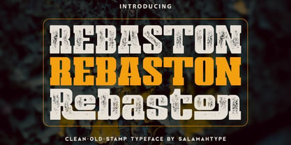 Rebaston is a display serif typeface with 40 ligatures and comes with a stamp style, which makes it perfect for developing logos and meeting a variety of branding needs. Its special stamp style gives your design a unique and classic touch. Features : Uppercase and lowercase Punctuation and symbols Multilingual support 40 Ligatures Enjoy our font! Thank you.
 - Deco Slice - Personal use only

- CA Postal by Cape Arcona Type Foundry,
$39.00 CA Postal is a cute and clever little stamp-font. It was originally intended for a record-cover only, but when the artist wanted all lyrics printed in the booklet, it was time for a font. The initial inspiration was a moveable-stamp printing-set, which had a nice Futura-like style, being very pleasant to read, especially in small sizes. But of course it’s the loose and irregular outlines that give the font its special charms. CA Postal features two sets of characters and the "Contextual Alternates" feature will make sure that never two identical characters will stand next to each other, so that the stamp-look becomes even more authentic.
 - Stencil Sheet JNL by Jeff Levine,
$29.00 Stencil Sheet JNL was modeled from an antique brass stencil sign that was custom hand punched for the customer. Sets of punch dies were available for years that allowed rubber stamp shops and similar trades to make custom stencils out of sheets of zinc or brass.
 - Delivery Matrix AOE by Astigmatic,
$19.95 The Delivery Matrix typestyle is inspired by the high bleed stamp printing on some shipped packages I've received over the years. An extended techno dot matrix style, good for so many uses at a wide variety of sizes, even with the tight "e" and "s" characters. Do you send out packages to friends...? Do you make techno style art/flyers...? Here is a typestyle for you. Put the power of the Digital and Postal systems in your computer and at your fingertips, get Delivery Matrix today!
 - Brughler by Invasi Studio,
$17.00 Take inspiration from the old-fashioned era. The Brughler typeface gives a vintage aesthetic. With it's unique & distinct characteristics, it stands out from the rest, while also keeping a timeless appeal. Brughler comes with 3 different styles of the font: Regular, Rough, and Stamp. Brughler's Rough & Stamp versions allow you to create a printed look without using 3rd party effects, removing a step in the creation of your final product. It is perfect for packaging, posters, and branding projects that need a bold impact. Features: Uppercase Numerals & Punctuation Alternates Multilanguage Supports 60+ Latin based languages
 - KG All Of Me by Kimberly Geswein,
$5.00 A stamped, eroded font with the texture of a real rubber stamped image.
 - Stempel by Linotype,
$29.99The Stempel family consists of two fonts; each made to look like a set of block stamps. Each letter appears inside its own roughly drawn square. Stempel One's letters are very simple form/counterform objects. Stempel Two's forms are more ornate: each square stamp has a thin border inside of it, and then the individual letterforms have been knocked-out, so that the colored area depicts the counters around the letters rather than the letters themselves. As a line of text is typed, a box appears for each letter entered, and all of the boxes slightly nudge against each other to form the line. The Stempel fonts have the appearance of a hand-made quality to them. Their forms appear too random, too delicate, and too thought out to have been made on a machine. Using these fonts will add a nice warm, linoleum-cut touch to your work. Both Stempel One and Stempel Two were designed by German designer Martina Balke in 2002, and are part of the Take Type 5 collection from Linotype GmbH." - BrunoBook by JOEBOB graphics,
$9.00 Stop using Times new Roman in children's books! BrunoBook is here to stay. A complete character set with numbers and most (but not all) special signs.
 - Handprint by Turtle Arts,
$20.00Handprint was inspired by a set of old metal alphabet stamps, with a few modifications. Stamped in a sketchy manner, these metal stamps made the basis for a very interesting alphabet and font. - Future Earth - 100% free

- Boldoy by Ardyanatypes,
$15.00 Boldoy is here everyone~ an attractive Typeface with agile and energic character See the beefy trunk? it will attract more attention like telling "hug me" ;) Boldoy come up with many decoration in multilanguage When you put it on the boom cover, it will stopping eye from others. The joyful shape impress a cheerful, clingy, gentle, cute, elephant, which super fit for your summer season Big Boy Boldoy also including alternates and ligatures that will make your idea never run out. It was so playful font but also easy to read and applied in various design styles such as traveling snacks, packaging, logos, event poster, animal lovers, cool T-shirts, and many more design projects. So, ready for play? Enjoy your design playground with BOLDOY
 - Dinosaur Cake by Hanoded,
$10.00 My son Sam’s birthday is coming up and we need to think of a cake. He’s old enough not to want a themed cake, but I suddenly remembered that we gave him a dinosaur cake for his second birthday! Dinosaur Cake? That’s a totally cool name for a font! So here it is: Dinosaur Cake - The Font. It’s a cute little handmade font, which looks like it was cut out of paper, but I have to disappoint you this time: it was not cut out.
 - Thirdlone by Letterhend,
$14.00 Thirdlone is a handmade typeface with monoline script and sans. This font is perfect to be used as t-shirt designs, logo/brands, signatures, headlines, lettering quotes, and more. It also comes in uppercase, lowercase, punctuation, symbols, numerals, stylistic set alternate, ligatures, and multi-lingual support. Thirdlone Script includes 3 different styles: Regular, Stamp, and Ink. Thirdlone Sans includes 4 different styles: Regular, Stamp, Ink, and Edge. Regular styles are a regular style that have clean look on it. Stamp styles give you aged texture on the font that will push out the vintage feel. Ink styles will give the font a little bit of an ink feel. The Edge style give this font a rough feel on its edge. You can choose one of the styles mentioned above that match perfectly for your style, or just mix and match it.
 - The Foregen by Vultype Co,
$29.00 Introducing The Foregen Vintage Font The Foregen is vintage sans serif font with 6 font styles including Regular, Outline, Vintage, Stamp one, And Stamp two. This font has a vintage feel with styles stamp on each letter. great for Logotype, Branding Design, Vintage Logo Design
 - Gibbons Gazette by Comicraft,
$39.00HOLD THE FRONT PAGE! STOP THE PRESSES! We have a new Headline for our Cover Story! DAVE GIBBONS is all over the tabloids, the trades AND the quality papers today. Yes, it's the opening of the WATCHMEN movie, but we have a much BIGGER story; the REAL scoop -- and we're announcing it in 72 point type... yes, there's a new addition to the Dave Gibbons family, and our editorial staff have the baby's name and our paparazzi have the pictures! Dave's new little sprog is called... GAZETTE. Man, that kid is gonna get teased at school, Dave. - Brenson Charlotte by Grezline Studio,
$15.00 Brenson Charlotte is a unique retro script and sans font duo. It has a bold and dynamic looks and is perfect for making any design stand out. Brenson Charlotte is perfect use for a logotype, typography design, product packaging, quotes, t-shirt design, label poster, headings, letterhead, cutting sticker, hot stamping, signage, and anything that need retro taste. Get your nostalgic vibe with this unique font! Feature : - A lot of Alternates ( With a Total of 800+ Glyphs ) - Multilingual Language - Works on PC & Mac - Simple installations - Accessible in the Adobe Illustrator, Adobe Photoshop, Adobe InDesign, even works on Microsoft Word.
 - Typesetter JNL by Jeff Levine,
$29.00 Typesetter JNL is based on an old-style 'grotesk' (or 'grotesque') text face popular with printers and rubber stamp makers since the 1800s. The nonconformist character shapes and line widths are reminiscent of hand-cut type of the era.
 - Reach by Salamahtype,
$17.00 Introducing our font called “REACH” – display typeface with 12 styles included (Fill-Fill Outline-Stamp-Outline). Perfect for branding projects, logos, labels, logotypes and more. Features: A-Z all caps characters (12 styles) Numbers, Symbols, and Punctuation Multilingual Support
 - Duarose by Sarid Ezra,
$15.00 This is the vintage version from my best selling font - Duarose, you can check it from this link - https://crmrkt.com/8dVKRE Duarose - Vintage Version is a classic and vintage serif with a bunch of alternates up to 6 style for each characters that will make your presentation or logo even more stunning and stand out! With two style, Rough & Stamp, this font will make your design looks more handmade and vintage. You can use this font for any adventure and outdoor design. Duarose also support Multi Language. and already PUA Encoded! Features Rough & Stamp Style All Uppercase Number & Symbol Multi language Alternates for each characters PUA Encoded
 - Goth Stencil - Personal use only


