10,000 search results
(0.028 seconds)
- Knip by Hanoded,
$15.00 Knip, in Dutch, means ‘cut’. You can tell by the glyphs that I made this font by cutting out the shapes from black paper, gluing it onto white paper and photographing the result so I could digitalise it! I don’t make too many cut out fonts, as it is a lot of work and it often leads to nothing. Besides that, I depend on the paper supply from my kids and they happened to have black paper this time!
 - Alphacal JNL by Jeff Levine,
$29.00Alphacal JNL and Alphacal Black JNL are variants of the same lettering style found in Jeff Levine's Juneway JNL font... all based on water-applied decals once made by the Duro Decal Company (now Duro Art Industries) of Chicago, Illinois. Alphacal JNL can be used alone as an outline font (best at 18 pt. and above) or with Alphacal Black JNL as a backfill. Note: Perfect registration is not guaranteed. Some user adjustments may be necessary. - DIN Next Slab by Monotype,
$56.99 Now even more design possibilities with the popular DIN Next. With its technical and neutral character, DIN Next has earned a permanent place in contemporary typography. Now, DIN Next Slab expands the font family further, offering new design potential. Now comes the next step, DIN Next Slab, also produced under the direction of Akira Kobayashi. On a team with Sandra Winter and Tom Grace, Kobayashi is creating the new font variant based on the optimized shapes of DIN Next. The expansion will make the popular font all the more flexible and versatile. Apart from that, the geometric slab serifs underline the technical and formal nature of the font and emphasize a central design element of DIN Next. However, the team did have some challenges to overcome. While it is relatively easy to imagine DIN Next Light with slab serifs, the amount of available space quickly disappears when it comes to the Black styles. Winter explains that many tests and trials were necessary to find a compromise between space, letters and the serif shapes. Experiments with modified contrast in the weight or only one-sided serifs were quickly abandoned. The central, technical and powerful character of the font changed too much. Nevertheless, it was necessary to simplify slightly the shape of some letters, such as the ‘k’ or ‘x’, for example. These changes, first developed in the Black styles, were applied to all weights in order to lend the font a consistent appearance. Like DIN Next, DIN Next Slab also has seven weights, which cover the range from Ultralight to Black, each with matching italic. There are various character sets in all of the styles and the four middle weights have small capitals available. DIN Next Slab harmonizes perfectly with the styles of DIN Next: the basic letterforms and weights are identical. Both versions of the font can work together perfectly, not just in headlines and body text, but also within a text; they complement each other very well as design variations. With the new DIN Next Slab, Monotype expands the DIN Next super family consistently. With DIN Next Slab, you can underscore the technical and formal nature of the understated font not only in headlines, but in texts, as well. In this way, you have new and diverse potential for application, thanks to the way the different styles of DIN Next combine perfectly.
 - TT Nooks by TypeType,
$39.00 TT Nooks useful links: Specimen | Graphic presentation | Customization options TT Nooks is an experimental font family that includes a high contrast serif, TT Nooks, and an upright italic, TT Nooks Script. Despite the difference in style, both subfamilies get along well, which is partially thanks to their similar proportions. Each of the subfamilies includes 4 weights: Light, Regular, Bold and Black. The main subfamily is TT Nooks—a stylish high-contrast serif with a light touch of self-centeredness. If TT Nooks were a person, it would be an elegant lady with an independent and firm personality. In the original sketches of TT Nooks there were traces of a broad pen, but in the course of further evolution the typeface moved away from this style, retaining only the high contrast of strokes. In addition, in the process of design searches TT Nooks has obtained a touch of geometricity. The serifs in TT Nooks stand out especially visibly thanks to their geometric shape that resembles slippers. In addition to their peculiarity, such serifs add stability to the font and allow better compensation of the black and white ratio within the letters. TT Nooks has small capitals for Latin and Cyrillic alphabets, as well as a set of stylistic alternates (including some figures) that makes the typeface a bit more geometric. In addition, we have drawn more than 25 ligatures, including ligatures for capital letters, slashed zero and many other useful OpenType features. TT Nooks Script is a complementary family designed to harmoniously extend the main family and expand its scope. The forms of the characters in bold and light fonts of TT Nooks Script are quite different. For example, Black & Bold have high contrast strokes and an open aperture, and in Regular & Light the aperture of the characters is closed. TT Nooks also has small capitals for Latin and Cyrillic alphabets, ligatures, oldstyle figures and other OpenType features. In light faces, TT Nooks Script is more humanist and has artifacts inherent to the continuous movement of a flat pen. In bold faces, TT Nooks Script has a very dense and dynamic typing rhythm, and the shape of the letters begins to geometrize. We had had the difficult task of preserving the continuity of forms between bold and light faces, and we have managed to solve it thanks to the found rhythm, which united different fonts, and proximate stylistic solutions.
 - RM True To Type by Ray Meadows,
$19.00 Throw away the carbon paper, ribbons and Tippex ... now you can get that typewritten look with RM True to Type. Legible at all sizes, it is available in regular and bold. That faithful old typewriter has given many years of valiant service, but now the keys are worn and blocked with ink. The Old styles replicate the wear and tear of years of use. Includes: Western European, Central European, Baltic & Turkish sets Due to the modular nature of this design there may be a slight lack of smoothness to the curves at very large point sizes (around 100 pt and above).
 - Ammurapi by Proportional Lime,
$5.99 Ammurapi was the last king of Ugarit, which was destroyed circa 1200 B.C. Back then all writing was done by hand and all that has been preserved is on clay tablets many of which were fired in the very destruction of the cities that enabled these documents to withstand the rvages of time. Ugarit unlike the other cuneiform scripts has a very limited number of glyphs. It is somehow exotically attractive. This font has been encoded in the appropriate unicode block to permit ease of use for scholarly purposes, but would also make a fine use as a decorative element.
 - Ebony by TypeTogether,
$35.00 Some typefaces need time to ripen; Burian and Scaglione made the first sketches for Ebony back in 2008, but it took a few years of maturing in a drawer to be developed into a multi-functional type family. While keeping in tune with TypeTogether’s focus on complex typographic structures needed for magazine, newspapers and books —whether printed or digital—, Ebony goes far beyond editorial use and promises great performance in branding and advertising. The range of dark weights with taut and powerful curves can boost any headline, while the lighter styles create an approachable and clean feel in blocks of continuous text. Ebony does not fall short on aiding legibility either; letterforms have a distinct direction of ductus and features like the top serif on ‘l’ help making them clearly distinguishable from each other. It is a type family that cleverly seeks a balance between the openness and legibility of humanist sans serifs and the striking and more regularised character of grotesques. The letter-shapes feature generous counters and open terminals with crisp angles, and daringly grow both in colour and width as the fonts get bolder. Infused with this strength, Ebony also shows a quirky side in some of her shapes; the vertical fractions, the at-symbol, the old-style numbers, … The predominantly slanted style of the italics is broken up in some letterforms, such as ‘a e f l’, that are more in line with a classic cursive appearance. This, together with a forceful italic angle, ensure a change in texture within a block of text, despite sharing the same letter weight and width with the uprights. With 18 styles, tending towards the heavier part of the weight-spectrum, this face has a powerful quality!
 - Starlikes by Say Studio,
$15.00 Starlikes - classic duo typeface with stencil serif and regular typeface, which can be adapted to your needs and desires Starlikes is a beautiful, nostalgic lowercase and uppercase typeface that works best as focus display text (think logos, headers, pretty quotes, calls to action, etc.) think logos, headers, pretty quotes, calls to action, etc.). Upper and lower case give it great versatility, but I honestly can't get over all the crumpled uppercase letters. This is too good. Including: Numbers & punctuation Foreign language support Have a wonderful day SayStudio :-)
 - Tropical Chemistry by Fikryal,
$18.00 Introducing Tropical Chemistry – Modern Serif font with many alternates and washes. This font is very suitable to be applied in various aspects of design, Also it’s perfect for logos, branding, title, social media posts, advertisements, product packaging, product designs, label, photography, watermark, special event, magazine, web designs, etc. Features : Tropical Chemistry (Uppercase, Lowercase) Alternates Swashes Ligatures Multilingual Support, including Latin, Western Europe, Central/Eastern Europe, Baltic, Turkis, Romanian, etc. If you have any questions please don’t hesitate to contact me follow my Instagram: @fkryall Thank you
 - Borscena by IbraCreative,
$17.00 Borscena is a luxury classic serif font that exudes timeless elegance and sophistication. Its meticulously crafted letterforms feature exquisite, ornate detailing and graceful, high-contrast strokes, making it the epitome of refined typographic design. Borscena’s regal presence and intricate serifs harken back to the golden age of print, offering a sense of opulence and exclusivity, ideal for conveying a sense of prestige and tradition in branding, editorial, or decorative applications. This font stands as a symbol of timeless beauty and an embodiment of the grandeur of bygone eras, making it the perfect choice for projects seeking a touch of sophistication and sophistication.
 - Stiana by WDC Fonts,
$30.00 Stiana font is a venetian serif in modern design. The general idea was inspired by beautiful masterpieces of Nicolas Jensen and William Morris. Stiana holds fine, balanced readability of venetian serif, and both 21st century trends. Letterforms are expressive and bold enough to use font as display, but it also fits nicely for text. Stiana supports Western Europe, Cyrillic and Greek languages. Stiana is surely a good choice both for screen applications and print media. Its multipurpose spreads over package design, logos, headlines, body texts, stationary and back labels. Also very good for books and magazines.
 - Dungeon - Unknown license

- Balboa by Parkinson,
$20.00 Balboa is a display design combining elements of early sans serif and grotesque types with contemporary types. It evolved from ATF Headline Gothic, Banner (a headline typeface I drew for the San Francisco Chronicle), and Newsweek No.9, a Stephenson Blake-like grotesque I designed for Roger Black's 1980 redesign of Newsweek Magazine. There are nine styles, including the three new styles that have been added in 2014: Medium, Light and Ultra Light.
 - Estricta by Graviton,
$24.00 Estricta font family has been designed for Graviton Font Foundry by Pablo Balcells in 2017. It is a sans serif typeface with a geometrical and mechanic appearence, its sharp, angular edges provide a strong and solid design. It has been conceived to be most suitable for short and middle length text blocks, as well as on all sized headlines. Estricta consists of 12 styles. Each containing small caps and glyph coverage for several languages.
 - Hekson by Maulana Creative,
$14.00 Hekson is a block handwritten display font. With bold stroke, fun character with a bit of ligatures. To give you an extra creative work. Hekson font support multilingual more than 100+ language. This font is good for logo design, Social media, Movie Titles, Books Titles, a short text even a long text letter and good for your secondary text font with sans or serif. Make a stunning work with Hekson font. Cheers, Maulana Creative
 - MC Sloanstone Outline by Maulana Creative,
$13.00 Sloanstone is a handwritten display font. With bold block stroke, fun character with a bit of ligatures. To give you an extra creative work. Sloanstone font support multilingual more than 100+ language. This font is good for logo design, Social media, Movie Titles, Books Titles, a short text even a long text letter and good for your secondary text font with sans or serif. Make a stunning work with Sloanstone font. Cheers, Maulana Creative
 - Afterglow by Vintage Voyage Design Supply,
$18.00 Elegant and so stylish serif typeface full of contrast lines, a lot of Stylistic Alternates with thin swashes. Some letters has up to 12 of them. Use only capitals for headers or quotes, it looks strong and refined, or use Caps with lowercase for block texts, or subheaders. Design your art- or beauty blogs, t-shirts or websites, posters, magazines or cards, and logo's of course. You will return to this font again and again.
 - Picaflor Soft by RodrigoTypo,
$29.00 Picaflor soft, is a continuation of "Picaflor" now in a rounded version, especially for titles, it contains different styles from Thin-Black, in addition to multiple languages
 - PIXymbols Flagman by Page Studio Graphics,
$40.00The numerals and alphabet of the Semaphore Flagging Code, as well as black and white version of the flags and pennants of the International Code of Signals. - Loyola Pro by RodrigoTypo,
$30.00 It is a redesign of "Loyola". This family contains Light, Regular, Bold, ExtraBold, Black, also a set of shadows and dingbats, special for short titles and children.
 - MB SIXTYTHREE by Ben Burford Fonts,
$20.00 A heavy black display face with lots of retro 'cool'. Modernist to the extreme MB SIXTYTHREE oozes 'mod' culture. Great for magazines & headlines, logotypes, posters, album artwork.
 - BD Gitalona by Balibilly Design,
$22.00 We introduce our high-complex typeface. A wide range of serifs for text and display titles are divided into one prominent sub-family and four display sub-families. Comes shifted from serif to sans serif to fulfilling the completeness of this font family that we named BD Gitalona. In addition to these massive things, this font family is filled with an explorative and experimental decorative version that we present separately. Figure out the decorative version BD Gitalona Moxa to make the aesthetic appeal of this whole typeface! Inspiration The world of entertainment moves non-stop. One by one, figures appeared and left. We expect to create something to entertain previous trends with packaging more relevant to the present. More specifically, we admire and are inspired by some of the world's leading and top singers with a segmented nature. We imagine so many figures that can affect every viewer. However, each artist or singer has a segment because almost all of them have characteristics. The Design The basic design of this typeface begins with a transitional serif shape with sharp, shapeless corners. Then in the middle of the invention, there was an opportunity to explore it further from the readability side by adding an optical variable that can adjust the serif thickness when used together between large, medium to paragraph text sizes for editorials. The shift from serif to sans-serif with the contrast initiated by the shift of the serif family form as a different variable also makes this font richer in terms of the features it contains. Parts are expected to add to the user satisfaction with the complexity of this font. The Features BD Gitalona consists of one sub-family intended for body text with nine weights from Thin(100) to Black(900) and four other display sub-families such as Display serif, Flick, Harmony Sans and Contrast Sans. Each consists of four weights Thin(100), Regular Weight(400), Bold(700), and Black(900). And again, there are also retailed separately; the BD Gitalona Variable font, which is designed to accommodate all Subfamily in 1 font file, and BD Gitalona Moxa, an experimental typeface. A total of 700+ glyphs in each style. Advanced OpenType features functionally and aesthetically, such as Case-sensitive forms, small caps, standard and discretionary ligatures, stylistic alternates, ordinals, fractions, numerator, denominator, superscript, subscript, circled number, slashed zero, old-style figure, tabular and lining figure. Supports multi-languages including Western Europe, Central Europe, Southeast Europe, South America, and Oceania.
 - Linotype Gotharda by Linotype,
$29.99Linotype Gotharda is part of the Take Type Library, chosen from contestants of Linotype’s International Digital Type Design Contests of 1994 and 1997. This display font started as an experiment of the Croatian-German designer Milo Dominik Ivir. He wanted to design a font with characteristics of both sans serif and Gothic faces. From the Gothic he took the heavy strokes, the narrow letters, the exaggerated overmatter and the high x-height. The modern standard forms of the letters s, a, x and z, the clear capitals and the lack of serifs are the characteristics taken from sans serif faces. The result is a font with a constructed, old German feel. Linotype Gotharda is intended exclusivley for headlines in large point sizes. - FF Meta Hebrew by FontFont,
$79.99German type designer Erik Spiekermann, created this sans FontFont between 1991 and 2010. The family has 28 weights, ranging from Hairline to Black in Condensed and Normal (including italics) and is ideally suited for advertising and packaging, book text, editorial and publishing, logo, branding and creative industries, small text as well as web and screen design. FF Meta provides advanced typographical support with features such as ligatures, small capitals, alternate characters, case-sensitive forms, fractions, and super- and subscript characters. It comes with a complete range of figure set options—oldstyle and lining figures, each in tabular and proportional widths. As well as Latin-based languages, the typeface family also supports the Cyrillic, Greek, and Hebrew writing systems. FF Meta Variable are font files which are featuring two axis and have a preset instance from Hairline to Black and Condensed to Roman In 2011, FF Meta was added to the MoMA Architecture and Design Collection in New York. This FontFont is a member of the FF Meta super family, which also includes FF Meta Correspondence , FF Meta Headline , and FF Meta Serif . - Parisine Plus Std by Typofonderie,
$59.00 A playfull fancy sanserif typeface in 16 fonts Parisine Plus was designed in 1999 as an informal version of Parisine. A reaction to the subjective functionalism of Parisine. In fact, when Parisine try to express neutrality (a typeface is never neutral), Parisine Plus has fun with contrasts and not-so-obvious additions for a sans family. Parisine Plus is a precursor in the way it offers many ligatures and strange forms we generally find more in serif typefaces families that express historical connotations. The various Parisine Plus typeface subfamilies Parisine Plus is organised in various weight subsets, from the original family Parisine Plus (4 compatible fonts), Parisine Plus Gris featuring lighter versions of the usual Regular and Bold (4 compatible fonts), Parisine Plus Claire featuring extra light weights (4 compatible fonts), to Parisine Plus Sombre with his darker and extremly black weights as we can seen in Frutiger Black or Antique Olive Nord (4 compatible fonts). About Parisine Parisine helps Parisians catch the right bus Parisine Plus and its fancy type effects Observateur du design star of 2007
 - Mi Casa by FontMesa,
$25.00 Mi Casa is a new condensed version of our Home Style font which is a revival of an old 1800's classic ornate French font. This new 2021 condensed version takes this old classic to an all new level by adding small caps, italics and a new black version. Mi Casa is perfect for headlines and logos from advertising to product labels, t-shirt lettering and restaurant menus. Fill fonts are also part of this family, new to this font style is the half fill font for creating a two color effect on the letters, you'll need an application that works in layers to use the fill fonts in Mi Casa. The regular fill font for Mi Casa isn't meant to be used as a stand alone font so we've created a solid black version with thicker serifs on top and adjusted outlines throughout for a better appearance as a solo font. We hope you enjoy Mi Casa as much as we did making it. Mi Casa is a trademark of FontMesa LLC
 - FF Infra by FontFont,
$50.99 FF Infra™ is a fresh take on the robust sans serif typefaces of the early 20th century. Drawn by Gabriel Richter, it’s a friendly, inviting – and multi-talented family. Whether long blocks of editorial text, or snackable copy in web pages and blog posts, FF Infra’s 20 typefaces are easy on the eyes in both print and digital environments. The design also performs as well at petite sizes, as it does at supersized display settings. Pair FF Infra with an old style or Didone serif design and you’ll have powerful and distinctive typographic pages! FF Infra is available in 10 weights, ranging from a delicate light to a commanding black, each with an italic companion. OpenType® Pro fonts of FF infra have an extended character set supporting most Central European and many Eastern European languages, in addition to providing for the automatic insertion of ligatures and fractions. Each font also contains four sets of figures and a bevy of arrows that are ideal for wayfinding and similar info-graphic projects. A generous lowercase x-height, open counters and subtle graduations between family weights, make for a family that is at home in a wide range of sizes, and comfortable in everything from large signage, content for mobile apps, product manuals and full-scale branding projects. In addition, to provide design diversity, Richter drew alternate designs for the a, G and ß. Richter first became interested in fonts and the art of creating typefaces while studying communication design at Düsseldorf University of Applied Sciences. His first designs were experimental, but these lead a position at FontShop International in 2013, where he developed his typeface design skills. A strong background in font production, hinting and font marketing were also part of his FontShop experience. Richter worked as freelance graphic and type designer until he founded übertype in 2017. He also invests back into the type community through the type design courses he teaches at his alma mater. FF Infra is Richter’s first commercial design for Monotype. We’re sure that you’ll find it as versatile and powerful as we do.
 - Dorgan by Flawlessandco,
$9.00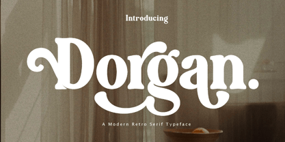 Dorgan is a Serif Retro with Fun and Elegant Style in each character with some alternate. An Original typeface that suitable for any graphic designs such as branding materials, t-shirt, print, business cards, logo, poster, t-shirt, photography, quotes .etc This font support for some multilingual. Serif Retro Font that contains uppercase A-Z and lowercase a-z, alternate character, numbers 0-9, and some punctuation. If you need help, just write me! Thanks so much for checking out my shop!
 - The Aquebella by Jafar07,
$18.00 The Aquebella font was made because I had too much trouble finding a font that was unique but still within the serif standard, as a branding designer about finding a suitable font for a client who is looking for a luxurious and elegant design, and finally this font is finished which you can use as a designer or someone who need a serif font with a very unique style, elegant style and can be used as a logo, magazine header, poster, etc.
 - Mighe Huntera by Namara Creative Studio,
$20.00 Retro modern serif typeface inspired by the typography of the ’90s, which exudes an irresistible sense of nostalgic and timeless charm. Each character showcases sharp, defined serifs that effortlessly merge with thick, prominent strokes, creating a harmonious balance between boldness and elegance. Features : Full Set of standard characters and punctuations. Alternates, Ligatures & Multilingual Support PUA Encoded | no special software needed to access extra characters. We recommend using a program that supports OpenType features and Glyphs panels like Adobe Apps, Corel, etc.
 - Slurp - 100% free

- Ordinatum Medium - Personal use only

- Squareworm - Personal use only

- Octin Prison Free - 100% free

- Greghor II - Unknown license

- atthewindowPRO - Unknown license

- Reaver - Personal use only

- Quake & Shake - Unknown license

- cheaptype - 100% free

- Oxona Caps - Personal use only


