10,000 search results (0.065 seconds)
  1. BPtypewrite is a font that effortlessly captures the nostalgic essence of an era dominated by the mechanical charm of typewriters. Designed by Backpacker, this font is meticulously crafted to embody ...
  2. MEcanicules - Unknown license
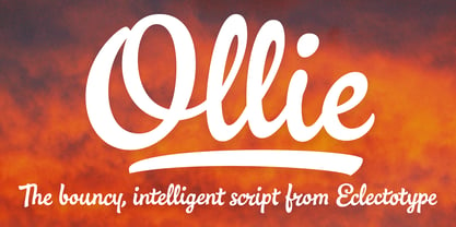
  3. Ollie by Eclectotype, $40.00
    Meet Ollie, a casual signage script whose friendly, bouncy exterior belies a heart of sophisticated OpenType programming. This font is designed to make the most of OpenType savvy applications, and as such is recommended for professional design use. Or to put it another way: Make sure that contextual alternates and ligatures are always turned on! Ollie includes about 900 glyphs, many of which are automagical substitutions to keep the text flowing smoothly, and to pseudo-randomly pick different glyphs to avoid repetition. With contextual alternates turned on (as they should be by default), most lowercase letters will alternate between at least two different forms. The powerful OpenType programming makes the font itself ‘look back’ (up to eight characters) on previously used letters; typing “banana” will give you three different a’s and two different n’s (the last a is a special ‘end form’ character). The calt feature controls many other ‘special effects’ which all add together to give a smooth-flowing, hand-lettered look. These effects include start and end forms (and indeed, ‘loner’ forms) of many letters, which are automatically substituted in at beginnings or ends of words, or when the previous or next letter doesn't connect. Another special feature tests to see if there is room for the crossbar of t (or tt ligature) to extend further over the previous or next letter, or both, as is often the case. The last main effect of the calt feature is to substitute certain letters typed before any ‘e’ character, to make for a more natural connection (see the pe combination in ‘Eclectotype’ in the first poster). Ligatures should be on by default, for a much nicer looking tt combination, and a few others besides. The swash feature should be used sparingly (one glyph at a time, really) to apply a more extravagant look to g,j and y in the lower case, and quite a few of the upper case too. Oldstyle figures are included, as well as the lining defaults. Now to delve into the stylistic alternates... These are all included in the salt feature, or for uses of applications that support them, separated into stylistic sets thus: ss01 - (with swash feature on) L and G swashes get even swashier. ss02 - standard s changes to a connected script s form. ss03 - r takes on a script form. ss04 - z also gets a scriptier look. [the previous three sets also change any versions of s, r or z with diacritics] ss05 - a useful underline function. When enabled, typing two or more underscores will extend a cool underline under the previous letters. More underscores = longer underline. ss06 - the Polish script lslash changes to its more standard form. ss07 - E, S and B change to a more top-heavy alternate form. ss08 - An alternate form for A characters. ss09 - Alterative rounder forms of M and N. ss10 - An alternate ampersand. That about wraps up the features. Now all that’s left is for you to license the font and get experimenting!
  4. VAG-HandWritten - 100% free
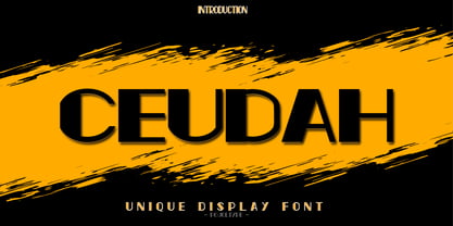
  5. Ceudah by PojolType, $12.00
    Ceundah font is inspired by thick and thin Hand Sketches. This font can be used for film titles, magazine titles, newspaper front pages, billboards, or company brands.
  6. Z_tUBBAnomal - Unknown license
  7. First Grade by m u r, $10.00
    Searching for a font that resembled true children's handwriting, this font's creator designed a font from his own first grade penmanship assignments. Ideal for anything related to children.
  8. Oomph, designed by David Kerkhoff, is a font that truly lives up to its name, delivering visual impact and dynamic energy to any piece it graces. One of the defining features of Oomph is its bold and...
  9. Indezonefont - Creative is a font that embodies artistic expression and innovation. It's not just a set of characters; it's a tool that brings life and character to words. The essence of this font li...
  10. Macaroni, as a font name, suggests a whimsical, playful, and perhaps slightly quirky character. Imagine a font that embodies the spirit of fun and creativity, just like its pasta namesake which is kn...
  11. Riggle is a font that dances across the page with a playful yet robust energy. Imagine each letter crafted not merely to form words, but to invoke a feeling of joy and creativity. Its design leans in...
  12. The "SkyFall Done" font, crafted by the designer known as SpideRaY, encapsulates a suave and dynamic aesthetic that pays homage to the sleek sophistication often found in spy films and literature, pa...
  13. The TaitDemo font, crafted by Daryl Askey, is an exquisite display of typeface design that merges modernity with a slightly vintage aura, creating a versatile font suitable for a wide array of applic...
  14. Sfilth, a distinctive font crafted by the talented Stephen Bird, stands as a testament to the innovative and adventurous spirit of modern typography. At first glance, Sfilth captivates with its uniqu...
  15. The Conduit 2 Italics BRK font, crafted by the talented designer or group known as AEnigma, is a striking example of typeface design that brings together utility with a distinct personality. This fon...
  16. Hand Sketch Rough Poster by TypoGraphicDesign, $25.00
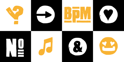
    “Hand Sketch Rough Pos­ter” is a hand­made, rough and dirty sans-serif dis­play font for deco­ra­tive head­line sizes. Hand drawn. A–Z (× 2), a–z (× 2) and 0–9 (× 4) are each many dif­fe­rent forms. Con­text­ual alter­na­tes. Is inten­ded to show the hand-made cha­rac­ter and the vibrancy of the dis­play font. The dif­fe­rent forms of rough­ness crea­tes a live­li­ness in the typeface. Stan­dard liga­tures like ae, oe, AE, OE, ff, fl, fi, fj, ffl, ffi, ffj and more deco­ra­tive liga­tures like CT, LC, LE, LH, LI, LO, LU, LY, TOO, TC, TE, TH, TU, TZ and ch, cl, ck, ct, sh, sk, st, sp, addi­tio­nal logo­ty­pes like BPM, fff, ppp, sfz and many more … plus Ver­sal Eszett (Capi­tal Let­ter Dou­ble S) give the font more life and shows that des­pite their retro-looks works with modern Open­Type tech­no­logy (type the word note for the sym­bol ♫ and the word love for the ding­bat ❤ … ). Sym­bols like play, stop, eject, for­ward, back­ward, skip, pause and so on. The topic for the dis­cre­tio­nary liga­tures and the sym­bols are music. Have fun with this font – turn up the volume! How To Use – awe­some magic OpenType-Features in your lay­out application ■ In Adobe Pho­to­shop and Adobe InDe­sign, font fea­ture con­trols are wit­hin the Cha­rac­ter panel sub-menu → Open­Type → Dis­cre­tio­nary Liga­tures … Che­cked fea­tures are applied/on. Unche­cked fea­tures are off. ■ In Adobe Illus­tra­tor, font fea­ture con­trols are wit­hin the Open­Type panel. Icons at the bot­tom of the panel are but­ton con­trols. Dar­ker ‘pres­sed’ but­tons are applied/on. ■ Addi­tio­nally in Adobe InDe­sign and Adobe Illus­tra­tor, alter­nate gly­phs can manu­ally be ins­er­ted into a text frame by using the gly­phs panel. The panel can be opened by selec­ting Win­dow from the menu bar → Type → Gly­phs. Or use sign-overview of your ope­ra­ting sys­tem. ■ For a over­view of OpenType-Feature com­pa­ti­bi­lity for com­mon app­li­ca­ti­ons, fol­low the myfonts-help http://www.myfonts.com/help/#looks-different ■ It may pro­cess a little bit slowly in some app­li­ca­ti­ons, because the font has a lot of lovely rough details (anchor points). TECHNICAL SPECIFICATIONS ■ Font Name: Hand Sketch Rough Pos­ter ■ Font Weights: Regu­lar ■ Fonts Cate­gory: Dis­play for Head­line Size ■ Desktop-Font For­mat: OTF (Open­Type Font for Mac + Win) + TTF (True­Type Font) ■ Web-Font For­mat: SVG + EOT + TTF + WOF ■ Font License: Desk­top license, Web license, App license, eBook license, Ser­ver license ■ Glyph cover­age: 715 ■ Lan­guage Sup­port: Afri­kaans, Alba­nian, Alsa­tian, Ara­go­nese, Ara­paho, Aro­ma­nian, Arr­ernte, Astu­rian, Aymara, Bas­que, Bela­rusian (Lac­inka), Bis­lama, Bos­nian, Bre­ton, Cata­lan, Cebuano, Cha­morro, Che­yenne, Chi­chewa (Nyanja), Cim­brian, Cor­si­can, Croa­tian, Czech, Danish, Dutch, English, Espe­ranto, Esto­nian, Fijian, Fin­nish, French, French Creole (Saint Lucia), Fri­sian, Fri­ulian, Gali­cian, Genoese, Ger­man, Gil­ber­tese (Kiri­bati), Green­lan­dic, Hai­tian Creole, Hawaiian, Hili­gaynon, Hmong, Hopi, Hun­ga­rian, Iba­nag, Iloko (Ilo­kano), Indo­ne­sian, Inter­g­lossa (Glosa), Inter­lin­gua, Irish (Gae­lic), Istro-Romanian, Ita­lian, Jèr­riais, Kas­hubian, Kur­dish (Kur­manji), Ladin, Lat­vian, Lithua­nian, Loj­ban, Lom­bard, Low Saxon, Luxem­bour­gian, Malag­asy, Malay (Lati­ni­zed), Mal­tese, Manx, Maori, Megleno-Romanian, Mohawk, Nahuatl, Norfolk/Pitcairnese, Nort­hern Sotho (Pedi), Nor­we­gian, Occi­tan, Oromo, Pan­gasinan, Papia­mento, Pied­mon­tese, Polish, Por­tu­guese, Pota­wa­tomi, Que­chua, Rhaeto-Romance, Roma­nian, Romansh (Rumantsch), Roto­kas, Sami (Inari), Sami (Lule), Samoan, Sar­di­nian (Sardu), Scots (Gae­lic), Sey­chel­lois Creole (Seselwa), Shona, Sici­lian, Slovak, Slove­nian (Slovene), Somali, Sou­thern Nde­bele, Sou­thern Sotho (Seso­tho), Spa­nish, Swa­hili, Swati/Swazi, Swe­dish, Taga­log (Filipino/Pilipino), Tahi­tian, Tau­sug, Tetum (Tetun), Tok Pisin, Ton­gan (Faka-Tonga), Tswana, Tur­kish, Turk­men, Turk­men (Lati­ni­zed), Tuva­luan, Uyghur (Lati­ni­zed), Veps, Vola­pük, Votic (Lati­ni­zed), Wal­loon, Warl­piri, Welsh, Xhosa, Yapese, Zulu ■ Spe­cials: Alter­na­tive let­ters, logo­ty­pes, ding­bats & sym­bols, accents & €. OpenType-Features like Access All Alter­na­tes (aalt), Con­text­ual Alter­na­tes (calt), Glyph Composition/Decomposition (ccmp), Dis­cre­tio­nary Liga­tures (dlig) Deno­mi­na­tors (dnom), Frac­tions (frac), Kerning (kern), Stan­dard Liga­tures (liga), Lining Figu­res (lnum), Nume­ra­tors (numr), Old Style Figu­res (onum) Ordi­nals (ordn), Pro­por­tio­nal Figu­res (pnum), Sty­listic Alter­na­tes (salt), Sty­listic Set 01 (ss01), Sty­listic Set 02 (ss02), Sty­listic Set 03 (ss03), Sty­listic Set 04 (ss04), Super­script (sups), Tabu­lar Figu­res (tnum) ■ Design Date: 2015 ■ Type Desi­gner: Manuel Viergutz
  17. Ah, Eurofurence Modified! A font that truly brings a unique character to the screen or page, drawing its inspiration from the original Eurofurence typeface. Picture a design that breathes a modern sp...
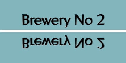
  18. Brewery No 2 Paneuropean by Linotype, $103.99
    An entry in the Second Linotype Design Contest, Linotype Brewery, designed by Gustavs Andrejs Grinbergs, became part of the TakeType Collection in 1997. Brewery No 2 represents a significantly improved version of its precursor, and the typeface has been both extended and enhanced. When asked about prototypes, Grinbergs cites German typefaces of the early 20th century. It is thus not surprising that the characters of Brewery™ No 2 are based on geometrical forms. However, this is no mere synthetic Grotesque-derived typeface. It has significant contrasts in line thickness and triangular line terminals that are not unlike serifs, placing it in the middle ground somewhere between a Grotesque and serif font. The contrast between the features of a synthetic Grotesque and an Antiqua gives the characters of Brewery No 2 their distinctive charm and is the distinguishing attribute of this contemporary typeface. Additional vibrancy is provided by bevelled line endings (as in the case of the 'E' and the 'F'), the circular punctuation marks and the slight curve of the descending bar of the 'k'. Thanks to a generous x-height and its open counters, Brewery No 2 is also highly legible in small point sizes. Only in its bolder versions is another aspect of Brewery No 2 apparent; Grinbergs has here made the linking elements more rectangular and has emphasized the counters, so that the Bold variants of Brewery No 2 exhibit elements typical of a broken typeface. Brewery No 2 is available in seven finely graduated weights, ranging from Light to Black. Every variant has a corresponding, slightly narrower Italic version. In addition, the lowercase 'a' is given a closed form, the 'e' is more rounded and the 'f' has a descender. The character sets of Brewery No 2 leave nothing to be desired. In addition to small caps and ligatures, there are various numeral sets with old style and lining figures for setting proportional text and table columns. In its most extensive form (the Pan-European variant), Brewery No 2 can be used to set texts in many languages that employ the Latin alphabet and also texts in international languages that use Cyrillic or monotonic Greek orthography. Although some of the features of Brewery No 2, such as the tiny serifs, are only evident in the larger point sizes, this typeface is not just at home when used to set headlines. Brewery No 2 also cuts a good figure in short or medium length texts. This contemporary typeface with its formally elegant quality looks good, for example, on posters, in newspapers and promotional material. It can also be used for websites as it is also available as a web font.
  19. Brewery No 2 by Linotype, $40.99
    An entry in the Second Linotype Design Contest, Linotype Brewery, designed by Gustavs Andrejs Grinbergs, became part of the TakeType Collection in 1997. Brewery No 2 represents a significantly improved version of its precursor, and the typeface has been both extended and enhanced. When asked about prototypes, Grinbergs cites German typefaces of the early 20th century. It is thus not surprising that the characters of Brewery™ No 2 are based on geometrical forms. However, this is no mere synthetic Grotesque-derived typeface. It has significant contrasts in line thickness and triangular line terminals that are not unlike serifs, placing it in the middle ground somewhere between a Grotesque and serif font. The contrast between the features of a synthetic Grotesque and an Antiqua gives the characters of Brewery No 2 their distinctive charm and is the distinguishing attribute of this contemporary typeface. Additional vibrancy is provided by bevelled line endings (as in the case of the 'E' and the 'F'), the circular punctuation marks and the slight curve of the descending bar of the 'k'. Thanks to a generous x-height and its open counters, Brewery No 2 is also highly legible in small point sizes. Only in its bolder versions is another aspect of Brewery No 2 apparent; Grinbergs has here made the linking elements more rectangular and has emphasized the counters, so that the Bold variants of Brewery No 2 exhibit elements typical of a broken typeface. Brewery No 2 is available in seven finely graduated weights, ranging from Light to Black. Every variant has a corresponding, slightly narrower Italic version. In addition, the lowercase 'a' is given a closed form, the 'e' is more rounded and the 'f' has a descender. The character sets of Brewery No 2 leave nothing to be desired. In addition to small caps and ligatures, there are various numeral sets with old style and lining figures for setting proportional text and table columns. In its most extensive form (the Pan-European variant), Brewery No 2 can be used to set texts in many languages that employ the Latin alphabet and also texts in international languages that use Cyrillic or monotonic Greek orthography. Although some of the features of Brewery No 2, such as the tiny serifs, are only evident in the larger point sizes, this typeface is not just at home when used to set headlines. Brewery No 2 also cuts a good figure in short or medium length texts. This contemporary typeface with its formally elegant quality looks good, for example, on posters, in newspapers and promotional material. It can also be used for websites as it is also available as a web font.
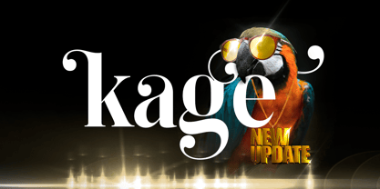
  20. Kage by Balibilly Design, $12.00
    Welcome to the old version of Kage. "Old does not mean obsolete" In April 2022, we updated whole letterforms. We redrew all glyphs and refined the nodes, corners, rounded shapes, flowing tails, etc. Of course, you can still use the update of an older version of Kage, although we highly recommend you move to the Pro version for the full benefits. Kage Pro has massive development, puts forward experimentation on alternate letters, and applies an oblique style to provide diverse style choices. Come with tons of swirly ligatures and advanced opentype features include case-sensitive forms, small caps, standard and discretionary ligatures, stylistic alternates, ordinals, fractions, numerator, denominator, superscript, subscript, circled number, slashed zero, old-style figure, tabular and lining figure. Learn more about Kage Pro here: Kage Pro 2.0 | Type Specimen About Kage The Inspiration: The radical exploration world of fashion inspires us. It leads our minds to the Neo-classical type style created during the age of enlightenment in the 18th century. It has a reasonably extreme contrast from the previous serif style, making the impression that it is emitted more expensive and classy. Organically, this Neo-Classical typeface is closely related to the fashion world, especially in Europe, and even spread across the globe. Fashion and this typeface reflect each other. After, we boldly observed Japanese fashion designer Rei Kawakubo. Famous for radical & deconstructive fashion, which makes the world of fashion more flexible and dynamic. The Design: As well as the typeface that we made, we started it with a cultural foundation of the Didone typeface. We tried to deconstruct the appearance. The decoration that better reflected the dynamic of fashion implemented in the fashionable alternate and calligraphical stylistic set ended with ball terminals. The versatile impression created is like taking off a scarf on the model's hair during a fashion show. The deconstructive image is combined with a legibility structure like the appearance of the Neo-Classical style. Kage is designed to visualize a costly and exclusive image of a thing, product, world clothing brand, famous fashion magazine, etc. The modern transitions of each letterform are softer, so when repositioning and escalating the size of this font, it will remain beautiful without injuring other elements. So, Kage is a bold choice on headlines and more prominent media with a portion of 50% even more. The Feature: Kage has 11 styles, from thin to black; all family-style consist of one variable font with two axes. The total number of glyphs is 748 in each style. She comes with tons of swirly ligatures and stylistic alternates in Advance OpenType features, including: discretionary ligatures, stylistic alternates, ordinals, fractions. Support multi-language including Western European, Central European, Southeastern European, South American, Oceanian, Vietnamese.
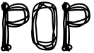
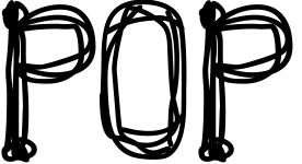
  21. POP - Unknown license
  22. Z_SHINOBI - Unknown license
  23. Morseircle code - Unknown license
  24. SKYSCRAPER - Unknown license
  25. Z_tUBBA - Unknown license
  26. damara - Unknown license
  27. HRKtKAI - Unknown license
  28. The font "Chopin-Bold" evokes a sense of elegance and grandeur that is truly reminiscent of its namesake, the famed composer Frédéric Chopin. Known for his romantic-era compositions that stir the sou...
  29. The font "Basket of Hammers" created by !Exclamachine is a remarkable display of creative ingenuity that breaks away from traditional font designs. This typeface stands out with its unique name that ...
  30. The MerryCouple Demo San Serif font, crafted by Katario Studio, is a delightful embodiment of joy and celebration. Its design reflects a playful yet elegant aesthetic, making it an ideal choice for i...
  31. The PopticsOneExtras font, as its name intriguingly suggests, is not your average typeface. It belongs to a special category of fonts known as "dingbat" or "extras" fonts. These types of fonts are kn...
  32. Sure thing! WhoopAss is a distinctive font created by Blambot Fonts, a company renowned for crafting unique typefaces tailored especially for comic book creators and artists. As the name suggests, Wh...
  33. Averia Sans by Dan Sayers emerges as a unique and innovative addition to the world of typography. This font, with its distinctive character and warmth, effortlessly bridges the gap between accessibil...
  34. The font "Barbaric," designed by Chris Vile, is a striking and visually impactful typeface that carries a distinct air of raw energy and rebellious spirit. The design of Barbaric stands out through i...
  35. Imagine a font that put on its Sunday best, but with a cheeky twist, and you've got yourself Belta Bold by Antipixel. This isn't your run-of-the-mill, stiff-upper-lip typeface. No, sir! Belta Bold is...
  36. Vectroid Cosmo, conceived by the creative minds at dustBUSt Fonts, is a captivating font that transports its audience into a nostalgic yet futuristic realm. This typeface, with its roots deeply embed...
  37. The font "Poison Berries" crafted by Levi Halmos entices the visual senses with its intriguing blend of mystery and charm. This typeface stands out for its imaginative flair, drawing inspiration from...
  38. Spylord Bold, a captivating font crafted by Iconian Fonts, embodies the essence of adventure and intrigue, making it a standout choice for projects that demand a touch of mystery and authority. With ...
  39. LT Staircase is an intriguing and versatile font crafted by LyonsType, a type foundry known for creating innovative and high-quality typefaces. This particular font draws inspiration from the structu...
  40. Heidorn Hill crafted by Apostrophic Labs is a typeface that marries the essence of adventurism with the meticulous touch of modern design. It embodies a sense of exploration, reminiscent of a journey...
Looking for more fonts? Check out our New, Sans, Script, Handwriting fonts or Categories
abstract fontscontact usprivacy policyweb font generator
Processing