10,000 search results
(0.023 seconds)
- The Beroga Fettig typeface, crafted by the talented German type designer Peter Wiegel, is a striking example of typographic artistry that seamlessly blends classic design elements with a modern twist...
- The Suecos Locos font, created by the skilled typographer Måns Grebäck, stands as a remarkable example of creativity and flair within the world of type design. This font is a dazzling mix of whimsica...
- Prepare yourself to delve into the whimsically wicked world of EvilGenius BB, a font that could only spring from the vibrant minds at Blambot Fonts. This is a font that puts on a cape, laughs maniaca...
- FS Albert by Fontsmith,
$80.00 The x factor How do you make a font like FS Albert unique, distinctive? “When designing a font I try to question every letter,” says Jason Smith, “but all you need is a few that have an x factor. With FS Albert, they’re the lowercase ‘a’ and ‘g’ and the uppercase ‘I’ and ‘J’. “I remember a friend saying, ‘Why on earth have you designed the ‘a’ like that? Isn’t it too friendly for this kind of font?’ And, in a way, that’s what I wanted – honesty and warmth, because a lot of big brands at the time really needed to show a more human side.” Range of weights and styles FS Albert is a charismatic type: a warm, friendly sans serif face with a big personality. Open, strong and amenable, and available in a wide range of weights and styles, FS Albert suits almost every task you put it to. Fontsmith has crafted five finely-tuned upright Roman weights and four italic weights, as well as a special Narrow version to provide the best coverage and give headlines and text an easy-going character. The chunky kid “FS Albert was inspired by – and named after – my son, who was a bit of a chunky kid,” says Jason Smith. “I designed an extra bold weight because I always felt that the really big font heavy weights had the most personality. “I recently told Albert this story. He laughed, and forgave me for thinking he was a fat baby. He liked the big personality bit, though.” 1000s of glyphs Not content with a character set that covered Europe and the whole of the Western world, the studio decided to go further afield. There are now FS Albert character sets that cover western and eastern European languages, including those of Russia, as well as Cyrillic, Arabic and Greek scripts. In fact, the font now covers more than 100 languages, making it ideal for bringing a consistent typographic style to the communications of global brands.
 - FS Albert Paneuropean by Fontsmith,
$90.00The x factor How do you make a font like FS Albert unique, distinctive? “When designing a font I try to question every letter,” says Jason Smith, “but all you need is a few that have an x factor. With FS Albert, they’re the lowercase ‘a’ and ‘g’ and the uppercase ‘I’ and ‘J’. “I remember a friend saying, ‘Why on earth have you designed the ‘a’ like that? Isn’t it too friendly for this kind of font?’ And, in a way, that’s what I wanted – honesty and warmth, because a lot of big brands at the time really needed to show a more human side.” Range of weights and styles FS Albert is a charismatic type: a warm, friendly sans serif face with a big personality. Open, strong and amenable, and available in a wide range of weights and styles, FS Albert suits almost every task you put it to. Fontsmith has crafted five finely-tuned upright Roman weights and four italic weights, as well as a special Narrow version to provide the best coverage and give headlines and text an easy-going character. The chunky kid “FS Albert was inspired by – and named after – my son, who was a bit of a chunky kid,” says Jason Smith. “I designed an extra bold weight because I always felt that the really big font heavy weights had the most personality. “I recently told Albert this story. He laughed, and forgave me for thinking he was a fat baby. He liked the big personality bit, though.” 1000s of glyphs Not content with a character set that covered Europe and the whole of the Western world, the studio decided to go further afield. There are now FS Albert character sets that cover western and eastern European languages, including those of Russia, as well as Cyrillic, Arabic and Greek scripts. In fact, the font now covers more than 100 languages, making it ideal for bringing a consistent typographic style to the communications of global brands. - FS Untitled Variable by Fontsmith,
$319.99Developer-friendly The studio has developed a wide array of weights for FS Untitled – 12 in all, in roman and italic – with the intention of meeting every on-screen need. All recognisably part of a family, each weight brings a different edge or personality to headline or body copy. There’s more. Type on screen has a tendency to fill in or blow so for each weight, there’s the choice of two marginally different versions, allowing designers and developers to go up or down a touch in weight. They’re free to use the font at any size on any background colour without fear of causing optical obstacles. And to make life even easier for developers, the 12 weight pairs have each been designated with a number from 100 (Thin) to 750 (Bold), corresponding to the system used to denote font weight in CSS code. Selecting a weight is always light work. Easy on the pixels ‘It’s a digital-first world,’ says Jason Smith, ‘and I wanted to make something that was really functional for digital brands’. FS Untitled was made for modern screens. Its shapes and proportions, x-height and cap height were modelled around the pixel grids of even low-resolution displays. So there are no angles in the A, V and W, just gently curving strokes that fit, not fight, with the pixels, and reduce the dependency on font hinting. Forms are simplified and modular – there are no spurs on the r or d, for example – and the space between the dot of the i and its stem is larger than usual. The result is a clearer, more legible typeface – functional but with bags of character. Screen beginnings FS Untitled got its start on the box. Its roots lie in Fontsmith’s creation of the typeface for Channel 4’s rebrand in 2005: the classic, quirky, edgy C4 headline font, with its rounded square shapes (inspired by the classic cartoon TV shape of a squidgy rectangle), and a toned-down version for use in text, captions and content graphics. The studio has built on the characteristics that made the original face so pixel-friendly: its blend of almost-flat horizontals and verticals with just enough openness and curve at the corners to keep the font looking friendly. The curves of the o, c and e are classic Fontsmith – typical of the dedication its designers puts into sculpting letterforms. Look out for… FS Untitled wouldn’t be a Fontsmith typeface if it didn’t have its quirks, some warranted, some wanton. There’s the rounded junction at the base of the E, for example, and the strong, solid contours of the punctuation marks and numerals. Notice, too, the distinctive, open shape of the A, V, W, X and Y, created by strokes that start off straight before curving into their diagonal path. Some would call the look bow-legged; we’d call it big-hearted. - FS Untitled by Fontsmith,
$80.00 Developer-friendly The studio has developed a wide array of weights for FS Untitled – 12 in all, in roman and italic – with the intention of meeting every on-screen need. All recognisably part of a family, each weight brings a different edge or personality to headline or body copy. There’s more. Type on screen has a tendency to fill in or blow so for each weight, there’s the choice of two marginally different versions, allowing designers and developers to go up or down a touch in weight. They’re free to use the font at any size on any background colour without fear of causing optical obstacles. And to make life even easier for developers, the 12 weight pairs have each been designated with a number from 100 (Thin) to 750 (Bold), corresponding to the system used to denote font weight in CSS code. Selecting a weight is always light work. Easy on the pixels ‘It’s a digital-first world,’ says Jason Smith, ‘and I wanted to make something that was really functional for digital brands’. FS Untitled was made for modern screens. Its shapes and proportions, x-height and cap height were modelled around the pixel grids of even low-resolution displays. So there are no angles in the A, V and W, just gently curving strokes that fit, not fight, with the pixels, and reduce the dependency on font hinting. Forms are simplified and modular – there are no spurs on the r or d, for example – and the space between the dot of the i and its stem is larger than usual. The result is a clearer, more legible typeface – functional but with bags of character. Screen beginnings FS Untitled got its start on the box. Its roots lie in Fontsmith’s creation of the typeface for Channel 4’s rebrand in 2005: the classic, quirky, edgy C4 headline font, with its rounded square shapes (inspired by the classic cartoon TV shape of a squidgy rectangle), and a toned-down version for use in text, captions and content graphics. The studio has built on the characteristics that made the original face so pixel-friendly: its blend of almost-flat horizontals and verticals with just enough openness and curve at the corners to keep the font looking friendly. The curves of the o, c and e are classic Fontsmith – typical of the dedication its designers puts into sculpting letterforms. Look out for… FS Untitled wouldn’t be a Fontsmith typeface if it didn’t have its quirks, some warranted, some wanton. There’s the rounded junction at the base of the E, for example, and the strong, solid contours of the punctuation marks and numerals. Notice, too, the distinctive, open shape of the A, V, W, X and Y, created by strokes that start off straight before curving into their diagonal path. Some would call the look bow-legged; we’d call it big-hearted.
 - Once upon a time, in the mystical land of AEnigma, there was a font that decided it didn't want to play by the rules. Its name? Bandwidth Bandless BRK. This font was the digital equivalent of that qu...
- Touch Me by Latinotype,
$69.00 Touch Me is a Script hand-drawn style typeface—designed by Coto Mendoza—resulting from polyrhythmic exploration, sign deconstruction and altered calligraphic contrast plays with watercolour brush. Coto has been using these experimental calligraphy techniques when creating the catchwords for Macarons, the Boho Family, Bikini Season Script and Matcha Script and so forth. Touch Me was inspired by a character in a story written by Coto while attending a literary workshop with Ina Groovie in Santiago de Chile. The character is a tribal girl who lives on an island in the Caribbean. She is heir of ancestral knowledge and possesses wild beauty, very passionate and sensual: intense, strong and free. These features are reflected in the polyrhythm of the typeface's curves: an irregular baseline, variable x-height, different lengths of initial and terminal strokes (that sometimes expand and sometimes shrink) and amount of brush pressure that generates changes in contrast within the characters. This way, when composing, signs with stroke contrast randomly alternate with monolinear ones and with signs of altered contrast, thanks to the typeface's OpenType programming. The family, with more than 3,000 glyphs, provides a number of alternative characters, swashes, ligatures, initial and terminal forms, in short, a vast ocean of choices! Touch Me is a spontaneous typeface with a fresh and unique personality. It is the perfect choice for short text in both print and digital formats. The family comes with a Script Regular version and a seductive Script Drop that you will enjoy a lot! The Extras set includes some catchwords, dingbats and ornaments that allows for endless composition options. The family also comes with a Caps version —designed by Luciano Vergara—in 2 styles: a funny and big-headed condensed Sans Grotesk display of inverted vertical proportion plus a Grotesk, neutral and slightly expressive Petite. Both versions, available in 6 weights, have been especially designed to create hierarchies when composing. This allows for balance between strokes of different weight when it comes to the Sans and Script fonts. Come and dare yourself! Touch Me! Thanks Alisa for sharing your amazing and beautiful picture with us.
 - Sabor by Intellecta Design,
$59.90 Sabor is a voluptuous upright connected display font with mixed taste of script fonts. There were many inspirations for Sabor, but all started with a book from the 1950s about the battles of World War II. To that first sketches of a naive dense display typeface we, day by day, start to create a mixed style evolving some lettering concepts from 1950s, some calligraphy notions and the first display ideas. The feeling of this font is good to be used in many artworks, like logos, packaging, party invitations, layouts for t-shirts, magazine headings, and much more, since websites to and all kind of printed jobs. That font is not really a script, but, like the scripts we strongly recommends to use the caps only in the beginning of words and sentences, to contrast with the lower cases : it’s not designed for all-caps settings, so avoid that kind of use. This font has almost 700 glyphs and supports the most important Latin-based languages. We works hard in a tour-de-force kerning: over 12.000 kerning pairs soft adjusted handily. Its OpenType features include final forms, initial forms, special sets (upper and lowercase's), hundreds of contextual alternates ligatures providing letter-form variations and connections that make your designs really special, and ornaments (tails). Because of its high number of alternate letters and combination's, we suggest the use of the glyph palette to find ideal solutions to specific designs. The sample illustrations will give you an idea of the possibilities. You have full access to this amazing stuff using InDesign, Illustrator, QuarkXpress and similar software. However, we still recommend exploring what this font has to offer using the glyphs palette: principally to get all the power of the Contextual Alternates feature. You can get an idea of the power of this font looking at the “Sabor User Guide”, a pdf brochure in the Gallery section. Also available two sister fonts easy to use : SaborWords and SaborRasgosEscritura Sabor has original letters designed by Iza W and overall creative direction plus core programming by Paulo W.
 - Exquisite Corpse - 100% free

- Janda Everyday Casual - Personal use only

- Aeroboost by Mevstory Studio,
$30.00 Aeroboost is a sporty look with a strong and sporty feel, perfect for your titles, logos, typography, flyers and various design needs, making your designs more modern and professional. Aeroboost comes with these all caps making them look strong and bold, giving them a bold and modern feel, so enjoy creating any project that will showcase your main idea!
 - Bounties by Balpirick,
$15.00 BOUNTIES is a Fun & Rounded Handbrushed Font. Bounties is a fun, round, hand-brushed, and handwritten font that has an innocent and clean style. It is perfect for product packaging, branding project, magazine, social media, wedding invitations and so much more! BOUNTIES also multilingual support. Enjoy the font, feel free to comment or feedback, send me PM or email.
 - Ventoux by Wiescher Design,
$39.50 The highest and windiest mountain of Provençe is the Mont Ventoux. That is where I saw a pretty windy signpost in a very windy typeface that inspired me to design Ventoux. I recently added a Small-Caps style to it and overhauled the font a little bit without destroying its shaky appearance. Your not so windy Gert Wiescher
 - Anthemis by Blankids,
$17.00 Introducing Anthemis, the bold script font inspired by Bold hand lettering style. Anthemis is good for branding logotype, Packaging, poster, headline, book cover, Flyer, t-shirt design and any more. Anthemis has many alternative character and have opentype features like a stylistic alternatives, stylistic set, ligature and swash so you can mix and match like a you want.
 - Horrifal by Khoir,
$15.00 Displays the appearance of a serif font that has a spooky impression but with elegant characteristics that make this horror-themed font different from other horror fonts, with the addition of sharp alternative letters that make the impression even more gripping so it is perfect for movie titles, posters, logotypes and many others. Thank you for seeing
 - Big Bag NF by Nick's Fonts,
$10.00This industrial-strength titling face takes its design cues from Hans Eduard Meier's Syntax Antigua. This version is bolder and beefier, so your headlines will grab and hold attention in a refined and genteel manner. Both versions include complete Latin 1252, Central European 1250 and Turkish 1524 character sets, with localization for Moldovan, Romanian and Turkish. - My Lovely by Good Java Studio,
$20.00 My Lovely is a beautiful script font made with many swashes in start and ending character, offering beautiful love swashes. This font includes a full set of swash heart lowercase letters, numerals, and punctuation. It also includes opentype Ligatures and Stylistic Setuntil 10 option. This is so perfect for invitations, monograms, wedding, fashion, branding, labels or logotype.
 - London Handlettering by Axara Creative,
$39.00 The London Signature is an amazing Ellegant Signature font. It was made with perfect precision for every single curve that was build with a horizontal, vertical path & smooth. London signature script font which stylish natural handwritten font with beautiful curve in every single corner. This font is so fashionable & elegant and perfect for photography, branding, signature and logo .
 - Lamenta by Dawnland,
$13.00 All that remains from this once so proud and glorious antiqua are steel skeletons. Destroyed. Distorted. Ruins. The main focus and usage of LamentaX are headlines, posters for event graphics and music/media/game packaging. Lamenta X was revised 2012 and now hold a full character set of basic english/latin letters and west european diacritics!
 - Fillippo by Stefani Letter,
$12.00 Fillippo is a stunning monoline style script font with authentic and casual vibes. It looks beautiful on a variety of designs requiring a personalized style, such as wedding invitations, thank you cards, advertising, poster, greeting cards, logos and so on. Fillippo is PUA encoded which means you can access all of the glyphs and swashes with ease!
 - Taka Sans by FSodic.com,
$15.00 Taka is a font that can be used in all situations, be it Articles, News, Titles and so on. We will be adding variants of the font in the coming weeks which will make this font even more complete. This font is only sold by Monotype and its subsidiaries, make sure you get the original only here!
 - Hypercrack by Invasi Studio,
$19.00 Introduction of our new collection of playful doodle font styles. The Hypercrack Handwritten all-caps Font with scribbles styles font. Also, Hypercrack has a unique stylistic alternates character. So you can create a combination of whatever you want! This font is perfect for your display project for headlines, quotes, editorial design, print posters, and much more.
 - Christmas letter by Stefani Letter,
$12.00 Christmas letter is a stunning monoline style script font with authentic and casual vibes. It looks beautiful on a variety of designs requiring a personalized style, such as wedding invitations, thank you cards, weddings, greeting cards, logos and so on. Christmas letter is PUA encoded which means you can access all of the glyphs and swashes with ease!
 - Creative Thinking by Java Pep,
$17.00 Proudly present a new font that fresh from the oven Creative Thinking font, an elegant font family that has 4 weight styles regular, italic, bold, and bold-italic. It's so perfect to combining and mixing the weight styles to make outstanding and beautiful design project. Don't worry this font already with multilingual support more than 30 languages.
 - Blossom Riviera by Olivetype,
$18.00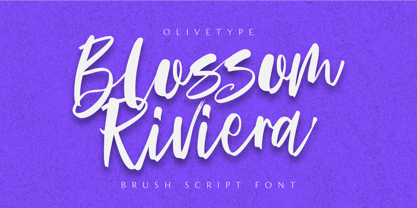 Blossom Riviera is the perfect brush script font for giving your projects a natural, handmade feel. With its cool, awesome texture, it's perfect for creating beautiful, unique logos and headlines. So what’s included : Standard Latin Numbers, symbols, punctuations and ligatures Multilingual Support. PUA Encoded and fully accessible without additional design software Simple Installations Works on PC & Mac Thank You!
 - Brotherly by Creativework Studio,
$14.00 Brotherly is a modern san serif font that is very different from the standard san serief form in general, this font is more artistic so it is very flexible to use for various design project needs, both formal and non-formal, but this font is based on the basic san serief font. easy to read and clear.
 - Gibroma by Letterena Studios,
$9.00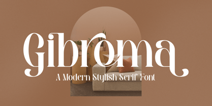 Proudly present Gibroma – a modern and classic serif typeface with its own unique style & modern look. This typeface is perfect for an elegant & luxury logo, book or movie title design, fashion brand, magazine, clothes, lettering, quotes, and so much more. This font is PUA encoded, which means you can access all of the glyphs and swashes with ease!
 - Satin Orange by Epiclinez,
$18.00 Satin Orange is an elegant and delicate script font. This versatile script font has a wide spectrum of applications ranging from greeting cards to headlines and is guaranteed to add a romantic feel to your next project. So what's included : Basic Latin A-Z & a-z Numbers, symbols, and punctuations Ligatures Accented Characters : ÀÁÂÃÄÅÆÇÈÉÊËÌÍÎÏÑÒÓÔÕÖØŒŠÙÚÛÜŸÝŽàáâãäåæçèéêëìíîïñòóôõöøœšùúûüýÿžß Thank you
 - Avenue by Hackberry Font Foundry,
$24.95Avenue is an eleven font family with five synthesist serif faces, five humanist sans serif faces, and one old style face. It is designed as an extrememly versatile body copy set. There are many special dingbats for bullets, and so on. It has oldstyle numbers and the small caps versions have lining numbers and small caps numbers. - Maloja Palace NF by Nick's Fonts,
$10.00A 1930s luggage tag from an eponymous hotel provided the inspiration for this face. The uppercase letters lean to the left and the lowercase letters lean to the right, so aLtErNaTiNg the two will give your headlines a little bounce. Both versions of the font include 1252 Latin, 1250 CE (with localization for Romanian and Moldovan). - Fleurons Initials by Wiescher Design,
$39.50Fleurons Initials is a set of elegantly decorated blocked initials, reminiscent of old Jazz and Circus Posters. I have added one set of flat underlays and one of blocked underlays, so you can easily add a little colorful touch here and there. Easy because those underlays have the the same spacing! Have fun. Your elegant designer, Gert Wiescher - Rahardian by Putracetol,
$32.00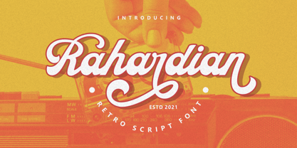 Introducing Rahardian a retro script font. A unique font style with classic retro feel. Rahardian is perfect for vintage and retro design, badge, logos,t-shirt, poster, branding, packaging, signage, book coverand so much more! Come with Opentype feature with a lot of alternates, its help you to make great lettering. This font is also support multi language.
 - Wolfriend by Letterafandi Studio,
$9.00 Wolfriend is a refined and graceful calligraphy typeface with characters that dance along the baseline. It can be used for various purposes such as logos, wedding invitations, headings, t-shirts, letterhead, signage, labels, news, posters, badges and so much more. Wolfriend is PUA encoded which means you can access all of the glyphs and swashes with ease!
 - Fairy Tail by Gatype,
$8.00 Fairy Tail is a bold and friendly typeface designed specifically for headlines. All of the letters are chunky and rounded,which is probably the reason why they are visible from afar. The overall feel of the typeface is meant to be very casual and affable, so it is great for businesses that are fun, outgoing and sincere.
 - Quessera by Oui Studio,
$21.00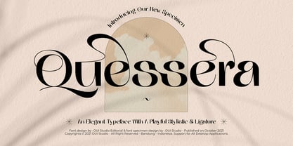 Hello, friend! 'Quessera' font is coming; an elegant typeface with huge playful stylistic & ligatures. Quessera has a complete stylistic of uppercase and has many unique ligatures, so you have many choices to determine the most perfect one for your work and make it look stunning. Quessera is perfect for branding, logo, invitation, wedding vibes, fashion, headlines, and more.
 - Wood Type Bodoni JNL by Jeff Levine,
$29.00 Wood Type Bodoni JNL is a variant of the popular ultra bold version of the classic Bodoni design, with variants in character widths and shapes. Based on a vintage set of wood type, the "hairline" strokes of the 4 and 8 have been made ever-so-slightly thicker in spots to add a modest amount of additional contrast.
 - Universally Corrupt Pro by The Type Fetish,
$25.00 Universally Corrupt is a distressed, noisy and corroded font that is perfect for hiding any words of truth by burying it in chaos. A “must have” typeface for any politician or corporate C.E.O! It was expanded to include extended Latin, extended Cyrillic and Greek alphabets so it will work with most languages in Europe and the Americas.
 - HU Malrang by Heummdesign,
$30.00 'HU Malrang' is a font that gives a round and soft feel to its tightly packed modules. This font has a variable function, allowing users to fine-tune the thickness they want. (Available only in Adobe programs.) Six basic weights are provided so that they can be used even in programs that do not apply the variable function.

