10,000 search results
(0.03 seconds)
- Off The Wall JNL by Jeff Levine,
$29.00Off the Wall JNL is a unique typeface that combines graffiti-style lettering with a brick wall background. special keystroke features give you a complete "wall of text": { (left bracket) places a smaller closed end cap on the left side of the text. } (right bracket) places a medium closed end cap on the right side of the text. [ (left brace) places a regular closed end cap on the left side of the text. ] (right brace places a regular closed end cap on the right side of the text. | (vertical bar key) adds a space between words. \ (backslash) adds a larger space between words. - The Northland & Southland Combinations by Almeera Studio,
$10.00 Introducing The Northland Combinations. is a pair of Northland script and Southland sans font that perfectly. The classic feel is really perfect for you who needs a typeface for especially logotype, apparel, invitation, branding, packaging, advertising etc. This typeface is comes in uppercase, lowercase, punctuations, symbols & numerals,swashes, 05 stylistic set alternate, ligatures,underlines and also support multilingual and already PUA encoded. to access the underlines you simply press numbers 1-5 followed by an underscore after the last letter. For example: 1_ 2_ 3_ 4_ 5_ We highly recommend using a program that supports OpenType features and Glyphs panels like many of Adobe apps and Corel Draw, so you can see and access all Glyph variations. HOW TO ACCESS ALTERNATE CHARACTERS Open glyphs panel: -In Adobe Photoshop go to Window - glyphs -In Adobe Illustrator go to Type - glyphs
 - National First Font Dotted - Unknown license

- Modern Dot Digital-7 - Personal use only

- Advanced Dot Digital-7 - Personal use only

- Def Writer | BASE Cyr - Unknown license

- Small Dot Digital-7 - Personal use only

- Iron Lounge Smart Dot - Unknown license

- KR Get Well Dings - Unknown license

- Iron Lounge Dots 2 - Unknown license

- Van Der Hoef Capitals by Monotype,
$29.99 - Display Dots Two Serif by Gerald Gallo,
$20.00 Display Dots Two Serif is a display font not intended for text use. It, along with its sans counterpart were designed specifically for display, headline, logotype, branding, and similar applications. Display Dots Two Serif has an uppercase alphabet, numbers, and punctuation.
 - Dez Weimar Plakat Pro by Dezcom,
$20.00 Dez Weimar Plakat Pro was inspired by a 1923 Weimar Bauhaus exhibition poster. It is in strict keeping with Constructivist rectilinear thought of that time. Dez Weimar Plakat Pro includes multiple language support including Greek and Cyrillic-- contains nearly 800 glyphs.
 - Bandiera Del Legno NF by Nick's Fonts,
$10.00 This typeface appeared in the William H. Page Woodtype specimen book as Gothic Tuscan Condensed Reversed—quite a mouthful. Banner elements appear in the brace and bracket positions, and reversed spaces can be found in the underscore and bar positions. Both versions of this font support the Latin 1252, Central European 1250, Turkish 1254 and Baltic 1257 codepages.
 - Architype Van der Leck by The Foundry,
$50.00 Architype Konstrukt is a collection of avant-garde typefaces deriving mainly from the work of artists/designers of the inter-war years, whose ideals have helped to shape the design philosophies of the modernist movement in Europe. Due to their experimental nature character sets may be limited. Architype Van der Leck originates from the lettering that Bart Van der Leck created for ‘Flax’ magazine in 1941. The letterforms‘ restricted shapes and abstract, stencil-like forms reflect the strong geometric language of De Stijl and show influence from his abstract paintings.
 - Display Dots Three Sans by Gerald Gallo,
$20.00 Display Dots Three Sans and Serif are display fonts not intended for text use. They were designed specifically for display, headline, logotype, branding, and similar applications. Display Dots Three Sans and Serif include an uppercase alphabet, numbers, and punctuation.
 - Display Dots Three Serif by Gerald Gallo,
$20.00 Display Dots Three Sans and Serif are display fonts not intended for text use. They were designed specifically for display, headline, logotype, branding, and similar applications. Display Dots Three Sans and Serif include an uppercase alphabet, numbers, and punctuation.
 - Display Dots Four Sans by Gerald Gallo,
$20.00 Display Dots Four Sans and Serif are display fonts not intended for text use. They were designed specifically for display, headline, logotype, branding, and similar applications. Display Dots Four Sans and Serif include an uppercase alphabet, numbers, and punctuation.
 - KG LET HER GO by Kimberly Geswein,
$5.00 Tall, chunky title-friendly sans serif capitals in 3 styles. Use all caps for even lettering or alternate caps and lowercase for bouncy lettering.
 - Display Dots Four Serif by Gerald Gallo,
$20.00 Display Dots Four Sans and Serif are display fonts not intended for text use. They were designed specifically for display, headline, logotype, branding, and similar applications. Display Dots Four Sans and Serif include an uppercase alphabet, numbers, and punctuation.
 - Dirty Deo Hand Ink by TypoGraphicDesign,
$19.00 CONCEPT/CHARACTERISTICS Experimental analog handwritten style. Handwritten in ink in a conventional roll-on deodorant. The dirty, grimmy Grunge-Look and the sloppy, rough Handwritten-Look script character, gives the typeface a high recognition value and uniqueness. The motto is handmade, rough & experimental. APPLICATION AREA The rough, ink-like, handwritten look of the handmade font „dirty deo hand ink“ would look good at logos, display size for poster, flyer, comics and graphic novel lettering, headlines in magazines or websites, packaging, music covers or webbanner etc. TECHNICAL SPECIFICATIONS Headline Font | Display Font | Raw Trash Script Font „dirty deo hand ink“ OpenType Font with & 282 glyphs & 1 style (regular). Symbols and ligatures (with accents & €)
 - Icons Dingbats Symbols Set by TypoGraphicDesign,
$9.00 The typeface “Icons Dingbats Smybols Set” is designed at 2019 for the font foundry Typo Graphic Design by Manuel Viergutz. The Basic Icons Set is a display typeface that inspired by the here and now. 426 glyphs / icons / decorative extras like icons, arrows, dingbats, emojis, symbols, ornaments, social media icons, sign of the zodiac, geometric shapes, catchwords, decorative ligatures (type the word #LOVE for or #SMILE for as OpenType-Feature dlig) and stylistic alternates (8 stylistic sets). For use in logos, magazines, posters, advertisement plus as webfont for decorative headlines. The font works best for display size. Have fun with this font & use the DEMO-FONT (with reduced glyph-set) FOR FREE! ■ Font Name: Icons Dingbats Smybols Set ■ Font Weights: Reg + DEMO (with reduced glyph-set) ■ Font Category: Display for headline size ■ Font Format: .otf (OpenType Font for Mac + Win) ■ Glyph Set: 436 glyphs / decorative extras like icons ■ Specials: Alternative letters, stylistic sets, automatic contextual alternates via OpenType Feature. Dingbats & Symbols, arrows, hearts, emojis/smileys, stars, further numbers, lines & geometric shapes ■ Design Date: 2019 ■ Type Designer: Manuel Viergutz
 - F2F El Dee Cons by Linotype,
$29.99The Face2Face (F2F) series was inspired by the techno sound of the mid-1990s, personal computers and new font creation software. For years, Thomas Nagel and his friends formed a unique type design collective, which churned out a substantial amount of fresh, new fonts, none of which complied with the traditional rules of typography. Many of these typefaces were used to create layouts for the leading German techno magazine of the 1990s, Frontpage. Nagel and his fellows would even set in type at 6 points, in order to make it nearly unreadable. It was a pleasure for the kids to read and decrypt these messages! F2F EI Dee Cons one of 41 Face2Face fonts included in the Take Type 5 collection from Linotype. Nagel designed nine of these himself." - Display Dots Two Sans by Gerald Gallo,
$20.00 Display Dots Two Sans is a display font not intended for text use. It, along with its serif counterpart were designed specifically for display, headline, logotype, branding, and similar applications. Display Dots Two Sans has an uppercase alphabet, numbers, and punctuation.
 - Van den Velde Script by Intellecta Design,
$68.90 Iza and Paulo W (Intellecta Design) are proud to announce Van den Velde Script. A free interpretation of the work of the famous master penman Jan van den Velde, to be found in the “Spieghel der schrijfkonste, in den welcken ghesien worden veelderhande gheschrifften met hare fondementen ende onderrichtinghe. ” (Haarlen, 1605). Van den Velde Script has evocative ancient ligature forms from the XVII Century Dutch master penman Jan van den Velde. Your indescritible writing-book was important not only with regard to the specific period it represents, but also in relationship to the entire history of calligraphy as an art: Van den Velde is rightly credited with having introduced and perfected a new trend in Dutch calligraphy. Our font, Van den Velde Script merges modern necessities o better legibility without loose the taste of his archaic origins. This enhanced OpenType version is a complete solution for producing documents and artworks whith a evocative and voluptuous style of calligraphic script: - dozens of stylistic alternates for each letter (upper- and lowercase), accessed with the glyph palette; - historical ornaments and fleurons in the typical style (and motifs) from the XVII century at the Lower Countryes accessed with the glyph palette using the Ornaments feature); - an extensive set of ligatures (100s of contextual alternates plus discretionary ligatures) providing letterform variations that make your designs really special, resembling real handwriting on the page; - a tour-de-force kerning work: over 700 gliphs in this font was adjusted to your kern pairs handly. In non-OpenType-savvy applications it works well as an unusual and beautiful script style font. Because of its high number of alternate letters and combinations (over 700 glyphs), we suggest the use of the glyph palette to find ideal solutions to specific designs. The sample illustrations will give you an idea of the possibilities. You have full access to this amazing stuff using InDesign, Illustrator, QuarkXpress and similar software. However, we still recommend exploring what this font has to offer using the glyphs palette: principally to get all the power of the Contextual Alternates feature. You can has an idea of the power of this font looking at the “Van den Velde User Guide”, a pdf brochure in the Galçlery section. Two last things: take a special look at the Van den Velde Words (ready words) font and another super script font, Penabico. Van den Velde Script has original letters designed by Iza W and overall creative direction plus core programming by Paulo W.
 - zerpixl - Personal use only

- E-Lie by Shaun C. Kennedy,
$99.99E-Lie is based on the logo for the Portland band E-Lie. Jon Lincicum designed the logo, and then the basic shapes of the principal letters and numbers. He then gave these designs to Shaun Kennedy, who expanded the design, adding punctuation, accented letters, and math symbols. Shaun then compiled the designs into an OpenType font, adding kerning and ligature information. The design is a distinctive, stylistic font excellent for use when you need to grab someone's attention. - CHE LIVES! - Unknown license

- This Corrosion - Unknown license

- Note this - Unknown license

- Fight This - Unknown license

- Daddy Tie - Unknown license

- Rub This! - Unknown license

- this kettle - Unknown license

- TIE-Wing - Unknown license

- Gudeg Theo by Letterayu Studio,
$15.00 Gudeg Theo is a modern Slab serif style display font category. This font is very attractive. Perfect for cute quotes, packaging, branding, invitations, greeting cards, and more. Features : – Uppercase and Lowercase letters – Numbering and Punctuations – Multilingual Support – Works on PC or Mac – Simple Installation – Support Adobe Illustrator, Adobe Photoshop, Adobe InDesign, also works on Microsoft Word
 - And Then by Throndsen,
$10.00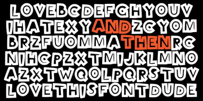
- Tre Giorni by Eurotypo,
$60.00 Tre Giorni, is a variant of the "Due Giorni" font with the possibility of combining between the two. This useful writing font is very expressive, fresh, agile and organic. It comes in two styles: Solid and outline (just a little shine) Each font contains 571 glyphs with many OpenType features: standard and discretionary ligatures, stylistic alternates, decorative characters, old-style figures, small caps, titles, case sensitives, and ornaments. Specially designed for creating eye-catching headlines, logos, packaging, greeting cards, advertisements and websites. It also has good readability for longer texts.
 - Obnoxious Tie by PizzaDude.dk,
$16.00 That tie you wore in the 1990'ies...the one from the 1980'ies...perhaps even the one from the 1970'ies...could look obnoxious today - or maybe ... it's super fashionable these days! :) This Obnoxious Tie is a mix of upper- and lowercase ... well, that goes for the "lowercase" - the uppercase is uppercase, just as usual!
 - This year by Jadatype,
$10.00 This Year is a duo font that contains fine line script font and playful slab that had cute, playful, joy, youth, and bouncy feel. suitable for social media, branding, craft, products, handwritten, and so on. contains standard English letters, numbers, punctuation, and several accents that support multilingualism. Thank you!.


