10,000 search results
(0.031 seconds)
- Black Tie by Scholtz Fonts,
$19.00 Black Tie is an art-deco font with the smooth sophistication of retro design. It is very readable and can be used at all sizes. It functions well as a display font and creates attention-attracting headers and subheaders. Black Tie comes in two styles: 1. Black Tie Regular: in which the caps and lower case have different baselines. Black Tie Regular is better for sub-heads and display. 2. Black Tie Baseline: in which all characters share a common baseline. This style is better for body text and smaller sizes. Fully professional, Black Tie contains a full character set Ñ Upper and Lower case, all numerals, punctuation, symbols and accented characters. It is suitable for layout work in all major European languages Ñ Spanish, Portuguese, German, French, Swedish and Italian (to name a few). The characters are spaced for readability and have been carefully kerned.
 - Bow Tie by Pedro Teixeira,
$16.00 Bow Tie, a slight textured, organic and elegant signature. This modern, stylish but legible script is handy for logo, poster, headlines, invitations, cards and all display needs. The OpenType Features are: stylistic alternates that cover all latin language and cyrillic, ligatures and discretionary ligatures.
 - Tee Franklin by Suomi,
$19.00 The British Vogue commissioned this typeface for their magazine re-design in 2001. After studying the originals of Morris Fuller Benton and the existing versions, this font was designed with all new thin weights. Just when the family was finished, Vogue informed that they had decided to use American Typewriter instead. Bastards. But here is a true classic typeface with a facelift. The pun intended. Tee Franklin has seven weights with obliques, the Heavy being just slightly heavier than the existing versions from Adobe and ITC, and moving down to totally new Ultra Light, using Luc(as) de Groot's formula to keep the weights optically correct. The glyphs are the same as the Morris Fuller Benton's original from 1902, except for the upper case Q, which was re-designed with a loop in the counter for added differentiation.
 - This Notes by Afkari Studio,
$13.00 Introducing This Notes - Handwritten Marker Note Font is a delightful testament to the artistry of handwriting, meticulously crafted to infuse your designs with an authentic, hand-drawn aesthetic. With a distinctive yet versatile style, This Note is poised to enhance a diverse array of design projects, serving as a conduit for creativity and expression. At its core, This Note embodies the charm of handwritten notes, capturing the nuances and imperfections that make each stroke unique. It's a natural flow and effortless elegance make it an ideal choice for a multitude of graphic endeavors, ensuring its relevance across various platforms and applications. Highlighted Features: - Complete set of uppercase and lowercase letters, numerals, and punctuation marks - Unique alternates and ligatures for added character variation - Compatible with both PC and Mac platforms - Hassle-free installation process - Seamless integration with Adobe Illustrator, Adobe Photoshop, Adobe InDesign, and Microsoft Word - No additional design software is required for full accessibility - Multilingual support encompassing characters such as ä, ö, ü, Ä, Ö, Ü, ß, ¿, and ¡ This Note transcends mere functionality; it becomes a catalyst for innovation and inspiration. Its versatility knows no bounds, seamlessly integrating into digital notes, quote designs, book covers, logos, posters, menu layouts, apparel designs, scrapbooks, comic illustrations, magazine headers, and numerous other creative avenues. The font’s adaptability is matched only by its ability to breathe life into every project it graces. Whether adorning a playful children's illustration or adding a touch of personality to a sophisticated magazine title, This Note lends an air of authenticity that captivates audiences. In conclusion, This Note Handwritten Marker Note Font isn’t merely a font; it's a conduit for creativity, a bridge between imagination and realization, poised to elevate your projects to new heights. Embrace its charm, leverage its versatility, and allow it to become the catalyst for your creative journey. Unlock the boundless potential of This Note, where each stroke tells a story and every design bears the mark of authenticity.
 - Shirt & Tie by Olivetype,
$18.00 Shirt & Tie is a cool, trendy looking handwritten font. This font looks fun and authentic, and it will enhance the quality of each of your posters, flyers, or print. This font is also supporting Multi-Languages, which includes: Afrikaans Albanian Catalan Danish Dutch English Estonian Finnish French German Italian Norwegian Portuguese Spanish Swedish Zulu. Thank You.
 - This Corrosion by K-Type,
$20.00 Distressed stencil font that looks wildly windswept, eaten away, or coarsely misprinted on fabric.
 - SL Che by Sudtipos,
$29.00SL Che is a homage to Ernesto Guevara de la Serna, “El Che”, who lived between 1928 and 1967. El Che turned into an universal icon through a memorable photograph which was reproduced and multiplied to the infinite. It was that way he became a synonymous of resistance, revolution and change for lots of generations. That "Che" comes back today by the hand of the genial Jorge Alderete, who designed heroic, laughing and cool variations of that popular first icon. SL Che unfolds like a fan of thousands of "Che", in a development plenty of metaphors. SL Che abridges a sum of original iconographic illustrations in True Type format, which masterly synthesizes the most important themes of the grand genius of the literature. SL Che takes part of the "Icons of Icons" Gallery, developed by SinergiaLab for Sudtipos - Sandy Toes by Putracetol,
$22.00 Sandy Toes - Quirky Summer Theme Font is a delightful typeface that transports you to the sunny shores of summer. This font features playful, rounded, and bold letterforms that capture the essence of fun and the warmth of the season. It's versatile and can be used on its own or combined with any of its eight vibrant variations. With eight distinctive variations inspired by summer, including palms, suns, beaches, pineapples, waves, starfish, and more, Sandy Toes is the perfect choice for children's themes, crafting projects, and designs that radiate fun, playfulness, and a burst of colorful energy.
 - Theo Stevanie by Mazkicibe,
$10.00 Theo Stevanie Font is Beautyful Sans Serif and modern font combined with a sweet touch and beautifully curved each letter. using a touch of soft curves so that it is pleasing to the eye designs. Theo Stevanie Font is great for: Wedding invitations, fashion magazines, logos, signatures, and suitable for watermark photography. Included with Theo Stevanie is a full set of Uppercase and ending lowercase Special Character, Ligature, to create a realistic look for your designs.
 - THD Senus by Tim Hutchinson Design,
$35.00 THD Senus is a modern, high contrast font that expresses a sophisticated and contemporary feeling. The font comes in ‘Roman’ and ‘Bold’ styles plus the softer versions of ‘Roman-Curve’ and ‘Bold-Curve’ – there is also a shadow style available as ‘Roman-Shaded’. The font is perfect for range of uses such as editorial, brand messages, packaging, promotions, campaigns etc.
 - Theo Ballmer by URW Type Foundry,
$39.99 The Theo Ballmer font family is based on Theo’s design ideas which were completed by his son Theo Ballmer (Thierry’s father), and digitized by Thierry, with the help of URW++ and their Ikarus technology. Theo Ballmer is available in 3 x 5 variants: condensed, regular, expanded each in 5 weights. Theo Ballmer is a masterpiece, which fills a historical gap and provides a real font family from the Bauhaus era.
 - THD Praxim by Tim Hutchinson Design,
$25.00 THD Praxim is a modern, condensed style, sans serif font that comes in four weights – thin/regular/bold/heavy. The font is perfect for header & subheadings, editorial, display, brand & identity, campaigns, apps & web. It has a clarity & confidence which can communicate a range of messages through different media channels.
 - NT Theo by Novo Typo,
$26.00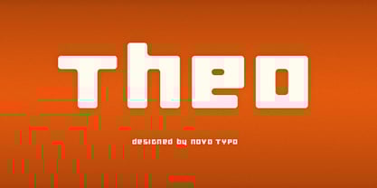
- Them Bones by Wing's Art Studio,
$10.00 Them Bones is a hand-drawn, spooky, ghost pirate, cartoon font for Halloween. Them Bones is a hand-drawn and spooky font made from the remains of ancient skeletons and ghostly pirate ships. It has a fun, light-hearted design inspired by campfire tales, Saturday morning cartoons, kids adventure movies and vintage comic books. This unique all-caps font comes in two flavours - a novelty design that’s drawn to appear like old bones, and a clean, versatile alternative that works great on it’s own or as contrasting characters. Each of these come with a hand-drawn outlined version with their imperfections intact for an authentic inky look. It’s a great choice for light-hearted Halloween designs or adventure stories with a fun, gruesome edge!
 - Theo Handwriting by SoftMaker,
$15.99 Digitized handwriting fonts are a perfect way to give documents the “very special touch”. Invitations look simply better when handwritten than when printed in bland Arial or Times New Roman. Short handwritten notes look authentic and appealing. There are numerous occasions where handwritten text makes a better impression. “Theo Handwriting” is a beautiful typeface that mimics true handwriting closely. Use Theo Handwriting to create stunningly beautiful designs easily.
 - Pete-Boy <> Hand of Pete-Boy - Unknown license

- State of Love and Toast LL by Leftover Lasagne,
$25.00 State Of Love and Toast is a retro typeface reminiscent of the early 90’s. It’s certainly the Seattle of fonts. The font features auto ligatures for duplicate letters, quite a few graphical elements & shapes which can be accessed by shortcuts (lowercase letter + number form 0-9) and smallcaps (alternate versions of the lowercase letters).
 - Tes by Alien,
$60.00 The Tes family was designed specially for a limited-edition book about Nikola Tesla and Resonance Waves. It needed to be modern and complete for a multilingual version of the book.
 - Cul De Sac - Personal use only

- Fleurs de Liane - Unknown license

- B de bonita - Personal use only

- Marquis De Sade - Unknown license

- Tour de Font - 100% free

- Chausettes de Noel - Unknown license

- Panier de Paques - Unknown license

- Olho de Boi - Personal use only

- DT Skiart Lexiconic by Dragon Tongue Foundry,
$10.00 Apparently, Lexicon is the most expensive font in the world. ‘Skiart Lexiconic’ has been on a long growing path getting to where it is now. This font family was originally inspired by the san serif font ‘Skia’, by Mathew Carter for Apple. ‘Skiart’ was designed to feel more like a serifed font, but without any actual serifs. It took a small step between sans serif and serif fonts. Next on the path towards a serif font came Skiart Serif Mini, with tiny serifs added. This was a true serif font, although they were subtle. Then came ‘Skiart Serif Leaf’. and now... We present to you... DT Skiart Lexiconic. Having evolved from the Skiart family, we chose to give it the serifed styling of Lexicon. This is no way a copy or clone of Lexicon. It still has the basic bones of the original Skiart font, but the position, shape and size of the serifs were very much influenced by the world famous Lexicon font. DT Skiart Lexiconic is not the most expensive font in the world.
 - Delargo DT Informal by DTP Types,
$49.00An original design by Malcolm Wooden of DTP Types Limited. - Beverley Sans DT by DTP Types,
$49.00 - Kreme De Fresh by PizzaDude.dk,
$20.00Kreme de Fresh is most likely the lacking ingredient for your next project! - Dias de Follaje by Bonez Designz,
$30.00 During the 2019 "36 Days of Type" we created a leafy letter for each day. After the project finished we decided it wouldn't be the end and translated those letters into a workable font we named "Dias de Follaje". We also added a whole range of additional glyphs to cover the extended Latin, Cyrillic, and Greek scripts as well as filling in the punctation. The uppercase glyphs feature the leaves whereas the lowercase showcase the letterforms without leaves, allowing for a versatile and fun display typeface. Prints and specimen available HERE
 - Monsieur des problemes by Woodcutter,
$55.00 The commercial typeface with its irregular appearance is an artistic expression,With uneven strokes and slightly chaotic shapes, it exudes authenticity and impression.Perfect for titles that capture attention and stand out from the crowd,Complete with accents and punctuation marks, it's ready to make your designs proud.This typography brings originality and freshness, an unmistakable style,A tribute to creativity that will make your projects worthwhile.
 - Pain de Mie by PintassilgoPrints,
$24.00 Pain de Mie is a soft font, friendly and sweet, kinda creamy, kinda bubbly. It's an all caps font with 2 different glyphs for each letter: easily access these through the keyboard upper or lower cases keys. Make them cycle with OpenType Contextual Alternates. There's also a handful of drawings to add an extra charm here and there. Reach these via OpenType Ornaments or pick your choices through a glyphs palette. Like a fresh loaf of bread, Pain de Mie goes well in so many ways. Give it a try!
 - Noir et Blanc by Pelavin Fonts,
$25.00 Noir et Blanc began as a proposed logo for a new Broadway production of Moulin Rouge and ended up as a challenge to find how bold a stroke weight could still be beautifully legible. Now that it is complete, we hope it will have the chance to become noir et blanc et rouge partout.
 - Kabel DT Condensed by DTP Types,
$49.00Based on custom design work by DTP Types Limited in 1992. - DT Skiart Subtle by Dragon Tongue Foundry,
$9.00 ‘Skiart Serif Subtle’ is now available online. Originally inspired by the san serif font ‘Skia’ by Mathew Carter for Apple. ‘Skiart’ was designed to feel more like a serifed font, but without any serifs. It took a step between sans serif and serif fonts. Next on the path towards a serif font came Skiart Serif Mini, with tiny serifs added. This was a true serif font, all be it on the small side. Skiart Serif Subtle is less of a serif than Skiart Serif Mini, in that it doesn’t have actual 'serifs' as such. It has a subtle flare where a serif might normally be found. It remains fully readable and feels as clean and normal as any of the best body copy serifs, and yet still has the strong solid bones of all the other Skiart font families. If compared to one of the more commonly used serifs like ‘Times New Roman’, the ‘Skiart Serif Subtle’ lowercase is more open with a taller x-height, increasing its readability and friendliness. The serifs are smaller and less distracting. They are not pretending to be ligatures. Where ‘Times’ makes its p q b d forms out of a barely touching oval and stem, the ‘Serif Subtle’ forms are much more firmly attached, appearing clearly as single letters. The standard setting for the a’s and g’s are round single story, feeling warmer and more inviting in the ‘Serif Mini’ font. Much more friendly than the stuffy double-storied versions in fonts such as ‘Times’ etc.
 - DT Paper Type by Dragon Tongue Foundry,
$9.00 DT PaperType has evolved and morphed over time from quite distant origins. I previously created DT Paperside. It was neither Papyrus nor SSI Countryside, but was inspired in some ways by the Papyrus form, although untextured and smoother, and had the more open dimensions and proportions, similar to that of Countryside SSi, with its larger easily readable lowercase body, and more consistent, shorter stems. DT Paperside had an open scripted feel which was pleasing to the eye and easy to read. DT PaperType has since been crafted from of the original Paperside font. The Organic flow and comfortable form of Paperside has been retained, but it has been shifted very much from the feel of a script font, into a quality, extremely readable, organic and friendly, serif font, retaining its clarity, while adding a great deal of pose and class. This font is primarily suited to body text, and as such is extremely readable. It does however also make an excellent Display font, and comes with a full set of over sized Caps that drop below the line to stand out on a headline when required. Paperside can also automatically enhance the first letter of most sentences, and changes other letters to suit their position within words, and the letters they appear beside. Now comes with an italic that curves and softens various letters. For best results, use this ‘smart font’ with Contextual Ligatures turned on. Mulitiple Stylistic Alternatives are included. Inspiration for this fonts predecessor (Paperside) came from two other fonts. Papyrus: designed by Chris Costello and created in 1982, it is a hand-drawn textured typeface, emulating texts written in biblical times. One of the most used (and misused) fonts of all times. Owned by Letraset, and currently published by the Internation Typeface Corporating (ITC). Countryside SSi: The serif font of an unknown designer, currently licensed by Southern Software Inc. Feel free to preview some other Dragon Tongue fonts that are yet to be released, at https://www.dragon-tongue.com/fonts
 - DT Sticky Stones by Dragon Tongue Foundry,
$10.00 Inspired by early cool cartoon fonts, early rock and hippie posters, I created the casual 'DT Stoner Toon' font. Then by adding strategic dots to add a little more quirkiness to the mix, I came up with this organic 'DT Sticky Stones' font. Please use with contextual ligatures turned on when possible. These letters like to adapt to their neighbours.
 - Finalia DT Condensed by DTP Types,
$49.00An original design by Malcolm Wooden of DTP Types Limited. - San de More by Kereatype,
$12.00 San de More is a Variable family Serif font. A Hype of summer-themed brings us to express a thirst for creating a product that can help you to choose fonts for your creations. Like as we are on the preview above, how the fonts can "stand" within your design. San de More is created on a 5 weight with italics style. You won’t be worried about which one fits your creative design. Also, You can Mix it up all of it without worrying about design collision. No special software is required to type out the standard characters of the Typeface. To access the Opentype Ligatures and Alternates you will need software that supports Opentype features in fonts. San de More Features: Multilanguage Alternates PUA Encoded Ligatures Very easy to use in any software (Instructions included). If you have any questions, please feel free to get in touch. Thank you


