10,000 search results
(0.084 seconds)
- Tiva by Laura Worthington,
$29.00 Tiva is a light and breezy casual script reminiscent of handwriting and packed with contextual and stylistic alternates. This easy and friendly style adds a personal touch to any project. See what’s included! http://bit.ly/2c5Nn4K This font has been specially coded for access of all the swashes, alternates and ornaments without the need for professional design software! Info and instructions here: http://lauraworthingtontype.com/faqs/
 - Hesia by Ardyanatypes,
$17.00 Introducing Hesia Typeface Style which has a unique and very strong character that makes all designs look unique and have a modern feel. Hesia has its own charm, so it will be very suitable to be combined with any style. Has Lots of Alternatives and ligatures to add a great interactive feel to every design. Hesia also comes with multilingual support and is very easy to use. Hesia is interesting to use in designs such as books, movie posters, logos, branding, business cards, and more that can be combined with Hesia Typeface.
 - Girl Script by Scholtz Fonts,
$10.00 Based on the popular Girltalk font, cute, cheeky Girlscript, was specially designed for the young-teen market. I felt that it was time for Girltalk to have a "big sister" script font to complete the group. Pretty & feminine, with a large dose of cheek, Girlscript is great for: -- “girl style” stationery -- diary covers -- clothing hang-tags -- party invitations -- greeting cards -- book covers -- movie posters -- CD covers -- game advertising media Girlscript is perfect for hen parties, baby showers, pamper parties and other occasions that bring out the “girl in” women. Think sugar 'n spice, think cute 'n cheeky, add a dash of Girlscript and you're on a winning streak! Girlscript is fully professional, carefully letterspaced and kerned. All upper and lower case characters, punctuation, numerals and accented characters are present.
 - Uncencored Halloween by Ably Creative,
$12.00 Uncensored Halloween is a cute font for Helloween. Expertly designed to become a true favorite, this font has the potential to take your every creative idea to the highest level! Add it to any of your Halloween-related designs and see how to make it come alive, add this font to your creative ideas and see how to make it so scary. An uncensored Halloween font, eye-catching, cute horror-style font for you to use in your future projects. With this unique font, you're sure to make your designs stand out!
 - All Is Quiet by Kitchen Table Type Foundry,
$15.00 The year 2022 went and 2023 came. I can honestly say that last year was a horrible year and I am happy it ended a couple of days ago. The first week after New Year’s Eve always fills my head with the U2 song ‘New Year’s Day’ - so I named this font after a line from the lyrics. I also happened to watch a fantastic movie called ‘Im Westen Nights Neues’, directed by Edward Berger, but based on a book by Erich Maria Remarque, which, in English, was published as ‘All Quiet On The Western Front’. So there you have it: naming a font in 2 easy steps! ;-) All Is Quiet is a lovely brush font, which I created using my father in law’s Chinese pencil and ink. I can suggest some uses here, but I am convinced you can come up with that yourself.
 - Silent Brush by Ditatype,
$29.00 Silent Brush is a very lovely, elegant script font in capital letters bigger than ordinary ones to express such dramatic, attractive visual effects. To be consistently legible and harmonious in the whole context, every letter has its own proportions. One of the font’s main features is the brush scratch on every letter to show that the writing is made up of a paint brush producing a lot of rough textures. You can see the brush scratches along the letters’ edges and the letters’ sides to express dynamic moving flows. Despite being inspired by handwritings, this script font has gone through various adjustments making it more consistent and legible. Furthermore, it is much better to use this font for big text sizes to be more legible. In addition, you may enjoy the available features here as well. Features: Multilingual Supports PUA Encoded Numerals and Punctuations Silent Brush fits best for any design projects requiring artistic touches such as brands’ logos, posters, merchandise designs, and other promoting media. Find out more ways to use this font by taking a look at the font preview. Thanks for purchasing our fonts. Hopefully, you have a great time using our font. Feel free to contact us anytime for further information or when you have trouble with the font. Thanks a lot and happy designing.
 - Elido by Kontour Type,
$50.00 Elido (Odile in reverse) is the sans counterpart to the Odile type. Together they form a sans/serif superfamily with a wide range of variations for editorial use. Elido follows Odile’s proportions and matches the weight and typographic color of its serif twin. Elido is a sans with classical proportions. A slight geometric hint and open counters convey an airy feel. Elido’s family structure and relations within echo the conceptual approach of Odile. The arched stroke low off the stem reveals a script characteristic most pronounced in the Elido Upright Italic. This particular interpretation is gradually diminished in the Italic and becomes even less emphasized in the Regular. Six balanced weights, from an elegant Light to a pronounced Black, are in tune with three display solutions and a set of beautiful Ornaments. These variants allow for a diverse and multifaceted typography for the discerning type user. Sans serif initials amount to a rare finding. The charming monolinear Elido Initials come in two flavors, elaborate and rational, designed to hold their own in editorial and headline sizes. This type design boasts an extensive character set, many OpenType features including roman and italic Small Caps, five sets of numerals, beautiful ligatures, and many more. OT stylistic variants (with accents) offer a one-story “a” for the roman weights, alternate “g” and “s” designs for the italics, and a variant glyph “s” for the Upright Italic. These distinct qualities with its versatile and sincere traits make Elido an excellent choice for text and display use.
 - Starlive Script by Cooldesignlab,
$13.00 Starlive Script is a beautiful and interesting calligraphy handwriting font. You can see from scratches that give a realistic and modern style. This font looks sweet and is full of the best characters. You can use this font in your design product range like invitation, mockup, embossed, branding card and others. Starlive Script includes a full set of large and attractive international letters, numbers, punctuation and ligatures. All lowercase letters include the beginning and end of the swashes. Also, Starlive includes multilingual symbols. The script is encoded with PUA Unicode, which allows full access to all additional characters without special design software. Mac users can use Font Books, and Windows users can use Map Characters to view and copy additional characters to be included in your favorite text editor / app.
 - Stamnaki by Nantia.co,
$16.00 The Stamnaki Greek Font is a 100% hand-drawn decorative font with which you can achieve a handwritten-type lettering feeling. Of course, the fun font supports a full set of Greek characters and an extended Latin character set with diacritics. Therefore, this multilingual font supports all the European languages. In addition, Stamnaki includes over 20 ligatures so you can achieve a hand-lettering aesthetic on the spot. Cleary, this font can cover from “hand-written” quotes to food packaging, merchandise, and branding projects. Also, it can be used on social media content, for poster design, and any other kind of graphic design that requires a hand-crafted feeling. The style of the font is perfect for your modern graphic design needs. Again, if you are into art and crafts, this is a fun font for you!
 - NS Philapost by Novi Souldado,
$35.00 Philapost was inspired by the Blackletters era of typeface, specifically Textura. Existed in Western Europe, from approximately 1150 until the 17th century. Reminiscing about the domination of Blackletter styles in every visual hierarchy from multiple industries. We talk about the newspaper, books, headlines, signs, architectures, cemetery, manufacture, and many more. As the life goes on, the historical aspect is still inevitable. Nowadays, the blackletter style of typeface got modernized a lot in the form of a print and digital media. Magazines, journals, movie titles, album artwork, signage, merchandise, events, branding, logo, and massive possibilities in graphic-design-based industry and business. Armored with a well-designer Opentype Features such as various of Stylistic Alternates and Ligatures that makes your visual statement historical, yet remarkable. And the majestic touch is a bonus, of course.
 - Quintaras Signature Script by Maulana Creative,
$14.00 Quintaras is a complete script and sans font duo. With expressive signature mono-line stroke and condensed sans solid and outline stroke, fun character with some of ligatures. To give you an extra creative work. Quintaras font support multilingual more than 100+ language. This font is good for logo design, Social media, Movie Titles, Books Titles, a short text even a long text letter. Make a stunning work with Quintaras font. Cheers, MaulanaCreative
 - Bulblamp by Popskraft,
$9.00 Layered font set 3D Bulb lamp Bulblamp is a 12 component font system that can be layered in different ways to create endless classic titling effects used commonly in signage by skilled sign painters and sign makers and any who interested in simple and flexible ways to make graphic design. Examples of how to use this you can see on the images. Moreover, You can start fast in Figma, Illustrator and Photoshop with predefined downloadable package. ! Download free predesigned Figma, Illustrator and Photoshop sets for this fonts here: https://drive.google.com/open?id=17ogdSIjPuLA5-CUaAO1TlqJGbRPWy5iA&authuser=popov_av%40koriphey.ru&usp=drive_fs Each file is named according to its purpose. The number indicates the recommended order of the layers. 1 below, 5 on top. 1 means you should place it first. Of course, you do not have to use all the fonts, and vice versa - you can repeatedly use the same font style with different styles. What is Layered font? In fact, these are common fonts located in a stack strictly one above the other. This allows quickly create unique text effects using ordinary fonts. Where can you use this? These fonts can be used in any program that allows you to stack fonts as objects strictly one above the other, however it is recommended to work in professional programs such as Illustrator, Photoshop, Figma and so on ... How to use this font set quickly? For quick use, I recommend using ready designs for Figma, Photoshop or Illustrator. Download fonts and Install all fonts. Go to the link https://drive.google.com/open?id=17ogdSIjPuLA5-CUaAO1TlqJGbRPWy5iA&authuser=popov_av%40koriphey.ru&usp=drive_fs which has contained pre-made solutions for this font applicable in Figma, Photoshop or Illustrator and download presets. Follow the recommendations on the pages. Basically, you will need to replace the words in the template with your own, then edit colors and transfer the result to your design. In that’s all, it's easy.
 - Hells Kittchen Devil God by TypoGraphicDesign,
$19.00 CHARACTERISTICS The font name is a pun on the German word "Kittchen" (English prison/jail) and the English "Hell’s Kitchen". The character of the font looks as though the scum here — the guilty and innocent prisoners carved/scratched their signs and messages at the prison walls of their jail cell. The cold, creepy and scratchy character of the handwritten typeface is a very unique gloomy atmosphere. APPLICATION AREA The scary, dark, horror, trash, handwritten script font "Hells Kittchen Devil God" with many symbols/dingbats would look creepy good at rusty display size for headlines. Magazines or websites, movie posters, music covers or webbanner. TECHNICAL SPECIFICATIONS Headline Font / Display Font / Trash Script "Hells Kittchen Devil God" OpenType Font with 375 glyphs — many symbols/dingbats, alternative letters and ligatures (with accents &€) & 2 style (regular, bold)
 - Burger by Lián Types,
$25.00 Inspired in the world of the fast-food, my aim with Burger was to achieve a sexy slab serif font. Since it's not very common to see slabs with swashes I consider this project as an experiment with interesting results. In order to mantain an even weight on the written word, all the glyphs including the swashy ones had to look like compact blocks: This makes the font work much better used with almost no leading, as seen in posters above. Despite the formal look of its genre, this slab serif is also very playful and unique. (Maybe unhealthy food deserves better fonts already, right?) Taste Burger, come on, give it a try! On a more personal note: Why I made this font? Some months ago I started the gym and with it, an strict diet to see some results faster... Maybe my temptation is being, in Lacanian terms, "sublimated" by making delicious and unhealthy fonts.
 - Trivia Grotesk by Storm Type Foundry,
$49.00 Another 48-cut family from a typeface system which originally arose from the need to simply explain to some publishers what it is “serif, sans-serif, egyptian”, etc. including their style variations. Over time, the Trivia became quite popular, which was her goal. Now is the opportunity to explain what it is “grotesque.” Grotesque in art is generally synonymous with bizarre, repulsive impropriety, but also surreal abomination exciting an empathic pity. These are qualities that undoubtedly attract the viewer’s attention since the days of Gothic gargoyles, stone gorgons and chimeras. Grotesque font is unlike the cold sans-serif much warmer, more appealing for the title, poster or advertisement, and is usually given in a variety of widths and weights. With our Trivia it shares basic proportions and OpenType features.
 - Komikaze - 100% free

- MC Allbine by Maulana Creative,
$12.00 Allbine experimental display typeface font, fun character with a bit of ligatures and alternates. To give you an extra creative work. Allbine font support multilingual more than 100+ language. This font is good for logo design, Social media, Movie Titles, Books Titles, a short text even a long text letter and good for your secondary text font with script or serif. Make a stunning work with Allbine font. Cheers, Maulana Creative
 - Waltzy Blackletter Display Font by Maulana Creative,
$17.00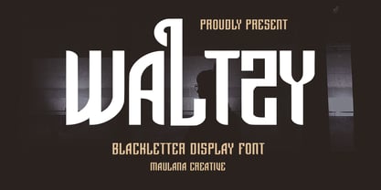 Waltzy display typeface font, fun character with a bit of ligatures and alternates. To give you an extra creative work. Waltzy font support multilingual more than 100+ language. This font is good for logo design, Social media, Movie Titles, Books Titles, a short text even a long text letter and good for your secondary text font with script or serif. Make a stunning work with Waltzy font. Cheers, Maulana Creative
 - MC Ifetur by Maulana Creative,
$16.00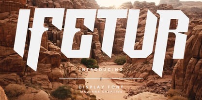 Ifetur display font. Bold stroke, fun character with a bit of ligatures and alternates. To give you an extra creative work. Ifetur font support multilingual more than 100+ language. This font is good for logo design, Social media, Movie Titles, Books Titles, a short text even a long text letter and good for your secondary text font with script or serif. Make a stunning work with Ifetur font. Cheers, Maulana Creative
 - Broukha by Maulana Creative,
$15.00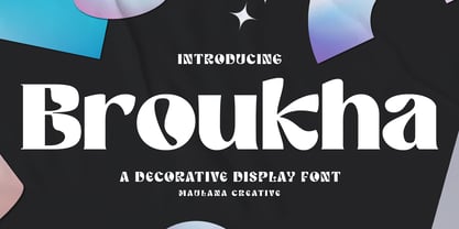 Broukha is a decorative display font. With bold contrast stroke and fun character. To give you an extra creative work. Broukha font support multilingual more than 100+ language. This font is good for logo design, Social media, Movie Titles, Books Titles, a short text even a long text letter and good for your secondary text font with sans or serif. Make a stunning work with Broukha font. Cheers, Maulana Creative
 - Spaziel Serif Round by Maulana Creative,
$12.00 Spaziel Round serif is a modern serif font. With regular round stroke, and fun character. To give you an extra creative work. Spaziel font support multilingual more than 100+ language. This font is good for logo design, Social media, Movie Titles, Books Titles, a short text even a long text letter and good for your secondary text font with Script typeface. Make a stunning work with Spaziel font. Cheers, MaulanaCreative
 - Collibryums by Maulana Creative,
$11.00 Collibryums is a modern signature font inspired by social media advertising and product titles. It has Opentype features Ligatures. Collibryums support multilingual more than 100+ language. This font is good for logo design, Social media, Movie Titles, Books Titles, a short text even a long text letter and good for your secondary text font with sans or serif. Make a stunning work with Collibryums signature font. Cheers, MaulanaCreative
 - Curves Accent by Blackout,
$20.00Curves accent is based on the idea of accents. We add small details to increase interest. Some say small details make all the difference; the font seeks to prove this. This font is fun, open, and ready to accent any work it is placed on. It may very well be used to add the special touch most people would love to see. - monogram kk - Personal use only

- Beats by 4RM Font,
$29.00 Inspired by street posters, this font combines the value of beauty and authenticity in its creation. and the style set feature adds variety to the anatomy of the letters, this font belongs to the display category which is suitable for use in graphic designs such as posters, billboards, and large graphic designs.
 - Gothikka - Unknown license

- Weiss by Linotype,
$29.99The German poet, painter, calligrapher and type designer Emil Rudolf Weiß originally created this eponymous typeface for the Bauer Foundry of Frankfurt. Long known and loved by metal type enthusiasts under the name "Weiss Antiqua," this design was inspired by typefaces from the Italian Renaissance while still distinctly reflecting the artistic and poetic personality of its twentieth-century designer. Weiss has tall ascenders, sharp apex points, and a low-slung midsection on the caps. The italic moves like a classical ballerina. Weiss is one of the earliest contemporary serif types to have italics based on the chancery style of writing. The Weiss family works well for warmly legible text typography; and it's also an original choice for refined headline and display graphics." - ITC Aram by ITC,
$29.99Jana Nikolic was finishing her degree program at the Faculty of Applied Arts, in Belgrade, with a final project that would combine her two majors: type and book design. Three stories from William Saroyan's My Name Is Aram would provide the text for the book, to be set in a typeface that Nikolic would design. Nikolic knew something special was happening the moment she put pen to paper. The letters just emerged," she recalls. "I started to explore a few new pens and found one I loved. I was able to make its tip bend with pressure." Like the family Saroyan writes about, the design flowing from Nikolic's pen would be simple but a little quirky. "When there were a whole bunch of little black letters around me," continues Nikolic, "I saw that this was going to be a very interesting typeface family." Nikolic drew Latin and Cyrillic letters, lowercase and capital letters, wide letters and narrow letters. She was surprised at how quickly and easily the design came. "There were no badly written letters," she says. "I hardly had to rework them and they fit together remarkably well." ITC Aram's standard character complement consists of one set of lowercase letters and two sets of capitals: one narrow and the other wide. The wide caps can be used with the standard lowercase, or mixed with the narrow caps for a variation on "cap and small cap" copy. The ITC Aram create the opportunity to mix and combine the letters into playful typographic expressions. Words and sentences that twinkle; text that seems light and alive - one runs the risk of creating work that is both delightful and charming when setting copy in ITC Aram." - Thinpaw by upirTYPO,
$4.00 Thinpaw is a serif handwritten font perfect for usage in a really big sizes (50 pt+). The stem width is about 0.5 mm (0.019") in 100 pt size. The font comes with central european character set and a set of various glyphs and icons (see preview images). Opentype features: - Standard ligatures - fi, fl, ff - Discretionary Ligatures - ft, fb, fh, fk, fj - Contextual Alternates - a, e, f, g - Stylistic set 01: A Stylistic set 01 changes every dot into the heart shape symbol. It turns every writing into a nice looking love letter! Thinpaw is perfect for wedding proposals, wedding invitations, happy birthday cards or anything personal. For usage on the computer screen, the stem width is about 1 pixel for 50 pt size, and 2 pixel for 100 pt size.
 - Black Pearl by FontMesa,
$30.00 Black Pearl is a revival of an ornate calligraphic font possibly created between 1850 and 1870. I spent two years looking for all the letters of this font; once I found them all, I immediately went to work on recreating this old classic. I was not able to find any numbers for the font, so new to this style are numbers, some punctuation and currency symbols. The Truetype and OpenType formats include an extended character set with Central and Eastern European accented letters. Extra characters in this font are left and right pointing hands in place of the less than and greater than keys; a ship’s wheel, located on the asterisk key; and a boat anchor on the bracket keys.
 - Selfie Neue Rounded by Lián Types,
$29.00 INTRODUCTION When I started the first Selfie back in 2014 I was aware that I was designing something innovative at some point, because at that time there were not too many, (if any) fonts which rescued so many calligraphy features being at the same time a monolinear sans. I took inspiration from the galerías’ neon signs of my home city, Buenos Aires, and incorporated the logic and ductus of the spencerian style. The result was a very versatile font with many ligatures, swashes and a friendly look. But… I wasn’t cognizant of how successful the font would become! Selfie is maybe the font of my library that I see the most when I finally go out, (type-designers tend to be their entire lives glued to a screen), when I travel, and also the font that I mostly get emails about, asking for little tweaks, new capitals, new swashes. Selfie was used by several renowned clients, became part of many ‘top fonts of the year’ lists and was published in many magazines and books about type-design. These recognitions were, at the same time, cuddles for me and my Selfie and functioned as a driving force in 2020 to start this project which I called Selfie Neue. THE FONT "Selfie for everything" Selfie Neue, because it’s totally new: All its glyphs were re-drawn, all the proportions changed for better, and the old and somehow naive forms of the first Selfie were redesigned. Selfie Neue is now a family of many members (you can choose between a Rounded or a Sharp look), from Thin to Black, and from Short to Tall (because I noticed the feel of the font changed notoriously when altering its proportions). It also includes swashy Caps, which will serve as a perfect match for the lowercase and some incredibly cute icons/dingbats (designed by the talented Melissa Cronenbold) which, as you see in the posters, make the font even more attractive and easy to use. You'll find tons of alternates per glyph. It's impossible to get tired with Selfie! Like it happened with the old Selfie, Selfie Neue Rounded was thought for a really wide range of uses. Magazines, Book-covers, digital media, restaurants, logos, clothing, etc. Hey! The font is also a VF (Variable Font)! So you can have fun with its two axes: x-height and weight, in applications that support them. Let me take a New Selfie! TECHNICAL If you plan to print Selfie Neue VF (Rounded or Sharp), please remember to convert it to outlines first. The majority of the posters above have the "contextual" alternates activated, and this makes the capitals a little smaller. I'd recommend deactivating it if you plan to use Selfie for just one word. Use the font always with the "fi" feature activated so everything ligatures properly. The slant of the font is 24,7 degrees, so if you plan to have its stems vertical, you may use Selfie with that rotation in mind. THANKS FOR READING
 - Martin Luther by Harald Geisler,
$59.00 ❧ Useful links: Luther’s Manuscripts at the UNESCO Memory of the World at Google Arts and Culture Martin Luther font on Kickstarter (with Film about the creation) Each letter of the Martin Luther font is strictly based on original samples found in Martin Luther’s 500 year old handwritten manuscripts. Letters that occur more often for example vowels have two or more different versions stored in the font. (➶ Figure 4) These alternative forms are exchanged automatically by the font as you type, and create a vivid look that comes close to actual handwriting. The font avoids that two identical letters are placed next to each other like, for example the two “o” in the word “look”. ➸ What Historic Sources is the Font based on? Two historic documents were used to base the font on. The notes Luther took before giving his speech in Worms in 1521 and a 6 page letter he wrote immediately after to Emperor Charles V., summarising his speech (➶ Figure 2). Both documents have been added to the UNESCO “Memory of the World” and can be seen at the Google Arts and Culture website. ➸ The Creation of a Handwriting Font The creation of a handwriting font is very different from the creation of a regular font. Harald Geisler has specialised in recreating handwriting in preceding projects with Albert Einstein’s, Sigmund Freud’s and his own handwriting. His experience working with Archives and Museums has gone into this project. First Geisler analyses the movement in the writing to understand how each letter is drawn. This involves partially learning how to write like a person. In this process not the outlines of the sample are reproduced but the original movement path of the handwriting (➶ Figure 3). In a second step width and contrast is added to reproduce Martin Luther’s characteristic impetus and the writing tools used at the time. (Link: Youtube Playlist showcasing the creation of individual letters) How about signs that can’t be found in archives? Some Glyphs can not be found in 500 year old manuscripts, for example the @-sign. Towards the end of the creation one collects a profund amount of details about how a writer moves on paper and addresses certain tasks moving the pen. Keeping this knowledge in mind an improvisation can be based on similar letter forms. For example the @ sign is based on of the movement of a lowercase a and parenthesis. ➸ Features of the Martin Luther font ❶ Extensive Documentation of the creation of the font, including high quality reproduction of the used manuscripts. ❷ Additional texts from Historian Dr. Henning Jürgens and Palaeographer (and Luther handwriting expert) Prof. Ulrich Bubenheimer ❸ Alternating Letters - in handwriting every word looks a bit different. To avoid that two identical letterforms are placed next to each other (for example in the word look) the font actively changes between different versions of letters as you type. ❹ Ligatures - characteristic writing forms when two letters are combined (for example “ct”) (➶ Figure 5) ❺ Terminal Letterforms - renders a special letterform when letter is at the end of a word. (➶ Figure 8) ❻ ‘’’Initial and Medial Letterforms''' - some letterforms are different when placed in the beginning or middle of a word, for example the lowercase s. ❼ Luther Rose - is a seal Luther used to authorise his correspondence. Today it is a widely recognized symbol for Luther. When you enter the numbers of Luthers year of birth and death 14831546 using the Martin Luther PRO font, it will render a stylised version of the Luther Rose. (➶ Figure 7) ❽ Historic letter-forms - letter-forms that are specific to medieval writing around 1500. For example the long-s or h with a loop at the bottom. (➶ Figure 6) ⚑ Multi language support - see the technical information tab for a full list of supported languages. (➶ Figure 11) ➸ The different Styles explained ❋ Martin Luther PRO - this includes all features listed above and is geared towards writing texts that are more readable today. It features alternating letters to create a natural handwriting look as well as two stylistic sets accessible through the OpenType menu. Historic forms are available through the glyph picker. ❋ Martin Luther Historic - this font creates a historically correct reproduction (i.e. with long-s) of Luther’s medieval latin handwriting. It features alternating letters to create a natural handwriting look as well as two stylistic sets accessible through the OpenType menu. ❋ Martin Luther Expert-1 - Dedicated access to the first set of letters only. ❋ Martin Luther Expert-2 - Dedicated access to the second set of letters only. ❈❈❈ Family Pack - recieve all fonts at a discounted price. ❈❈❈ ➸ Kickstarter The creation and development of the Martin Luther font was financed by 500 supporters on ➸Kickstarter.
 - Little Ribbon by IKIIKOWRK,
$17.00 Introducing Little Ribbon - Cutie Type, created by ikiiko. Little Ribbon is a beautiful handwritten typeface with bold shapes combining simple lines. This letter is suitable if you want to show a cheerful impression or playful design with solid color. This typeface is perfect for an kids stuff like ads, poster, flyer, or email blast. And also good for packaging product, food & beverages, quotes, or simply as a stylish text overlay to any background image. What's included? Uppercase & Lowercase Number & Punctuation Stylistic & Swashes Multilingual Support Get also a good offer & FREEBIE at our site : www.ikiiko.com Enjoy our font and if you have any questions, you can contact us by email : ikiikowrk@gmail.com
 - FH Getto Funky by FHFont,
$23.00 Getto Funky is a display font with a fun retro style, getto funky includes six (6) stylistic sets (ss) there are ss01, ss02, ss03, ss04, ss05, ss06, and also Standard Ligatures. In every Stylistic Set, this font has unique swashes, and a unique style, like a retro style. This font basically is in display style, suitable for titling, logotype, and font for a poster.
 - Actium by Type Mafia,
$45.00 Actium is a contemporary multilingual sans serif typeface developed to help perfect typography automatically. Type Mafia has focussed on words with odd combinations of capital letters and numbers, such as product names and postal codes such as WD40 and H1N5, jump out of the text. They sit awkwardly together as the numerals have been designed to work with the lowercase, not the uppercase letters – affecting readability.To fix this Type Mafia invented Smart Capo™. Smart Capo™ Smart Capo is a feature that automatically activates once you type an uppercase letter together with a number. When a capital letter is sat next to a numeral, Smart Capo converts the letter to a mid-cap — a contemporary alternative to small caps — and the default old-style numeral to a lining numeral. Actium’s mid-caps and lining numerals have been designed with the same height (between cap and x-height) so they sit comfortably next to each other and fit more harmoniously into text. Smart Capo applies equal attention to capitalised words without any numbers, such as NAVO and USA, and are also automatically set into mid-capitals. Working on its own, Smart Capo saves time and money for the typographer — taking the pain out of text formatting — and makes it a more pleasurable experience for the reader. This feature is made possible by the use of ‘contextual alternates’, an OpenType feature used in modern font software, working with a set of characters specially designed at mid-cap height. By default these changes automatically take place so it doesn't need to be switched on, it will just work. Actium Actium’s design has an unusual diagonal contrast — much more common in a serifed face than in a sans serif — giving it more bite. The typeface looks elegant when set in large sizes and remains very legible when shown in small sizes. The family consists of six weights in two styles, making a dozen fonts. Weights range from light to black in roman and true italic. All fonts are fully loaded with functional elements. Actium boasts an extended Latin character set and with Greek. This means a wide range of Western languages are supported: perfect for use in bilingual publications and packaging. For numerals, each font includes old-style and lining figures in both proportional and tabular widths, with superiors and inferiors. These allow you to select the right set of numbers for the right task.
 - Falfurrias NF by Nick's Fonts,
$10.00Another in the Whiz-Bang Woodtype series, based on authentic xylographic designs from the late nineteenth century. Named after (surprise!) a small town in Texas. The net effect is a typeface which can add style and warmth to any project. Both versions of this font include the complete Unicode 1252 Latin and Unicode 1250 Central European character sets. - Dirty Numbers by Coniglio Type,
$9.00 DIRTY NUMBERS LTD At $1 US dollar each: Dirty Numbers - Provides (9) individual sets of unique numerals [0 thru 9] and nothing else. That is all. Very limited character sets integrated into one font by Coniglio Type -and- a very inexpensive set of marketing numerals. They are revivals from type crafted images and they are monospaced, easy to use and to kern the way you wish. You will have to review your glyphs to locate them and they were pasted in the most logical and accessible places and made economical to you for your special design and crafts needs. Dirty Numbers by Joseph Coniglio, Coniglio Type 2021.
 - Mythring by Ditatype,
$29.00 Myhtring is a spine-chilling display font that will cast a spell of fear on your designs. Designed in uppercase and with a bold weight, this typeface demands attention and exudes an aura of darkness and mystery. Each letter is meticulously crafted with details resembling menacing plant roots with sharp edges, adding an eerie and sinister touch to the font. With its bold weight and uppercase design, this font creates a powerful and impactful presence. The root-like details in each letter of Myhtring give the font an organic and unsettling appearance, as if the letters are entangled with malevolent and ancient roots. These haunting details add a sense of otherworldly energy and create an atmosphere of foreboding and suspense. The combination of bold weight and sharp-edged root details gives this font a sinister and enigmatic look, evoking images of dark and sinister forces lurking in the shadows. The letters seem to possess an aura of malevolence, making it an ideal choice for projects that delve into the horror and the supernatural. For the best legibility you can use this font in the bigger text sizes. Enjoy the available features here. Features: Alternates Multilingual Supports PUA Encoded Numerals and Punctuations Mythring fits in headlines, logos, movie posters, flyers, invitations, branding materials, print media, editorial layouts, headers, and any horror-themed project. Find out more ways to use this font by taking a look at the font preview. Thanks for purchasing our fonts. Hopefully, you have a great time using our font. Feel free to contact us anytime for further information or when you have trouble with the font. Thanks a lot and happy designing.
 - Moonthyu by Skiiller Studio,
$20.00 Moonthy is a beautiful type of script font, There are more than 150 alternate encoded PUAs suitable for graphic design and other needs What's include: Ligature Stylistic set for lowercase Stylistic set for Ending\ PUA Encoded Characters - Fully accessible without additional design software. Basic Latin Language Support (AÀÁÂÃÄÅCÇDÐEÈÉÊËIÌÍÎÏÑOØÒÓÔÕÖUÙÜÚÛWYÝŸÆß ) How to access alternate glyphs? you can see it on this link ( http://goo.gl/1vy2fv )
 - Apla Clare by Hooper Type,
$9.00 Apla Clare comes from the love of my wife.. She's 'Simply' Clare. It's a straihght forward sans, but with a little bit of play, and a friendliness that ensures it moves away from sterile, serious sans. PLease enjoy!


