10,000 search results
(0.31 seconds)
- Talib Fragment - Personal use only

- Munro - Unknown license

- Mailart - Unknown license

- Spacedock Stencil - Unknown license

- Kingthings Embroidery - Unknown license

- Eli 5.0b - Unknown license

- P22 Virginian by IHOF,
$24.95
- Antique Olive by Linotype,
$40.99
- Jerky by Noir Typo,
$15.00
- Buttercut by PizzaDude.dk,
$15.00
- Willoughby JNL by Jeff Levine,
$29.00 - Skizzors by Fonthead Design,
$19.00 - Ornaments 3 AR by ARTypes,
$30.00 - Derriey Vignettes by Intellecta Design,
$15.50
- Tschicholina by Type-Ø-Tones,
$40.00
- Twigglee by Ingrimayne Type,
$9.95
- Bowman by ParaType,
$25.00 - Bank Gothic by Bitstream,
$29.99
- Moksha - 100% free

- Harb - Unknown license

- disc - Unknown license

- Lightmorning - Unknown license

- Teacher_A - Unknown license

- disc_black - Unknown license

- Godzilla - Unknown license

- PEZ_font - Unknown license

- Gear - Unknown license

- 28 Days Later - Unknown license

- Krt - Unknown license

- Kelly - Unknown license

- Desperation - Unknown license

- GENERAL - Unknown license

- Camelot - Unknown license

- Gauze Strips - Unknown license

- Borzoi - Unknown license

- Arabic Transparent by Microsoft Corporation,
$49.00 - Giulio No2 by SoftMaker,
$9.99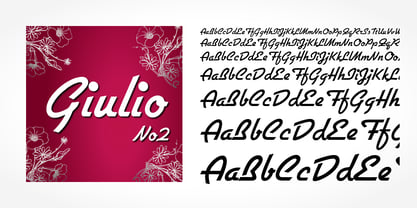
- Hubert by SoftMaker,
$9.99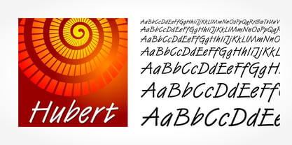
- Eller Initials by SoftMaker,
$7.99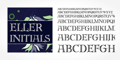
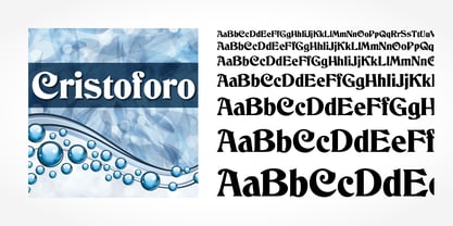
- Cristoforo by SoftMaker,
$9.99