10,000 search results
(0.051 seconds)
- The Essential by Earlyfair Studio,
$18.00 The Essential is a script font that combines minimalist and classical styling so that your design will look elegant when viewed. Hope you enjoy it!
 - Kachong by ZetDesign,
$13.00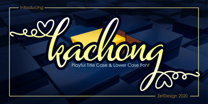 Kachong is a cute and elegant handwritten font with an incredibly friendly feel. It features gorgeous swashes and ligatures that make this script incredibly versatile.
 - Fashyon by Typo5,
$16.95Fashyon was created as an experiment blending script and calligraphic elements, and with a perfect balance between characters, looks dynamic yet with a classical look. - DR Lineart by Dmitry Rastvortsev,
$29.98 Display type-family in op-art style with Latin, Greek and Cyrillic scripts support. Award: The Best Of Ukrainian Design in Typestyle and typography 2016.
 - Shantine by Sibelumpagi,
$8.00 Shantine is a monoline script font with an elegant style. It has good readability and is perfect for logos, invitations, wedding, signatures, and much more!
 - Manuscrita by Celtibérica,
$19.00 What was the inspiration for designing the font? Spanish script from 16th Century. What are its main characteristics and features? Handwriting. Usage recommendations: Literature books.
 - Loose Leaf JNL by Jeff Levine,
$29.00Loose Leaf JNL is a handwritten script with a disconnected, scrawled look as if either written by a child or done as a casual notation. - FG Rakel by YOFF,
$13.95FG Rakel is a small old looking handwriting connected script font. I have found it useful on greeting cards and scrapbook journaling among other things. - Stitka by ARToni,
$19.00 Stitka is a chic, refined script font that emanates sophistication and elegance. Its stylish and ligatures make this font the perfect match for any project.
 - Adventure by ParaType,
$30.00 PT Adventure™ was designed by Natalia Vasilyeva and licensed by ParaType in 2001. An original calligraphic script. For use in advertising and display typography.
 - dearJoe 2 by JOEBOB graphics,
$19.00 DearJoe 2 is the second of four handwritten scripts by JOEBOB graphics. A complete character set with numbers and most (but not all) special signs.
 - Sweet Steeffie by Hanoded,
$15.00 Sweet Steefie is a cursive, feminine script. It is highly legible, contains a full range of accents and is very useful for all your projects.
 - Minnie by Lebbad Design,
$24.95 Minnie is a clean monoline upright script. This fun-loving font is great for headline display and text use. It comes with numerous alternate characters.
 - Amelie by Typadelic,
$19.00This is a connected script font with a trendy flair. You can add little flourishes to the beginning or end letters for a whimsical touch. - Distinction by Great Lakes Lettering,
$12.00 Distinction Is a brand new font from Great Lakes Lettering. A high contrast brush script with a ton of usefulness. Make you mark with Distinction.
 - Bayern Handschrift NF by Nick's Fonts,
$10.00A hundred-year-old offering from Bauer & Company, named simply "Manuscript," provided the inspiration for this elegant script face. The name translates as Bavaria Handwriting. - Reinert by E-phemera,
$12.00Reinert is a casual script font inspired by a few words in a magazine ad layout from the mid-1930s hand-lettered by Allen Reinert. - Chorettan by OCSstudio,
$12.00 Chorettan is a hand-written script. This is perfect for branding, wedding invitations, cards, social media, or maybe for your logo products, and also websites.
 - Anjelina by Nandatype Studio,
$12.00 Anjelina is a beautiful and romantic script font. It is PUA encoded which means you can access all of the glyphs and swashes with ease!
 - Susa by Hubert Jocham Type,
$29.90 Susa is an elegant and flowing brush script typeface. Ideal for short text in the lighter weights and for headlines in bold and heavy weights.
 - Breakdance by Trustha,
$15.00 Breakdance is a vintage font duo. Combination of sans and script with sharp textures making all your creative projects getting a vintage and authentic impression!
 - Tavern by FontMesa,
$25.00 Tavern is a super font family based on our Algerian Mesa design, with Tavern we've greatly expanded the usability by creating light and bold weights plus all new for 2020 with the introduction of extra bold and black weights Tavern is now a five weight family. The addition of the bold weight made it possible to go further with the design by adding open faced shadowed, outline and fill versions. Please note, the fill fonts are aligned to go with the open faced versions, they may work with the outline versions, however you will have to apply them one letter at a time. The Tavern Fill fonts may also be used a stand alone font, however, the spacing is much wider than the regular solid black weights of Tavern. In the old days of printing, fill fonts rarely lined up perfect with the open or outline font, this created a misprinted look that's much in style today. To create that misprinted look using two different colors, try layering the outline fonts offset over the top of the solid black versions. Next we come to the small caps and X versions, for a font that's mostly seen used in all caps we felt a small caps would come in handy. The X in Tavern X stands for higher X-height, we've taken our standard lowercase and raised it for greater visibility in small text and for signage where you want the look of a lowercase but it needs to be readable from the street. In August of 2016 I started the project of expanding this font into more weights after seeing the font in use where someone tried creating a bold version by adding a stroke fill around the letters. The result didn't look very good, the stroke fill also caused the shadow line to merge with the serifs on some letters. This lead me to experiment to see if a new bold weight was possible for this font and I'm pleased to say that it was. After the bold weight was finished I decided to type the regular and bold weights together in a first word thin second word bold combination, however the weight difference between the two wasn't enough contrast. This lead me to wonder if a lighter weight was possible for this font, as you can see yes it was, so now for the first time in the history of this old 1908 type design you can type a first word thin second word bold combination. So why the name change from Algerian to Tavern? Since the original font was designed in England by the Stephenson Blake type foundry I decided to give this font a name that reminded you of the country it came from, however, there were other more technical reasons. During the creation of the bold weight the engraved shadow line was sticking out too far horizontally on the bottom right of the serifs dramatically throwing the whole font off balance. The original font encountered this problem on the uppercase E, L and Z, their solution was a diagonal cut corner which was now needed across any glyph in the new bold weight with a serif on the bottom right side. In order to make the light and regular weights blend well with the bold weight diagonal cut offs were needed and added as well. This changed the look of the font from the original and why I decided to change the name, additional concerns were, if you're designing a period piece where the font needs to be authentic then this font would be too new. Regular vs. Alt version? The alternate version came about after seeing the regular version used as a logo and secondary text on a major product label. I felt that some of the features of the regular version didn't look good as smaller secondary text, this gave me the idea to create an alternate version that would work well for secondary text in an advertising layout. But don't stop there, the alternate version can be used as a logo too and feel free to exchange letters between both regular and alternate versions. Where are the original alternates from Algerian? Original alternates from Algerian are built into the regular versions of Tavern plus new alternates have been created. We're excited to introduce, for the first time, all new swash capitals for this classic font, you're going to love the way they look in your ad layout, sign or logo. The best way to access alternate letters in Tavern is with the glyph map in Adobe Illustrator and Adobe InDesign products, from Adobe Illustrator you can copy and paste into Photoshop as a smart object and take advantage of all the text layer style features Photoshop has to offer. There may be third party character maps available for accessing alternate glyphs but we can't advise you in that area. I know what you're thinking, will there be a Tavern Condensed? It takes a lot of hours to produce a large font family such as this, a future condensed version will depend on how popular this standard version is. If you love Tavern we're happy to introduce the first weathered edge version of this font called Bay Tavern available in February 2020.
 - FS Split Sans by Fontsmith,
$80.00 Quirky and irregular FS Split is no ordinary typeface. Its irregular proportions make it unique, with round letters appearing wide, and straight letters narrow. Other quirks include its eclectic crossbars – the uppercase ‘A’ has an unusually low bar, while the bar on ‘G’ is particularly long. The uppercase has many interesting features in fact, including large counters, closed terminals on certain letters like ‘J’, and a cap-height that lines up with ascenders. The lowercase also holds surprises – the dots on ‘i’ and ‘j’ are unusually large, and some characters, such as ‘g’, feature double-storey counters. An extreme but stylish italic The italic versions of FS Split Sans and Serif are particularly striking. While similar in style to their upright, Roman versions, they take on a larger-than-usual 18-degree angle, making the forward-slant more dramatic. Although the main purpose of any italic is to help words and phrases stand out, this unique execution helps to make the italic variants of FS Split stylish fonts in their own right – they would work brilliantly on magazine covers, in titles and headlines, pull quotes, and even used commercially in logos and corporate branding. Serif and sans: a split personality FS Split Sans and Serif have their differences but also their similarities, contrasting and complementing each other perfectly. This ‘love hate’ relationship inspired the name of the typeface family, and means the two variants provide a versatile, typographic palette for use in graphics and branding. While its proportions are similar to the sans, the serif has a bigger contrast between its weights of bold, regular and light, bracketed serifs, and different styles of terminals, some being straight and others ball-shaped. FS Split Sans has more subtlety and simplicity, with a smaller weight contrast, less flamboyant terminals, and more consistent counter sizes. The two variants are distinct yet alike, so can be used successfully either in isolation or together.
 - FS Split Serif by Fontsmith,
$80.00 Quirky and irregular FS Split is no ordinary typeface. Its irregular proportions make it unique, with round letters appearing wide, and straight letters narrow. Other quirks include its eclectic crossbars – the uppercase ‘A’ has an unusually low bar, while the bar on ‘G’ is particularly long. The uppercase has many interesting features in fact, including large counters, closed terminals on certain letters like ‘J’, and a cap-height that lines up with ascenders. The lowercase also holds surprises – the dots on ‘i’ and ‘j’ are unusually large, and some characters, such as ‘g’, feature double-storey counters. An extreme but stylish italic The italic versions of FS Split Sans and Serif are particularly striking. While similar in style to their upright, Roman versions, they take on a larger-than-usual 18-degree angle, making the forward-slant more dramatic. Although the main purpose of any italic is to help words and phrases stand out, this unique execution helps to make the italic variants of FS Split stylish fonts in their own right – they would work brilliantly on magazine covers, in titles and headlines, pull quotes, and even used commercially in logos and corporate branding. Serif and sans: a split personality FS Split Sans and Serif have their differences but also their similarities, contrasting and complementing each other perfectly. This ‘love hate’ relationship inspired the name of the typeface family, and means the two variants provide a versatile, typographic palette for use in graphics and branding. While its proportions are similar to the sans, the serif has a bigger contrast between its weights of bold, regular and light, bracketed serifs, and different styles of terminals, some being straight and others ball-shaped. FS Split Sans has more subtlety and simplicity, with a smaller weight contrast, less flamboyant terminals, and more consistent counter sizes. The two variants are distinct yet alike, so can be used successfully either in isolation or together.
 - Ankara Texture by Koray Özbey,
$5.00 This font is designed to create typographic textures. It's based on Ankara Display but not in the same family because of some of its different forms. Also, its angular forms give a digital impact.
 - Qebab Shadow FFP - Personal use only

- NewRocker - 100% free

- Kreepshow 'Frigid' - Personal use only

- Obcecada Serif - Personal use only

- Obcecada Sans - Personal use only

- Uchrony Circle - Personal use only

- Evanescent - Unknown license

- Fenwick Outline Free - Unknown license

- Local Eatery JNL by Jeff Levine,
$29.00 Here's yet another variation of the classic Futura Black Art Deco stencil form of display lettering. The inspiration for this typeface came from various images of the Blossom Dairy Co. restaurant, originally opened as an ice cream and sandwich shop located on Quarrier Street in Charleston, West Virginia. The restaurant first opened in 1938 as an outgrowth of the Blossom Dairy Co. itself, and existed under various ownerships until it permanently closed on Nov. 11, 2016. Digitally redrawn as Local Eatery JNL, it is available in both regular and oblique versions.
 - Monik by Sensatype Studio,
$15.00 MONIK is a A New Elegant Classy Serif Font A serif that we created special for elegant branding needs, with extra ligature and alternates in unique shape will be ready to add value of your brand. It so nice to leverage designer or product owner that need solutions to make their design look more classy and modern. MONIK serif font ready with: Ready 3 Weights (Light, Regular, and Bold) Preview as a inspirations that you can do with MONIK font Ready with Lowercase and Uppercase characters Wish you enjoy our font. :)
 - Happy New Year Party by Putracetol,
$26.00 Happy Ney Year Party is a playful and quirky display font. I made this font especially for New Year and holidays. This font has 8 decoration versions : regular, firework, splash, ribbon, star, trumpet. These decorations are related to New Year decorations, making this font the perfect fit for any new year or holiday themed activity / project. Happy Ney Year Party perfect for crafter, gift, tshirt, card event, anniversary, birthday,greeting cards, logotype, branding, poster, packaging, stationery, website, and any other projects requiring a handwritten and luxurious touch. This font is also support multi language.
 - Phola Slab by RainBomb Studio,
$16.00 This modern slab serif typeface expands on the phola type family and complements it's siblings with style. Phola is a geometric san-serif display type family. It consists of 64 fonts and includes an extensive character set and multilingual support. Crafted with love this font family offers a numerous styles (Regular, Solid, Square, Diablo, Oblique, Outline, Clean) the family allows for extensive use cases. This OpenType font offer a fantastic options for users to create some unique artwork. Perfect for branding, Logos, displays, posters and other related projects.
 - Glarestha by Mevstory Studio,
$25.00 Glarestha is a modern high-contrast display font with bright positive character. Clean forms and a bit curly letter ends creates a friendly mood in any designs. It comes with Regular version, Opentype features (stylistic alternates and standard ligatures). The easiest way to get alternate is to add number after character (for example A2, A3) or add Underscore after end character (for example a r). The full set of alternates you can find in font presentation. Faery Dream font is perfect for headlines, magazines, logotypes, food package, advertising and many others. Multilingual Support
 - Brilliant Soulmate by Din Studio,
$22.00 Brilliant Soulmate is a modern signature typeface. It’s perfect for any signature or name card design, for branding projects, product packaging, quotes, logos, book covers, and many other awesome projects. With the combination of elegant and casual style, this font contains a full set of lowercase and uppercase letters. Includes: Brilliant Soulmate Regular Version 1,2,3 Brilliant Soulmate Italic Version 1,2,3 Features: Stylistic Alternates and Ligatures Character Set A-Z Numerals and Punctuation (OpenType Standard) · Accents (Multilingual Characters) · PUA Encoded With an elegant and casual design, I hope this font could fit your design needs.
 - Foundry Dat by The Foundry,
$50.00 Foundry Dat is created with a common horizontal dash grid structure for accurate layering when characters are superimposed. Foundry Dat’s integrated background aligns vertically and horizontally, when set solid, forming a continuous pattern. Foundry Dat’s companion family Foundry Dit functions as a legible correspondence font, with a ‘typewriter’ feel. Each family contains: light, regular, medium and bold weights. Foundry Dat comes with a series of dashes to extend the background grid. Characters can also be offset to make different patterns – in the process becoming images – a graphic language with total integration of form and function.


