10,000 search results
(0.309 seconds)
- Quarx Outline - 100% free

- acid_reflux - Unknown license

- Godzilla - Unknown license

- Knife Fight - Personal use only

- AB Exp - 100% free

- KometenMelodie1 - Unknown license

- Digital dream Fat - Unknown license

- Circus Ornate - Personal use only

- Gimmicky - Unknown license

- Dead World - Unknown license

- bubble - Unknown license

- Action Is, Shaded JL - Unknown license

- Victor Moscoso - Unknown license

- EvilGenius BB - Personal use only

- Ink Tank (BRK) - Unknown license

- Monster boxes - Personal use only

- !the troubles - Unknown license

- Jurassic - Unknown license

- Amsterdam Graffiti - Unknown license

- Bodrum Stencil by Bülent Yüksel,
$19.00 Bodrum Collection: 1- Bodrum Sans 2- Bodrum Sweet 3- Bodrum Stencil 4- Bodrum Slab 5- Bodrum Styte 6- Bodrum Soft Bodrum Stencil is a stencil serif type family. Designed by Bülent Yüksel in 2018/19. The font, influenced by style serifs, popular in the 1920s and 30s, is based on optically corrected geometric forms for better readability. Bodrum Stencil is not purely geometric; it has vertical strokes that are thicker than the horizontals, an “o” that is not a perfect circle, and shortened ascenders. These nuances aid in legibility and give "Bodrum Stencil" a harmonious and sensible appearance for both texts and headlines. Bodrum Stencil provides advanced typographical support for Latin-based languages. An extended character set, supporting Central, Western and Eastern European languages, rounds up the family. The designation “Bodrum Stencil 14 Regular” forms the central point. "Bodrum Stencil" is available in 10 weights (Hair, Thin, Extra-Light, Light, Regular, Meduim, Bold, Extra-Bold, Heavy and Black) and 10 matching italics. The family contains a set of 650+ characters. Case-Sensitive Forms, Classes and Features, Small Caps from Letter Cases, Fractions, Superior, Inferior, Denominator, Numerator, Old Style Figures just one touch easy In all graphic programs. Bodrum Stencil is the perfect font for web use.
 - Radar by Type-Ø-Tones,
$60.00 Radar is a revival of the sans serif typeface “Grotesca Radio”, from the Spanish foundry Richard Gans, which existed from 1888 to 1975. His authorship is attributed to the German type designer and master punchcutter Carl Winkow. Although the new version of this font has always tried to keep accurate similarities with the original typeface, Radar is not intended as a strict revival, but as a contemporary interpretation. In this new version the user can find some alternate characters that give the typeface a more art-déco or neutral flair.
 - Bandera Pro by AndrijType,
$45.00 This square serif typeface is a real workhorse. It is a modern tool for text design: extremely legible, pan-european multilingual (Latin, Greek and Cyrillic), well shaped. Bandera Pro has six weights with original italics, alternatives, small capitals and three sets of digits. It catches attention in headlines of posters and magazines or makes reading comfortable in plain texts. Bandera Pro shares main proportions with sans serif Osnova Pro typefamily so ideally can pair it. Bandera is Spanish for ‘flag’. And Bandera is a symbol of Ukrainian fighting for freedom for many years.
 - Rheago by Keristyper Studio,
$14.00 say hello to Rheago, a sweet and cute typeface. This font is good for logo design, Social media, Movie Titles, Books Titles, short text even long text letters, and good for your secondary text font with sans or serif. Featured: Standard Uppercase & Lowercase Numeral & Punctuation Multilingual : ä ö ü Ä Ö Ü ß ¿ ¡ Alternate & Ligature PUA encoded We recommend programs that support the OpenType feature and the Glyphs panel such as Adobe applications or Corel Draw. so you can use all the variations of the glyphs. Hope you enjoy our fonts!
 - Magallanes Condensed by Latinotype,
$29.00 Say hello to the new Magallanes Condensed Family, a contemporary neo-humanist sans serif font designed by Daniel Hernández. Its strokes and terminals are related to the calligraphic strokes from humanist typefaces. It comes with 8 styles, from Ultra Light to Black, each with its true italics. Every weight comes with alternative glyphs for a more dynamic use. Magallanes is the perfect titling font to complement text faces in magazines, logotypes, etc. Languages supported include Basic Latin, Western European, Euro, Catalan, Baltic, Turkish, Central European, Romanian, Pan African Latin.
 - Rushine by Keristyper Studio,
$14.00 Say hello to Rushine Script, a vintage calligraphy brush stroke font. This font is good for logo design, Social media, Movie Titles, Books Titles, short text even long text letters, and good for your secondary text font with sans or serif. Featured: Standard Uppercase & Lowercase Numeral & Punctuation Multilingual : ä ö ü Ä Ö Ü ß ¿ ¡ Alternate & Ligature PUA encoded We recommend programs that support the OpenType feature and the Glyphs panel such as Adobe applications or Corel Draw. so you can use all the variations of the glyphs. Hope you enjoy our fonts!
 - Magallanes by Latinotype,
$29.00 Say hello to the new Magallanes Family, a contemporary neo-humanist sans serif font designed by Daniel Hernández. Its strokes and terminals are related to the calligraphic strokes from humanist typefaces. It comes with 8 styles, from Ultra Light to Black, each with its true italics. Every weight comes with alternative glyphs for a more dynamic use. Magallanes is the perfect titling font to complement text faces in magazines, logotypes, etc. Languages supported include Basic Latin, Western European, Euro, Catalan, Baltic, Turkish, Central European, Romanian, Pan African Latin.
 - Aerofoil by Mans Greback,
$59.00 Aerofoil is a vintage script typeface. This high quality font gives any project a genuine spirit. Designed and created by Måns Grebäck, Aerofoil has a timeless and classic style, while still being original. It has several alterate characters, ligatures and OpenType functions, and the font also supports hundreds of languages. Use _ for an underline. Example: Aer_ofoil
 - Soapy Feelings by PizzaDude.dk,
$18.00 Soapy Feelings is my slightly rough-edged handmade fantasy (or perhaps even fairytale) font. I've added several swashes, which can be used for both starting and endings of words. I've also added 4 slightly different versions of each letter (and they automatically cycle as you type!) and lastly, of course Soapy Feelings has multilingual support! Caps Only Fonts
 - Laurels Qeylla by Asd Studio,
$15.00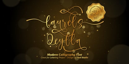 Laurels Qeylla is a script font created with love, sincerity, and patience. can be used to make invitation writing, lettering, and all graphic design needs. This font is equipped with 5 stylistic sets and several alternative letters that will make your design look more attractive and beautiful. Thank you if you are interested in purchase and using my font.
 - Blackstone by Chris Costello,
$28.75 Dragons, pirates, magic, and all that is gothic was the inspiration for this design. Blackstone was one of ten winners in The 1988 Chartpak Typeface Design Competition and is now available in two styles with additional characters, alternates and dingbats. Several alternate caps can be found using alt keystrokes, so try using different combinations of all caps.
 - System Overload by Hanoded,
$15.00 I sometimes think that we live in strange times: a lot of good (and bad) things seems to happen all at once. System Overload font is based on the protest posters from the seventies. You can use it for your own protest posters, your restaurant signs or whatever you fancy. Comes with several interesting discretionary ligatures as well!
 - Soft Lime by PizzaDude.dk,
$10.00 Soft Lime is my simple, yet powerful typeface. It definitely fits in the comic department, but is very useful for posters, postcards (do anybody use these anymore?!) greeting cards and anything that needs a legible handmade typeface. It comes in several versions, that can be mixed for great results - and of course they all have multilingual support!
 - Notes by Resistenza,
$39.00 Notes Is a handwritten-Italic font style, casual and fresh. Our recipe for this project is a perfect blend of typography and handwriting. Works well in small sizes and has several ligatures. Notes Family has many cuts, Pen, Pencil, Marker and Felt Tip. This font family can be used for many purposes like publishing, quick notes, adding captions, signage.
 - Mitten Condensed by Sohel Studio,
$12.00 “Mitten” is a bold serif that has a classic and bold style. Depicted to provide basic headlines that are confident and impressive - while still feeling warm and welcoming. there are 3 different styles that you can apply in your design projects. This typeface is perfect for an book or movie title design, fashion brand, magazine, clothes, lettering, quotes, social media posts and so much more. Mitten Features: · 3 Weights font (Regular,Italic,Bold) · Uppercase And Lowercase · Numerals & Punctuation · Accented characters · Multilingual Support · PUA Encoded While using this product, if you encounter any problem or spot something we may have missed, please don't hesitate to drop us a message. We'd love to hear your feedbacks in order to further fine-tune our products. Thanks and have a wonderful day
 - Coigum by Keristyper Studio,
$14.00 Coigum is a modern display font that is perfect for creating attention-grabbing headlines, titles, and logos. Its bold and fat lettering style is sure to make a statement and capture the viewer's attention. This font is ideal for projects that require a bold, strong, and impactful appearance, such as posters, advertisements, packaging, and branding materials. With its unique and modern design, Coigum is a great choice for designers who want to add a touch of boldness and energy to their projects. Featured: Standard, Uppercase & Lowercase Numeral & Punctuation Multilingual : ä ö ü Ä Ö Ü ß ¿ ¡ Alternate & Ligature PUA encoded We recommend programs that support the OpenType feature and the Glyphs panel such as Adobe applications or Corel Draw, so you can use all the variations of the glyphs. Hope you enjoy our fonts!
 - Glary Tropic by Product Type,
$17.00 Say hello to Glary Tropic, the top choice for stunning, tropical-inspired designs. With boldness and strength imbued in every accent, this font brings a bold touch that immediately steals the show. Glary Tropic's bold style brings strong and eye-catching design elements. Filled with a fun tropical feel, each letter creates a fresh, vibrant atmosphere, perfect for projects that require exceptional visual appeal. This font is designed to provide maximum clarity and impact. With a strong tropical theme, Glary Tropic will be the perfect choice for posters, announcements, branding designs, or other creative projects that require a fresh and dynamic touch. Enhance your creativity and create unforgettable designs with Glary Tropic. With strength and uniqueness in every accent, this font will be an undeniable choice to take your design projects to the next level.
 - Lunar Modular by Comicraft,
$19.00 TOUCHDOWN! This is not a Hoax, not a What If, not an Imaginary Font! The Eagle has Landed... Comicraft's latest manned mission: Space Age Faces for Space Age Spaces! Our Apollo Modules have settled in the moondust and our Astronauts are buckled up in the Rover collecting little rocks and looking for suitable spots to play golf. We invested billions and billions of dollars to send these fonts into space using the largest and most powerful rockets ever built, and rest assured, our Orbiter is coated with a phenolic epoxy resin ablative heatshield to protect you for your journey back to Earth. Features: Six fonts (Modular, Modular-Bold, Orbiter, Orbiter-Bold, Rover, Rover-Bold) with upper and lower case characters. Opentype version of Orbiter also includes 52 auto-ligatures.
 - Sony Sketch EF - Unknown license

- GALLEGA - Unknown license

- Arbeka - Unknown license


