8,625 search results
(0.03 seconds)
- Funky Nouveau JNL by Jeff Levine,
$29.00 The free-form Art Nouveau hand lettering for the 1905 song "Will You Love Me in December as You Do in May" was the design model for Funky Nouveau JNL, which is available in both regular and oblique versions. Since the 1960s hippie counterculture embraced elements of the Art Nouveau period in their art and design, it seemed only fitting to use the term "Funky Nouveau" in the fontís name as an homage to both eras.
 - Bulldog Slab by Club Type,
$36.99 Figgins and Caslon may be names familiar to many as Type Founders. Indeed they are, but they are perhaps less well known for the emergence of Sans Serif type styles which have become part of our lives since 1889. The first hundred years of this style is celebrated with this design by Adrian Williams, completed in 1989. It echoes many features of the Gothic, Grotesque and Sans Serif models of the period, based particularly on the 1870 Figgins.
 - Dual Line Deco JNL by Jeff Levine,
$29.00 Sheet music for the title song from the 1933 Jean Harlow-Clark Gable film "Hold Your Man" has the movie title hand lettered in a dual line sans serif with Art Deco influences. This is now available as Dual Line Deco, and is available in both regular and oblique versions. The song itself was written by Arthur Freed and Nacio Herb Brown, whose vast catalog of musical compositions was tapped for the 1952 musical classic "Singing in the Rain".
 - Smith Premier NF by Nick's Fonts,
$10.00In ye olden days, nothing said “personalized business correspondence” like a typewritten letter, and several type foundries cast simulated typewriter fonts so authentic-looking “personal” letters could be mass-produced. This typeface is based on one such font from a href="/foundry/atf/">American Type Founders, which was patterned after the letters of the Smith Premier No. 3. Both versions of the font include 1252 Latin and 1250 CE (with localization for Romanian and Moldovan) character sets. - KhaoSans by TypeK,
$35.00 KhaoSans is a Rounded typeface. The latin was inspired from Thai woodtype used as headline in old day Thai newspaper. The refined curve with some sharp end add uniquely beautiful touch to the typeface. In Thai language, ‘Khao’ (ข่าว) means ‘news’ and ‘Sans’ (สาร) means ‘message’. The font comes in 8 weights, ranging from a delicate ExtraLight to Black, with 3 widths (Normal, Wide, and Expanded). Matching italics are provided, resulting in a total of 48 styles family.
 - Vanitha by Arterfak Project,
$18.00 Vanitha is a bold script font, inspired by vintage logos and old-school sign painting. This font is made with hand drawings and still pays attention to the calligraphic form so that it looks modern and unique. Vanitha is a display font, which you can use as logos, logotypes, merchandise, sports themes, flags, banners, stickers, labels, posters, and others. This font is also equipped with stylistic alternates to beautify your typographic design. Thank you for your support!
 - Milky Skies by Bogstav,
$15.00 Thursday Afternoon is like a typewriter that was out in the rain all night - all wobbly and worn, but with the well-known details of a typewriter, just a bit...well a lot...out of the ordinary! Although being awkward, Thursday Afternoon is surprisingly legible. I'd like that the font should be used for labels, toys for kids, candy or any kind of organic product. It even looks really well with headlines or shoutouts in all-caps!
 - Venio by Craft Supply Co,
$20.00 Venio – Double Line Font: Display Typography with Art Deco Flair Deco-inspired Elegance Infused with Art Deco sophistication, Venio, a double-line sans-serif font, brings timeless elegance to your designs. Distinctive Display Presence Venio ensures a bold yet refined aesthetic for logos and headlines, making your display stand out with its distinctive double-line design. Artful Symmetry Paying homage to Art Deco’s geometric precision, Venio’s symmetrical lines provide a visually pleasing experience, adding a touch of artistic flair.
 - Bulldog by Club Type,
$36.99Figgins and Caslon may be names familiar to many as Type Founders. Indeed they are, but they are perhaps less well known for the emergence of Sans Serif type styles which have become part of our lives since 1889. The first hundred years of this style is celebrated with this design by Adrian Williams, completed in 1989. It echoes many features of the Gothic, Grotesque and Sans Serif models of the period, based particularly on the 1870 Figgins. - Mellnik by ParaType,
$25.00Mellnik is a sans serif of humanist style (in a way) that was developed by Oleg Karpinsky for ParaType in 2006. The type family contains nine styles with a number of alternate characters in each ones. For use as a text font in long text passages of advertising booklets, catalogues or magazines, as well as for accident setting. Mellnik may be also applied as a corporate typeface. Five condensed styles were added in 2007 by the same designer. - Astaneh by Si47ash Fonts,
$24.00 Super clean, yet sophisticated! Astaneh with its 2 weights brings a modern and clean sans serif Arabic/Persian typeface to life! Shahab Siavash, the designer has done more than 30 fonts and got featured on Behance, Microsoft, McGill University research website, Hackernoon, Fontself, FontsInUse,... Astaneh text and headline font which is one of his latest designs, already got professional typographers, lay-out and book designers' attention as well as some of the most recognizable publications in Arabic/Persian communities.
 - Roxic by Thinkdust,
$10.00 Roxic doesn’t push boundaries, or break them; Roxic doesn’t recognise your pedestrian concept of boundaries. It doesn’t so much laugh in the face of convention as much as it refuses to acknowledge its very existence. Roxic is a font for the modern day, but without the layers of pretension so often associated with modernism. Elegantly conveying your message with its uniquely delicate sturdiness, Roxic is a font that people haven’t met before, but they can’t help but trust it.
 - Jeenull by Twinletter,
$15.00 Jeenull is a distinctively appealing typeface with a thick character that gives a distinct impression ideal for a variety of serious and casual applications. What are you waiting for? Get this font and enjoy the beauty of letter combinations in words that you may use in a variety of projects. This font is perfect for games, sporting events, branding, banners, posters, movie titles, book titles, quotes, logotypes, and more. Start using our fonts for your amazing projects.
 - Hezareh by Si47ash Fonts,
$24.00 Familiar, yet eye-catching! Hezareh with its 2 weights brings a modern and clean serif Arabic/Persian typeface to life! Shahab Siavash, the designer has done more than 30 fonts and got featured on Behance, Microsoft, McGill University research website, Hackernoon, Fontself, FontsInUse,... Hezareh text and headline font which is one of his latest designs, already got professional typographers, lay-out and book designers' attention as well as some of the most recognizable publications in Arabic/Persian communities.
 - Fineprint by Monotype,
$29.99The script typeface named Fineprint is based on its designer's own handwriting, or at least as Steve Matteson saw his handwriting on a really good day. Unlike many digitizations of handwriting, Fineprint maintains a consistent harmony and balance across its letters in a line of text. The Fineprint family includes a number of swash and alternate letterforms, which helps pull this quirky personal nature off. Use Fineprint whenever you want to make something appear personal, friendly, or informal! - Darling Duo Script by Haksen,
$13.00 Darling Duo include two font styles with full set of handwritten style draw for script and cute style letters for sans. Numerals, a large range of punctuation and ligatures giving realistic hand-lettered style. In order to use the beautiful ligatures for script also all uppercase for sans serif, you need a program that supports OpenType features such as Adobe Illustrator CS, Adobe Photoshop CC, Adobe Indesign and Corel Draw. Thanks and have a great day :) Haksen
 - Wedding Doodles Too by Outside the Line,
$19.00Wedding Doodles Too is the follow-up font to the popular Wedding Doodles. This font gives you all you need to make your own invitations, announcements, RSVP cards, save your date cards and thank you notes. Font includes 3 sets of hand-lettered words… save our date, thank you and RSVP. Just add a wedding cake, flowers, top hat, wedding bell, heart or flower and you are done. Check out Wedding Doodles, you may need both. - Mc Cartey by Maulana Creative,
$11.00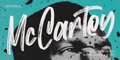 Mc Cartey is a Fancy Handwritten Brush Display font. With raw brush stroke, slanted and fun character with a ligatures. To give you an extra creative work. Mc Cartey font support multilingual more than 100+ language. This font is good for logo design, Social media, Movie Titles, Books Titles, a short text even a long text letter and good for your secondary text font with sans or serif. Make a stunning work with Mc Cartey font. Cheers, MaulanaCreative
 - Durer Display by iframe,
$28.00 Durer is a modern font, its soft curves and refined details create a sense of elegance. Inspired by the work of Albrecht Dürer (21 May 1471 – 6 April 1528), who was a German painter, printmaker, and theorist of the German Renaissance. Born in Nuremberg, Dürer established his reputation and influence across Europe in his twenties due to his high-quality woodcut prints. 551 Glyphs Upper / lower case, numbers, punctuation Language support: Latin / Greek Designed by iframe type foundry
 - Endurant by Baps Patil,
$15.00 Endurant is a font inspired by futuristic conceptual arts from the late-20th century. The question it answers is, "What if someone in the late 20th century were to imagine a futuristic font?" Endurant is a brave, all-caps display font. Because of what it's inspired by, it is suitable for futuristic and retro-modern designs in the modern-day world. It can be used for graphic design, poster design, web and mobile UI design—and many other applications.
 - Fattalsfort by Maulana Creative,
$13.00 Fattalsfort is a Handwritten Brush font. With Bold raw brush stroke, slant and fun character with a bit of ligature and swashes. To give you an extra creative work. Fattalsfort font support multilingual more than 100+ language. This font is good for logo design, Social media, Movie Titles, Books Titles, a short text even a long text letter and good for your secondary text font with sans or serif. Make a stunning work with Fattalsfort font. Cheers, MaulanaCreative
 - Brignell Sunday by IB TYPE Inc.,
$40.00 BRIGNELL SUNDAY is an eight font family designed by Ian Brignell. A relaxed, easy-reading companion for any day of the week. A clean, modern, friendly sans serif characterized by an open style with occasionally rounded corners, occasional curved junctures on diagonals and a slightly sloped lower case A. Brignell Sunday was born in 2006 and was inspired by corporate custom font ideas Ian designed for an LG Electronics sub-brand called Best Shop. Extended Latin set.
 - The Half SunBurst-w4-02 font embodies a blend of creativity and radiant energy, reminiscent of the glowing aura of a setting or rising sun. This font stands out for its unique design, which combines ...
- The Contour Generator font, crafted by the accomplished and prolific typeface designer Ray Larabie, is an exceptional display font that stands out due to its unique characteristics and the aesthetic ...
- Jerash Demo by David F. Nalle is a distinctive font that immerses users into the depths of artistic expression and historical resonance. Crafted with an acute attention to detail, this typeface bridg...
- Overspray - Personal use only

- Bodoni Ornamental by FontMesa,
$30.00 New for 2020 Bodoni Ornamental now has two italics to choose from, one basic italic and a second which is more of a true italic with a few uppercase letters that have been stylized. Only one italic can be style linked to the regular upright version so in the second italic we've added Avanti to the name which means forward in Italian. When purchasing the regular upright and Avanti italic together they will install as two separate families. Bodoni Ornamental is a revival of a very old typeface based on the Poster Bodoni letter shape. Giambattista Bodoni passed away in 1813, this decorative version was created in the 1820’s or 1830’s which was the time period when many of these ultra bold decorated type faces began to appear, the original artist is currently unknown. The original version of this ornate classic was only available as a set of uppercase letters, today over one hundred eighty years later this font is now complete with a new lowercase, numbers and accented characters for Eastern, Central and Western European countries. Due to the ornate detail in Bodoni Ornamental when printing itís recommended to use a laser printer 600dpi or greater, a 1200dpi printer will give you the best results rendering the most detail at the smallest possible point size for this font. Small home user Ink Jet printers are not recommended for Bodoni Ornamental unless you set the font to a very large point size. With Ink Jet printers much of the detail in the letters will bleed together as the ink hits the page, commercial Ink Jet printers such as GiclÈe printers may give good results. When using Bodoni Ornamental for digital images including web site graphics it may help to add a one pixel stroke fill around the letters setting color to white or grey, this may help the web site images display better on some computer's. You will need a photo editing application such as Adobe Photoshop to create your image adding the stroke fill and save as a jpg , png or gif file. I hope you enjoy this old font as much as I did making it. Note: When previewing the Bodoni Ornamental font in the Windows font preview you may notice some letters appearing lighter and some darker, this is a problem with the preview window and some ornate fonts, Bodoni Ornamental will print normal and not with mixed light and dark letters.
 - Reaver - Personal use only

- Robot Teacher - Unknown license

- Night Train by FontMesa,
$19.95 Night Train is a new font built from the ground up; while Night Train may resemble an old classic wood type there are a few lines that make this font a little more modern setting it apart from other wood type revivals. If you're a railroad enthusiast you're sure to enjoy the steam locomotive graphic located on the less than and greater than keys on all versions of this font, due to the fine detail of this train illustration the best printing results will be at 600dpi or higher on a laser printer. An alternate K and R are within the Night Train fonts, for Win Type1 these alternates are on the left and right bracket keys, for Truetype and OpenType you may access the alternates by using the Character Map in Windows or Adobe Illustrator, for OpenType you may also find them on the stylistic alternates page of the glyph map in Illustrator. There's something new with Night Train that the sign making people will love, for the first time FontMesa is pleased to offer a block shadowed version in four directions. One fill font is all that is needed for all four open faced fonts, you'll need an application that works in layers in order to use the fill font with the open faced fonts, simply place the fill font in its own layer then move it behind one of the open faced fonts of Night Train. The Night Train name has been on my list to use as a font name for a few years, a friend from years ago used to sail his boat in the Mackinac race from Chicago to Mackinac Island, the name of that boat was the Night Train. Watching the 2010 Olympic four man U.S. bobsled team win gold with their sled also called Night Train has inspired me to complete this font.
 - Cabrito Inverto by insigne,
$- Life’s always more fun when you reverse the stress. The same goes for the new member of the Cabrito family. Cabrito itself is a recently developed slab serif made for the kid’s book The Clothes Letters Wear. Cabrito proved to be more popular than I thought, and I promised I would create an inverted style for this new addition to the font world--a variant that would pair well with the original or even stand well on its own. And so now, here it is. Cabrito Inverto, which features the reversed stress of the strokes from a font’s “normal” traits. Inverted stress fonts are most often associated with cowboys and the Old West. The inverted stress gives it a happy-go-lucky appearance, not to be taken too seriously. It’s a pleasantly rounded, not-so-strictly geometric typeface with handwriting-inspired forms. Whew, that’s a mouthful! Inverto’s bundle of alternates is accessible in any OpenType-enabled program. It contains a workforce of alternates, swashes, and alternate titling caps to embellish the font. Also bundled are swash alternates, aged design and style figures, and compact caps. Peruse the PDF brochure to examine out these solutions in action. OpenType-enabled purposes such as Adobe suite or Quark will allow ligatures and alternates. This font family also includes the glyphs for 72 different languages. Cabrito Inverto does pair well with Cabrito. There is even an extra font weight, Black, for when you want to punch it up a bit. Jeremy Dooley designed Inverto to be a welcoming, day-to-day font family. Use it to express friendliness on just about anything, from candy to food to children’s toys. Cabrito Inverto’s one-of-a-kind visual appearance brings a bundle of fun to the party. Buy Cabrito Inverto to give a boost to your designs every day of the week.
 - Prillwitz Pro by preussTYPE,
$49.00 Johann Carl Ludwig Prillwitz, the German punch cutter and type founder, cut the first classic Didot letters even earlier than Walbaum. The earliest proof of so-called Prillwitz letters is dated 12 April 1790. Inspired by the big discoveries of archaeology and through the translations of classical authors, the bourgeoisie was enthused about the Greek and Roman ideal of aesthetics. The enthusiasm for the Greek and Roman experienced a revival and was also shared by Goethe and contemporaries. »Seeking the country of Greece with one’s soul«. All Literates who are considered nowadays as German Classics of that time kept coming back to the Greek topics, thinking of Schiller and Wieland. The works of Wieland were published in Leipzig by Göschen. Göschen used typefaces which had been produced by until then unknown punch cutter. This punch cutter from Jena created with these typefaces master works of classicist German typography. They can stand without any exaggeration on the same level as that of Didot and Bodoni. This unknown gentleman was known as Johann Carl Ludwig Prillwitz. Prillwitz published his typefaces on 12th April 1790 for the first time. This date is significant because this happened ten years before Walbaum. Prillwitz was an owner of a very successful foundry. When the last of his 7 children died shortly before reaching adulthood his hope of his works was destroyed, Prillwitz lost his will to live. He died six months later. His wife followed him shortly after. The typeface Prillwitz as a digital font was created in three optical styles (Normal, Book and Display). The typeface Prillwitz Press was created especially for a printing in small sizes for newspapers. »Prillwitz Press« combines aesthetic and functional attributes which make written text highly readable. It was originally designed for a newspaper with medium contrast to withstand harsh printing conditions. Its structure is quite narrow which makes this typeface ideal for body text and headlines where space is at premium. For the Normal – even more for the Book – a soft and reader-friendly outline was created through a so-called »Schmitz« and optimized in numerous test prints. The arris character and the common maximal stroke width contrast of the known classicist typefaces (Didot/Bodoni) were edited by the study of the original prints. This was also done in order to reach a very good readability in small type sizes. This typeface is perfectly suited to scientific and belletristic works. Accordingly it has three styles: Regular, Bold and Italic as Highlighting (1). The typeface Prillwitz is a complete new interpretation and continuing development of the conservated originals from 1790. They have been kept in the German Library in Leipzig. It was always given the priority to keep the strong roughness and at the same time optimizing the readability of this striking font. The type family has all important characters for an efficient and typographic high quality work. ----------- (1) Accentuation of particular words or word orders (e.g. proper names, terms etc.). Typographic means for Highlighting could be Italic, SmallCaps or semi-bold.
 - Fast Rewind by Wing's Art Studio,
$20.00 Fast Rewind: A Timeless Handwritten Script Font A handwritten brush script with a versatile, relaxed and nostalgic feel. This illustrative brush script owes its inspiration to the 1950s art direction typical of mainstream magazines and book covers. A relaxed hand-lettered title was often paired with illustrations of handsome couples or escapist scenes, encouraging readers to settle into the latest gripping story from authors such as Ray Bradbury, Donald Westlake or Arthur Miller. Fast Rewind aims to repurpose this vintage look for contemporary designers with two handwritten fonts, drawn in ink and brush, and then digitally mastered to maintain those all-important human imperfections. Included are the Regular and Alternative designs, with a complete set of uppercase and lowercase characters, along with numbers, symbols and language support. Also included are a variety of underlines and illustrations as seen in these visuals. Each style also comes with its own selection of extra glyphs to helps you achieve the perfect flow between characters and avoid tell-tale repetition. Thanks to all the great photographers who provided images for these visuals.
 - evereverse - Personal use only

- Maryland JNL by Jeff Levine,
$29.00 The 1913 sheet music for "There's A Girl in the Heart of Maryland (with a Heart That Belongs to Me)" may have had no shortage of words in the title - fifteen to be exact, but it also offered some nice hand lettering in the Art Nouveau style. Maryland JNL is a condensed typeface with an unusual twist. The "S" and "G" both have spurs on them, which is reminiscent of the preceding Victorian period and the popular spurred Tuscan alphabets of the time.
 - Yakitori Alley by Kitchen Table Type Foundry,
$16.00 My son Sam saved all his pennies for a trip to Japan with me. Hi dream came true this year and we traveled around Honshu for 10 days. One of the things on his ‘to do’ list was eating yakitori, so I took him to famous Yakitori Alley in Tokyo. The setting was legendary, the smell was great, but the yakitori, unfortuntely, was so-so.. Yakitori Alley is a fun, scribbly script font with language support and a set of contextual alternates.
 - Linotype Ancient Chinese by Linotype,
$29.99Peter Kin-Fan Lo designed the award winning Linotype Ancient Chinese™ in 1997. It is a symbol font that contains 92 “portraits” of figures who look as if they could have populated ancient China. These portraits are black and white symbols, gathered together into a font. This symbol font may be used for any design piece dealing with history, China, Chinese restaurants, or Asian art. To clearly see all the details, these symbols should be used at larger point sizes. - Sharon by Haksen,
$20.00 Sharon is a Classic Display serif style with Uppercase and Lowercase feel nice balanced. Provide alternates font in uppercase and lowercase variant style make the design letter looks incredible. Honestly it works perfectly for headlines, logos, posters, packaging, T-shirts and much more. Recommended to use in Adobe Illustrator or Adobe Photoshop with opentype feature. How to access Alternate Characters? Open glyphs panel : In Adobe Photoshop choose tool Window glyphs In Adobe Illustrator choose tool Type glyphs Have a great day, Haksen
 - HGB Info OSF by HGB fonts,
$20.00 It's nice when a font provides old style figures, small caps and alternate letters. But what to do if my typesetting program doesn't support Open Type features? The solution may be old-fashioned, but it's effective: the variants are placed in separate font families: Standard, Old Style Figures (OSF), and Small Caps (SC). Any word processor can handle it. As a special feature, my OSF fonts also contain alternative letters such as a looped g or descenders in the italic f.
 - Sabinella Script by Strong,
$20.00 New "Sabinella script" font Perfect for text cushions, mugs, frames, logo types and other home decorations make your home look attractive with neat calligraphy Sabinella is a magical script font carefully created with a touch of elegance. This is a beautiful combination of timeless elegance and authentic calligraphy. It features an incredibly classic style, while still keeping a friendly feel. Sabinella is the perfect font for making original and outstanding designs. You will get: Thank you for your attention Have a nice day :)


