10,000 search results
(0.014 seconds)
- Times New Romance - Unknown license

- times new vespasian - Unknown license

- Times New Omen - Unknown license

- Times New Roman by Monotype,
$67.99 In 1931, The Times of London commissioned a new text type design from Stanley Morison and the Monotype Corporation, after Morison had written an article criticizing The Times for being badly printed and typographically behind the times. The new design was supervised by Stanley Morison and drawn by Victor Lardent, an artist from the advertising department of The Times. Morison used an older typeface, Plantin, as the basis for his design, but made revisions for legibility and economy of space (always important concerns for newspapers). As the old type used by the newspaper had been called Times Old Roman," Morison's revision became "Times New Roman." The Times of London debuted the new typeface in October 1932, and after one year the design was released for commercial sale. The Linotype version, called simply "Times," was optimized for line-casting technology, though the differences in the basic design are subtle. The typeface was very successful for the Times of London, which used a higher grade of newsprint than most newspapers. The better, whiter paper enhanced the new typeface's high degree of contrast and sharp serifs, and created a sparkling, modern look. In 1972, Walter Tracy designed Times Europa for The Times of London. This was a sturdier version, and it was needed to hold up to the newest demands of newspaper printing: faster presses and cheaper paper. In the United States, the Times font family has enjoyed popularity as a magazine and book type since the 1940s. Times continues to be very popular around the world because of its versatility and readability. And because it is a standard font on most computers and digital printers, it has become universally familiar as the office workhorse. Times?, Times? Europa, and Times New Roman? are sure bets for proposals, annual reports, office correspondence, magazines, and newspapers. Linotype offers many versions of this font: Times? is the universal version of Times, used formerly as the matrices for the Linotype hot metal line-casting machines. The basic four weights of roman, italic, bold and bold italic are standard fonts on most printers. There are also small caps, Old style Figures, phonetic characters, and Central European characters. Times? Ten is the version specially designed for smaller text (12 point and below); its characters are wider and the hairlines are a little stronger. Times Ten has many weights for Latin typography, as well as several weights for Central European, Cyrillic, and Greek typesetting. Times? Eighteen is the headline version, ideal for point sizes of 18 and larger. The characters are subtly condensed and the hairlines are finer."
 - Times New Roman Seven by Monotype,
$67.99In 1931, The Times of London commissioned a new text type design from Stanley Morison and the Monotype Corporation, after Morison had written an article criticizing The Times for being badly printed and typographically behind the times. The new design was supervised by Stanley Morison and drawn by Victor Lardent, an artist from the advertising department of The Times. Morison used an older typeface, Plantin, as the basis for his design, but made revisions for legibility and economy of space (always important concerns for newspapers). As the old type used by the newspaper had been called Times Old Roman," Morison's revision became "Times New Roman." The Times of London debuted the new typeface in October 1932, and after one year the design was released for commercial sale. The Linotype version, called simply "Times," was optimized for line-casting technology, though the differences in the basic design are subtle. The typeface was very successful for the Times of London, which used a higher grade of newsprint than most newspapers. The better, whiter paper enhanced the new typeface's high degree of contrast and sharp serifs, and created a sparkling, modern look. In 1972, Walter Tracy designed Times Europa for The Times of London. This was a sturdier version, and it was needed to hold up to the newest demands of newspaper printing: faster presses and cheaper paper. In the United States, the Times font family has enjoyed popularity as a magazine and book type since the 1940s. Times continues to be very popular around the world because of its versatility and readability. And because it is a standard font on most computers and digital printers, it has become universally familiar as the office workhorse. Times?, Times? Europa, and Times New Roman? are sure bets for proposals, annual reports, office correspondence, magazines, and newspapers. Linotype offers many versions of this font: Times? is the universal version of Times, used formerly as the matrices for the Linotype hot metal line-casting machines. The basic four weights of roman, italic, bold and bold italic are standard fonts on most printers. There are also small caps, Old style Figures, phonetic characters, and Central European characters. Times? Ten is the version specially designed for smaller text (12 point and below); its characters are wider and the hairlines are a little stronger. Times Ten has many weights for Latin typography, as well as several weights for Central European, Cyrillic, and Greek typesetting. Times? Eighteen is the headline version, ideal for point sizes of 18 and larger. The characters are subtly condensed and the hairlines are finer." - Times New Roman WGL by Monotype,
$67.99 In 1931, The Times of London commissioned a new text type design from Stanley Morison and the Monotype Corporation, after Morison had written an article criticizing The Times for being badly printed and typographically behind the times. The new design was supervised by Stanley Morison and drawn by Victor Lardent, an artist from the advertising department of The Times. Morison used an older typeface, Plantin, as the basis for his design, but made revisions for legibility and economy of space (always important concerns for newspapers). As the old type used by the newspaper had been called Times Old Roman," Morison's revision became "Times New Roman." The Times of London debuted the new typeface in October 1932, and after one year the design was released for commercial sale. The Linotype version, called simply "Times," was optimized for line-casting technology, though the differences in the basic design are subtle. The typeface was very successful for the Times of London, which used a higher grade of newsprint than most newspapers. The better, whiter paper enhanced the new typeface's high degree of contrast and sharp serifs, and created a sparkling, modern look. In 1972, Walter Tracy designed Times Europa for The Times of London. This was a sturdier version, and it was needed to hold up to the newest demands of newspaper printing: faster presses and cheaper paper. In the United States, the Times font family has enjoyed popularity as a magazine and book type since the 1940s. Times continues to be very popular around the world because of its versatility and readability. And because it is a standard font on most computers and digital printers, it has become universally familiar as the office workhorse. Times?, Times? Europa, and Times New Roman? are sure bets for proposals, annual reports, office correspondence, magazines, and newspapers. Linotype offers many versions of this font: Times? is the universal version of Times, used formerly as the matrices for the Linotype hot metal line-casting machines. The basic four weights of roman, italic, bold and bold italic are standard fonts on most printers. There are also small caps, Old style Figures, phonetic characters, and Central European characters. Times? Ten is the version specially designed for smaller text (12 point and below); its characters are wider and the hairlines are a little stronger. Times Ten has many weights for Latin typography, as well as several weights for Central European, Cyrillic, and Greek typesetting. Times? Eighteen is the headline version, ideal for point sizes of 18 and larger. The characters are subtly condensed and the hairlines are finer."
 - Times New Roman PS by Monotype,
$67.99In 1931, The Times of London commissioned a new text type design from Stanley Morison and the Monotype Corporation, after Morison had written an article criticizing The Times for being badly printed and typographically behind the times. The new design was supervised by Stanley Morison and drawn by Victor Lardent, an artist from the advertising department of The Times. Morison used an older typeface, Plantin, as the basis for his design, but made revisions for legibility and economy of space (always important concerns for newspapers). As the old type used by the newspaper had been called Times Old Roman," Morison's revision became "Times New Roman." The Times of London debuted the new typeface in October 1932, and after one year the design was released for commercial sale. The Linotype version, called simply "Times," was optimized for line-casting technology, though the differences in the basic design are subtle. The typeface was very successful for the Times of London, which used a higher grade of newsprint than most newspapers. The better, whiter paper enhanced the new typeface's high degree of contrast and sharp serifs, and created a sparkling, modern look. In 1972, Walter Tracy designed Times Europa for The Times of London. This was a sturdier version, and it was needed to hold up to the newest demands of newspaper printing: faster presses and cheaper paper. In the United States, the Times font family has enjoyed popularity as a magazine and book type since the 1940s. Times continues to be very popular around the world because of its versatility and readability. And because it is a standard font on most computers and digital printers, it has become universally familiar as the office workhorse. Times?, Times? Europa, and Times New Roman? are sure bets for proposals, annual reports, office correspondence, magazines, and newspapers. Linotype offers many versions of this font: Times? is the universal version of Times, used formerly as the matrices for the Linotype hot metal line-casting machines. The basic four weights of roman, italic, bold and bold italic are standard fonts on most printers. There are also small caps, Old style Figures, phonetic characters, and Central European characters. Times? Ten is the version specially designed for smaller text (12 point and below); its characters are wider and the hairlines are a little stronger. Times Ten has many weights for Latin typography, as well as several weights for Central European, Cyrillic, and Greek typesetting. Times? Eighteen is the headline version, ideal for point sizes of 18 and larger. The characters are subtly condensed and the hairlines are finer." - Ross by Elemeno,
$25.00Ross, named after Harold Ross, is also available as part of the Algonquin Collection at a special price. Six font families inspired by the great wits of the Algonquin Round Table. Buy all six and get two free! - Rush by Canada Type,
$24.95Follow us to the future. It is in your face. It is fashionable. It is friendly. It is fly, far-out, funkadelic, fun. But first of all, the future is fast and full. Named after the most famous Canadian rock group of all, Rush is a typeface that wants your full attention. It is square like a bodybuilder's jaw, round like a football player's muscles, and tight like an abdomen after a thousand sit-ups. It gives you plenty of attitude. It commands your respect and lets you know that if you've been thinking of giving up on macho in this brave new world, think again. It tells you that everything has an underlying engine, that every engine hums clockwise, that adrenaline is the name of the game, and if you don't like it, get your sensitive self back to your silly scripts. Rush comes in two fully interchangeable variations: Rush One and Rush Two. While Rush Two is the somewhat predictable, determined pedal-to-the-metal contemporary brute, Rush One is sharper, smarter and more sophisticated in the way it affects a design. While Rush Two's message is a straight-forward one of strength and speed belonging in an overall design, Rush One calls attention to itself first then turns on the wonder about everything surrounding it. Expertly mixing shapes from both fonts in the same word or line can achieve just that perfect form a design needs for its message. Such flexibility and distinction in character design and degree of message relay makes Rush the perfect font package for any design that has anything to do with speed, strength, and proud pursuit of adrenaline. - Rosse by Letterara,
$10.00 Rosse features an irregular baseline, making it the perfect font to give your designs a fun and unique feel!
 - Times by Linotype,
$40.99In 1931, The Times of London commissioned a new text type design from Stanley Morison and the Monotype Corporation, after Morison had written an article criticizing The Times for being badly printed and typographically behind the times. The new design was supervised by Stanley Morison and drawn by Victor Lardent, an artist from the advertising department of The Times. Morison used an older typeface, Plantin, as the basis for his design, but made revisions for legibility and economy of space (always important concerns for newspapers). As the old type used by the newspaper had been called Times Old Roman," Morison's revision became "Times New Roman." The Times of London debuted the new typeface in October 1932, and after one year the design was released for commercial sale. The Linotype version, called simply "Times," was optimized for line-casting technology, though the differences in the basic design are subtle. The typeface was very successful for the Times of London, which used a higher grade of newsprint than most newspapers. The better, whiter paper enhanced the new typeface's high degree of contrast and sharp serifs, and created a sparkling, modern look. In 1972, Walter Tracy designed Times Europa for The Times of London. This was a sturdier version, and it was needed to hold up to the newest demands of newspaper printing: faster presses and cheaper paper. In the United States, the Times font family has enjoyed popularity as a magazine and book type since the 1940s. Times continues to be very popular around the world because of its versatility and readability. And because it is a standard font on most computers and digital printers, it has become universally familiar as the office workhorse. Times™, Times™ Europa, and Times New Roman™ are sure bets for proposals, annual reports, office correspondence, magazines, and newspapers. Linotype offers many versions of this font: Times™ is the universal version of Times, used formerly as the matrices for the Linotype hot metal line-casting machines. The basic four weights of roman, italic, bold and bold italic are standard fonts on most printers. There are also small caps, Old style Figures, phonetic characters, and Central European characters. Times™ Ten is the version specially designed for smaller text (12 point and below); its characters are wider and the hairlines are a little stronger. Times Ten has many weights for Latin typography, as well as several weights for Central European, Cyrillic, and Greek typesetting. Times™ Eighteen is the headline version, ideal for point sizes of 18 and larger. The characters are subtly condensed and the hairlines are finer. Times™ Europa is the Walter Tracy re-design of 1972, its sturdier characters and open counterspaces maintain readability in rougher printing conditions. Times New Roman™ is the historic font version first drawn by Victor Lardent and Stanley Morison for the Monotype hot metal caster." - New by hgo,
$15.00
- Times New Roman PS Cyrillic by Monotype,
$67.99In 1931, The Times of London commissioned a new text type design from Stanley Morison and the Monotype Corporation, after Morison had written an article criticizing The Times for being badly printed and typographically behind the times. The new design was supervised by Stanley Morison and drawn by Victor Lardent, an artist from the advertising department of The Times. Morison used an older typeface, Plantin, as the basis for his design, but made revisions for legibility and economy of space (always important concerns for newspapers). As the old type used by the newspaper had been called Times Old Roman," Morison's revision became "Times New Roman." The Times of London debuted the new typeface in October 1932, and after one year the design was released for commercial sale. The Linotype version, called simply "Times," was optimized for line-casting technology, though the differences in the basic design are subtle. The typeface was very successful for the Times of London, which used a higher grade of newsprint than most newspapers. The better, whiter paper enhanced the new typeface's high degree of contrast and sharp serifs, and created a sparkling, modern look. In 1972, Walter Tracy designed Times Europa for The Times of London. This was a sturdier version, and it was needed to hold up to the newest demands of newspaper printing: faster presses and cheaper paper. In the United States, the Times font family has enjoyed popularity as a magazine and book type since the 1940s. Times continues to be very popular around the world because of its versatility and readability. And because it is a standard font on most computers and digital printers, it has become universally familiar as the office workhorse. Times?, Times? Europa, and Times New Roman? are sure bets for proposals, annual reports, office correspondence, magazines, and newspapers. Linotype offers many versions of this font: Times? is the universal version of Times, used formerly as the matrices for the Linotype hot metal line-casting machines. The basic four weights of roman, italic, bold and bold italic are standard fonts on most printers. There are also small caps, Old style Figures, phonetic characters, and Central European characters. Times? Ten is the version specially designed for smaller text (12 point and below); its characters are wider and the hairlines are a little stronger. Times Ten has many weights for Latin typography, as well as several weights for Central European, Cyrillic, and Greek typesetting. Times? Eighteen is the headline version, ideal for point sizes of 18 and larger. The characters are subtly condensed and the hairlines are finer." - Times New Roman Small Text by Monotype,
$67.99In 1931, The Times of London commissioned a new text type design from Stanley Morison and the Monotype Corporation, after Morison had written an article criticizing The Times for being badly printed and typographically behind the times. The new design was supervised by Stanley Morison and drawn by Victor Lardent, an artist from the advertising department of The Times. Morison used an older typeface, Plantin, as the basis for his design, but made revisions for legibility and economy of space (always important concerns for newspapers). As the old type used by the newspaper had been called Times Old Roman," Morison's revision became "Times New Roman." The Times of London debuted the new typeface in October 1932, and after one year the design was released for commercial sale. The Linotype version, called simply "Times," was optimized for line-casting technology, though the differences in the basic design are subtle. The typeface was very successful for the Times of London, which used a higher grade of newsprint than most newspapers. The better, whiter paper enhanced the new typeface's high degree of contrast and sharp serifs, and created a sparkling, modern look. In 1972, Walter Tracy designed Times Europa for The Times of London. This was a sturdier version, and it was needed to hold up to the newest demands of newspaper printing: faster presses and cheaper paper. In the United States, the Times font family has enjoyed popularity as a magazine and book type since the 1940s. Times continues to be very popular around the world because of its versatility and readability. And because it is a standard font on most computers and digital printers, it has become universally familiar as the office workhorse. Times?, Times? Europa, and Times New Roman? are sure bets for proposals, annual reports, office correspondence, magazines, and newspapers. Linotype offers many versions of this font: Times? is the universal version of Times, used formerly as the matrices for the Linotype hot metal line-casting machines. The basic four weights of roman, italic, bold and bold italic are standard fonts on most printers. There are also small caps, Old style Figures, phonetic characters, and Central European characters. Times? Ten is the version specially designed for smaller text (12 point and below); its characters are wider and the hairlines are a little stronger. Times Ten has many weights for Latin typography, as well as several weights for Central European, Cyrillic, and Greek typesetting. Times? Eighteen is the headline version, ideal for point sizes of 18 and larger. The characters are subtly condensed and the hairlines are finer." - Times New Roman Windows compatible by Monotype,In 1931, The Times of London commissioned a new text type design from Stanley Morison and the Monotype Corporation, after Morison had written an article criticizing The Times for being badly printed and typographically behind the times. The new design was supervised by Stanley Morison and drawn by Victor Lardent, an artist from the advertising department of The Times. Morison used an older typeface, Plantin, as the basis for his design, but made revisions for legibility and economy of space (always important concerns for newspapers). As the old type used by the newspaper had been called Times Old Roman," Morison's revision became "Times New Roman." The Times of London debuted the new typeface in October 1932, and after one year the design was released for commercial sale. The Times New Roman World Version is an extension of the original Times New Roman with several other scripts like with the Helvetica World fonts. It is part of the Windows Vista system. The following code pages are supported:1250 Latin 2: Eastern European 1251 Cyrillic 1253 Greek 1254 Turkish 1255 Hebrew 1256 Arabic Note: The Roman and Bold versions include the arabic scripts but they are not part in the corresponding italic versions. 1257 Windows Baltic 1258 Windows Vietnamese
- Times New Roman PS Greek by Monotype,
$67.99In 1931, The Times of London commissioned a new text type design from Stanley Morison and the Monotype Corporation, after Morison had written an article criticizing The Times for being badly printed and typographically behind the times. The new design was supervised by Stanley Morison and drawn by Victor Lardent, an artist from the advertising department of The Times. Morison used an older typeface, Plantin, as the basis for his design, but made revisions for legibility and economy of space (always important concerns for newspapers). As the old type used by the newspaper had been called Times Old Roman," Morison's revision became "Times New Roman." The Times of London debuted the new typeface in October 1932, and after one year the design was released for commercial sale. The Linotype version, called simply "Times," was optimized for line-casting technology, though the differences in the basic design are subtle. The typeface was very successful for the Times of London, which used a higher grade of newsprint than most newspapers. The better, whiter paper enhanced the new typeface's high degree of contrast and sharp serifs, and created a sparkling, modern look. In 1972, Walter Tracy designed Times Europa for The Times of London. This was a sturdier version, and it was needed to hold up to the newest demands of newspaper printing: faster presses and cheaper paper. In the United States, the Times font family has enjoyed popularity as a magazine and book type since the 1940s. Times continues to be very popular around the world because of its versatility and readability. And because it is a standard font on most computers and digital printers, it has become universally familiar as the office workhorse. Times?, Times? Europa, and Times New Roman? are sure bets for proposals, annual reports, office correspondence, magazines, and newspapers. Linotype offers many versions of this font: Times? is the universal version of Times, used formerly as the matrices for the Linotype hot metal line-casting machines. The basic four weights of roman, italic, bold and bold italic are standard fonts on most printers. There are also small caps, Old style Figures, phonetic characters, and Central European characters. Times? Ten is the version specially designed for smaller text (12 point and below); its characters are wider and the hairlines are a little stronger. Times Ten has many weights for Latin typography, as well as several weights for Central European, Cyrillic, and Greek typesetting. Times? Eighteen is the headline version, ideal for point sizes of 18 and larger. The characters are subtly condensed and the hairlines are finer." - rusted plastic - Unknown license

- Fundamental Rush - Unknown license

- Rusted MachineSW - Unknown license

- Panton Rust by Fontfabric,
$30.00 The long-awaited Rust Bundle addition to our Panton type family has arrived, featuring the headliner Panton Rust and its trusted partner Panton Script Rust. Start your engines and get ready for 72 fonts, grouped into five weights ranging from SemiBold to Heavy, and including multiple Base combinations with different Shadows and Grunge Textures. All of the above is also a part of the accompanying Panton Rust Script, whose natural flow is further emphasized with specifically adjusted Contextual Alternates. The list of OpenType features wouldn’t be complete without localizations, figures, fractions, superiors and inferiors, numerators and denominators, as well as tabular numerals for Panton Rust. The Rust Bundle includes Extended Latin and Cyrillic coverage, providing support for more than 130 languages. This handcrafted package was created to bring about authentic and original vintage type, making it especially suitable for any design that speaks of craftsmanship, a sublime human touch, and a mature signature with undeniable flavor. In Rust we trust! Features: • Textures, Shadows and Inline versions of the fonts which can be combined for a multicolor effects • 72 styles in total, including 42 fonts for Panton Rust and 30 fonts for Panton Script Rust; • 5 weights from SemiBold to Heavy; • Extended Latin and Cyrillic coverage with support for more than 130 languages; • A broad set of contextual alternates and ligatures for Panton Script Rust
 - Alquitran Rust by RodrigoTypo,
$45.00 Alquitran Rust is a dirty version of Alquitran Pro thought of extreme sports, magazines, covers etc .. Alquitran Rust contains alternatives and Cyrillic.
 - Rush Turbo by Letterena Studios,
$9.00 Rush Turbo is a cool and bold display font. This typeface is perfect for an elegant & luxurious logo, book or movie title design, fashion brand, magazine, clothes, lettering, quotes, and so much more. Rush Turbo is PUA encoded which means you can access all glyphs and swashes with ease!
 - Floyal Rush by PizzaDude.dk,
$18.00 Floyal Rush is 100% handmade, it’s organic looking and super friendly in a funky wobbly way! Although inspired by grafitti, Floyal Rush has got this cartoon and whimsical vibe to it. I don’t know about using Flyal Rush for massive text, but I would suggest short words and shout-outs - but I dare you! Go ahead and challenge me! I have added 3 versions, which fit together: Solid, Shine and Regular.
 - Ballpoint Rush by Motokiwo,
$17.00 Ballpoint Rush is an organic and classy handwritten script font that crafted from pen strokes. The font very simple as a real quick writing with a pen. It's great for chic and elegant projects such as fashion branding, casual notes text, signature, song lyric, and many more. Features & Files: OTF Uppercase letters Lowercase letters Numbers & Punctuation Ligatures Standard Latin Multilingual Support Easy to use in any software
 - Street Rush by Gleb Guralnyk,
$13.00 Introdusing a creative font set Street Rush. It's a stencil typeface with grunge and clean variations. Grunge version has a rough damaged shape with imitation of a melting paint. Clean font suits better for smaller text without noisy details. Street rush font will perfectly fit for T-shirt print with different lettering compositions. This font has west european multilingual support (check out all available characters on the screenshots). Grunge font has a set of alternative characters for english alphabet to avoid repetetive noise effect.
 - Spur Rust by Open Window,
$19.95 Spur Rust is a disheveled take on a spicy classic Hellenic Wide. The characters were loosely drawn and then given a scratched effect for authenticity. Victory awaits your design applications with Spur Rust.
 - Hot Rush by Set Sail Studios,
$16.00 Prepare yourself for a wild retro ride with Hot Rush – 80s nostalgia is about hit you harder than a DeLorean at 88 miles per hour. This Sans & Script font duo were simply meant to be together; the unmistakeable clean & condensed sans is complimented perfectly by the long, fast, textured strokes of the script. It’s the ideal font pairing for retro-inspired high impact display text, merchandise design, logos, packaging & more. The Hot Rush font family consists of; Hot Rush Script • A fast, textured script font hand-made with a marker pen. Hot Rush Script contains uppercase-only characters, however a full alternate set of uppercase letters is available when you switch to lowercase. Supports a full set of numerals & punctuation. Hot Rush Sans • A condensed sans-serif font with a big impact, containing uppercase-only characters. Supports a full set of numerals & punctuation. Hot Rush Sans Striped • A second version of Hot Rush Sans, with vertical stripes running through each letter for added retro style. Italic Versions • For Hot Rush Sans & Hot Rush Sans Striped are also included as separate fonts. Extra Stuff; End Forms For Hot Rush Script are available for the letters A, C, E, F, G, H, K, L, R & T. These have elongated horizontal strokes and look great as the last letter of a word. Simply turn on ‘Stylistic Alternates’ with any Opentype capable software to access these characters. 4 Swashes For Hot Rush Script are available, these are great for underlining your text for extra style. Simply type any of the square brackets [ ] { } in the Hot Rush Script font to access the swashes. Language Support; All fonts support English, French, Italian, Spanish, Portuguese, German, Swedish, Norwegian, Danish, Dutch, Finnish, Indonesian, Malay, Hungarian, Polish, Turkish, Slovenian
 - Rush Berry by Forberas Club,
$16.00 Rush Berry font is handwritten style. Recommended to use for wedding party, invitation, memorable moment, love story and many more with special moment.
 - Rush Funky by HansCo,
$15.00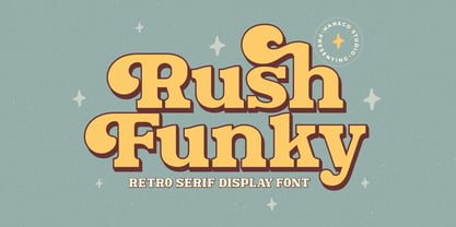 Rush Funky is a serif typeface with vintage and retro look!. Equipped with all complete characters ranging from uppercase letters, lowercase letters, numbers, punctuation marks and multi-lingual support, this font is ready to be used in any project. Uppercase & Lowercase Numbers & Punctuation Multilingual Alternate character & ornament How to access alternate / ornament ? : https://hanscostudio.com/tutorial/ Enjoy!
 - Rust Core by Salamahtype,
$19.00 Introducing our font called “RUST CORE” – display font with 4 styles included (Clean and Stamp/Textured). Perfect for branding projects, logos, labels and more. With texture like rust core, will make your design, product, logo or label more cool, unique and meaningful. Font: All caps characters (4 styles) Numbers, symbols, and punctuation Multilingual support Enjoy our cool font! Thank you.
 - Speed Rush by Pixesia Studio,
$10.00 Speed Rush - A Race Display Font Speed Rush is an assertive and modern display font that oozes strength and toughness. It suits perfectly any racing theme or online game. Have fun with this beautiful font and explore its endless variations. FEATURES - Uppercase and Lowercase letters - Numbering and Punctuations - Multilingual Support - Works on PC or Mac - Simple Installation - Support Adobe Illustrator, Adobe Photoshop, Adobe InDesign, also works on Microsoft Word Hope you Like it. Thanks.
 - Rusted Bevel by Gleb Guralnyk,
$13.00 Introducing a vintage rough font set "Rusted Bevel". It includes three font files for combining and easy recoloring a textured bevelled effect.
 - Sticky Rush by Bogstav,
$16.00 This is my and it's handmade super legible sans font. Very suitable for anything that needs a clearly handmade look, but not overdoing it. I've added several different versions, and they all fit on top of each other - or you can use them just fine as individual fonts.
 - Rusted Sabbath by Ferry Ardana Putra,
$99.00 Introducing our brand new black metal font! It is Rusted Sabbath, baby! This savage death metal font can be used for logos or branding and your metal band name without having to pay for expensive logo-making services. You can immediately make your band or brand logo name by buying this font. Combine it with the death metal ornaments and make your death metal design with ease! This black metal typeface is perfect for logotypes, t-shirts, vintage badges, branding, packaging, posters, clothing brands, horror movies, album covers, and many more! ——— Rusted Sabbath features: A full set of uppercase and lowercase Numbers and punctuation Multilingual language support PUA Encoded Characters OpenType Features +295 Total Glyphs +Death Metal Ornaments included! ——— Rusted Sabbath Includes: Rusted Sabbath Regular
 - Intro Rust by Fontfabric,
$25.00 Intro Rust is one of the biggest packages on the market, including 214 fonts. The font family is a rough version of the famous Intro. Intro Rust includes 4 sub-families - Intro Rust, Intro Script, Intro Head and Intro Goodies. It can be used to create almost all types of design projects like print materials and web design. Just use your imagination and your project will become more alive and vivid than ever with one of the Intro Rust fonts. You want to make a greeting card or a package design, or even a brand identity? Feel free to play with all the patterns and shapes, scripts or those cool fonts with the dots and that will lead you to your next successful project.
 - Zing Rust by Fontfabric,
$29.00 Zing Rust is a truly handmade type system consisting of 238 fonts. This incredible font family is based on layer combinations and gives endless possibilities to mix and make various designs. Each style could be used separate or merged in order to achieve all the creative designs you can imagine. The font is based entirely on hand writing which brings an aesthetics that can’t be imitated with any computer filters, scripts or plugins. Having moderate proportions Zing RustTM is the perfect solution for logos and headlines that really stand out. Zing Goodies As a dessert we serve you Zing GoodiesTM that tops off the whole package, making it the extraordinary delicacy! It has 4 basic forms—Bakery, BBQ, Banners and Words — with two style each, which contain plenty of adorable icons for any food and taste, elaborated banners, ribbons and ornaments, and even beautiful selection of useful words accentuating your design.
 - Cherry Rush by D&K Project,
$15.00 Cherry Rush - It's fun, it's cute, it's smooth, and it's mighty splash. A mixed-case font (Uppercase and lowercase) with lots of combination possibilities, make greats fun display! It's good to make a logotype, sticker, fun kids sign, and other lettering project. This fun is perfect combination uppercase and lowercase. This font contains all uppercase, lowercase, numbers and basic punctuation also a fun 40 ligatures. (If you're having trouble finding the basic punctuation, you can access it in the Glyphs panel) Please let me know in the comments what you think or if you have any issues or queries , If you have any questions about licensing, need help with a typeface, or would like to request a new feature, drop me a message.
 - Rusted Brushpen by Gleb Guralnyk,
$13.00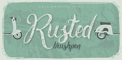 Introducing handcrafted "Rusted brushpen" font. It's a fancy brushpen script with rough grungy effect.
 - August Rush by Callie Sharp,
$13.00 August Rush is a delicate handwritten script font. The font comes in 2 weight options: regular and semi-bold. It's best used as a main headlines or as a secondary headline combed with other simple serif or sans-serif fonts. It can be used for various designs such as packaging, wedding stationery or branding.
 - Rush Twist by madeDeduk,
$14.00 Rust Twist is a font duo signature and sans display. Signature includes more than 145 ligatures to make everything look natural handmade signature and sans display come out with a lot alternative and ligature so you can be much creative with your designs. Feature Uppercase & Lowercase Number & Symbol International Glyphs Multilingual support Alternative Ligature Hope you enjoy it.


Page 1 of 250Next page