2,162 search results (0.029 seconds)
  1. Melancholy by Blechmen, $20.00
    Melancholy is designed to be a rough and blotchy typeface that replicates ink from a typewriter. The letters themselves are meant to be imperfect with a nice flow. The typeface can act as a more natural sans-serif, and provide relief from reading normal perfect sans-serif typefaces. Melancholy comes in three different styles; regular, delusional and glitch.
  2. MKAbelRough-random - 100% free
  3. Bad - Unknown license
  4. Jelek - 100% free
  5. So Run Down - Unknown license
  6. SmallTypeWriting - 100% free
  7. Fraught by Morganismi, $12.00
    Fraught is a rough tough stencil font for hard use. Feel the touch of cracked concrete, rusty iron and undressed board. Fraught supports most European languages.
  8. Silk Remington Pro by Jadugar Design Studio, $19.00
    Silk Remington Pro is the best Typewriter font with 14 variations, one of the most variations in typewriter fonts available in market. It's designed to give a real typewriter feel.
  9. Teamhair Tower by Evertype, $20.00
    Teamhair Tower is a “rough” monowidth font based on the face used on the old Sears Tower Gaelic manual typewriter. Teamhair was first digitized in 2002 by Michael Everson and originally used the MacGaelic character set on the Macintosh platform, and ISO/IEC 8859-14 on the PC. In 2008 Doire version 3 was released in OpenType format, completely compliant with Unicode encoding and with an extended character set.
  10. Suomi Slab Serif by Suomi, $19.00
    All typewriter types are rounded and especially American Typewriter has an almost too-slick appearance. Suomi Slab Serif has the glyph shapes similar to typewriting, but the serifs, terminals and connections are crisp and sharp.
  11. TiredOfCourier by Ingrimayne Type, $14.95
    Courier is the king of typewriter faces. But if you want an alternative, something with a look reminiscent of the older, manual typewriters, consider TiredOfCourier. The family includes true italics, something very unusual in a typewriter face.
  12. Courier Now - Unknown license
  13. The Rio Lobo - Unknown license
  14. Chisel Mark - 100% free
  15. Grunge Serifia - Unknown license
  16. Doire Royal by Evertype, $20.00
    Doire is a monowidth font based on the face used on the old Royal Gaelic manual typewriter. Doire Royal is a “rough” version of that font. Doire was first digitized in 1993 by Michael Everson and originally used the MacGaelic character set on the Macintosh platform, and ISO/IEC 8859-14 on the PC. In 2008 Doire version 3 was released in OpenType format, completely compliant with Unicode encoding and with an extended character set.
  17. Darmhagh Underwood by Evertype, $20.00
    Darmhagh Underwood is a “rough” monowidth font based on the face used on the old Underwood manual typewriter. Darmhagh Underwood was first digitized in 1999 by Michael Everson and originally used the MacGaelic character set on the Macintosh platform, and ISO/IEC 8859-14 on the PC. In 2008 Darmhagh Underwood version 3 was released in OpenType format, completely compliant with Unicode encoding and with an extended character set. The particular Underwood typewriter from which samples were taken to design Darmhagh Underwood is on display in the National Library of Ireland. It belonged to Conradh na Gaeilge and was used to draft armistice documentation which led to the end of the Irish War of Independence in 1921. Darmhagh is pronounced [ˈdaɾuː].
  18. LD Remington Portable by Illustration Ink, $3.00
    This font represents the type style created by this very famous classic typewriter. Remington was considered the father of all typewriter companies.
  19. Click Clack by Fonthead Design, $15.00
    ClickClack is a family designed by Ethan Dunham that is made of hand-drawn typewriter letters. An actual sample of a typewriter alphabet was blown up and carefully traced into the two versions, regular and light. This family has a bouncy, informal feel and is a departure from other typewriter fonts.
  20. Apothecary by Pixel Colours, $26.00
    Apothecary is a modern stylish font duo that includes a sweet flowing script font and a typewriter font made from an authentic typewriting. Combine both fonts to create beautiful logos and branding. Design professional apothecary and botanical labels and packaging or make elegant wedding invitations. Includes: Apothecary regular: a script flowy monoline font Apothecary typewriter: an antique typewriter font perfect for small texts, taglines or info Lowercase and uppercase characters Numerals, alternates and ligatures. Language support
  21. Linoset by Ensor Creative, $20.00
    Linoset was created from cut and printed linoleum. The lettering is based on Helvetica Neue Condensed Bold – it has been cut, printed and re-drawn to take on a completely new life – it's rough, tough and downright nasty!
  22. Linotype Typo American by Linotype, $29.99
    Mark Stanczyk designed Linotype Typo American in 1999. The font is an excellent revival of American style typewriter type. As most of us can remember from our childhood years, or through old stories and movies, everyone used to type with typewriters before the invention of computers. Unlike computers, most individual typewriters only had one typestyle, or font, to chose from. To make matters worse, the letters in a typewriter font would wear down with use. Over time, text typed out on a typewriter would look more and more corroded, old, and uneven. Stanczyk has captured exactly these features in this “revival” font! Also like most older typewriter styles, Linotype Typo American’s letters are all mono-spaced, i.e., the letter i is the same width as the letter w. Typewriter letters also all tended to be cast in the same size, around 12 points or so. When using typewriter-style fonts, it is best to keep setting your text in similar sizes. (Of course, you can set really large and fun headlines with Linotype Typo American, too; if anything the unevenness of the design will come even more across in these applications.)
  23. Keystoned by TypeArt Foundry, $45.00
    Typewriter with problem keys.
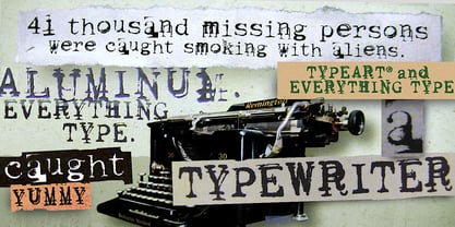
  24. Speedwriter - Personal use only
  25. ChickClicks - Unknown license
  26. Cub Reporter JNL by Jeff Levine, $29.00
    In the 1934 edition of the American Type Foundry’s “Book of American Type” is a selection of letterpress fonts which emulate typewriter faces. One design named “Bulletin Typewriter” served at the model for Cub Reporter JNL, and is available in both regular and oblique versions. The font has been monospaced in order to add a more traditional typewriter look to any project.
  27. KG Wake Me Up by Kimberly Geswein, $5.00
    Fun blocky typewriter-esque lettering.
  28. Romanstone by TypeArt Foundry, $45.00
    Typewriter simulation with extreme inking imperfections.
  29. Dear John by TypeArt Foundry, $45.00
    Typewriter simulation with slight inking imperfections.
  30. Writing Machine by TypeArt Foundry, $45.00
    Typewriter simulation with moderate inking imperfections.
  31. This Man This Monster by Comicraft, $19.00
    Half Man, Half Monster, Comicraft’s latest variable font hybrid is not only your burly, hard-edged, upfront and blunt buddy, it’s also your rough-hewn, tough and grim, rocky-featured pal! Not just Two-in-One, our latest offering brings together Four Fantastic Faces!
  32. KG Already Home by Kimberly Geswein, $5.00
    A cute doodled outline typewriter style font.
  33. Remix by Intellecta Design, $20.00
    a typewriter font with many style variations
  34. Typist Slab Mono by VanderKeur, $25.00
    The typeface Typist originated during an extensive research on the origin and development of typewriter typestyles. The first commercially manufactured typewriter came on the market in 1878 by Remington. The typestyles on these machines were only possible in capitals, the combination of capitals and lowercase came available around the end of the nineteenth century. Apart from a few exceptions, most typestyles had a fixed letter width and a more or less unambiguous design that resembled a thread-like structure. A lot of this mechanical structure was due to the method the typestyles were produced. Looking at type-specimens for print before the first typewriters were good enough to came on the market we can see that in 1853 and in 1882 Bruce’s Type Foundry already had printing type that had a structure of the typewriter typestyles. Of course printing types were proportional designed as typewriter typestyles had a fixed width. So it is possible that except from the method of production for typewriter typestyles, the design of printing types were copied. In the design of the Typist, the purpose was – next to the monospace feature – to include some of the features of the early typewriter typestyles. Features such as the ball terminals and the remarkable design of the letter Q. This new typeface lacks the mechanical and cold look of the early typewriter typestyles. The Typist comes in six weights with matching italics in two versions. One that resembled the early typewriter typestyles (Typist Slab) and a version designed with coding programmers in mind (Typist Code).
  35. Typist Code Mono by VanderKeur, $25.00
    The typeface Typist originated during an extensive research on the origin and development of typewriter typestyles. The first commercially manufactured typewriter came on the market in 1878 by Remington. The typestyles on these machines were only possible in capitals, the combination of capitals and lowercase came available around the end of the nineteenth century. Apart from a few exceptions, most typestyles had a fixed letter width and a more or less unambiguous design that resembled a thread-like structure. A lot of this mechanical structure was due to the method the typestyles were produced. Looking at type-specimens for print before the first typewriters were good enough to came on the market we can see that in 1853 and in 1882 Bruce’s Type Foundry already had printing type that had a structure of the typewriter typestyles. Of course printing types were proportional designed as typewriter typestyles had a fixed width. So it is possible that except from the method of production for typewriter typestyles, the design of printing types were copied. In the design of the Typist, the purpose was – next to the monospace feature – to include some of the features of the early typewriter typestyles. Features such as the ball terminals and the remarkable design of the letter Q. This new typeface laks the mechanical and cold look of the early typewriter typestyles. The Typist comes in six weights with matching italics in two versions. One that resembled the early typewriter typestyles (Typist Slab) and a version designed with coding programmers in mind (Typist Code).
  36. Grunge - Unknown license
  37. Downcome - 100% free
  38. BackSplatter - Unknown license
  39. Dirty Headline - Unknown license
Looking for more fonts? Check out our New, Sans, Script, Handwriting fonts or Categories
abstract fontscontact usprivacy policyweb font generator
Processing