10,000 search results
(0.038 seconds)
- Moline Quotes Sans by Ayska,
$20.00
- Neo Sans Paneuropean by Monotype,
$114.99 - FF Page Sans by FontFont,
$47.99
- Garota Sans SC - Personal use only

- LT Edge Sans - 100% free

- Ams Trame - 100% free

- Dirty Ames - Unknown license

- I Am - Unknown license

- Am Beauty by Tilde,
$29.75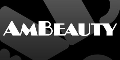
- One AM by T-26,
$29.00 - AM Bright by Angga Mahardika,
$16.00
- Ames' Shaded by Greater Albion Typefounders,
$16.00
- AM Fame by Alexey Markin,
$40.00
- AM Consist by Alexey Markin,
$50.00
- AM Racy by Alexey Markin,
$20.00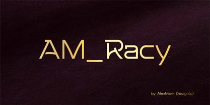
- AM Siola by URW Type Foundry,
$39.99
- Ames' Roman by Greater Albion Typefounders,
$16.00
- Ames' Weathered by Greater Albion Typefounders,
$16.00
- Ebrima SA by Microsoft Corporation,
$49.00 - Ames' Text by Greater Albion Typefounders,
$16.00
- AM Godina by Errea Type,
$10.00
- SA Tampico by Artcoast,
$9.00
- AM Floriana by URW Type Foundry,
$39.99
- D3 LiteBitMapism Bold-Selif - Unknown license

- Sandalwood JNL by Jeff Levine,
$29.00
- Cicero Series 2 by Alphabet Agency,
$15.00
- Geogrotesque Condensed Series by Emtype Foundry,
$69.00
- Gracia Series 50 by astype,
$30.00
- Geogrotesque Expanded Series by Emtype Foundry,
$69.00
- Concert Series JNL by Jeff Levine,
$29.00
- Gracia Series 40 by astype,
$30.00
- Guayaba Sans - personal use - Personal use only

- SF Diego Sans Condensed - Unknown license

- Andreas Sans Cnd Oblique - Unknown license

- SF Diego Sans Outline - Unknown license

- I hate Comic Sans - Unknown license

- SF Diego Sans Outline - Unknown license

- Eleme S Sans HBold - Unknown license

- SF Diego Sans Condensed - Unknown license

- SF Diego Sans Shaded - Unknown license


