8,278 search results
(0.024 seconds)
- Quirick by Gatra Std,
$10.00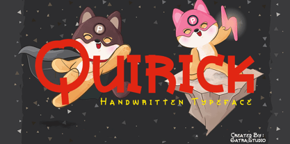 Introducing a cute handwriting "QUIRICK" Handwritten Display Font! If you are needing a touch of casual modern display for your designs, this font was created for you! What's Included: Uppercase and Lowercase Number and Punctuation Support Language This font works best in a program that supports OpenType features such as Adobe Indesign, Adobe Illustrator CC and CS, or Adobe Photoshop CC and CS also CorelDraw More Questions? Here are some (potential) answers! Do not to resell this font in any way. Multilingual Support is included for Western European Languages Have a Wonderful Day, Gatra Std
 - Bleheri by Gatra Std,
$15.00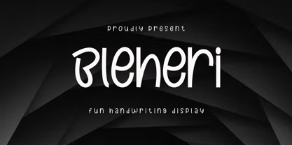 Introducing a cute handwriting "Bleheri" display font If you are needing a touch of casual modern calligraphy for your designs, this font was created for you! What's Included: - Uppercase and Lowercase - Number and Punctuation - Support Language This font works best in a program that supports OpenType features such as Adobe Indesign, Adobe Illustrator CC and CS, or Adobe Photoshop CC and CS also CorelDraw More Questions? Here are some (potential) answers! Do not to resell this font in any way. Multilingual Support is included for Western European Languages Have a Wonderful Day!
 - Klepon by Gatra Std,
$15.00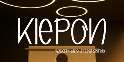 Introducing a cute handwriting "Klepon" display font If you are needing a touch of casual modern calligraphy for your designs, this font was created for you! What's Included: - Uppercase and Lowercase - Number and Punctuation - Support Language This font works best in a program that supports OpenType features such as Adobe Indesign, Adobe Illustrator CC and CS, or Adobe Photoshop CC and CS also CorelDraw More Questions? Here are some (potential) answers! Do not to resell this font in any way. Multilingual Support is included for Western European Languages Have a Wonderful Day, Gatra Std
 - Surf And Turf JNL by Jeff Levine,
$29.00 Surf and Turf JNL was redrawn from hand-lettering on a souvenir folder for an event believed to be sponsored by Miami Beach's exclusive Surf Club on March 19, 1938. Entitled "Steeplechase Pier March 19 Surf Club Stroller", it's now lost to time whether the event recreated some of the fun and games of Atlantic City's famed Steeplechase Pier at the Surf Club, or if this was a special event trip to the New Jersey venue. It's also highly possible that the Steeplechase Pier referred to in the title was the one at Coney Island.
 - Limboek by Gatra Std,
$10.00 Introducing a cute handwriting "Limboek" Handwritten Display Font! If you are needing a touch of casual modern display for your designs, this font was created for you! What's Included: Uppercase and Lowercase Number and Punctuation Support Language This font works best in a program that supports OpenType features such as Adobe Indesign, Adobe Illustrator CC and CS, or Adobe Photoshop CC and CS also CorelDraw More Questions? Here are some (potential) answers! Do not to resell this font in any way. Multilingual Support is included for Western European Languages Have a Wonderful Day, Gatra Std
 - Rantang by Gatra Std,
$12.00 Introducing a modern&elegant "Rantang" signature script If you are needing a touch of casual elegant signature script for your designs, this font was created for you! What's Included: Uppercase and Lowercase Ligatures Alternates Number and Punctuation Support Language This font works best in a program that supports OpenType features such as Adobe Indesign, Adobe Illustrator CC and CS, or Adobe Photoshop CC and CS also CorelDraw More Questions? Here are some (potential) answers! Do not to resell this font in any way. Multilingual Support is included for Western European Languages
 - Beardsons by Arterfak Project,
$20.00 Introducing our new exploration Beardsons, another vintage-inspired font with the additional effect: Normal - Inline - Shadow, packed as the layered font. Collected from many references such as vintage signage, logo, badges, and old fashioned graphics. Beardsons is An all-caps font, carefully crafted with a high ornamental taste. Beardsons is perfect for many display purposes. You can use this font for poster, label, logo, signboard, t-shirt, book cover, decoration, merchandise, and more! Multilingual support with extra ornaments included! Fonts featured: Uppercase Smallcaps Numbers & symbols Stylistic alternates Accented characters: ����������������������������ތ������������������������������������ Thank you for watching!
 - Morenita by John Moore Type Foundry,
$20.00 Morenita is a script letter style, very basic geometric construction which refers to the style and the Art Deco glory, designed to provide a highly readable. It comes in two weights, Regular and Bold, italic versions both comes equipped with terminals and final words or tails in ways very easy to apply glue. Ideal for creative banner ads, versatile and readable form makes it’s ideal to creating logos or marks or create modern invitations, children’s publications or interesting or video or film credits. His look goes from vintage to contemporary.
 - TT Marxiana by TypeType,
$59.00 TT Marxiana useful links: Specimen | History of creation | Graphic presentation | Customization options Please note! If you need OTF versions of the fonts, just email us at commercial@typetype.org About TT Marxiana: TT Marxiana is a project to reconstruct a set of pre-revolutionary fonts that were used in the layout of the "Niva" magazine, published by the St. Petersburg publishing house A.F. Marx. In our project, we decided to focus on a specific set of fonts that were used in the preparation and printing of the "Niva" magazine in 1887, namely its Antiqua and Italic, Grotesque and Elzevir. As part of the TT Marxiana project, we sought to adhere to strict historicity and maintain maximum proximity to the paper source. We tried to avoid any “modernization” of fonts, unless of course we consider this to be kerning work, the introduction of OpenType features and creation of manual hinting. As a result, with the TT Marxiana font family, a modern designer gets a full-fledged and functional set of different fonts, which allows using modern methods and using modern software to create, for example, a magazine in a design typical of the late 19th century. The TT Marxiana project started in the late summer of 2018 and from the very beginning went beyond the traditional projects of TypeType because of the importance of preserving the historical identity. Since up to this point, we had never before reconstructed the font from historical paper sources and with such a level of elaboration and attention to detail, it took us two years to implement this project. You can read more about all stages of the project in our blog, and here we will briefly talk about the result. As it turned out, drawing a font following the scanned pages of a century-old magazine is a very difficult task. In fact, such a font reconstruction very much resembles archaeological excavations or solving a complex cipher, and all these efforts are needed only in order to finally understand what steps need to be taken so that the resulting font is not just an antiqua, but the specific and accurate antiqua from "Niva" magazine. In addition, due to the specifics of printing, same characters in the old magazine setting looked completely different, which greatly complicated the task. In one place, there was less ink than needed, and the letter in the reference was not well-printed and thin, in some other place there was more ink and the letter had flooded. An important task was to preserve and convey this feeling of typographic printing, but at the same time it was important to identify the common logic and character of the dot gains so that the font would form a harmonious, single, but at the same time lively picture. Since the "Niva" magazine was historically published in Russian, the magazine had no shortage of references for the reconstruction of Cyrillic characters, but there were not many Latin letters in the magazine at all. In addition, the paper source lacked a part of punctuation, diacritics, there were no currency signs nor ligatures at all—we developed all these characters based on font catalogs of the 19–20 centuries, trying to reflect characteristic details from the main character composition to the max. So, for example, the Germandbls character, which is not in the original "Niva" set, we first found in one of the font catalogs, but still significantly redesigned it. We decided that in such a voluminous project, only graphic similarities with the original source are not enough and we came up with a feature that can be used to exchange modern Russian spelling for pre-revolutionary spelling. When this feature is turned on, yat and yer appear in the necessary places (i, ѣ, b, ѳ and ѵ), the endings of the words change, and so appears a complete sensation of the historical text. This feature works in all fonts of the TT Marxiana font family. TT Marxiana Antiqua is a scotch style serif, the drawing of which carefully preserved some of the artifacts obtained by printing, namely dot gain, a slight deformation of the letters and other visual nuances. TT Marxiana Antiqua has an interesting stylistic set that imitates the old setting and in which some of the signs are made with deliberate sticking or roughness. Using this set will provide an opportunity to further simulate the setting of that great time. TT Marxiana Grotesque is a rather thick and bold old grotesk. Its drawing also maximally preserved the defects obtained during printing and characteristic of its paper reference. In addition to pre-revolutionary spelling, TT Marxiana Grotesque has a decorative set with an inversion. This is a set of uppercase characters, numbers and punctuation, which allows you to type inverse headers, i.e. print white on black. As a result of using this set, you get the text against black bars—this way of displaying was very characteristic for print advertising at the turn of the century. In addition, about 30 decorative indicator stubs were drawn for this set: arrows, hands, clubs, etc. TT Marxiana Elzevir is a title or header font and is a compilation of monastic Elzevir that were actively used in the "Niva" magazine for all its prints. Unlike the antiqua, TT Marxiana Elzevir has sharper forms, and the influence of deformations from typographic printing is not as noticeable in the forms of its signs. This is primarily due to the specifics of its drawing and the fact that it was usually used as a heading font and was printed in large sizes. The height of the lowercase and uppercase characters of Elsevier is the same as the heights of the antiqua, but the font is more contrasting and lighter, it has a lot of white and, unlike the antiqua and the grotesque, there are a lot of sharp corners. An exclusive feature of the TT Marxiana Elzevir is an alternative set of uppercase characters with swash. • TT Marxiana Antiqua consist of 625 glyphs each and and it has 23 OpenType features, such as: aalt, ccmp, locl, subs, sinf, sups, numr, dnom, frac, ordn, lnum, pnum, tnum, onum, salt, calt, liga, ss01, ss02, ss03, ss04, ss05, case. • TT Marxiana Antiqua Italic consist of 586 glyphs each and and it has 22 OpenType features, such as: aalt, ccmp, locl, subs, sinf, sups, numr, dnom, frac, ordn, lnum, pnum, tnum, onum, salt, calt, liga, ss01, ss02, ss03, ss04, case. • TT Marxiana Grotesque consists of 708 glyphs and it has 22 OT features, such as: aalt, ccmp, locl, subs, sinf, sups, numr, dnom, frac, ordn, lnum, pnum, tnum, onum, salt, calt, liga, ss01, ss02, ss03, ss04, case. • TT Marxiana Elzevir consists of 780 glyphs and it has 21 OT features, such as: aalt, ccmp, locl, ordn, frac, tnum, onum, lnum, pnum, calt, ss01, ss02, ss03, ss04, ss05, ss06, salt, c2sc, smcp, case, liga. FOLLOW US: Instagram | Facebook | Website TT Marxiana language support: Acehnese, Afar, Albanian, Alsatian, Aragonese, Asu, Aymara, Banjar, Basque, Belarusian (cyr), Bemba, Bena, Betawi, Bislama, Boholano, Bosnian (cyr), Breton, Bulgarian (cyr), Catalan, Cebuano, Chamorro, Chiga, Cornish, Corsican, Cree, Danish, Dutch, Embu, English, Erzya, Estonian, Faroese, Fijian, Filipino, Finnish, French, Friulian, Gaelic, Galician, German, Gusii, Haitian Creole, Hiri Motu, Hungarian, Icelandic, Ilocano, Indonesian, Interlingua, Irish, Italian, Javanese, Judaeo-Spanish, Kabuverdianu, Kalenjin, Karachay-Balkar (cyr), Kashubian, Khasi, Khvarshi, Kinyarwanda, Kirundi, Kongo, Kumyk, Ladin, Leonese, Luganda, Luo, Luxembourgish, Luyia, Macedonian, Machame, Makhuwa-Meetto, Makonde, Malagasy, Malay, Manx, Mauritian Creole, Minangkabau, Montenegrin (cyr), Mordvin-moksha, Morisyen, Nauruan, Ndebele, Nias, Nogai, Norwegian, Nyankole, Occitan, Oromo, Palauan, Polish, Portuguese, Rheto-Romance, Rohingya, Romansh, Rombo, Rundi, Russian, Rusyn, Rwa, Samburu, Sango, Sangu, Scots, Sena, Serbian (cyr), Seychellois Creole, Shambala, Shona, Soga, Somali, Sotho, Spanish, Sundanese, Swahili, Swazi, Swedish, Swiss German, Tagalog, Taita, Tetum, Tok Pisin, Tsonga, Tswana, Ukrainian, Uyghur, Valencian, Volapük, Võro, Vunjo, Walloon, Xhosa, Zulu.
 - Clockmaker by Sudtipos,
$49.00 Sudtipos is proud to announce the release of Clockmaker, an 8-weight family that takes initial inspiration from typography around the turn of the twentieth century. Clockmaker takes aesthetic references from Victorian, Art Nouveau and Art Deco advertising and typography, taking special influence from John F. Cummings’ all-caps – and never digitized – type design Elandkay. Clockmaker is a robust multi-weight family that includes an array of ligatures as well as alternate characters and support for all latin languages. The design process began with developing and modernizing the uppercase letterforms, followed by designing the lowercase and additional weights. Creating a diverse and playful set of uppercase ligatures was an almost endlessly enjoyable task; they are one of Clockmaker’s most charming features. Clockmaker is an impeccable choice for designs requiring a vintage flair such as a luxury liquor labels, restaurant identities, lavish hotels and many other applications where elegance and grace are needed. In addition to its historical references, Clockmaker is an homage to my grandfather who was a master craftsman, repairing antique clocks and fine watches with great skill and mathematical precision. Watching him work was fascinating and it has been a joy to remember those quiet and curious moments from my childhood while designing this font.
 - Vena Amoris by Delve Fonts,
$49.00 New Orleans, June 25, 1895 My dear Edmond, I found upon my return home to dinner yesterday, your letter informing me of your affection for Annie and asking that we confide her future happiness to your keeping... This excerpt was taken from a letter written by designer Kathryn Podorsky’s great-great-grandfather, Lucien Doize, in response to Edmond’s request to marry his daughter, Annie. The letter was not only beautiful contextually, but exquisitely penned and epitomized the delightful charm of the New Orleans people of the time. Vena Amoris, or “Vein of Love” refers to a phrase coined by Henry Swinburne in his A Treatise of Espousal published in 1686. Vena Amoris also refers to the fourth finger on the left hand which was traditionally believed to contain a vein running directly to the heart, hence “the ring finger.” As a digital font, Vena Amoris boasts an extensive Latin-based character set that supports 51 languages. Also included are stylistic and contextual alternates, ligatures, swash variants, oldstyle figures, and roman numerals and calligraphic words that will undoubtedly bring a dynamic quality to any setting. All of those extras are driven by cleverly applied OpenType features allowing you to add harmony and calligraphic beauty to your layout.
 - Tombstone, designed by Iconian Fonts, is a distinctive typeface that captures the essence of the Wild West and evoking the rugged aesthetics of historical tombstones. This font stands out due to its ...
- Pea Lyndal, a free handwriting font from Fonts For Peas, encapsulates the charm and personality you’d expect from a thoughtfully designed personal handwriting style. Its creation, inspired by individ...
- Akvaléir is a captivating font that seems to echo the murmuring tales of mythical sea realms and the elegance of Art Nouveau design. It stands as a testimony to the beauty of fluidity in typography, ...
- Jerash Demo by David F. Nalle is a distinctive font that immerses users into the depths of artistic expression and historical resonance. Crafted with an acute attention to detail, this typeface bridg...
- Kaushan Script - 100% free

- d puntillas A Lace - Personal use only

- Fucked Plate - Unknown license

- Bones Bummer - Unknown license

- Steiner - Unknown license

- Garino Variable by Julien Fincker,
$185.00 About Garino: Garino is a modern sans-serif typeface family. It gains its expressive character from a dynamic sweep in the curves and high-contrast transitions. The thinner and thicker weights are particularly suitable for strong headlines, while the middle weights can be used for typographic challenges and body text. As a result, it can be used in a reserved as well as an expressive way. Thanks to an extensive character collection, it becomes a real workhorse. A versatile allrounder that is up to all challenges – for Corporate Identity, Editorial, Branding, Orientation and Guidance systems and much more. Variable Font The Variable font contains 2 axes: weight and oblique – all in just one file. Features: With over 1165 characters, it covers over 200 Latin-based languages. It has an extended set of currency symbols and a whole range of Open Type Features. There are alternative characters as stylistic sets, small caps, automatic fractions – just to name a few. Arrows and numbers: In particular, the extensive range of arrows and numbers should be highlighted, which are perfectly suited for use in orientation and guidance systems. Thanks to Open Type Features and an easy system, the various designs of arrows and numbers can also be simply "written" without first having to select them in a glyph palette. Get the static version of the Garino family here: https://www.myfonts.com/fonts/julien-fincker/garino/
 - Garino by Julien Fincker,
$34.99 About Garino: Garino is a modern sans-serif typeface family. It gains its expressive character from a dynamic sweep in the curves and high-contrast transitions. The thinner and thicker weights are particularly suitable for strong headlines, while the middle weights can be used for typographic challenges and body text. As a result, it can be used in a reserved as well as an expressive way. Thanks to an extensive character collection, it becomes a real workhorse. A versatile allrounder that is up to all challenges – for Corporate Identity, Editorial, Branding, Orientation and Guidance systems and much more. Features: The Garino family has a total of 20 styles, from thin to heavy with matching italics. With over 1165 characters, it covers over 200 Latin-based languages. It has an extended set of currency symbols and a whole range of Open Type Features. There are alternative characters as stylistic sets, small caps, automatic fractions – just to name a few. Arrows and numbers: In particular, the extensive range of arrows and numbers should be highlighted, which are perfectly suited for use in orientation and guidance systems. Thanks to Open Type Features and an easy system, the various designs of arrows and numbers can also be simply "written" without first having to select them in a glyph palette. Get the Variable Font here: https://www.myfonts.com/fonts/julien-fincker/garino-variable/
 - FF Scuba by FontFont,
$62.99 German type designer Felix Braden created this sans FontFont in 2012. The family has 16 weights, ranging from Thin to Black (including italics) and is ideally suited for advertising and packaging, editorial and publishing, logo, branding and creative industries, poster and billboards, wayfinding and signage as well as web and screen design. FF Scuba provides advanced typographical support with features such as ligatures, alternate characters, case-sensitive forms, fractions, super- and subscript characters, and stylistic alternates. It comes with a complete range of figure set options – oldstyle and lining figures, each in tabular and proportional widths.In 2013, FF Scuba received the CommArts award and was also selected as one of Typographica’s favorite typefaces of 2012.
 - Rundigsburg by Ingrimayne Type,
$9.95 Is Rundigsburg a calligraphic face morphing into sans serif or sans serif reverting back to a medieval, calligraphic face? The letters are angular and some retain traces of older letter forms, but the ornamentation is gone. Rundigsburg is decorative but also very legible, suitable for both display and some text purposes. The family has four weights, each with an italics style. There are two shadowed versions and each has an "inside" style designed for uses in layers with its shadowed style to add color. These "inside" style are similar to the light style but the spacing matches its shadowed complement. Among Rundigburgs OpenType features are a few basic fractions and some alternative letter forms.
 - Borensa by Arterfak Project,
$28.00 Introducing Borensa. our brand new serif exploration with reversed contrast and unique shapes. Inspired by the historical books and vintage signage. Borensa is classically elegant to be applied to formal designs and can be used for the headline and long text. This font also has some alternates characters to give you some options in making the design. You can use Borensa for editorial, label, invitation, newspaper, books, poster, flyer, signboard, logo, branding, merchandise, apparel, and many more! We recommend you to use a program that has OpenType support such as Photoshop, Illustrator, Indesign, CorelDraw, etc. Featured : Uppercase Lowercase Numbers & symbols Accented characters Stylistic alternates Ligatures. Thank you for your support and have a nice day!
 - Fresh Paint by Graffiti Fonts,
$29.99 Super fresh paintbrush style lettering with a definite graffiti slant. Reverse italic and highly detailed these hand-made letters, splats, swipes, numbers and symbols give an energetic human feel to your custom text. This font is an all-caps style with no real lowercase letters however the single font actually contains 3 full alphabets (78 individual letters) so you can mix and match to create endless unique letter combinations. Fresh Paint also includes several highly detailed paint splatters, brush strokes and swipes to use along with your custom lettering. All glyphs are created from hand made, painted letters, all splatters and strokes are made from real specimens & have sufficient detail to work even at very large sizes.
 - Rare Bird Specimen II by Rare Bird Font Foundry,
$100.00 RARE BIRD SPECIMEN II Specimen II is an elegant hand by Karla Lim of Written Word Calligraphy. It floats across the page on gossamer wings. Specimen II pairs well with classic typefaces like Baskerville, Garamond and Bodoni. OBSERVATIONS Specimen II is exquisitely delicate but not fragile. Best suited for unforgettable affairs. DEFINING CHARACTERISTICS Opentype programming, formal title & preposition wordart, 7 alternate ëandí options, Roman numerals, in and out-stroked letterforms at beginning and end of words, multiple alternate lowercase t cross-strokes, realistic double-letter ligatures, seamlessly connecting calligraphic letters, alternate capital letters, old style numerals, basic Latin encoding. POTENTIAL SIGHTINGS Wedding stationery suites, logo design, luxury product packaging, fragrance, wine labels.
 - Opal Bulgarian by Context Foundry,
$6.00 Opal Bulgarian is a humanistic sans serif typeface of a modern type, inspired by the famous Optima typeface (designed by Hermann Zapf). Opal Bulgarian consists of 2 weights and corresponding italics. Opal Bulgarian is suitable for body texts; for titles; for corporate identity. Opal Bulgarian continues the design of Opal BulgarianCYR, designed in 1992 by Zhivko Stankulov. In compare to Opal BulgarianCYR the new font family Opal Bulgarian has more glyphs and cover more languages. A number of shortcomings in the construction of the glyphs have been eliminated, and the design as a whole has been updated. Opal Bulgarian is available with active support and upgradeability. Licensees will receive all new versions of the font free of charge.
 - Aziga by Eclectotype,
$40.00 In a typeface category that has been sorely under-represented until now, Aziga is a high (occasionally reversed) contrast, postmodern, deconstructed-reconstructed, serifless (mostly), fashion didone! Aziga lends itself to being set loud and proud, and the consistent angles throughout the glyphs make it a good candidate for more abstract typographic compositions. For the really graphically inclined (excuse the pun) a rotation of 66° will make the main diagonals in the font horizontal and vertical. Cool right? Features include stylistic and contextual alternates, ligatures and case sensitive forms. This is an unusual font, that’s for sure, but give it a try and you'll be rewarded with layouts that really stand out from the crowd.
 - PF Adamant Pro by Parachute,
$59.00 The Adamant family is a serif typeface that comes in six weights, from Light to ExtraBold, each with italic and small caps versions. It has received an original typeface award from Granshan Awards 2010. Every font in this family includes ligatures, lining and oldstyle figures in proportional and tabular widths, fractions, alternate characters, and other typographic features. The weights are finely balanced so that they can be easily combined, depending on type of paper and print conditions. Its proportions, sturdy serifs, high x-height and wide apertures make it very readable at small sizes. It is suitable for setting books, magazines and newspapers, but is also appropriate for use in large sizes like in poster design.
 - Oddity Script by Resistenza,
$45.00 Oddity is a calligraphic script font with reversed contrast with some exceptions in some letters, adding more legibility and rhythm. This new typeface has a nostalgic Lo-Fi vibe, a tribute to a past era. When experimenting we were finally breaking rules to create a really openminded letterset. Using ideas from English calligraphy and our own Nautica family as a starting point, we created this classy 70s flavour type design. Its modern concept transforms a vintage design trend into an absolutely contemporary typeface. Oddity is a perfect match for quote designs, it is simply outstanding when used at very large sizes. You will love to use this font for posters, branding, magazines, book covers, packaging, or products.
 - Marsh Scroll by ArtyType,
$29.00 The concept for ‘Scroll’ came to me fully formed when setting out to design a bold display typeface. The premise for this was to base the letter-forms on a rolled strip of paper. A simple enough idea in principle but one I hadn't seen before. After working out the basic characters I set about completing the full effect I was after. This was achieved by applying a suitably incised line following the curve at each turning point to convey the important three-dimensional aspects of a scroll. Although the phonetic name personifying the font was there as a working title from the outset, I didn't commit to it fully until everything was completely resolved.
 - Payload by Device,
$29.00 Payload began as an early concept for Loaded magazine, and here is developed into a clean outline and rough splattery spraycan version. In this font, the upper and lower case characters are subtly different enabling a more realistic appearance to be achieved by ßipping between cases whenever characters occur together in pairs. Wide and Narrow styles of this popular font have been subsequently been added. This font is reminicent of military stencilling, urban graffiti and freight packaging. The "Outline" version, as before, is a carefully weighted addition where the thickness of the stroke is identical to the stencil gap. It has also been respaced and rekerned to allow for the additional character spread.
 - Boldgia by Portograph Studio,
$23.00 This typeface has a unique and attractive appearance. Boldgia looks great when combined with solid character fonts. For branding projects, logos, wedding designs, social media posts, advertisements, product packaging, product designs, labels, photography, watermarks, invitations, stationery, and anything requiring handwritten taste, Boldgia is perfect. What’s Included : Ton of glyphs Ligature & Alternate Works on PC & Mac Simple installations Accessible in Adobe Illustrator, Adobe Photoshop, Adobe InDesign, even work on Microsoft Word. PUA Encoded Characters – Fully accessible without additional design software. Fonts include multilingual support for; Afrikaans, Albanian, Czech, Danish, Dutch, English, Estonian, Finnish, French, German, Hungarian, Italian, Latvian, Lithuanian, Norwegian, Polish, Portuguese, Slovak, Slovenian, Spanish, Swedish. Your purchase has been received! Thank you!
 - Lalo Grotesk by Nois,
$18.00 Lalo Grotesk is made up of five weights, their slant versions and a two axis (weight and slant) Variable font. Lalo Grotesk is a grotesque typeface with characterful lowercase letters that are highly legible in large body texts, while the uppercase letters are wider to give a sense of speed in big size headlines. Its shapes are super readable, making the font ideal for use in web and editorial projects. It also have a big range of standard ligatures and icons. Lalo Grotesk font family will keep expanding and improving. Users will continue to receive free updates with technical and aesthetic improvements. Any suggestion will be welcome, don’t hesitate to contact us!
 - Nouveau Artiste JNL by Jeff Levine,
$29.00 A sheet music edition of an early 1900s song entitled "You Taught Me How to Love You, Now Teach Me to Forget" was hand lettered in a free-form Art Nouveau style that combined varying line widths and character shapes. This unrestricted style of lettering was popularly embraced and revived by the hippie counterculture of the mid-1960s through the mid-1970s through their rock concert posters, record album covers and tee shirt graphics. It is now available digitally as Nouveau Artiste JNL. As a side note, a 1940s reprint of the sheet music was done in a popular metal typeface, which was also redrawn digitally and available as Elite Resort JNL [in both regular and oblique versions].
 - FF Sero by FontFont,
$83.99 German type designer Jörg Hemker created this sans FontFont in 2011. The family has 16 weights, ranging from Extra Thin to Black (including italics) and is ideally suited for advertising and packaging, editorial and publishing, logo, branding, wayfinding and signage as well as web and screen design. FF Sero provides advanced typographical support with features such as ligatures, small capitals, alternate characters, case-sensitive forms, fractions, and super- and subscript characters. It comes with a complete range of figure set options – oldstyle and lining figures, each in tabular and proportional widths. As well as Latin-based languages, the typeface family also supports the Cyrillic and Greek writing systems. In 2011, FF Sero received the CommArts award.
 - Muvia by Clevus,
$16.00 Muvia funky vibe yet retro display typeface. Muvia offers a captivating reverse contrast retro display font, exuding a nostalgic throwback perfect for vintage-themed designs. With its distinctive features including unique glyphs, weights, and styles. Muvia stands out among retro fonts, making it a versatile choice for various creative projects. Muvia super funky vibe makes it an ideal choice for headline fonts, amplifying the visual impact of designs. From posters to merchandise or brand identities seeking a touch of vintage flair, Muvia adds a punch of retro charisma. Take Muvia for a spin today and witness its retro charm elevate your designs. Add this unique font to your collection and unleash its nostalgic magic! Have a Good Day !
 - Moucha by Vibrant Types,
$41.00 Moucha is a geometric superfamily that received the German Design Award 2024 for its multitude of variants. Find a vintage and a modern variant and play with all the proportions in between. The variable font is your typographic toolbox with the perfect sans-serif match for your favorite serif. It supports 619 Latin, Cyrillic and Greek languages. How it works: All variants share the same round characters while rectangle-based characters vary in width. Do you want a dynamic classic look with a narrow ‘n’ and uppercase proportions like you know from prototypes like Futura®? Or do you prefer a homogenous contemporary look? Use Moucha X for the exact middle or bubble up your own variant!
 - Sassoon Joined ENGLISH by Sassoon-Williams,
$66.00 These fonts will join-as-you-type in your OpenType application as shown in the posters above. Choose Use Contextual Alternates option in your app to get basic recommended baseline joins for teaching. Additionally, use can choose from 7 Stylistic Sets of alternative letterforms that are so important for Teachers. Create ‘pen lifts’ anytime too! Fonts display unjoined by default on this website and are delivered that way - joining is controlled by your application. Free to download resources Stylistic Sets and how to access the alternative letters feature in these OpenType fonts Purchasers of this font package may use their Order Number to receive a free Copybook PDF by Rosemary Sassoon recommended for effective teaching


