10,000 search results
(0.022 seconds)
- MonAmourFraktur-Broken - Unknown license

- CuxhavenFraktur - Unknown license

- Cadeaulx™ - Unknown license

- Faustus - Unknown license

- Novantico by Typofactura,
$14.00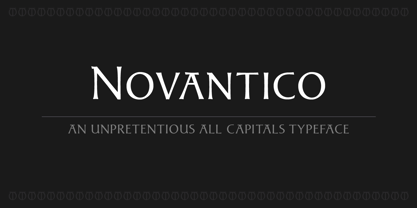 Novantico is an all capitals typeface, influenced mainly by roman inscriptional capitals and renaissance typefaces. Classicly designed forms give text a noble and elegant feel. It is intended to be used for relatively short and important texts, titles, headings, quotes, etc.
 - Augustin by Ludwig Type,
$45.00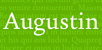 Augustin is an elegant and legible typeface inspired by the classic letter forms of the renaissance, namely the type of Nicolas Jenson made in Venice in 1470. The style-linked family includes oldstyle and lining figures both tabular and proportional.
 - GLC Ornaments One by GLC,
$20.00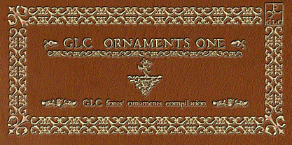 This font is a collection made with the largest part of the ornaments contained in the GLC foundry medieval and renaissance period fonts. It was made for the use of customers who wish to embellish their works without buying our complete catalog! It is used to embellish and animate as variously as web-site titles, posters and fliers design or greeting cards, all various sorts of presentations, menus, certificates, letters. It was specially drawn to accompany our medieval and renaissance fonts, like 1462 Bamberg, 1509 Leyden, 1538 Schwabacher, 1543 Humane Jenson, 1557 Italique, 1589 Humane Bordeaux, 1592 GLC Garamond and others, giving them an historical additional genuine touch...
 - Sole Serif by CAST,
$45.00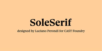 Sole Serif is a newspaper face with features relating to book typography. Inspiration from Francesco Griffo’s romans was adapted to resist the rough usage typical of newspaper printing without any loss of quality. Sole Serif is available in an extensive range of cuts including extra bold and ultra thin. With its big x-height, short ascenders and a roundish and wide italic for text and titles, it has all the attributes of a newspaper face. Nonetheless, details like the inclined axis, calligraphic terminations, Renaissance proportions and a refined but slightly mannered design, all evoke the book rather than the daily paper.
 - Brevier by CAST,
$45.00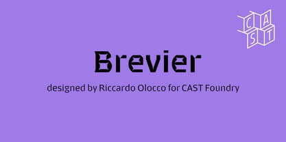 Compact sans, ideal for setting long texts in small or very small type sizes: for packaging, instruction booklets, drug information leaflets and anything else that has to be legible at very small sizes. Lean and rhythmical, designed ideally to be used at less than 8 points (Brevier was the old typefounders’ name for 8-point type), Brevier holds up well even under adverse printing conditions. The apparently geometric letterforms hide Renaissance characteristics, the x-height and openings are very generous and the strokes slightly modulated. In order to offset ink spread – which is inevitable when printing very small sizes of type – Brevier has large white spaces between the letters. All internal angles have deep ink traps and many connections have been left open.
 - Dited - 100% free

- Madonna - Unknown license

- Humanist 531 by ParaType,
$30.00Humanist 531 is the Bitstream version of Syntax (Stempel, 1968) by Hans Eduard Meier. A humanist sans serif typeface with an optically even thickness of the line which interprets a humanist old style type of the Renaissance. Its vertical strokes are inclined to the right by one degree. Serves well in text and display typography. Cyrillic version was developed at ParaType in 1999 by Isay Slutsker and Manvel Shmavonyan and was awarded Diplomae at Kirillitsa'99 and "bukva:raz!" type design contests. - Stempel Schneidler LT by Linotype,
$29.99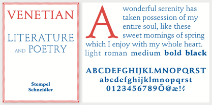 F .H. Ernst Schneidler, type designer and teacher, originally designed Schneidler Old Style in 1936 for the Bauer foundry. Stempel Schneidler is based on the typefaces of Venetian printers from the Renaissance period and possesses their grace, beauty, and classical proportions. The Stempel Schneidler, a completely reworked and tuned font family made by D. Stempel AG in Frankfurt, is a fine, legible text font that also works well in display. One of Schneidler's more unique features is its question marks.
 - Goth Titan - Personal use only

- HYERBA - Personal use only

- GothBallCrap - Unknown license

- Plakat-Fraktur - Unknown license

- CA Texteron by Cape Arcona Type Foundry,
$40.00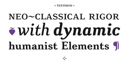 CA Texteron is a modern text font family to cover the most common typographical needs with a minimum of weights. It is aiming for a serious but unconventional look, which is achieved by combining round and edgy forms in the same font, often in the same glyph, and by using Humanist and modern form-principles at the same time. It merges classical type-design with an experimental spirit. CA Texteron combines elements of the dynamic renaissance principle with the static neo-classic style, which makes it hard to classify. The result is a post-modern hybridization. The Regular weight works best in text size, and with more letter-space also for footnotes. The low contrast makes it robust and legible even in very small sizes. Bold, Italic and Small Caps are intended for emphasis. Bold, Bold Italic and Heavy make good headlines, that reveal the unconventional details. The Italic is not just a slanted version of the Regular weight but has individual forms and typical italic characteristics.
 - Marigold by Monotype,
$29.99Originally designed by calligrapher Arthur Baker, Marigold font was released by Agfa Compugraphic in 1989. Marigold font is narrow in width like the chancery hand, and its shapes are true to the prescribed Renaissance proportions. The authentic handwritten look makes it versatile for a large variety of informal uses. - Karins Lombardy Caps by New Renaissance Fonts,
$10.00Karin's free reinterpretation of the early Renaissance Lombardic tradition, in two different versions. In the upper case the fill is blacker and has a straight pattern with diamond elements; in the lower case the fill is thinner with more white space and has a wavy pattern with rounded elements. - Rachee by Studio Sun,
$18.00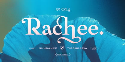 Rachee Display is a modern serif typeface. Inspired by late Renaissance-era type and intended for display font, perfect for logotype, logogram, title, caption, and more. Rachee comes with 6 weights with some opentype features (Linnning figure, full 'ff' ligature, luballin avantgarde ligature, stylistic set, fraction, and more).
 - Eloquence by Monotype,
$31.99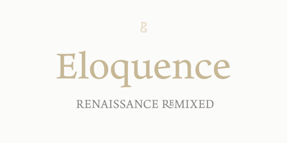 Eloquence has a modern aesthetic with a strong classical influence – this is the “Renaissance Remixed”. While being inspired by the first printed texts of the Renaissance period, this typeface has contemporary features such as a high x-height, open bowls and counters, along with razor-sharp serifs and terminals. It has been designed specifically for creating a pleasant reading experience. With a comprehensive character set, Eloquence can comfortably handle printed documents such as novels, magazines, annual reports, along with their equivalent online/digital formats. This 14-font family also has a few tricks up its sleeve by means of some neat, complementing discretionary ligatures and alternates that will prove to be useful embellishments to your typography. Small Caps are included too, along with corresponding diacritics meeting the Latin Extended specification. You can view more details, design examples, and a specimen PDF at eloquence-font.com Key Features: • 14 font family – 7 weights in Roman and Italic • Small Caps, Alternates, Ligatures, with Proportional, Old Style, Small Cap, Fractions, Numerators, Denominators, Superior, and Inferior Figures • Full European character set (Latin Extended) • 900+ glyphs per font.
 - Basco Std by Typofonderie,
$59.00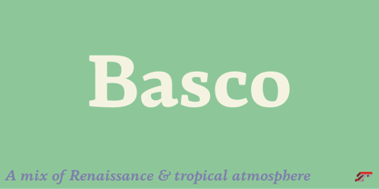 A mix of Renaissance & tropical atmosphere Basco is an exploration of the Renaissance style, a period in which letterforms were informed primarily by hand writing. It is clearly a contemporary interpretation of calligraphic shapes forms. The serifs are subtly asymmetrical. Slightly curved arches on the n, m and u are noticeable, creating an interesting tension in the text. Bruno Mello’s distinctive style is most obvious in his mastery of super fluid curves. It is a result of his extensive exploration of calligraphic forms, their tensions and dynamics, mixing angularities with curves. The roman weights include alternate swashes, as well as initial and terminal glyphs. The italics, based on chancellery script, feature simple stroke endings, most visible on the s and c. ➼ Basco minisite
 - Lucrezia by Florence,
$19.95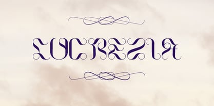 A decorative capitalis font inspired by the renaissance font Rotunda and old calligraphic foundings. From the beginning my aim was to design a font which focusses on simplyfing historical typography. I wanted to give people the possiblity to write with letters which refer to history but still are readable and modern. It is perfect for headlines and logos that need a historical touch. The font Lucrezia and its dangerous forms (the stitchy endings) are also inspired by the history of Lucrezia Borgia, who as we know, was a very mysterious person.
 - Kyiv by Apostrof,
$40.00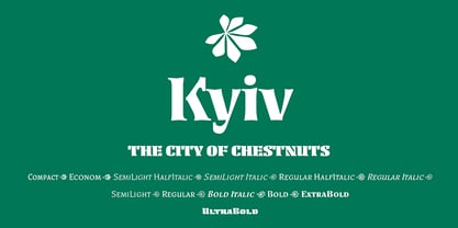 The font Kyiv is an attempt to unite old-style antiqua with the Ukrainian tradition and modern requirements. Besides having usual italics the Renaissance tradition of "semi-italics" renewed, compact weights are also provided. Special charm is added by decorative motives of chestnut leaves and flowers. The weights are included in a way to promote the solution of various tasks both text, and an accidental set in various combinations. The font Kyiv was awarded the 2nd prize in category of text fonts in the first Ukrainian typeface competition Ruthenia in 2010.
 - Mengelt Basel Antiqua by Linotype,
$29.99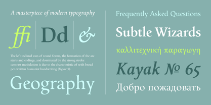 Inspired by the excellent serif fonts of the Basel printer of the 15th and 16 Century, Christian Mengelt designed the Mengelt Basel Antiqua. The typeface is a Renaissance Antiqua with stylistic reference to the historical model, but with the technical and typographic qualities of a modern text typeface with excellent reading quality.
 - Mengelt Basel Antiqua Paneuropean by Linotype,
$103.99Inspired by the excellent serif fonts of the Basel printer of the 15th and 16 Century, Christian Mengelt designed the Mengelt Basel Antiqua. The typeface is a Renaissance Antiqua with stylistic reference to the historical model, but with the technical and typographic qualities of a modern text typeface with excellent reading quality. - Schwandner Versalia by Intellecta Design,
$35.00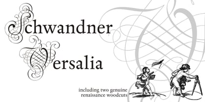 A highly intrincated decorative capital from the work of Johann Georg Schwandner (1716-1791). An accurate historical revival and interpretation of Iza W, at Intellecta Design. State-of-art to use in headings, chapter initials from books, magazines and other publications. Also use in baroque and renaissance inspired layouts, or modern mixed proposals.
 - Anger Styles - Personal use only

- LT Glockenspiel Black - 100% free

- Goth Stencil - Personal use only

- ozzy - 100% free

- Saddlebag - Personal use only

- Tropicana - Unknown license

- Fette Trump-Deutsch - Unknown license

- Mellow Sans by ParaType,
$30.00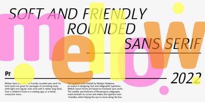 Mellow Sans is a soft and friendly rounded sans serif. Its bold styles are great for packages of something tasty, while light and regular ones work well in rather long texts, from a children's book to a reading app, or a family restaurant menu. The typeface was created by Natalya Vasilyeva, an expert in designing text and calligraphic typefaces. Mellow Sans’s forms are based on humanist sans serifs. The nobility and liveliness of Renaissance calligraphy reads beneath its curves and makes the typeface even friendlier, while helping the eye to move along the line. The typeface supports extended Latin, extended Cyrillic (all major languages of the Russia’s peoples) and Greek. It also has old style figures, arrows and non-alphabetic signs. With Mellow Sans as a heading typeface (in that case bold styles fit the best), calm open sans serifs, f.e. Vast or Fact, are its optimal text companions on the screen. Calm serifs, f. e., Octava, Scientia or Aelita, will work as its companions on paper. And to create expressive typography, for example, in packaging, you can match Mellow Sans with quirky rounded serifs — Cooper or Epice.
 - Agmena by Linotype,
$40.99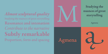 Created by Jovica Veljović, the Agmena typeface family is a fine melding of digital technology and beautifully crafted Renaissance fonts. This typeface makes skillful use of proportion, form and spacing rather in the way that a practiced storyteller varies the timbre of his voice and deftly inserts longer pauses to bring his tale alive.
 - Lehmann by ParaType,
$30.00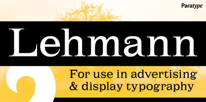 PT Lehmann™ was designed for ParaType in 2002 by Tagir Safayev. Inspired by letterforms of Shiroky (Wide) Renaissance typeface and other fonts of Ossip Lehmann foundry, St.-Petersburg, c. 1874. A face of the so-called Elzevir type has thin triangular serifs and sharp spiral-like terminals. For use in advertising and display typography.
 - Bembo MT by Monotype,
$45.99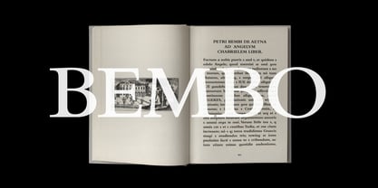 The origins of Bembo go back to one of the most famous printers of the Italian Renaissance, Aldus Manutius. In 1496, he used a new roman typeface to print the book de Aetna, a travelogue by the popular writer Pietro Bembo. This type was designed by Francesco Griffo, a prolific punchcutter who was one of the first to depart from the heavier pen-drawn look of humanist calligraphy to develop the more stylized look we associate with roman types today. In 1929, Stanley Morison and the design staff at the Monotype Corporation used Griffo's roman as the model for a revival type design named Bembo. They made a number of changes to the fifteenth-century letters to make the font more adaptable to machine composition. The italic is based on letters cut by the Renaissance scribe Giovanni Tagliente. Because of their quiet presence and graceful stability, the lighter weights of Bembo are popular for book typography. The heavier weights impart a look of conservative dependability to advertising and packaging projects. With 31 weights, including small caps, Old style figures, expert characters, and an alternate cap R, Bembo makes an excellent all-purpose font family.
 - Bembo Infant by Monotype,
$45.99The origins of Bembo go back to one of the most famous printers of the Italian Renaissance, Aldus Manutius. In 1496, he used a new roman typeface to print the book de Aetna, a travelogue by the popular writer Pietro Bembo. This type was designed by Francesco Griffo, a prolific punchcutter who was one of the first to depart from the heavier pen-drawn look of humanist calligraphy to develop the more stylized look we associate with roman types today. In 1929, Stanley Morison and the design staff at the Monotype Corporation used Griffo's roman as the model for a revival type design named Bembo. They made a number of changes to the fifteenth-century letters to make the font more adaptable to machine composition. The italic is based on letters cut by the Renaissance scribe Giovanni Tagliente. Because of their quiet presence and graceful stability, the lighter weights of Bembo are popular for book typography. The heavier weights impart a look of conservative dependability to advertising and packaging projects. With 31 weights, including small caps, Old style figures, expert characters, and an alternate cap R, Bembo makes an excellent all-purpose font family.


