10,000 search results
(0.253 seconds)
- Space Rocks by Wing's Art Studio,
$10.00 Space Rocks! A Retro Sci-Fi Font Inspired by 1950s Television Serials “Oh boy, oh boy, oh boy! The next episode of Space Rocks is on tonight! What’s it about? Well, it’s all to do with this family of astronauts who crash land on Mars and how they survive all sorts of alien creatures and killer storms! The science is really real too! Who needs school!!!” And so goes the story of one young fan whose imagination is captured by the latest offering in a golden-age of TV science-fiction. A brand of 1950s programming that offered a light-hearted and optimistic view of the future full of exploration, discovery and hazardous adventure! Sometimes even a cautionary tale to live on in your nightmares! With Space Rocks I want to capture this vibe with an all-caps design inspired the opening titles of these shows, fully hand-drawn with a range of discretionary ligatures that add a comic (not atomic!) touch. The package includes Regular and Outlined (all hand-drawn) versions with a complete set of alternatives to help maintain the analogue look. This font also includes unique uppercase and lowercase characters, along with numerals, punctuation, language support, underlines and symbols. It’s perfect for movie and television titles, album covers, posters or any design that needs a dramatic, spacey and fun look. Check out the visuals to see it in action.
 - Erler Titling by RMU,
$30.00 Herbert Thannhaeuser’s 1953 titling font Erler-Versalien which was distributed by Typoart in hot-metal times, was carefully redrawn and redesigned. To preserve its handwritten character, irregularities in the letters’ strokes were left as they are. This font spreads best its beauty in book titles, magazines, diplomas, greeting cards or as initials.
 - Spooky Christmas by Stefani Letter,
$12.00 Spooky Christmas is an incredibly unique and spooky display font. Add this font to your favorite Halloween-themed ideas: invitations, banner, logo, app game scary or horror, and notice how it makes them come alive! Spooky Christmas is PUA encoded which means you can access all of the glyphs and swashes with ease!
 - Miscelanea by Lián Types,
$18.50 There is often a need to have original and personal backgrounds over pieces of design. This is the first dingbats font by Argentina Lian Types. Each glyph was designed to be part of a pattern. However, they could work as separated glyphs to decorate artworks and also to act as punctuation symbols.
 - Classy Jazzy by Epiclinez,
$18.00 Classy Jazzy is a lovely serif font featuring charming, playful characters that seem to dance along the baseline. Add this font to your most creative ideas, and notice how it makes them stand out! So what's included : Basic Latin A-Z & a-z Numbers, symbols, and punctuations Accented Characters : ÀÁÂÃÄÅÆÇÈÉÊËÌÍÎÏÑÒÓÔÕÖØŒŠÙÚÛÜŸÝŽàáâãäåæçèéêëìíîïñòóôõöøœšùúûüýÿžß Thank you
 - Snacky Plop by PizzaDude.dk,
$18.00 What excactly is a snacky plop? To be honest, I don't know!!! The name comes out of a wordplay! :) But what I know is that this font is playful, unpredictable and fun to look at and use! I have added 5 different versions of each letter, and they automatically changes as you type!
 - Hallo Skull by Letterara,
$14.00 Hallo Skull is a fun friendly and spooky display font. It is suitable for each of your party designs or Halloween creation. Add it to your creative Halloween-themed ideas and notice how it makes them stand out! This font is PUA encoded which means you can access all of the glyphs.
 - High Beginning by Twinletter,
$12.00 High Beginning is our newest script font, a product font with a modern, artistic style. each letter has a strong and beautiful character to be used as a title, a sentence that if you use it creates an elegant effect in the appearance of your design. not limited to that, the bold calligraphy font is designed to keep paying attention to the beauty of each letter, there are alternate options for the letters which are certainly easy for you to access, so you can automatically customize the letters you want to enhance the visual appearance of your design project. This font also offers harmoniously beautiful abstract typography for a wide variety of design projects. This font is also perfect for wedding invitations, quote designs, for social media business designs, advertisements, trademarks, food and beverage promotion banners, text, posters, signatures, and any design that requires handwriting. This font is equipped with uppercase, lowercase, numbers, punctuation marks, swhas and several variations on each character including multi-language. ================================================== This font is best suited for open type friendly applications. How to get alternative glyphs from open type fonts: http://adobe.ly/1m1fn4Y PUA Character Code - Fully accessible without additional design software. we hope you enjoy this font. Feel free to send whatever message you want to convey.
 - Matryoshka by Volcano Type,
$19.00 Matryoshka is a display layering type family which is inspired by the Russian wooden doll. The family contains eight different weights from XXS (thin) to XXL (fat) + Pregnant (all in one). The design is based on an elaborate and complex grid, so each font fits perfectly into the other. With the Matryoshka family the typographer can create millions of new solutions. Play with it!
 - Neutraface Condensed by House Industries,
$33.00 Richard J. Neutra became an icon of Modern architecture as an artistic visionary, social commentator and outspoken defender of the environment. He refined his unique approach to design, for which he coined the term biorealism, over half a century ago. Regarding humankind and its surroundings as two inseparable halves to a greater whole, Neutra created habitats with the welfare of man and nature as his utmost concern. His ideas of evolutionary growth and adaptability compelled House Industries to develop Neutraface Condensed, built upon the original typeface and driven by the enduring spirit of the revolutionary who inspired it. “I have tried to be a feeling observer of life in all its manifestations, not a cold rationalist.” House Industries adopted this precept of Neutra as the guiding principle when the foundry commissioned Christian Schwartz to draw Neutraface Condensed. Instead of being exactingly compressed, the new companion fonts were composed around a complementary structural framework in order to better reflect the sensibilities of their predecessor. The result is an individualistic design with a restrained exuberance that shuns stylistically ersatz imitation. This compact yet lively presence allows Neutraface Condensed to lend flexibility and economy to headlines without sacrificing the simplicity and charm of the original. Like all good subversives, House Industries hides in plain sight while amplifying the look, feel and style of the world’s most interesting brands, products and people. Based in Delaware, visually influencing the world.
 - Neudoerffer Fraktur by Linotype,
$29.99Johann Neudörffer the Elder's 1538 writing manual fascinated the German designer Helmut Bomm for years. Together with Albrecht Dürer and Hieronymus Andreä, Neudörffer helped create Fraktur, perhaps the most Germanic of all the blackletter styles. As a tribute to this master, and bringing its letterforms to a 21st century public, Boom released the Neudoerffer Fraktur family through Linotype in 2009. Neudoerffer Fraktur's appearance is based very much in handwriting, and Bomm had already begun using letters from prototype versions of this typeface as early as the 1990s. For years, Neudoerffer Fraktur'sletters would appear secretly and seductively in design projects like historical sign restorations or heraldry pieces. The sources that Bomm used while drawing the typeface were images from Jan Tschichold's Treasures of Calligraphy" and Albert Kapr's "Schriftkunst." The Neudoerffer Fraktur family has four separate fonts. Any user of Adobe CS applications should consider licensing Neudoerffer Fraktur Regular (the font without any numeral suffixes). This font contains three different OpenType stylistic sets. Users can pick and choose which versions of the letters that they would like to set. Anyone using Quark XPress, Microsoft Word, or other applications without support for Stylistic Sets should license Neudoeffer Fraktur Regular 1, Neudoeffer Fraktur Regular 2, and Neudoeffer Fraktur Regular 3. Each of these three fonts has letters with slightly different style of flourish, and all three may be combined with each other. Neudoerffer Fraktur Regular 1 is optimal for longer texts; Neudoerffer Fraktur Regular 2 contains alternate letters, and well as more ornamented capitals; Neudoerffer Fraktur Regular 3's letters have a stronger calligraphic accent." - Starless Shutters by PizzaDude.dk,
$16.00 Starless Shutters is my slightly rough handmade all-caps headline font. With its crunchy outline, the font is suitable for most things that needs an organic look. That could be organic products, children's books or toys, book covers or poster. I have added 4 slightly different versions of each letter, and they automatically cycles as you type - or you can manually choose the ones that suits you the best.
 - Magola by Andinistas,
$39.95 Magola is a creamy flavor font family whose purpose is to season with emotions the reading of words and phrases formed by puffy glyphs coated with a caramel of empty spaces external and internal. Independently or in groups, members of the family serve to decorate and organize packaging or advertising material in letters apparently crafted for food or entertainment contexts. Its starting point was to draw letters like a ballon fish evolved into a black version with empty areas and microscopic contrasted with colorful inflated and filled areas. Then the challenge was based on the sum transferred between full and empty into a lighter caliber. In that vein, its overall design adapted skeletons of italics and Roman calligraphy. Therefore, its regular, bold and black files have great height "x" with upwards and downwards extremely short and large internal counterblocks to facilitate reading. In this regard, to strengthen its objective and capture the reader's attention, its kind of contrast and simulated auctions flat tip brush strokes, and amount of contrast between thick and thin in the black version is slightly inverted. Its sizes, smooth strokes and irregular lines reinforce its traditional spirit, so it is favorable to shine the information on posters or large-format media. In short, its optical conformation based on a non-literal way, in metrics similar in all family members to be easily exchanged without changing the ìxî height. It is therefore a striking and versatile tool, that besides being useful in large sizes, can be used in small sizes as well. And more importantly, its general concept is more profitable when its members are mixed to nest headings, subheadings and short paragraphs, designed according to size, position, color and location in logos, covers, posters, ads and flyers.
 - Gunplay by Typodermic,
$11.95 Are you tired of weak, flimsy fonts that can’t handle the heat? Look no further than Gunplay—the tenacious stencil typeface that will make your message stand out from the pack. Inspired by the iconic 1972 film The Getaway, Gunplay exudes a gritty, rugged aesthetic that demands attention. With three different special effect styles, this font brings a bold and authoritative voice to your designs. Whether you’re looking to make a statement with a bold headline or add a touch of grit to your body text, Gunplay has got you covered. With its rugged design, this typeface can handle anything you throw its way. So if you’re ready to take your designs to the next level, give Gunplay a try. With its tough voice of authority, this font is sure to leave a lasting impression. Some Latin-based European writing systems are supported, including the following languages. Afaan Oromo, Afar, Afrikaans, Albanian, Alsatian, Aymara, Basque, Bemba, Bikol, Breton, Cape Verdean, Creole, Catalan, Cebuano, Chamorro, Chavacano, Danish, Dawan, Dholuo, Dutch, English, Estonian, Faroese, Fijian, Filipino, Finnish, French, Frisian, Friulian, Galician, Genoese, German, Guadeloupean Creole, Haitian Creole, Hiligaynon, Icelandic, Ilocano, Indonesian, Irish, Italian, Jamaican, Kaqchikel, Kikongo, Kinyarwanda, Kirundi, Lombard, Low Saxon, Luxembourgish, Makhuwa, Malay, Ndebele, Neapolitan, Norwegian, Novial, Occitan, Papiamento, Piedmontese, Portuguese, Quechua, Rarotongan, Romansh, Sango, Saramaccan, Sardinian, Scottish Gaelic, Shona, Sicilian, Silesian, Slovak, Slovenian, Somali, Sotho, Spanish, Swahili, Swazi, Swedish, Tagalog, Tetum, Tshiluba, Tsonga, Tswana, Tumbuka, Uzbek (Latin), Venetian, Võro, Walloon, Waray-Waray, Wayuu, Xhosa, Yapese, Zapotec Zulu and Zuni.
 - TT Chocolates by TypeType,
$39.00 Introducing the third reincarnation of TT Chocolates! The popular typeface was updated to stay up-to-date with the latest requirements and trends in design! TT Chocolates is an elegant Humanist sans serif with a dense typesetting and well-balanced proportions similar to the classical tradition. This font's nice and friendly nature makes it seem like something close and familiar. It has earned a reputation among designers as the perfect font for confectionery, but the application range of the TypeType's "sweetest" typeface goes well beyond that! In 2023, we decided to do a full-scale font update referring to extensive sans-serif market research. We figured out where the trends are headed and what users want—this information helped us enhance TT Chocolates. Specifically, we introduced a new Condensed font version, a narrow font style with the authentic proportions of the standard version. At the same time, TT Chocolates Condensed boasts a more expressive personality than the base subfamily, which allows designers to solve even more creative tasks using only one typeface. The third version of TT Chocolates has become even more modern and advanced. A large number of characters, various OpenType features, and stylistic sets make the font suitable for multiple purposes and tasks. TT Chocolates is a perfect match for both branding and layouts. The font's dynamic shapes make it easy to read in small point sizes, allowing the eye to move effortlessly across the line. This typeface can also be used in web design due to the TrueType manual hinting option. TT Chocolates 3.000 includes: 29 font styles: 14 roman, 14 italic, and one variable font; Condensed version consisting of 14 new font styles; Carefully crafted contours; Optimized font rhythm and completely new kerning; Enhanced italics in basic subfamily; Variable font with three axes of variation: width, weight, and slant; 32 OpenType features, counting in 13 new ones; 901 characters in each font style—the character set has grown compared to the previous version, which had 629 characters in each font style; 230+ languages support, including the new ones: 35 Cyrillic-based and 16 Latin-based. Elevate your design's appeal with TT Chocolates!
 - PeterPierre by Ingrimayne Type,
$6.95 PeterPierre is a stiff, awkward sans serif face. It has little variation in stroke width and the vertical and horizontal elements are connected with short, sharp curves. The condensed style was developed first and then, in a quest for legibility, it was widened into the regular style.
 - Bomiro by Issam Type,
$22.00 Bomiro is a modern classy ligature serif typeface comes with joining ligatures that give it a fancy and unique style. This awesome font is perfect for branding, logos, invitation, watermark and so much more. Bomiro typeface comes with regular, italic, Thin and Thin Italic font styles. Uppercase & lowercase letters, numbers, punctuation, ligatures, alternates and multilingual support. If you have any questions, please feel free to get in touch. Thank you
 - Pin Spotter JNL by Jeff Levine,
$29.00 It’s Art Deco “thick and thin”… It’s wide… It’s quirky… It’s a hand lettered sign over the lanes of the Bryant-Lake Bowl – a landmark bowling alley in Minneapolis, Minnesota… and it was spotted in an amazing YouTube video from a “drone tour” of the facility! The sign inspired the font Pin Spotter JNL which is available in both regular and oblique versions.
 - BB Torsos Pro by Bold Studio,
$49.00 BB Torsos™ (Pro) is based on the shape and proportion of the human body. For the interpolation of the typeface family, a special formula was developed, which reflects the different and individual character: flat to round, thin to fat and narrow to wide. ● 11 Stylistic Sets ● 13 Styles/Weights/widths ● 29 Opentype-Features/Style ● 87 Languages Support ● 8,450 Glyphs (650/Weight)
 - Good Explorer by Gassstype,
$23.00 Here comes our new font Good Explorer This is a handwritten brush that is written casually and quickly. comes in two mode = Standart and italic. this font are made with brushes on Procreate. Then crafted carefully drawn into vector format. That is why Good Explorer has Rough and strong characteristic more natural look to your text with a more modern look to your text.
 - Buttery Signature by Fontysia,
$13.00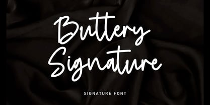 Buttery Signature is a unique and elegant monoline font, this font was created by being inspired by a signature by someone, then developed into a work that can be used by many people. It comes with an elegant and unique style which is perfect to make any design stand out! This font is perfect for branding, wedding invites, magazines, mugs, business cards, quotes, posters, and more.
 - Tokoloshe by Scholtz Fonts,
$17.95Tokoloshe is a name in African mythology for a mischievous leprechaun-like figure that loves practical jokes and tricking people. There are many books of such African stories, for example Tales of the Tokoloshe by Pieter Scholtz. The letter shapes that I used in the Tokoloshe font have inspiration from two sources: -- the spiky character of the font was derived from the wonderfully imaginative, wooden carvings of the Makonde people of beings called "shetani". The word "tokoloshe" is used by other tribes, but from his behaviour, he is certainly a type of shetani. -- some of the letter shapes were informed by Art Deco styles of fonts, for example: Kunjani, Black Tie SF, Selznick Normal, Zaire SF, Binner Gothic and ITC Anna. But the Tokoloshe font, like its namesake, is much more freespirited. Use this font whenever you want to suggest the rich artistic, cultural and spiritual heritage of Africa. The font is fully professional in terms of its character set. It contains over 235 characters - (upper and lower case characters, punctuation, numerals, symbols and accented characters are present). In fact, it has all the accented characters used in the major European languages. - Vianova Serif Pro by Elsner+Flake,
$59.00 The font superfamily Vianova contains each 12 weights of Sans and Slab and 8 weights of the Serif style. The design from Jürgen Adolph dates back into the 1990s, when he studied Communication Design with Werner Schneider as a professor at the Fachhochschule Stuttgart. Adolph started his carrier 1995 at Michael Conrad & Leo Burnett. He was responsible for trade marks as Adidas, BMW, Germanwings and Merz. He has been honored as a member of the Art Directors Club (ADC) with more than 100 awards. On February 26, 2014, Jürgen Adolph wrote the following: “I was already interested in typography, even when I could not yet read. Letterforms, for instance, above storefronts downtown, had an irresistible appeal for me. Therefore, it is probably not a coincidence that, after finishing high school, I began an apprenticeship with a provider of signage and neon-advertising in Saarbrücken, and – in the late 1980s – I placed highest in my field in my state. When I continued my studies in communications design in Wiesbaden, I was introduced to the highest standards in calligraphy and type design. “Typography begins with writing” my revered teacher, Professor Werner Schneider, taught me. Indefatigably, he supported me during the development of my typeface “Vianova” – which began as part of a studies program – and accompanied me on my journey even when its more austere letterforms did not necessarily conform to his own aesthetic ideals. The completely analogue development of the types – designed entirely with ink and opaque white on cardboard – covered several academic semesters. In order to find its appropriate form, writing with a flat nib was used. Once, when I showed some intermediate designs to Günter Gerhard Lange, who occasionally honored our school with a visit, he commented in his own inimitable manner: “Not bad what you are doing there. But if you want to make a living with this, you might as well order your coffin now.” At that time, I was concentrating mainly on the serif version. But things reached a different level of complexity when, during a meeting with Günther Flake which had been arranged by Professor Schneider, he suggested that I enlarge the offering with a sans and slab version of the typeface. So – a few more months went by, but at the same time, Elsner+Flake already began with the digitilization process. In order to avoid the fate predicted by Günter Gerhard Lange, I went into “servitude” in the advertising industry (Michael Conrad & Leo Burnett) and design field (Rempen& Partner, SchömanCorporate, Claus Koch) and worked for several years as the Creative Director at KW43 in Düsseldorf concerned with corporate design development and expansion (among others for A. Lange & Söhne, Deichmann, Germanwings, Langenscheidt, Montblanc.”
 - Vianova Slab Pro by Elsner+Flake,
$59.00 The font superfamily Vianova contains each 12 weights of Sans and Slab and 8 weights of the Serif style. The design from Jürgen Adolph dates back into the 1990s, when he studied Communication Design with Werner Schneider as a professor at the Fachhochschule Stuttgart. Adolph started his carrier 1995 at Michael Conrad & Leo Burnett. He was responsible for trade marks as Adidas, BMW, Germanwings and Merz. He has been honored as a member of the Art Directors Club (ADC) with more than 100 awards. On February 26, 2014, Jürgen Adolph wrote the following: “I was already interested in typography, even when I could not yet read. Letterforms, for instance, above storefronts downtown, had an irresistible appeal for me. Therefore, it is probably not a coincidence that, after finishing high school, I began an apprenticeship with a provider of signage and neon-advertising in Saarbrücken, and – in the late 1980s – I placed highest in my field in my state. When I continued my studies in communications design in Wiesbaden, I was introduced to the highest standards in calligraphy and type design. “Typography begins with writing” my revered teacher, Professor Werner Schneider, taught me. Indefatigably, he supported me during the development of my typeface “Vianova” – which began as part of a studies program – and accompanied me on my journey even when its more austere letterforms did not necessarily conform to his own aesthetic ideals. The completely analogue development of the types – designed entirely with ink and opaque white on cardboard – covered several academic semesters. In order to find its appropriate form, writing with a flat nib was used. Once, when I showed some intermediate designs to Günter Gerhard Lange, who occasionally honored our school with a visit, he commented in his own inimitable manner: “Not bad what you are doing there. But if you want to make a living with this, you might as well order your coffin now.” At that time, I was concentrating mainly on the serif version. But things reached a different level of complexity when, during a meeting with Günther Flake which had been arranged by Professor Schneider, he suggested that I enlarge the offering with a sans and slab version of the typeface. So – a few more months went by, but at the same time, Elsner+Flake already began with the digitilization process. In order to avoid the fate predicted by Günter Gerhard Lange, I went into “servitude” in the advertising industry (Michael Conrad & Leo Burnett) and design field (Rempen& Partner, SchömanCorporate, Claus Koch) and worked for several years as the Creative Director at KW43 in Düsseldorf concerned with corporate design development and expansion (among others for A. Lange & Söhne, Deichmann, Germanwings, Langenscheidt, Montblanc.”
 - Vianova Sans Pro by Elsner+Flake,
$59.00 The font superfamily Vianova contains each 12 weights of Sans and Slab and 8 weights of the Serif style. The design from Jürgen Adolph dates back into the 90th, when he studied Communication Design with Werner Schneider as a professor at the Fachhochschule Stuttgart. Adolph started his carrier 1995 at Michael Conrad & Leo Burnett. He was responsible for trade marks as Adidas, BMW, Germanwings and Merz. He has been honoured as a member of the Art Director Club (ADC) with more than 100 awards. On February 26, 2014, Jürgen Adolph wrote the following: “I was already interested in typography, even when I could not yet read. Letterforms, for instance, above storefronts downtown, had an irresistible appeal for me. Therefore, it is probably not a coincidence that, after finishing high school, I began an apprenticeship with a provider of signage and neon-advertising in Saarbrücken, and – in the late 1980s – I placed highest in my field in my state. When I continued my studies in communications design in Wiesbaden, I was introduced to the highest standards in calligraphy and type design. “Typography begins with writing” my revered teacher, Professor Werner Schneider, taught me. Indefatigably, he supported me during the development of my typeface “Vianova” – which began as part of a studies program – and accompanied me on my journey even when its more austere letterforms did not necessarily conform to his own aesthetic ideals. The completely analogue development of the types – designed entirely with ink and opaque white on cardboard – covered several academic semesters. In order to find its appropriate form, writing with a flat nib was used. Once, when I showed some intermediate designs to Günter Gerhard Lange, who occasionally honored our school with a visit, he commented in his own inimitable manner: “Not bad what you are doing there. But if you want to make a living with this, you might as well order your coffin now.” At that time, I was concentrating mainly on the serif version. But things reached a different level of complexity when, during a meeting with Günther Flake which had been arranged by Professor Schneider, he suggested that I enlarge the offering with a sans and slab version of the typeface. So – a few more months went by, but at the same time, Elsner+Flake already began with the digitilization process. In order to avoid the fate predicted by Günter Gerhard Lange, I went into “servitude” in the advertising industry (Michael Conrad & Leo Burnett) and design field (Rempen& Partner, SchömanCorporate, Claus Koch) and worked for several years as the Creative Director at KW43 in Düsseldorf concerned with corporate design development and expansion (among others for A. Lange & Söhne, Deichmann, Germanwings, Langenscheidt, Montblanc.”
 - Bim - Personal use only

- Ovnis - Personal use only

- Cable - Personal use only

- Crakos - Personal use only

- Sui Generis Free - Unknown license

- Ameba - Personal use only

- Ziboulateur by Kitchen Table Type Foundry,
$15.00 Ziboulateur is French slang for bottle opener. The word consists of two parts: Zibula (a word from Congo-Brazzaville meaning: ‘to decork’) and the French suffix -ateur. I thought this rather creative word would be a good name for this particular font! Ziboulateur is a handmade, all caps display font. It comes with extensive language support, including Sami and Vietnamese.
 - Rose Pink by Olivetype,
$18.00 Introducing Rose Pink, a fun and exciting font suitable for any creative project. From product packaging to logos, this font is the perfect way to express your creativity with a bold style and playful look. The whimsical and flowing curves of this font also can help create a sense of lightheartedness in your design. project. Thank You and Happy Designing!
 - Suave Sam NF by Nick's Fonts,
$10.00An extremely low midline marks this offering, based on an “elegant” alphabet found in Samuel Welo’s chapbook, Lettering: Modern and Foreign, published in 1930 by Frederick J. Drake and Company. Definitely different, and Deco at its most debonair. All versions of this font include the Unicode 1250 Central European character set in addition to the standard Unicode 1252 Latin set. - Alaskan Malamute by Letterara,
$12.00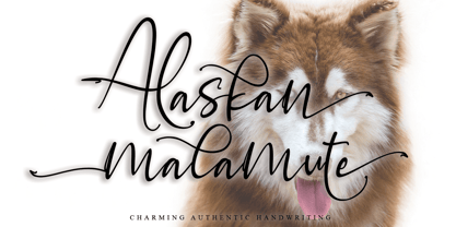 Alaskan Malamute is charming authentic handwriting font. This is a beautiful combination of timeless elegance and authentic calligraphy. Alaskan Malamute is the perfect font for making original and outstanding designs. This font is PUA encoded which means you can access all of the cute glyphs and swashes with ease! It also features a wealth of special features including alternate glyphs and ligatures.
 - Kaprice NF by Nick's Fonts,
$10.00This unusual sans typeface was inspired by a serif face called Faust, designed by Albert Kapr for the Institut für Buchgestaltung in 1959. Its mix of medieval, Jugenstil and Bauhaus influences makes it an intriguing choice for your next project. Both versions of this font include the Unicode Latin 1252 and 1250 Central European character sets, with localization for Moldovan and Romanian. - Cerulean NF by Nick's Fonts,
$10.00An offering from Barnhart Brothers & Spindler’s Catalog No. 9 from 1907, with the rather prosaic name of "Lining Gothic No. 71", inspired this non-nonsense and surprisingly ageless face. As versatile as it is simple, this typeface is a stylish choice for heads and subheads. Both versions of the font include 1252 Latin, 1250 CE (with localization for Romanian and Moldovan). - Ultimate Battle by Letterara,
$12.00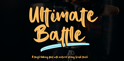 Ultimate Battle is a stylish and incredibly natural elegant handwritten font. This font was particularly crafted for those who need a strong and looks like a natural brush to their designs. Add it confidently to your projects, and you will love the results. This font is PUA encoded which means you can access all of the glyphs and swashes with ease!
 - Pyramus NF by Nick's Fonts,
$10.00This engaging antique text face is based on Paragon Light, from the 1905 specimen book from Barnhart Brothers & Spindler. Although it is spaced and kerned for text work, it also is suited for headlines if you tighten the tracking. Both versions of this font contain complete Unicode 1252 (Latin) and Unicode 1250 (Central European) character sets, with localization for Romanian and Moldovan. - Turista Gorda NF by Nick's Fonts,
$10.00Here’s another offering from the Baltimore Type Foundry, originally called Airport Tourist, which was obviously influenced by Paul Renner’s Futura Display, designed in 1932 for Bauersche Gießerei. This version features tight sidebearings and aggressive kerning, so your headlines will pack a punch. This font contains the complete Latin language character set (Unicode 1252) plus support for Central European (Unicode 1250) languages as well.


