5,358 search results (0.019 seconds)
  1. SF Piezolectric Inline - Unknown license
  2. SF Chaerilidae Outline - Unknown license
  3. SF RetroSplice Condensed - Unknown license
  4. SF Arch Rival - Unknown license
  5. SF RetroSplice Shaded - Unknown license
  6. SF Comic Script - Unknown license
  7. SF Piezolectric Condensed - Unknown license
  8. SF Piezolectric SFX - Unknown license
  9. SF Intermosaic B - Unknown license
  10. SF RetroSplice SC - Unknown license
  11. SF RetroSplice Outline - Unknown license
  12. SF Proverbial Gothic - Unknown license
  13. SF Chaerilidae Shaded - Unknown license
  14. SF Archery Black - Unknown license
  15. SF Theramin Gothic - Unknown license
  16. SF Piezolectric - Unknown license
  17. SF Automaton - Unknown license
  18. SF Intermosaic - Unknown license
  19. SF Chaerilidae - Unknown license
  20. SF Chaerilidae - Unknown license
  21. SF Speakeasy - Unknown license
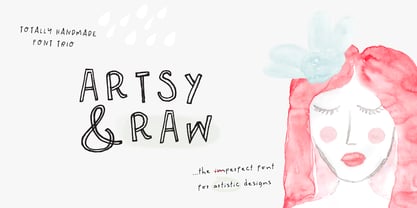
  22. Artsy and Raw by Pixel Colours, $19.00
    Artsy & Raw is a sweet font family designed to look absolutely hand drawn. It's so imperfect that is perfect for artistic projects. I'm sure you will love it!
  23. Futura Headline EF Pro by Elsner+Flake, $103.00
    The design of Futura seems to be timeless. This typeface family which had been developed in 1926 by Paul Renner for the Bauer Type Foundry in the style of constructivism and as part of the Bauhaus movement, experienced, however, in the course of the past 90 years, repeated time-appropriate revivals which guaranteed its on-going popularity. The version of the Futura EF Pro contains the original character constructions which Dennis Megaw described as the “first designs of Futura” in 1938 in “20th century sans serif types, Typography no. 7” (See: Dr. Christopher Burke: Paul Renner, Princeton Architectural Press, New York 1998). What makes it exceptional is the extension into three weights: “Text”, “Headline” and “Index” which came about as part of a degree dissertation at the Hochschule für Bildende Künste (HFBK) in Hamburg. In this context, the accompanying documentation “Die Kritik der reinen Futura” (“The Critique of the Pure Futura”) by Katharina Strauer was published by the Materialverlag, Hamburg, in 2003. Some copies are still available at Elsner+Flake.
  24. ITC Kabel by ITC, $40.99
    The first cuts of Kabel appeared in 1927, released by the German foundry Gebr. Klingspor. Like many of the typefaces that Rudolf Koch designed for printing use, Kabel is a carefully constructed and drawn. The basic forms were influenced by the Ancient Roman stone-carved letters, which consisted of just a few pure and clear geometric forms, such as circles, squares, and triangles. Koch also infused Kabel with some elements of Art Deco, making it appear quite different from other geometric modernist typefaces from the 1920s, like Futura. Linotype has two versions of Kabel in its library. Kabel has a shorter x-height, with longer ascenders and descenders, making it a bit truer to Koch's original design than the second version, ITC Kabel, which was designed by Victor Caruso. This version, also known in the United States as Cable, has a larger x-height, shorter ascenders and descenders, more weights ,and a diamond shaped i-dot. Typefaces in the same oeuvre include Avenir Next, ITC Avant Garde Gothic, Metrolite, Metromedium, Metroblack, and Erbar, just to name just a few."
  25. Futura Text EF Pro by Elsner+Flake, $103.00
    The design of Futura seems to be timeless. This typeface family which had been developed in 1926 by Paul Renner for the Bauer Type Foundry in the style of constructivism and as part of the Bauhaus movement, experienced, however, in the course of the past 90 years, repeated time-appropriate revivals which guaranteed its on-going popularity. The version of the Futura EF Pro contains the original character constructions which Dennis Megaw described as the “first designs of Futura” in 1938 in “20th century sans serif types, Typography no. 7” (See: Dr. Christopher Burke: Paul Renner, Princeton Architectural Press, New York 1998). What makes it exceptional is the extension into three weights: “Text”, “Headline” and “Index” which came about as part of a degree dissertation at the Hochschule für Bildende Künste (HFBK) in Hamburg. In this context, the accompanying documentation “Die Kritik der reinen Futura” (“The Critique of the Pure Futura”) by Katharina Strauer was published by the Materialverlag, Hamburg, in 2003. Some copies are still available at Elsner+Flake.
  26. SF Buttacup Lettering - Unknown license
  27. Friday by Fatchair, $6.95
    A variation on the 'futuristic' type genre - available in pre- and post-apocalyptic versions!
  28. SF Wonder Comic Inline - Unknown license
  29. SF Diego Sans Condensed - Unknown license
  30. SF Archery Black Shaded - Unknown license
  31. SF Archery Black Outline - Unknown license
  32. SF Diego Sans Outline - Unknown license
  33. SF Arch Rival Extended - Unknown license
  34. SF RetroSplice SC Shaded - Unknown license
  35. SF Wonder Comic Blotch - Unknown license
  36. SF Comic Script Shaded - Unknown license
  37. SF Gushing Meadow SC - Unknown license
  38. SF RetroSplice SC Condensed - Unknown license
  39. SF Comic Script Outline - Unknown license
Looking for more fonts? Check out our New, Sans, Script, Handwriting fonts or Categories
abstract fontscontact usprivacy policyweb font generator
Processing