10,000 search results
(0.014 seconds)
- DirtDevil - Unknown license

- Neospace Exp - Personal use only

- Jotting - Unknown license

- Astronaut Jones by Pink Broccoli,
$14.00 A light hearted comic and clumsy typestyle inspired by an old pulp novel called "The Astronaut". Several fun ornament characters can be accessed by turning on Discretionary alternates and typing "jones" for the Astronaut Head in an O, "atom" for a spirograph atom symbol, "little dipper" and "big dipper" for the constellations, as well as alternate "the", "and", and stacked "and the" characters.
 - Jano Sans Pro by Craceltype,
$39.00 Jano Sans™ Pro is a neo humanist sans serif that was initially created to be used as a text and display typeface in brand communication. The result is a type family with a relatable character and a collaborative profile. Designed with elegant forms, low contrast and a geometric feel, Jano Sans™ Pro is a highly legible typeface suited for any text application and typographic reproduction. Jano Sans™ Pro has 18 styles and its a workhorse type system. It covers 290+ languages, including Extended Latin, Cyrillic and Greek writing systems. With over 1800 glyphs per style, its Opentype features include alternative shapes, small caps, standard and discretionary ligatures, localized forms in Latin and Cyrillic, case sensitive forms, numerators and denominators, proportional and tabular figures, slashed zero, fractions and more. The techie personality and the huge set of features and glyphs makes Jano Sans™ Pro an excellent choice for a wide range of applications, such as branding, editorial, web and broadcast.
 - Amika by Craceltype,
$39.00 Amika™ is a rational geometric sans serif with an engaging personality and a contemporary profile. The large x-height, minimal contrast and the double storey 'a' makes Amika™ a highly legible typeface suited for any kind of text applications, from display poster type to massive text layouts. Amika™ has 22 styles and it's a workhorse type system. Versatile and reliable, it covers 230+ languages, including extended Latin, Cyrillic and Greek writing systems. With over 1280 glyphs per style, its Opentype features include alternative shapes, small caps, standard and discretionary ligatures, localized forms in Latin and Cyrillic, case sensitive forms, numerators and denominators, proportional and tabular figures, slashed zero, fractions and more. With a tectonic touch, Amika™ is a prototypical sans serif of the New Media age that, due to its extensive set of features, conveys a great choice for a wide range of applications, from branding to broadcast.
 - Gloriana - Unknown license

- Jambon - Unknown license

- Linotype Syntax Lapidar Serif Text by Linotype,
$29.99Modeled on the writings chiseled in stone in the second century B.C., Syntax™ Lapidar is an energetic, spirited typeface designed by Hans Eduard Meier in 2000. Linotype Syntax Lapidar Text and Linotype Syntax Lapidar Serif Text have five weights each, with both cap and lowercase letterforms. Lapidar Display and Lapidar Serif Display also have five weights each, with mostly all cap letterforms and many alternates. It's a terrifically fun and inventive family, and if you look closely, you can see the resemblance to the more modern and restrained Syntax™ relatives. Great for menus, artist books, travelogues, or advertising - and if used very sparingly, it could add just the right element of lapidary significance to corporate documents. - Linotype Syntax Lapidar Serif Display by Linotype,
$29.99Modeled on the writings chiseled in stone in the second century B.C., Syntax™ Lapidar is an energetic, spirited typeface designed by Hans Eduard Meier in 2000. Linotype Syntax Lapidar Text and Linotype Syntax Lapidar Serif Text have five weights each, with both cap and lowercase letterforms. Lapidar Display and Lapidar Serif Display also have five weights each, with mostly all cap letterforms and many alternates. It's a terrifically fun and inventive family, and if you look closely, you can see the resemblance to the more modern and restrained Syntax™ relatives. Great for menus, artist books, travelogues, or advertising - and if used very sparingly, it could add just the right element of lapidary significance to corporate documents. - Linotype Syntax Lapidar Display by Linotype,
$29.99Modeled on the writings chiseled in stone in the second century B.C., Syntax™ Lapidar is an energetic, spirited typeface designed by Hans Eduard Meier in 2000. Linotype Syntax Lapidar Text and Linotype Syntax Lapidar Serif Text have five weights each, with both cap and lowercase letterforms. Lapidar Display and Lapidar Serif Display also have five weights each, with mostly all cap letterforms and many alternates. It's a terrifically fun and inventive family, and if you look closely, you can see the resemblance to the more modern and restrained Syntax™ relatives. Great for menus, artist books, travelogues, or advertising - and if used very sparingly, it could add just the right element of lapidary significance to corporate documents. - Linotype Syntax Lapidar Text by Linotype,
$29.99Modeled on the writings chiseled in stone in the second century B.C., Syntax™ Lapidar is an energetic, spirited typeface designed by Hans Eduard Meier in 2000. Linotype Syntax Lapidar Text and Linotype Syntax Lapidar Serif Text have five weights each, with both cap and lowercase letterforms. Lapidar Display and Lapidar Serif Display also have five weights each, with mostly all cap letterforms and many alternates. It's a terrifically fun and inventive family, and if you look closely, you can see the resemblance to the more modern and restrained Syntax™ relatives. Great for menus, artist books, travelogues, or advertising - and if used very sparingly, it could add just the right element of lapidary significance to corporate documents. - Zooja by Aerotype,
$48.00 Zooja™ and Zooja Light have alternates for every capital and lowercase letter, consecutive characters are controlled with the OpenType Ligature feature. Zooja Elements & Borders has 90+ fun decorative doodads, borders and corners that play well with the fonts. Zooja Catchwords has 60+ hand drawn word glyphs and Zooja Banners & Patterns has 17 repeatable patterns and 50+ banner and frame elements to help pull it all together.
 - Hyacinth - Unknown license

- Hollywood X - Unknown license

- Pumpkin Island by Ardyanatypes,
$12.00 Be prepared, this Halloween party would be extraordinary . PUMPKIN ISLAND! A cute decorative Halloween theme Typeface, but still keeping the versatileness. Summoned for a Halloween theme look but doesn't lock the possibility to use in other attractive stuff. It fully pumps including ligatures & stylistic alternates in both capital or basic character, and the good news is . . PUMPKIN ISLAND also support multi-language within numbers and punctuations Glide through with every curve of each letter and be ready to rock pump your awesome needs! As how it looks, PUMPKIN ISLAND really fit for any needs such as horror books cover, posters, branding or any attractive design taste Here it goes! Have an awesome party ~ ----------- A guide to accessing all alternatives can be read at: http://adobe.ly/1m1fn4Y ---------- **Features:** - A-Z Character Set - a-z Characters set - Numerals & Punctuations (OpenType Standard) - Multilingual Thank you and have a nice day
 - Tobu by Hanoded,
$15.00 Tobu means 'to jump' in Japanese. I came across a haiku by Matsuo Bashô wich reads: The old pond… a frog jumps in… the sound of water (Furu ike ya… kawazu tobikomu… mizu no oto). The font is named Tobu because of its jumpy character: it doesn't have a real baseline, which makes it playful and fun to use. Tobu comes with a pond full of diacritics.
 - Porlane by ATK Studio,
$15.00 Porlane™ is a condensed sans-serif typeface created to be used for bold titles with distinctive shapes into a display fonts way to make it legible for contemporary use. Come with single weight, legible and expressive shapes. Its glyph catalog provides an easy to compose system for Latin languages with high x-height and tight line spacing.
 - Kiss And Tell by Comicraft,
$49.00 You wanted the best and you got the best! Originally created for the KISS: PSYCHO CIRCUS comic in the late '90s, this thick/thin font is one of our most versatile and popular offerings. Features automatic alternates, Manga characters, Western & Central European language support and Crossbar I Technology™ to place that character in exactly the right spot!
 - Winkell by Paavola Type Studio,
$10.00 Winkell family is a futuristic all caps four width opentype™ font family of 16 fonts featuring multilanguage support. Winkell is heavily inspired by dystopian futuristic settings in science fiction especially subgenres like cyberpunk and other futuristic visuals. Simple all caps display design based on straight forms connected by 45° rounded angles. Winkell Mix+Match Letters™ system allows you to mix letters from same weight but different widths.
 - Stampact by Spark Creative,
$39.00 This is a woodblock, printed, distressed, 'stamped' kinda font. It jumps all over the place, with no respect for the baseline.
 - Silvus - Unknown license

- ChromosomeLight - Unknown license

- Divona - Unknown license

- CochinArchaic - Unknown license

- Bilibin - Unknown license

- ChromosomeHeavy - Unknown license

- Avenir Next by Linotype,
$97.99 Avenir Next Pro is a new take on a classic face—it’s the result of a project whose goal was to take a beautifully designed sans and update it so that its technical standards surpass the status quo, leaving us with a truly superior sans family. This family is not only an update though, in fact it is the expansion of the original concept that takes the Avenir Next design to the next level. In addition to the standard styles ranging from UltraLight to Heavy, this 32-font collection offers condensed faces that rival any other sans on the market in on and off—screen readability at any size alongside heavy weights that would make excellent display faces in their own right and have the ability to pair well with so many contemporary serif body types. Overall, the family’s design is clean, straightforward and works brilliantly for blocks of copy and headlines alike. Akira Kobayashi worked alongside Avenir’s esteemed creator Adrian Frutiger to bring Avenir Next Pro to life. It was Akira’s ability to bring his own finesse and ideas for expansion into the project while remaining true to Frutiger’s original intent, that makes this not just a modern typeface, but one ahead of its time. Complete your designs with these perfect pairings: Dante™, Joanna® Nova, Kairos™, Menhart™, Soho® and ITC New Veljovic®. Avenir Next Variables are font files which are featuring two axis, weight and width. They have a preset instance from UltraLight to Heavy and Condensed to Roman width. The preset instances are: Condensed UltraLight, Condensed UltraLight Italic, Condensed Thin, Condensed Thin Italic, Condensed Light, Condensed Light Italic, Condensed, Condensed Italic, Condensed Demi, Condensed Demi Italic, Condensed Medium, Condensed Medium Italic, Condensed Bold, Condensed Bold Italic, Condensed Heavy, Condensed Heavy Italic, UltraLight, UltraLight Italic, Thin, Thin Italic, Light, Light Italic, Regular, Italic, Demi, Demi Italic, Medium, Medium Italic, Bold, Bold Italic, Heavy, Heavy Italic. Featured in: Best Fonts for PowerPoints
 - Giacometti by Linotype,
$29.99Giacometti Letter is a fun design by Sine Bergmann and Leonore Poth. It has a rough, handwritten-looking style that is perfect for informal communications. The letters are light and narrow similar to her thin figures in the Pi font Giacometti." When combining Giacometti Letter with other fonts, try using "Jump" - another of Sine's designs - which contrasts well since is it wider and bolder." - Nightjump by Balpirick,
$15.00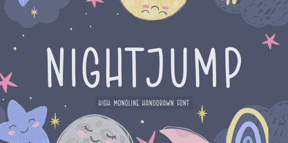 NIGHTJUMP is a High Monoline Hand drawn Font. Night Jump is a handwritten font with a casual look. It is perfect for product packaging, branding project, magazine, social media, wedding, or just used to express words above the background. NIGHTJUMP also multilingual support. Enjoy the font, feel free to comment or feedback, send me PM or email.
 - Necromantic - Unknown license

- Hortensia by ParaType,
$30.00Hortensia™ was designed by Natalia Vasilyeva and licensed by ParaType in 2001. An original calligraphic script. For use in advertising and display typography. - Vesna by ParaType,
$30.00PT Vesna™ was designed by Natalia Vasilyeva in 2000. Licensed by ParaType. An original calligraphic script for use in advertising and display typography. - Butterflies - Unknown license

- Lightmorning - Unknown license

- KG Keep Your Head Up - Personal use only

- Aircloud - Personal use only

- Optima Cyrillic by Linotype,
$65.00Many typefaces are distinctive or attractive at the expense of legibility and versatility. Not so the Optima® family. Simultaneously standing out and fitting in, there are few projects or imaging environments outside of its range. Although Optima is almost always grouped with sans serif typefaces, it should be considered a serifless roman. True to its Roman heritage, Optima has wide, full-bodied characters – especially in the capitals. Only the E, F and L deviate with narrow forms. Consistent with other Zapf designs, the cap S in Optima appears slightly top-heavy with a slight tilt to the right. The M is splayed, and the N, like a serif design, has light vertical strokes. The lowercase a and g in Optima are high-legibility two-storied designs. Optima can be set within a wide choice of line spacing values – from very tight to very open. In fact, there are few limits to the amount of white space that can be added between lines of text. Optima also benefits from a wide range of letter spacing capability. It can be set quite tight, or even slightly open – especially the capitals. If there are any guidelines, Optima should be set more open than tight. It’s not that readability is affected that much when Optima is set on the snug side; it’s just that the unhurried elegance and light gray typographic color created by the face are disrupted when letters are set too tight. Optima is also about as gregarious as a typeface can be. It mixes well with virtually any serif design and a surprisingly large number of sans serif faces. The Optima family is available in six weights, from roman to extra black, each with an italic counterpart. In addition, the family is available as a suite of OpenType® Pro fonts, providing for the automatic insertion of small caps, ligatures and alternate characters, in addition to offering an extended character set supporting most Central European and many Eastern European languages. When you’re ready to find its perfect pairing, browse these fantastic matches: Monotype Century Old Style™, Dante®, Frutiger® Serif, Joanna® Nova, Malabar™, and Soho®. - Optima by Linotype,
$45.99 Many typefaces are distinctive or attractive at the expense of legibility and versatility. Not so the Optima® family. Simultaneously standing out and fitting in, there are few projects or imaging environments outside of its range. Although Optima is almost always grouped with sans serif typefaces, it should be considered a serifless roman. True to its Roman heritage, Optima has wide, full-bodied characters – especially in the capitals. Only the E, F and L deviate with narrow forms. Consistent with other Zapf designs, the cap S in Optima appears slightly top-heavy with a slight tilt to the right. The M is splayed, and the N, like a serif design, has light vertical strokes. The lowercase a and g in Optima are high-legibility two-storied designs. Optima can be set within a wide choice of line spacing values – from very tight to very open. In fact, there are few limits to the amount of white space that can be added between lines of text. Optima also benefits from a wide range of letter spacing capability. It can be set quite tight, or even slightly open – especially the capitals. If there are any guidelines, Optima should be set more open than tight. It’s not that readability is affected that much when Optima is set on the snug side; it’s just that the unhurried elegance and light gray typographic color created by the face are disrupted when letters are set too tight. Optima is also about as gregarious as a typeface can be. It mixes well with virtually any serif design and a surprisingly large number of sans serif faces. The Optima family is available in six weights, from roman to extra black, each with an italic counterpart. In addition, the family is available as a suite of OpenType® Pro fonts, providing for the automatic insertion of small caps, ligatures and alternate characters, in addition to offering an extended character set supporting most Central European and many Eastern European languages. When you’re ready to find its perfect pairing, browse these fantastic matches: Monotype Century Old Style™, Dante®, Frutiger® Serif, Joanna® Nova, Malabar™ and Soho®.
 - Supria Sans by HVD Fonts,
$50.00 Supria Sans™ and Supria Sans Condensed is an extended family of 36 fonts designed by Hannes von Döhren. It contains two widths, six weights and three styles, including the curvy, feminine Italic as well as the more conventional Oblique. Although it is inspired by the utilitarian clarity of Swiss type design, subtle curves and fine detailing impart a more playful character to the whole Supria Sans family. Supria Sans™ is equipped for complex, professional typography. As an exclusively OpenType release, these fonts feature small caps, five variations of numerals, arrows and an extended character set to support Central and Eastern European as well as Western European languages. Supria Sans™ received the “Certificate of Excellence in Type Design” at the TDC2 (2011).


