10,000 search results
(0.029 seconds)
- Hasty Pudding - 100% free

- Wasty Pudding by PizzaDude.dk,
$15.00 Wasty Pudding was made by drawing a lot of letters, over and over again - and not caring so much about the looks, but focusing more on the speed of drawing, because I wanted a font that represented the way I write, when I am taking notes for myself. It’s not pretty, but it’s legible and scribbeliciously beautiful! :) Anyway, I think the purpose of this font is massive amounts of text. Song lyrics, novels, stories, diaries, manuscripts, books, etc. I bet you can fool someone with them thinking that this is not a font, because I have added 6 different versions of each lowercase letter!!!
 - Pod by Device,
$29.00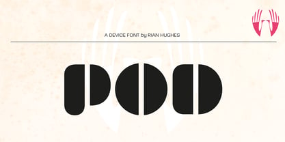
- Spud by Australian Type Foundry,
$30.00Capturing the free flowing feel of handwriting in a font is remarkably difficult. Spud is another attempt to achieve this. - Pod by kapitza,
$49.00 Pod™ is a cute foliage font consisting of 62 illustrations. It is entirely hand drawn and each character is unique. When combined it is easy to create fantasy forests and magical meadows.
 - Apud by DSType,
$26.00 Apud, a typeface with narrow proportions, interchangeable weights that avoid text warping, sharp serifs and square terminals. The clean, contemporary look and rigid structure makes Apud suited for any kind of publication design.
 - Osaka-Sans Serif - Unknown license

- Vazari Sans Serif - Unknown license

- Times Sans Serif - Unknown license

- Sans Serif Shaded - Unknown license

- Arabetic Sans Serif by Arabetics,
$32.00 The Arabetic Sans Serif type family follows the guidelines of the Mutamathil type style but also illustrates the effects of adding and removing Latin-like serifs on Arabetic scripts legibility. It has only one glyph for every basic Arabic Unicode character or letter as defined in Unicode Standards version 5.1. Arabetic Sans Serif employs variable x-height values. It includes all required Lam-Alif ligatures and uses ligature substitutions and selected marks positioning but it does not use any other glyph substitutions or forming. Text strings composed using types of this family are non-cursive with stand-alone isolated glyphs. Tatweel (or Kashida) glyph is a zero width space. Keying it before any glyph will display that glyph’s isolated form. Keying it before Alif Lam Lam Ha will display the Allah ligature. Arabetic Sans Serif family includes both Arabic and Arabic-Indic numerals; all required diacritic marks, Allah ligature, in addition to all standard English keyboard punctuations and major currency symbols. Fonts are available in regular, italic, bold, and bold italic styles.
 - Egiptian Sans Serif by Intellecta Design,
$26.90a 3D version of the classic egiptian style, but in a sans serif mode - Obcecada Sans & Serif by deFharo,
$15.00 Obcecada Sans & Serif are two geometric digital typefaces in regular and bold versions, very condensed and thin with a rounded finish on the horns and joints with a modern style. They include the Cyrillic and Greek alphabet. These fonts are the result of my obstinacy for very condensed fonts, in this case I have inclined to a very fine proportion with short ascending and descending that gives them elegance decó.
 - Cut Sans Serif by Aksharasarovara,
$25.00The thought behind this font was not to join vertical, horizontal and diagonal stems. Each stem is designed separately and arranged in a good manner to create glyphs. Something different from tradition; liberal, but in the limit. - Rotis Sans Serif by Monotype,
$45.99 Rotis is a comprehensive family group with Sans Serif, Semi Sans, Serif, and Semi Serif styles, for a total of 17 weights including italics. The four families have similar weights, heights and proportions; though the Sans is primarily monotone, the Semi Sans has swelling strokes, the Semi Serif has just a few serifs, and the Serif has serifs and strokes with mostly vertical axes. Designed by Otl Aicher for Agfa in 1989, Rotis has become something of a European zeitgeist. This highly rationalized yet intriguing type is seen everywhere, from book text to billboards. The blending of sans with serif was almost revolutionary when Aicher first started working on the idea. Traditionalists felt that discarding serifs from some forms and giving unusual curves and edges to others might be something new, but not something better. But Rotis was based on those principles, and has proven itself not only highly legible, but also remarkably successful on a wide scale. Rotis is easily identifiable in all its styles by the cap C and lowercase c and e: note the hooked tops, serifless bottoms, and underslung body curves. Aicher is a long-time teacher of design and has many years of practical experience as a graphic designer. He named Rotis after the small village in southern German where he lives. Rotis is suitable for just about any use: book text, documentation, business reports, business correspondence, magazines, newspapers, posters, advertisements, multimedia, and corporate design.
 - Microsoft Sans Serif by Microsoft Corporation,
$39.00Microsoft Sans Serif™ Regular is a very legible User Interface (UI) font. It was designed to be metrically compatible with the MS Sans bitmap font that shipped in early versions of Microsoft Windows. The original MS Sans was in the inflexible .fon bitmap format and could not be scaled. Microsoft Sans Serif Regular is much more flexible and legible as it font antialiasing and scalable user interfaces. Character Set: Latin-1, WGL Pan-European (Eastern Europe, Cyrillic, Greek and Turkish). - Sans Serif Inline by ARTypes,
$35.00Based on the 36-point design of the Amsterdam Nobel Inline capitals (1931), Sans Serif Inline™ is designed specially to meet the requirements of today's technology. - Sana Sans by Latinotype,
$29.00 Sana Sans is a humanist functional typeface with a modern feel. It is intended to be a face well-suited for multiple purposes, especially in publishing. Sana Sans looks perfectly legible and clean in long texts, and neat and simple in headlines. Thanks to its versatility, this font is also ideal for both screen and print usage. Sana Sans consists of 32 styles and 8 weights—ranging from Thin to Heavy—italics, small caps and an alternative family. The alternative family offers slight variants in many glyphs, some of which include the lowercase a, e, l, q, y and uppercase G, L, and Q. Sana Sans was designed by Felipe Sanzana, under the supervision of Latinotype Team.
 - MerryCouple Demo San Serif - Personal use only

- Today Sans Serif SH by Scangraphic Digital Type Collection,
$39.50 Since the release of these fonts most typefaces in the Scangraphic Type Collection appear in two versions. One is designed specifically for headline typesetting (SH: Scangraphic Headline Types) and one specifically for text typesetting (SB Scangraphic Bodytypes). The most obvious differentiation can be found in the spacing. That of the Bodytypes is adjusted for readability. That of the Headline Types is decidedly more narrow in order to do justice to the requirements of headline typesetting. The kerning tables, as well, have been individualized for each of these type varieties. In addition to the adjustment of spacing, there are also adjustments in the design. For the Bodytypes, fine spaces were created which prevented the smear effect on acute angles in small typesizes. For a number of Bodytypes, hairlines and serifs were thickened or the whole typeface was adjusted to meet the optical requirements for setting type in small sizes. For the German lower-case diacritical marks, all Headline Types complements contain alternative integrated accents which allow the compact setting of lower-case headlines.
 - MS Reference Sans Serif by Microsoft Corporation,
$39.00MS Reference Sans Serif font is a special font containing the WGL character set and a range of symbols and icons. The WGL Pan-European character set provides support for Western, Central and Eastern European languages including Greek, Cyrillic, Baltic and Turkish. MS Reference Sans Serif is based on the Verdana fonts created by Matthew Carter and hinted by Thomas Rickner. The MS Reference Sans Serif font is distributed under license from Microsoft Corporation. - Legal Obligation Sans Serif by Wing's Art Studio,
$4.00 Legal Obligation - Sans Serif Version A dedicated compressed Sans Serif font for movie poster credit blocks and cinematic title designs. A workmanlike tool for adding extensive cast and crew information to movie posters without dominating the overall layout. Supplied with lowercase characters and three weights. Contents: - Legal Obligation (Sans Serif Version) - Light, Regular and Bold Weights
 - Rotis Sans Serif Paneuropean by Monotype,
$98.99Rotis is a comprehensive family group with Sans Serif, Semi Sans, Serif, and Semi Serif styles. The four families have similar weights, heights and proportions; though the Sans is primarily monotone, the Semi Sans has swelling strokes, the Semi Serif has just a few serifs, and the Serif has serifs and strokes with mostly vertical axes. Designed by Otl Aicher for Agfa in 1989, Rotis has become something of a European zeitgeist. This highly rationalized yet intriguing type is seen everywhere, from book text to billboards. The blending of sans with serif was almost revolutionary when Aicher first started working on the idea. Traditionalists felt that discarding serifs from some forms and giving unusual curves and edges to others might be something new, but not something better. But Rotis was based on those principles, and has proven itself not only highly legible, but also remarkably successful on a wide scale. Rotis is easily identifiable in all its styles by the cap C and lowercase c and e: note the hooked tops, serifless bottoms, and underslung body curves. Aicher was a long-time teacher of design with many years of practical experience as a graphic designer. He named Rotis after the small village in southern Germany where he lived. Rotis is suitable for just about any use: book text, documentation, business reports, business correspondence, magazines, newspapers, posters, advertisements, multimedia, and corporate design. - Today Sans Serif SB by Scangraphic Digital Type Collection,
$39.50Since the release of these fonts most typefaces in the Scangraphic Type Collection appear in two versions. One is designed specifically for headline typesetting (SH: Scangraphic Headline Types) and one specifically for text typesetting (SB Scangraphic Bodytypes). The most obvious differentiation can be found in the spacing. That of the Bodytypes is adjusted for readability. That of the Headline Types is decidedly more narrow in order to do justice to the requirements of headline typesetting. The kerning tables, as well, have been individualized for each of these type varieties. In addition to the adjustment of spacing, there are also adjustments in the design. For the Bodytypes, fine spaces were created which prevented the smear effect on acute angles in small typesizes. For a number of Bodytypes, hairlines and serifs were thickened or the whole typeface was adjusted to meet the optical requirements for setting type in small sizes. For the German lower-case diacritical marks, all Headline Types complements contain alternative integrated accents which allow the compact setting of lower-case headlines. - Powderfinger Pad - Unknown license

- Bud Easy - Unknown license

- Zud Juice - Personal use only

- Bud Easy - Unknown license

- Escape Pod - Unknown license

- Zud Juice - Personal use only

- Zud Juice - Personal use only

- Dusky Pub by Gleb Guralnyk,
$14.00 Introducing a vintage typeface named Dusky Pub. It's a layered font set made in classic western style. Bold shape with slab serifs makes it perfect for various labels and product designs. Wide range of languages support is available, including west european and cyrillic characters.
 - Puls 2012 by Jovan Ivanov,
$20.00
- FUD Grotesk by Ilya Bazhanov,
$50.00 A narrow sans serif, FUD Grotesk was inspired by brutalist architecture and modernist typography. There is a subtle stroke contrast, many inktraps, and even some microserifs (look for them in the main strokes!). Note the closed bowl apertures, exaggerated in the alternate forms, which result in a dense, ornate typeset. Five weights (from Light to Bold), and a large set of discretionary ligatures.
 - Black Mud by Stripes Studio,
$20.00 Black Mud a new font that is brushed is very attractive with a natural, detailed and perfect texture, also has an additional Black Mud Underlines. Perfect for brand projects, logos, product packaging, posters, invitations, greeting cards, news, blogs, everything including personal charm etc.
 - Spud AF by Andrew Foster,
$12.00 100% authentic! - all characters were cut from real potatoes, creating the charming imperfections and unexpected results of the real thing. Perfect for posters, children’s projects and ‘green’ themed graphics. Spud AF brings a quirky, personal touch to any job. Please note: Spud AF Tatty has replaced the original Spud AF font.
 - Scratch Pad by Bedoodle,
$9.00 - Apud Display by DSType,
$26.00 Apud Display is the perfect companion for Apud. With its refined high contrast and sharpness, Apud Display has the vitality and rigor of modern typefaces, every time you need your display setting to shine.
 - SAA Series EM by URW Type Foundry,
$35.00 - SAA Series D by URW Type Foundry,
$35.00


Page 1 of 250Next page