5,202 search results (0.163 seconds)
  1. Andulka Sans by Storm Type Foundry, $55.00
    Andulka was drawn in 2004 for the purposes of publication and visual identity. Her peaceful expression also excels in poetry and fiction. It reads so smoothly that you won’t even know that its width proportion is actually narrowed, so it’s very suitable for magazines, newspapers and thickest volumes of scientific literature. Her serif counterpart is Andulka. The entire Andulka system can easily build a typography of the entire publishing house.
  2. Jeepney - Unknown license
  3. Dark Garden - 100% free
  4. Penguin Attack - Unknown license
  5. Ringlet - Unknown license
  6. Chevron by Altered Ego, $45.00
    For that tight fit, STF Chevron is perfect. An ultra-condensed display font, with a complete character set. The name? It's named after an oil company, but the shapes of the serifs reflect that as well. With some art deco overtones, try Chevron in places that you might want a simple art deco typeface. How should you use it? It's perfect for posters, packaging and advertising, CD covers and publications. Fully hinted and exquisitely kerned, Chevron will be one of your favorite faces for tall copy that need to get noticed. It's really ideal for calendars, when you want big numbers without losing space for writing in the date fields. License it today!
  7. DejaVu Sans Mono - Unknown license
  8. DejaVu Serif - Unknown license
  9. DejaVu Serif Condensed - Unknown license
  10. Domestic Manners - Unknown license
  11. P22 Basel Roman by P22 Type Foundry, $24.95
    In mid 2001, P22 was approached by a Daniel Garrison, a Classics scholar at Northwestern University about possibly digitizing a long lost "Garamond" typeface. This font was used by Johannes Herbst (a.k.a. Ioannes Oporinus) in 1543 to publish Andreas Vesalius' "On the Fabric of the Human Body" (De humani corporis fabrica) in Basel. The story of the development of this font takes a few twists and almost becomes forgotten itself over time.Forteen years later it is available to the public.
  12. Postmodern Moderne by Jeff Levine, $29.00
    First published in 1938, Letters and Lettering by Paul Carlyle and Guy Loring was a textbook on lettering examples and how to do them. On one of the pages was found a solid black (counterless) Art Deco sans serif design that in its many variations so typified the era. The example shown in that book served as the model for Postmodern Moderne JNL, which is available in both regular and oblique versions.
  13. DEATHE MAACH by The Fontry, $15.00
    There's a war starting; you just didn't notice because you were too busy fighting to realize what was happening. Take your sides. Pick your battles. Choose a face that stands ready to defend, enforce and police. All who are ready to serve, please step forward. Deathe Maach is a six-font family of descending weights with the strength and stamina to face all comers in the approaching conflict. Armor on. Pistols out. Barrels forward. Enforce and serve.
  14. Vinice by Illuminaut Designs, $15.00
    This typeface was created as a personal project. Inspired by places like Chattanooga and Berkley, I wanted to create a bespoke typeface family for the US Virgin Islands. I noticed that the typeface Berlin Sans was in use all over the islands, in signs, logos, even on the side of police cars. So I built this typeface from the ground up with the goal of updating an old tried-and-true font into a family with versatile potential.
  15. TXT Tough Love by Illustration Ink, $3.00
    Add character to your paper crafts and publications. Download this cool Tough Love font to create lettering with a scratched or brush-stroke look. Design titles, captions, journaling and more, or simply give your publication an off-beat, handwritten appeal.
  16. HS Ali by Hiba Studio, $59.00
    HS Ali was designed in memoriam of my brother - Ali Abu Afash who was martyred during the last aggression on Gaza in summer 2014. HS Ali introduced a modern OpenType Arabic typeface, which had the characterstic, features of Kufi style with noticeable both curvy and sharp segments; beside the refinements of its letters that made it more readable. HS Ali is a display font that has been designed to be used in titles in modern graphic and publication projects. It supports Arabic, Persian, Urdu and Kurdish languages and contains four weights: Light, regular, medium and bold which can be condsiderd as and elaboration to the library of Arabic fonts contemporary models that meet the variant purposes of designs for all tastes.
  17. Deutsche Poster by Intellecta Design, $19.95
    a naive font inspired in a vintage publicity poster
  18. Star Time Too JL - Unknown license
  19. Action Is, Shaded JL - Unknown license
  20. Saturn - Unknown license
  21. Toons One - Unknown license
  22. Bus by Volcano Type, $19.00
    Another font idea inspired by a public transport information display.
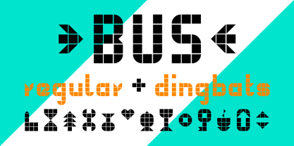
  23. El Abogado Loco - Unknown license
  24. Ogre by Australian Type Foundry, $30.00
    A funky, lively display font originally designed for a tourism publication.
  25. Tuffy - 100% free
  26. Tuffy - 100% free
  27. Ongunkan Armanen Runes by Runic World Tamgacı, $50.00
    The Armanen runes (or Armanen Futharkh) are a series of 18 runes, closely based on the historical Younger Futhark, introduced by Austrian mysticist and Germanic revivalist Guido von List in his Das Geheimnis der Runen (English: "The Secret of the Runes"), published as a periodical article in 1906, and as a standalone publication in 1908. The name Armanen runes associates the runes with the postulated Armanen, whom von List saw as ancient Aryan priest-kings. The Armanen runes continue in use today in esotericism and in currents of Germanic neopaganism.
  28. Tablet Gothic by TypeTogether, $35.00
    Graphic designers of any nationality and background know very well that the art of composing titles correctly is not easy, Especially when it comes to periodical publications where there is need for both flexibility and graphic coherence. Tablet Gothic was originally engineered as a titling type family, meant to help designers working on publications that require output as hard copies and a variety of digital platforms at the same time. As such, it is a grotesque sans serif that looks to the future of publishing with a clear understanding of its history, and reminiscences that go back to nineteenth century Britain and Germany. Tablet Gothic delivers the sturdy, straightforward and clean appearance expected from a grotesque, but it allows itself a good measure of personality to make it stand out on the page. Its 84 styles –six series of condensation and seven weights in each series plus obliques– guarantee that, whatever the publication format is, there's a Tablet Gothic font that will do the job and perform well both technically and aesthetically. Furthermore, the rounder styles, Tablet Gothic Wide, Normal and Narrow achieved amazing results at very small sizes, producing  a beautiful texture and highly readable text blocks. Tablet Gothic fonts can be purchased individually, by series or as a complete bundle (best value!)
  29. Cantarell - 100% free
  30. Livia - Unknown license
  31. old time radio - Unknown license
  32. Lichtner - Unknown license
  33. Tautier by Sihan Wu, $25.00
    Tautier is a display font based on the specimen of Enge Mediaeval-Antigua, published in 1900 from the Bauer Type Foundry. It is intentionally redrawn to keep its overall narrow proportions. Based on the existing basic alphabets, Tautier is redrawn to appear more classical and friendly, as you can notice in the rounded corners around the beaks, as well as the lachrymal terminals in lowercases. Tautier is a display typeface suitable for large applications, for example, headlines for editorial design, branding, webpages, and environmental design. It currently comes as a single-styled typeface disposed to extend with an italic version.
  34. Lichtner Italic - Unknown license
  35. ArtlookinOneType - Unknown license
  36. Murrx - 100% free
  37. Railway Point by Melissa Lapadula, $11.95
    This typeface has been influenced by the ongoing traffic congestion in Melbourne, and its lack of functional and reliable public transport as a possible solution. The font shapes are square-edged constrained angles, reflecting the way the Melbourne population feels when using the public transport system or roads. Use as headings and body copy in any graphic situation.
  38. CorpusCare - Unknown license
  39. Tink by Suomi, $25.00
    I was playing around with computer style forms, and suddenly noticed an optical effect in this style. There you go!
  40. Trooklern - Unknown license
Looking for more fonts? Check out our New, Sans, Script, Handwriting fonts or Categories
abstract fontscontact usprivacy policyweb font generator
Processing