8,826 search results
(0.039 seconds)
- Steletto OS Flair by Jonahfonts,
$42.00 Condensed Oldstyle Gothic with flair. Great for tight-fitting headlines and other condensed titling situations such as headlines, ads, invitations, captions, packaging, bulletins, posters, and greeting cards.
 - Roundwood JNL by Jeff Levine,
$29.00 The antique wood type Gothic Tuscan [a spurred design with rounded terminals] was the basis for Roundwood JNL, which is available in both regular and oblique versions.
 - Tin Pan Alley JNL by Jeff Levine,
$29.00 According to Wikipedia, Tin Pan Alley is the name given to the collection of New York City music publishers and songwriters who dominated the popular music of the United States in the late 19th century and early 20th century. The name originally referred to a specific place: West 28th Street, between Fifth and Sixth Avenues in Manhattan. With this in mind, Tin Pan Alley JNL, a typeface based on the bold hand lettering from a vintage piece of sheet music is aptly named.
 - Nerves of Steel BB by Blambot,
$9.00 Here's a deluxe comic book dialogue font with a vintage feel! Nerves of Steel BB comes with Regular, Italic, Bold, and Bold Italic. Contextual Alternates and Auto-ligatures enable six versions of every letter, and three versions of each number, the exclamation point and question mark. Barred-I correction is included as well as bouncy baselines when three or more duplicate letters are typed. To top it off, you get glyphs included for manga letterers, and a large European set of characters!
 - Quenta by Zetafonts,
$39.00 Canovaro was inspired by the hand-lettered masthead of Queenslander, a weekly magazine published during the first half of XIX century. The condensed serif letterforms of the magazine title, with the warm, human touch gave the shapes of Quenta a lively personality and a literary charme. To let you experiment with his vintage decorative layers, it comes in 4 styles including discretionary ligatures to allow you to use script elements to enrich its expressive range for editorial and logo design.
 - Poltrone by TeGeType,
$29.00 The Poltrone typefaces family was inspired by the public inscriptions of the 19th century and was designed to be used for titling, headlines, etc.
 - Azoe by Okaycat,
$29.95 The Azoe font family is cute unique handwriting. Azoe features extended characters, and contains West European diacritics & ligatures. Highly suitable for international environments & publications.
 - Portaso by Larin Type Co,
$12.00 PORTASO This is a vintage display font inspired by signage, logos in the style of the wild west of the old time. This is a great find for creating logos, various kinds of designs in vintage and wild West style. Portaso font family has only Capital letters and alternates to them. Also the Stamp style has a different texture for upper and lowercase. This collection includes 14 font styles: regular, rough, two shadows for regular style and two shadows for rough style and stamp style, also vintage, vintage rough, two shadows for vintage style and two shadows for vintage rough style and stamp style,
 - ITC Angryhog by ITC,
$29.00The name Angryhog came out of nowhere out of free association. "When you're working on a typeface on the Mac it demands a name from you which I find a bit confrontational" says Donaldson. ITC Angryhog brings together Roman and Gothic influences in a quirky and sophisticated display face. Characteristic of this typeface are its sharp, pointed forms, especially noticeable in the serifs, which give ITC Angryhog a restless, almost aggressive feel. It is as though the letters have a mind of their own and ignore all rules and regulations. ITC Angryhog is a perfect typeface for comics or satire, best suited to short to middle length texts and headlines. - Empire State Deco by Comicraft,
$19.00 Every face tells a story but this font is 77 stories high (1,046 feet with antenna included)! A lofty companion to Empire State Gothic , Empire State Deco is a tall, stately font containing four different styles, sometimes contradictory, united by the desire to be modern. Those familiar with the Exposition Internationale des Arts Décoratifs et Industriels Modernes will notice a post-postmodernism combined with the fine craftsmanship and rich materials for which those awfully nice chaps at Comicraft are known. During its Art Deco heyday, Comicraft represented luxury, glamour, exuberance, and faith in social and technological progress -- this new font recaptures those halcyon days in letter form.
 - Interzone by MYSTERIAN,
$9.00 This type crept up the sense that it was made in Eastern Europe by poorly trained urbanites from a crippled nation, or that it is the remains of a contemporary gothic (like Eckmann) stencil. The choice of what this type signifies is up to the public. Lately I like the idea of 'putting on' (in McLuhan's sense) a genre of idea that is somewhat different from my tradition's beliefs, and fitting a core category of that toward a teleological/eschatological advantage. Therefore postmodernist/apocalyptic carelessness (which I may 'put on' by using this type) is how I abstain from the cravings of immortality, or more so that wanting it is pointless. It’s stands as memento morí; that I will have to die someday. I have to become less, He must become more. Of course, Interzone may signify a classic Joy Division track from Unknown Pleasures as well as the Cold Warish ongoings of conflicted eastern European life. I considered naming this Lunik 9.
 - Melcheburn by Scriptorium,
$18.00Melcheburn is a classic late-medieval gothic font based on original lettering by Samuel Welo. It has strong, formal lower case letters and extremely ornate and decorative capitals. - Pimento by BA Graphics,
$45.00A slightly wide gothic with just a touch of flair. This font will add a nice elegant touch to all your designs; works great for text and headlines. - AdverGothic by ParaType,
$25.00 Designed at ParaType in 1989 by Vladimir Yefimov based on Advertisers Gothic, 1917, by Robert Wiebking, inspired by Art Nouveau lettering. For use in advertising and display typography.
 - Birstein by Ilhamtaro,
$32.00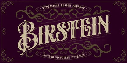 BIRSTEIN is a vintage decorative font, Victorian style. Perfect for vintage designs, vintage branding, liquor labels/brands. To enable the OpenType Stylistic alternates, you need a program that supports OpenType features such as Adobe Illustrator CS, Adobe Indesign & CorelDraw X6-X7. Cheers!
 - Circus Minimus Pulex by Morganismi,
$12.00 Circus Minimus Pulex typeface honours the memory of gone flea circus veterans. The icons present the little artists and their equipment to the great public.
 - Azola by Okaycat,
$29.95 The Azola font family is elegant, hand lettered & charming. Azola features extended characters, and contains West European diacritics & ligatures. Highly suitable for international environments & publications.
 - Farson Family by Garisman Studio,
$20.00 Proudly Present Farson - Vintage Typeface Farson born from an inspiring vintage display. This font gives a feel of a vintage, classic, old, and based on handmade. Already PUA Encoded and I think this font is perfect for people looking for vintage aesthetic or logo-type. Suitable for any graphic designs such as branding materials, t-shirt, print, business cards, logo, poster, t-shirt, photography, quotes .etc.
 - Bell Centennial by Bitstream,
$29.99 Designed specifically for AT&T by Matthew Carter at Mergenthaler to replace Bell Gothic with a typeface that made effective use of digital typesetting technology, Bell Centennial gets several more lines per page than Bell Gothic, reduces calls to information because of its significantly higher legibility under adverse printing conditions, saving AT&T many millions of dollars per year. Although intended for use at small sizes, Mazda UK used Bell Centennial at huge sizes to striking effect in a mid-1990s ad campaign.
 - Bebas Kai by Dharma Type,
$- Bebas Kai is free font which is licensed under the SIL Open Font License 1.1. Designed by Ryoichi Tsunekawa. We have another Bebas edition called Bebas Neue and there are some derived, rounded fonts such as Bebas Neue SemiRounded and Bebas Neue Rounded. Bebas Neue Pro has lowercases and Italics. When you need more impact for titling, please try Dharma Gothic and Rama Gothic. When you need body-text font matching with this Bebas family, please try our Bio Sans font family.
 - Warp Three NF by Nick's Fonts,
$10.00This face is a bit of a time traveler. It combines the lowercase from a font called simply Square Gothic from the 1888 James Conner’s Sons specimen book with the uppercase of Morris Fuller Benton’s 1932 monocase masterwork Agency Gothic, resulting in a high-tech typeface right at home in the twenty-first Century. Available in three weights. All versions of this font include the Unicode 1250 Central European character set in addition to the standard Unicode 1252 Latin set - Register by Device,
$29.00 The capitals of Register share a similar construction to Morris Fuller Benton’s 1930 Bank Gothic for American Type Founders, but iron out the broader curves and add ‘ink traps’ to emphasise the machine aesthetic. Register also provides the lower case missing from Bank Gothic. Available in two main widths, each in five weights plus reweighted italics with cursively-derived letterforms, plus a bold condensed, Register has been used for the Sochi Winter Olympics, Source magazine and releases from Transient Records.
 - Merlove by Pixesia Studio,
$15.00 Introducing Merlove - A Contemporary Display Font Merlove is a strong and contemporary display font. It has an unique vintage style, that is perfect for branding. Add it to your most creative ideas and notice how it makes them come alive! FEATURES - Stylistic Alternates - PUA Encoded - ALL Caps - Numbering and Punctuations - Multilingual Support - Works on PC or Mac - Simple Installation - Support Adobe Illustrator, Adobe Photoshop, Adobe InDesign, also works on Microsoft Word Hope you Like it. Thanks.
 - P22 Tyndale by IHOF,
$24.95Quill-formed roman/gothic with an olde-worlde flavor. Some background in the designer's own words: "A series of fonts came to mind which would be rooted in the medieval era -for me, a period of intense interest. Prior to Gutenberg's development of commercial printing with type on paper in the mid-1400s, books were still being written out by hand, on vellum. At that time, a Bible cost more than a common workman could hope to earn in his entire lifetime. Men like William Tyndale devoted their energies to translating the Scriptures for the benefit of ordinary people in their own language, and were burned to death at the stake for doing so. Those in authority correctly recognized a terminal threat to the fabric of feudal society, which revolved around the church. "This religious metamorphosis was reflected in letterforms: which, like buildings, reflect the mood of the period in which they take shape. The medieval era produced the Gothic cathedrals; their strong vertical emphasis was expressive of the vertical relationship then existing between man and God. The rich tracery to be seen in the interstices and vaulted ceilings typified the complex social dynamics of feudalism. Parallels could be clearly seen in Gothic type, with its vertical strokes and decorated capitals. Taken as a whole, Gothicism represented a mystical approach to life, filled with symbolism and imagery. To the common man, letters and words were like other sacred icons: too high for his own understanding, but belonging to God, and worthy of respect. "Roman type, soon adopted in preference to Gothic by contemporary printer-publishers (whose primary market was the scholarly class) represented a more democratic, urbane approach to life, where the words were merely the vehicle for the idea, and letters merely a necessary convenience for making words. The common man could read, consider and debate what was printed, without having the least reverence for the image. In fact, the less the medium interfered with the message, the better. The most successful typefaces were like the Roman legions of old; machine-like in their ordered functionality and anonymity. Meanwhile, Gutenberg's Gothic letterform, in which the greatest technological revolution of history had first been clothed, soon became relegated to a Germanic anachronism, limited to a declining sphere of influence. "An interesting Bible in my possession dating from 1610 perfectly illustrates this duality of function and form. The text is set in Gothic black-letter type, while the side-notes appear in Roman. Thus the complex pattern of the text retains the mystical, sacred quality of the hand-scripted manuscript (often rendered in Latin, which a cleric would read aloud to others), while the clear, open side-notes are designed to supplement a personal Bible study. "Tyndale is one of a series of fonts in process which explore the transition between Gothic and Roman forms. The hybrid letters have more of the idiosyncrasies of the pen (and thus, the human hand) about them, rather than the anonymity imbued by the engraving machine. They are an attempt to achieve the mystery and wonder of the Gothic era while retaining the legibility and clarity best revealed in the Roman form. "Reformers such as Tyndale were consumed with a passion to make the gospel available and understood to the masses of pilgrims who, in search of a religious experience, thronged into the soaring, gilded cathedrals. Centuries later, our need for communion with God remains the same, in spite of all our technology and sophistication. How can our finite minds, our human logic, comprehend the transcendent mystery of God's great sacrifice, his love beyond understanding? Tyndale suffered martyrdom that the Bible, through the medium of printing, might be brought to our hands, our hearts and our minds. It is a privilege for me to dedicate my typeface in his memory." - Kingthings Annex - 100% free

- Ab Fangs - Unknown license

- Agathodaimon - Personal use only

- La Rosa Muerta - Unknown license

- A Charming Font Outline - Unknown license

- Augsburg Initials by Kaer,
$18.00 Hey! I'm happy to introduce to you my new initial's set. These drop caps I found in the "Introductorium in astronomiam" manuscript. It was printed in Augsburg in 1489 by Erhard Ratdolt. I've added some lost letters and assembled a full alphabet. Augsburg is a medieval gothic style font. Set of dim colored and monochrome grunge style emblems. Engraved initial drop caps. Perfect for vintage premium identity, Middle Ages posters, luxury packaging. If you want dark and strong medieval style concepts, please try it. --- *You can use color fonts in PS since CC 2017, AI since CC 2018, ID since CC 2019, macOS 10.14 Mojave* *Please note that the Canva & Corel doesn't support color fonts!* --- Please feel free to request any help you need: kaer.pro@gmail.com Best, Roman. Thank you!
 - Giro - 100% free

- TXT Small World by Illustration Ink,
$3.00Get that Disney look with this downloadable "Small World" font. It's ideal for journaling and titles for theme park scrapbooking or wording for other creative publications. - TXT Annesia by Illustration Ink,
$3.00Add a touch of flair with this one-of-a-kind TrueType font. It gives a handwritten appeal to scrapbook journaling, greeting cards, and creative publications. - Humpty Dumpling NF by Nick's Fonts,
$10.00This rollicking romp through the alphabet is based on an offering from the irrepressible M. Draim, seen in La Lettre dans le Décor & la Publicité Modernes, published by Monrocq Frères of Paris in 1932. Its animated and friendly demeanor will add personality to any headline it graces. Both versions of this font contain the Unicode 1252 (Latin) and Unicode 1250 (Central European) character sets, with localization for Romanian and Moldovan. - Nersans by Garisman Studio,
$20.00 Nersans - Vintage Font with 3 Styles Nersans born from an inspiring vintage display with all caps glyphs. This font gives a feel of a vintage, classic, old, handmade looked like. Already PUA Encoded and I think this font is perfect for people looking for vintage aesthetic or logo-type. Suitable for any graphic designs such as branding materials, t-shirt, print, business cards, logo, poster, t-shirt, photography, quotes .etc.
 - Neue Northwest by Kaligra.co,
$19.00 Neue Northwest is a vintage sans serif family, Inspired by Vintage Wild west culture and combining with modern vintage touch. An All-Caps Sans Serif pairing with a Clean, Rounded & textured version of each. Choose between varying texture strength for your desired effect. This font is great for logo print, Restaurant Menus & Signage, Pubs, Bars, Tattoo Shops, Barber Shops, Butcher Shops, Handmade Brands, BBQ, Anything vintage styles related, etc
 - Garagin Rock by Rodrigo de Carvalho,
$14.50 Garagin Rock was developed from the studies for the title of a publication called Garagin in 1999. Its use is indicated for the titles on posters and stuff like that, but feel free to dare. Anyway, it really was not made for small sizes and is not a WebFont obviously, but again, feel free to dare. May you notice something odd in the baseline position, this is to keep leading with a defined size. But of course you can change it in any editing program. Being a heavy typeface, use in moderation... or not! Garagin Rock Lite is a version with a limited set of characters.
 - Quamoclit by Enfeeltype,
$15.00 It is indeed a beautiful serif font that exudes luxury and exclusivity. Its elegant and refined design makes it a popular choice for high-end branding, editorial design, and fashion publications. I completely agree with you! Quamoclit's unique style and exquisite details make it a perfect fit for any project that requires a touch of sophistication and elegance. It is no wonder that it has become a go-to choice for luxury brands and high-end publications.
 - Afterword JNL by Jeff Levine,
$29.00 At the end of the 1931 gangster film “The Public Enemy” a hand lettered card offers up an afterword on the demise of Tom Powers (James Cagney’s character in the film) and how a “public enemy” is neither a man nor a character but a problem society must deal with. The text is in an Art-Deco influenced sans serif, and has been digitally recreated as Afterword JNL, which is available in both regular and oblique versions.
 - Scalter by Dirtyline Studio,
$25.00 SCALTER was designed in the early April and published in July 2020. Scalter Serif is inspired by the characteristics American vintage sign then the sans serif it’s combination retro typeface. All shape of this typeface is make strong and more contrast, giving a more dynamic and retro feel. Scalter are available in 5 Widths (Condensed – SemiCondensed – Normal – SemiExpanded – Expanded) with matches 4 style (Serif – Semi Serif – Sans Bold- Sans Black - Script) with a total 42 Styles. Also includes support for 26+ Latin (Extended) Languages.


