6,074 search results
(0.033 seconds)
- Spooky Grave by Letterara,
$14.00 Spooky Grave is a chunky lettered and spooky display font. Add this font to your favorite Halloween-themed ideas: invitations, banner, advertising, logo, movie, poster, novel, app game scary or horror, and notice how it makes them come alive! No matter the topic, this font will be an incredible asset to your fonts’ library, as it has the potential to elevate any creation. This font is PUA encoded which means you can access all of the glyphs.
 - Off Side by HansCo,
$15.00 Off Side is a bold and chunky lettered display font. Add this font to your creative ideas and notice how it will make them stand out. This texture is very detailed. Off Side is suitable for logos, product branding, printable templates, posters, flyers, shirts, or for text overlay to any background image. This font comes with a FULL CAPS, numbers and punctuation + standard multilingual support in ALL CAPS. We recommend using Adobe Illustrator or Photoshop. Ennjoy!
 - Overbeat by PizzaDude.dk,
$20.00 Grunge is not dead! Neither is punk! The proof is the Overbeat font! It has got both grunge and punk in the one and same. The letters are grungy, and punked up with a sort of halftone slime effect. It's hard, it's tough and perhaps even scary! Play around with the font and you'll quickly notice the variety of the font. Each lowercase letter has 4 different versions and there is ligature substitution for most common uppercase double letters!
 - Calla Script by Great Lakes Lettering,
$30.00 Calla is a scripted typeface with an interesting personality. Each letter was created many times so you can get a truly distinctive look to your designs. Notice when you type with open type feature switched on, your letters will bounce around and change as you type? This feature ensures you get a new version of each letter throughout the words you use! Want to get even more custom? Pair all caps words with your lowercase words to create hierarchy!
 - PF DIN Text by Parachute,
$79.00 The purpose of the original DIN 1451 standard was to lay down a style of lettering which is timeless and easily legible. Unfortunately, these early letters lacked elegance and were not properly designed for typographic applications. Ever since its first publication in the 1930’s, several type foundries adopted the original designs for digital photocomposition. By early 2000, it became apparent that the existing DIN-based fonts did not fulfil the ever-increasing demand for a diverse set of weights and additional support for non-Latin languages. Parachute® was set out to fill this gap by introducing the PF DIN series which has become ever since the most comprehensive and sophisticated set of DIN typefaces. It was based on the original standards but was specifically designed to fit typographic requirements. Its letterforms divert from the stiff geometric structure of the original and introduce instead elements which are familiar, softer and easier to read. The first set of fonts was completed in 2002 as a group of 3 families which included condensed and compressed versions. With its vast array of weights, the extended language support, but most of all its meticulous and elaborate design, it has proved itself valuable to numerous design agencies around the world. Ever since its first release, it has been used in diverse editorials, packaging, branding and advertising campaigns as well as a great number of websites. It was quoted by Publish magazine as being “an overkill series for complex corporate identity projects”. The whole PF DIN Text type system (with normal, condensed and compressed styles) includes 45 weights from Hairline to Extra Black including true-italics. Additionally, every font in the Pro series is powered by 270 very useful symbols for packaging, environmental graphics, signage, transportation, computing, fabric care. There are 2 versions to choose from: The PRO version is the most powerful. All weights support Latin, Cyrillic, Greek, Central/Eastern European, Romanian, Baltic and Turkish, with 20 advanced opentype features including small caps. The standard STD version is more economic. All weights support Latin, Central/Eastern European, Romanian, Baltic and Turkish, with 18 advanced opentype features including small caps. In 2010 Parachute® released 4 new families DIN Monospace, DIN Stencil, DIN Text Arabic and DIN Text Universal. All these are complemented by the popular DIN Display version. Altogether the Parachute DIN series is a set of 8 superfamilies with a total of 96 weights.
 - Fraktura, designed by the talented typographer Juan Casco, is a distinct and deeply evocative font that draws its inspiration from the historical gothic script known as Fraktur. This type of script, ...
- The Abaddon™ font, designed and released by The Scriptorium, is a distinctive typeface that exudes a strong aura of dark fantasy and gothic elegance. Its name, inspired by a term that often reference...
- Converon by Maulana Creative,
$14.00 Converon is a decorative cubical display font. With bold sharp edges stroke, fun character with a bit of ligatures. To give you an extra creative work. Converon font support multilingual more than 100+ language. This font is good for logo design, Social media, Movie Titles, Books Titles, a short text even a long text letter and good for your secondary text font with sans or serif. Make a stunning work with Converon font. Cheers, MaulanaCreative
 - Ray Harts by Maulana Creative,
$12.00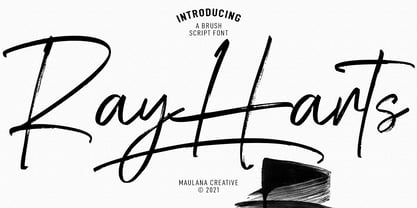 Converon is a decorative cubical display font. With bold sharp edges stroke, fun character with a bit of ligatures. To give you an extra creative work. Converon font support multilingual more than 100+ language. This font is good for logo design, Social media, Movie Titles, Books Titles, a short text even a long text letter and good for your secondary text font with sans or serif. Make a stunning work with Converon font. Cheers, MaulanaCreative
 - Zephyrus Cyber by Ferry Ardana Putra,
$19.00 Introducing Zephyrus, our new condensed modern cyber font that's designed to take your designs to the next level! With its unique condensed squared feel, this font is perfect for anyone looking to add a modern and futuristic touch to their work. But we didn't stop there - we've also included a rounded version of Zephyrus, which softens the edges and provides a more approachable feel. This versatility means that you can use Zephyrus for a wide range of design projects, from logos and branding to websites and digital presentations. In addition, Zephyrus comes equipped with numerals, symbols, punctuation, and foreign language support, making it a versatile and functional font that's suitable for global projects. Whether you're creating a tech-based project or looking to add a futuristic touch to your branding, Zephyrus has you covered. Zephyrus is a great font for modern and futuristic designs. Its unique condensed squared feel and rounded version make it a versatile choice for a wide range of design applications. Here are some perfect use cases for Zephyrus font: Technology-based websites and apps: Zephyrus is an excellent choice for designing websites and apps that focus on technology and innovation. Its modern and futuristic design complements the content of these websites and apps and creates an atmosphere of innovation. Corporate branding: Zephyrus can be used to create a modern and innovative corporate branding identity for companies in the technology and innovation sectors. It is perfect for creating logos, letterheads, business cards, and other branded materials. Advertising campaigns: Zephyrus is perfect for advertising campaigns that require a futuristic or high-tech look and feel. It can be used in print ads, online ads, and other promotional materials to create a sense of innovation and modernity. Product packaging: Zephyrus can be used to create packaging designs for technology-based products. Its modern and futuristic design can help these products stand out on shelves and create an impression of innovation and quality. Presentations: Zephyrus is a great choice for creating compelling and modern presentations. Its unique design can add an element of creativity and innovation to your presentations and help you stand out from the competition. Video game design: Zephyrus can be used to create a video game design that requires a futuristic or cyberpunk style. Its unique design can help create an immersive gaming experience for players. In conclusion, Zephyrus is the perfect choice for anyone looking for a condensed modern cyber font that's both versatile and functional. With its squared feel, rounded version, and support for numerals, symbols, punctuation, and foreign languages, Zephyrus is a font that's sure to take your designs to the next level! Zephyrus features: A full set of uppercase Numbers and punctuation Multilingual language support PUA Encoded Characters OpenType Features Cyber Style +278 Total Glyphs ⚠️To enable the OpenType Stylistic alternates, you need a program that supports OpenType features such as Adobe Illustrator CS, Adobe InDesign & CorelDraw X6-X7, Microsoft Word 2010, or later versions. There are additional ways to access alternates/swashes, using Character Map (Windows), Nexus Font (Windows), Font Book (Mac) or a software program such as Pop Char (for Windows and Mac). ⚠️For more information about accessing alternatives, you can see this link: http://adobe.ly/1m1fn4Y ——— 🔑Important tutorial from the author: Tutorial for Mollusca font trio: https://lnkd.in/d984CQD6 How to use Midway | Retro Script Font on illustrator: https://lnkd.in/eusbZd7s How to use Midway | Retro Script Font on Photoshop: https://lnkd.in/evsYrwgs How to use Hellfire Flames | Death Metal Font on Photoshop: https://www.youtube.com/watch?v=Z0MSBYzl9EM&t=35s How to use Rusted Sabbath | Black Metal Font Font on Photoshop: https://www.youtube.com/watch?v=_BTTgnSszsM&t=6s How to use Black Dread | Death Metal Font on Photoshop: https://www.youtube.com/watch?v=cKoSvIEbdZ4 ——— 🔥 Thank you for purchasing our product, hope you like it and have fun with our product. If you have any queries, questions, or issues, please don't hesitate to contact us directly. If you are satisfied with our product, please give 5 stars rating. ——— Happy Designing...😊
 - Demigrunge by Aah Yes,
$9.95Just a hint of grunge in this font, one side fairly clean and one side with subtle grunge. Demigrunge lends itself readily to display, headlines and writing sentences without verbs in them. Just one style in this family. Lots of accented characters and extensive punctuation. Great for goth titles. - Wolf's Bane Expanded Italic by Iconian Fonts is not just a font; it's a voyage into the realm of the extraordinary and the distinctive, a perfect blend of the menacing and the elegant. As suggested b...
- Minnak by Esintype,
$18.00 Minnak, as a whole geometric display type is our take on Square Kufic (Makili) style Latin script fonts, comes in eleven weights with linear progression. It is an Uniwidth typeface at the core. From Hairline to Black, all multiplexed weights take up the same space in width and can be used interchangeably. Supports wide range of Open Type features, with many stylistic alternates in 12 context. Minnak is also have a close relation with pixel fonts, because in spite of its based on Makili forms, it all started as a pixel font in the drawing stage before further steps came into play. The key difference between Minnak and Makili style is that the latter must have the exact square counters with no diagonal strokes, and any other components of a letterform must conform to be proportional. Such style-specific requirements determine the overall dimensions of the glyphs and therefore, there can be only minor differences between the typefaces. In Minnak, counters are rectangular because of its narrow and condensed proportions, but the Makili form influence is still manifest. This impression is best confirmed with Medium weight where negative spaces and stem thickness are equal. Contrast and virtually no optical correction were presented, as characteristic of its genre had to have equal horizontal and vertical line thicknesses. As per the minimal and authentic look of the type, all glyphs are drawn as straight or only as 45-degree diagonal strokes. The representation of the ‘diagonalless’ approach is preserved by stylistic alternatives, making its similarity in visual aesthetics clearly visible. Marks and punctuation is another feature that doesn’t follow the strict rules of the origin style. Although not a pixel font, all building parts of the glyphs in Minnak share the same unit precision as they are designed with pixel equivalents in mind. Even space characters are designed to match glyph widths, meeting the demands of certain typesetting or multi-line lettering compositions. With its Pseudo Ancient and Runic alternates, extention parts and ornaments included in all weights, Minnak is suitable for branding, logo and monogram designs, the screen titles and headlines, packaging, posters, book covers and more, where it shines at big sizes. Its pixel font-like appearance makes it a significant choice for the modern compositions. Thanks to mostly uniform width design, it is possible to use Minnak also as a system for lettering. This feature can be used as vertical fitting of the letters between the lines. As a casual expression in Turkish, “Minnak” is one of the seven typeface designs in Esintype's ancient scripts of Anatolia project, Tituli Anatolian series — representing Seljuk period in the medieval Anatolia and their tradition of architectural stone ornamentation.
 - Claudius - Unknown license

- Rudelsberg-Initialen - Personal use only

- Andras by Alive Fonts,
$40.00 Inspired from fragments peeled from the helmet of retired stunt-man Andras Balaset, font designer Allen Mercer of Alive fonts has created an alphabet ready to give you the best performance in a variety of conditions. Andras Bold has a more noticeable casual flare with uniquely angled strokes while Andras Slim is a more polished and rigid contender. Whether hand painted on rockets, race cars or pleather jackets, Andras has been highly refined to maintain readability even while traveling at high speeds.
 - Fruity Mellow Sun by Epiclinez,
$18.00 Fruity Mellow Sun is a lovely script font featuring charming, playful characters that seem to dance along the baseline. Add this font to your most creative ideas, and notice how it makes them stand out!. This script font is supporting Multi-Languages, which include: Afrikaans Albanian Catalan Danish Dutch English Estonian Finnish French German Italian Norwegian Portuguese Spanish Swedish Zulu. So what's included: Basic Latin A-Z & a-z. Numbers, symbols, punctuations and ligatures. Multilingual Support. Accented Characters : ÀÁÂÃÄÅÆÇÈÉÊËÌÍÎÏÑÒÓÔÕÖØŒŠÙÚÛÜŸÝŽàáâãäåæçèéêëìíîïñòóôõöøœšùúûüýÿžß Thank You.
 - Pax by Linotype,
$29.99Pax is clearly a didone, using Vox classification. The contrast between the thin lines and the thicker ones is noticeable, as you would expect from a didone. The basic form is relatively narrow, therefore I designed another Pax, slightly wider and darker, and called it Pax #2. Otherwise they are more or less identical. Pax is Latin for peace, on everyone's want list in 1995 - as well as every single year before and after that. Pax was released in 1995. - Quiet Time by ParaType,
$25.00The font was developed as a part of a corporate identity project for a pillow shop on the base of existing logo. It’s an attempt to reflect the space of a dream -- virtual reality where objects don’t have solid shapes, but present just hardly noticed disappearing contours. This idea determines the design of letters that resemble illustrations rather then alphabetical symbols and are based on ultra thin stems. The font was designed by Elena Kolesnikova and released by ParaType in 2009. - Ekela by AukimVisuel,
$9.00 Ekela family has 216 styles in 5 versions: Normal, Round, Circle, Punch and Round Punch. Ekela family is a neat, unique sans serif simple font with minimal and round letters. It can easily be combined with an incredibly large set of projects, so add it to your creative ideas and notice how it sets them apart! Suitable for a wide variety of designs thanks to its neat styling, Ekela family has the potential to become your favorite font, whatever the occasion!
 - SK Sofuto by Shriftovik,
$32.00 SK Sofuto is a bold display typeface inspired by graffiti culture. Striking and unusual forms of the font distinguish it and do not allow you to forget about it. SK Sofuto is a typeface that cannot be unnoticed. It is bright, wicked, and screaming. The typeface supports multilingualism, namely Latin, both classical and extended, as well as Cyrillic! The SK Sofuto typeface will make your work noticeable and will fit perfectly in both poster and printing design, as well as in web design.
 - Flashy by Invasi Studio,
$18.00 The flashy font is a fun, cool, and retro style. Come with a fun alt glyph, it can easily be matched to an incredibly large set of projects, so add it to your creative ideas and notice how it makes them stand out! This font is perfect for headings, flyers, greeting cards, product packaging, book cover, printed quotes, logotype, apparel design, album covers. This font is PUA encoded which means you can access all of the glyphs and swashes with ease!
 - Pax 2 by Linotype,
$29.99Pax is clearly a didone, using Vox classification. The contrast between the thin lines and the thicker ones is noticeable, as you would expect from a didone. The basic form is relatively narrow, therefore I designed another Pax, slightly wider and darker, and called it Pax #2. Otherwise they are more or less identical. Pax is Latin for peace, on everyone's want list in 1995 - as well as every single year before and after that. Pax was released in 1995. - Hollow Mummy by Attype Studio,
$10.00 Hollow Mummy is a bold and authentic display font. Add this font to your creative and spooky ideas and notice how it will make them stand out! Hollow Mummy is perfect for branding, logo, invitation, stationery, social media post, product packaging, merchandise, blog design, game titles, cute style design, Book/Cover Title and more. What's Included : - hollow mummy (.otf) - hollow mummy display (.otf) - Multilingual Support (Afrikaans, Albanian, Catalan, Danish, Dutch, English, Estonian, Finnish, French, German, Icelandic, Italian, Norwegian, Portugese, Spanisch, Swedish, Zulu)
 - Sure, Squareworm by Måns Grebäck is a visually striking font that captures attention with its unique and playful essence. It's like stepping into a whimsical digital playground where each character h...
- The Arkitech font, crafted by the talented designer Ivan Filipov, embodies a sleek and modern aesthetic that is at once simple yet profoundly distinct. This typeface falls within the category of geom...
- Rational TW by René Bieder,
$39.00 Rational TW is the typewriter addition to the Rational family. It is a monospaced font building on the same principles as its proportional, neogrotesque brother, such as maximum legibility and flexibility while combining Swiss and American gothic elements with a modern aesthetic. Due to the monospaced environment, some of its letter shapes like “r”, “m”,“f”, “i” and “w” have been slightly adapted but kept the same in appearance. Rational TW comes in two version: Rational TW Display and Rational TW Text. As indicated by its name, Rational TW Text is not limited to, but works best in small font sizes because it features distinctive letter shapes like a double storey “a” or “g” in order to help differentiate similar glyphs in small sizes. Rational TW Display, on the other hand, creates a geometric uniformity by implementing round shapes in “a” and “g”, giving it a subtle friendly and open character. Unlike many other monospaced fonts, Rational TW has a large amount of opentype features like small caps, alternative glyphs, case sensitive shapes, and many more making it the perfect choice for countless scenarios. With more than 700 glpyhs per font, it performs excellently in any project from print to digital.
 - Callimathy by Anomali Creative,
$15.00 Broken letters or Gothic letters, also known as German letters, are the typeface used in Europe West from the 12th century to the 17th century. Meanwhile, Danish spoke it until 1875 and German, Estonian and Latvian spoke it well into the 20th century. Fracture is one of the broken typefaces that is often considered to represent the entire broken typeface. Broken letters are sometimes also called Old English, but not in the Old English or Anglo-Saxon sense that was born centuries earlier. This group of letters is so named because it contains Latin letters that have breaks in the curvature of the letters, either in part or in whole designs. The fracture arises from a sudden dip when writing certain parts of the letter. In contrast, letters with perfect, unbroken curves, such as Antikua, are created from smooth, flowing writing movements. Callimathy is a font inspired by the Blackletter typeface, made with a modern impression but still looks strong and unique. In addition, Young Best font is also supported with multilingual characters that can be used in several international languages. Callimathy font is very suitable for use in making music album cover designs, tattoo logos, wishkey labels, packaging pomades and so on which are made with dark and strong concepts.
 - Bengala by Andinistas,
$59.95 Bengala is a font based on Calligraphy & Geometry designed by Carlos Fabián Camargo. Its purpose is to be an innovative typographic system combining Script letters with geometric and hard Caps letters. The contradictory styles are ideal for designing covers, posters, branding and packaging. Its smooth calligraphic look meticulously incorporates characters to design logos and phrases that communicate dynamism and strategy. Bengala Script was inspired by Mistral by R. Excoffon. Bengala Script provides violent and unstable lines with generous spacing between the letters and tight horizontal proportions, producing showy upper and lower case italics inspired by French Gothic calligraphy late fifteenth century. For this reason, Bengala Script retains some uninterrupted calligraphic logic, up and down sometimes higher or shorter than the height of the lowercase, creating dynamism through a variable amount of contrast between thick and thin strokes. Bengala Dingbats has 62 drawings designed to accompany the designs. Script and Caps Bengala have different gender and the similar X height produces more visual appeal. This way Bengala Caps - inspired by the Porshe logo, due to its geometric uppercase Roman construction, extended horizontal proportions, light caliber, rounded strokes terminations and generous spacing between letters. Special thanks to John Moore and Manuel Corradine for their help with Open Type.
 - Bordonaro Spur by Estudio Calderon,
$35.00 Bordonaro Spur - Bordonaro Script’s partner - is a typography strongly influenced by old beer labels and includes some serifs based on Frederic W. Goudy’s Copperplate, but with some softened spurs adding an elegant and soft texture to the text. It is ideal to be used on large bodies and has a set of special ligatures ideal to be used in branding. Psss...Check out the NEW Bordonaro Spur with Rounded corners , same version but soft! FEATURES Co = company1 Co = company2 Estd = established Inc = incorporated Ltd = limited Mc = mac Rd = Road St = street And also from Adobe CC you can activate Style Sets (SS) and get ideal ligatures for ordinal numbers: 1st = st 2nd = nd 3rd = rd 4th = th Bordonaro Script and Bordonaro Spur are two typographic styles that were designed under the same characteristic features with the idea of combining them to obtain better results, for that reason, we recommend merging them in a creative way and you will realize everything you can design with them. The banners designs are based on old brands of beer labels, coffee packaging, sports logos and in some cases we use Copperplate Gothic but only as a complementary font in order to harmonize the layout of the elements in each banner.
 - Xpress Rounded by Wiescher Design,
$12.00 »XPress-Rounded« is my new addition to »XPress«, my Sans-Serif that impresses – especially in small sizes – with its outstanding readability. »XPress-Rounded« looks very different, almost like a completely new font. But the rounded version has the same seven precisely calibrated weights from »Thin« to »Heavy« and its corresponding italics make this font-family universally usable. The »XPress« fonts got their bearings from the fabulous American »Gothic« fonts of the twenties of last century. Modern, present day elements, high lowercase letters and infinitesimal elegant slight curves in start- and end strokes make the font family not only great for body copy, but also very useful in advertising. Enjoy! »XPress-Rounded« ist meine neue Erweiterung zur »XPress« Familie, die durch aussergewöhnliche Lesbarkeit auffällt. »XPress-Rounded« sieht jedoch vollkommen anders aus als sein älterer Bruder. »XPress-Rounded« hat jedoch die selben sieben präzise aufeinander abgestimmten Schnitte von »Thin« bis »Heavy« und die dazu passenden Kursiven. Das macht die Schriftfamilie vielseitig einsatzfähig. Die »XPress« Schriften basieren auf der Formensprache der grossen amerikanischen Groteskschriften der zwanziger Jahre des letzten Jahrhunderts. Durch moderne Formelemente, große Mittellängen und unendlich leichte, elegante An- und Abstriche ist die Schrift jedoch nicht nur als Textschrift, sondern auch im gesamten Bereich der Werbung vielseitig einsetzbar. Viel Erfolg!
 - Cocogoose Classic by Zetafonts,
$39.00 Download PDF Specimen Created as a display typeface in 2012 by Cosimo Lorenzo Pancini, Cocogoose is one of Zetafonts most loved typefaces. A sans serif typeface of geometric proportions, with very low contrast and slightly rounded corners, it was the first typeface to be produced in the Coco series, an ongoing research on the design variation in gothic typefaces through the ages. Cocogoose extreme x-height and ultrabold weight (with regular being comparable to heavy weights of other typefaces), have since then made it very popular for effective display and logo use, also thanks to decorative versions like Cocogoose Letterpress. Since 2016, Andrea Tartarelli has been improving the typeface expanding the original glyph set to include cyrillic and greek and adding extra weights, widths, and italics to the original family range, and bringing Cocogoose to an impressive count of 52 variants. In 2019, Francesco Canovaro has teamed with Andrea Tartarelli and Cosimo Lorenzo Pancini to create a new variant subfamily: Cocogoose Classic, featuring 8 weights and matching italics. Cocogoose Classic keeps the original design for uppercase characters while developing a new design for lowercase, with a smaller x-height, round dots and expanded open-type features, including positional numerals, alternate forms, and extended ligatures and bringing the glyph count to over 1000 characters.
 - Ahmed by Linotype,
$187.99Ahmed is a modern Arabic headline face, first produced by Linotype-Hell Ltd. in the early 1980s. Originally developed as a simplified face, its design recalls the inscriptional and decorative tile work lettering of the medieval period. The strong treatment of the tails of certain characters departs from the more traditional style of tapering these finials, introducing a modern feel to the design. The contrasting proportions of the tall vertical strokes and the rather elongated counters lend a monumental look to Ahmed, allowing its effective use in titling. During the later 1980s Ahmed was developed into a traditional typeface, with the introduction of medial forms to improve character spacing and balance. Recently, Ahmed has been converted into the OpenType font format, ensuring its continued popularity as a heading face for newspaper typesetting. The Ahmed typeface contains two weights, Ahmed and Ahmed Outline. Both of the OpenType fonts include Latin glyphs from Clearface Gothic Roman inside the font files, allowing a single font to set text in both most Western European and Arabic languages. The two Ahmed fonts include the Basic Latin character set and the Arabic character set, which supports Arabic, Persian, and Urdu. They include tabular and proportional Arabic, Persian, and Urdu numerals, as well as a set of tabular European (Latin) numerals. - Boncaire Titling by insigne,
$22.00 Inspired by the type elements of 17th century Dutch mapmaking, Boncaire Titling provides you with a historic yet adventurous look for your library. This addition from insigne found its muse in a map of Curacao by Dutch cartographer Gerard Van Keulen, a member of the prosperous Van Keulen family from Amsterdam, who were engaged in the manufacture of maps for seafaring. Much thanks on this project goes to The Norman B. Leventhal Map Center, housed at the Boston Public Library. Through the centers kindness, I was able to view a number of period maps in person and to meet with curators, who explained more about the Van Keulen family and the way maps of the period were created. While I studied the maps, I narrowed in on some of the original types unique idiosyncrasies. For instance, the long, exaggerated serifs, which give the forms a sense of stability, aid in the faces legibility--largely a byproduct of the engraving method that was used to create the metal plates for manufacturing these maps. In creating Boncaire Titling, I decided to capture these unique idiosyncrasies, embracing the character of the engravings rather than removing them entirely through over-refining the forms. The result is an elegant family with far more than seafaring potential. This font has a full range of six weights, from thin to black. It also includes a wide variety of OpenType alternates. All insigne fonts are fully loaded with OpenType features. Boncaire Titling is also equipped for complex professional typography, including alternates, smaller titling caps and plenty of alts, including normalized capitals and lowercase letters. There are over 30 autoreplacing ligatures, and the face includes a number of numeral sets, including fractions, old-style and lining figures with superiors and inferiors. OpenType capable applications such as Quark or the Adobe suite can take full advantage of automatically replacing ligatures and alternates. You can find these features demonstrated in the .pdf brochure. Boncaire Titling also includes the glyphs to support a wide range of languages, including Central, Eastern and Western European languages. In all, Boncaire Titling supports over 40 languages that use the extended Latin script, making the new addition a great choice for multi-lingual publications and packaging. Maps are fascinating; they come with the promise of treasure to be uncovered. Examining the map itself, too, you can find great wealth in the details so artfully condensed to that single piece of paper--details carried over into this new insigne font. For your next project, explore the imagination potential in Boncaire Titling.
 - Brown Amsonia by Nathatype,
$29.00 Brown Amsonia is a lovely script font of which letters are in handwriting to express unique, personal nuances in your designs. Such a handwriting font is available in high contrasts having noticeable differences between the bright and the dark letter parts to produce clear, firm displays making the designs look professional and modern. Besides, Brown Amsonia can express personal, artistic displays to create more interesting, noticeable designs. The letters are interconnected and their details show sharp, curvy scratches on the edges. Due to the complex font style details, this font is better to apply for big text sizes. In addition, you may enjoy the available features here. Features: Ligatures Stylistic Sets Multilingual Supports PUA Encoded Numerals and Punctuations Brown Amsonia fits best for various design projects, such as brandings, invitations, greeting cards, name cards, quotes, printed products, merchandise, social media, etc. Find out more ways to use this font by taking a look at the font preview. Thanks for purchasing our fonts. Hopefully, you have a great time using our font. Feel free to contact us anytime for further information or when you have trouble with the font. Thanks a lot and happy designing.
 - PF DIN Serif by Parachute,
$36.00 DIN Serif: Specimen Manual PDF The DIN Type System: A Comparison Table This is the first ever release of a true serif companion for the popular DIN typeface. DIN Serif originated in a custom project for a watchmaking journal which required a modern serif to work in unison and match the inherent simplicity of DIN. As a result, a solid, confident and well-balanced typeface was developed which is simple and neutral enough when set at small sizes, but sturdy and powerful when set at heavier weights and bigger sizes. It utilizes the skeleton of the original DIN and retains its basic proportions such as x-height, caps height and descenders, whereas ascenders were slightly increased. DIN Serif makes no attempt to impress with ephemeral nifty details on individual letters, but instead it concentrates on a few modern, functional and everlasting novelties which express an overall distinct quality on the page and set it apart from most classic romans. This is a low contrast typeface with vertical axis and squarish form which brings out a balance between simplicity and legibility. Its narrow proportions offer economy of space which is critical for newspaper body text and headlines. At small sizes the text has an even texture, it is comfortable and highly readable. The serifs are narrow at heavy weights and when tight typesetting is applied at large sizes, the heavier weights become ideal for headlines. DIN Serif was inspired by late 19th century Egyptian and earlier transitional roman faces. Bracketed serifs were placed on the upper part of the letterforms (this is where we mostly concentrate our attention when we read) whereas small clean square serifs were placed on and under the baseline to simplify the letterforms. In order to reduce visual tension at the joins and make reading smooth and comfortable, a slight hint of bracketed serif was added at the joins in the form of a subtle angular tapered serif, which softens the harsh angularity. These angular tapered serifs tend to disappear at smaller sizes (or smooth out the joins) but stand out at bigger sizes exuding a strong, modern and energetic personality. What started out as a custom 2 weight family, it has developed into a full scale superfamily with 10 styles from Regular to ExtraBlack along with their italics. Additional features were added such as small caps, alternate letters and numbers as well as numerous symbols for branding, signage and publishing. All weights were meticulously hinted for excellent display performance on the web. Finally, DIN Serif supports more that 100 languages such as those based on the Latin, Greek and Cyrillic alphabet.
 - Externa by Typenemy,
$19.99 Externa™ is inspired by science fiction culture. A typeface to be used in the outer space, outside the atmosphere of our planet. Perfect for logos, film, video games, packaging, signs, album covers and more. Included in Externa™: Support for over 94 languages. Over 400 glyphs. Take your designs to the future with Externa™. Please note: artwork is not included with font purchase. The images above are intended as Externa™ examples of use only. Externa™ was designed and created by Franz Noise. Designer: Franz Noise Publisher: Typenemy Format: OpenType OTF Release date: 2020/2021
 - FF Dax Compact by FontFont,
$59.99 German type designer Hans Reichel created this sans FontFont in 2004. The family has 6 weights, ranging from Light to Black and is ideally suited for editorial and publishing and small text. FF Dax Compact provides advanced typographical support with features such as ligatures, alternate characters, case-sensitive forms, fractions, super- and subscript characters, and stylistic alternates. It comes with a complete range of figure set options – oldstyle and lining figures, each in tabular and proportional widths. This FontFont is a member of the FF Dax super family, which also includes FF Dax and FF Daxline.
 - Aromatica by Latinotype,
$39.00 Aromática—designed by Sofia Mohr—is a rounded typeface with a simple and clean look that reminds us of those strokes found in handwriting while providing functionality and readability. Aromática consists of 7 fonts: a monolinear Script, a Sans-serif of 5 weights, ranging from Extra Light to Bold, and a Patterns font, inspired by aromatic herbs and spices, which is the perfect companion to the Script and Sans faces. Aromática was specially designed for branding and packaging, but it may also be used for headlines, publishing and advertising. The family comes with a character set that supports 207 different languages.
 - Yo Quiero Taquitos NF by Nick's Fonts,
$10.00The basic letterforms of this typeface were found in a lettering book, Rotalución Decorativa, published in Barcelona in the 1940s. Add a lowercase and a few flourishes suggested by a hand-painted sign seen at a neighborhood tavern on Staten Island, and you have a seriously fun face. To add even more spice, the font also contains alternate characters in the Logical Not, ASCII circumflex and tilde positions. It also contains a few alternate characters in the ASCII circumflex and tilde positions to perk things up. Both versions of the font contain characters to support all major European languages.

