10,000 search results
(0.03 seconds)
- Stajn Pro by Anže Veršnik,
$45.00 stajn-type.com — Stajn Pro Type Family Website where you can get DEMO version of Stajn Pro Book Stajn Pro was designed upon a main goal of using this typeface to set larger amount of text. The slightly condensed proportion allows for more content per page while large x height with its larger counters improves legibility and readability while used on smaller sizes. Despite the fact that Stajn Pro was designed as a body text Type Family, it works as well as a display too. Wide variety of weights as well as interesting, strong and at the same time beautiful character along with some stylistic alternate makes Stajn Pro a useful typeface in a field of editorial, magazine and promotional materials design. The Stajn Pro character includes some humanistic typeface characteristics, which add some softness and elegance in its strong and stable presence. More information about development, usage and characteristics of a Stajn Pro Type Family at stajn-type.com If you have any other questions please do not hesitate to write me at info@stajn-type.com
 - AmpleNu by Soneri Type,
$50.00 AmpleNu is a display type family derived from the Ample typeface. It has optical mono-linear stroke and a bit squarish form in nature. It has a seamless stroke movement instead of sharp angles formed by the junction of two strokes, which is a prominent feature of its design. It is designed to be a little eye-catching yet legible. It has clear and distinguishable letterforms, which helps to elaborate and emphasize the message. It is graphically strong and commands the viewer's attention. The overall appearance of type is suitable for setting and using it as heading, title, headline, logotype, etc. The type family consists of sixteen styles which include eight upright weights and their italics. AmpleNu has a bit more squarish counters and angles than Ample typeface, it even has straight terminals while Ample typeface has a slight curve. In addition to this, few characters have some major or minor changes and the letter ‘g’ plus ‘y’ and their respective diacritics have alternate style variations. AmpleNu is designed by Aakash Soneri during the period between 2018-2020.
 - Sommerwerk Ink by Sommerwerk,
$29.00 This font is inspired by typography found on old German shop windows. It is a script font, but instead of imitating human handwriting and the gestures connected to it, the goal was to come up with a new writing flow and stroke order. As opposed to handwriting Latin script letters, which normally means drawing each character and then connecting it to the next one, the strokes of this font run across multiple glyphs. Intentionally, the design aims to achieve a flowing transition between each glyph without making use of contextual alternates, taking the limitations of classic machine lettering as a challenge.
 - Simple Monoline by Almazova Dolzhenko,
$12.00 Simple Monoline has the character of childlike spontaneity and playful cartoon mood. It will look great for logotype, quotes, greeting cards, social media overlays, prints, ads and much more. Simple Monoline is hand-drawn and contains a full set of uppercase and lowercase letters and one alternate set of lowercase letters plus a big set of ligatures - which helps to imitate handwriting. Multilingual support is included. Features: Uppercase & Lowercase Alternate set of lowercase Numerals & Punctuation Ligatures Multilingual support I hope you love it and if you have any question, feel free to contact me! Thanks! Lena (instagram @almaz_dolzhe)
 - Sedid by Fontuma,
$20.00 Sedid, “solidity; It is an Arabic term meaning “righteousness”. In particular, the correctness and soundness of a word is indicated by this word. The fact that I gave this name to the writing family is to point out its accuracy and robustness. This typeface, which is sans serif, consists of three families: ▪ Sedid: Font family containing Latin letters ▪ Sedid Pro: Font family including Latin, Arabic and Hebrew alphabets ▪ Sedid World: A family of typefaces including Latin, Cyrillic, Greek, Arabic and Hebrew alphabets Those who want to meet a new face of writing for their works and projects and make a difference in their work should meet the Sedid writing family. This typeface is as serious as it is affectionate, and solid as well as elegant. The Sedid font family can be used as a text and title font in all publishing and printing areas, magazines, newspapers, books, banner and poster designs, and websites. Sedid also has a pleasant-looking, flexible face with smooth lines and transitions. The inner and outer spaces of the font are proportioned so that the text can be read easily. Sedid font family consists of 14 fonts, seven plain and seven italic. The font family includes open type features, as well as a large number of ligatures, small caps, modifiers, and currency symbols of many countries.
 - GauFontLoveRocket - Unknown license

- GauFontRubberSoul - Unknown license

- GauFontWhiteBase - Unknown license

- GauFontMilkChoco - Unknown license

- GauFontPopMagic - Unknown license

- GauFontOverDrive - Unknown license

- GauFontSpyLetter - Unknown license

- Brexon by OneSevenPointFive,
$15.00 Meet Brexon! A heavy display typeface that commands attention. Ideal for use in prominent headlines and heavy text layouts.
 - Aldrans by FaceType,
$20.00 Aldrans Medium is a homage to the poster style used in the 1920’s to promote skiing in Austria.
 - Charme by Linotype,
$29.99In 1957, Helmut Matheis designed Charme for the Ludwig and Mayer type foundry, located in Frankfurt am Main, Germany. This informal script is of medium weight and has some variation of color. The caps are flowing and the lower case letters are close fitting. Their is a bold companion, called Slogan. - Merchant Trade JNL by Jeff Levine,
$29.00 A precursor to Art Deco headline/display sans serif typefaces with thick and thin strokes is the Matthews Series (circa 1902). It was manufactured and sold through the Inland Type Foundry of St. Louis, MO. Digitally redrawn as Merchant Trade JNL, it’s now available in both regular and oblique versions.
 - Popularity JNL by Jeff Levine,
$29.00 Popularity JNL is an all-caps titling font, based (for the most part) on a popular typeface known in some foundry books as "Radiant". Many pieces of sheet music from the 1940s engaged this lettering design for their titles, and with some newly-reinterpreted characters, it takes on a fresh look.
 - Alacant by Eurotypo,
$28.00 Alacant is a family of slab serif fonts composed of seven weights and their versions in italics. One of the most characteristic advantages of this font is its particularly square shape, very short descenders, open counter-forms and precise kerning that provides a very good visual impact and clear legibility.
 - Really Big Shoe NF by Nick's Fonts,
$10.00This quaint headline typeface is based on an offering from the Cleveland Type Foundry, originally named Oxford. The centered small caps treatment makes for unusual and alluring headlines. All versions of this font include the Unicode 1250 Central European character set in addition to the standard Unicode 1252 Latin set. - Plug by Superfried,
$32.50 Plug is an experimental, curvy, display typeface designed by Superfried. As its name suggests, it features ‘plugs’ within all the glyph counters. Plug has a very retro feel and its chunky structure leads to a distinct, high-impact display font. Plug has been featured on the Behance curated typographic gallery TypographyServed.com.
 - Penny Arcade by Solotype,
$19.95A popular caps-only type of late Victorian times was called Mural, brought out by Boston Type Foundry in 1890. We always liked it, drew a lowercase for it, and then strengthened it by adding a bit of weight. It now has a nice, understated retro look for paragraphs of copy. - Hoosier Daddy by Parkinson,
$20.00 Hoosier Daddy is based on Foundry Type samples from various mid-19th century specimen books. This shaded slab serif was made by conforming several different cuts of the styles, filling out the character set, and adding a few contemporary touches for freshness. This is a display face. Use it big.
 - Bla Bla by S6 Foundry,
$25.00 Bla Bla is a contemporary serif typeface inspired by brutalist forms, featuring large open counters, curved, round forms, creating a modern & elegant glyph set. The organic curves with gentle repetitions create powerful and harmonious forms. Designed to be a stylish modern family it is perfect for communication and branding projects.
 - Palestina by Tipo,
$50.00 Palestina is a sans serif font designed for reading texts and inspired in the condensed Trade Gothic font, which features a strong influence from the time of metal foundry-based typography. The characteristic of its design is easily recognizable and very stable to use for titles and newspaper and magazine headlines.
 - Embryo Open by HVD Fonts,
$30.00 Embryo Open is the companion of the Embryo Typeface. In contrast to its forerunner it is equipped with counters. These superheavy sweet fonts are perfect for logos, posters or flyers and can be used nicely together. Embryo Open has an extended character set to support Central and Eastern European languages.
 - Sadi Slab by Koray Özbey,
$19.00 Sadi Slab is designed to be used on small scales like book texts, newspapers, magazines etc. Also its large counters make the font suitable for digital screens. The anatomy of the typeface gives a formal appearance which is a more fitting choice for subjects like law, finance, medical science etc.
 - Alto Rey NF by Nick's Fonts,
$10.00 Originally issued by the Palmer and Rey Type Foundry of San Francisco in 1884, this typeface bore the name Octagon Condensed, and is as fresh today as it was way back when. Both versions of this font support the Latin 1252, Central European 1250, Turkish 1254 and Baltic 1257 codepages.
 - Rockland by Monotype,
$15.99 This is an original, confident and cheeky little font; characterised by its boldness and dense letterforms, which boast a solid texture and distinctive lack of counters. Drawn with a marker pen, the bounciness of Rockland counteracts its solidity to make for a friendly aesthetic that’s as confident as it is playful.
 - Linoset by Ensor Creative,
$20.00 Linoset was created from cut and printed linoleum. The lettering is based on Helvetica Neue Condensed Bold – it has been cut, printed and re-drawn to take on a completely new life – it's rough, tough and downright nasty!
 - Kopius by Kontour Type,
$50.00 The Kopius™ family is a contemporary serif type that features friendly characteristics with round, open counters conveying a relaxed ambiance. The robustness of the characters supports a wide variety of applications including editorial and display use. The uniquely defined novel glyph construction and serif shapes convey an allusion to a brush stroke that bestows a contemporary, texture-rich appearance entirely in tune with functionality. The top and bottom slightly curved stems imply flow and reading direction. Kopius is an exuberant family with a genuinely multifaceted repertoire. This upbeat type comes with a multitude of weights to satisfy any fanciful appetite for a colorful typographic palette. With packaging solutions in mind the family includes sets of expandable and combinable box heading material for a boundless range of adjusted composites. In addition, pertinent labels, weight-adjusted arrows, and word logos complete the Kopius family. OpenType provides advanced layout features including figure sets, small caps, fractions, and more. Herbert Thannhaeuser’s Liberta, an Antiqua type family designed for the East German type foundry VEB Typoart between the middle to end 1950s, has stirred the initial inspiring force for Kopius. Baskerville-like open and modern typeface proportions further characterize Kopius’ letter dimensions. With its affable yet serious demeanor, Kopius is confidently assuming numerous tasks.
 - The Canadian font, much like the country it's named after, is characterized by its diverse and inclusive design elements, making it a versatile and welcoming choice for a wide range of applications. ...
- Caprice by Berthold,
$57.99 Caprice is a trademark of Berthold Types Limited.
 - Geomanticus by 2D Typo,
$28.00 Simple geometric print with a clear modular design.
 - Simone by Berthold,
$67.99 Simone is a trademark of Berthold Types Limited.
 - Inkblock by Turtle Arts,
$20.00Inkblock is based on various ink printing and rubbings from an ancient wood type set. Inkblock the alphabet has lots of detail, so looks great printed large. It's a good headline font or whenever an antique look is needed. - Woodout by Justyna Sokolowska,
$15.00 Wooden font block. Taken from the typesetting department at the Academy of Fine Arts in Warsaw. All the letters were printed on paper, scanned and polished on the computer. It’s very detailed font, which are suitable for large prints.
 - MAWNS' Serif - Personal use only

- Summer in the city - Unknown license

- Betty Noir - Personal use only

- Cambourne by Studio K,
$45.00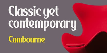 Classic yet contemporary, Cambourne is a crisp, curvaceous and timelessly elegant display font ideal for branding or promoting luxury goods.


