8,753 search results (0.018 seconds)
  1. Farm Days Out by Epiclinez, $18.00
    Farm Days Out is a cute and playful font. Suitable for your crafting projects.
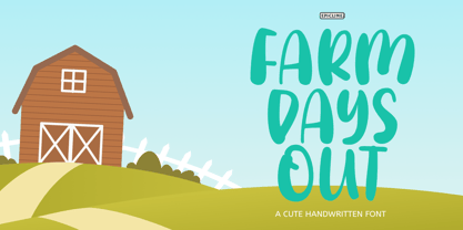
  2. Rail Route Stencil JNL by Jeff Levine, $29.00
    Rail Route Stencil JNL is based on a hand-cut paper stencil depicting a logo for the Baltimore and Ohio (B&O) Railroad. The lettering is from the motto encircling an image of the Capitol dome: "Linking 13 Great States with the Nation". This motto was not present on some other versions of the B&O logo.
  3. 7 days fat rotated - Unknown license
  4. Freak out, Go bananas - Unknown license
  5. Bionic Type Out Italic - Personal use only
  6. Futurex Distro - Wiped Out - Unknown license
  7. Eat your heart out - Unknown license
  8. Ultra Supervixen Honeyed Out - Personal use only
  9. Cut Paper Stencil JNL by Jeff Levine, $29.00
    Playing around with a previous design, Jeff Levine came up with Cut Paper Stencil JNL, a typeface with both an Art Deco flair and the look of letters made from cut paper.
  10. KG Thinking Out Loud by Kimberly Geswein, $5.00
    A neat upright font with a small x-height.
  11. P22 Way Out West by P22 Type Foundry, $24.95
    Howdy pardner! Giddy-up and lasso yerself these renegade typefaces. Created by renowned illustrator David Lyttleton , this set presents an Englishman's unique vision of the American West. Perfect for your next hoe-down, barn raising or Western-themed cricket match.
  12. Junge Holiday Cuts NF by Nick's Fonts, $10.00
    A charming series of 26 holiday “type warmers” based on the works of Carl S. Junge for the Barnhart Brothers & Spindler type foundry in the 1920s. Single-color cuts are in the uppercase positions, while 13 of the cuts suitable for two-color usage occupy the lowercase in adjacent pairs; e.g., a and b, c and d, and so on.
  13. Printers Stock Cuts JNL by Jeff Levine, $29.00
    Still more vintage letterpress cartoons, cuts, dingbats, ad enhancers and embellishments comprise Printers Stock Cuts JNL.
  14. Hand Cut Stencil JNL by Jeff Levine, $29.00
    Hand Cut Stencil JNL is a condensed Roman typeface modeled from an antique tin stencil hand cut for shipping merchandise. The design is available in regular and oblique versions.
  15. Letterpress Stock Cuts JNL by Jeff Levine, $29.00
    Letterpress Stock Cuts JNL is another assemblage of classic cartoons and illustrations re-drawn from vintage source material.
  16. Print Shop Cuts JNL by Jeff Levine, $29.00
    Once again, another eclectic mix of vintage cartoons, ad cuts, sales builders, dingbats, borders and embellishments come together in Print Shop Cuts JNL. These charming images add that touch of "retro" to any digital or print project.
  17. Printing Press Cuts JNL by Jeff Levine, $29.00
    Printing Press Cuts JNL gathers vintage cartoons, sales helpers and decorative ornaments into one handy collection for embellishing any retro-oriented project.
  18. A Cut Above The Rest - Unknown license
  19. No Harmony Left Side Cut - Unknown license
  20. KR Out Of This World - Unknown license
  21. Out of Line Pro BB by Blambot, $10.00
    Out of Line Pro BB is a comic book dialogue typeface with Greek and Cyrillic support, as well as a hefty compliment of European diacritical glyphs. It's the improved remix of Blambot's popular Out of Line BB set. Designed after Blambot letterer, Nate Piekos's hand lettering, it features opentype autoligatures, contextual alternates, and fractions.
  22. ITC Out of the Fridge by ITC, $29.99
    ITC Out of the Fridge is the work of German designer Jochen Schuss. Its forms look as though they were scratched on rough paper with a pen. ITC Out of the Fridge is, in the designer's own words, fresh and cool", and works well where something modern yet "proper" is desired."
  23. Salvation by Device, $39.00
    Rough and ready, bold and urgent. Or playful and fun in bright colours. The original letters were cut from actual potatoes, then scanned in and converted to vector outlines. Lighter and more heavily inked versions were used for the three variants. Using Opentype character-substitution technology, Salvation rotates through three versions of each letter to create a naturally uneven printed effect. Unlike hot metal type, the potatoes were cut the right way around. This produced reversed prints, which were then flipped back in Photoshop. Originally produced for Hughes' Get Lettering activity book, the font was then extended to cover numbers, punctuation and full European language support.
  24. Fruit And Veggie Doodles by Outside the Line, $19.00
    Fruit and Veggie Doodles is a 33-picture clipart font. Use them as dingbats or enlarge the small pictures and use them as clipart. Lots to choose from potatoes, tomatoes, avocado, eggplant, fig, watermelon, radish, peppers, broccoli, asparagus, corn on the cob, green onions, carrots, peas, lettuce, mushrooms, onion, olives, garlic, okra, beans, lemon, pear, pineapple, grapefruit or orange, pumpkin, apple, strawberry, grapes, cherry and banana. This is the companion font to Food Doodles Too. Also works nicely with Coffee & Tea Doodles. And if you need some fancy cakes check out Party Doodles. All in the same line drawing style to mix and match.
  25. DF Pommes by Dutchfonts, $16.00
    The Pommes font originates from my mid seventies potato punchcuttings at artschool. Since I’m living in a potato republic (NE of the province of Groningen) I got inspired to continue. I prepared this culinary alphabet as a tribute to this wonderful allround vegetable. Belgian and French recipies helped me in selecting and cutting/cooking the 6 styles. The Pommes-Dauphine Ultra Heavy (too much eggs added) can be used as a layer behind the Pommes-Dauphine.
  26. Casual Deco JNL by Jeff Levine, $29.00
    The hand lettered sans serif title on the1931 sheet music for “(Potatoes are Cheaper-Tomatoes are Cheaper) Now’s the Time to Fall in Love” presented another opportunity to create a typeface from the wealth of unusual alphabets found on the covers of vintage and antique song sheets. However, it seems that even as late as the 1930s, song writers had the urge to pen long-worded titles for their musical compositions. This thirteen word verbal excursion became the model for Casual Deco JNL, which is available in both regular and oblique versions.
  27. Spud AF by Andrew Foster, $12.00
    100% authentic! - all characters were cut from real potatoes, creating the charming imperfections and unexpected results of the real thing. Perfect for posters, children’s projects and ‘green’ themed graphics. Spud AF brings a quirky, personal touch to any job. Please note: Spud AF Tatty has replaced the original Spud AF font.
  28. Loopo Stencil by Little Fonts, $15.00
    Loopo was created as an experiment with rotating forms. The cut of the stencil shows the rotation and creates a reference to motion throughout the font. Characters are created by manipulating the rotations of the stencil which gives the font a round and fluid look.
  29. EDGE - 100% free
  30. VLNL Bint by VetteLetters, $35.00
    Kornelis de Vries, a headmaster from the Dutch province of Friesland, cultivated new potato breeds that he named after pupils in his school. In the early 1900s he came up with the tasty Bintje (a Frisian girl’s name) and it became a big success – in Belgium and France it has remained the most popular potato for french fries to this day, more than a century since its introduction. Donald Roos took 10 kilos of fresh Bintje potatoes and cut the Bint typeface by hand with a short, sharp knife. He then inked each character once and printed it twice; the second, lighter printing is accommodated in the lower case alphabet. The Bint family offers a script to make the letters bounce up and down the baseline; with OpenType functionality the font randomly chooses each character from the upper- or lowercase alphabet. ‘Tabular lining figures’ will activate a series of negative numerals in boxes; ‘Discretionary ligatures’ activates specially designed letter combinations like ‘www’ as well as arrows and stars. Bint has a distinct, slightly rough handmade appearance, making it useful for a wide range of designs.
  31. bladeline - 100% free
  32. Deco Slice - Personal use only
  33. Future Earth - 100% free
  34. Goth Stencil - Personal use only
  35. Contour Generator - Unknown license
  36. Potpourri by Linotype, $29.99
    Potpourri was based on an energetic alphabet written by expert calligrapher Gottfried Pott. To create the elegant yet rugged strokes, Pott cut a pen with a unique fringed tip — from a drinking straw! He then produced an huge series of drafts before deciding on the final alphabet for digitization.
  37. Smartburst by Bogstav, $14.00
    Are you throwing a party, growing eco friendly potatoes or having a babyshower? Is so - go ahead and give Smartburst a try for the design. The friendly and rounded edges makes the letters look soft and legible. I've added 5 different versions of each letter, and they automatically cycle as you type. Or, you can choose them individually from the glyph menu.
  38. Dynamic Outfit by PizzaDude.dk, $17.00
    Dynamic Outfit is actually another one of my fonts (Universitet) cut and slightly rotated into a grunge font. To make the font more realistic and grungy, I have added 8 different versions of each letter - and these different versions automatically cycle as you type!
  39. MVB Emmascript by MVB, $39.00
    Kanna Aoki drew the letters for MVB Emmascript while on a picnic near the Conservatory of Flowers in San Francisco’s Golden Gate Park. Mark van Bronkhorst adapted the writing as a font that maintains a very natural scrawl. Later a bold weight was added. MVB Emmascript has been used to add a lighthearted, human touch to everything from fiction paperbacks to potato chip packaging. The typeface is named for Aoki's 1968 Volkswagen, Emma.
Looking for more fonts? Check out our New, Sans, Script, Handwriting fonts or Categories
abstract fontscontact usprivacy policyweb font generator
Processing