6,783 search results
(0.021 seconds)
- Clarks by PintassilgoPrints,
$45.00Clarks is a modular typeface built from a work by Lygia Clark, one of the giants of Brazilian postwar art. Packed in a font equipped with clever OpenType programming, there are at least 7 different designs for each letter, thus allowing, or rather, proposing, boldly unconventional compositions. The font is programmed to cycle all these different lettershapes, avoiding repetition. The user can also manually pick up preferred forms in a glyph palette. There are choices to both keep and to defy readability and it's almost hypnotic to play with these. Lygia Clark used to invite viewers to touch her works and so we did with her 'Planes in Modulated Surface no. 4', from 1957: we fragment it and turned and inverted and recombined it. Now we return it as audacious typography and invite you to put it to work in your designs. Keep it bold and have fun! Cheers! - Base&Bloom by NaumType,
$35.00Base & Bloom is an experimental (but relatively organic) fusion of geometric monoline sans and high-contrast flourish didone. It was inspired by the lack of curious modern display sans as opposed to the uprise of contemporary serifs past couple of years. The idea was to incorporate flourishes not as unnecessary elements like swashes, but as a part of letter structure, which was an especially interesting task considering it was not a serif, which potentially could give more room for that. And after all, the idea pays off by generating many inventive letterform solutions. Base & Bloom has alternates for each letter (up to 11) so you can make endless combinations to find the perfect look. It is a bold choice for posters, album covers, identity and packaging, headlines, oversize typography, and editorial design. - Rocket Man by Comicraft,
$19.00Don your Flying Suit and tighten up your Atomic Powered Jet Pack buckle! Pencil in your pencil-thin moustache and stick your head into that Rocketeering Helmet! It's Zero Hour, 9am, 1949! Five Days a Week, you ARE the King of the Rocket Men, ready to Burn out your Fuse on a Timeless Flight into Outer Space Alone! Mission Control has advised our Space Race Typeface that Mars is not the kind of place to raise your kids and, furthermore, it's gonna be a long, long time until touchdown brings you round again to find you're not the man they think you are at home. You are in fact a ROCKET MAN; not a postman or a milkman, you're a modern man, a higher-than-a kite flying masked hero on your first manned flight to Infinity and Beyond! - Coconut Punch by Hanoded,
$10.00Health Warning! Coconuts are not that healthy!! I always thought that coconuts were the new quinoa, but apparently they’re not that good for you. They are furry balls of saturated fat, sugar and calories, so don’t go all out with your coconut eating habits! Of course, eating a bit of coconut now and then will not kill you, so enjoy! Coconut Punch is a handmade didone-ish font. Nice and rounded and full of saturated brush strokes. Comes with all the diacritics you need too! - Music Festival JNL by Jeff Levine,
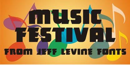
$29.00The Federal Music Project was part of Franklin D. Roosevelt's WPA (Works Progress Administration), putting many people back to work in the Depression years of the 1930s. A hand-lettered poster advertising an "American Music Festival" featuring the Bridgeport Symphony Orchestra offered up the extra bold Art Deco inspiration which became Music Festival JNL - Chub by Chank,
$39.95Chub was inspired by and dedicated to: Jimmy Dean Pork Sausage, J Otto, Ben & Jerry, Spunk, Chuck Jones, Run DMC, those teenage kids with their big baggy pants, French Market coffee, George Clinton, Bill Clinton, Chistina Ricci, Sesame Street and the letter C. God bless all those big, fat, fun things that make life grand. - Alys by Red Rooster Collection,
$45.00An original design. A memorial typeface by Pat for her mother, Alys, who was tragically killed. - Mars Police - Personal use only
- Mogzilla NF by Nick's Fonts,
$10.00An uncredited typeface discovered within the pages of Alphabete: Ein Schriftatlas von A bis Z named "Fat Cat" provided the pattern for this exercise in minimalist type design. Best used sparingly for inescapable, if somewhat cryptic, headlines. Both versions of this font include the complete Latin 1252 and CE 1250 character sets, with localization for Romanian and Moldovan. - Pannartz by Suomi,
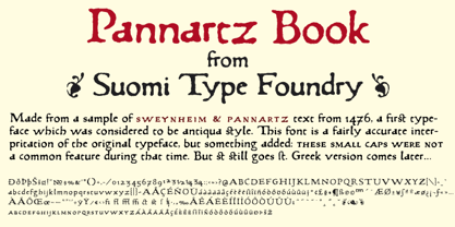
$29.00I happened to come across a facsimile of a sample of text with typeface made by Sweynheim & Pannartz in 1476. I scanned the sample, and redraw all the available glyphs from the sample in RobFog. After that I added the missing characters by copying and pasting the forms of the original characters, and filling in the missing parts. - Dersima by Cankat Saribas,
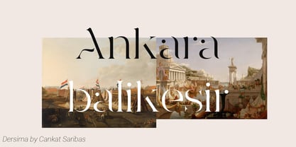
$10.99Home. Dersima is a stencil display typeface that is a homage to past relatives and ancestors of genocide and oppression. The philosophy of the typefaces missing parts symbolizes the dark and confusing history and the struggle for equality of the Alevi Kurds. The objective of this typeface is to live on and make sure they are not forgotten. - Printing Sorts JNL by Jeff Levine,
$29.00Over 75 images from the past and present comprise Printing Sorts JNL, another dingbat font from Jeff Levine paying tribute to the days of metal type and stock cuts. A PDF file is included with the font, showcasing the special feature that allows you to create arrows in varying lengths with just a few simple keystrokes. - Graveyard Smash by Comicraft,
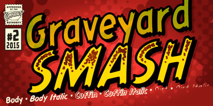
$19.00Tombstones tumble as the night shift begins; as bloodsucking bats turn into pale predators and the undead reach through the dirt that covers their coffins to crush and destroy those who dare cross the cemetery path... Finally there emerges a cold cast of creepy characters, a macabre cadre of lurid letters we had to call… GRAVEYARD SMASH. - OregonDry - Unknown license
- Monoska by ATK Studio,
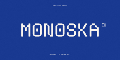
$15.00Monoska is a display monospaced font designed with classic industrial taste and rounded font style by Radinal Riki. Inspired by retro vhs font. created for electronic displays found in our modern techie world such as postal packing slips, airline tickets, informational video displays, ads, logos and more. Come in only one weight, this entire font is capitalized and with a character set that covers over 100 languages. - Proto Mono by ATK Studio,
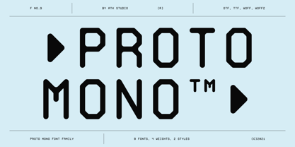
$15.00Proto Mono™ is a modular monospaced font built with rounded shapes, designed with tech industrial taste by Radinal Riki. Created for electronic displays found in our modern techie world such as postal packing slips, airline tickets, informational video displays, ads, and more. Come with 2 styles with 4 weights each. This entire font is capitalized and with a character set that covers over 100 languages. - Desk Drawer JNL by Jeff Levine,
$29.00Desk Drawer JNL is a collection of twenty-six images representing the kinds of small items lying around inside a desk at any given time… From a thumbtack to a spring clip… from a postage stamp to a roll of tape… even some shirt pins or some gummed labels… the center drawer of a desk can house just about anything that fits inside it! - Smart Bars12 by Postage Saver Software,
$15.00This is a special font for use creating US Postal Service "Intelligent Mail" barcodes. Those are the barcodes you see on most cards and envelopes. Commercial mailers get the best pricing by printing barcodes when they address the mail, saving the Postal Service a step. The barcodes are also used on reply mail and Share mail, and for "Informed Visibility" tracking. Software to create these barcodes, including the USPS Intelligent Mail Small Business (IMsB) tool, typically provide an output of 65 characters, each character being an A, D, T or F, corresponding to each of the styles of bar. SmartBars 12 replaces those characters with the corresponding bar. When doing a mail merge to print addresses, the user would set the barcode field on their merge template to be printed using SmartBars 12, at 12 point, regular, and the barcode will print with the correct bars and at the required size to meet USPS requirements. - Mars Police - Personal use only
- Casa Sans - 100% free
- Chaos1996 by Dawnland,
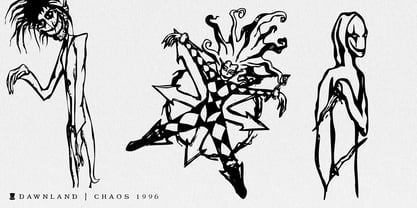
$9.00Graphite/4b pen illustrations from the past resurrected as vector/tattoo-art! The detailed illustrations can be displayed at large sizes/full magazine layout page down to thumbnail size! a-l: The full Zodiac of Chaos m-u: Parts from the Tarot of Chaos v-z: Faces of Chaos A total of 26 unique illustrations. Upper case A-Z hold mirrored versions. Enjoy! - Synopsis by Vasava Fonts,
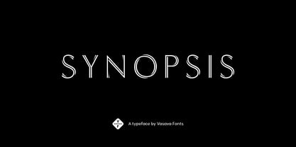
$45.00Synopsis draws inspiration on the classic proportions and letterforms of old romans. In addition to this a new modern twist has been infused to it, giving it a dimensional double stroke or virtual inline that makes the round parts twist in and out. Specially gorgeous in big sizes it brings the best from the past merging it with new ideas. - OregonDry - Unknown license
- Performance by ParaType,
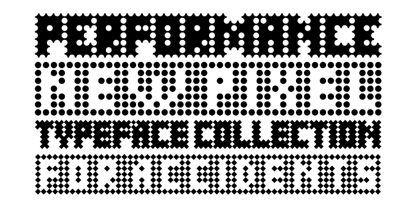
$25.00Performance is a set of perforated plates that appear to be characters. The construction of characters is described by sequences of holes whose shape and placement define the appearance and mood of font styles. An interesting feature of the design is an absence of side bearings and leading. Due to this feature a text article set by Performance forms a perforated coherent surface similar to postage stamp block. - Aux Mono by ATK Studio,
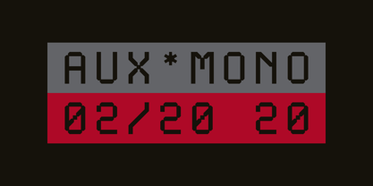
$15.00Aux Mono is a display monospaced font designed with tech industrial taste and solid font style by Radinal Riki. Inspired by airline tickets and airport sign, and created for electronic displays found in our modern techie world such as postal packing slips, airline tickets, informational video displays, coding, ads, logos and more. It comes in single weight with uppercase and lowercase and with a character set that covers over 100 languages. - Felt - Unknown license
- FeltMark - Unknown license
- Alright, let's dive into the world of Iconian Fonts and talk about one of their creations, the Postmaster font. Imagine for a moment venturing into a realm where the past and the future collide, brin...
- Oregon - Unknown license
- Comics - Unknown license
- Sylfaen by Microsoft Corporation,
$49.00Sylfaen was designed for Microsoft in 1998 by John Hudson and W. Ross Mills of Tiro Typeworks, and Geraldine Wade of Monotype Typography. Sylfaen is a Welsh word meaning foundation"; an apt name since the font stemmed from research into the typographic requirements of many different scripts and languages. This version of Sylfaen supports the WGL4.0 character set, for Pan-European language coverage. In addition to Latin, Greek and Cyrillic letterforms, the font contains the characters necessary for support of the Armenian and Georgian languages. Font Designer: John Hudson, W. Ross Mills, Geraldine Wade. The Sylfaen font contains 729 glyphs including Latin 1, WGL Pan-European, Armenian and Georgian." - NeedlePointSew-Plain - Unknown license
- OregonDry-Plain - Unknown license
- Chilly Cherry by Hanoded,
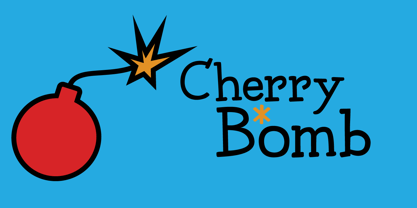
$15.00It’s cherry season, so I bought 2 kilos of cherries at the local cherry farm. The cherries I bought had been in a cooling cell, so they were quite cold. As I was eating them, the name for this new font popped up! Chilly Cherry is a handmade serif. It’s a little wobbly, a little off-center, but it will surely put a smile on the cherry lips of your customers. - Ghost Town by Comicraft,
$19.00The Gold Rush is over, the prospectors have made their fortune and the mine has been worked out! The inhabitants of Boomtown USA have moved on -- the saloon is dry, the sheriff has hung his hat and the only visitors to the local whorehouse are tumbleweeds. Yeah, the buildings remain -- hollowed out husks carrying memories of bar room brawls, high noon shootouts and high stake poker games between outlaws -- but if you take a walk down the street be careful not to kick up too much dust... Turn the corner and you might see Ol' Toothless Joe standing on the corner sucking on a bottle of whiskey... And don't walk too slowly past the storefront of the undertaker -- that guy made his living putting strangers like you in a wooden overcoat from sunrise to sundown. Spooks and Spectres linger everywhere... there's a sign just down the road -- didn't you see it? "Ghost Town! Abandon Hope all who Enter Here!" - As of my last update in early 2023, there isn't a widely recognized or popular font specifically called "Lastman" in the vast world of typography. However, let me paint a picture for you, imagining w...
- LOLO Dingcats by Okaycat,
$24.50LOLO Dingcats are here! Need some cats? Find just about any kind of cat you can imagine here. Not just a A-Z & 0-9 font, LOLO Dingcats has many extra characters. Check it out! There's a mother cat nursing kittens, a cat curled up sleeping, running cats and sleeping cats.There are black cats, white cats and striped cats. Even cats you might not expect: a pirate cat, a cat with an afro, even a robot cat -- and MORE! A must-have for any serious cat lover! - Noelia Script Pro by Vástago Studio,
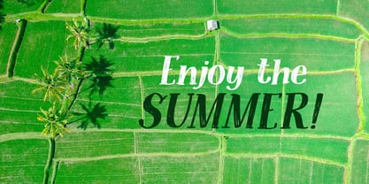
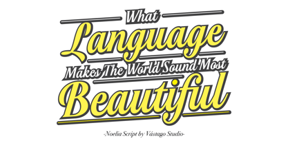
$19.00Noelia Script is a typeface inspired on the work of Doyald Young, Tommy Thompson, Matthew Carter and Giambattista Bodoni. This project is great to use in designs about sports, travel, and city postals, among others. This font has about 360 glyphs with stylistic alternates, old style numbers, serif caps, and a nice touch of classic penmanship. This is the result of a few months of work and that is it! Enjoy it! Thanks for buy it! - People Are People - 100% free
- Electro by Thinkdust,
$10.00Electro’s neon light inspiration gives it an interesting way to draw letters. Every part of this font could be part of a circuit board, with no lines doubling over or tracing the same path. The font stands out by occasionally taking shortcuts, such as in the E and S characters, which make up for many characters having to choose a longer route. Altogether, this constant state of quick then slow creates an unpredictability as of a surge of electricity or lightning bolt. Electro supports a number of languages with glyphs that keep up the electronic theme, and is perfect for party culture or futuristic science fiction. Like electric, this is the perfect font for shocking your audience.


