10,000 search results
(0.035 seconds)
- Mond by URW Type Foundry,
$39.99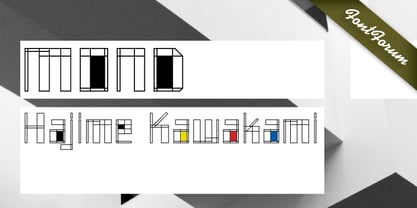
- Cord by Roland Hüse Design,
$20.00 Cord (Zsinór in Hungarian) was originally a commissioned work for a tablecloth pattern with a thread like frame decoration that is actually consist of letters. The lettershapes were being created based on Rovas characters, which were reinterpreted without decreasing legibility. Therefore, the Rovas alphabet was designed in the first place followed by its matching Latin company. The full character set contains: Western, Central and South Eastern European Latin characters basic symbols and punctuation Rovas alphabet Rovas number symbols and punctuation Display font, best fit in larger sizes for souvenirs, folk art theme, embroidery, ribbon like decorative texts and signages. Good luck and Happy Creating! Roland
 - Condo by Bogusky 2,
$20.00Novelty condensed serif font - Kondes by Tour De Force,
$25.00 Kondes is our "101 Dalmatians" – it's 101th release in our catalog! And it is the 1st one that belongs to variable typefaces. Kondes (which is made up word as mixture of "condensed" and "kondezovan" on Serbian) is simple, compact, straight-in-your-face sans serif family with 9 weights and 9 Italics. It was designed with purpose to serve and to be use in any project, from editorial to website. For example, Black weight could be used effectively as poster type, in big sizes while Regular fits perfectly as main webfont. Stem joining is done with generous ink trap that divides and opens letter contours, so letter breaths in smaller sizes. Contains extended Latin character set. Enjoy!
 - Sana Sans by Latinotype,
$29.00 Sana Sans is a humanist functional typeface with a modern feel. It is intended to be a face well-suited for multiple purposes, especially in publishing. Sana Sans looks perfectly legible and clean in long texts, and neat and simple in headlines. Thanks to its versatility, this font is also ideal for both screen and print usage. Sana Sans consists of 32 styles and 8 weights—ranging from Thin to Heavy—italics, small caps and an alternative family. The alternative family offers slight variants in many glyphs, some of which include the lowercase a, e, l, q, y and uppercase G, L, and Q. Sana Sans was designed by Felipe Sanzana, under the supervision of Latinotype Team.
 - Bolded by We Make Font,
$16.00 Bolded is a new complete type family, designed and developed by creative professionals. Contains geometric and rounded features, optimized for both long texts and small screens and texts. The complete family offers seven weights divided between the basic, italic, condensed and condensed italic family. Created in 2022, Bolded has a modern and functional look, designed for the most diverse uses and projects. Bolded is a geometric rounded family that can meet the needs of the most varied professionals looking for a clean and elegant font family with a wide set of Latin characters.
 - Bolde by Figuree Studio,
$18.00 Bolde is a powerful sans serif font family with modern touches. A balance of hard lines and smooth curves makes them able to stand on their own dynamically Features: five all caps font, Numbers & Punctuation / Extensive Language Support Bolde works great in any branding, logos, magazines, film. The different styles give you the full range to explore a whole host of applications. Thanks for having a peek at Bolde. As always, if you have any questions just send me a message!
 - Le Monde Sans Std by Typofonderie,
$59.00 Humanist sans in 8 styles Designed by Jean François Porchez, Le Monde Sans is a sanserif based on Le Monde Journal — a practice that become commonplace from early nineties. Designed originally in 1994 for the Le Monde newspapers, it was expended over the years to the large family we know today. Le Monde Sans features a “traditional g” in addition to the usual 1994’s g. Le Monde Sans is offered in numerous weights — in roman, italic to meet all kinds of situations. It will help designers to select the best weights depending their needs, from glossy paper printing to high resolution screen. Superfamily The design of Le Monde Sans continues the basic common structure found in the members of the Le Monde family: its proportions, a relatively narrow width, a fairly oblique axis, etc. The typographer can, at all times, switch between Sans & Journal or Courrier without any disruption in the composition. The verticals metrics and proportions of Le Monde Sans are calibrated to match perfectly others Typofonderie families. This family was designed in 1994 as bespoke typeface family for the French newspaper Le Monde. The family is not used any more by this newspaper from November 2005. Type Directors Club .44 1998 European Design Awards 1998
 - Bold Display Sans JNL by Jeff Levine,
$29.00 Bold Display Sans JNL is loosely based on one of the classic alphabets found within a Speedball Lettering Textbook of the 1940s; itself called "Bold Display". The original featured a stippled texture and inline curves placed in random patterns throughout the letters. This more simplified, all-caps version is for titling requirements where a strong, yet casual design is needed.
 - Andreas Sans Cnd Oblique - Unknown license

- Covington SC Cond - Unknown license

- Avondale SC Cond - Unknown license

- Covington SC Cond - Unknown license

- Covington SC Cond - Unknown license

- Avondale SC Cond - Unknown license

- Covington SC Cond - Unknown license

- Frigate Katakana - Cond - Unknown license

- Sassoon Primary Cond by Sassoon-Williams,
$48.00 Those who design books for young children should consider the different needs of their readers. When laying out pages for young readers, particular care should be taken over word spacing. Don't forget that justifying short lines disrupts spacing. Justification should be used only when absolutely necessary. In the research undertaken with young readers the importance of consistent spacing was clear. It also appeared that the poorer readers profited from wider word spacing, while spacing that suited the poorest readers, positively annoyed the better readers. These typefaces have built-in letter spacing because of their exit strokes, as well as extra clarity designed into them. Sassoon Primary Medium Condensed is a compact style for headlines combining the right amount of weight, yet in a friendly style. When used at large sizes the friendliness of Sassoon types really shines. Why not use it for headings throughout a book. You can find many other new ways to use this typeface. Ideal perhaps for the masthead or a magazine? Free to download resources: How to access Stylistic Sets of alternative letters in these fonts
 - Aaux Next Cond by Positype,
$22.00 When the original Aaux was introduced in 2002, I intended to go back and expand the family to offer more versatility. Years went by before I was willing to pick it up again and invest the proper time into building a viable and useful recut. Just putting a new designation and tweaking a few glyphs here and there would not do the designer or the typeface justice; instead, I chose to redraw each glyph's skeleton from scratch for the four main subsets of the super family along with their italics. Each glyph across the super family is 'connected at the hip' with each style—each character carries the no frills, simple architecture that endeared so many users to it. The new recut expands the family to an enormous 72 typefaces! The original has spawned Compressed, Condensed and Wide subsets—all with corresponding weights—for complete flexibility. Additionally, all of the original weight variants have all been incorporated within the OpenType shell: Small Caps and Old Style Figures are there along with new tabular figures, numerators and denominators, expanded f-ligatures and a complete Central European character set.
 - Portilla Rounded Bold Sans Font by Maulana Creative,
$15.00 Portilla is a modern round sans serif font. Bold stroke, fun character with a bit of ligatures and alternates. To give you an extra creative work. Portilla font support multilingual more than 100+ language. This font is good for logo design, Social media, Movie Titles, Books Titles, a short text even a long text letter and good for your secondary text font with script or serif. Make a stunning work with Portilla font. Cheers, Maulana Creative
 - Eleme S Sans HBold - Unknown license

- Zond Diktat by Device,
$29.00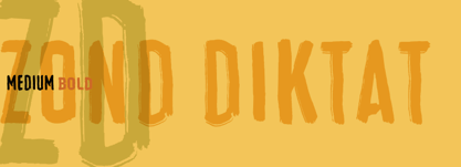
- Almonet Ronded by Gian Studio,
$16.00 About Product Almonet Ronded is a modern script font with a bold rounded style with a bold and modern look. This font is suitable for logos, branding, product design, product packaging, photography, watermarks, social media posts, advertisements, invitations, stationery, labels, logos, magazines, books, greeting/wedding cards, fashion, makeup, and more. other. What's Included: - Uppercase & lowercase - Numbers and punctuation marks - Multilingual support - Ligature - Alternative - Washing - Works on PC & Mac - Simple installation Accessible in Adobe Illustrator, Adobe Photoshop, Adobe InDesign, even works in Microsoft Word. PUA Coded Characters – Fully accessible without additional design software. Thank you for your purchase! Hope you enjoy with our fonts!
 - Simple Ronde by JBFoundry,
$20.00 Simple Ronde is conceived for young pupils. This upright script is based on the french use at primary schools. A large set of ligatures make the links between characters more natural, especially with o, b, v and w.
 - Monde Libre by Elyas Beria,
$12.00 Monde Libre is a display typeface that exudes optimism, joy, and whimsy. I designed this typeface based on a sign in a clip from some old film footage I saw somewhere. It stayed with me as a typeface that evokes the France of my dreams. Enjoy!
 - Ronde Pro by RMU,
$35.00 Ronde Pro is an expressive and decorative broad-nib font for multilingual usage.
 - Fonde SS by Sensatype Studio,
$15.00 fonde is a elegant chic font for brand, logo and quotes design. Based on our experience as a graphic designer who works for a lot of companies, we often are requested to design a logo in a unique style but with an elegant shape. So, we try to brainstorming and create this font to make the idea is going out. This is perfect for BRANDING and LOGO DESIGN. You will get classy, elegant, and certainly unique logos with this font. fonde is also included full set of: uppercase and lowercase letters multilingual characters numerals punctuation Wish you enjoy our font. :)
 - Ronde Script by GroupType,
$19.00 Ronde Script (Ronde meaning "A kind of script in which the heavy strokes are nearly upright, giving the characters when taken together a round look.") is based on the original design named Parisian Ronde released in 1878 by the Chappelle Foundry in Paris. Other versions of this script include Inland French Script, French Script, French Plate, and Typo Upright. Different type foundries tied to the releases of this design include Mayeur (Paris), Stephenson Blake (London), Bernhardt Brothers & Spindler (Chicago), and ATF (Elizabeth, NJ). This style of script has been a very popular choice in designing wedding invitations and so many other formal announcements for over 130 years. Its very readable, formal and elegant with an antique or retro feel.
 - Honey Ponds by Yumna Type,
$15.00 It is complicated to find an aesthetically charming font in a professional look. The thing is that a wrong font choice can damage your projects. For that reason, Honey Ponds is here for your needs. Honey Ponds is a simple display font in a plain, yet interesting, professional design. To create a better display and to be legible, the font’s form or geometry is presented in a simple style without many details. Additionally, this font provides you a clipart as a bonus. You can enjoy the available features here as well. Features: Multilingual Supports PUA Encoded Numerals and Punctuations Honey Ponds fits best for various design projects, such as brandings, posters, banners, headings, magazine covers, quotes, invitations, name cards, printed products, merchandise, social media, etc. Find out more ways to use this font by taking a look at the font preview. Thanks for purchasing our fonts. Hopefully, you have a great time using our font. Feel free to contact us anytime for further information or when you have trouble with the font. Thanks a lot and happy designing.
 - Bousni Ronde by Linotype,
$29.99The Bousni family's six faces display links unexpected by most readers of western alphabets. Inspired by both by Arabic calligraphy, and contemporary bitmap design, Bachir Soussi Chiadmi created this playful series of faces. Letters in each of the six typefaces link together, but not in the ways normally expected from script fonts. Suited for a wide array of fun functions, Bousni Carre and Bousni Ronde (each available in Light, Medium, and Bold weights) bring new a style and flavor to your collection. All six fonts in the Bousni family are included in the Take Type 5 collection from Linotype GmbH. The Bousni family espouses similar construction traits with other fonts from Linotype. Specifically, the straight lines and joints in the three Bousni Carre fonts are based off of a grid system similar to Anlinear, another member of the Take Type 5 collection from Linotype GmbH. The letter connections throughout the Bousni family are similar to Arabic kashidas, a typographic feature found recently in many non-Arabic typefaces, such as Linotype Atomatic." - Journal Sans Old School by ParaType,
$30.00 Journal Sans Old School is a new, modernized digital version of the widely popular Journal Sans. The new typeface preserves the character of the geometric sans from the famous “Science and Life” magazine of the 1960s. The weight of the basic styles corresponds to the Journal Sans regular and bold from the Soviet linotype catalogs. Also, the original vertical proportions and character forms match the original. Cyrillic Alternates, Greek language support expand the range of font’s usage. Journal Sans Old School was designed by Natalia Vasilyeva and released by Paratype in 2019.
 - Karvwood bold - Personal use only

- White Bold - Unknown license

- Goulong Bold - Unknown license

- Chopin-Bold - Unknown license

- Belta Bold - Personal use only

- Writers bold - Unknown license

- Helena-Bold - Unknown license

- TypoLatinserif-Bold - 100% free

- Pullchain Bold - Personal use only


