7,872 search results
(0.024 seconds)
- Fleet Street - Unknown license

- Manualito-Flo - Personal use only

- KG Beneath Your Beautiful by Kimberly Geswein,
$5.00 Quirky teen unicase handwriting with personality.
 - Narnfont - Personal use only

- Ikusuteito - Unknown license

- Xmas Stencils JNL by Jeff Levine,
$29.00 A retro delight for the holiday season is Xmas Stencils JNL, assembled from original 1950s holiday stencils and other sources. Twenty-Six designs offer a generous variety of embellishments for all of your seasonal projects.
 - Sweet blink play by Sulthan Studio,
$10.00 Sweet Blink is a cute and friendly handwritten font duo that is perfect for creating charming and playful designs. Its delicate and whimsical letters feature playful curves and loops, giving it a warm and inviting personality. This font is perfect for invitations, greeting cards, and other projects that require a personal and charming touch. The font’s cute and friendly personality is sure to make viewers smile.
 - fancyPens - Unknown license

- Digifit - Personal use only

- Susanna - Unknown license

- Brillo by Alessandro Pivetta Type,
$15.00 Brillo Typeface stems from the effort of combining the modern look of a grotesque sans serif font with the elegance of the calligraphic copperplate's swashes. The result is a typeface that is perfectly suitable for modern graphic applications, such as publishing, branding and web, but which has some ornamental features that differentiate it from all the other grotesque families. Brillo doesn't want to be a neutral typeface. It's a font with a strong personality, which can give outstanding aesthetic and conceptual relevance to the graphic projects which will be used in. Brillo is a typeface thought for titling rather than for texts. For this reason it works better with character sizes bigger than 16 points.
 - Silverland by FontMesa,
$49.00 Silverland is a revival of an old type font from the Bruce Type Foundry of New York, the original font from 1874 included uppercase only plus 22 end caps. This 21st. century version has been expanded to include many more decorative end caps plus new lowercase, small caps, italic, italic small caps, swash, swash small caps and gothic version. Approximately six months of painstaking work has gone into making this font family over the last 22 months. The OpenType versions of Silverland include between 230 and 370 kerning pairs each setup as auto ligature replacements, you will need an application such Adobe CS products in order to take advantage of this OpenType feature.
 - Gundrada ML by HiH,
$12.00 Gundrada ML was inspired by the lettering on the tomb of Gundrada de Warenne. She was buried at Southover Church at Lewes, Sussex, in the south of England in 1085. The Latin inscription on her tomb, STIRPS GUNDRADA DUCUM, meaning “Gundrada, descendant of the Duke” may have led to the speculation that she was the daughter of William, Duke of Normandy and bastard son of Robert the Devil of Normandy and Arletta, daughter of a tanner in Falaise. In 1066 William defeated Harold at the Battle of Hastings and was crowned William I of England. More commonly known as William the Conquerer, he commissioned a string of forts around the kingdom and charged trusted Norman Barons to control the contentious Anglo-Saxon population. William de Warenne, husband of Gundrada, was one of these Barons. There has also been the suggestion that Gundrada may have been the daughter of William’s wife, Matilda of Flanders, by a previous marriage. According to the Dictionary of National Biography (Oxford University Press, Oxford, England 1921-22), both of these contentions are in dispute. Searching the past of a thousand years ago is like wandering in a heavy fog: facts are only dimly in view. Regardless, I know that I found these letterforms immediately engaging in their simplicity. Unadorned and unsophisticated, they have a direct honesty that rests well in the company of humanistic sans serifs like Franklin Gothic or Gill Sans, appealing to a contemporary sensibility. The lettering on the tomb is in upper case only. Although Gundrada does not sound Norman French to me, her husband certainly and her father probably were Norman French. Nonetheless, the man that carved her tombstone was probably Anglo-Saxon, like most of the people. For that reason, we are quite comfortable with a fairly generic lower case from an Anglo-Saxon document of the time. The time was a time of transition, of contending language influences. This font reflects some of that tension. Features 1. Multi-Lingual Font with 389 glyphs and 698 Kerning Pairs. 2. OpenType GSUB layout features: onum, dlig, liga, salt & hist. 3. Tabular Figures and Alternate Old-Style Figures. 4. Alternate Ruled Caps (line above and below, matching to brackets). 5. Central Europe, Western Europe, Turkish and Baltic Code Pages. 6. Additional accents for Cornish and Old Gaelic. 7. Stylistic alternates A, E, y and #. 8. Ligatures ST, Th, fi and fl. 9. Historic alternate longs. The zip package includes two versions of the font at no extra charge. There is an OTF version which is in Open PS (Post Script Type 1) format and a TTF version which is in Open TT (True Type)format. Use whichever works best for your applications.
 - Xéfora - Personal use only

- Cabaret - Personal use only

- Fraktura - Personal use only

- TT Marxiana by TypeType,
$59.00 TT Marxiana useful links: Specimen | History of creation | Graphic presentation | Customization options Please note! If you need OTF versions of the fonts, just email us at commercial@typetype.org About TT Marxiana: TT Marxiana is a project to reconstruct a set of pre-revolutionary fonts that were used in the layout of the "Niva" magazine, published by the St. Petersburg publishing house A.F. Marx. In our project, we decided to focus on a specific set of fonts that were used in the preparation and printing of the "Niva" magazine in 1887, namely its Antiqua and Italic, Grotesque and Elzevir. As part of the TT Marxiana project, we sought to adhere to strict historicity and maintain maximum proximity to the paper source. We tried to avoid any “modernization” of fonts, unless of course we consider this to be kerning work, the introduction of OpenType features and creation of manual hinting. As a result, with the TT Marxiana font family, a modern designer gets a full-fledged and functional set of different fonts, which allows using modern methods and using modern software to create, for example, a magazine in a design typical of the late 19th century. The TT Marxiana project started in the late summer of 2018 and from the very beginning went beyond the traditional projects of TypeType because of the importance of preserving the historical identity. Since up to this point, we had never before reconstructed the font from historical paper sources and with such a level of elaboration and attention to detail, it took us two years to implement this project. You can read more about all stages of the project in our blog, and here we will briefly talk about the result. As it turned out, drawing a font following the scanned pages of a century-old magazine is a very difficult task. In fact, such a font reconstruction very much resembles archaeological excavations or solving a complex cipher, and all these efforts are needed only in order to finally understand what steps need to be taken so that the resulting font is not just an antiqua, but the specific and accurate antiqua from "Niva" magazine. In addition, due to the specifics of printing, same characters in the old magazine setting looked completely different, which greatly complicated the task. In one place, there was less ink than needed, and the letter in the reference was not well-printed and thin, in some other place there was more ink and the letter had flooded. An important task was to preserve and convey this feeling of typographic printing, but at the same time it was important to identify the common logic and character of the dot gains so that the font would form a harmonious, single, but at the same time lively picture. Since the "Niva" magazine was historically published in Russian, the magazine had no shortage of references for the reconstruction of Cyrillic characters, but there were not many Latin letters in the magazine at all. In addition, the paper source lacked a part of punctuation, diacritics, there were no currency signs nor ligatures at all—we developed all these characters based on font catalogs of the 19–20 centuries, trying to reflect characteristic details from the main character composition to the max. So, for example, the Germandbls character, which is not in the original "Niva" set, we first found in one of the font catalogs, but still significantly redesigned it. We decided that in such a voluminous project, only graphic similarities with the original source are not enough and we came up with a feature that can be used to exchange modern Russian spelling for pre-revolutionary spelling. When this feature is turned on, yat and yer appear in the necessary places (i, ѣ, b, ѳ and ѵ), the endings of the words change, and so appears a complete sensation of the historical text. This feature works in all fonts of the TT Marxiana font family. TT Marxiana Antiqua is a scotch style serif, the drawing of which carefully preserved some of the artifacts obtained by printing, namely dot gain, a slight deformation of the letters and other visual nuances. TT Marxiana Antiqua has an interesting stylistic set that imitates the old setting and in which some of the signs are made with deliberate sticking or roughness. Using this set will provide an opportunity to further simulate the setting of that great time. TT Marxiana Grotesque is a rather thick and bold old grotesk. Its drawing also maximally preserved the defects obtained during printing and characteristic of its paper reference. In addition to pre-revolutionary spelling, TT Marxiana Grotesque has a decorative set with an inversion. This is a set of uppercase characters, numbers and punctuation, which allows you to type inverse headers, i.e. print white on black. As a result of using this set, you get the text against black bars—this way of displaying was very characteristic for print advertising at the turn of the century. In addition, about 30 decorative indicator stubs were drawn for this set: arrows, hands, clubs, etc. TT Marxiana Elzevir is a title or header font and is a compilation of monastic Elzevir that were actively used in the "Niva" magazine for all its prints. Unlike the antiqua, TT Marxiana Elzevir has sharper forms, and the influence of deformations from typographic printing is not as noticeable in the forms of its signs. This is primarily due to the specifics of its drawing and the fact that it was usually used as a heading font and was printed in large sizes. The height of the lowercase and uppercase characters of Elsevier is the same as the heights of the antiqua, but the font is more contrasting and lighter, it has a lot of white and, unlike the antiqua and the grotesque, there are a lot of sharp corners. An exclusive feature of the TT Marxiana Elzevir is an alternative set of uppercase characters with swash. • TT Marxiana Antiqua consist of 625 glyphs each and and it has 23 OpenType features, such as: aalt, ccmp, locl, subs, sinf, sups, numr, dnom, frac, ordn, lnum, pnum, tnum, onum, salt, calt, liga, ss01, ss02, ss03, ss04, ss05, case. • TT Marxiana Antiqua Italic consist of 586 glyphs each and and it has 22 OpenType features, such as: aalt, ccmp, locl, subs, sinf, sups, numr, dnom, frac, ordn, lnum, pnum, tnum, onum, salt, calt, liga, ss01, ss02, ss03, ss04, case. • TT Marxiana Grotesque consists of 708 glyphs and it has 22 OT features, such as: aalt, ccmp, locl, subs, sinf, sups, numr, dnom, frac, ordn, lnum, pnum, tnum, onum, salt, calt, liga, ss01, ss02, ss03, ss04, case. • TT Marxiana Elzevir consists of 780 glyphs and it has 21 OT features, such as: aalt, ccmp, locl, ordn, frac, tnum, onum, lnum, pnum, calt, ss01, ss02, ss03, ss04, ss05, ss06, salt, c2sc, smcp, case, liga. FOLLOW US: Instagram | Facebook | Website TT Marxiana language support: Acehnese, Afar, Albanian, Alsatian, Aragonese, Asu, Aymara, Banjar, Basque, Belarusian (cyr), Bemba, Bena, Betawi, Bislama, Boholano, Bosnian (cyr), Breton, Bulgarian (cyr), Catalan, Cebuano, Chamorro, Chiga, Cornish, Corsican, Cree, Danish, Dutch, Embu, English, Erzya, Estonian, Faroese, Fijian, Filipino, Finnish, French, Friulian, Gaelic, Galician, German, Gusii, Haitian Creole, Hiri Motu, Hungarian, Icelandic, Ilocano, Indonesian, Interlingua, Irish, Italian, Javanese, Judaeo-Spanish, Kabuverdianu, Kalenjin, Karachay-Balkar (cyr), Kashubian, Khasi, Khvarshi, Kinyarwanda, Kirundi, Kongo, Kumyk, Ladin, Leonese, Luganda, Luo, Luxembourgish, Luyia, Macedonian, Machame, Makhuwa-Meetto, Makonde, Malagasy, Malay, Manx, Mauritian Creole, Minangkabau, Montenegrin (cyr), Mordvin-moksha, Morisyen, Nauruan, Ndebele, Nias, Nogai, Norwegian, Nyankole, Occitan, Oromo, Palauan, Polish, Portuguese, Rheto-Romance, Rohingya, Romansh, Rombo, Rundi, Russian, Rusyn, Rwa, Samburu, Sango, Sangu, Scots, Sena, Serbian (cyr), Seychellois Creole, Shambala, Shona, Soga, Somali, Sotho, Spanish, Sundanese, Swahili, Swazi, Swedish, Swiss German, Tagalog, Taita, Tetum, Tok Pisin, Tsonga, Tswana, Ukrainian, Uyghur, Valencian, Volapük, Võro, Vunjo, Walloon, Xhosa, Zulu.
 - Ongunkan Arkaic Greek by Runic World Tamgacı,
$45.00 Many local variants of the Greek alphabet were employed in ancient Greece during the archaic and early classical periods, until around 400 BC, when they were replaced by the classical 24-letter alphabet that is the standard today. All forms of the Greek alphabet were originally based on the shared inventory of the 22 symbols of the Phoenician alphabet, with the exception of the letter Samekh, whose Greek counterpart Xi (Ξ) was used only in a sub-group of Greek alphabets, and with the common addition of Upsilon (Υ) for the vowel /u, ū/.[1][2] The local, so-called epichoric, alphabets differed in many ways: in the use of the consonant symbols Χ, Φ and Ψ; in the use of the innovative long vowel letters (Ω and Η), in the absence or presence of Η in its original consonant function (/h/); in the use or non-use of certain archaic letters (Ϝ = /w/, Ϙ = /k/, Ϻ = /s/); and in many details of the individual shapes of each letter. The system now familiar as the standard 24-letter Greek alphabet was originally the regional variant of the Ionian cities in Anatolia. It was officially adopted in Athens in 403 BC and in most of the rest of the Greek world by the middle of the 4th century BC.
 - Meridien by Linotype,
$29.99 Frutiger based the design for his Meridien on the 16th century characters of Jenson, saying: As I designed Meridien, I wanted to avoid stiffness in the forms - I thought they should have a more natural line and flow. My main consideration was in creating a font which was both extremely legible and aesthetically pleasing. Meridien is proof of Frutiger’s success in his endeavor.
 - Iowan Old Style by ParaType,
$30.00 Iowan Old Style was designed for Bitstream in 1990 by noted sign painter John Downer. Iowan Old Style is a hardy contemporary text design modeled after earlier revivals of Jenson and Griffo typefaces but with a larger x-height, tighter letterfit, and reproportioned capitals. Cyrillic letters were designed by Natalia Vasilyeva in 2016. Iowan Old Style Cyrillic was released by Paratype in 2017.
 - Macromedia - Unknown license

- Romanesque Monogram by MonogramBros,
$10.00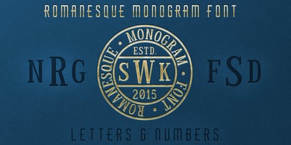 The perfect font for monogramming and personalization.
 - KG She Persisted by Kimberly Geswein,
$5.00 A chunky, playful, feminine font with personality.
 - Amika by Craceltype,
$39.00 Amika™ is a rational geometric sans serif with an engaging personality and a contemporary profile. The large x-height, minimal contrast and the double storey 'a' makes Amika™ a highly legible typeface suited for any kind of text applications, from display poster type to massive text layouts. Amika™ has 22 styles and it's a workhorse type system. Versatile and reliable, it covers 230+ languages, including extended Latin, Cyrillic and Greek writing systems. With over 1280 glyphs per style, its Opentype features include alternative shapes, small caps, standard and discretionary ligatures, localized forms in Latin and Cyrillic, case sensitive forms, numerators and denominators, proportional and tabular figures, slashed zero, fractions and more. With a tectonic touch, Amika™ is a prototypical sans serif of the New Media age that, due to its extensive set of features, conveys a great choice for a wide range of applications, from branding to broadcast.
 - FS Millbank by Fontsmith,
$80.00 A sign of something better When designer Stuart de Rozario surveyed the fonts used in signage on London’s public transport systems, he reached a dead end. They seemed staid, sterile, lacking in personality, and ill-suited to use by modern brands. He was pointed in another direction entirely. ‘The driving force behind my thoughts was to design something more current and fresh without compromising legibility and clarity. A font with both personality and function, that’s versatile and large and small sizes, and effortless to read, but which also says something new.’ Speed reading Late for a meeting and can’t find your way? Trying to catch a flight? Lost in a hospital? Reading signs is a different business to reading a book or a newspaper. Text on signs needs to be deciphered quickly and effortlessly. So the legibility criteria for signage letterforms are different to those for normal reading, too. Throughout FS Millbank’s uppercase and lowercase alphabets, characters have been given features for extra definition, including: wide ink traps on the A, K, M, V, W, X and Y; a serifed i, accentuated spurs on the a, d, l u; and different x-height shapes on the b, g, p and q. Distinctive forms and generous, open internal shapes all help the quick reading of sign text, and wide, open terminals and counters allow similar letter shapes to be distinguished easily when viewed at different angles. Running down a corridor, maybe... Positive/negative Standard type tends to glow on the kind of dark backgrounds often used for signage, and look heavier than its true weight. To correct the imbalance caused by this optical trick, special weights of the typeface have to be drawn for these ‘negative’, light-on-dark applications. These are lighter than their comparable positive weights to overcome the ‘glow’ effect. After extensive tests of the negative weights, at all sizes, we achieved the right optical balance. Glowing, glowing, gone. Icons This wouldn’t be a signage typeface without its own set of icons, or symbols, to help people find what they’re looking for. So, to sit alongside the positive and negative fonts, we’ve created a comprehensive set of 172 icons, covering a wide range of applications from transport and user interface to information and directional. Designed within the typeface capital height, they sit on the baseline and are spaced centrally.
 - TT Tunnels by TypeType,
$29.00 TT Tunnels useful links: Specimen | Graphic presentation | Customization options TT Tunnels is a modular font family with narrow proportions and a large number of pronounced visual compensators. In the basic version of the typeface, all glyphs have simple chopped shapes, created according to the usual geometric principles. In the alternative version of TT Tunnels, which becomes available when you turn on OpenType feature stylistic alternates or stylistic set 1, the typeface comes to life and turns into a stylized ductal gothic grotesque, in which the design of glyph forms is created based on the pen movements. Despite the fact that TT Tunnels was created as a display typeface for use in short inscriptions and titles, it works very interestingly in the body text, adding a small touch of archaics. This is especially evident in the Bold and Black faces, when the rhythm and thickness of the strokes create a dense set, covering the paper with a solid, dense pattern. The density and style of such a set conceptually refers us to the old Gothic texture and the Old Slavonic script. In addition to a larger number of alternates for lowercase letters, the typeface features an alternate for number 2, an alternate slashed zero, many ligatures, and other useful OpenType features (ordn, frac, sinf, sups, numr, dnom, case, tnum, onum, pnum, liga, salt, ss01, zero). The TT Tunnels includes five faces: Thin, Light, Regular, Bold, Black.
 - Ultras Liberi - Unknown license

- Pea Heather's Handwriting is a font that exudes charm, personality, and warmth, capturing the essence of handwritten notes with its distinctive and authentic style. Developed by Kevin and Amanda, a d...
- Sucker Font - Personal use only

- DBE-Beryllium - Personal use only

- Schindler’s Font - Personal use only

- Furia & Venganza - Personal use only

- Neue Goth - Personal use only

- Gamila by Romie Creative,
$15.00 Gamila is a modern classic style script font inspired by classic handwriting in books. This font comes with 110+ stylistic sets, Contextual Alternative, ligatures and also multi-language support which adds to the aesthetic that makes your work more attractive. This font is perfect for your creative projects like Logotype, printed quotes, invitations, cards, product packaging, headers, Letterheads, Clothing, Web design, Magazines, Books, etc. FEATURE: Total Glyphs: 322 Uppercase Lowercase Punctuation and Marks Symbol Contextual Alternative 110+ styles & Ligature sets If you have any questions or problems please contact email: sikemstudio@gmail.com. thank you and good job
 - Wonder Magnolia by Supfonts,
$15.00 Wonder Magnolia is a modern serif with vintage charm, fashionable appearance with a touch of retro Quick access - using the built-in OPEN TYPE functions. Just add "-" or "_" to the letter and instantly get an alternative. This feature works in most applications Font is an open type with clean shapes and precise kerning. It includes ligatures and alternations with a total of 522 characters encoded by the PUA. Also in the package you will find a list of all ligatures and alternatives Language support: All European languages Don't forget to subscribe so you don't miss out on the new awesome fonts Dima
 - Grindmore by LetterStock,
$25.00 **Grindmore Font** This pair was inspired by the vintage poster design that i saw on some coffee shop, It was crafted by hand specially to add natural handmade feeling in its brand identity than i make it clean with pentool. **Opentype features** Grindmore font has 222 character set included Cricket Font is very good looking in logo, labels, t-shirt prints, product packaging, invitations, advertising and others. * Multilingual support (Western European characters). This fonts works with folowing languages: English, Danish, Dutch, Estonian, Faroese, Filipino, Finnish, French, German, Hungarian, Icelandic, Irish, Italian, Norwegian, Polish, Portuguese, Spanish, Swedish. Thank you for using this font. LS
 - Kis Classico by Linotype,
$29.99Kis Classico™ is named after the Hungarian monk Miklós Kis who traveled to Amsterdam at the end of the seventeenth century to learn the art of printing. Amsterdam was a center of printing and punchcutting, and Kis cut his own type there in about 1685. For centuries, Kis's type was wrongly attributed to Anton Janson, a Dutch punchcutter who worked in Leipzig in the seventeenth century. Most versions of this type still go by the name Janson. In 1993, the Italian/Swedish type designer Franko Luin completed Kis Classico, his own contemporary interpretation of the Kis types. About the Kis/Janson story, Luin says: If you understand Hungarian I recommend you read the monograph, 'Tótfalusi Kis Miklós' by György Haiman, published in 1972 by Magyar Helikon. It has hundreds of reproductions from his Amsterdam period and from the time when he was an established printer in Kolozsvár (today's Cluj in Romania)." Kis Classico has five weights, and is an admirable version of this classic type. - Por Siempre Gótica - Personal use only

- Dalillah by Sabrcreative,
$25.00 Experience the art of personalized elegance with the Dalillah Handwriting Signature Font. This typeface effortlessly blends the authenticity of a handwritten signature with a touch of refinement, making it an exceptional choice for projects that demand a sophisticated and personalized touch.
 - Burgues Script by Sudtipos,
$99.00 Burgues Script is an ode to the late 19th century American calligrapher Louis Madarasz, whose legendary pen has inspired schools of penmanship for over 100 years. His talent has caused some people to call him “the most skillful penman the world has ever known.” I use the word ‘ode’ in a colloquially ambitious manner. If I was an actual poet, my words would be about things I desire but cannot attain, objects of utter beauty that make me wallow in humility, or people of enormous talent who look down at me from the clouds of genius. But I don’t write poems. My work consists of letters drawn to fit together, that become an element of someone’s visual poetry. I am the poet’s assistant, so to speak. Once in a while, the assistant persists on what the subject of the poem will be. And occasionally, the poet gives in to the persistence. I hope you, visual poet, find my persistence justified in this case. The two main sources for Burgues were the calligraphy examples shown in Zaner Bloser’s The Secret of the Skill of Madarasz: His Philosophy and Penmanship Masterpieces, and C. W. Jones’s Lessons in Advanced Engraver’s Script Penmanship by L. Madarasz. These two references were the cornerstone for the concept I was trying to work with. I did have to change many of the letters in order to be able to produce digital calligraphy that can flow flexibly and offered the user a variety of options, while maintaining its attractive appearance. To this end, many ligatures and swashes were made, as well as full flourished sets of letters for use at the beginnings or endings of words and sentences. All of this has been tied together with OpenType and tested thoroughly within today’s standard design and desktop publishing software. After working with digital scripts for so long, at one point I thought that Burgues Script would become a bit of a chore to complete. I also thought that, like with most other scripts, the process would regularize itself after a while and be reduced to a mechanical habit. Surprisingly, and fortunately for me, this did not happen. The past holds as many surprises as the future. Madarasz’s method of penmanship was fascinating and challenging to translate into the strict, mathematically oriented language of the computer. It seems that the extremely high contrast of the forms, coupled with the required flow and connectivity of such lettering, will always be hard work for any visual artist to produce, even with the aide of a powerful machine. I can only imagine what steady nerves and discipline Madarasz must have had to be able to produce fully flourished and sublimely connected words and sentences on a whim. When I think of Madarasz producing a flourished calligraphic logotype in a few seconds, and try to reconcile that with the timelines of my or my colleagues’ work in identity and packaging design, the mind reels. Such blinding talent from over a hundred years ago. Burgues is the Spanish word for Bourgeois. In the end, I hope Burgues Script will serve you well when a flourished word or sentence is required for a design project. One of the wonders of the computer age is the ability to visually conjure up the past, serving both the present and the future. With Burgues, you have a piece of “the most skillful penman the world has ever known,” at your service. Burgues received important awards such as a Certificate of Excellence TDC2 2008 and a Certificate of Excellence at the Bienal Tipos Latinos 2008.


