Freda Sack and Colin Brignall collaborated to produce the Victorian typeface. Their work was inspired by late 19th century display letterforms, and they sought to create a new ornate font in the same style. Victorian superbly reflects the refinement of the late 19th Century. Victorian Inline Shaded was designed by Nick Belshaw. He was inspired by late 19th century display letterforms, and sought to create a new ornate font in the same style. Victorian Inline Shaded superbly reflects the refinement of the late 19th Century.
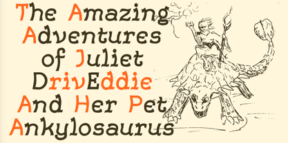
DrivEddie was an attempt to create a rough, hand-drawn typeface that was quirky but easily readable. It has a few serifs so it is almost but not quite san serif. All vertical stems are curved. For almost 25 years DrivEddie was a one-font family and one-font families often have limited applications. In 2020 I returned to this typeface to increase its possible uses by adding five new styles: italic, semibold, semibold-italic, bold, and bold-italic. I also corrected mistakes and added characters.
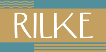
Rilke by Pelavin Fonts, $20.00 Rilke, is the lettering used by Gustav Klimt on the 1st Vienna Secession poster in 1898 and is named for Klimt’s contemporary the poet Rainer Maria Rilke. The Vienna Secession was a group of artists whose motto was "to every age its art and to art its freedom." Their goal was to create a new style not based upon any historical influence. Its subtle curving strokes and the idiosyncratic set of the various characters create an elegant lightness which lends itself well to poetry, inscription
Styling is a simple, light, sans-serif typeface inspired on old cars and planes with an aerodynamic shape. The font comes in 5 weights plus italics. Styling and Styling Alt families offer professionals a wide range of creative options. Styling was created in 2014, while its designer was 30,000 feet in the air and the plane was flying over some Latin America cities. A flight full of flavours and shapes. This typeface is the result of anxiety and speed. Keep on rollin’ and fly high with Styling!
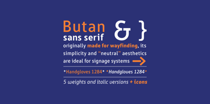
Butan was originally designed as a typographic project for the Specialization in Typography Design at the University of Buenos Aires, during the years 2013 and 2014. The project was conceived as a “wayfinding” font, that would be functional for bilingual signage systems. The main guideline for its design was to create a font that could be readable from great distances and it could be potentially used in signage systems. Therefore the neutral aesthetics and clean shapes were very relevant in order to create this particular font.
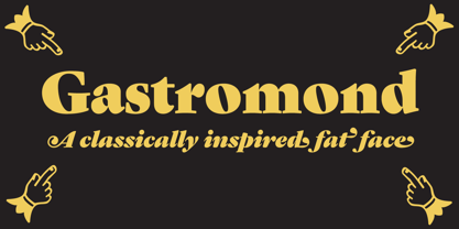
Gastromond began about five years ago with a question: why are fat faces always based on Didot or Bodoni models? Was there a reason that the stresses of these display faces was always vertical or horizontal and never angled? It was time to find out. Gastromond is meant to blend the Renaissance stylings of the Garamond types with the Victorian outlandishness of the fat faces. The result is an emphatic take on a classic genre. Loaded with swashes and alternates, Gastromond has enough character to go around.
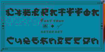
CyberNippon is a unique latin script font that references Japanese and Cyberpunk motifs. Literal translation of the name "Cyber Japan" This typeface took many months to complete and was inspired by the style and mood of cyberpunk, for whom Japanese culture is very close. Since the Japanese are inherent in perfectionism, while working on this font, I brought everything to perfection. The result of all the work was, in my opinion, a font that was perfectly verified and worked out for many hours. The main motives that are visible in this work are the modern interpretation of the classic Japanese hieroglyphic systems - hiragana and katakana. Originally, the font was completely handwritten using a calligraphic pen, and then converted to digital format.
Nyfors was a sudden idea. I noticed an ad in a magazine, with some handtexted words. I don't recall what the ad was about, neither the words. When I later on tried to remember how the single characters looked like and began to draw them, the result wasn't bad at all. I am not longer sure that they resemble the characters in the ad, but it doesn't matter. Nyfors is a nice handtexted typeface, whatever its origin. There is a small stream in Tyresö where I live and work, called Nyfors. During some centuries there was a center of small scale industries along it, and they used its water to run their machinery. The typeface has its name from that stream. Nyfors was released in 1995.
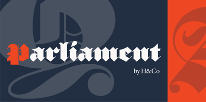
The Parliament typeface was designed by Jonathan Hoefler beginning in 1995. A burlesque typeface in the Regency Blackletter style, Parliament was inspired by the ‘Four-line Pica Black No. 1’ typeface of William Caslon Jr (1821), whose enigmatic design for the letters E, G, I, N, V and Y hinted at a broader ambition to modernize the arcane shapes of the gothic alphabet’s capital letters. Parliament completes this project for the first time by including two sets of alphabets, one archaic and one modern, along with a third set of ‘small caps’ that restores to the blackletter the versatility of Roman type. Parliament was first used for the 1998 ATypI Conference in Lyon, and was published by Hoefler&Co in 2022.
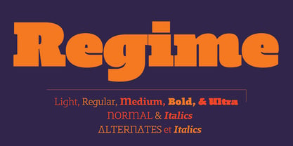
Regime by Barnbrook Fonts, $75.00 Historical influences coalesce with a contemporary twist to form the striking slab serif typeface Regime. In the early 19th century, as the Industrial Revolution began to transform Britain, the slab serif was born. The impact of new technology created a demand for a visual language that was compatible with mass-production and that could capture the attention of a newly-literate consumer. The design of the first slab serif typeface is credited to British punchcutter and typefounder Vincent Figgins and was released under the name Antique in 1815. In the same year, Napoleon was defeated at Waterloo. The name Regime alludes to this moment in history, when Britain emerged as the principal naval and imperial power of the 19th century.
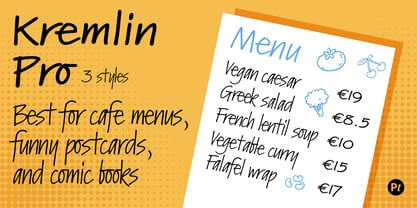
The first version of Kremlin was designed at ParaType (ParaGraph) in 1995 by Tagir Safayev. Based on an informal handwriting. Kremlin is a Russian word for a fortress or a citadel. The reason why the author selected this word for the font name is not quite clear even for him. Probably the appearance of the text line set in this font resembled a tight fence. Later the font was expanded in character set and got two style variations with extended proportions. The suffix "Pro" in the name was added to distinguish the new version from the previous one. The derivative work was done by Dmitry Kirsanov and Gennady Fridman in 2010. The font is recommended for advertising and display typography.
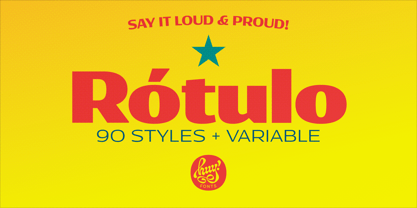
Rotulo Variable is a contrasted sans family which combines the Thick & Thin signpainter's style and some 70s feeling in a huge font family with three axis: Width, Weight and Slant. A visit to an exhibition of Spanish movie posters by Jano was the beginning of Rótulo (Spanish for Sign) project. Classic thick & thin signpainter style was featured in many letterings of those posters, as it was a very common style in 60s and 70s Spanish design. Unfortunately, today very few Contrasted Sans are seen, something that was quite common years ago has fallen into disuse in favor of Helvetic monotony. Rótulo recapture all that personality, with an extense range of weights and widths to be used in striking headlines and short texts.
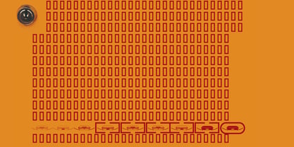
Fontology-E is an experimental font designed by Fabrizio Schiavi. It was created for the cover of the Fontology catalogue. Schiavi's need was to build an optical false modulation effect with versions of the logotype and typical rectangles of an empty font chart. The basic idea was to create a page that contained many rectangles in order to demonstrate the modulation. At the same time, it was important to understand that Schiavi inserted 8 versions of the same logotype each time the corresponding letter is digitized in e, a, d, f, g, h, c and b. The inside of the catalogue has the same layout and text, which is revealed by fanning the pages. Schiavi confess that Fontology-E is a highly experimental typefont.
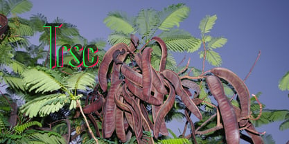
Trsc by Konrad Trzeszczkowski, $5.00 This font was based on calligraphic letters I made with pen size 2B.
Van Wyck JNL was inspired by some old printing found in a catalog.
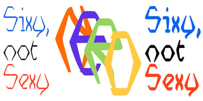
NerdishHex is a hexagonal distortion of NewNerdish that I thought was rather interesting.
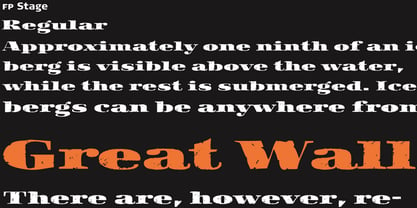
FP Stage was inspired by old Victorian theater posters and corresponding typographic designs.
The typeface was designed by Alexey Chekulaev inspired by artwork of Grigory Klikushin.
Mystery Stencil JNL was inspired by lettering spotted on images of European kitchenware.
This font was inspired by music from the band The Devil Wears Prada.
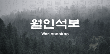
The height of various characters was designed by reinterpreting the woodblock print Worinseokbo.
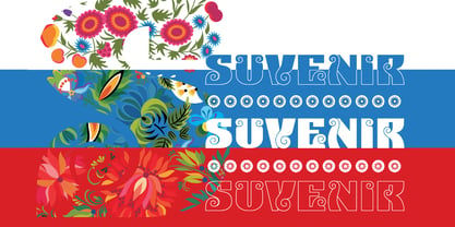
A set of ornaments was designed at ParaType in 1992 by Elvira Slysh.
Pattheda, designed by Azcreative Studio, is an elegantly crafted font that encapsulates a harmonious blend of modern design principles with a touch of playfulness. This font stands out for its unique...
Candy Pop! by deFharo is a distinctive and engaging font that captures the essence of fun, creativity, and dynamism. DeFharo, a Spain-based typographic designer, is known for his wide range of fonts,...
DIVERGENT, a unique font crafted by the designer known as SpideRaY, embodies a standout style that clearly sets it apart from the plethora of typefaces available. This distinctive font captures the e...
Ah, Lein Bold, the typeface that struts into the typographic scene with the confidence of a peacock at a bird show. Picture this: if fonts were people, Lein Bold would be that one friend who's always...
Corrodated J, a font by the creative minds at Immortalware, is what you might call the rebellious teenager of the typeface family. Imagine a font that decided it wasn’t going to follow the rules, swi...
As of my last update in 2023, the "Copyright Violations Nudged" font by GemFonts | Graham Meade isn't a widely recognized or popularly discussed font in mainstream typography circles, which suggests ...
CoasterPoster by Nick Curtis stands as a tribute to the vibrant and boisterous spirit of vintage amusement parks and circuses, encapsulating the essence of fun and excitement through its design. As y...
Sinister Plot is a font that seems to have emerged from the darkest corners of a creative mind, encapsulating a feeling of intrigue and mystery with each stroke. Its name itself evokes images of shad...
Corners 2 isn't one of the mainstream fonts that you'd find popping up in your everyday text editor or design program. It's more like a hidden gem tucked away in the vast world of typography, waiting...
As of my last update in April 2023, without direct information on a specific typeface designated as "13_Fletcher," I can fabricate a creative description based around the intriguing elements the name...
Sure, let's dive into the delightful world of "Amurg" by Sabina Chipara, shall we? Imagine if the letters you type, instead of falling in line like good little soldiers, decided to throw a little soi...
Imagine if a squadron of pencils, armed with quirky personalities and a shared dream of starring in a visual symphony, decided to skate across a blank canvas. That, in essence, is the font Pencilled ...
Alright, let's dive into the enchanting world of the Dark Crystal Outline font, crafted by the talented folks over at Sharkshock Productions. Picture this: as you gaze upon the letters, it's as if yo...
Plakative Grotesk, designed by Uwe Borchert, stands as a testament to the power of typographic expression in conveying direct and impactful messages through design. As suggested by its name, with "Pl...
Imagine wandering into a neon-soaked, nostalgia-fueled cinema alley from the golden era of blockbusters. There, amidst the scent of buttery popcorn and the echoes of cinematic triumphs, emerges the e...
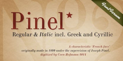
The characteristic ‘French face’ was originally made in 1899 under the supervision of Joseph Pinel. Thus, what was originally French 10 pt. Nº 2, got its present name. The Frenchman Joseph Pinel called himself a "typographical engineer", but was at the time employed as a type draughtsman at the Linotype Works in Altrincham. It appears that this and some other faces that he supervised, were, except for use on the Linotype, also meant for manufacturing matrices for the Dyotype. This composing machine was an invention of Pinel. The Dyotype was a rather complicated machine and consisted, like the Monotype, of two separate contraptions, a keyboard which produced a perforated paper ribbon and a casting machine which produced justified lines of movable type. Unlike the Monotype which has a square matrix carrier, the Dyotype had the matrices on a drum (in fact two drums, hence the name of the machine). A Pinel Diotype company was founded in Paris and a machine was built with the help of the printing press manufacturer Jules Derriey. As is often the case, a lack of sufficient capital prevented the commercializing of this ingenious composing machine. Coen Hofmann digitized the font from a batch of very incomplete, damaged and musty drawings, which he dug up in Altrincham. He redrew all characters, bringing up the hairstrokes somewhat in the process. The result is a roman and italic, while the roman font also includes Small Caps
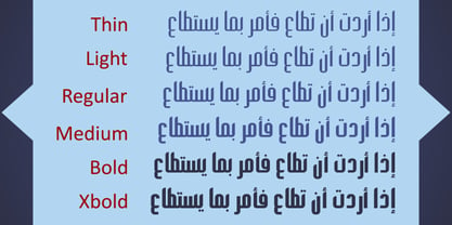
Hasan Aya is an Arabic display typeface. It is useful for titles and graphic projects The font is based on the simple lines of Kufi calligraphy. This font was created based on the Latin font "Bedrock" which was designed by Corel Corporation in 1992. It supports Arabic, Persian and Urdu.
ITC Ozwald was designed by David Farey and is a revival of a little-known typeface of American type designer Oswald Cooper called Cooper Fullface. The original was intended to be a modernized version of Bodoni and Farey captured all the charm, wit and creativity of the original in ITC Ozwald.