10,000 search results
(0.033 seconds)
- Smart Sans by Monotype,
$29.99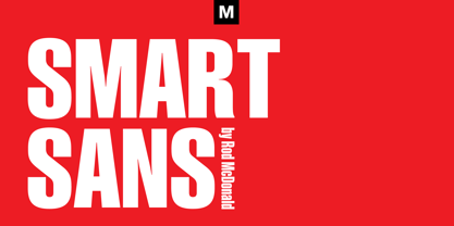 Smart Sans is a personal tribute to Leslie (Sam) Smart, the first type director to be hired by a major typesetting house in Canada. Smart was a twentieth century design pioneer who raised the standards of Canadian typography. Together with three of his peers, he established the first Type Directors Club in Toronto. After Smart's death in 1998, type designer Rod McDonald decided that something should be done to commemorate Smart's life and achievements. I had first thought of establishing a scholarship in Sam's name, but a typeface design soon replaced this idea," says McDonald. "Once I decided to design a typeface, however, it became a foregone conclusion that it would be a sans serif - for no other reason than that I loved the name Smart Sans." Two typefaces served as inspiration for McDonald's work. "Like thousands of designers, I'm keen on Matthew Carter's Helvetica Compressed series. And, when I was younger, I also loved Fred Lambert's Compacta," says McDonald. "I thought there might be a place for a small range that could take over from these 'old workhorses' and, in the process, bring a fresher look to the genre." McDonald drew three weights for the Smart Sans family, all ideally suited for setting attention-getting headlines and powerful display copy. The two-storied 'g' contributes to the design's lively personality, and the short 'r' helps maintain tight, even spacing. Smart Sans is the perfect homage to a great typographer, because it raises the bar on what to expect from condensed sans serif typefaces. Sam Smart would be pleased."
 - Babetta by Viktor Nübel Type Design,
$-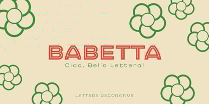 Babetta is a display typeface that comes with some decorative typographical features. Alongside a set of arrows and flower icons, it also includes an alternative ›E‹, some special diacritic marks, a wavy ›S‹ and a series of ligatures. It features 5 weights, a special ›Neon‹ version and supports a wide range of Latin languages. This typographical tool box provides a large and playful variety of options for headlines and logotypes. Babetta supports Latin and Cyrillic languages. The initial inspiration for Babetta was an illuminated vintage shop sign—that of a famous bookstore in Berlin called Karl-Marx-Buchhandlung that dates back to the days of East Germany. During the course of the design process, this slightly shabby historical original was kissed by an Italian Art Deco beauty and has blossomed into a new typeface with its own special charm. The aim was not to preserve the original lettering, but to use it as a starting point for typographical exploration.
 - Salloon by Ingrimayne Type,
$8.95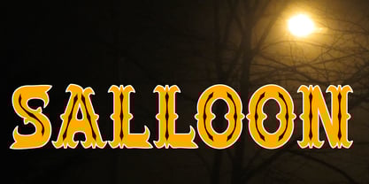 The original version of Salloon was what has become Salloon-Wide. It was designed a year or two before 1990. The narrower version, which is now the regular version of the face, was constructed a few years later. There never has been a true lower-case set of letters for these fonts, but the narrower version introduced a second set of caps by removing the side bumps from the letters. Although Salloon may look like an old font, no historic font closely resembles it. Fonts with bold, thick stems such as Salloon invite interior decoration. The five striped versions and the shattered version of the font were produced a year or two after the construction of the narrower Salloon when the arrival of a font distortion program made it easy to cracked and stripe fonts. In 2019 an outline style and two highlighter styles were added to be used in layers with the Salloon-Regular and one highlighter style was added to be used with Salloon-Wide.
 - Baro B by Our House Graphics,
$15.00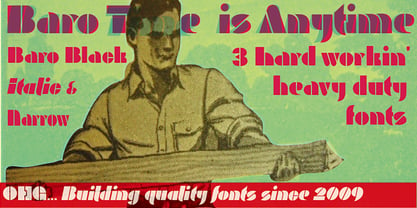 Baro is a powerful, fun and expressive font, great for loud, cheerful and super-fat headlines and packaging for odd novelty toys. With its bold and distinctive stylized geometric forms, it is ideal for logos, heavy machinery and wacky party invites. Baro had its beginning in a handful of rigidly geometric uppercase letters from an unidentified 1960�s or 70�s era press-down lettering font, which in turn was possibly a revival of a 20�s era Art Deco font. The exercise quickly expanded into a complete typeface with 300+ characters, including several catch words (word glyphs), stylistic alternates, discretionary ligatures, multilingual support and both lining and old style numerals. Baro maintains much of the characteristic geometric rigidity of the original handful of letters, but � With the addition of just a little bit of flare, a bit of cheerfulness breaks through, like a wink and a smile on the face of a fat and otherwise stern policeman.
 - Audrey by Fenotype,
$30.00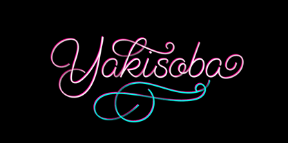 Audrey is an elegant monolinear Script and Sans font family. Audrey is great for designing headlines, packaging or as a logotype online or offline. Audrey has three weights of Script and Sans and a set of Ornaments. The weights go following: Regular is twice and Bold is three times as wide as Thin so if you want to have an Ornament example with same stroke width as Script you can set the Script in 36pt Regular and Ornament 72pt Thin -and they’ll have exactly the same width. Audrey Script is packed with OpenTtype features: Keep Standard Ligatures on for smooth connections and try Swash, Stylistic or Titling Alternas for more showier letters or seek for even more alternates from the Glyph Palette. Script also has Lining numerals as default and Old Style numerals as an OpenType alternates. Audrey is a close relative to widely popular Cosmopolitan released earlier by Fenotype. Compared to Cosmopolitan Audrey has more geometric forms and bigger lowercase characters with larger x-height.
 - Full Neue by Bülent Yüksel,
$19.00Full Neue is the younger brother of original Full Sans, Full Slab and Full Tools. Ideally suited for advertising and packaging, editorial and publishing, logo, branding and creative industries, poster and billboards, small text, way-finding and signage as well as web and screen design. Full Neue provides advanced typographical support for Latin-based languages. An extended character set, supporting Central, Western and Eastern European languages, rounds up the family. The designation “Full Neue LC 50 Book” forms the central point. The first figure of the number describes the stroke thickness: 10 Thin to 90 Bold. Full Neue LC comes 5 weights and italics also Full Neue SC comes 5 weights and italics total 20 types. The family contains a set of 485 characters. Case-Sensitive Forms, Classes and Features, Small Caps from Letter Cases, Fractions, Superior, Inferior, Denominator, Numerator, Old Style Figures just one touch easy In all graphic programs. Full Neue is the perfect font for web use. You can enjoy using it. - Bach by Los Andes,
$39.00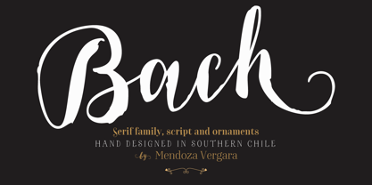 We have grown a new flower in our Garden, but this time, in a more emotional way, capturing its vibrations and using them to create a fresh handmade typeface: ‘Bach’, a display type system inspired by the new lifestyle trends that look to go back to basics and increase the value of old natural healing methods. Bach comes in two styles: a 6-weight Serif font in regular and italic versions, and a 2-weight Script in regular and bold versions. Ornaments are also included! Bach Script is based on the calligraphic catchwords set (handcrafted with brush pen) and the Serif version of the Garden typeface. This font is the perfect choice for labelling, packaging, illustrated books and posters. Go back to nature and feel the vibration again, this time with Bach! Bach is a Mendoza Vergara Studio design with the collaboration of Cecilia Mendoza in digital editing, under the supervision of Luciano Vergara and Coto Mendoza.
 - Stencil PTX by Pedro Teixeira,
$12.00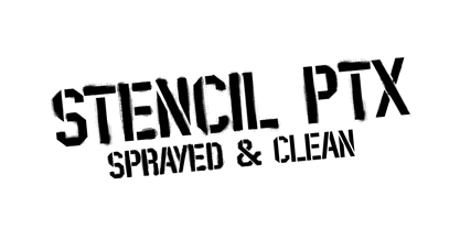 Introducing the Stencil PTx font family. We created two styles, sprayed, to be used in display giving the idea of graffiti on the wall and the clean, to possibly be used in print. This is the idea We have of an old school stenciled typeface/look. This typographic masterpiece brings the raw energy and urban flair of stencil graffiti art to your fingertips. The Stencil PTx font family is tailored for designers seeking to infuse their projects with the rebellious spirit and visual impact of street art. Whether you're designing for urban-themed events, streetwear branding, social media graphics, or edgy advertising campaigns, this font family adds an authentic urban edge to your creations. At Pedro Teixeira Foundry we're passionate about bringing the raw and vibrant energy of street art into the realm of typography. Explore the Stencil PTx font family to unleash the bold, gritty, and dynamic essence of stencil graffiti, elevating your designs with an urban attitude that commands attention and amplifies your message.
 - Full Slab by Bülent Yüksel,
$19.00Full Slab is the younger brother of original Full Sans, FullNeue and Full Tools. Ideally suited for advertising and packaging, editorial and publishing, logo, branding and creative industries, poster and billboards, small text, wayfinding and signage as well as web and screen design. Full Slab provides advanced typographical support for Latin-based languages. An extended character set, supporting Central, Western and Eastern European languages, rounds up the family. The designation “Full Slab LC 50 Book” forms the central point. The first figure of the number describes the stroke thickness: 10 Thin to 90 Bold. Full Slab LC comes 5 weights and italics also Full Slab SC comes 5 weights and italics total 20 types. The family contains a set of 485 characters. Case-Sensitive Forms, Classes and Features, Small Caps from Letter Cases, Fractions, Superior, Inferior, Denominator, Numerator, Old Style Figures just one touch easy In all graphic programs. Full Slab is the perfect font for web use. You can enjoy using it. - Data Error AOE Pro by Astigmatic,
$24.00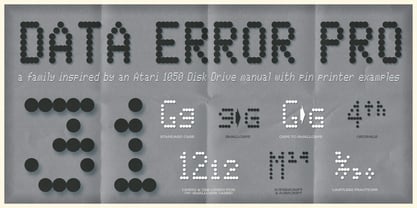 The Data Error AOE Family was one of my earliest typefaces, at a time when I had become obsessed with all forms of "digital/techology" typestyles. It's been awhile since the early 2000's, but I've had a hankering for awhile now to revisit this typeface, giving it a more expansive language character set and fill it out with some Opentype features. Inspired by some old printouts of BASIC programs and an Atari 1050 Disk Drive manual with pin printer examples, comes the familiar yet oddly restricted style with this Data Error family. This family comes complete with Regular and Bold versions with their respective Oblique versions. Odd pin printer restrictions inherent in this typeface are: no characters extend below baseline or above ascender line, (except international accents). A nostalgic typeface for computer programmers everywhere, strong and legible at any size, Data Error is perfect for so many purposes, get it today!
 - Archiva by CozyFonts,
$25.00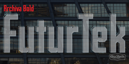 Archiva Regular - Archiva Italic - Archiva Bold - Archiva Bold Rounded - Archiva Wide Rounded - Archiva Dropline - Archiva Stencil - Archiva Worn - Archiva Outline is the eighth font family created by American Graphic Designer Tom Nikosey. Tom specializes in lettering, typographic design & illustration for branding and trademarks. New from CozyFonts Foundry. Archiva was designed to maximize limited horizontal space reserved for text, type, or headlines, titles and label wording. The Archiva Family is perfect for Labels, headlines, ads and especially signage. The 9 members of the Archiva Font Family maintain a consistency and likeness to each other in form and dynamics but yet each member of the family has it’s own individual personality. Archiva derived from the word archival or place where records are kept. Archiva is the Greek word for Archive. The x-height and organized glyph consistency enables the user to keep files organized and clean much like an archive. Caps and numbers work extremely well together also. There are over 300 glyphs contained in each of the 9 variations of Archiva© by CozyFonts and they work in over 70 Languages. Please visit my website or Google Tom Nikosey for more info on his illustrious career. CozyFonts is Tom's intro into the world of font design.
 - Club - Personal use only

- ALCATRAZ - Personal use only

- Teatral - Personal use only

- HeummSwifthongcha142 - Unknown license

- Shanghai - Unknown license

- Gothic Birthday Cake - 100% free

- KG Lego House - Personal use only

- Staubach - 100% free

- 84 Rock! - Personal use only

- Digital tech - Personal use only

- Cher Font - Unknown license

- GarbageG - Unknown license

- Espresso - Unknown license

- PlasterCaster - Unknown license

- GASMASK - Personal use only

- Drebiek - Unknown license

- Kings of Pacifica - Personal use only

- VTCSuperMarketSaleTallTilt - Unknown license

- SF Piezolectric Inline - Unknown license

- Ebola - Unknown license

- Avain - Personal use only

- Wonton - Unknown license

- Riquoth - Unknown license

- Jazayeri Kufic Shoushtar by Arabetics,
$79.00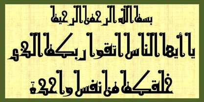 The Jazayeri Kufic Shoushtar font is a beautiful typographic implementation of the decorative Kufic calligraphy inscribed on the walls of the historic Grand Mosque of Shoushtar in southwestern Iran. This mosque contains many other inscriptions added over time for documentary purposes but its four monumental Kufic inscriptions which are revived in this font are the most essential ones to understand its design and meaning. Built in the ninth century CE, this mosque is one of the earliest hypostyle mosques in Iran. It was built in “the city of scholars” when its residents included two great Sufis, Sahl Ibn Abdullah Tostari and Mansur Hallaj. The designer and producer of the font is Seyed Mohammad Vahid Mousavi Jazayeri, a well-known Iranian master calligrapher, designer, scholar, and author. Mousavi Jazayeri has taken a personal interest in the Kufic script and devoted years to independent research, visiting archaeological locations, historic buildings and cemeteries, mosques, libraries and museums to study the script through direct contact. He has developed a systematic research methodology and published his findings in several books. His professional interest in script and calligraphy stimulated his discovery of the historic method for cutting the Kufic pen, which has had a direct impact on his own work, as seen in several well-received exhibitions and workshops. The historical research and achievements of Mousavi Jazayeri brought together the first international group dedicated to the study and revival of the historic Kufic script operation through kuficpedia.com.
 - Cougher by Context,
$10.00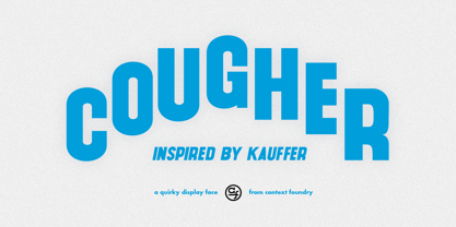 A big fat quirky face for big bold weird uses. Inspired by E. McKnight Kauffer and vintage travel posters, both styles have support for multiple languages.
 - KG Always A Good Time by Kimberly Geswein,
$5.00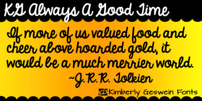 Happily-lettered handwriting full of optimism. This handwriting was drawn with a chunky round marker and is bold enough for drawing attention yet still completely legible.
 - Safety Goggles by Ali Hamidi,
$10.00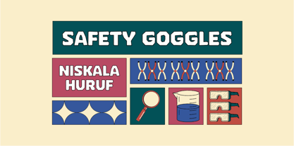 Safety Goggles is a bold, strong, masculine display font. This font is perfect for SVG design, sticker, home decoration, quotes, headings, blogs, logos, invitations and more!
 - Scrap Caps by Illustration Ink,
$3.00Cap off your project with this all capital letter font. Bold and stylish with hand lettered appeal. Great for any paragraph or headline that demands attention. - Display Engraved JNL by Jeff Levine,
$29.00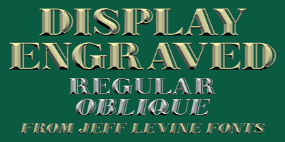 Display Engraved JNL was inspired by the bold, engraved Sphinx Blanc from the Deberney & Peignot circa 1925, and is available in both regular and oblique versions.


